Bright + Cozy Loft Makeover
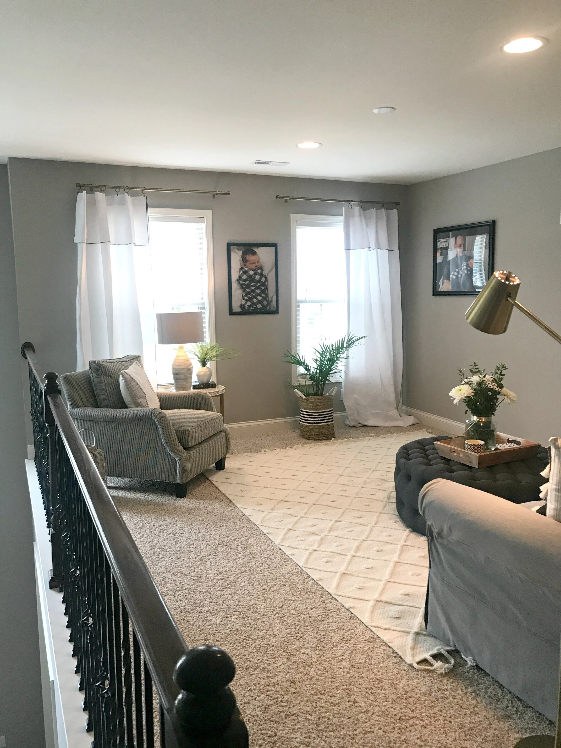
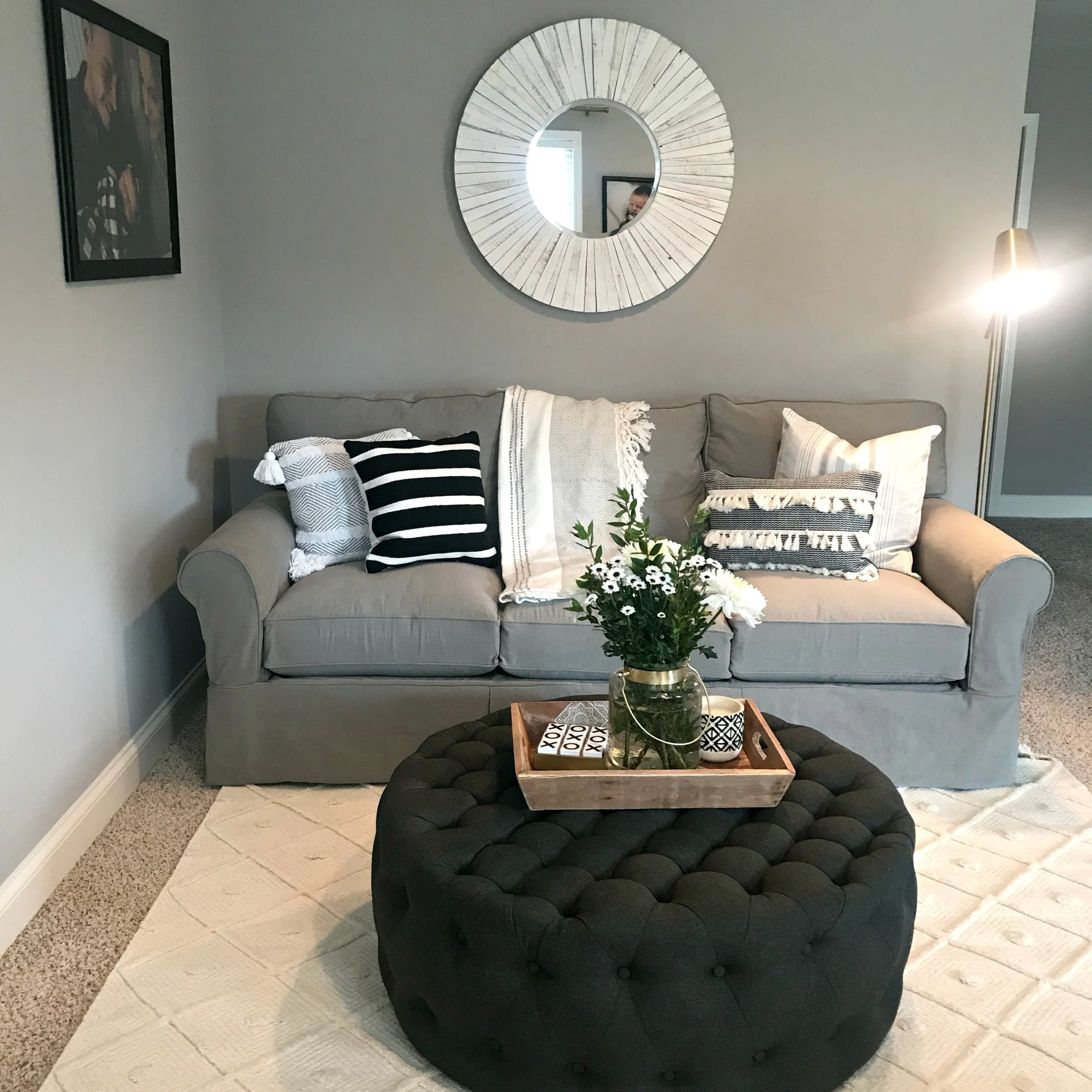
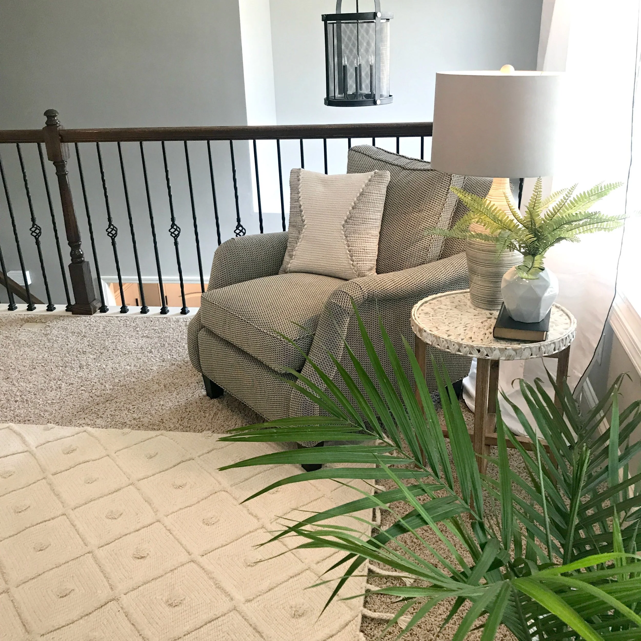
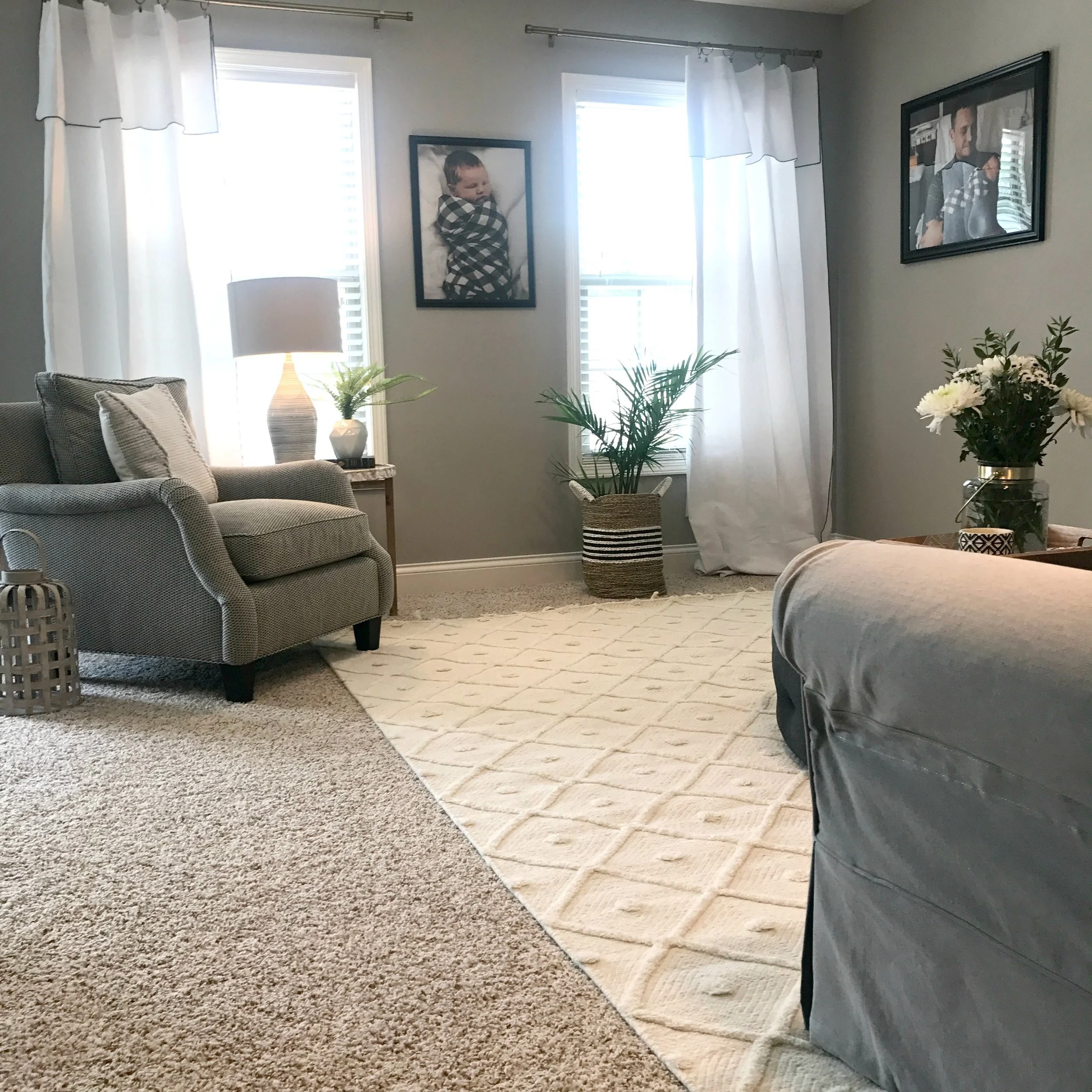
This past week I started wrapping up the final stages of a design project I've been working on for the past couple of months for one of my favorite clients. The install day of all the finishing touches and accessories is always my favorite because it always makes the space feel the most complete and cozy! This was my first time tackling a loft living space at the top of the stairs like this and it was definitely challenging, but I love the (almost) finished product. The main challenge was trying to make such an open space feel cozy and comfortable, as well as figuring out the right way to arrange the furniture when you are basically missing an entire wall of the room!
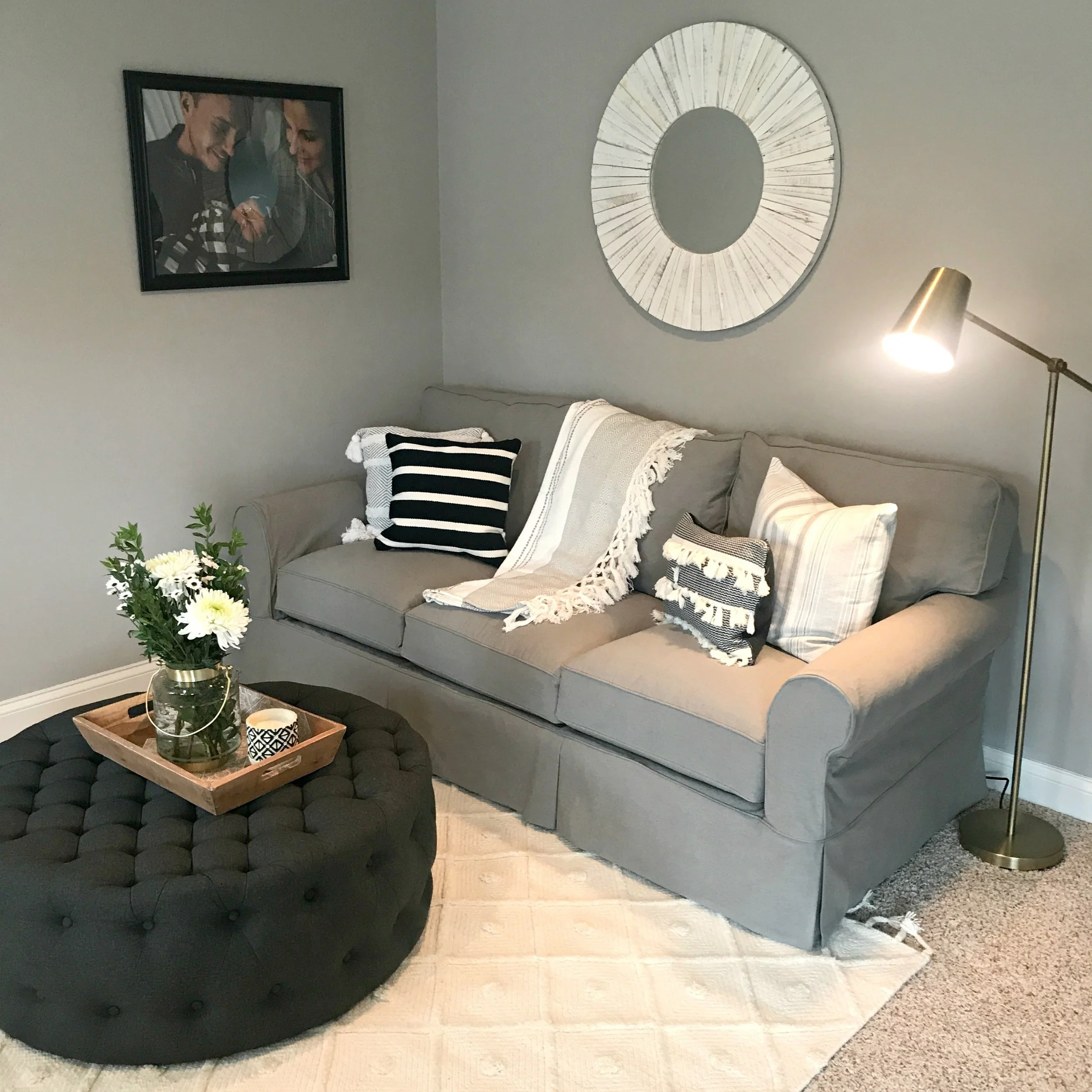
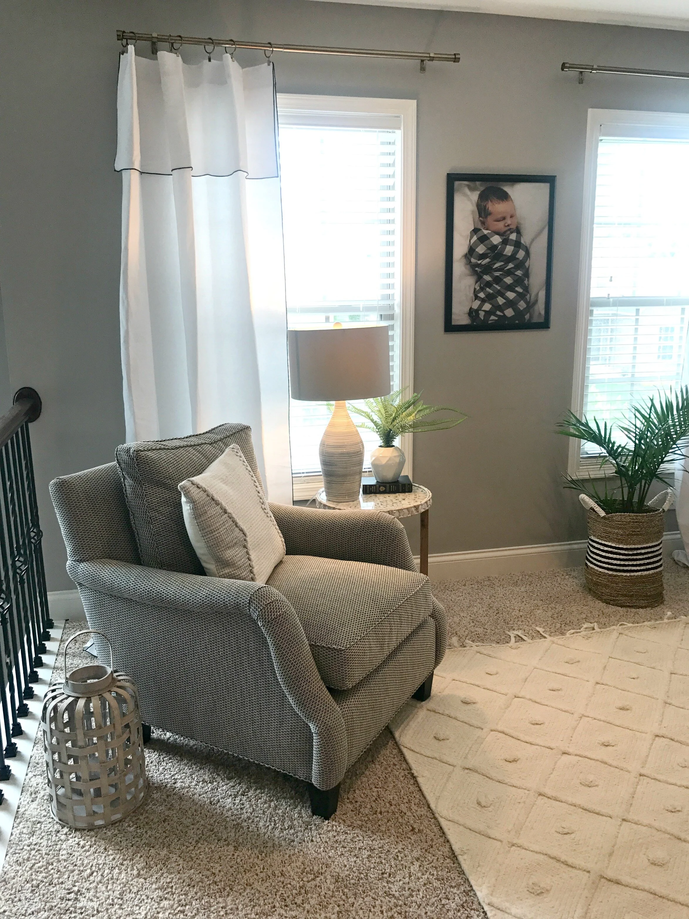
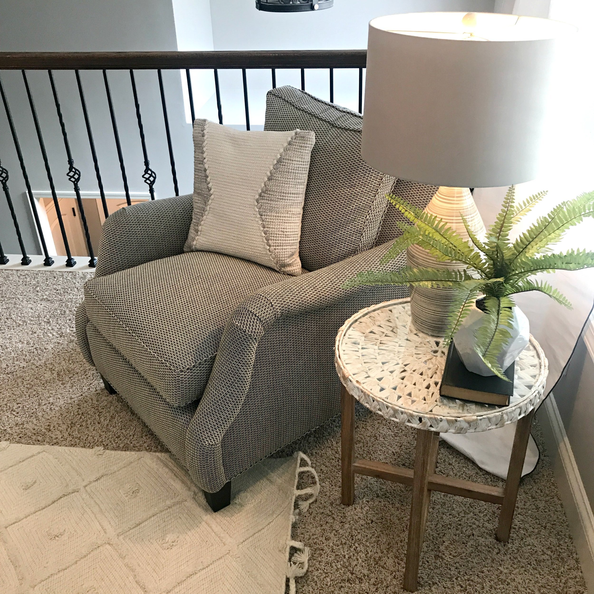
We started with a completely empty room in here. My clients found the furniture (chair and couch) at Arhaus soon after we put the design plan together. After the furniture had been delivered and before I had started installing anything, my client called me saying she hated all the furniture they picked out and was feeling totally down on the space as a whole. She felt everything was too big for the space and everything was too gray and blending in with the walls. So I made it my focus to make the space feel lighter and brighter so that you wouldn't even notice the gray. I had sent my client a lot of rug options to choose from, most all textured and fringey, but some gray and some white/creams. Ultimately she told me to make the decision on the rug and after mulling over all the options the decision to go with a light, cream rug really set the direction of the rest of my decor for the space.
Next I went hunting for the perfect big mirror or set of mirrors to go over the couch! I narrowed it down to several options- most being more traditional/farmhouse style and then the round, distressed white wood mirror that I ended up choosing in the end. I decided to take a chance on the mirror, even though it was a little different than the style my client would typically choose. I could just picture it with the cream rug and thought it would add that brightness and texture the space needed. It ended up being the perfect size for filling the wall and once I chose that and the rug, all the other style elements just came together so easily for the space.
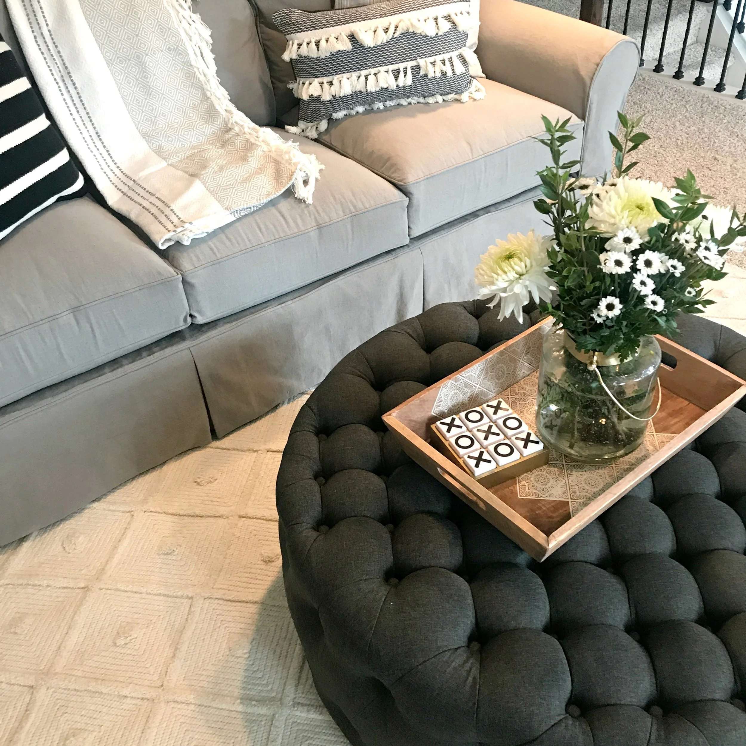
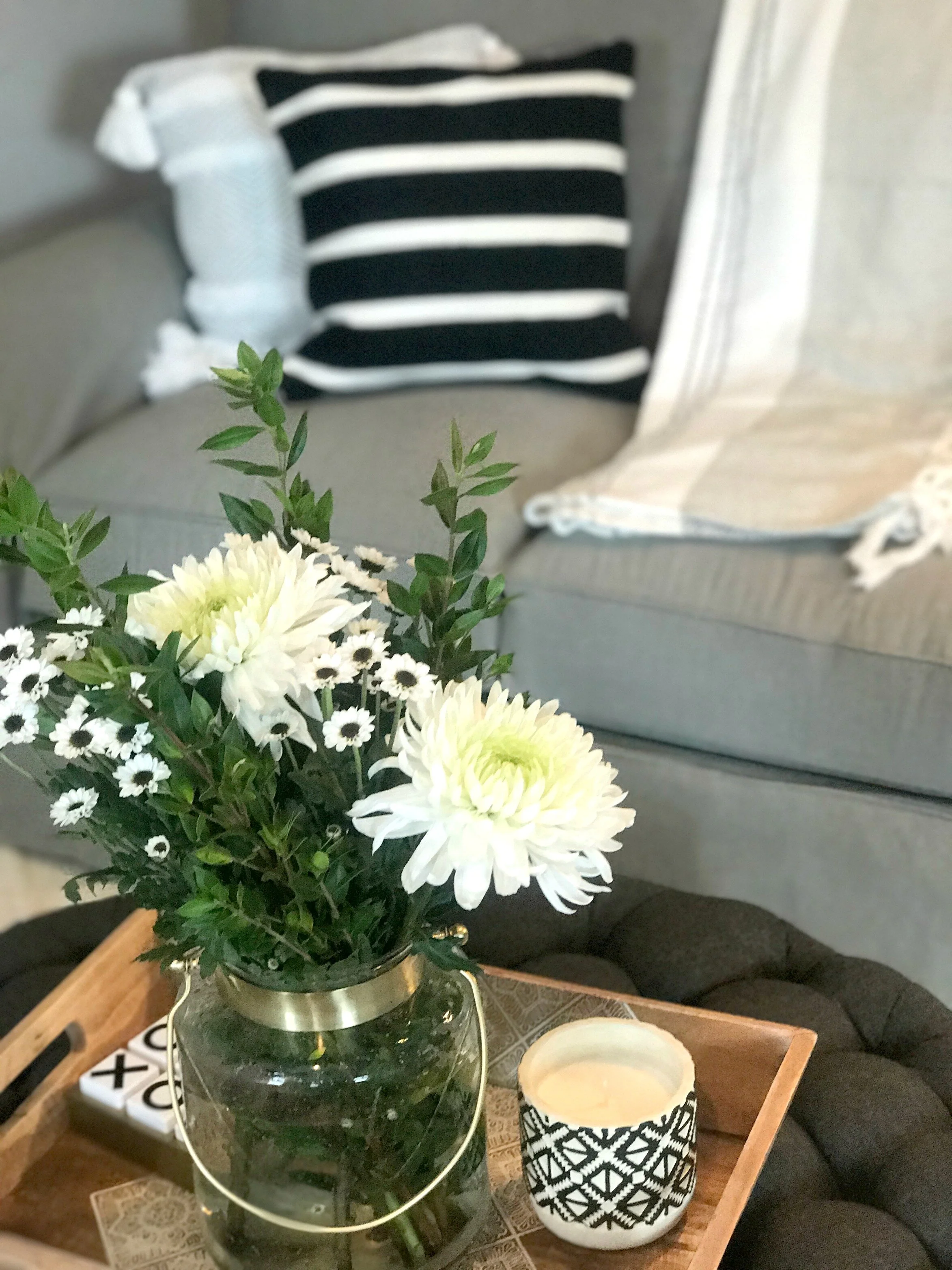
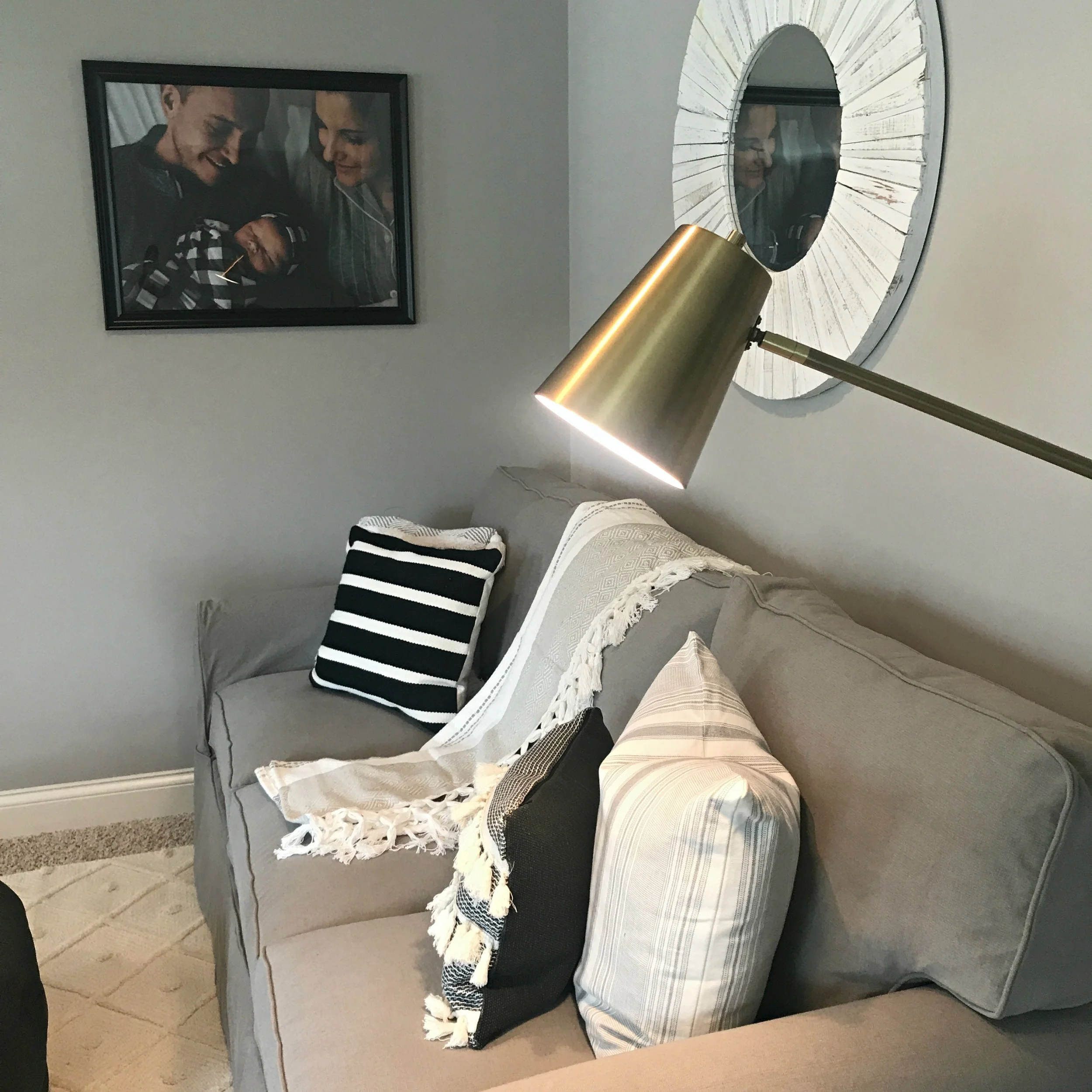
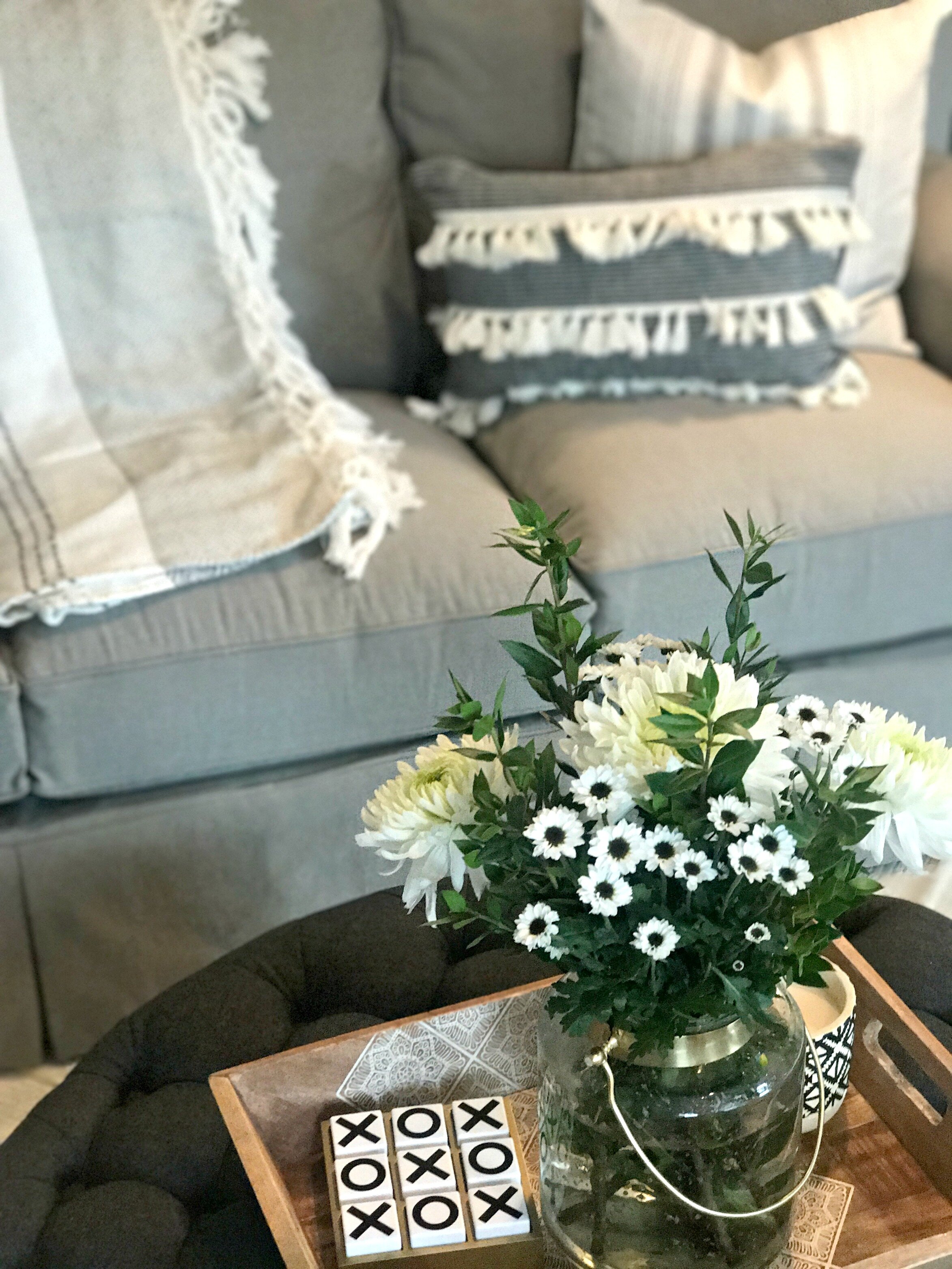
I found the most perfect side table to coordinate with the mirror at Homegoods as well as the cute gray and white lamp on top of it. Overall I kept the accessories pretty simple for now since there isn't a lot of surface area in the room and I didn't want it to feel too crowded. I definitely wanted to fill in the walls as well so we enlarged family photos into poster size prints. This young family definitely has room to continue adding to the space as they need to in the future. The last few things we are going to do to complete this space are:
1. hanging this wallpaper on the big open wall (with the 2 big family photos on them).
2. mounting the television to the center of that wall
3. installing this fun light fixture in the center of the room!
Stay tuned for the final reveal of the space once it's complete!
xoxo
Emily

