Our Fixer Upper: Demo Continues
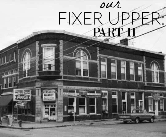
Demo continues at our latest fixer upper project and the progress downstairs is amazing! I knew it would make such a huge difference removing all the walls and raising the ceilings back to the original height, but it has transformed the space even more than I had imagined. The whole downstairs level feels twice as big and once all the windows are uncovered, all the natural light is going to make this whole area feel so bright and open. You can read more about our plans for this building and see some "before" pictures here.
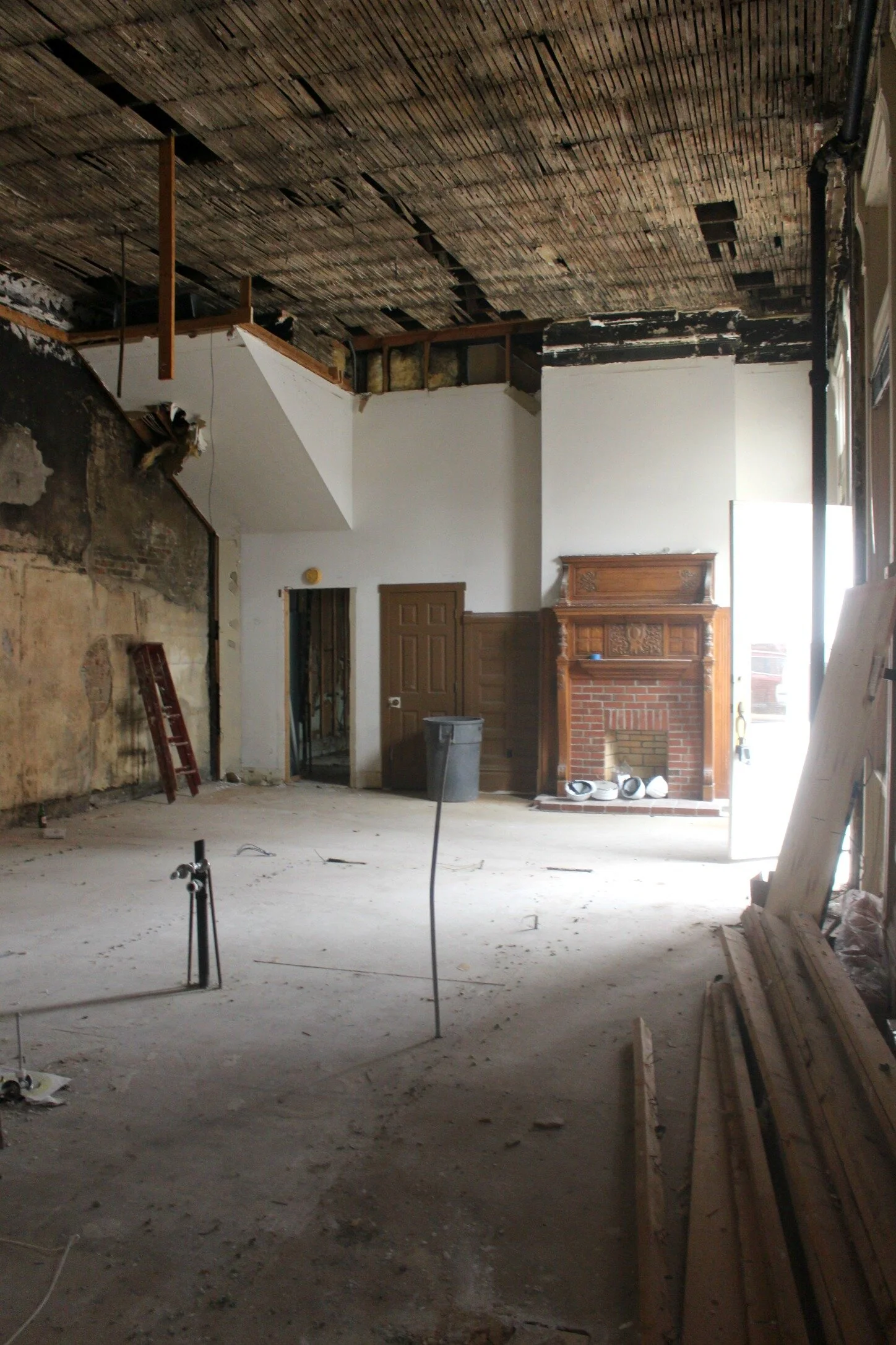
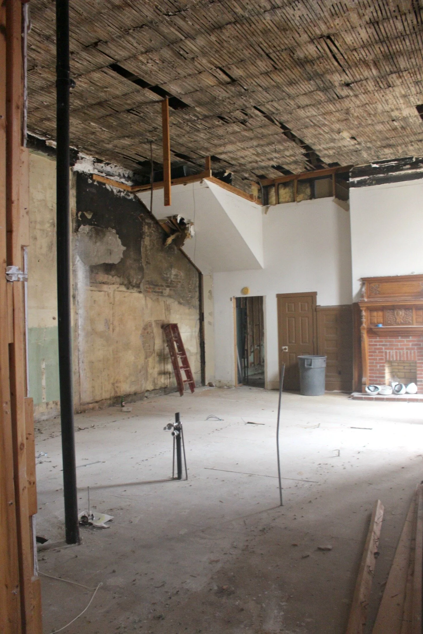
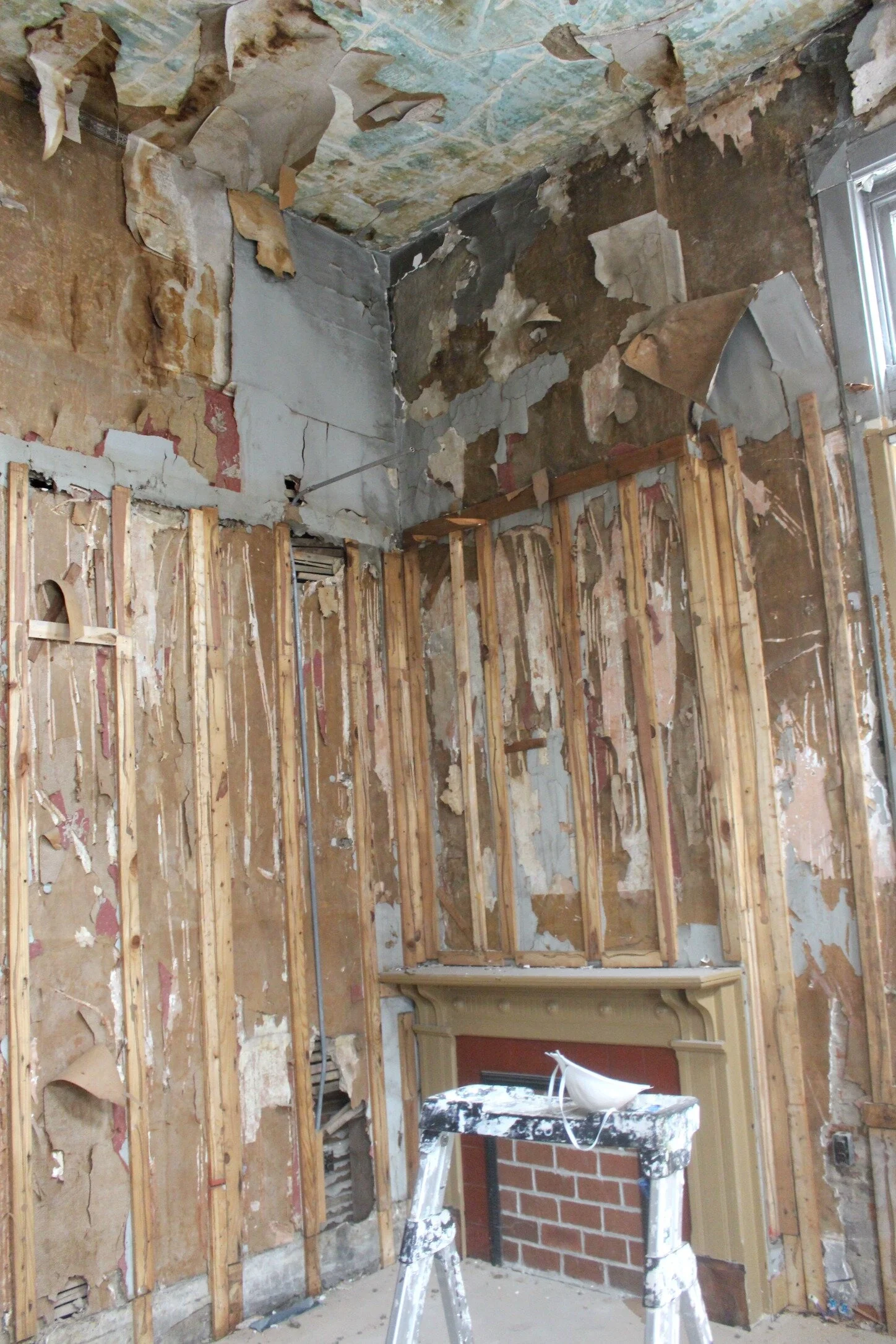
Above you can see the middle space downstairs which will house the retail store section of our concept. This space has a separate entrance and I immediately fell in love with the beautiful fireplace mantle. The whole left hand side wall that you see will be taken back to exposed brick.
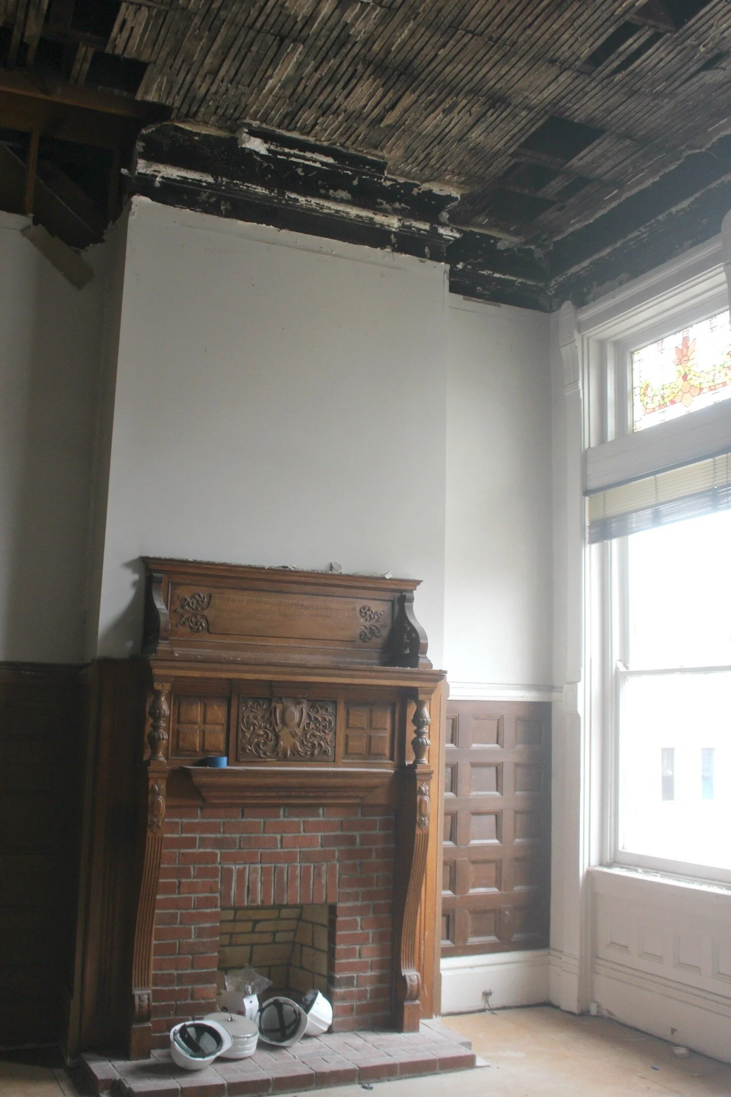
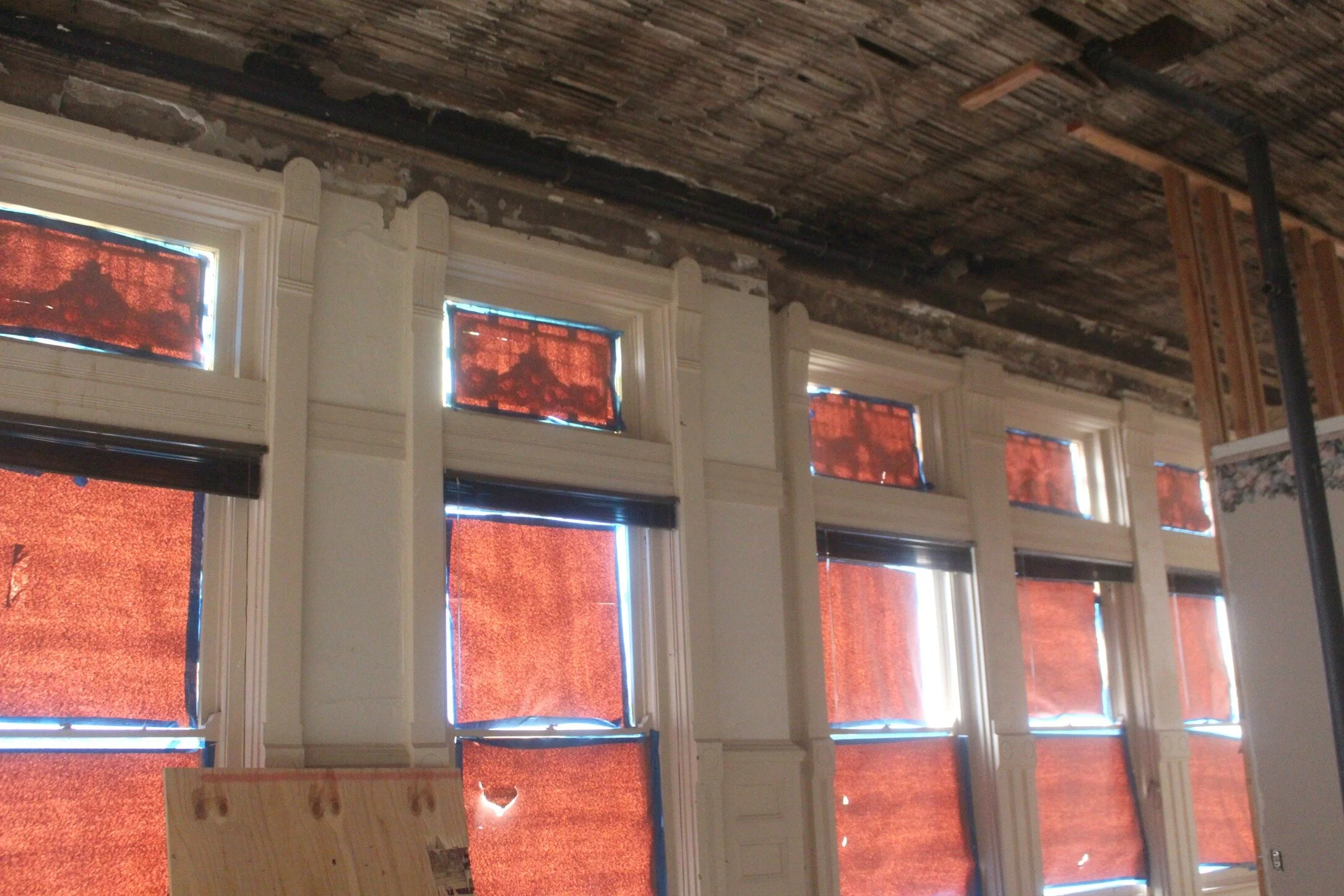
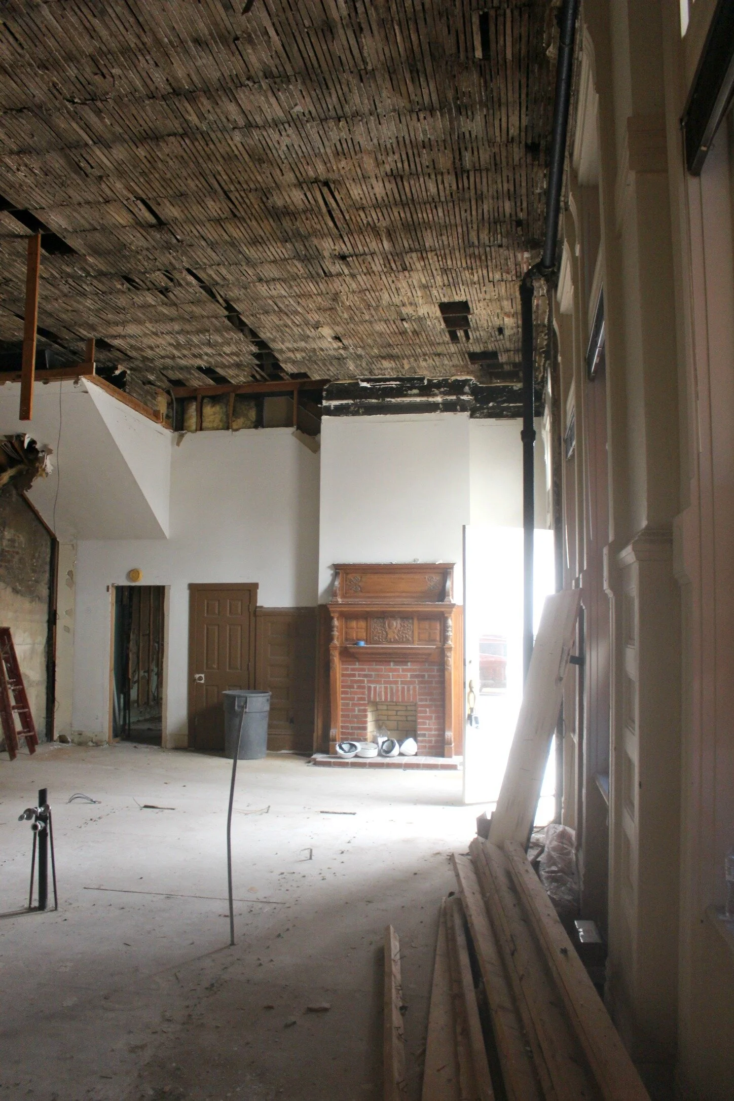
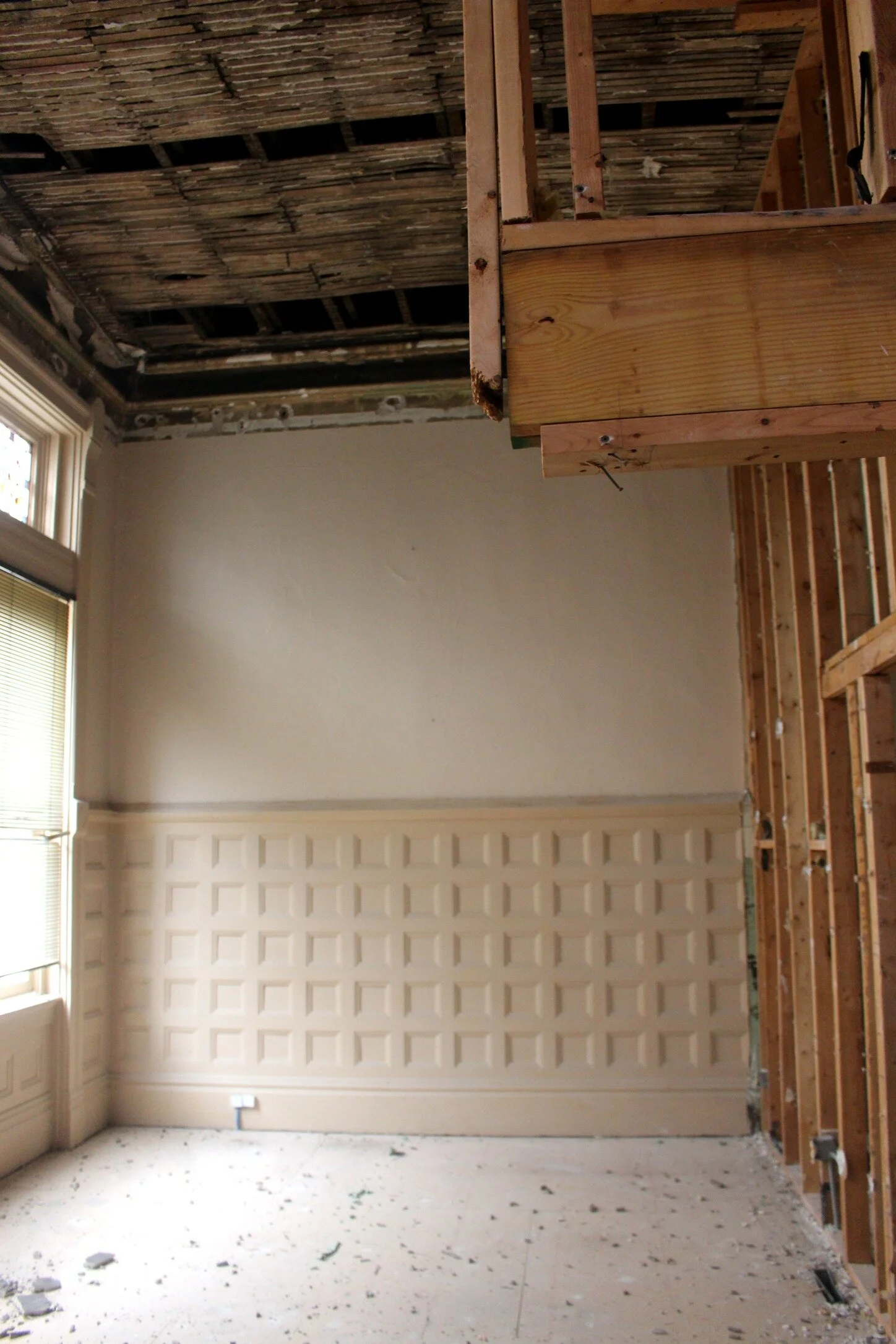
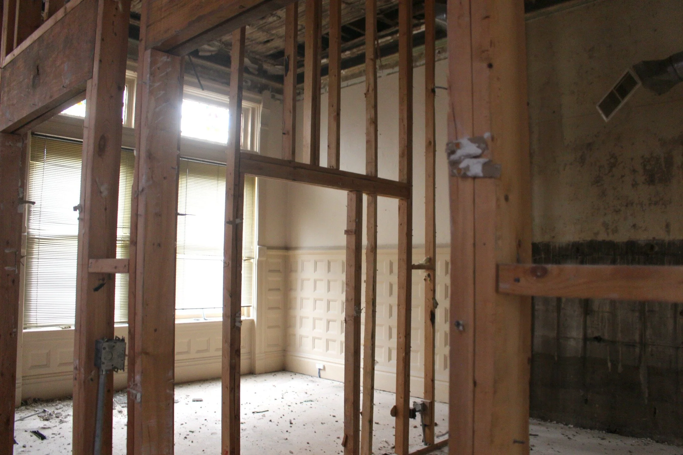
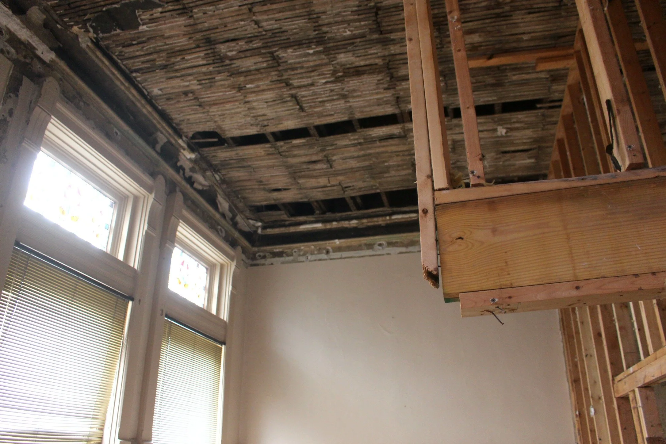
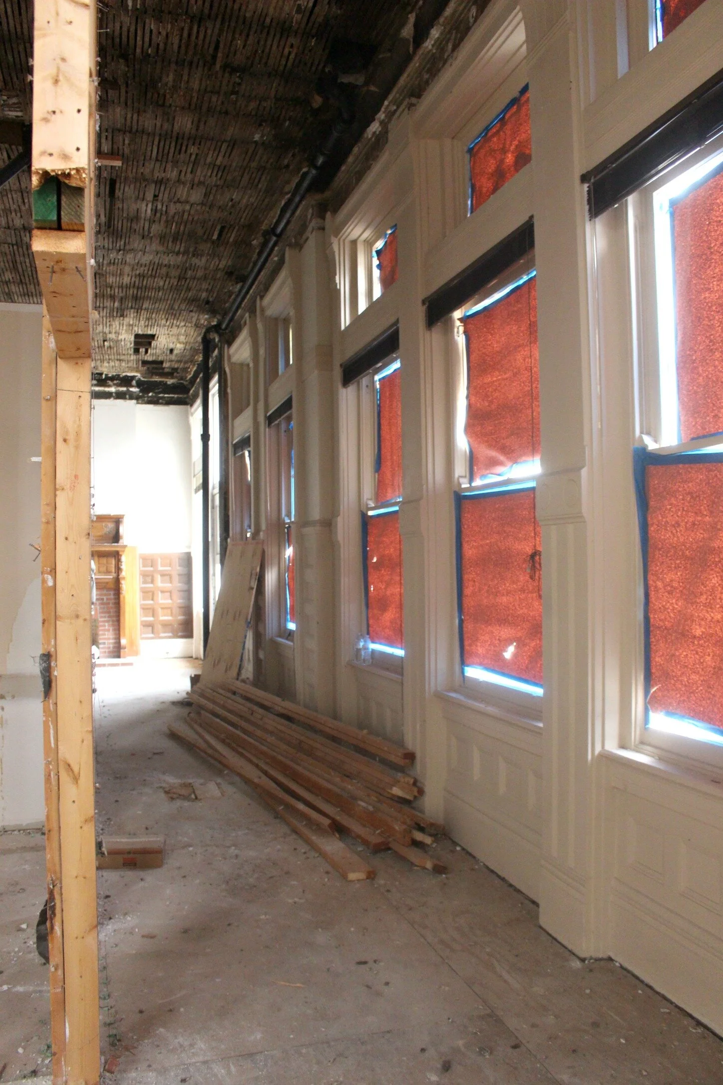
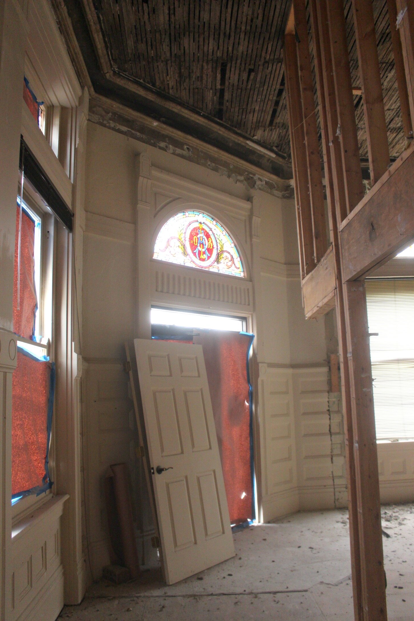
Here can see a closer look at the original fireplace and moldings, which we will be keeping and restoring as much as we can. These giant windows on the right side continue all the way down this side of the building (as you can see below too). The top windows feature original stained glass and they all have some amazing moldings surrounding them.
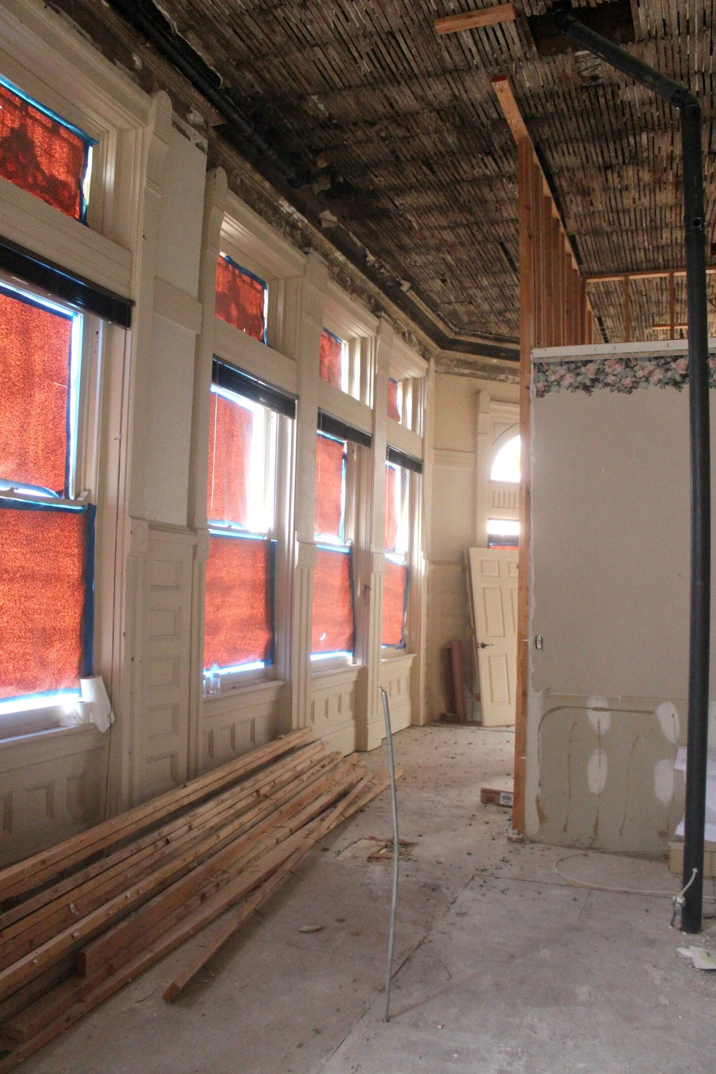
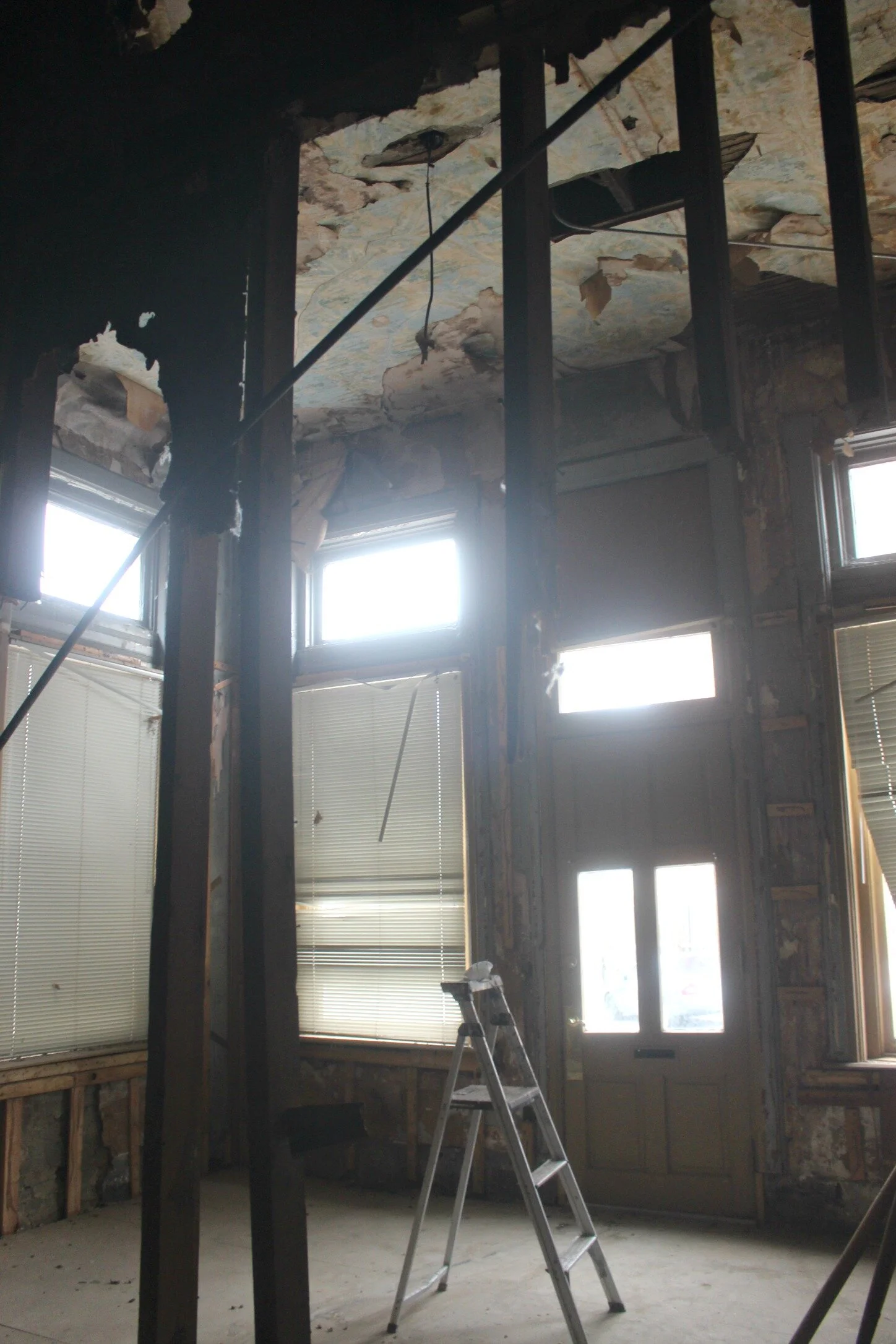
Unfortunately the original ceilings which probably featured some type of beautiful tiling was removed completely during one of the past renovations. You can see the original lath that the ceiling has been stripped down to, and we are considering keeping that as a unique element throughout the space if we can figure out how to clean it up a bit and fill in the missing areas.
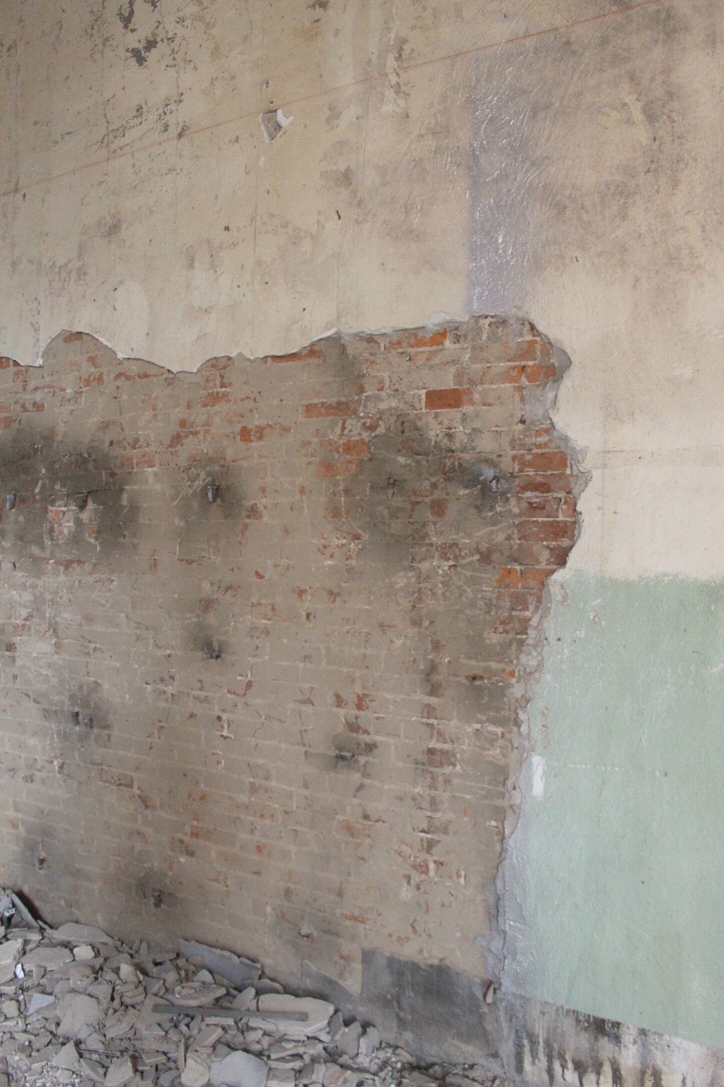
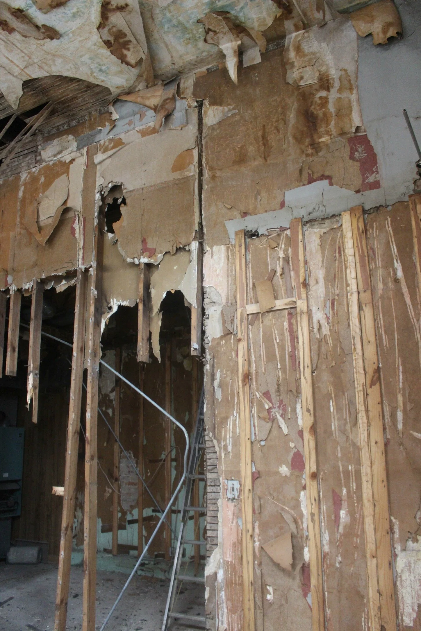
Above and below you can see a bit of the exposed brick that we are continuing to uncover. It is buried under many layers of plaster making it a little more difficult to get to, but we know it will be worth it to have this statement feature across the entire back wall of the building.
The open doorway that you see on the far wall leads to the third and last space of the downstairs of the building (more photos of that later in the post). The closed doorway is now a tiny closet bathroom but we will be removing that and closing both of those doorways off to just create a normal wall.
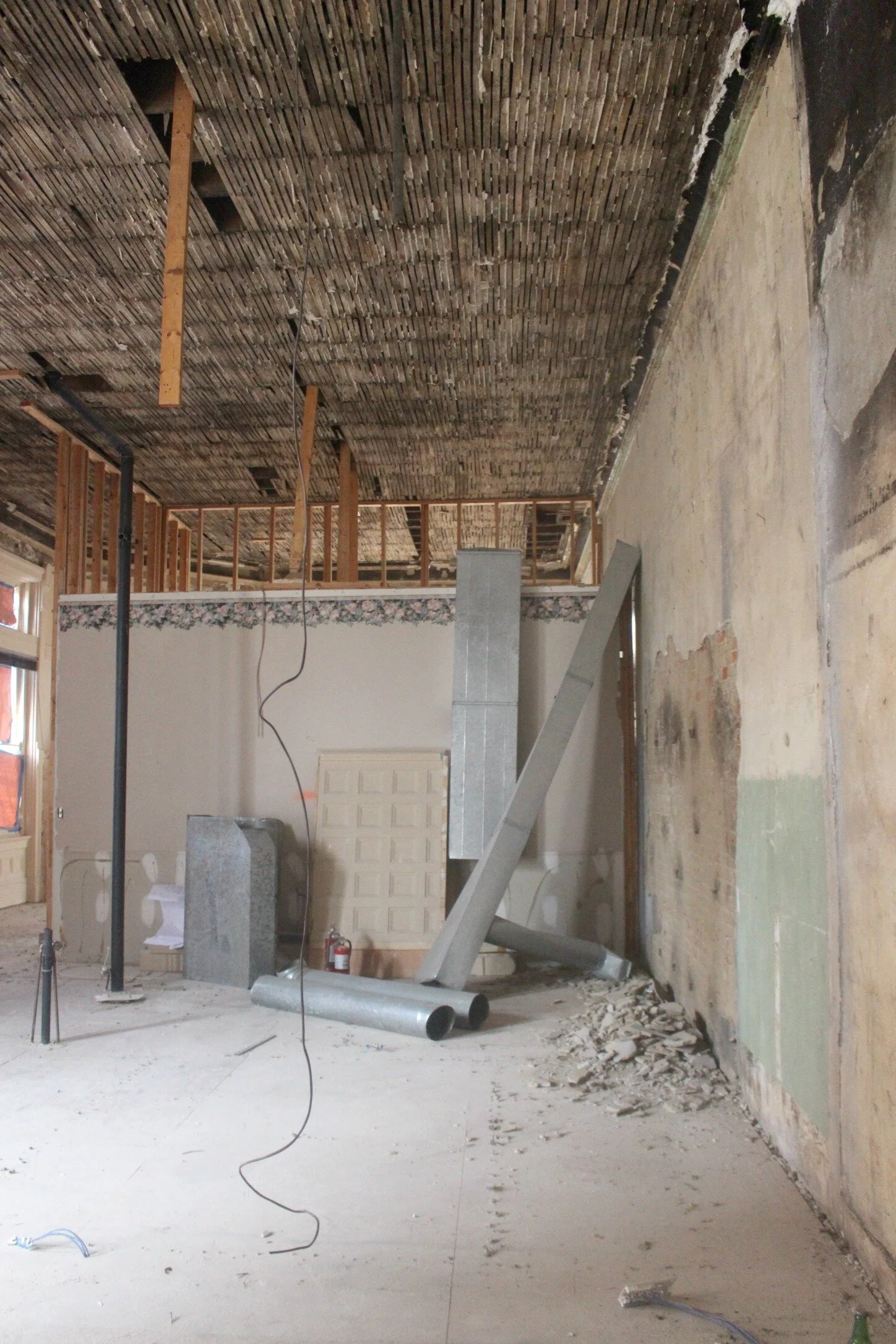
Above and below you can see a better look at the expanse of the lath ceilings throughout the front of the building. The wall in the center will separate the coffee shop from the retail space and we will add some type of glass door or sliding door so that it can be closed off when needed.
Below is a look at the front space of the building which will house the coffee shop. The few beams that are left will mostly be removed and the only walls that will be added in the area will be for the bathroom (which will back up to the dividing wall).
Above you can see the wall where the back counter for the coffee shop will be placed and there will also be a floating front counter right in front of that. That wall will also hopefully be exposed brick as well above the trim.
There are two more large windows in the front room which you can see above and below, and the front doorway is right to the left of those. That is the entrance that goes straight out to the sidewalk on Main Street.
Below is a view looking from the front of the coffee shop into the retail space. We hope to add a floating window bar on the right side for extra seating in the coffee shop.
The front entrance into the coffee shop can be seen above. This currently has a very plain glass and metal commercial style door but we are going to replace it with something wood and glass that better fits the look of the building.
Here's a look at the back space which we are hoping to rent out to another business, hopefully a bar or cocktail lounge of some sort. This was originally divided into two rooms with a bathroom in the back room and a storage closet but we are completely opening it up to one large space.
Above is a look at the wall that originally divided the space which they are still working on getting down. Luckily all the walls were added in later renovations so none of them have been load bearing so far.
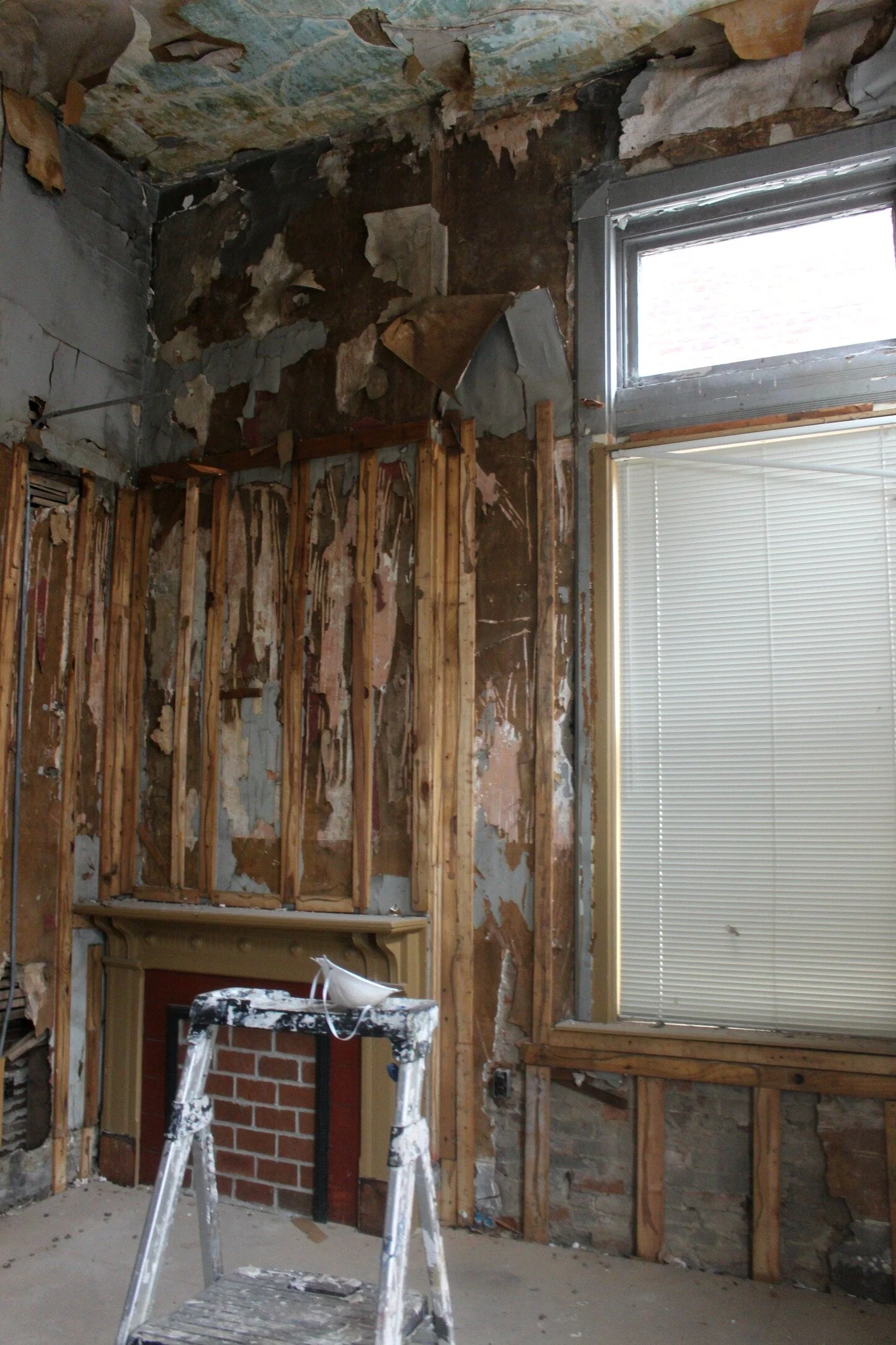
There's also a fireplace in this area which we will try to restore so that it's not just filled in with brick! The ceilings used to be much lower in here and actually covered up that top smaller window that is above the larger windows, but that has now been removed and we are raising the ceiling back up to the original 14 foot height.
Lots of layers of insulation, plaster, paneling, wallpaper, and more in here that all have to be peeled back to get to the original brick. We want to expose as much of the original brick as we can on all the walls. They also have been saving any and all original trim, doors, etc. that they have removed so that we can repurpose and reuse as much of it as possible, even if it's in different areas.
Above you can see the front of the 3rd space, it has its own entrance and three large windows (exactly like the windows that are in the front half of the building). We will probably replace the door to something with more glass that will let in more light and has a bit more character. I was hoping for concrete floors down here but so far it's just old subfloor so we will have to lay new floors of some sort. I will continue to share more progress as demo wraps up and we begin framing some of the new walls and slowly putting everything back together!
xoxo
Emily


