Our Fixer Upper: Entryway Before + After
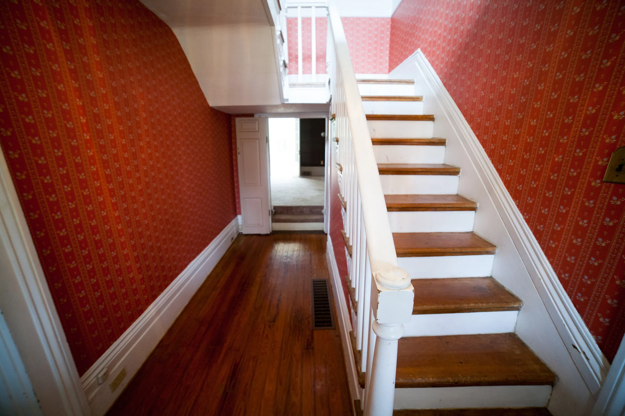
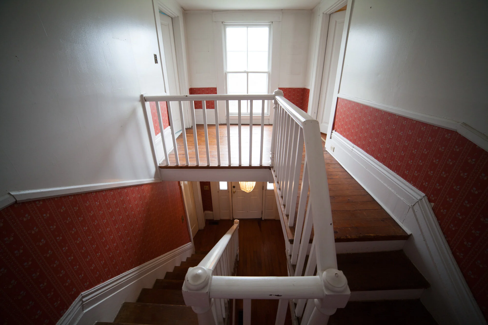
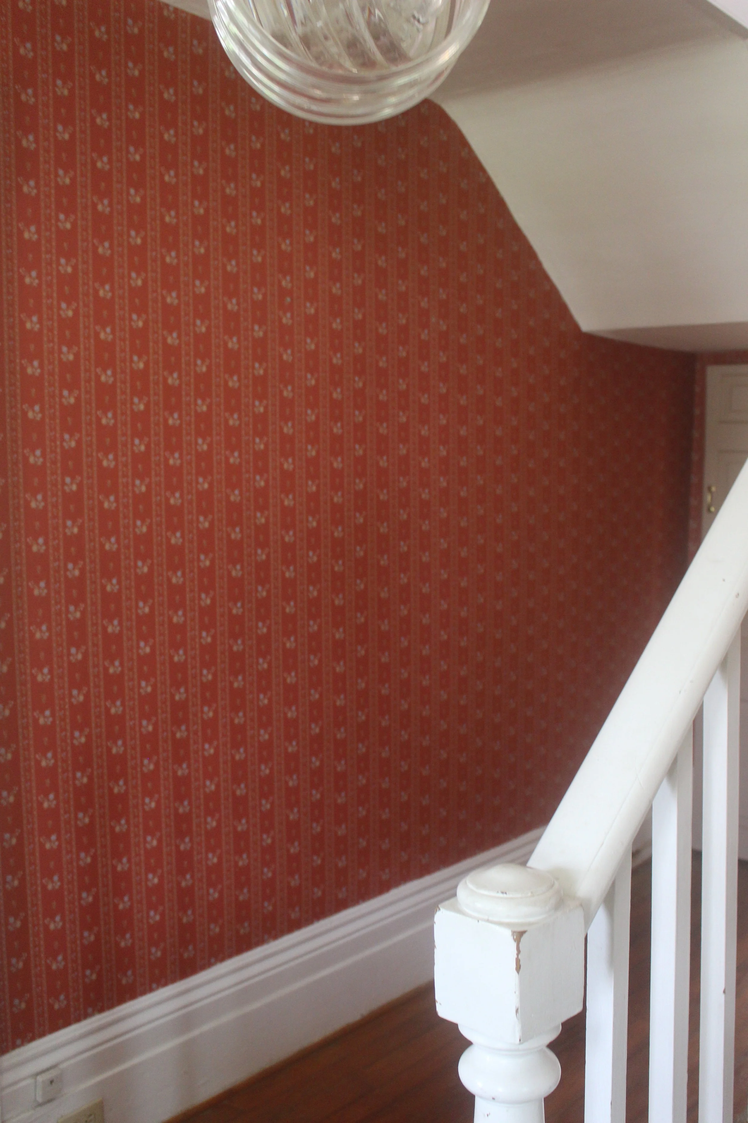
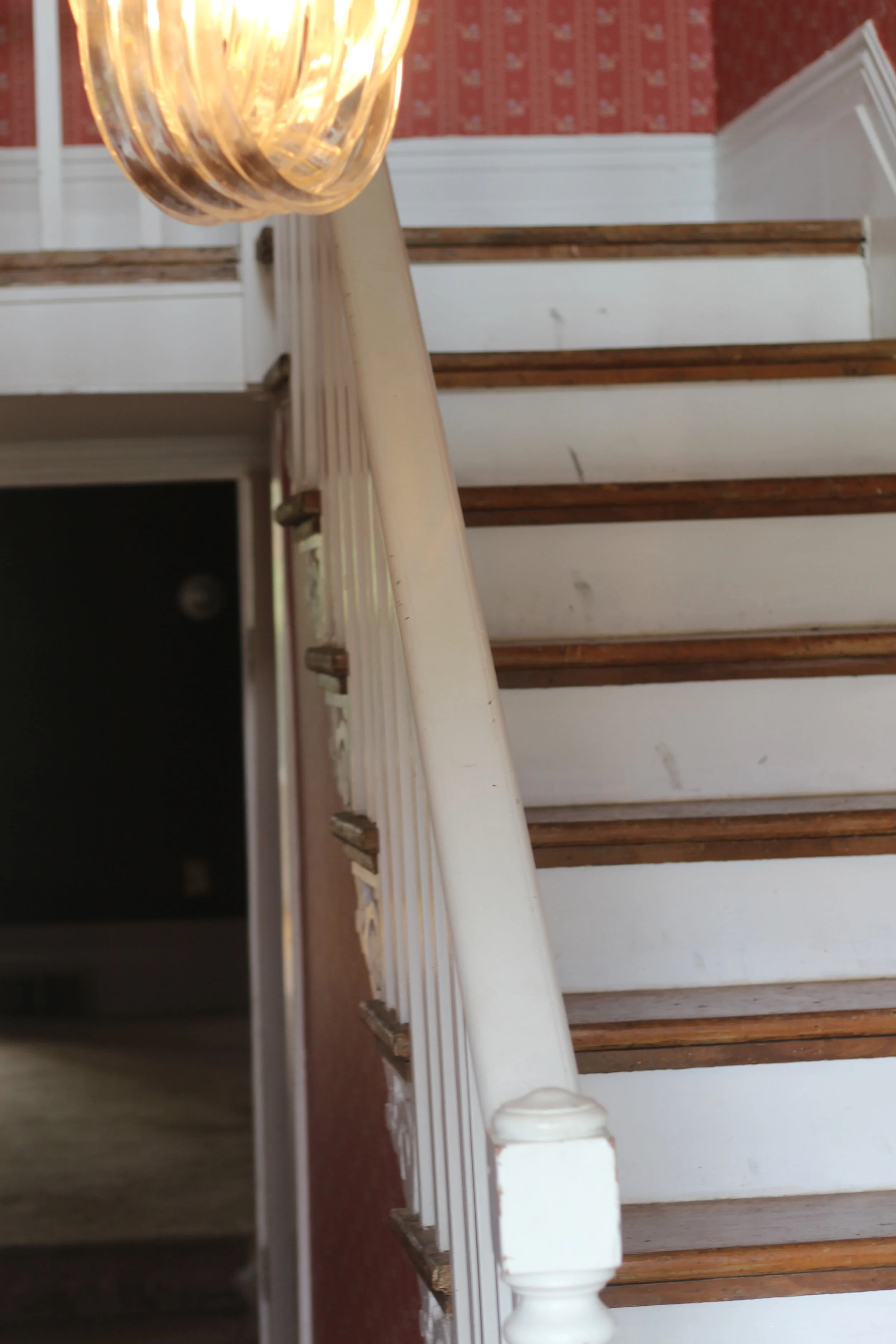
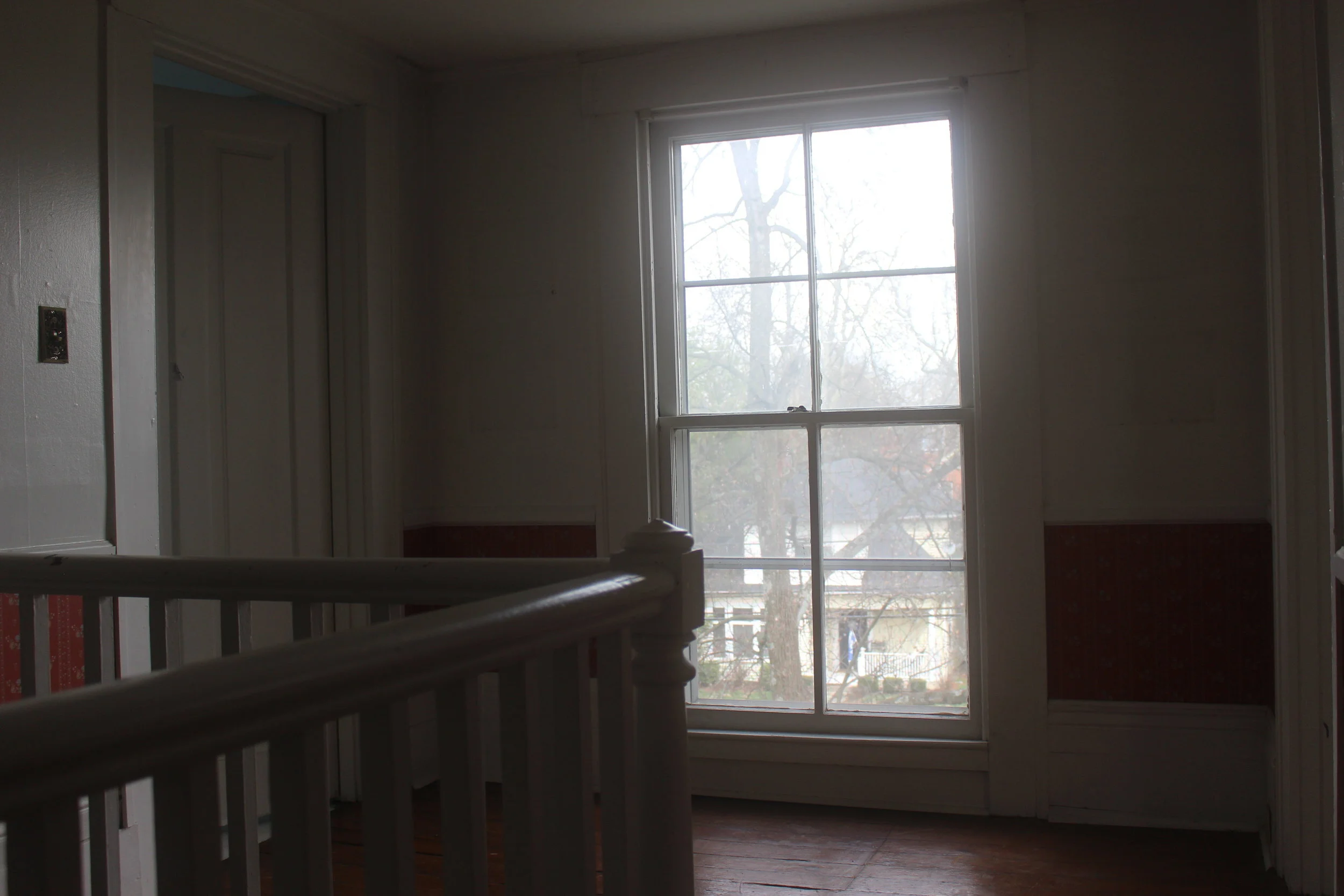
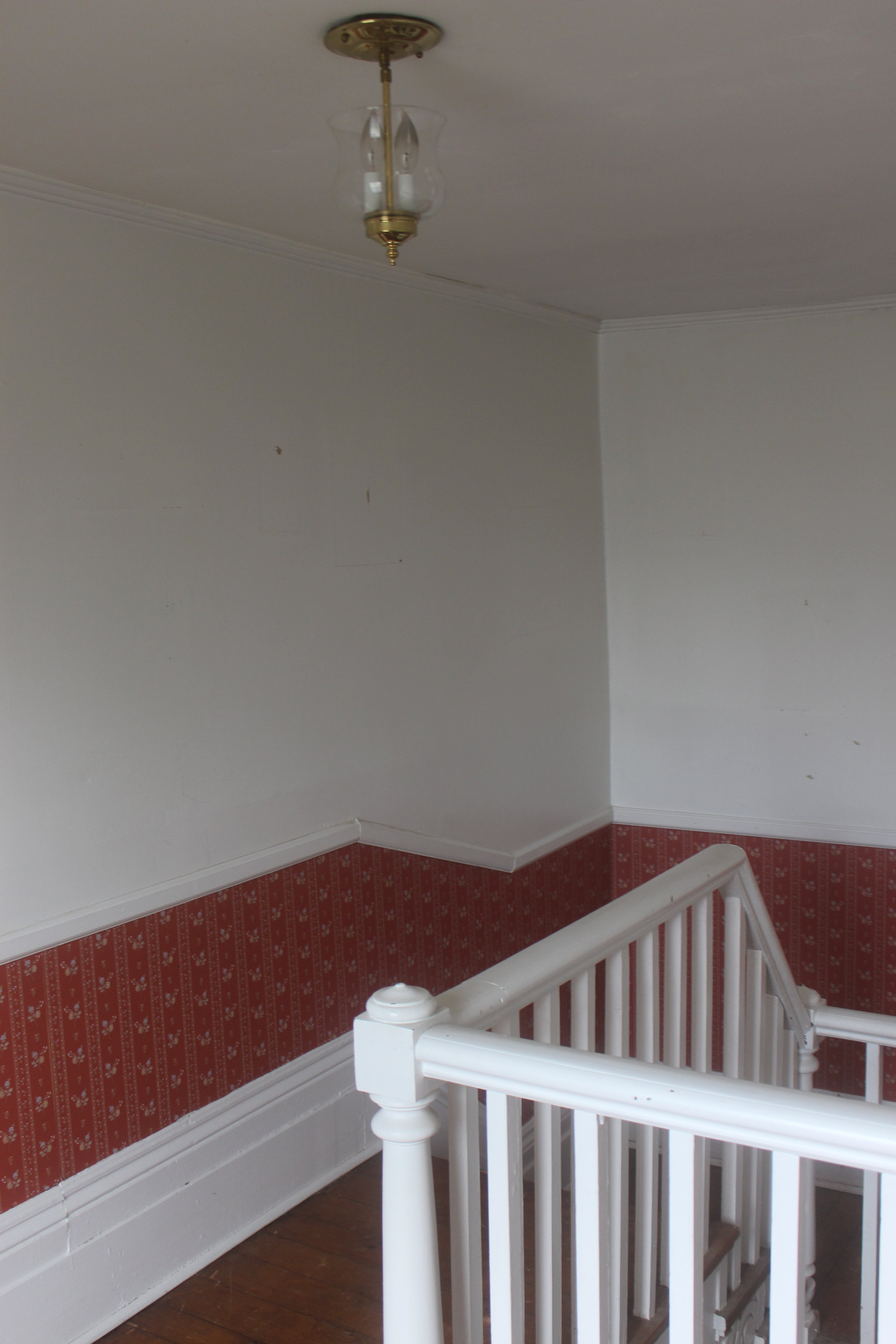
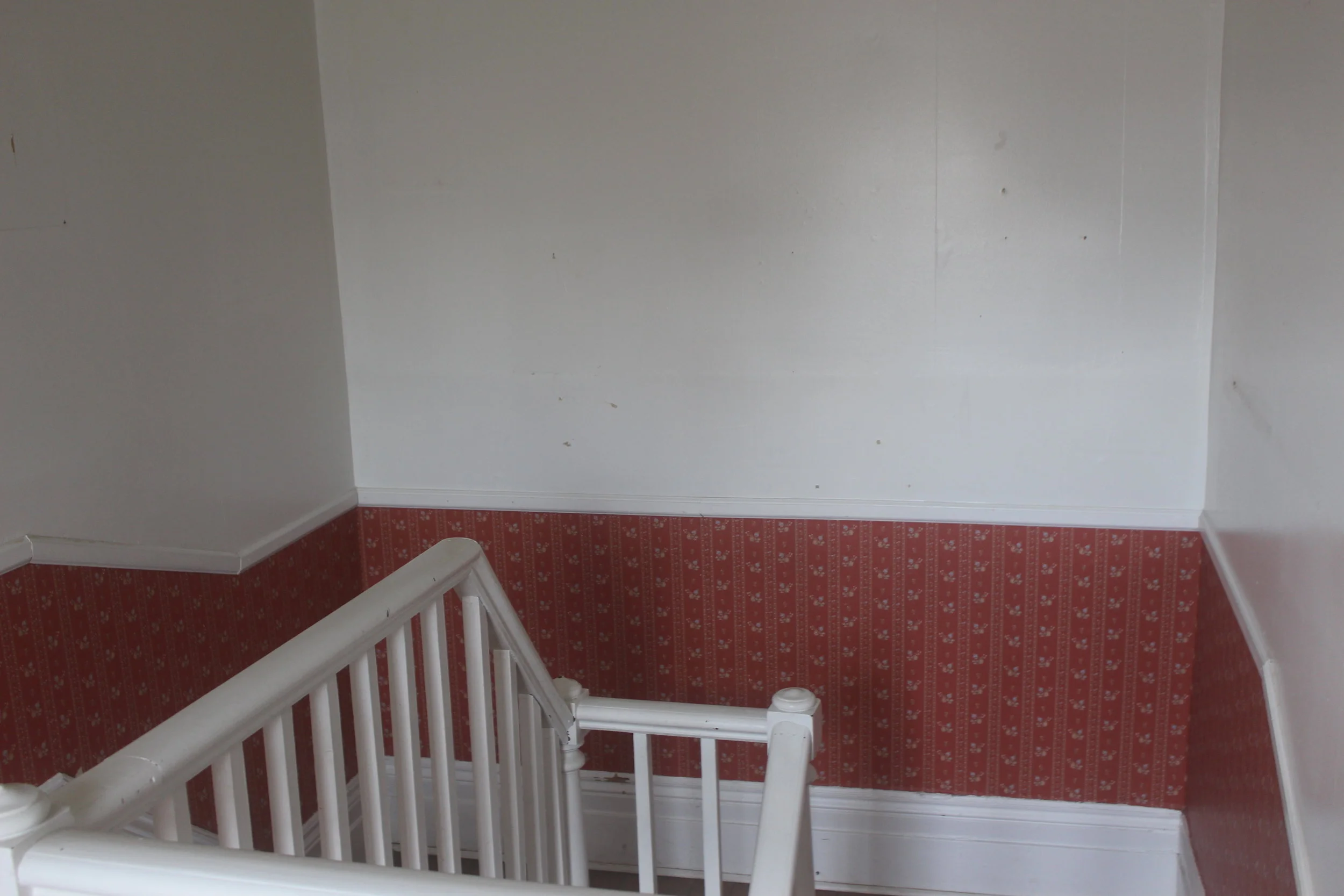
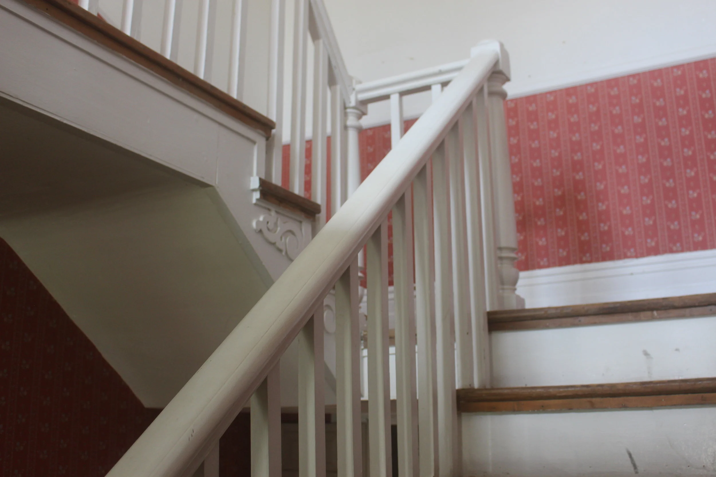
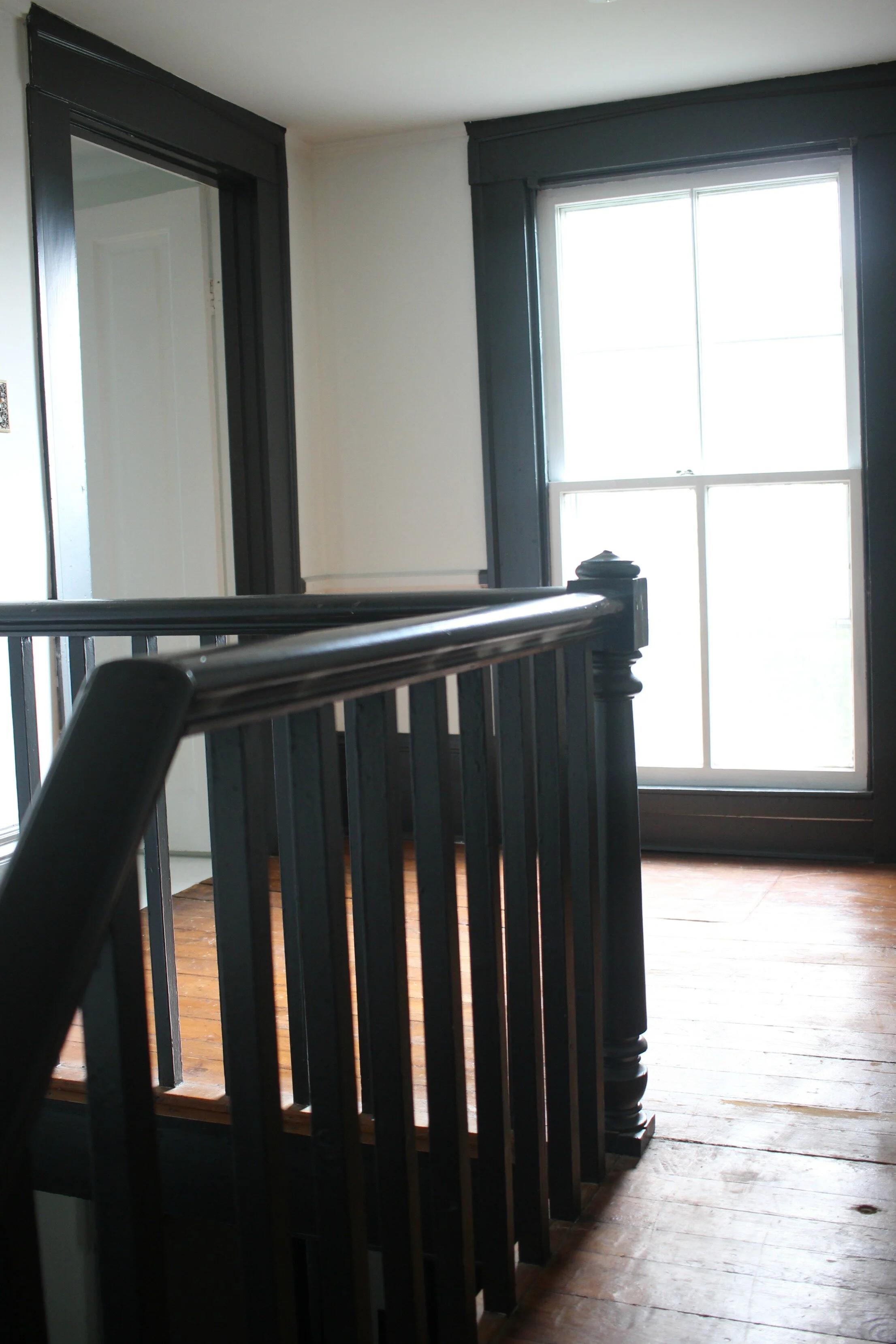
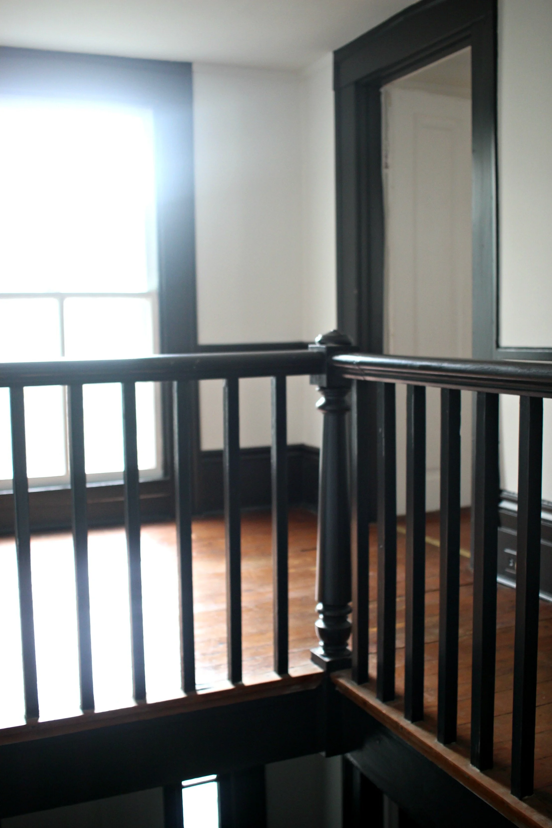
Last week I showed you a little sneak peek of our entryway and a furniture painting makeover I had recently completed for the space. I have never had a true entryway before to decorate, and I really love having this separate little space, both upstairs and downstairs. In my first blog post about our entryway, I discussed all my ideas and design plans for this space including an equestrian-themed gallery wall and painting all the trim dark. To get a better idea of what we started with in this space, take a look at the before photos below:
One big change that we made was closing off this super low doorway you see straight ahead on the lower level. We think this doorway was probably added on as it was not standard size and just looked strange. This doorway went into what is now our butler's pantry, but closing it off made this space feel more like a true entryway.
The other major changes we made were removing all the wallpaper and painting all the walls and trim both upstairs and downstairs.
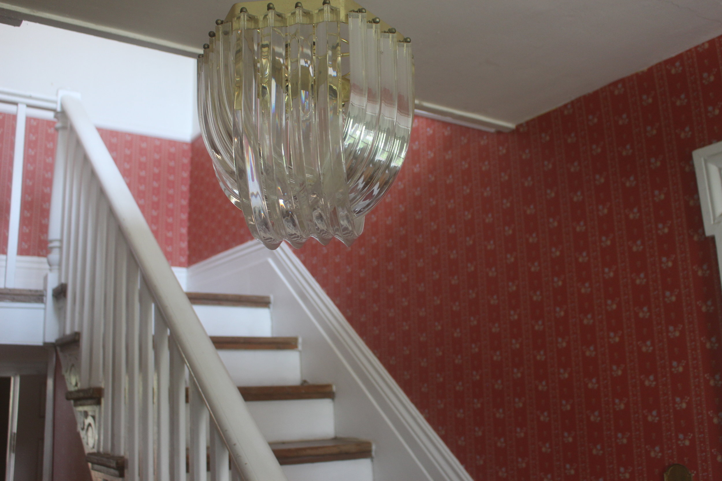
These old light fixtures also needed to go in order to make the space feel less dated.
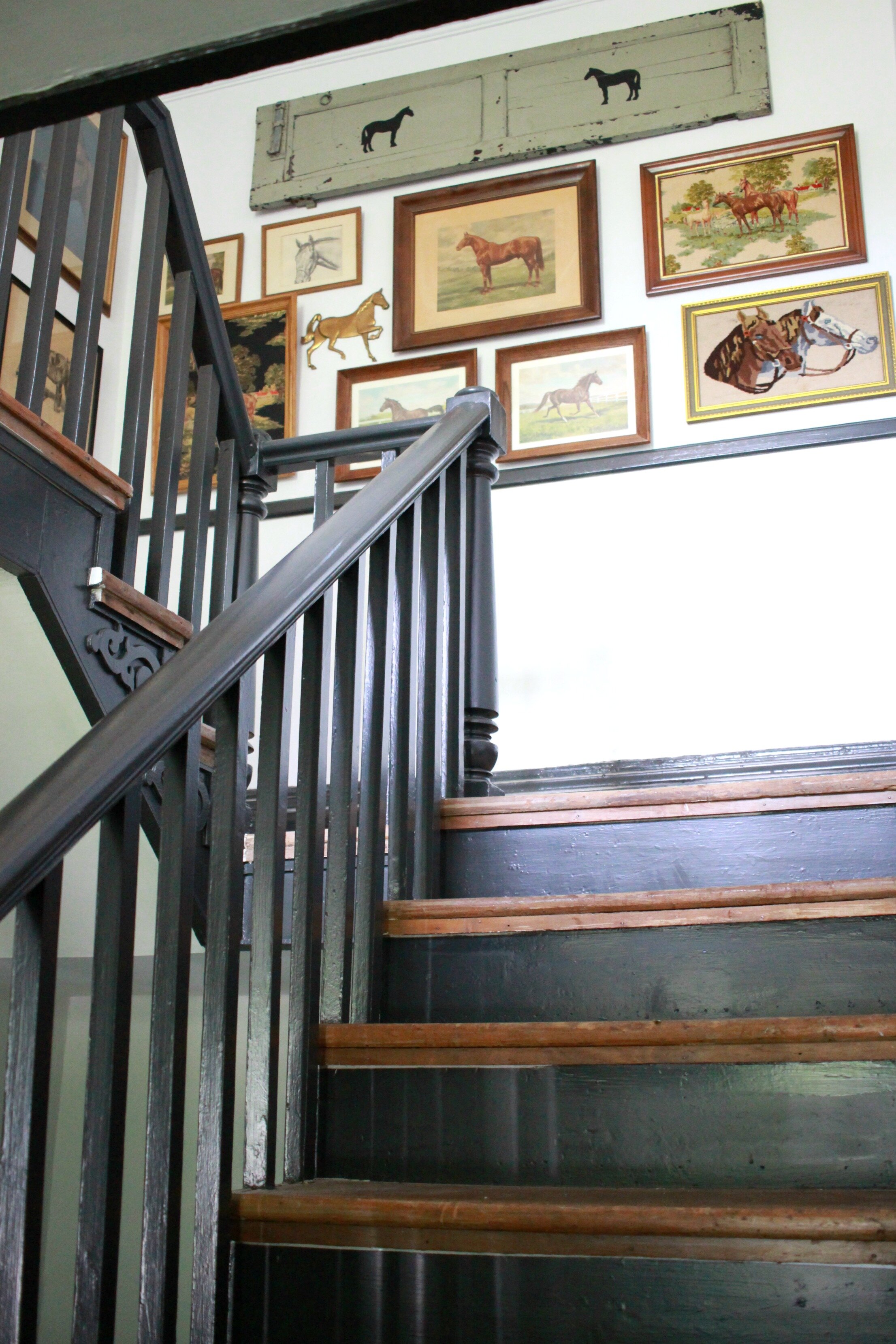
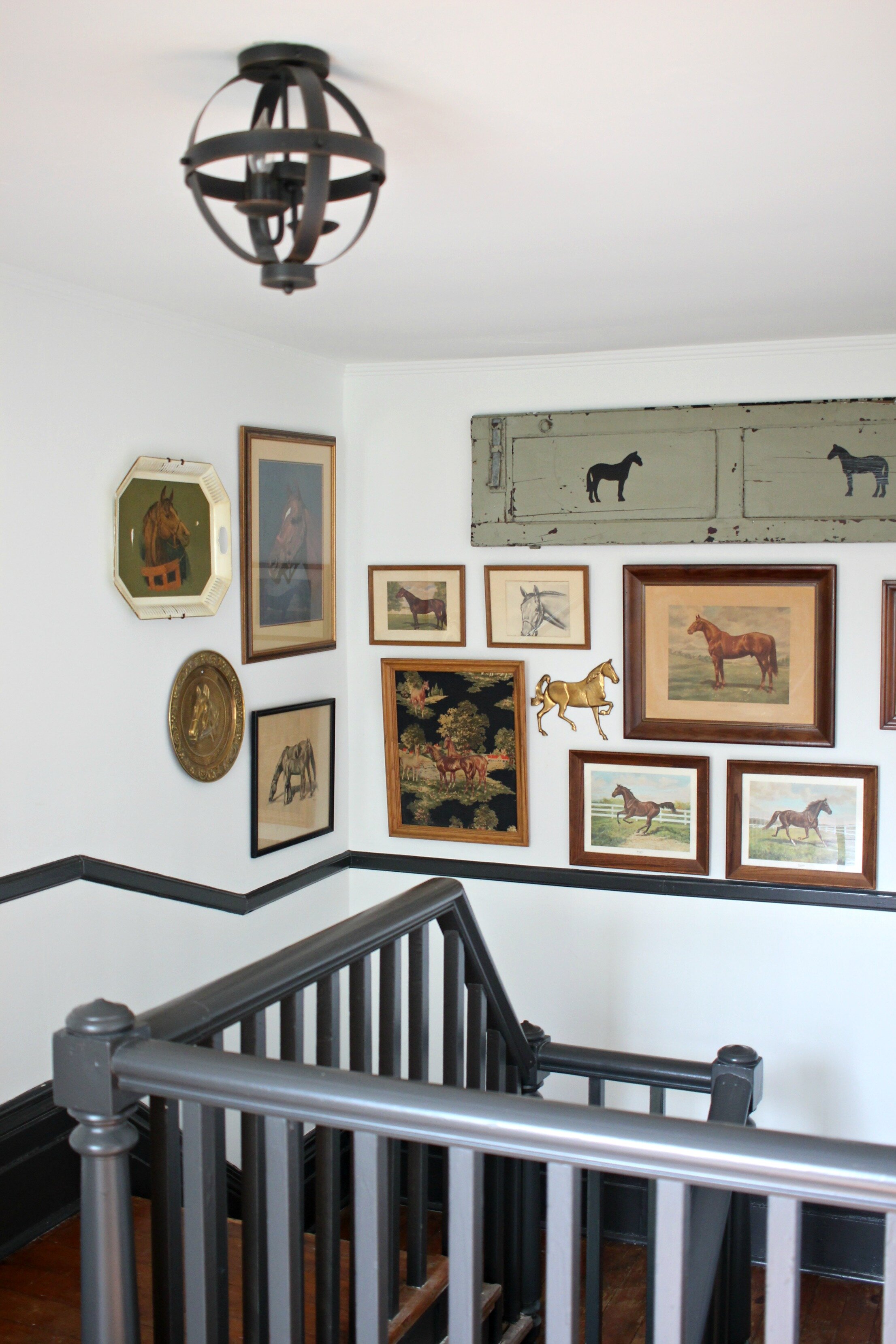
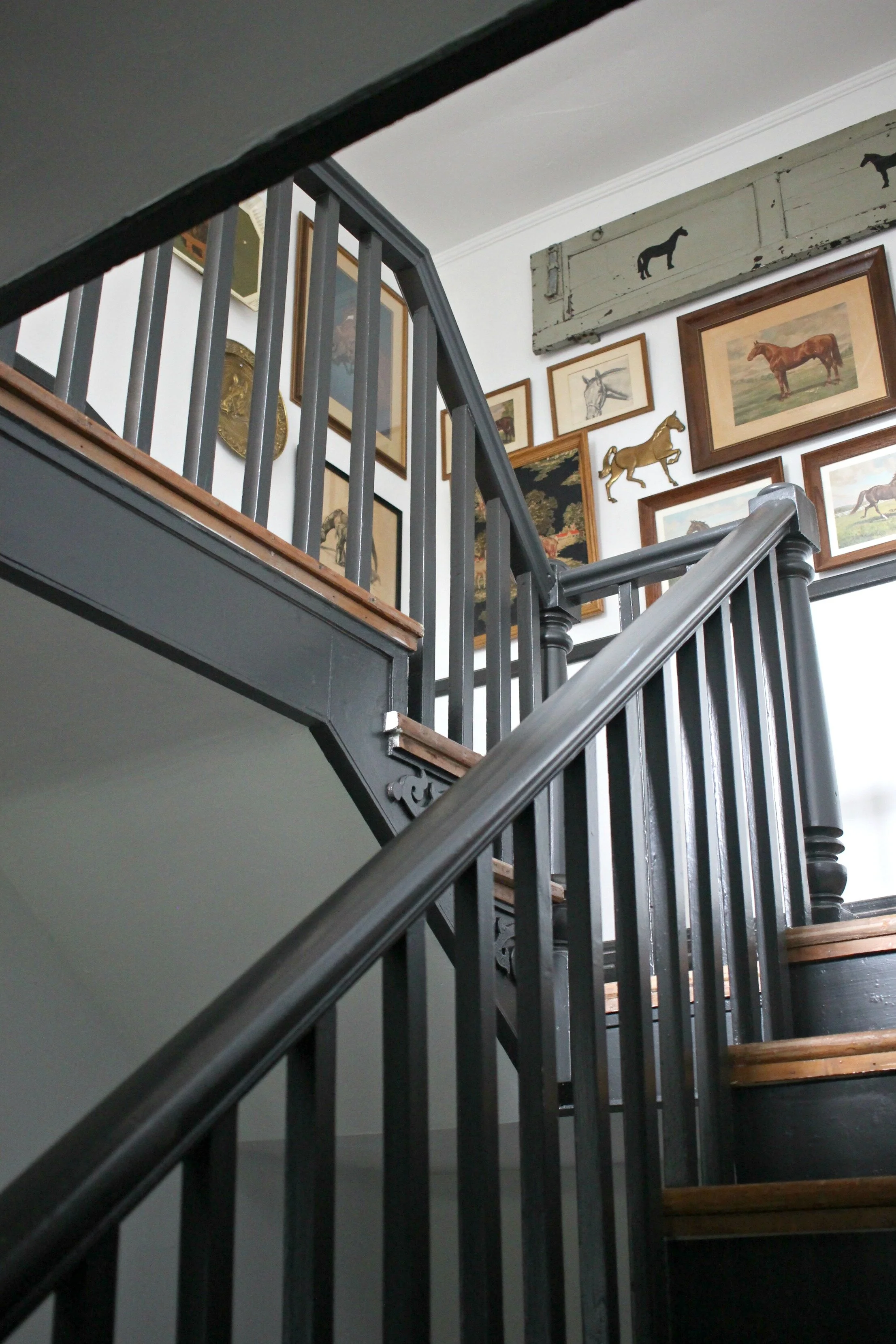
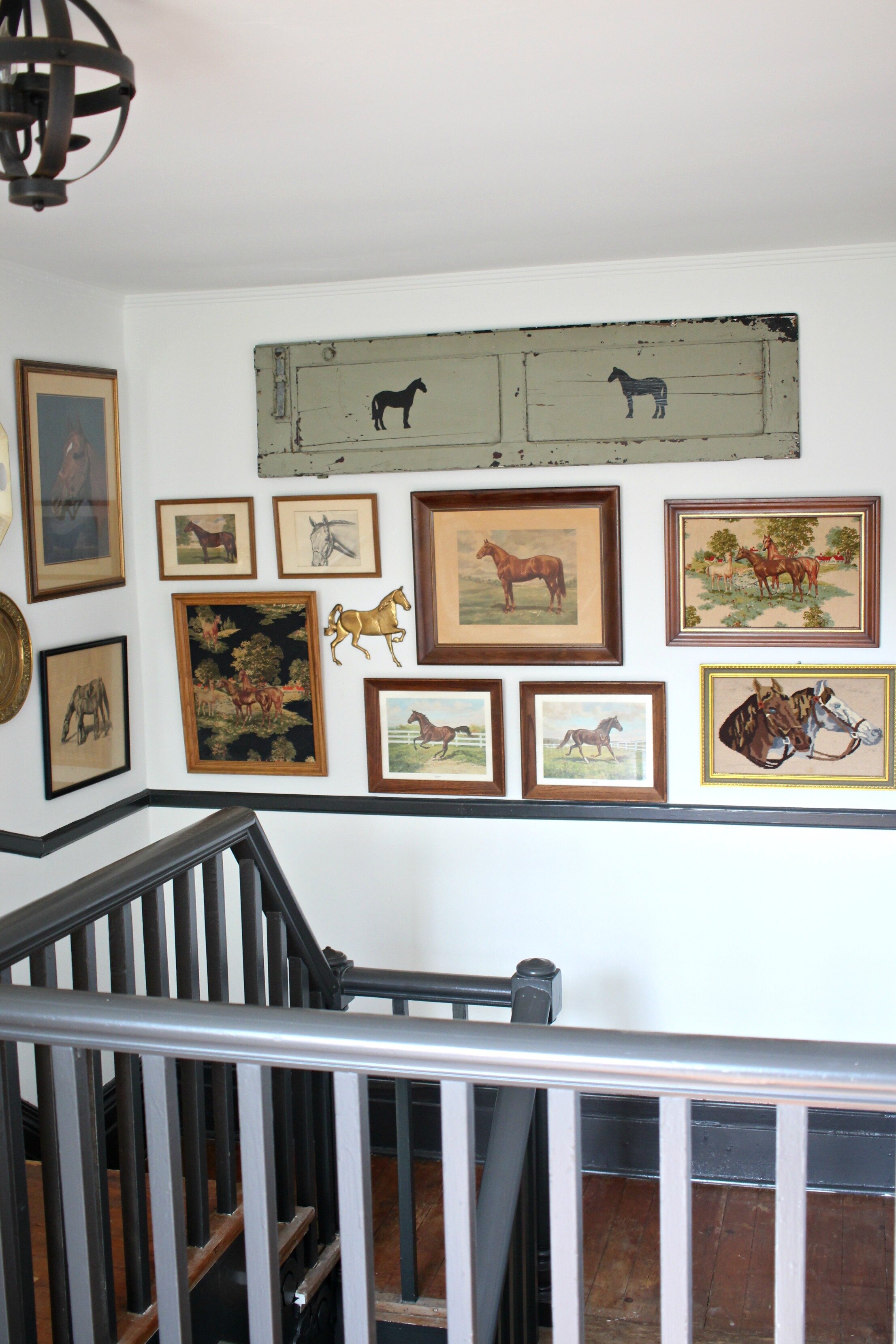
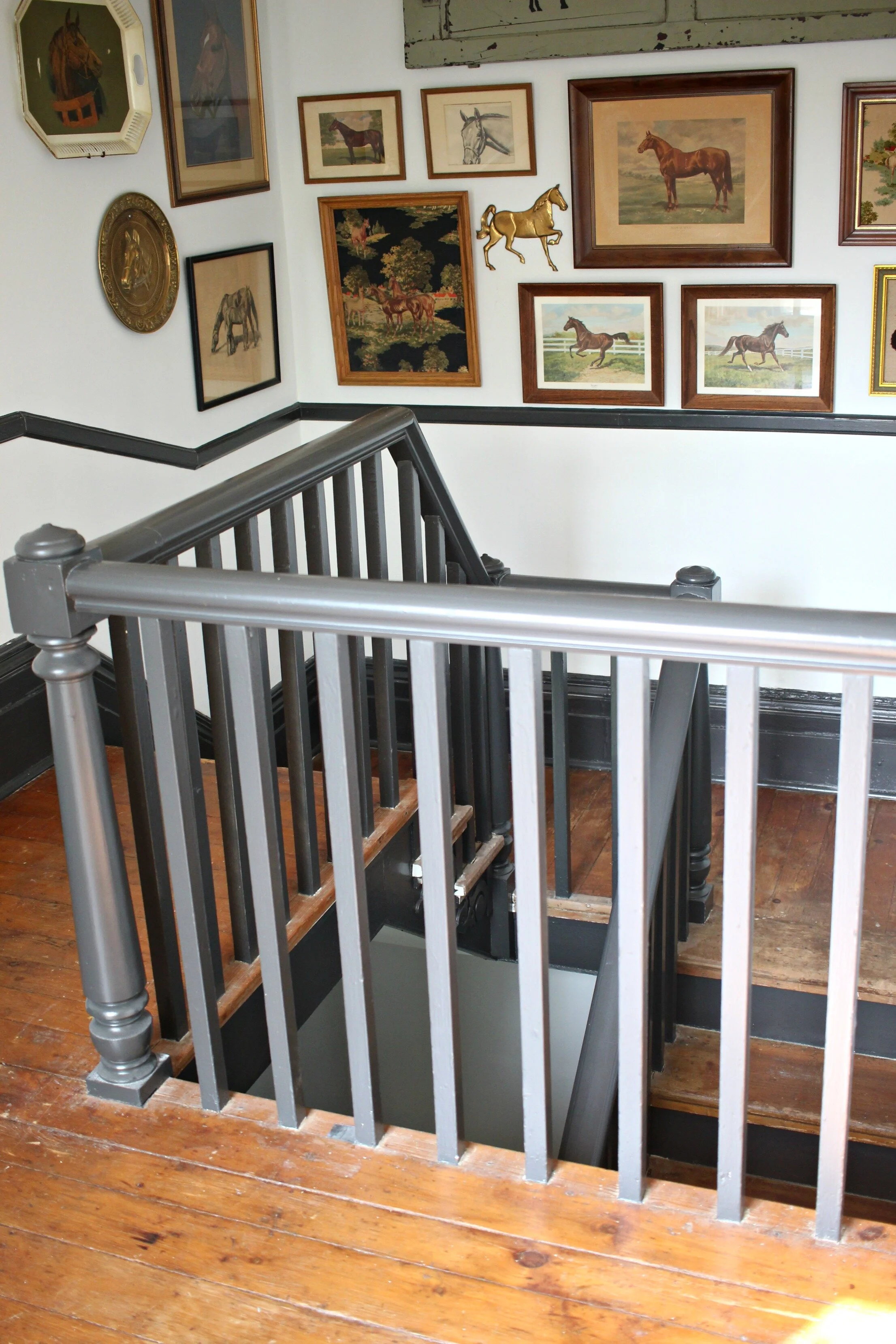
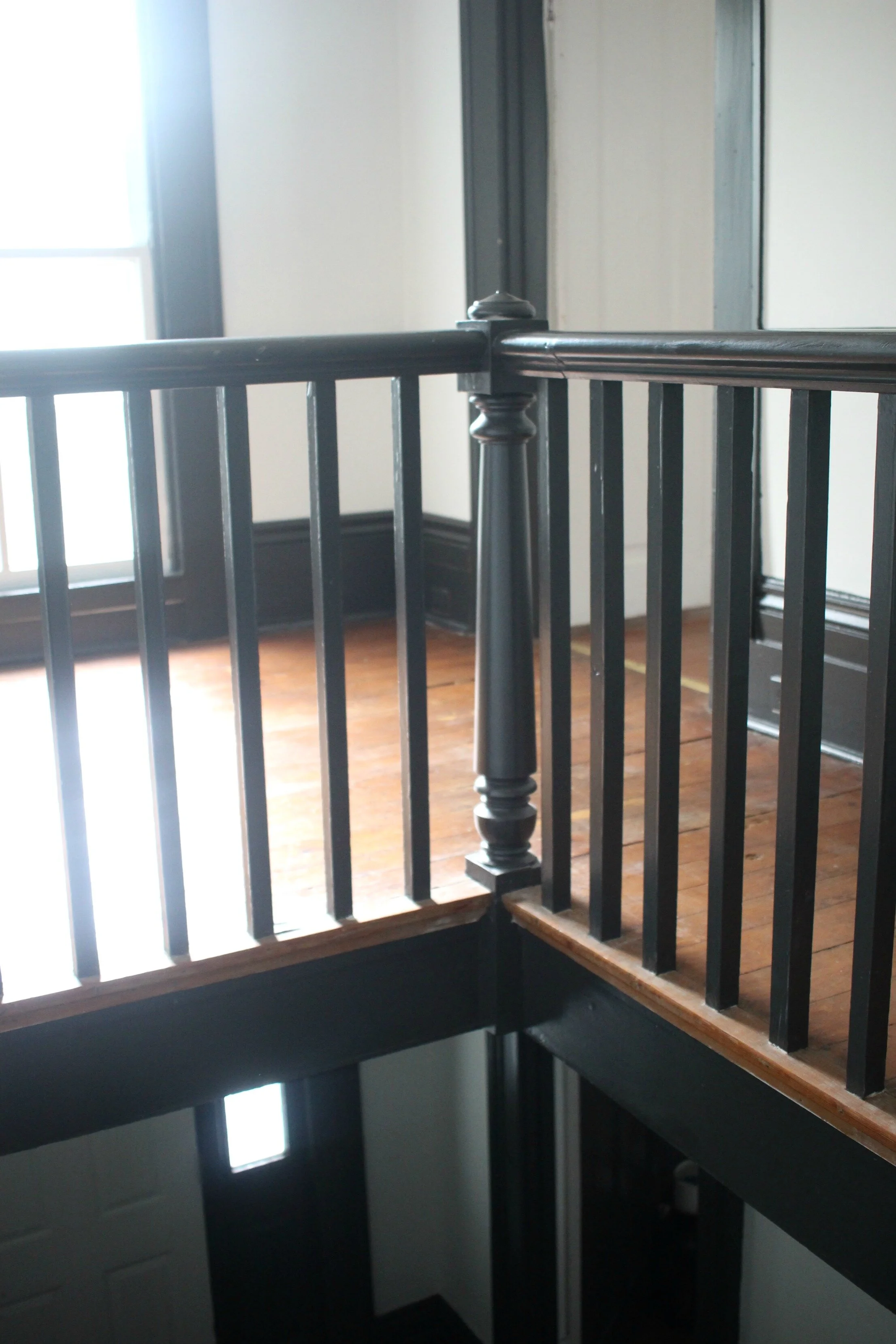
Removing the old wallpaper and painting the walls, as well as painting the trim for contrast made the biggest difference in modernizing this space. The wall color is a classic white, "Pure White" by Sherwin Williams, which I used all over my house. The dark trim is painted with Sherwin William's "Iron Ore," which is a perfect dark charcoal that's just a shade lighter than black.
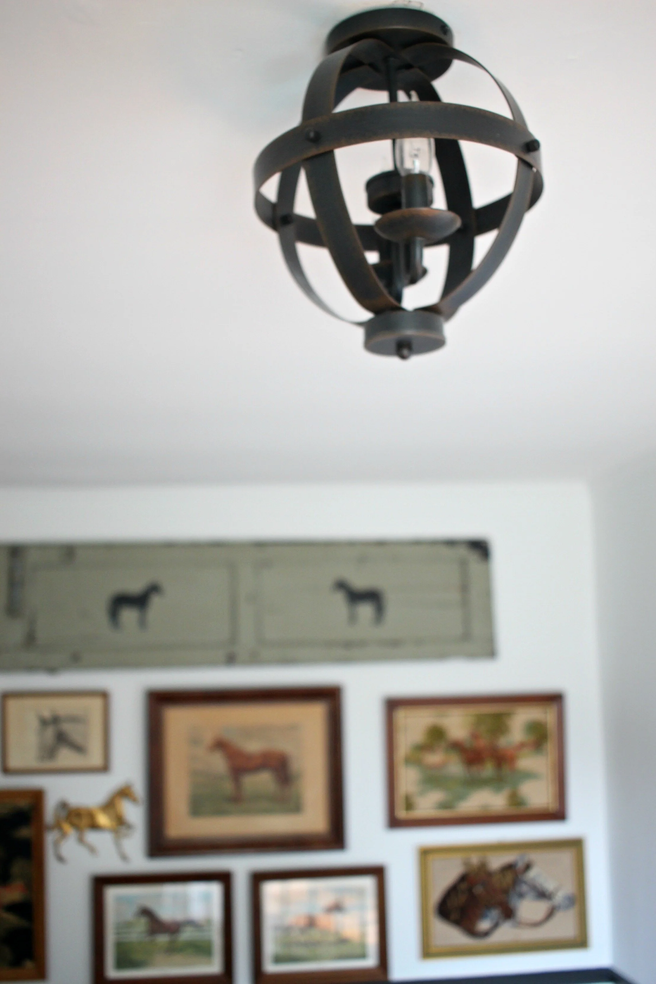
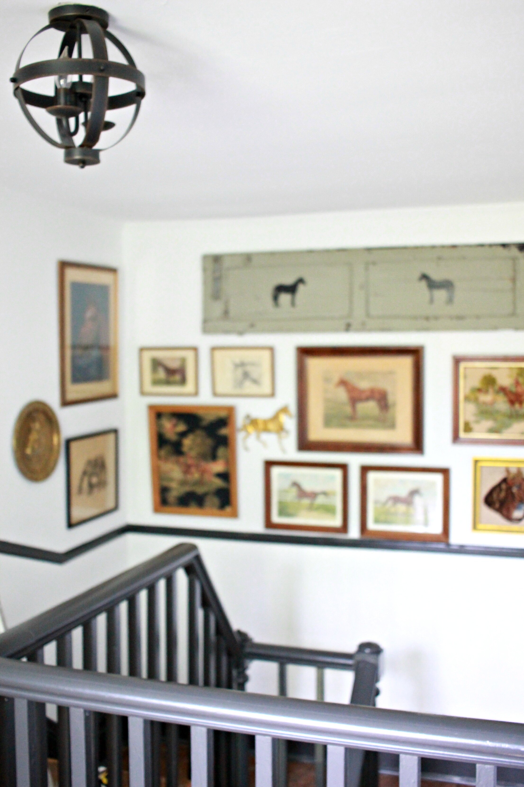
I also could not wait to change out those old 80's light fixtures and I really wanted the look of a modern geometric semi-open flush-mount. I was shocked to find several options at Lowe's that were exactly what I wanted (I chose this smaller one for upstairs and this slightly larger one for downstairs). If you haven't checked out the lighting options at Lowe's lately, they recently revamped all their lighting options this spring and they have so many new styles that are really on trend and super affordable.
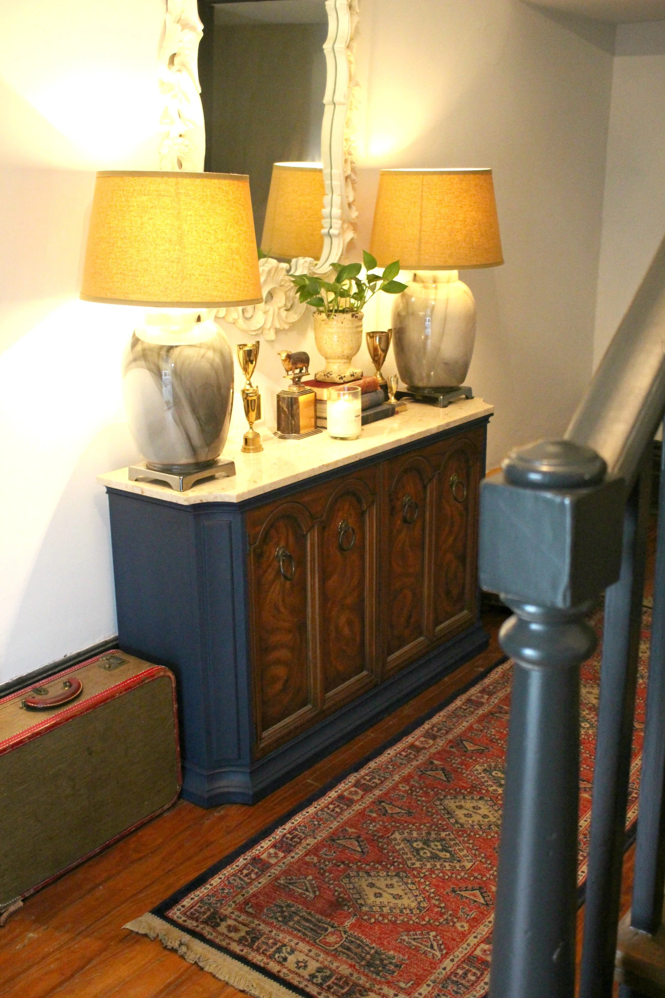
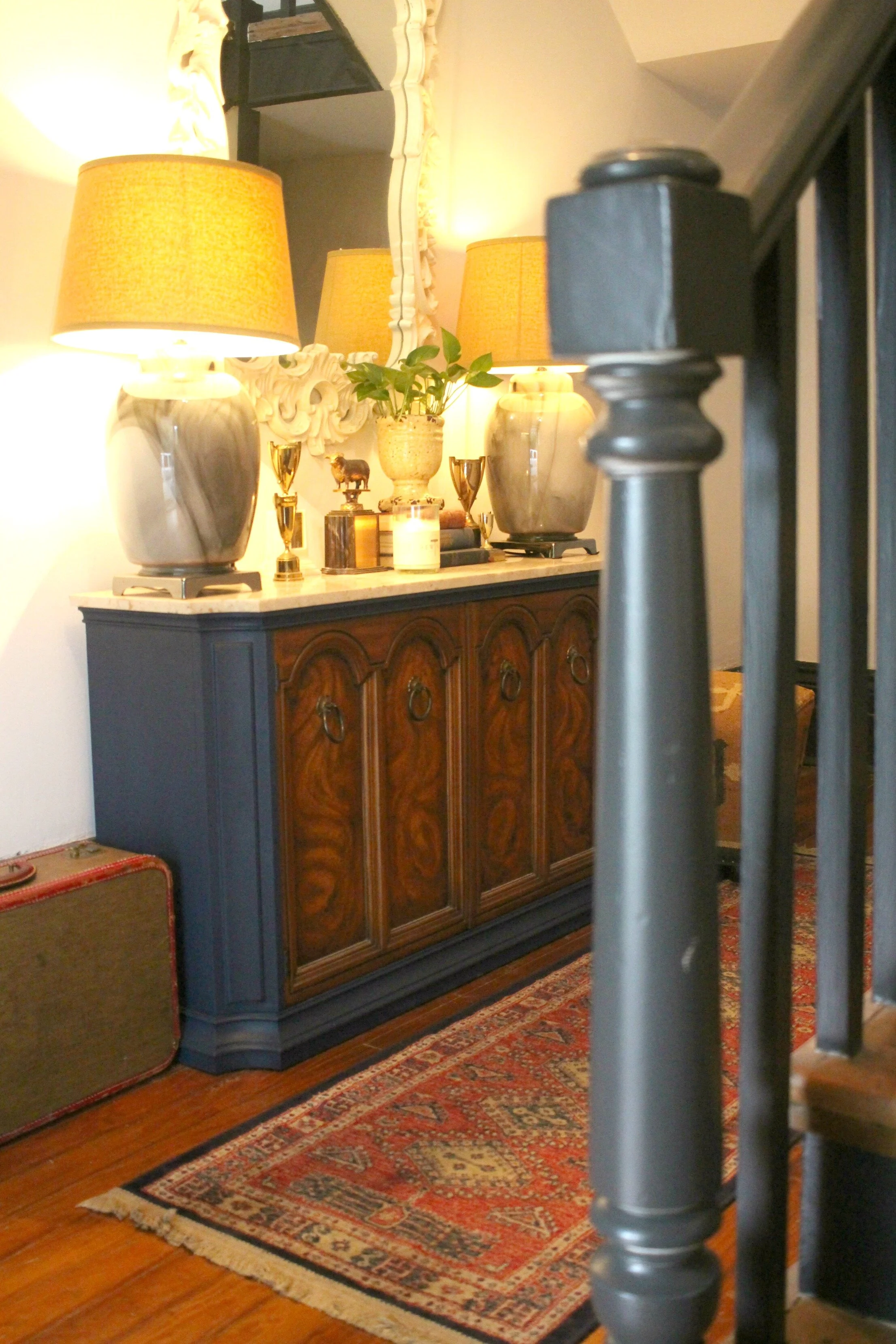
I still need to add some more furniture/wall decor downstairs but I've started with this console, large vintage mirror, and antique rug.
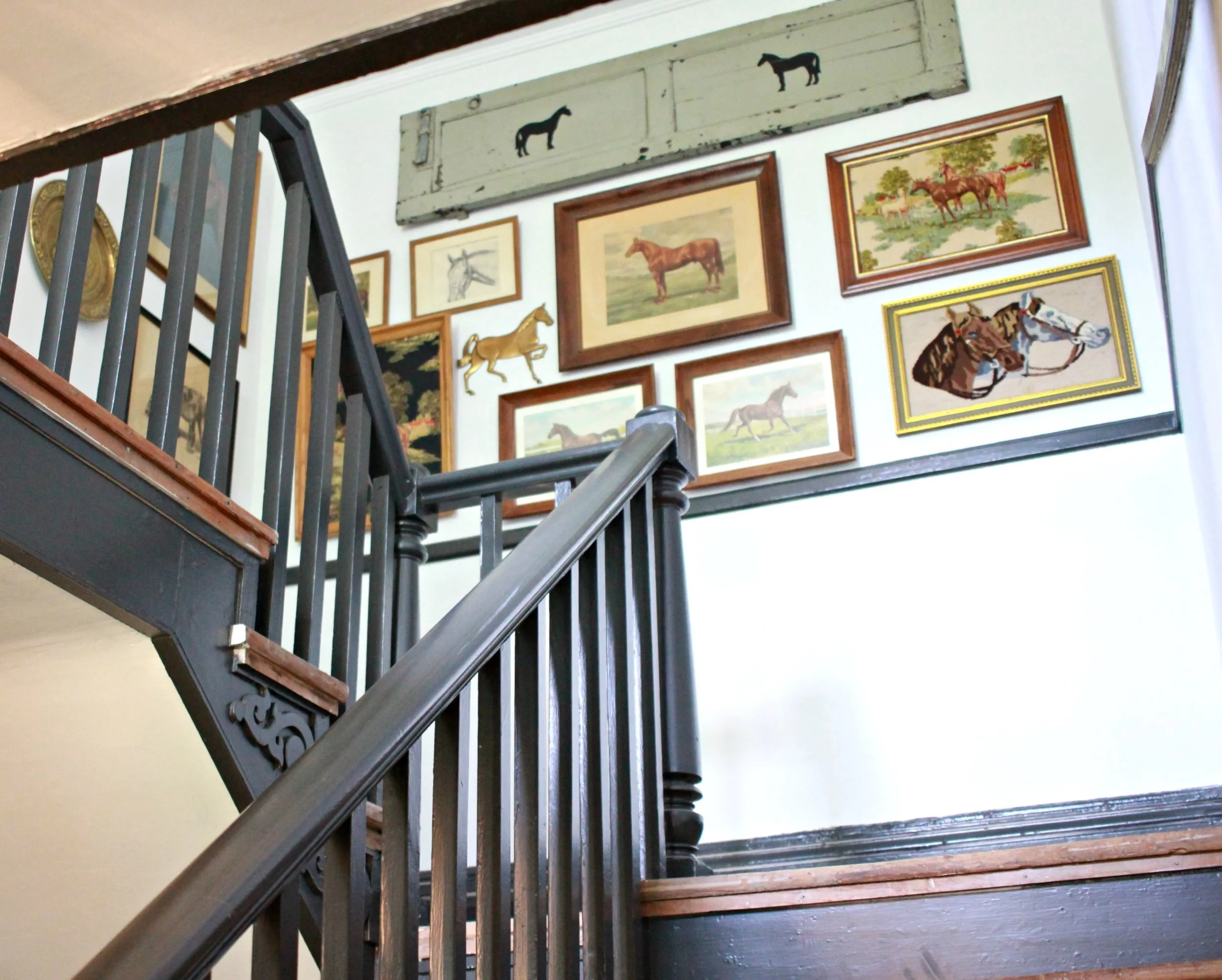
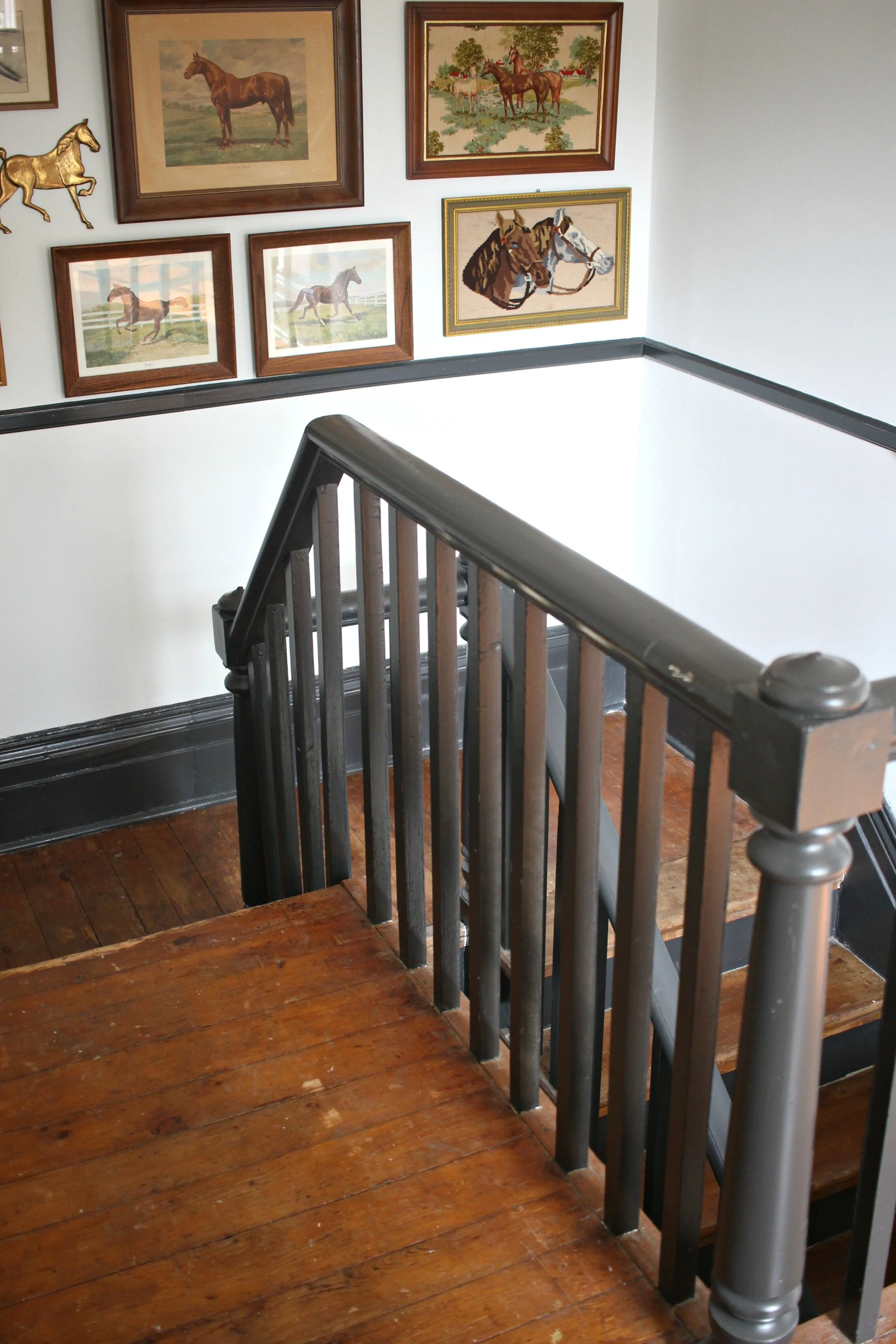
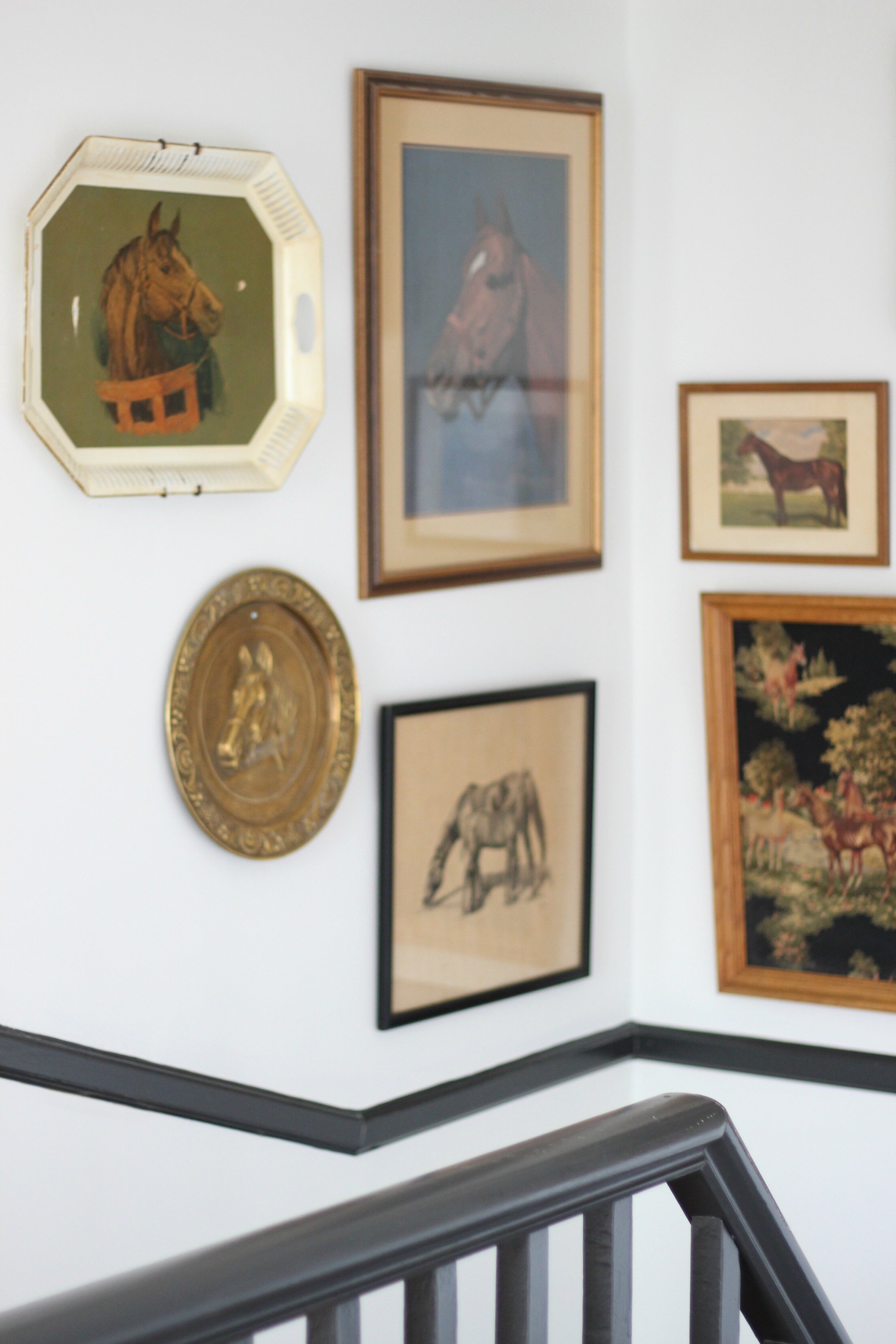
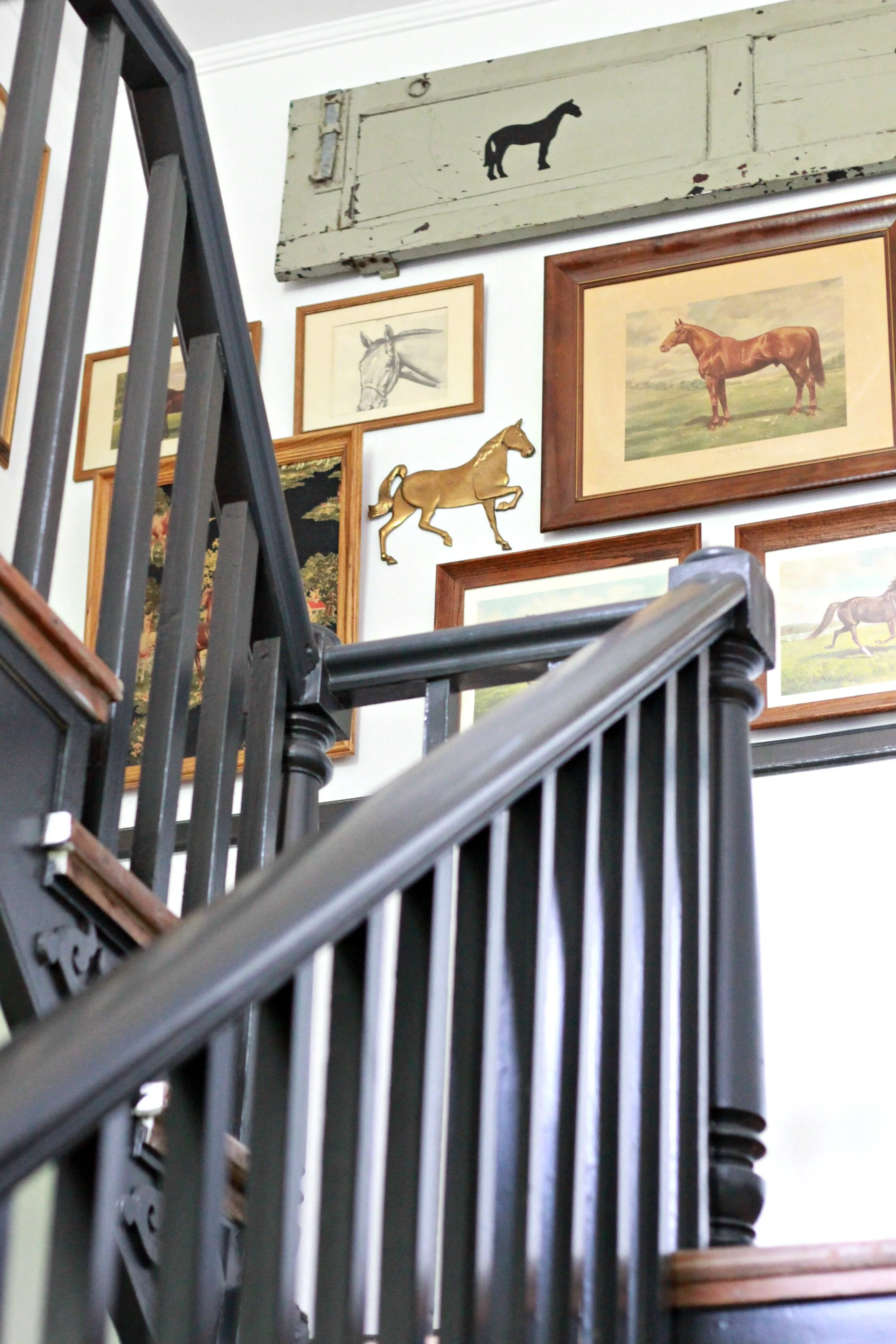
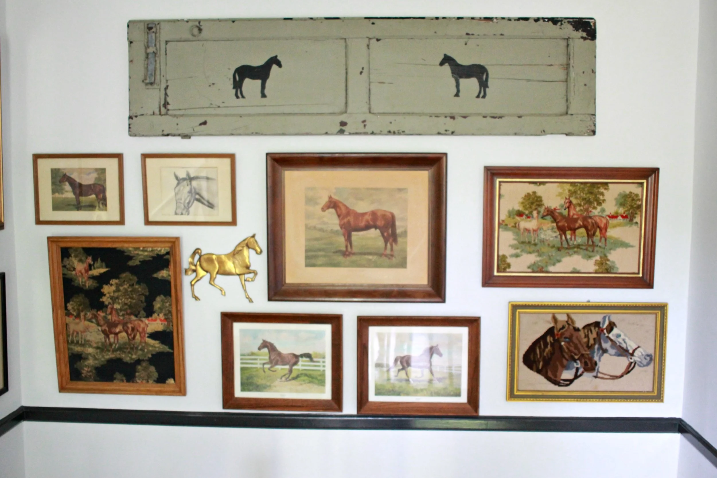
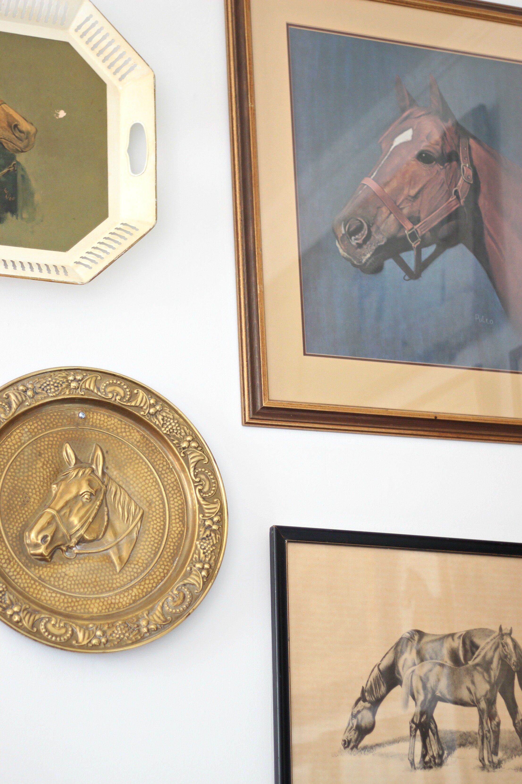
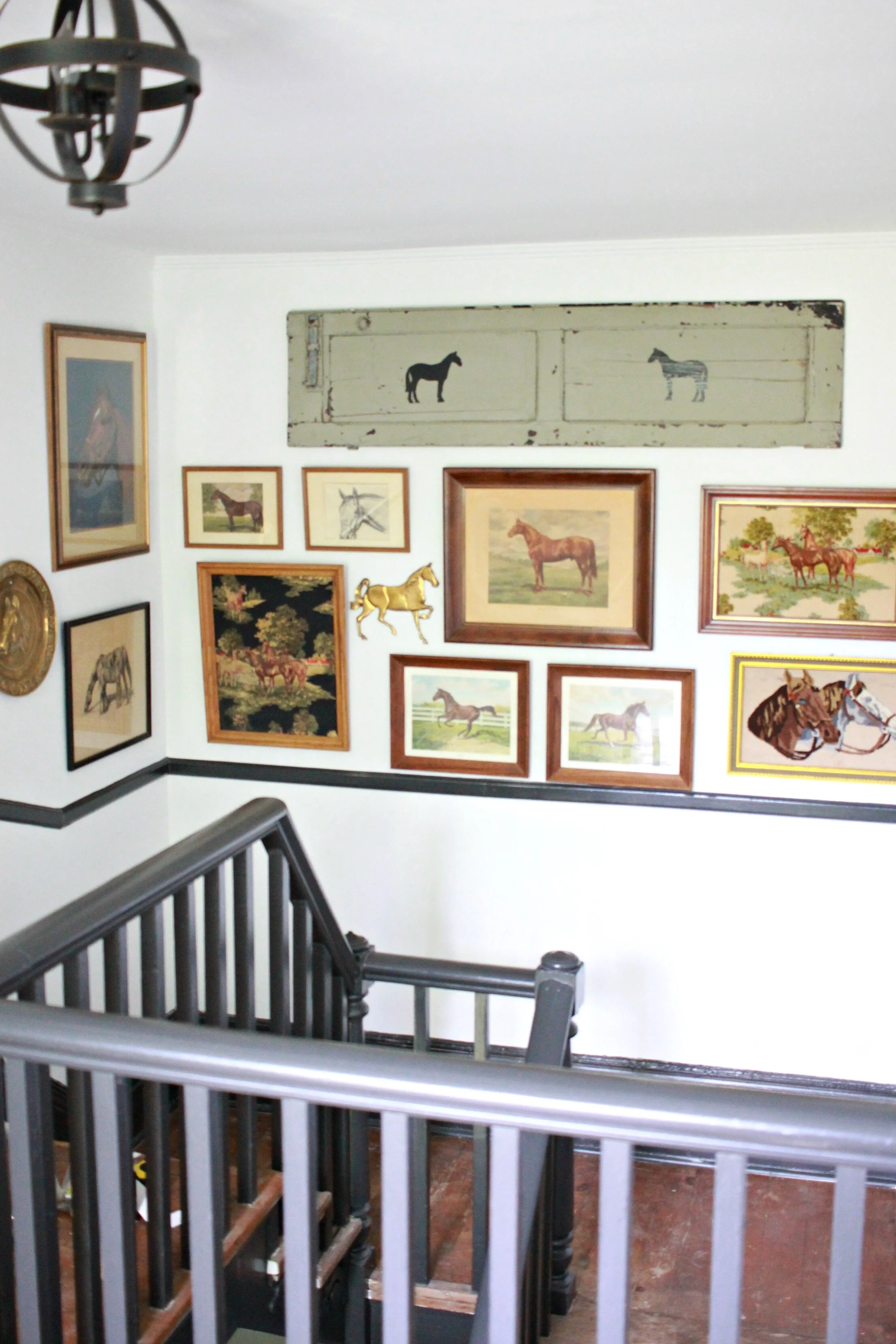
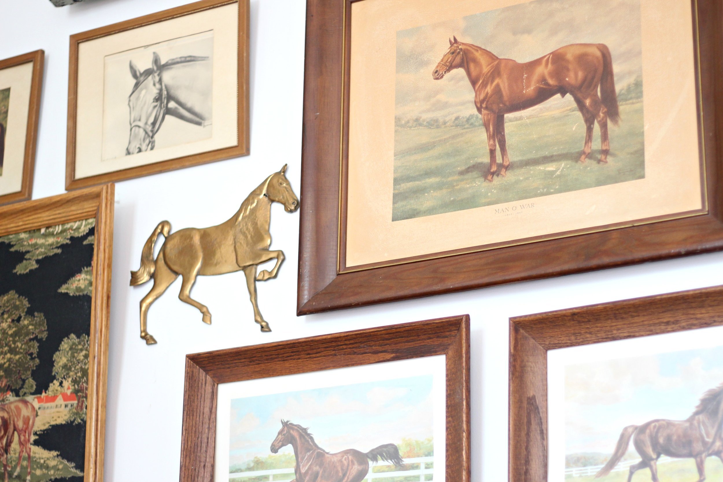
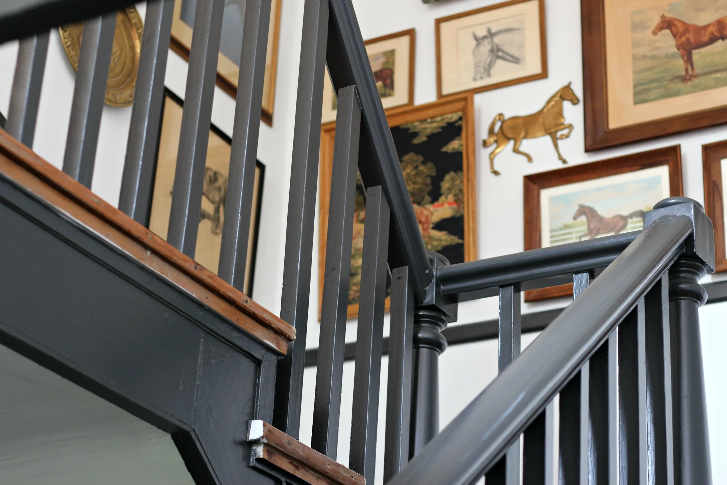
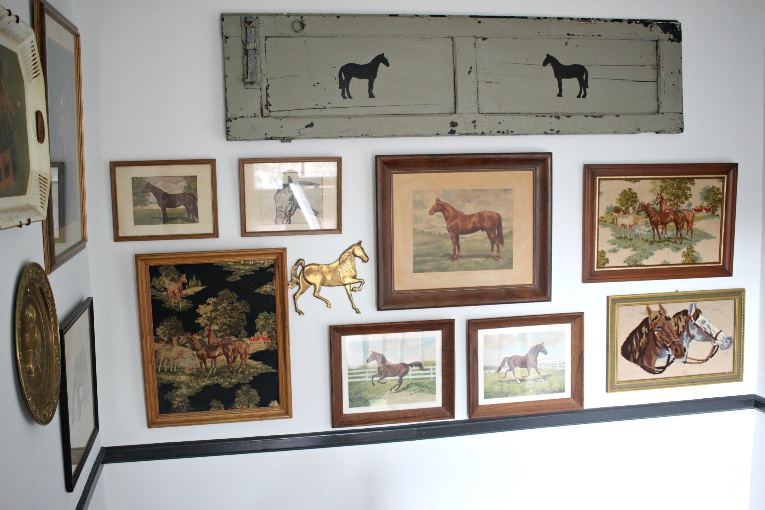
My favorite part of the entryway is the equestrian-themed gallery wall I created. I have such a large collection of vintage horse prints and I wanted to make a statement wall by clustering them all together. It's the perfect focal point for this entryway and really sets the tone for the overall style of the entire house.
This area both upstairs and downstairs has original wood floors. They are in rough shape but I love them anyways! I think they add so much character to the space and I would rather have old beat-up floors than cheap-looking new wood floors any day!
All of my horse pictures came from garage sales or peddler malls. I've been collecting them for several years and most of them cost $10 or less! I like how they all have slightly different styles, textures, and frames. I think the most interesting gallery walls look truly collected and less planned.
I still need to add a couple more furniture pieces (maybe a bench or shelf downstairs and a small table or plant stand on the upstairs landing), but I'm happy with the progress we have made so far. It is amazing how much a little paint can change a space and make it feel brand new. When we first bought the house this was a space that felt kind of dingy and dark, but now it is becoming a more welcoming and modern entryway.
xoxo
Emily

