Primary Bathroom Makeover- One Room Challenge: Week 8- The Big Reveal!
The big day is finally here and after several late nights- my bathroom makeover is officially complete! I am so in love with how it turned out- it’s even better than what I was picturing in my head! I definitely feel like my overall ideas and vision for the space transformed over the 8 weeks as I would complete more and more. Coincidentally it really took until the final week for me to hone in on the final, complete look and from there, I couldn’t work fast enough! Somehow I feel like even though this is the smallest room I’ve ever tackled for the One Room Challenge, it was the most labor-intensive of them all! I don’t think I ever want to see a paintbrush again for quite a while! Even though it was a ton a work, I am so pleased with the end result and can’t wait to now enjoy a beautiful finished bathroom! Let’s take a look at where I started, just 8 weeks ago below!


I pretty much touched every inch of this bathroom in some way. Let me take you through and share more about how I updated each area! One of my favorite things about this project is that I was able to complete transform the space without doing a full blown renovation. Just about everything I chose to do and update, I wanted to make sure we could do ourselves (minus shower glass, countertops, and a little bit of plumbing for sink). I do wish I had hired out some of the painting, but there are a ton of DIY projects throughout that I’ll share about below!
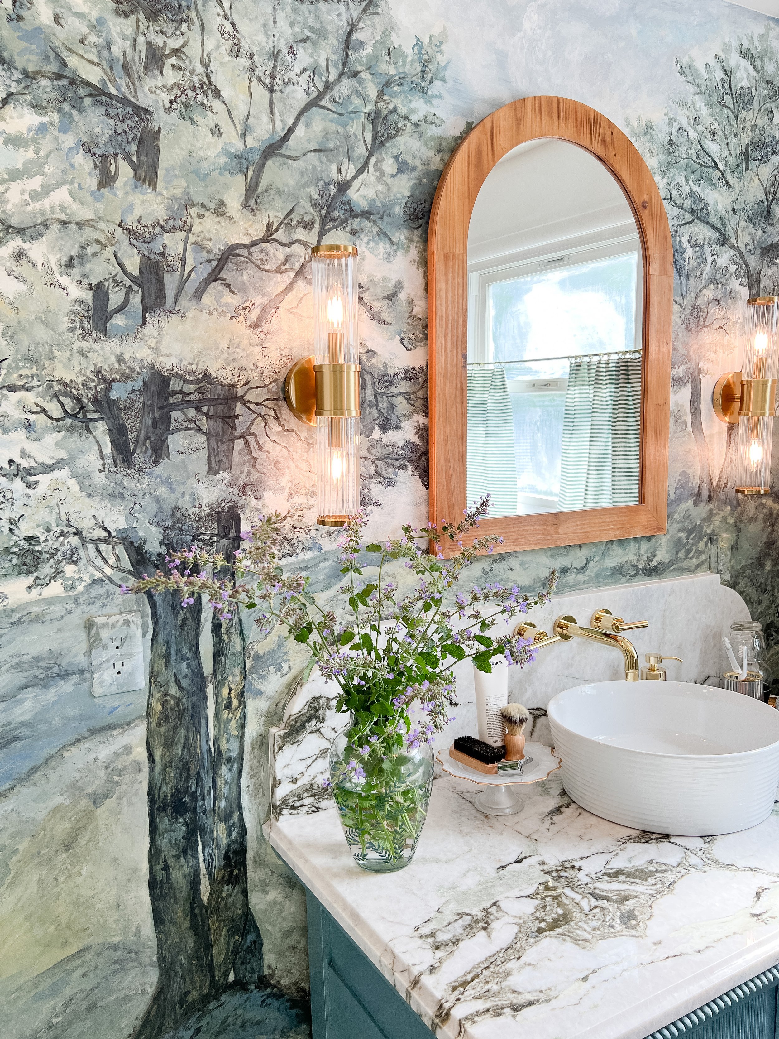

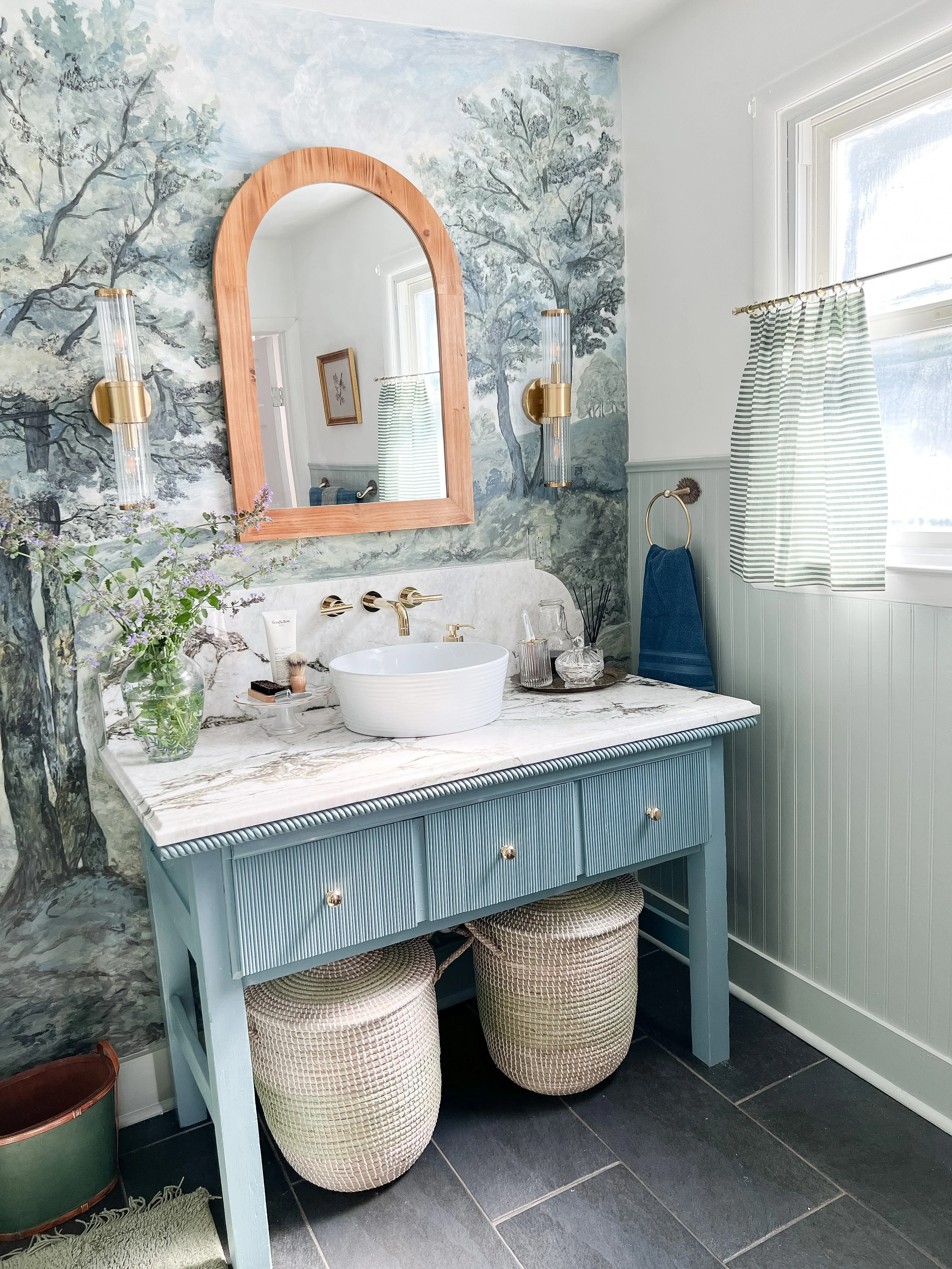
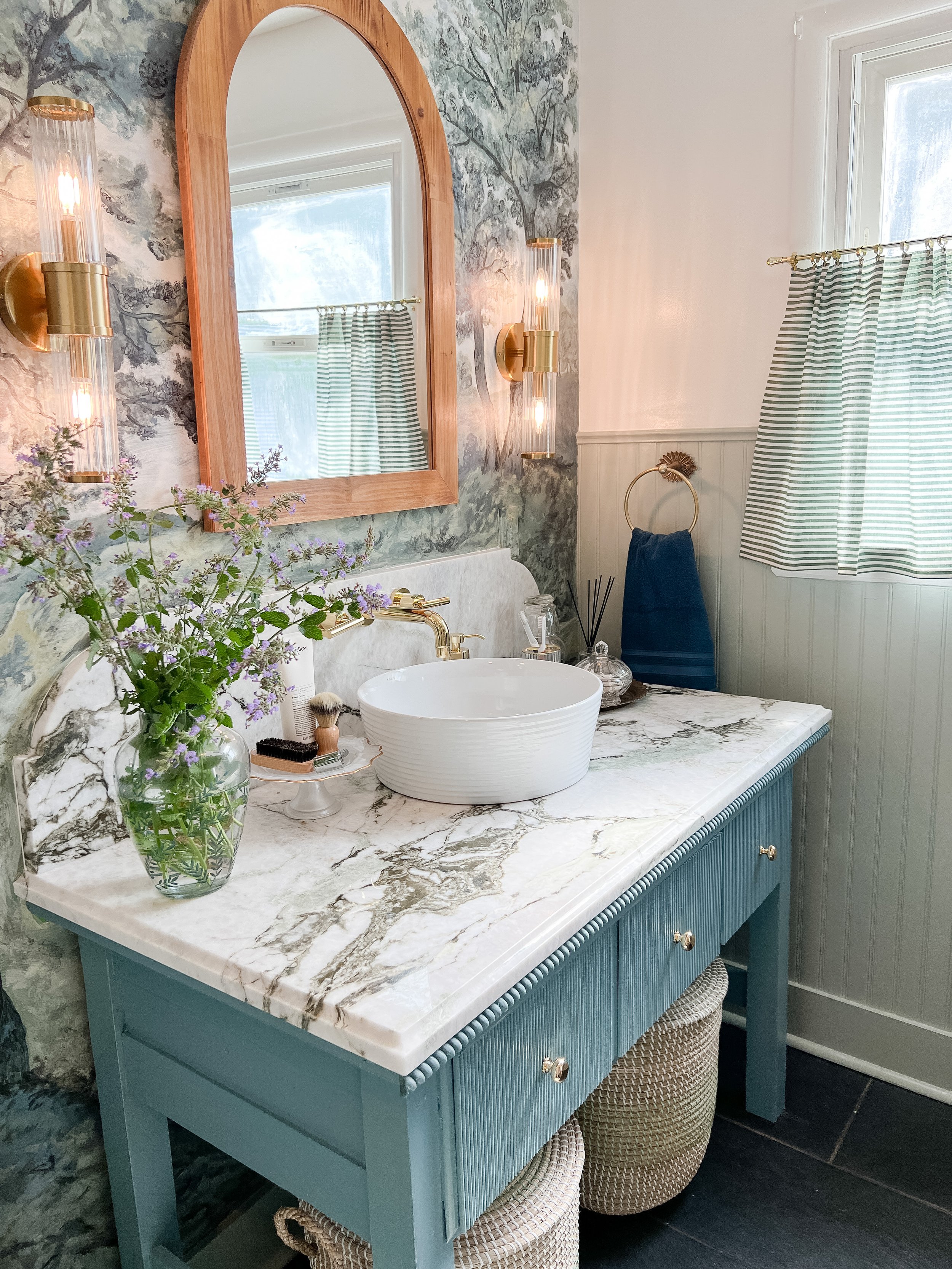

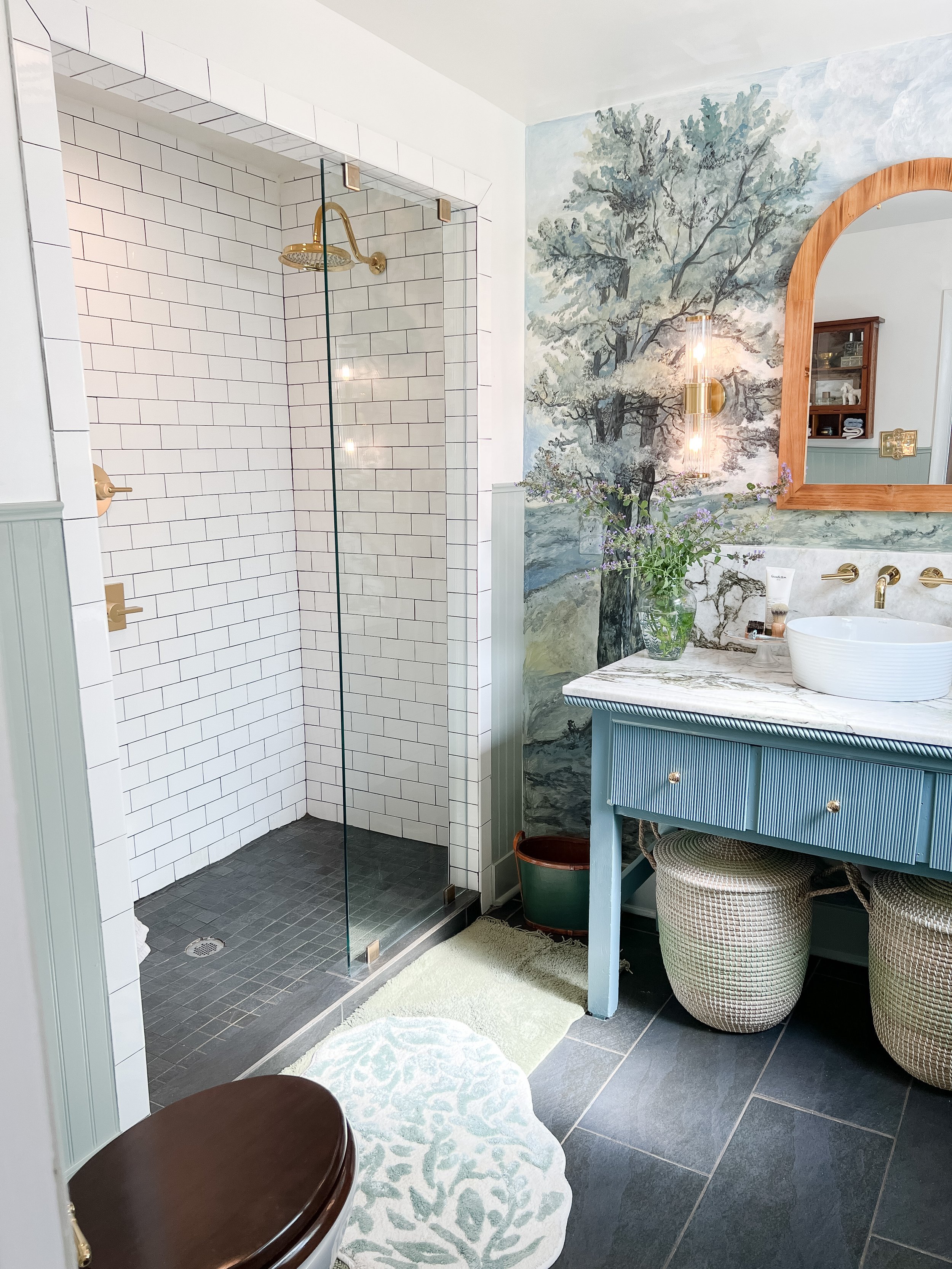
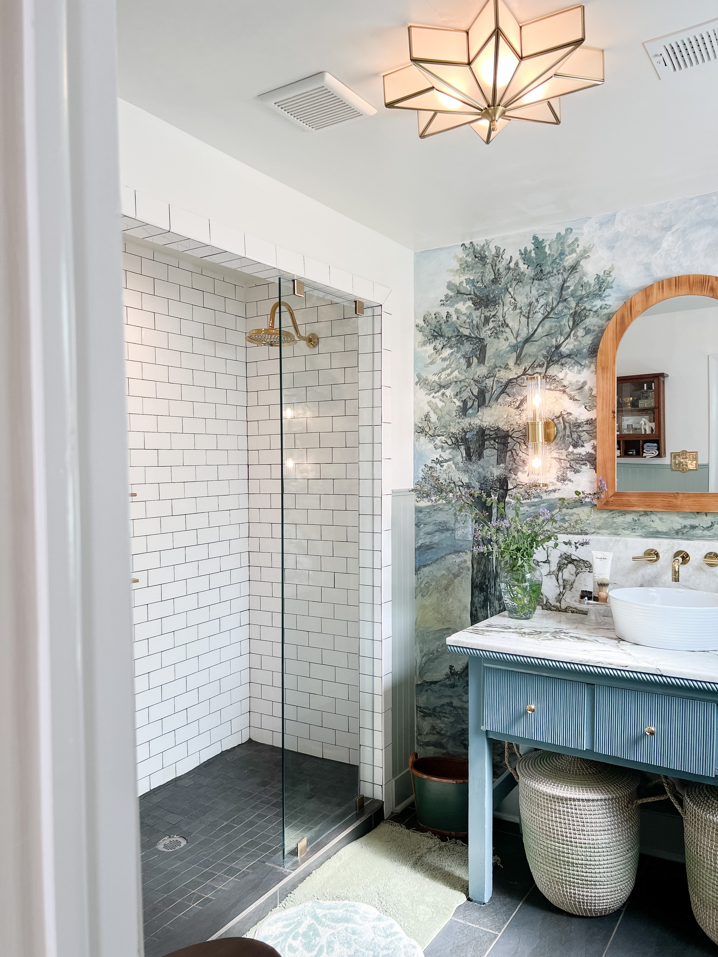
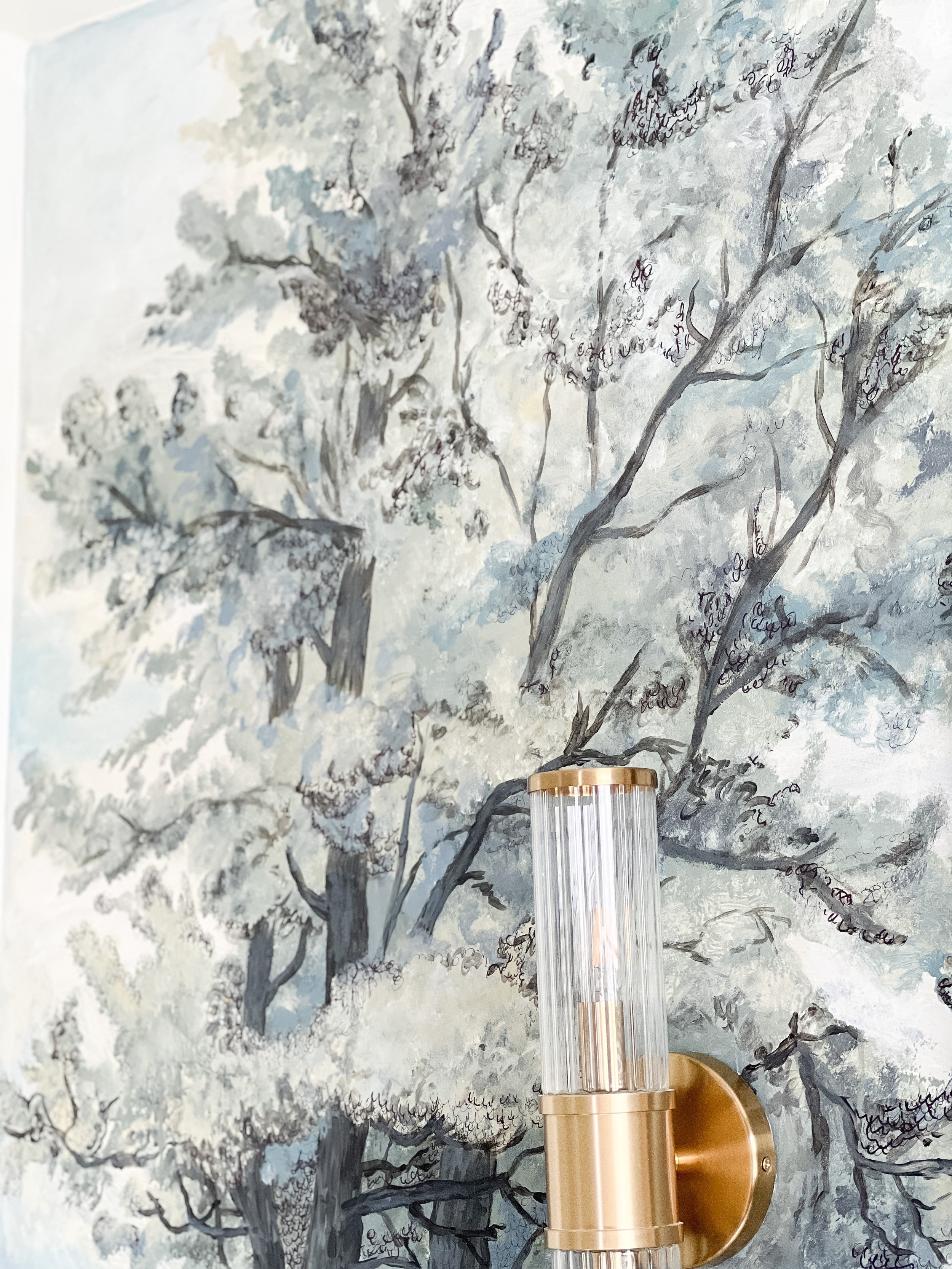
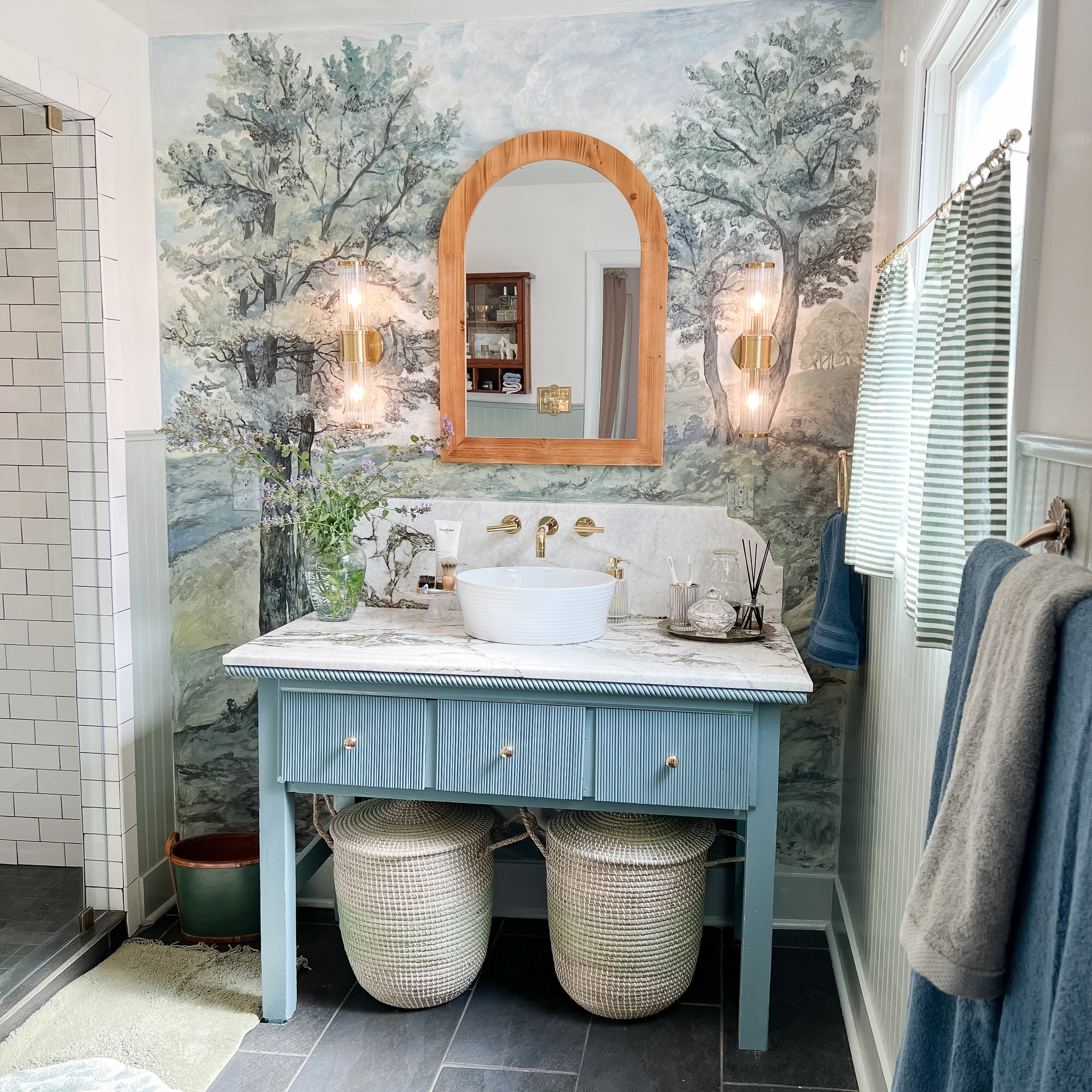
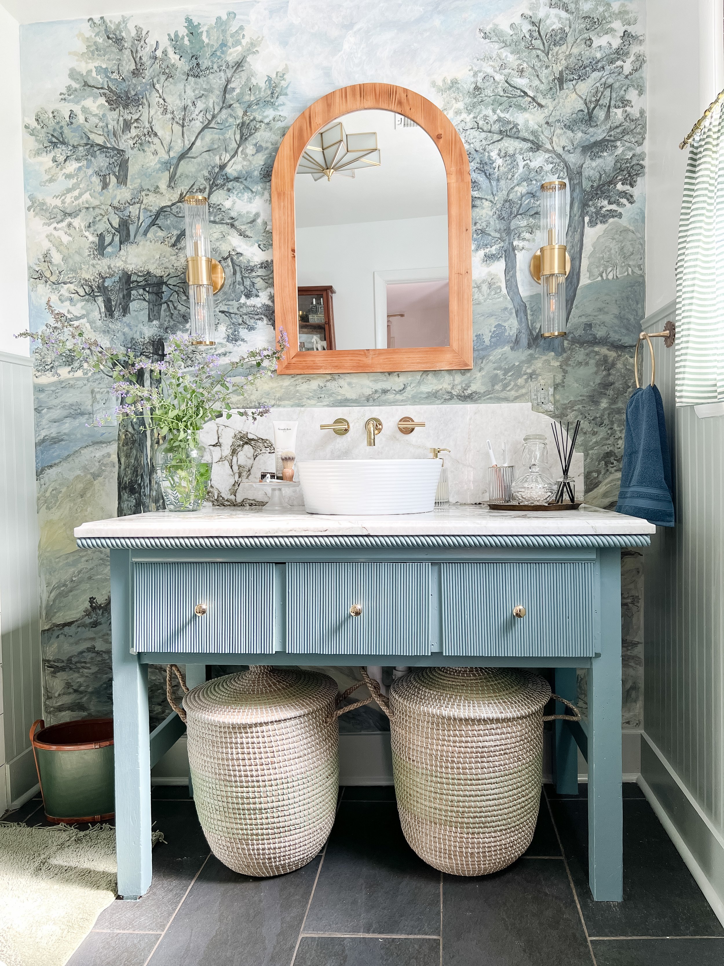
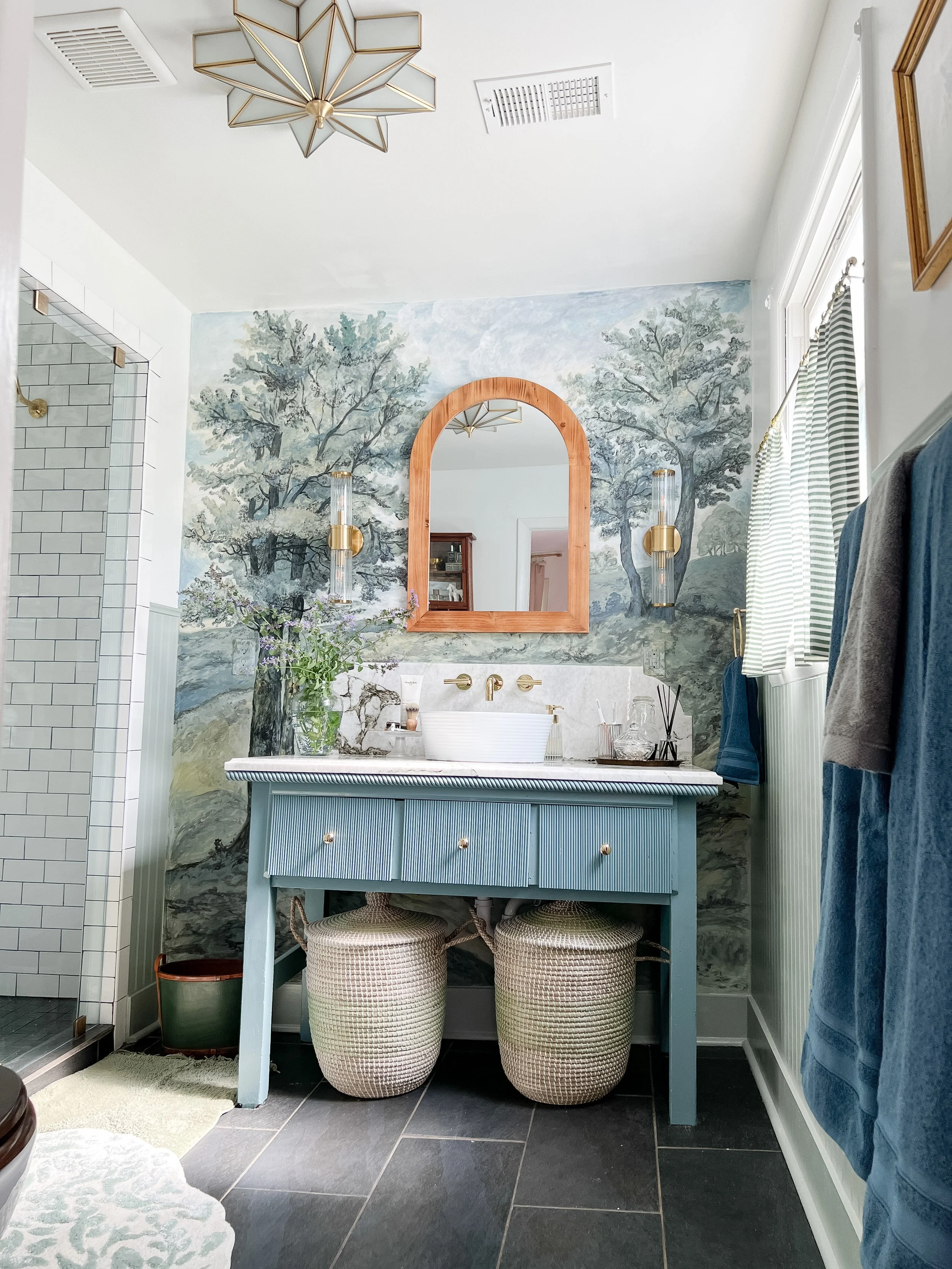
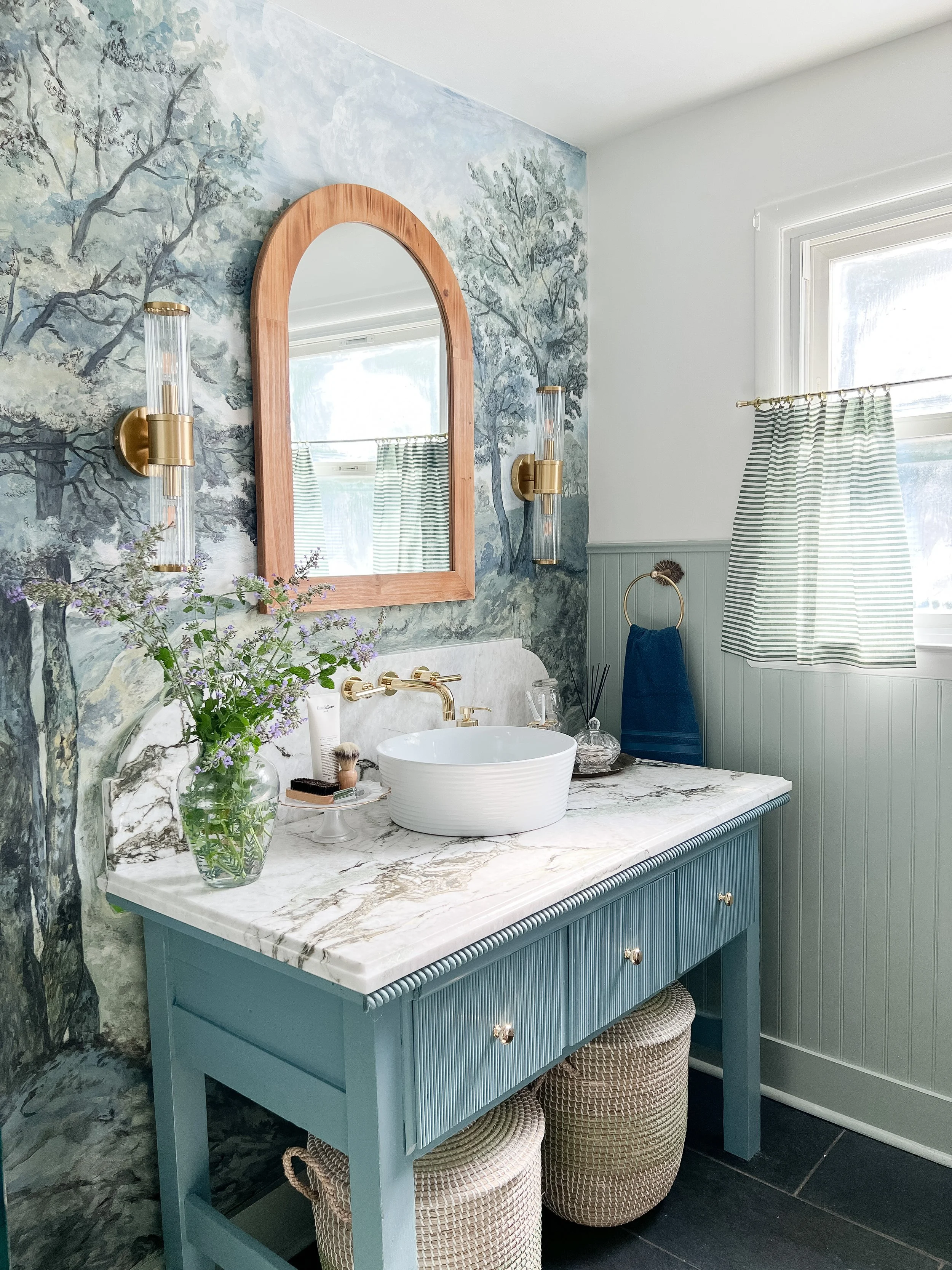
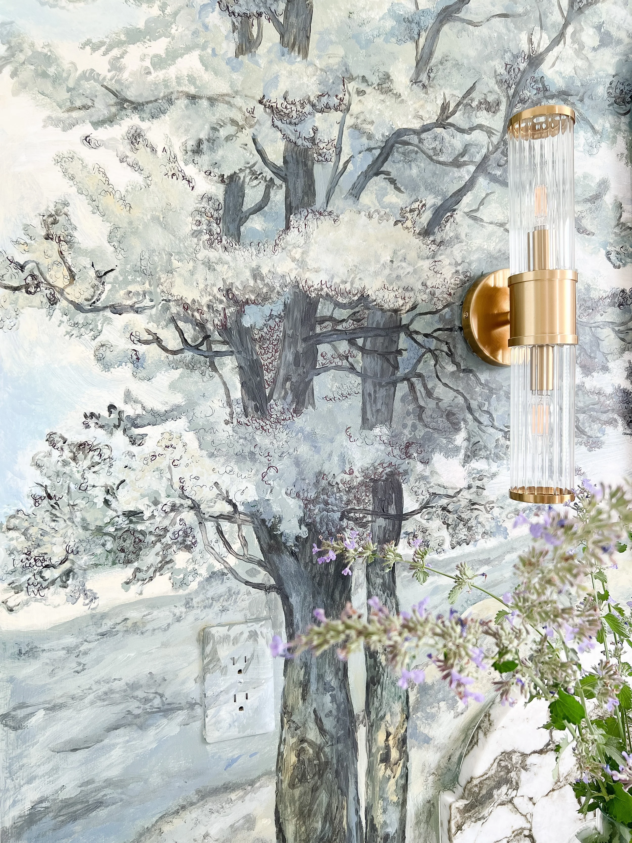
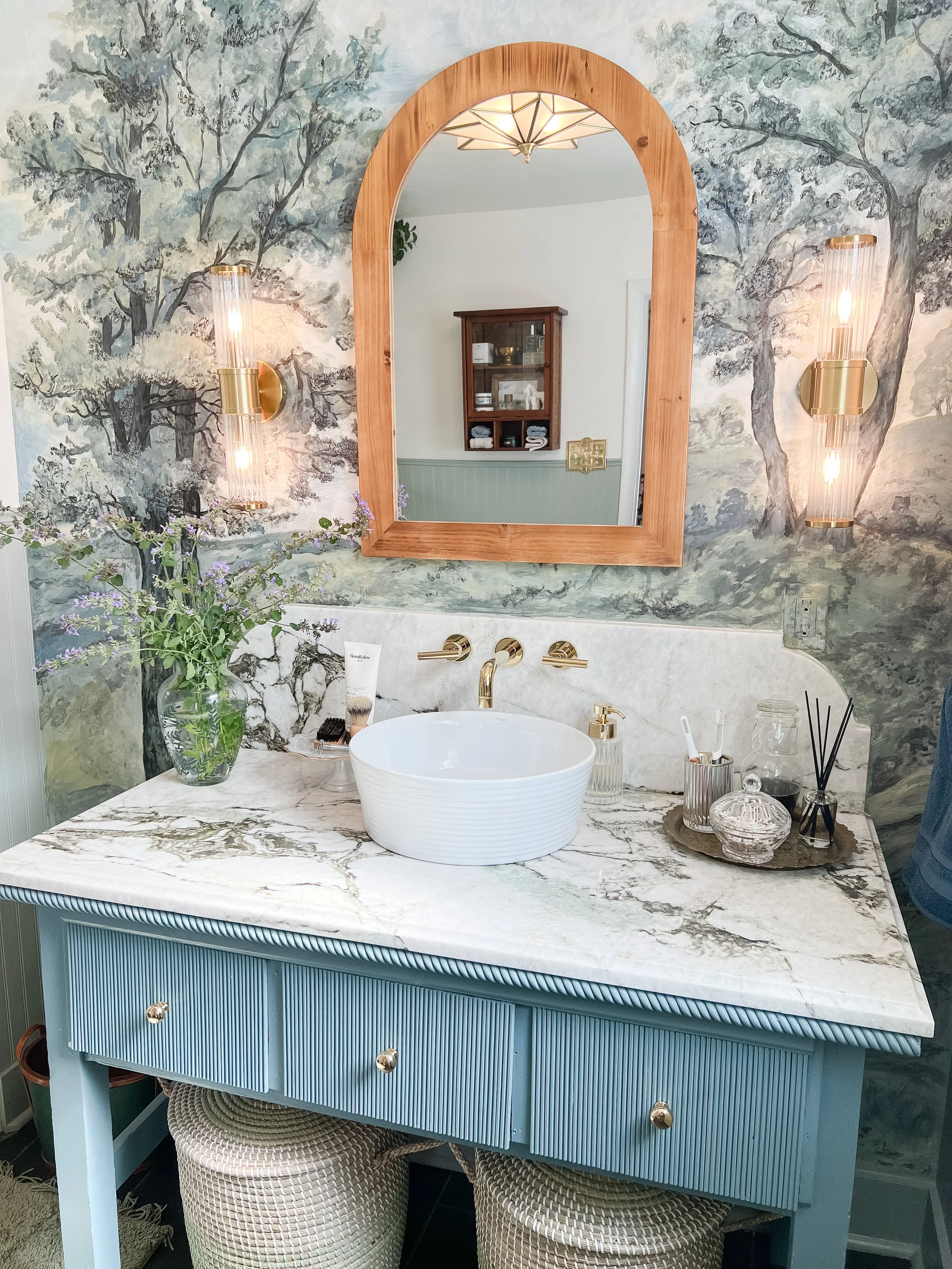
The star of the show in here is the mural on the main wall! This admittedly was a very last minute decision. I had been planning on doing wallpaper here from the start and was considering several landscape style mural wallpapers. I just couldn’t decide on one I loved that had all of the elements I was looking for. I originally was planning for this space to be much darker and moodier, but throughout the process my vision kind of changed and the wallpaper was going to be very important to pull it all together.
I finally decided that since none of the wallpaper options had everything I needed, I would just make my own! Funny enough, I’ve done this before in my very first One Room Challenge, but this was a totally different look and style! I was envisioning an antique kind of landscape look which was going to take some serious art skills. Most people don’t know I did go to school for Art Education and painting and drawing was my focus, but I definitely don’t get to paint or make traditional art these days as much as would like (hardly ever actually). I knew I could do it, but the main question was- did I have enough time?! I decided this with just ONE WEEK left!
I found an inspiration photo that I really liked (shown below) and based the mural off of that. I kind of made it my own and changed a few things but I think it’s the perfect combination of colors and old and new that pulls everything in the room together! I also love that since I painted this myself, I could customize the colors to exactly what I needed to pull in the other elements of the space.

I started by doing a loose pencil sketch of the layout I wanted for the mural- the trees, hills, skyline, etc. Next I did quite a bit of underpainting of the main colors. I used regular acrylic paints from Hobby Lobby and got a ton of different sizes/textures of brushes and even some sponges to use for texture. From the little bit of research I did, Liquitex acrylic paint was a recommended brand for interior murals, so I stuck with that paint.

After I got a good base, I started tackling details section by section. For example, one night I did all the grass/hills, another night I did the big main tree, another night the two smaller trees. This helped the entire project no seem too daunting. I also used some ink pen at the end as my inspiration photo did have some very sketchy black marks throughout and I wanted to add that detail.
I could’ve kept adding and painting more details for a couple more days at least, but I had to make myself stop so I could finish everythin else! I am very happy with the end result and how the colors pull everything else in the room together. It definitely is the focal point of the room and adds so much character to the space!
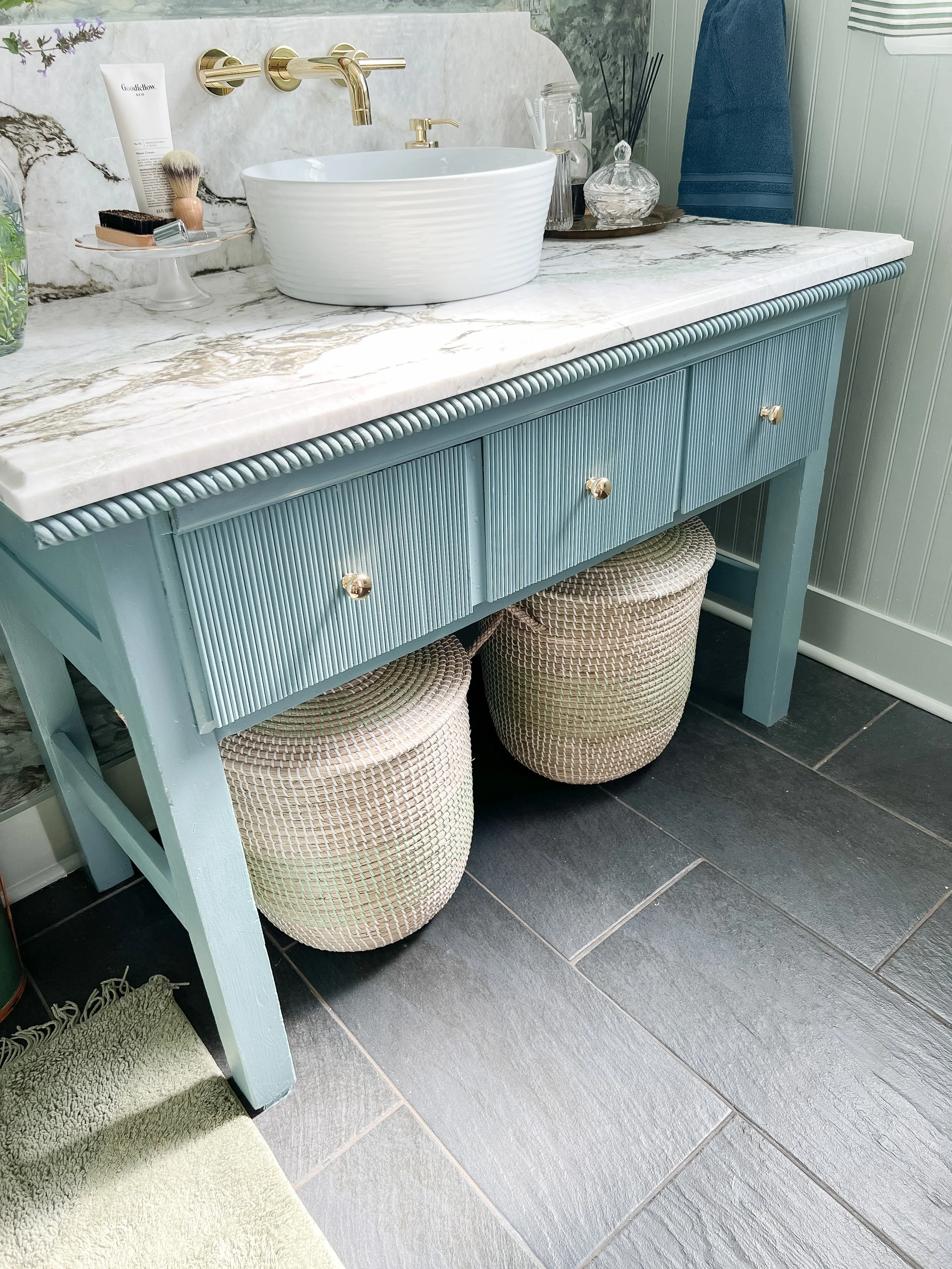
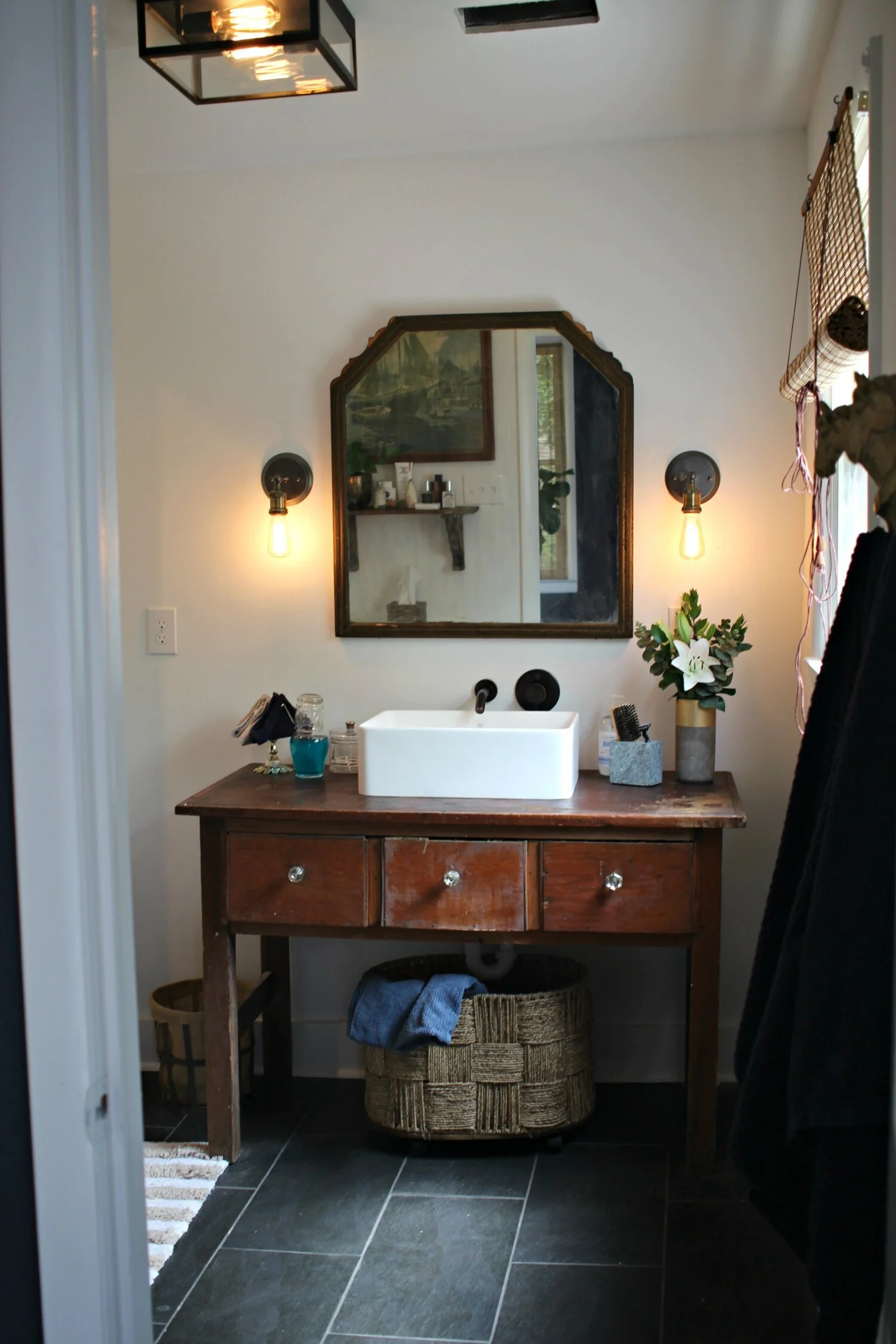
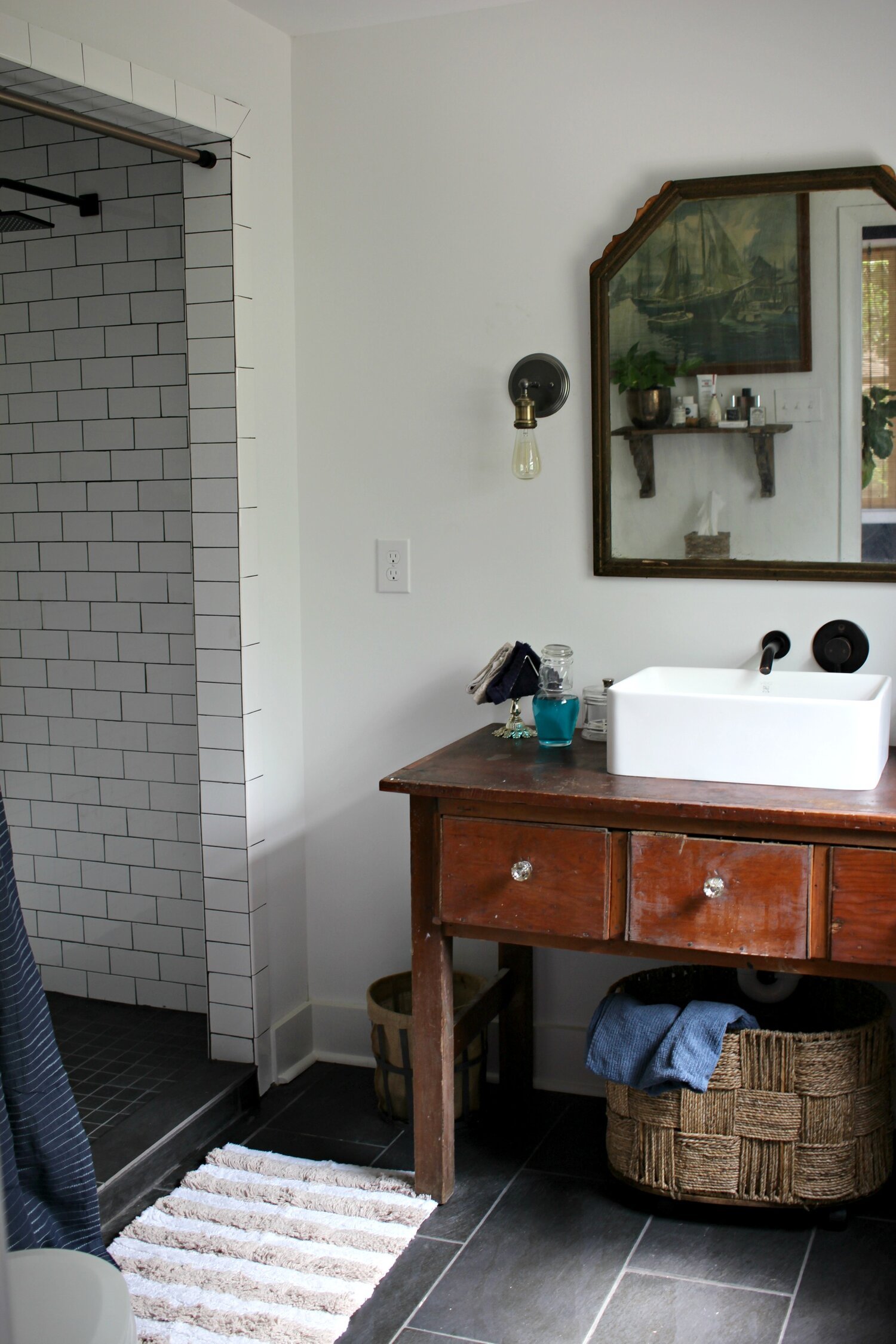
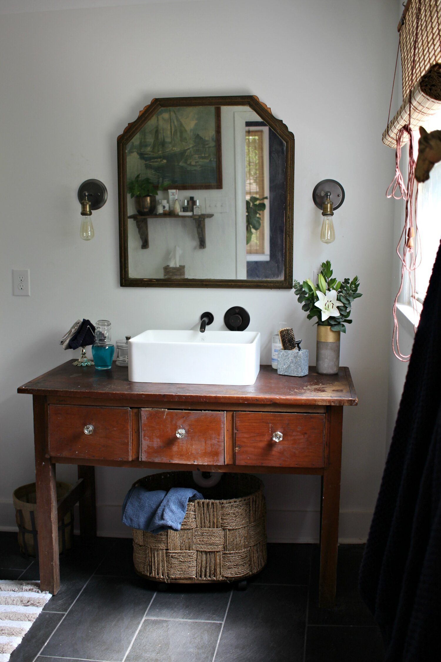
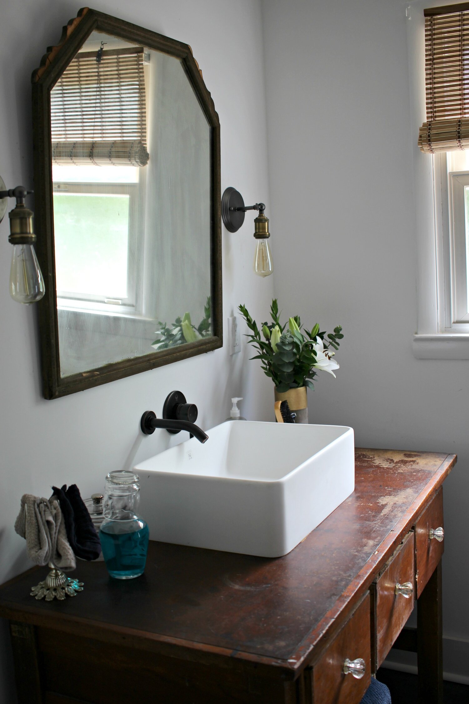
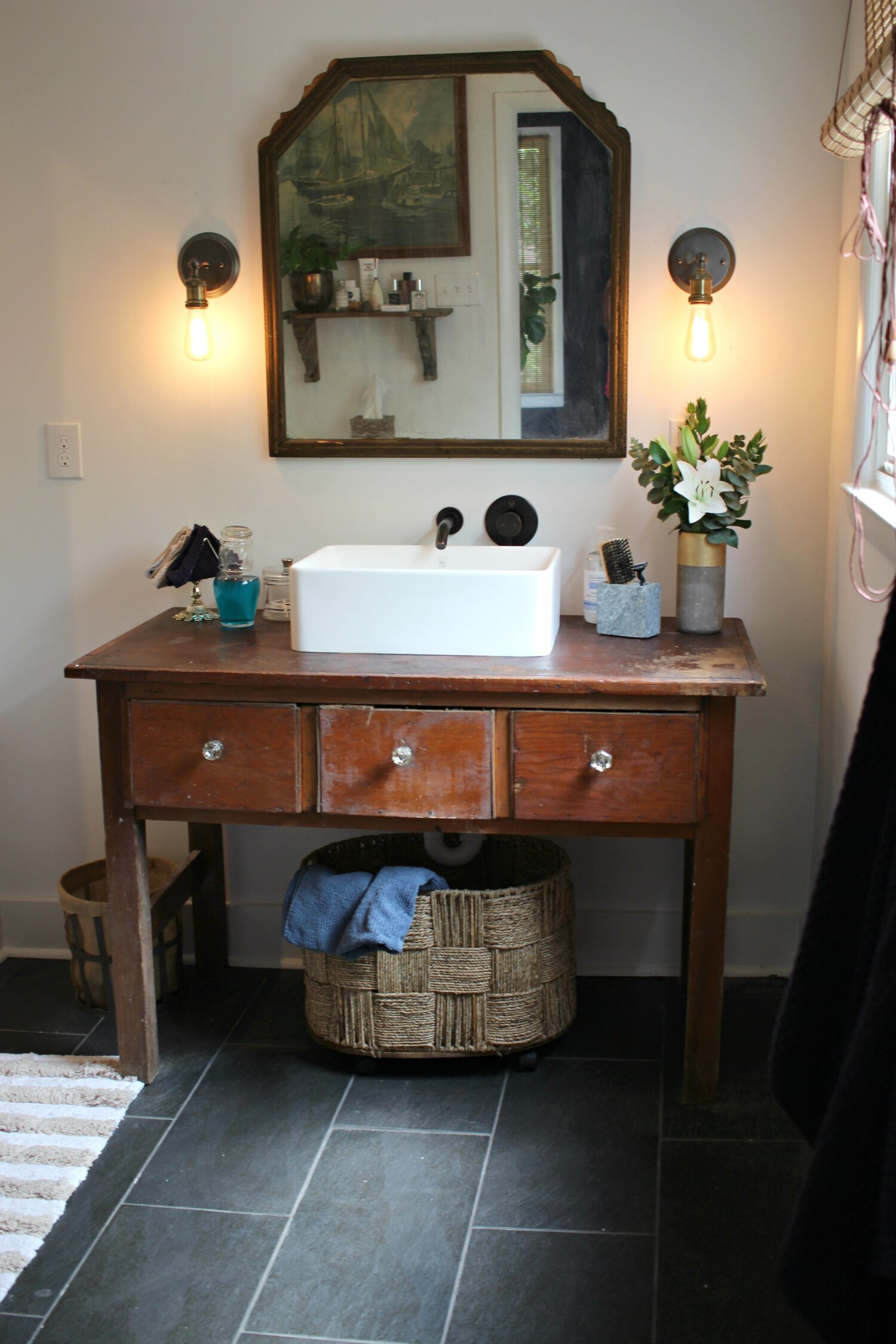
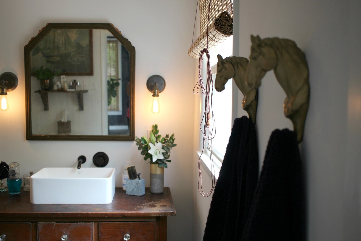
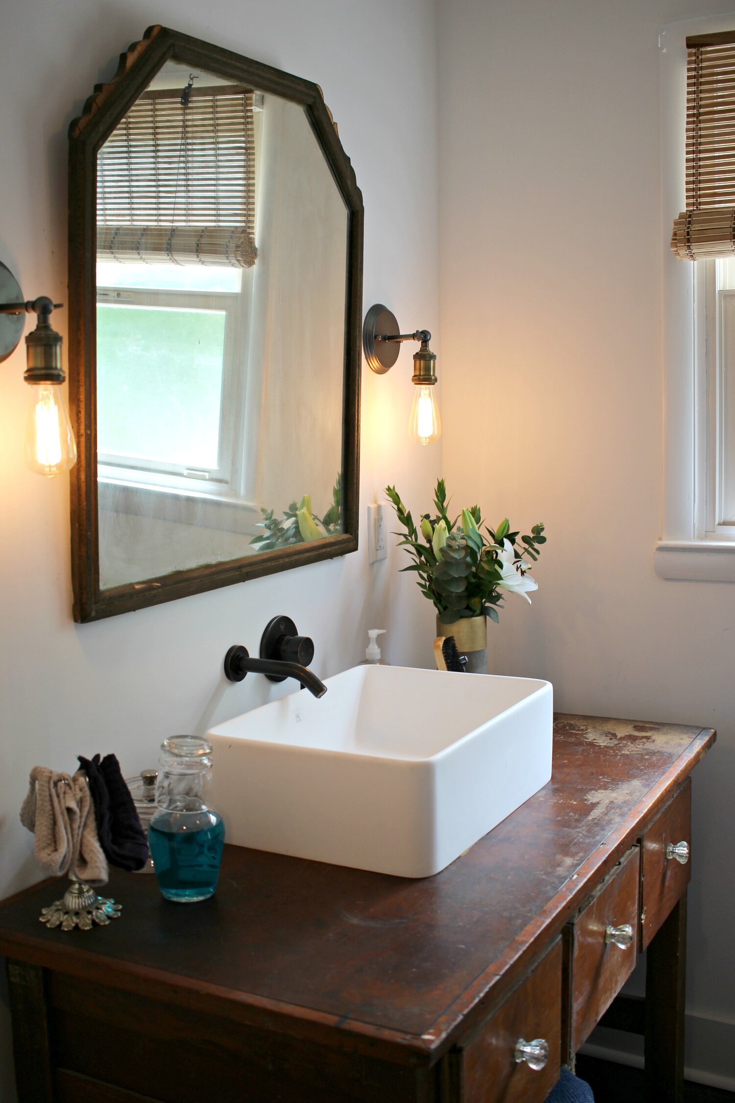
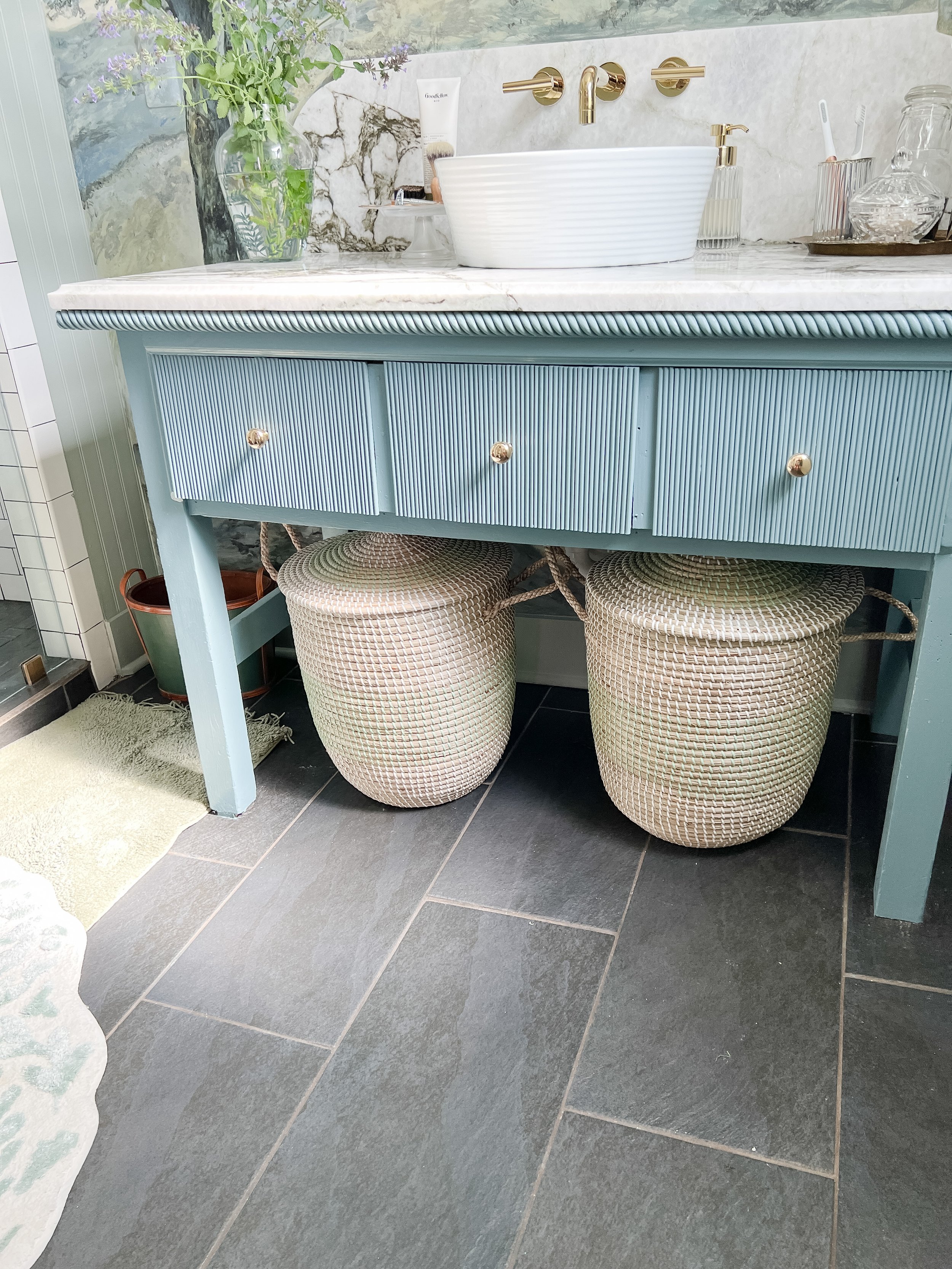
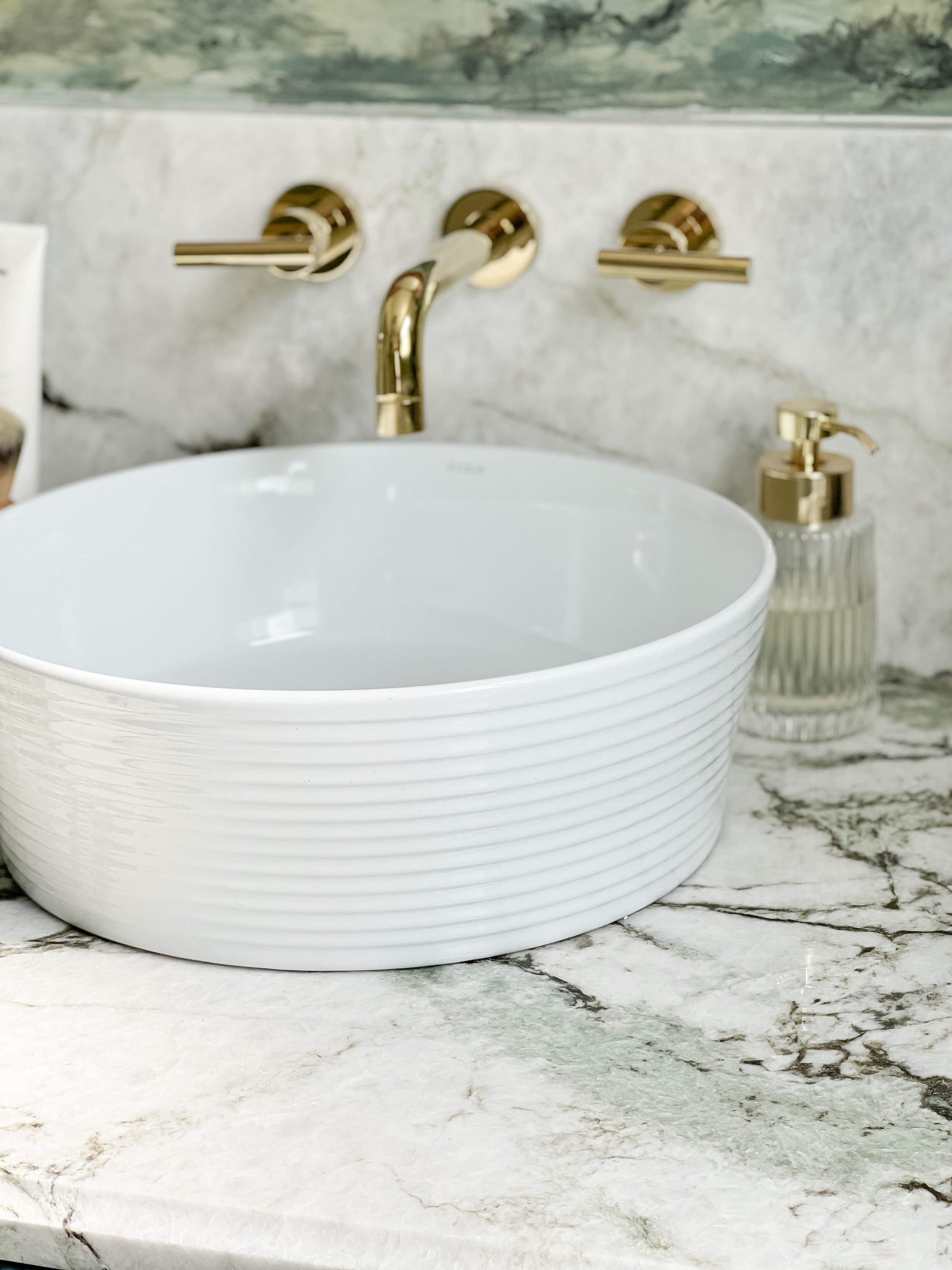
Besides the mural- the other focal point and biggest transformation of the room is the vanity! Can you believe this is the same piece of furniture shown below?!

One of my main goals from the beginning of this project was to elevate this piece and make it feel more finished and less rustic. I knew that switching out the vanity and all the plumbing would be a big expense that would cut out other things I wanted to do in the space, so I opted to keep it and make it new through paint, trim, and a new countertop!
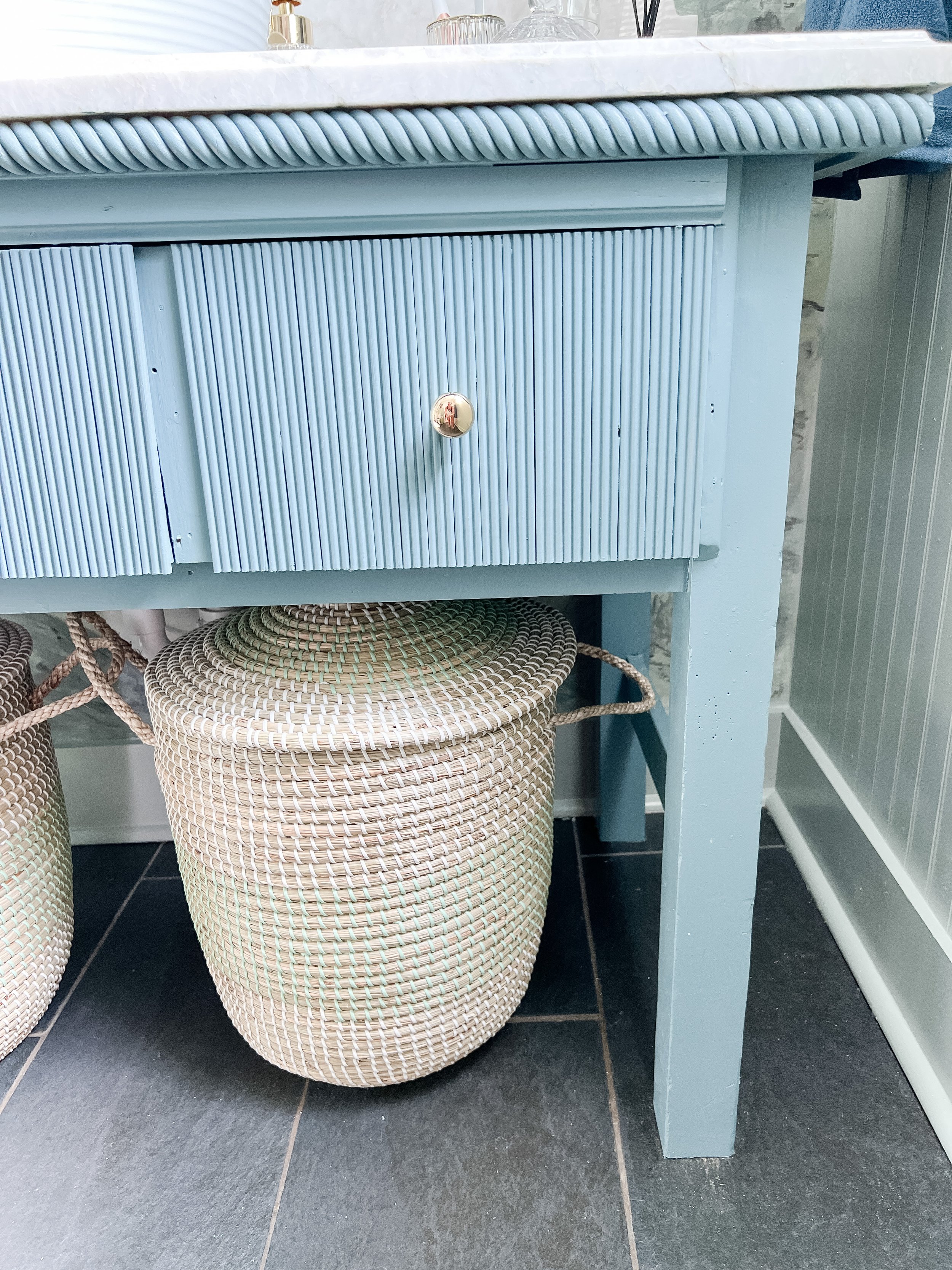
I painted the entire piece Blustery Sky by Sherwin Williams in a semi-gloss. It’s a great medium tone slate blue. I had SUCH a debate over the color of this, and I didn’t really like it until I had the mural complete! I actually had bought another color to repaint it (dark green), but after the mural was complete, I decided I loved the blue here!
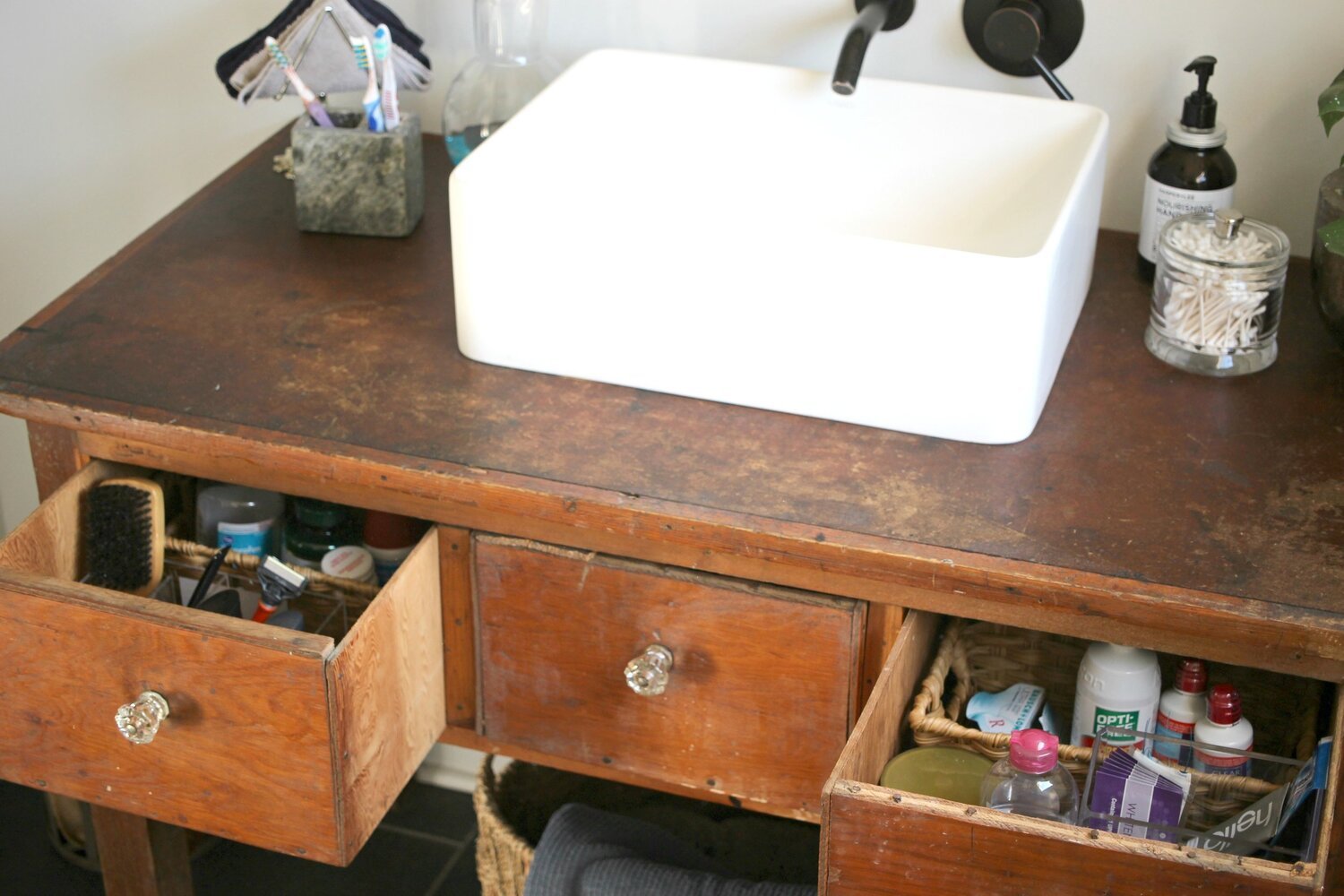
Another transformative DIY I did with the vanity was adding the trimwork to the drawers and front edges. This is such an easy way to clean up or upgrade any piece of old furniture! I purchased all the trim at Lowe’s and we attached the drawer pieces with wood glue (so there wouldn’t be any nails/holes showing). I attached the other longer pieces with my electric nail gun (same I used for wainscotting- linked below!). This is the fluted trim I added to the drawers- we just cut them into strips all the same length (length of drawers), and wood glue them on side by side with no space in between. We took them outside and sat them up to dry with some weight on top to hold everything flat.
I added a braided molding to the top edge of the vanity and this molding to the area in between the top and the drawers. I took the measurements of the exact width I needed to Lowe’s and just narrowed down the best options to fit these spaces. These areas were very rustic looking with lots of dents/nail holes/etc. and I wanted to clean them up! Finally, these are the knobs I added to the vanity- super simple and classic! All of these upgrades together totally transformed the vanity and made it look like a completely different piece of furniture!

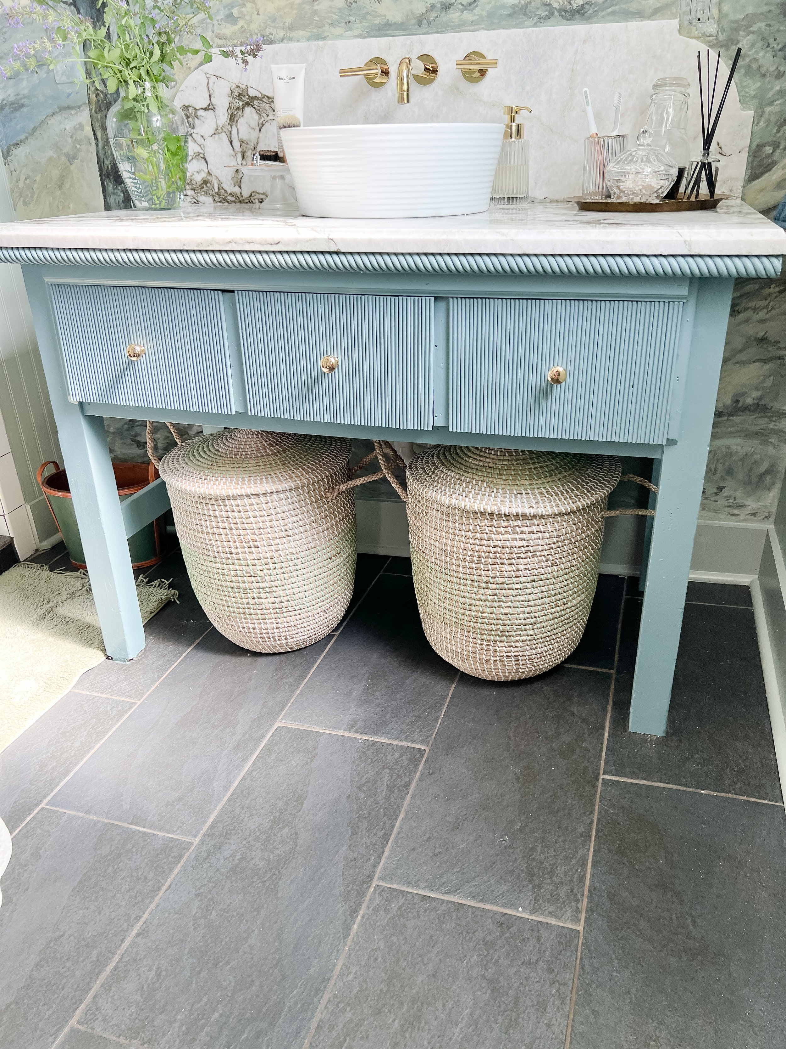
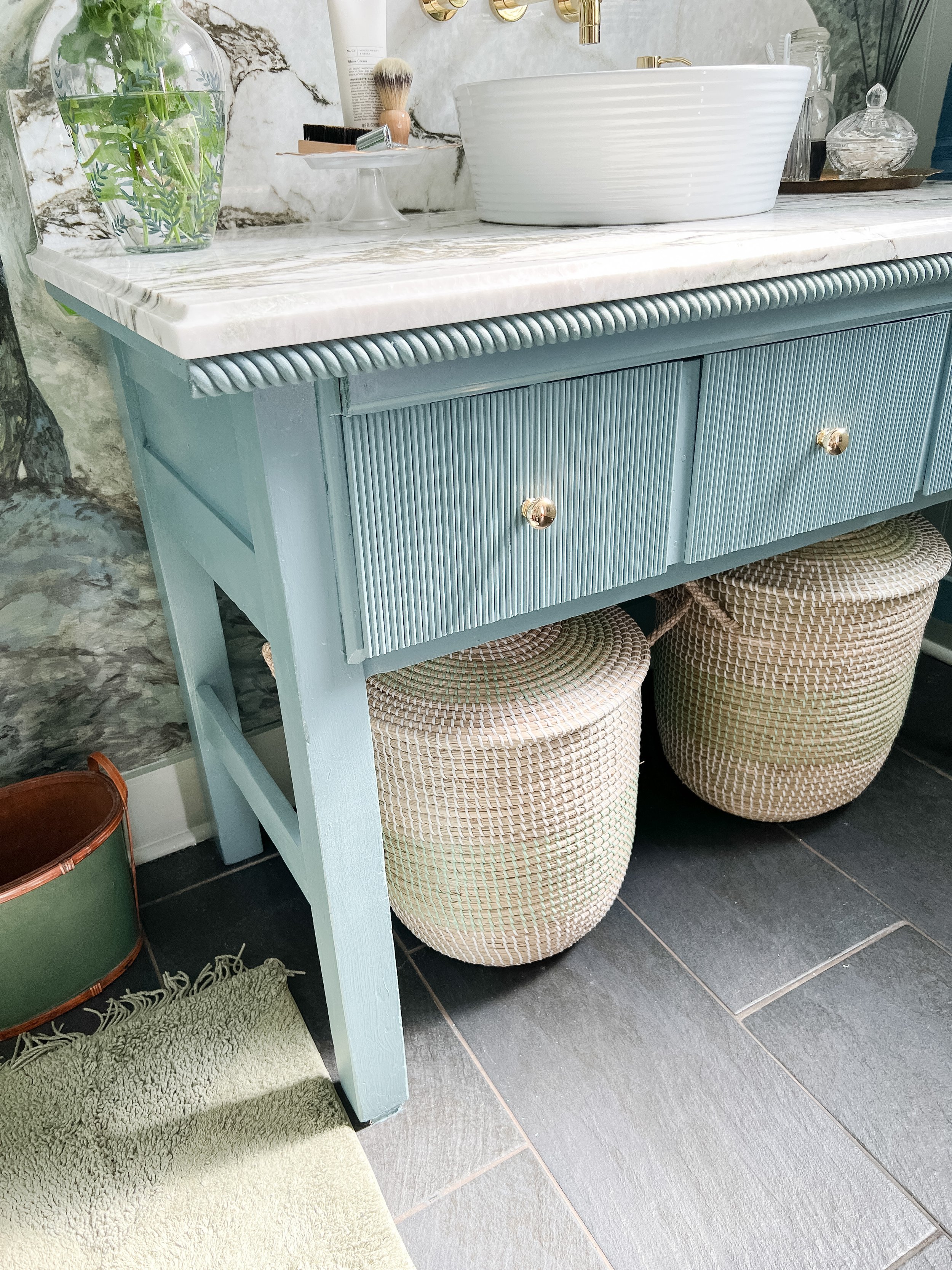

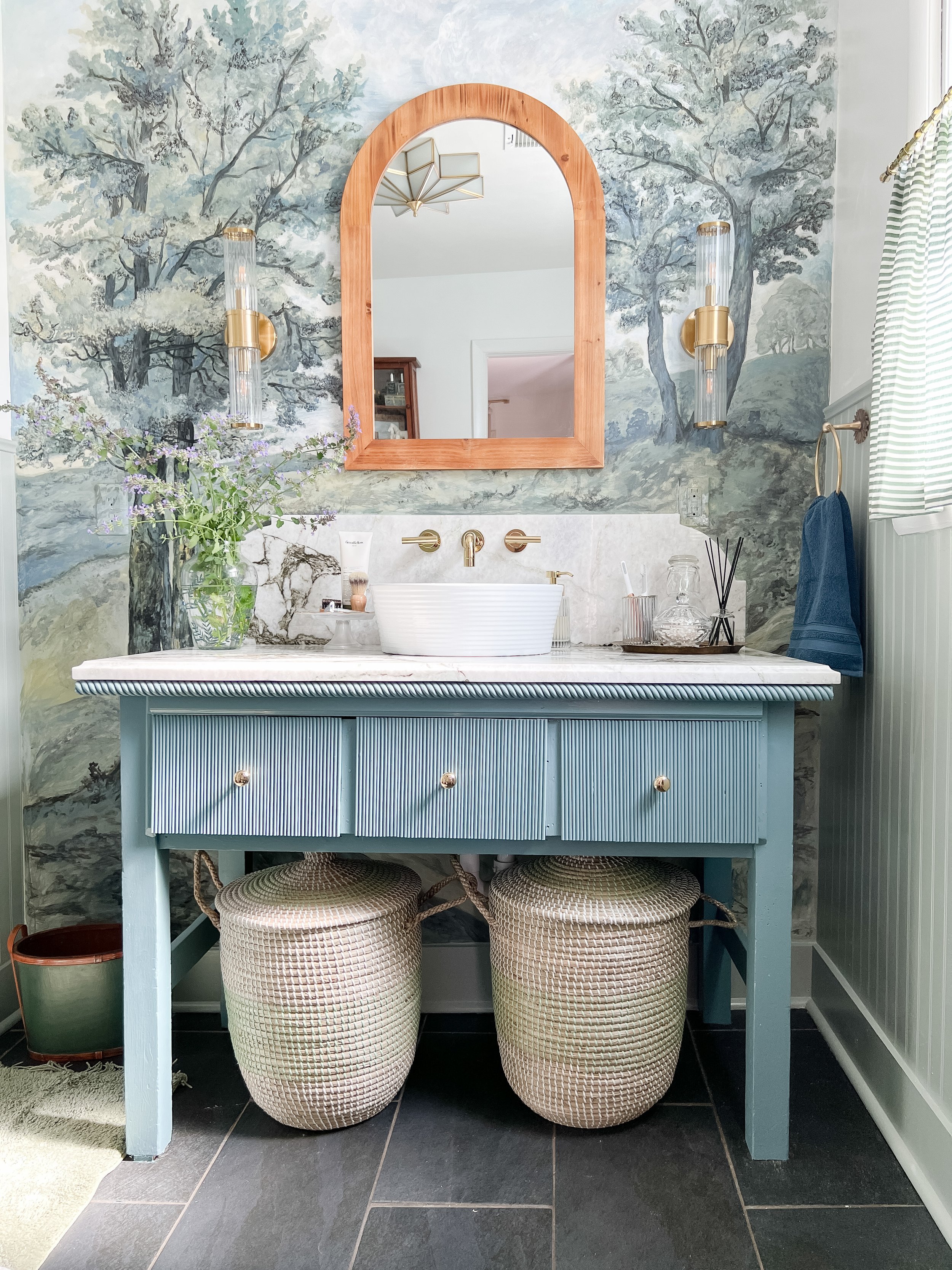
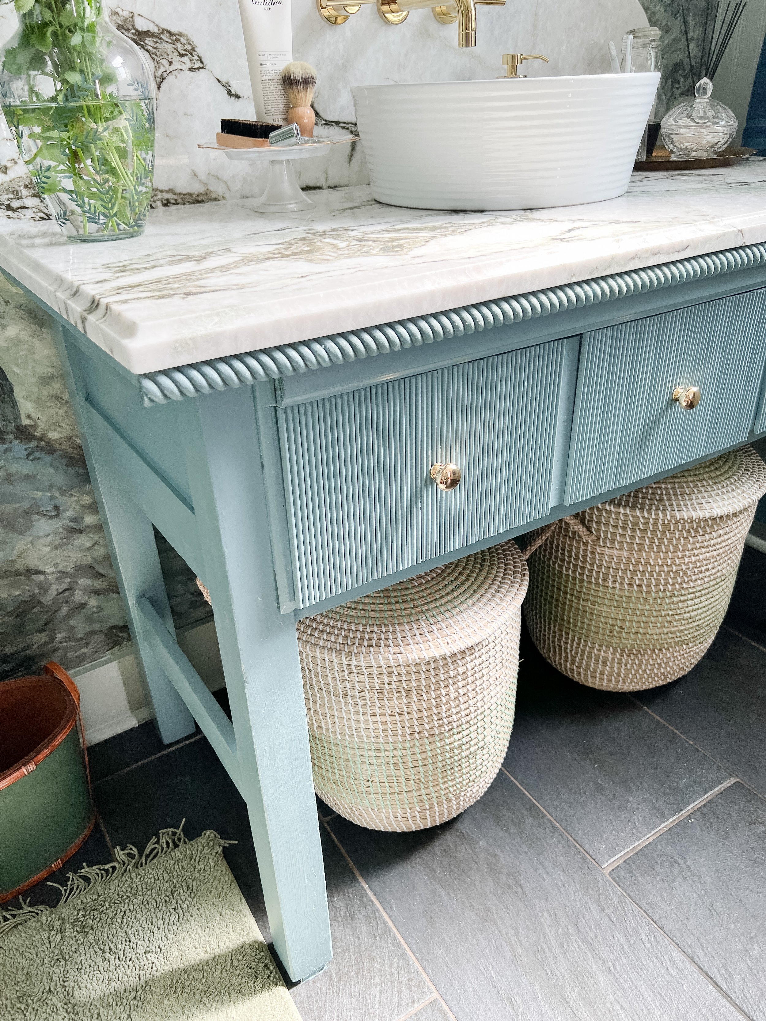
The countertops of course are the biggest upgrade on this piece and such a gorgeous, luxury detail for this room. I am just in love with the backsplash and scalloped detail there too! Counter Culture did such a phenomal job with the install and fabrication of these and I can’t recomend them enough! My week 6 post here talks about the countertops in detail and more about my experience with Counter Culture.
The countertops are an Amazon Green Marble and I was able to use a remnant they had to save some money (and they were able to install so fast too!). It has a 12 inch backsplash with scalloped detail on each end. The front edge is a cove edge and the backsplash is a regular straight edge.

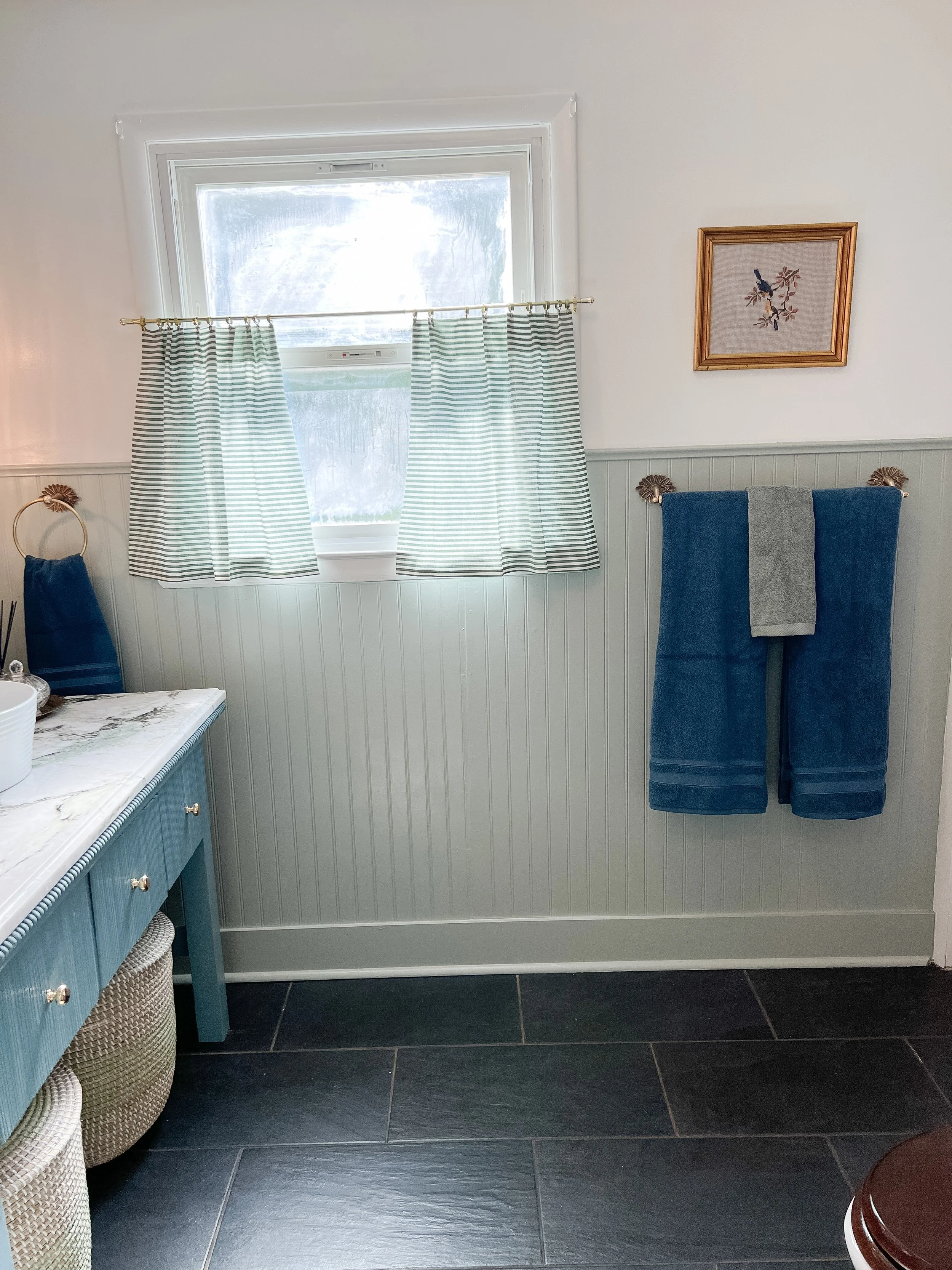
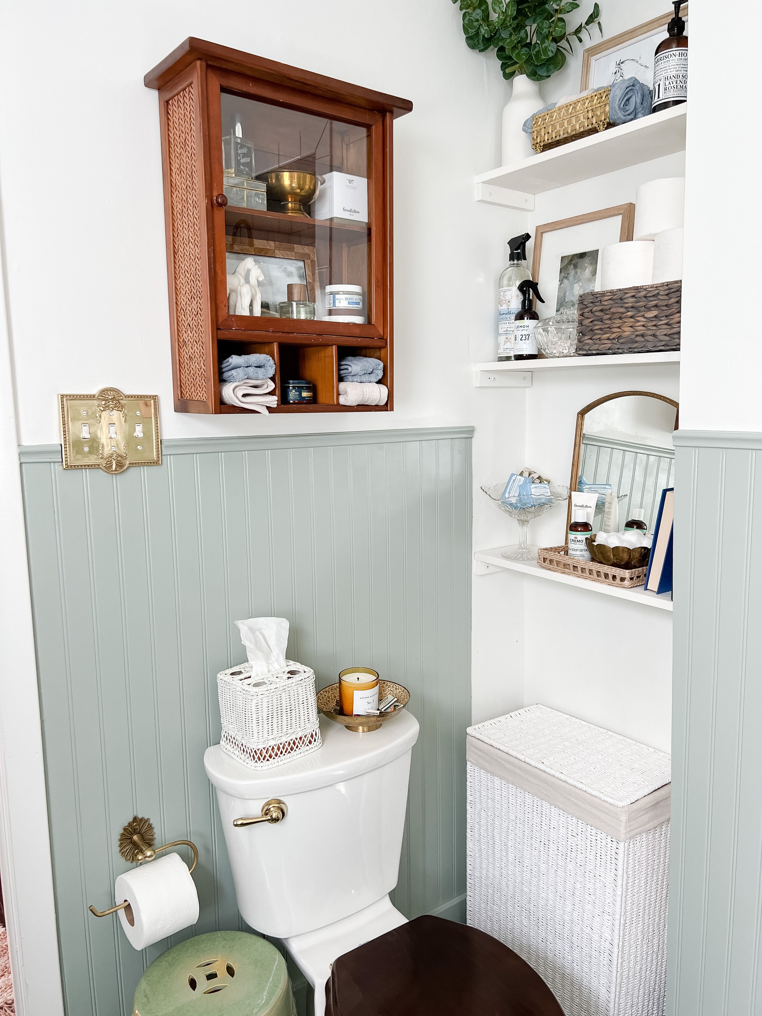
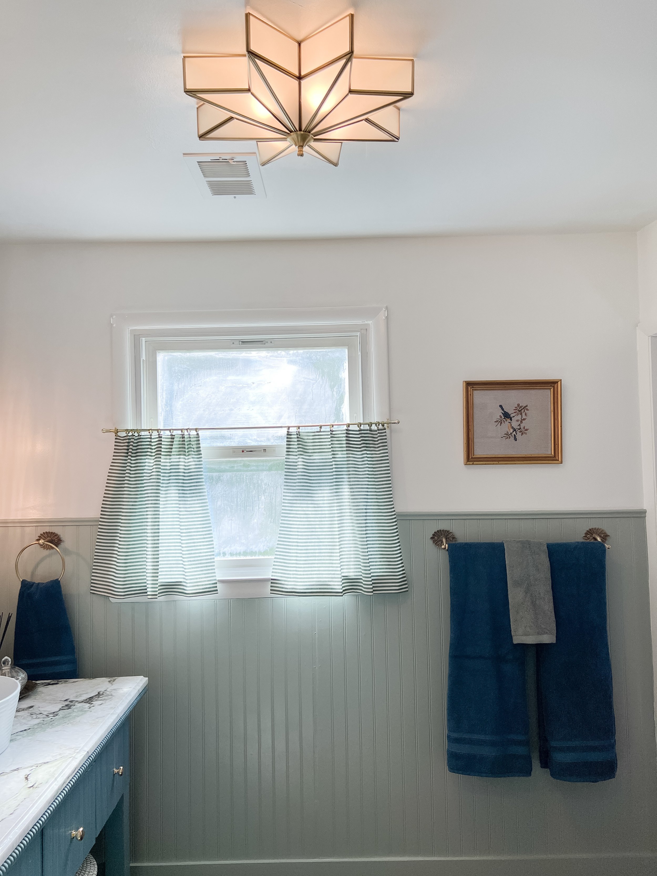
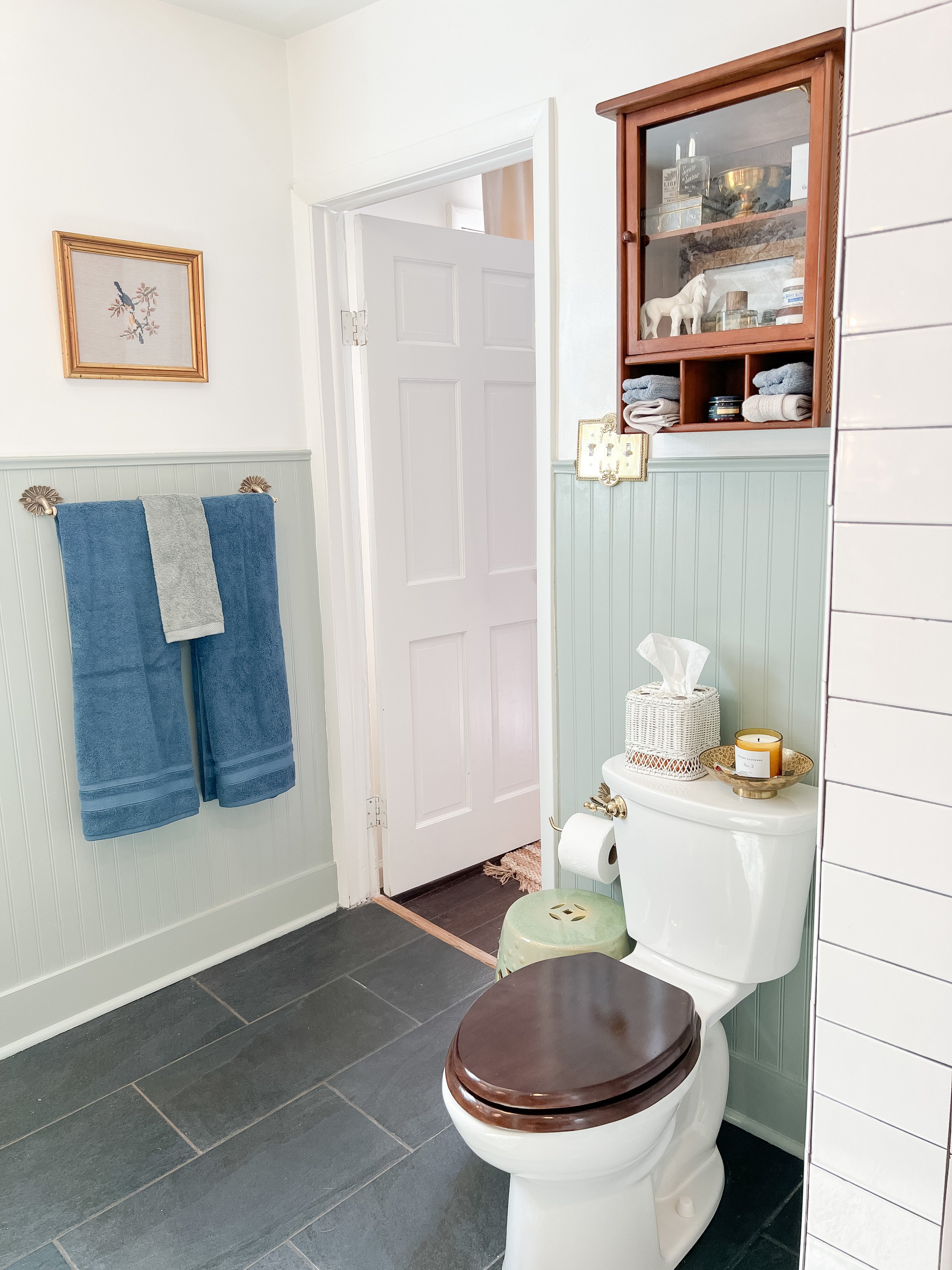
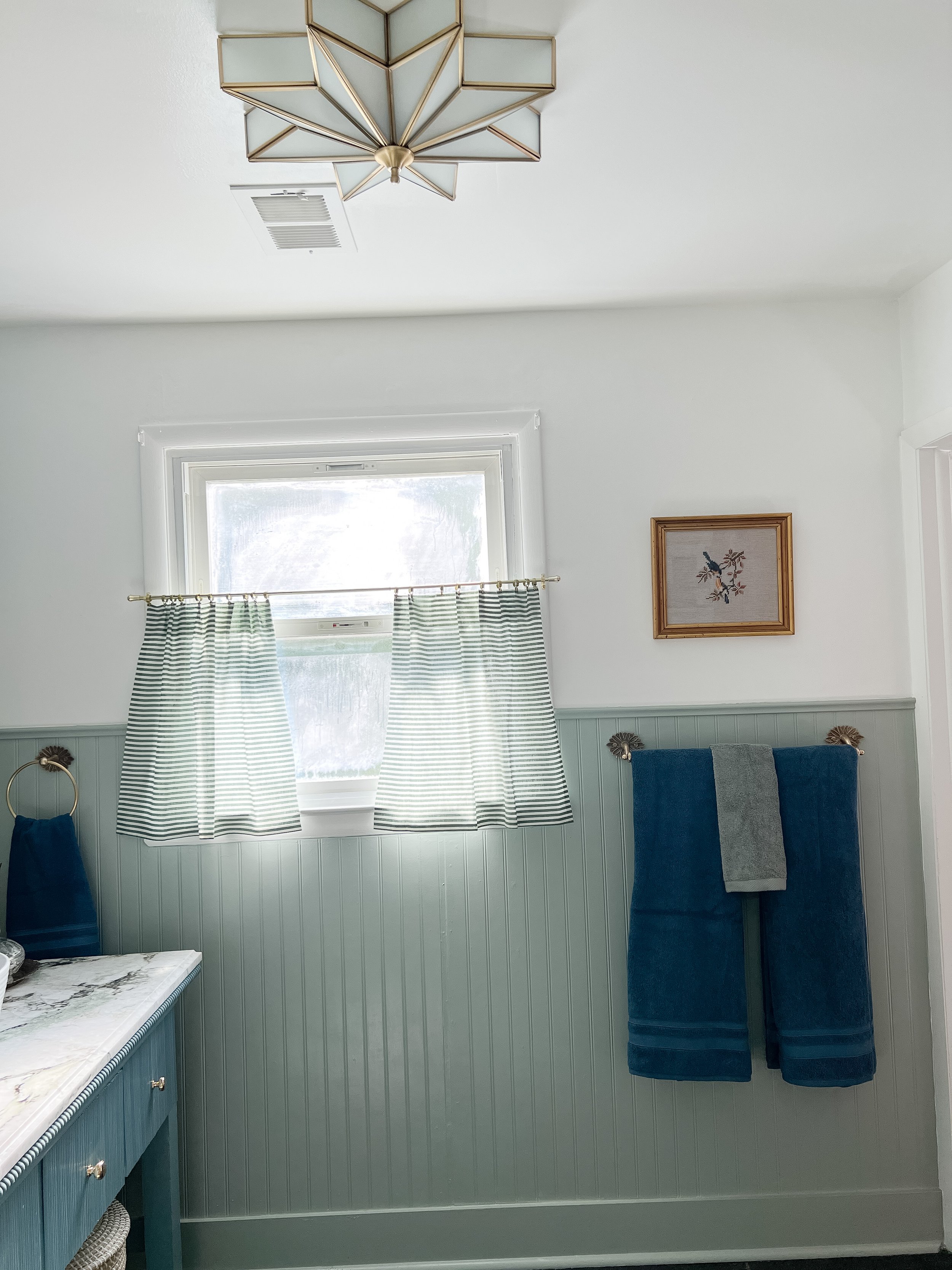
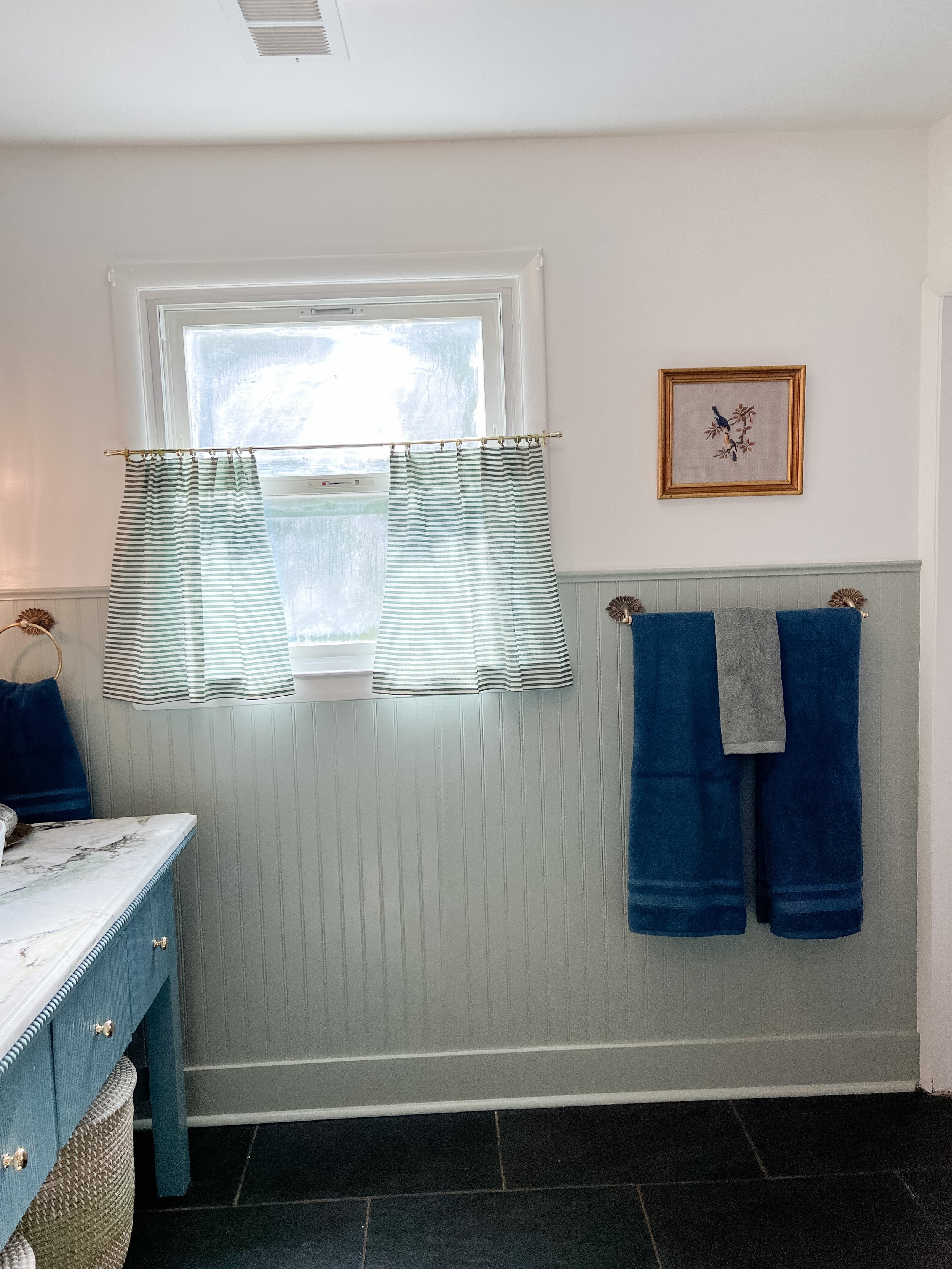
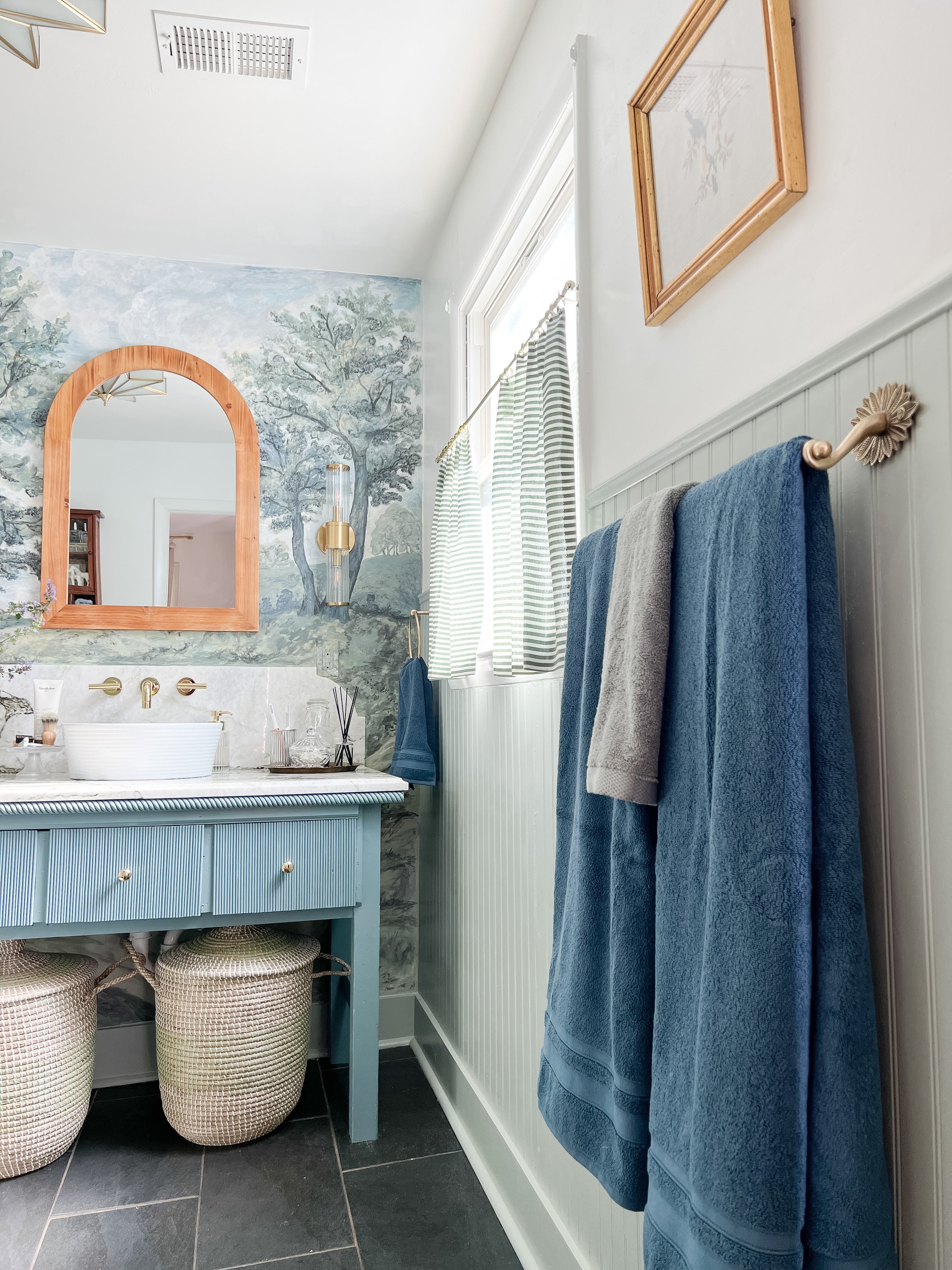
I am so happy I decided to add some trimwork around the bottom half of my walls, and even better- do it all ourselves! This was our first time trying this and I defintiely think I feel confident enough to do it again now! I continued the wainscoting style trim around all the walls, minus the mural wall with a chair rail at the top. I painted this all Gracious Gray by Valspar (in semi-gloss) which is a beautiful pale olive/sage color with just a touch of blue undertones. I had to do 3-4 coats, sanding in between each one to get a good finish. I used a small cabinet paint roller and trim brush for details spots.

Since we didn’t have a ton of detailed cuts- this was fairly easy to do and we only needed about 3 sheets of the wainscotting total for the whole space! Here is the wainscotting I used and here is the chair rail.
I used an electric trim nailer to attach it to the walls and a Dremel tool for cutting around the window/plugs/etc. The Dremel tool came in handy throughout this entire project! We used the sanding attachment to sand in between paint coats and any rough spots/patched spots too. We even got a tile cutting attachment to help us cut the tile we used for the floating shelves in the shower (more on that below!).
On the walls above and ceiling, I gave a fresh coat of Pure White by Sherwin Williams in semi-gloss. These walls were previoulsy painted in flat paint and it was a nightmare to clean/maintain and had gotten so beat up! They also were Pure White already but it was shocking how much they had yellowed over time- the fresh paint looked completely different! I love having the glossier finish all the way around in here. It was a pain in the butt to paint, and I definitely could have made this project much easier by hiring my painter to do that part (lesson learned!).
Overall this is one of my favorite details of the space and I love the character the trimwork adds. I will definitely be tackling this in more space in my home now that I have practice! I also can’t believe what a difference just freshening up the white paint made throughout the space!


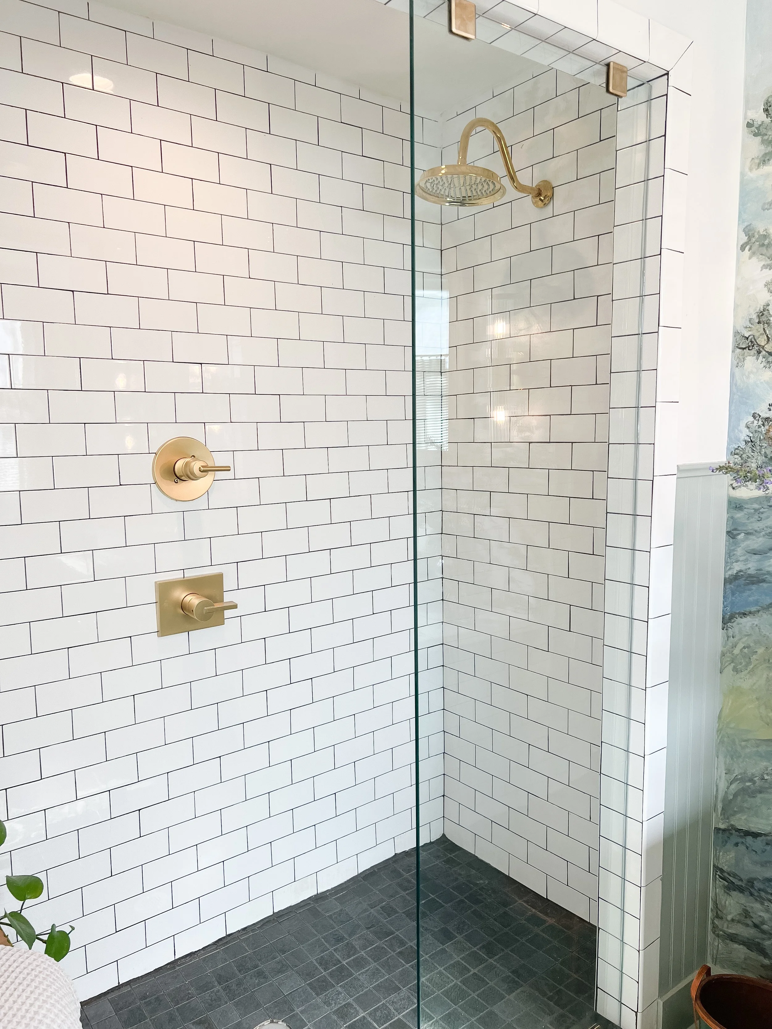
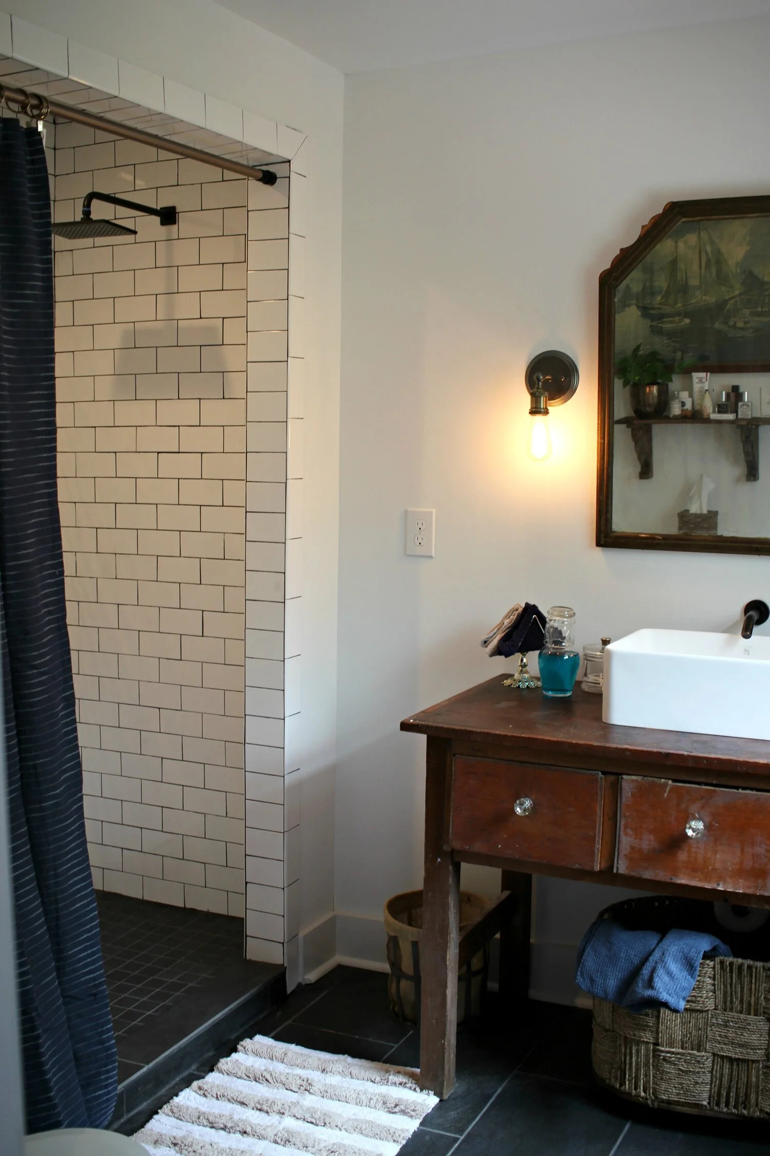
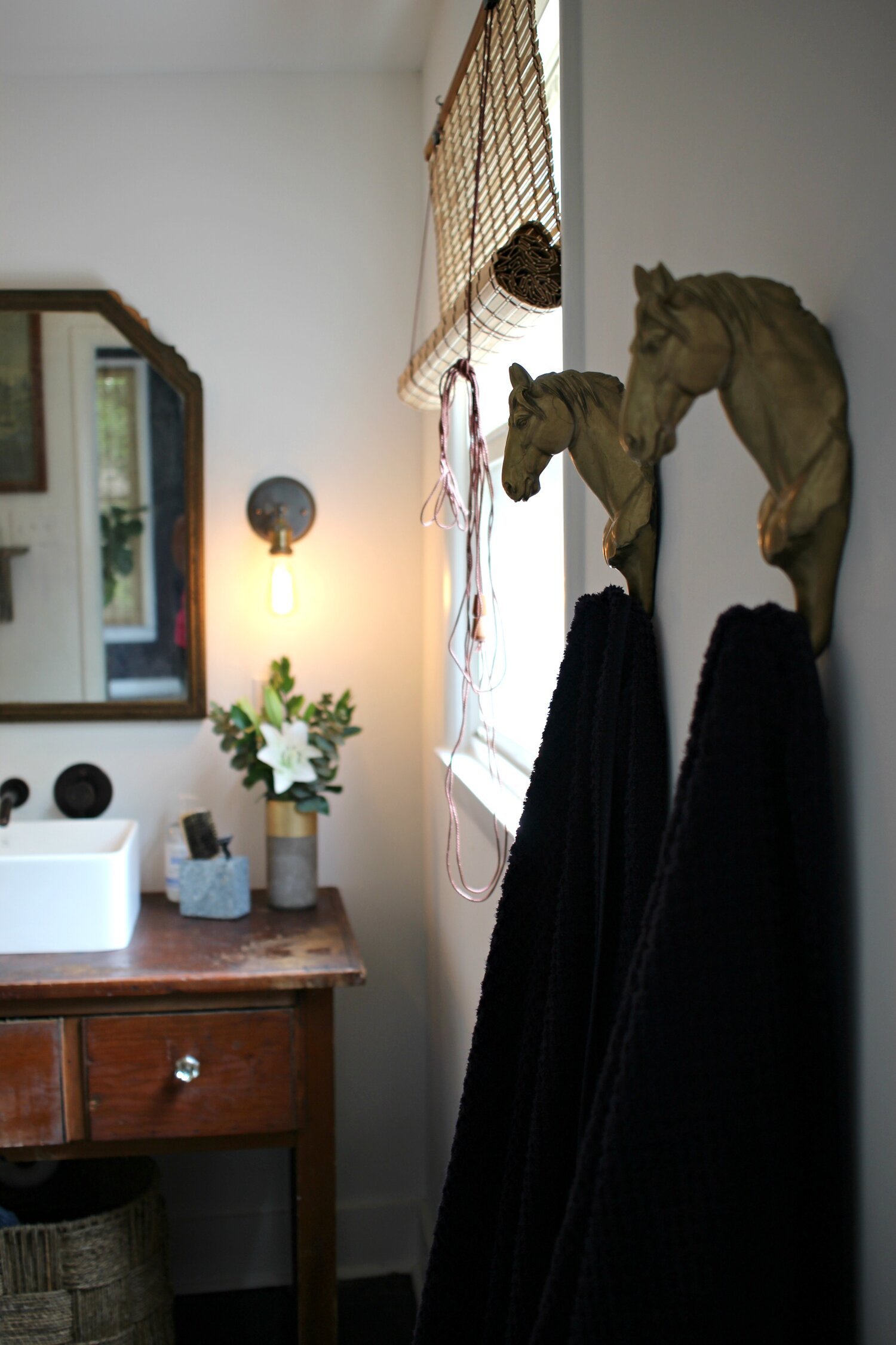
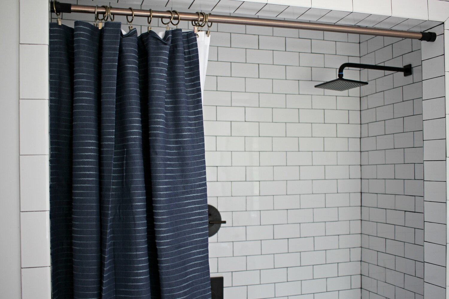
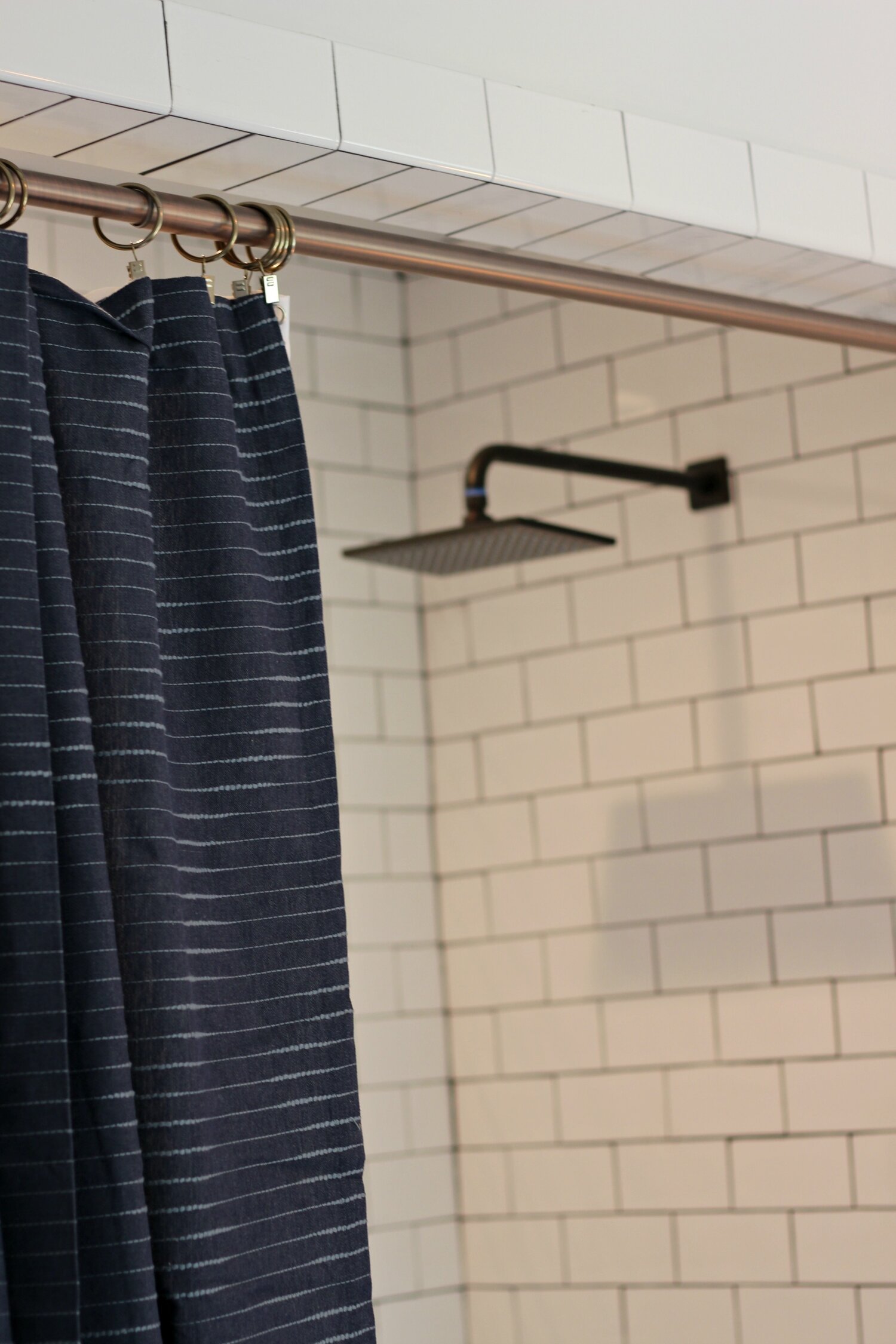
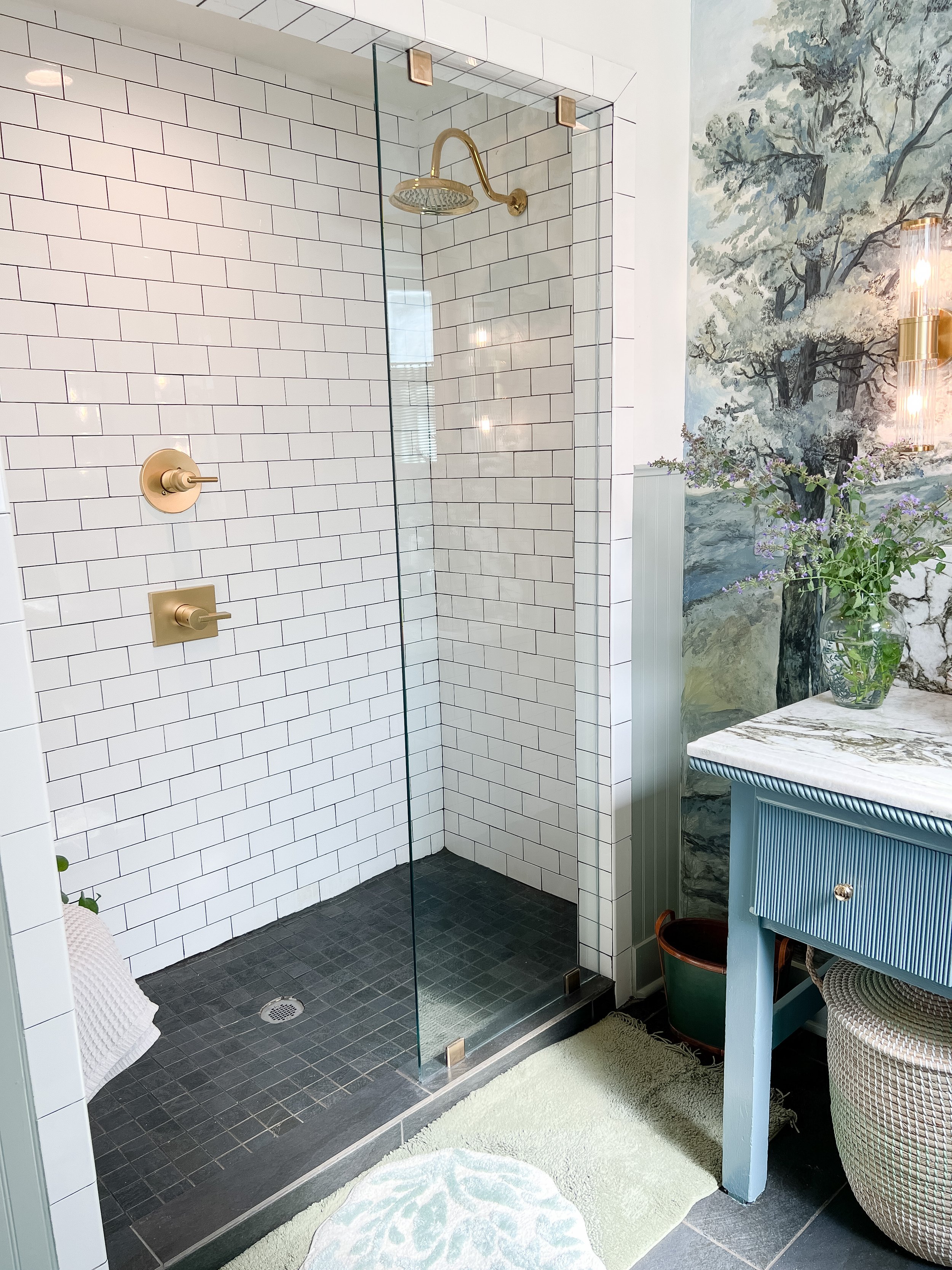
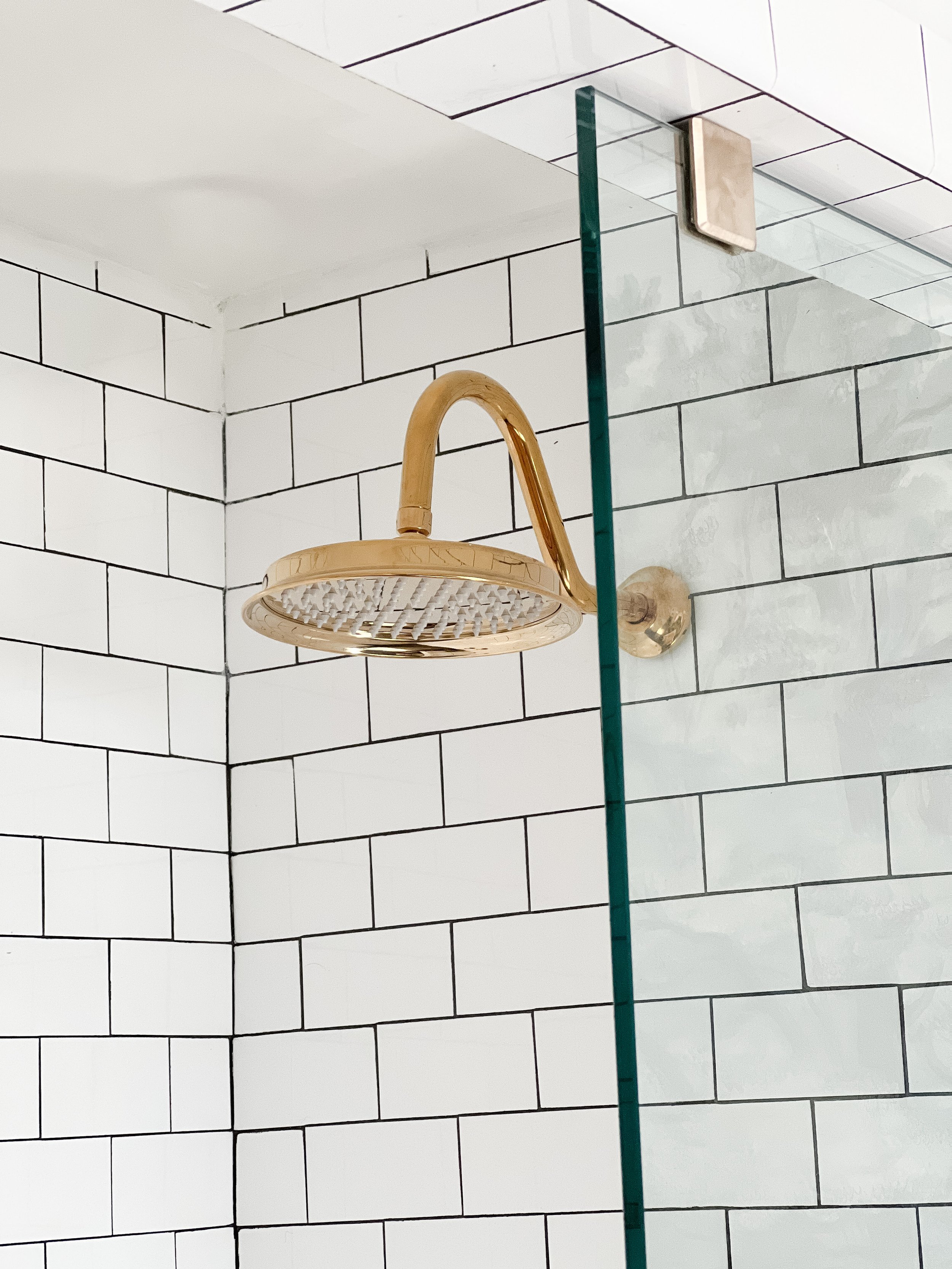
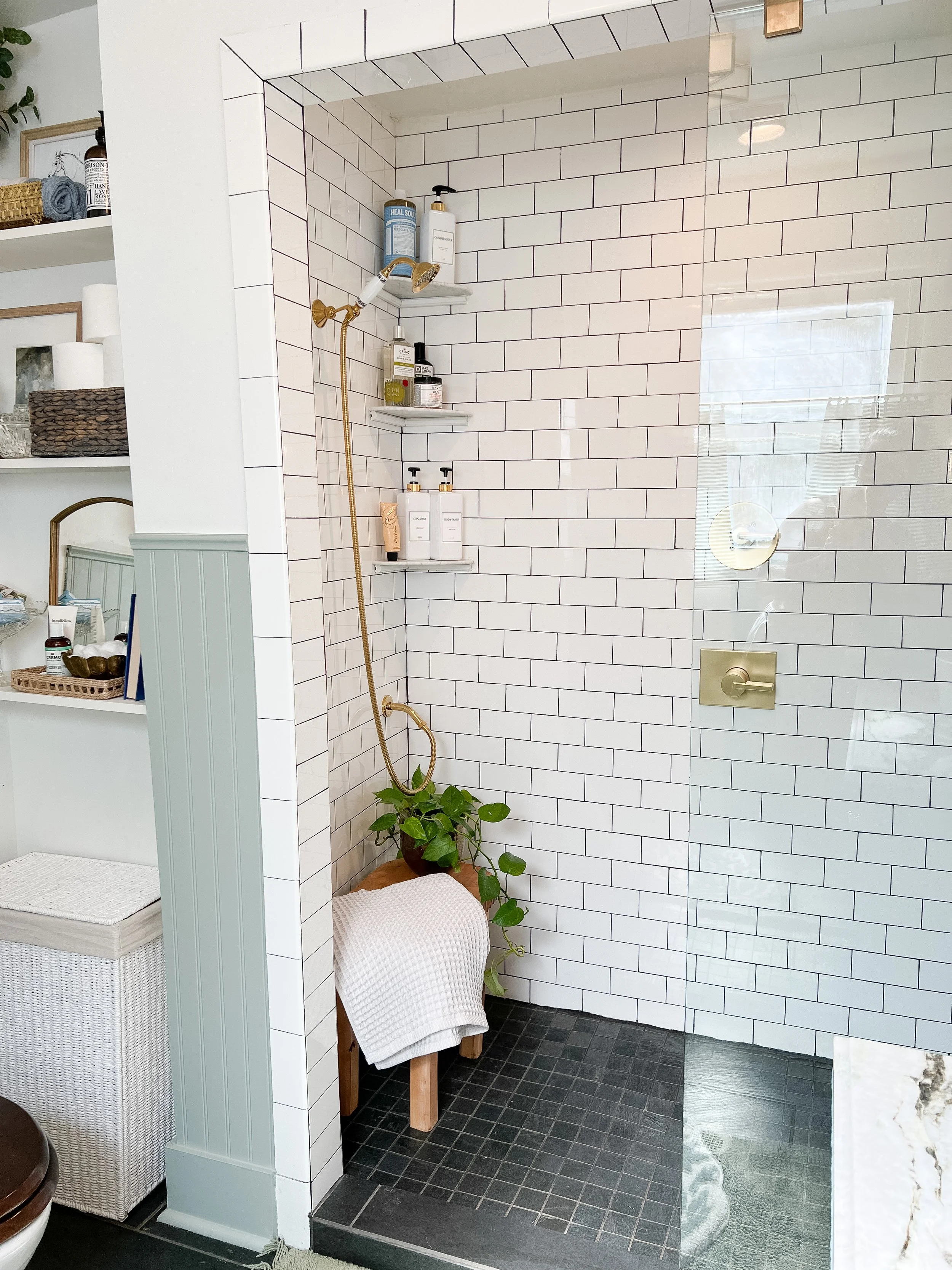
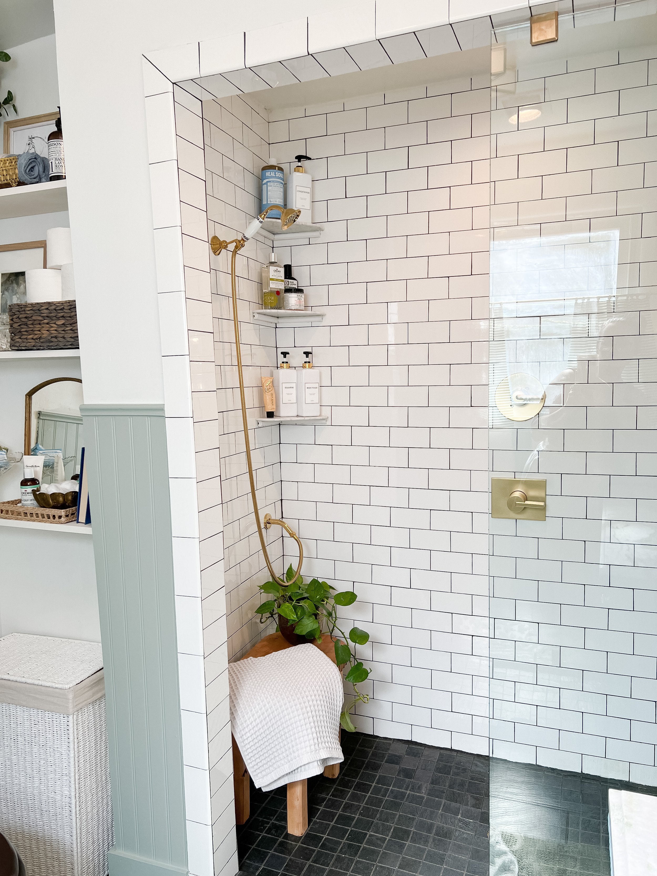
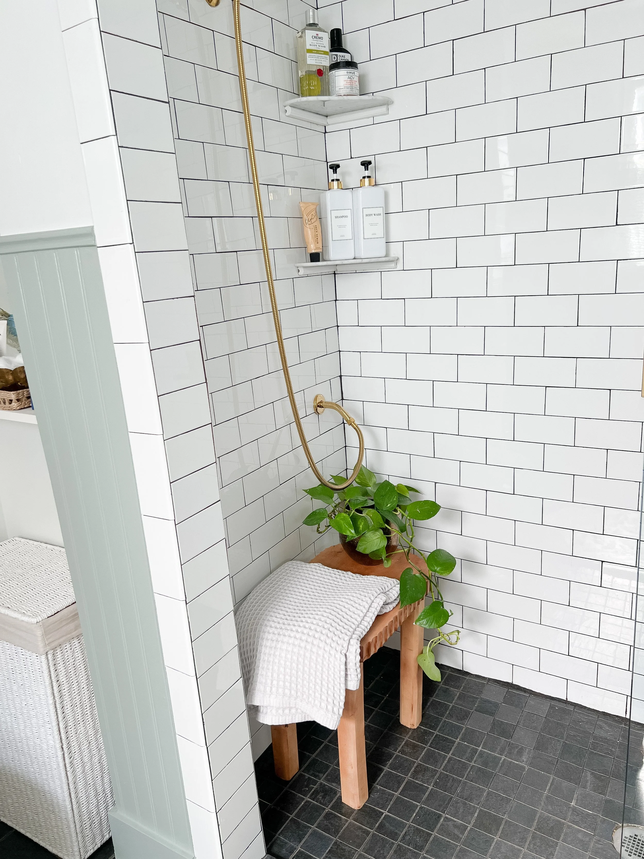
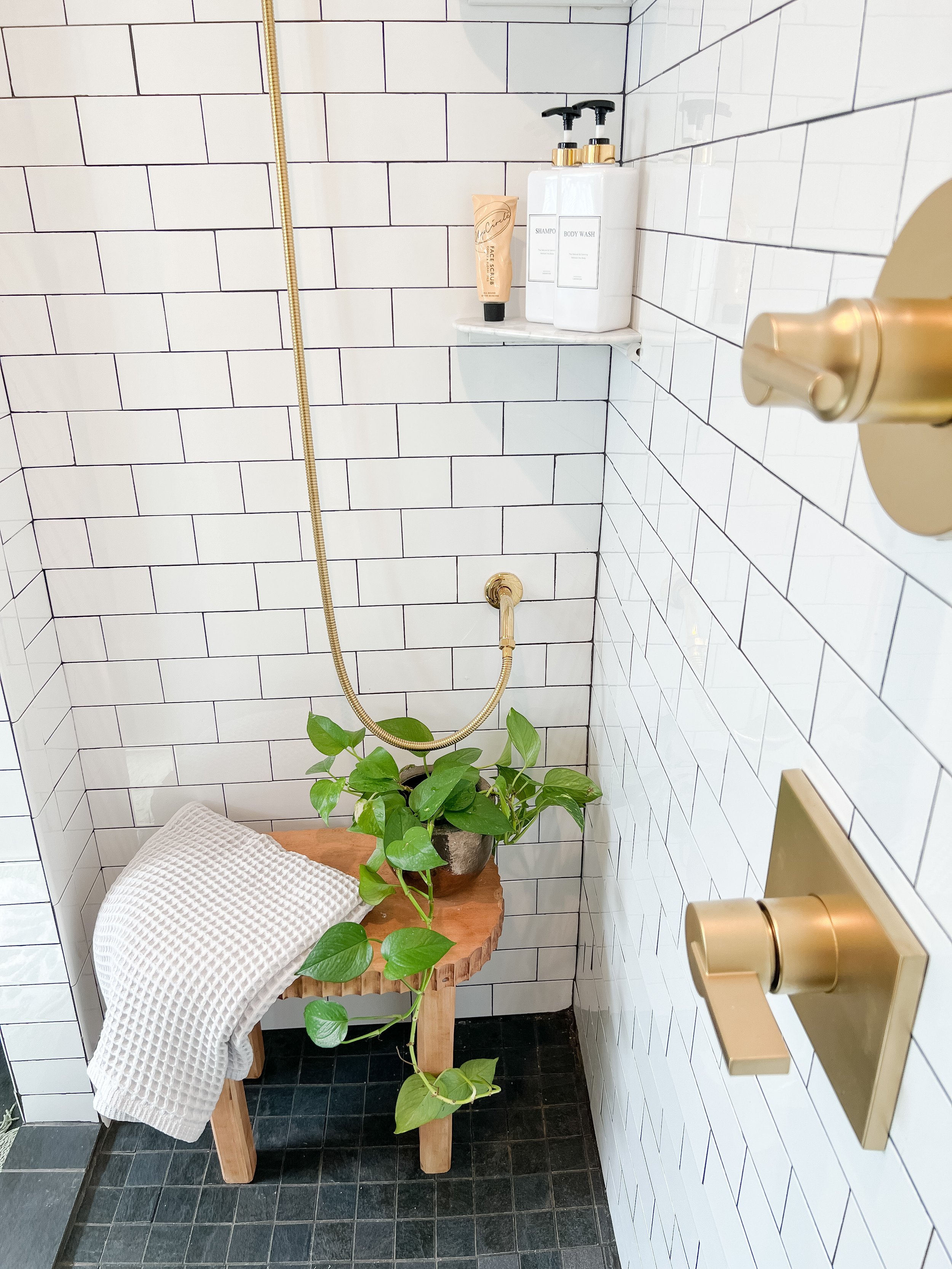
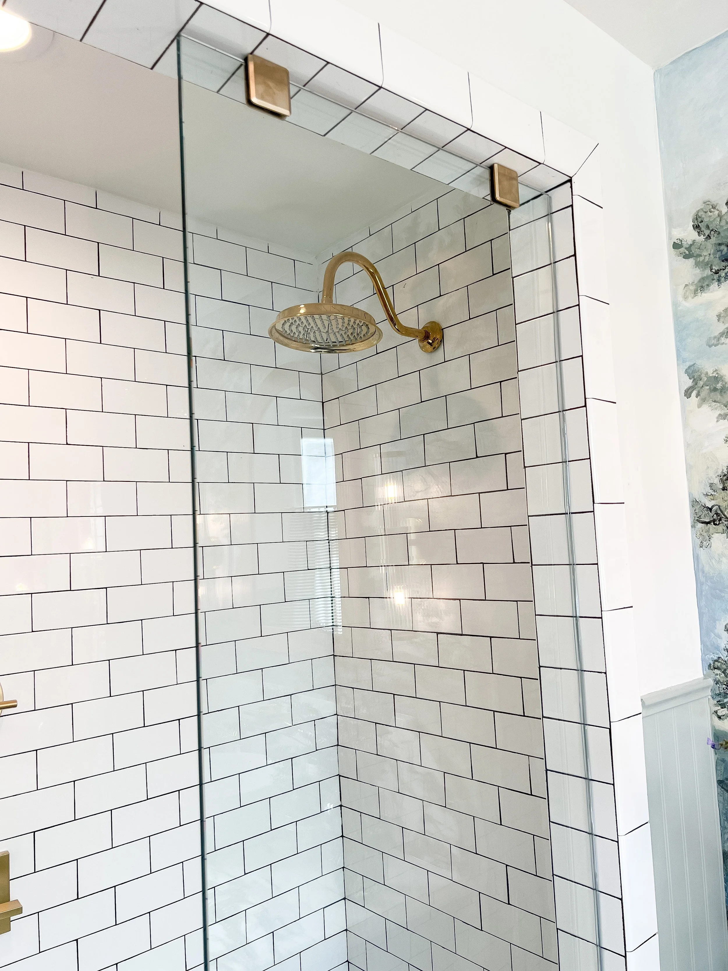
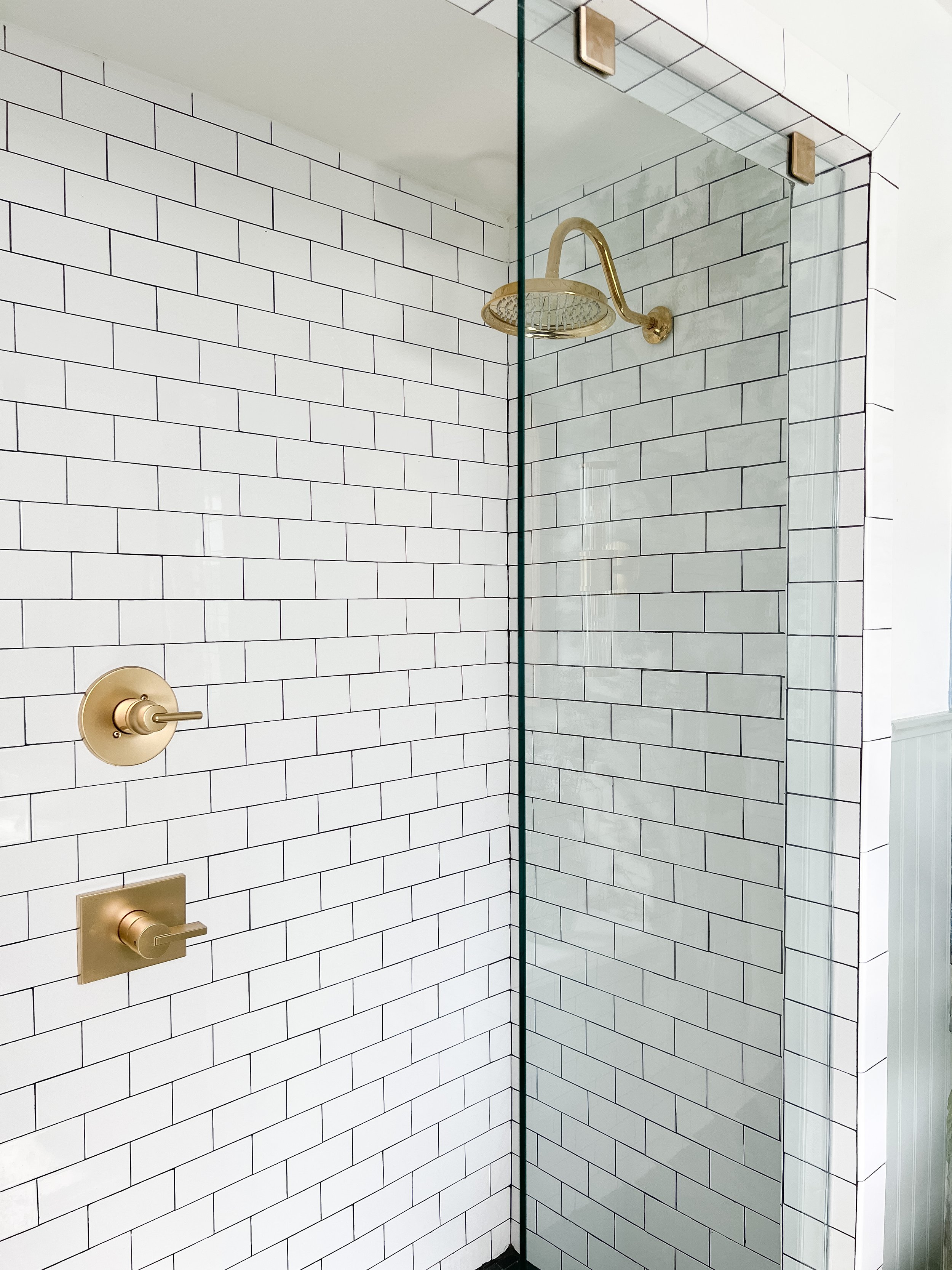
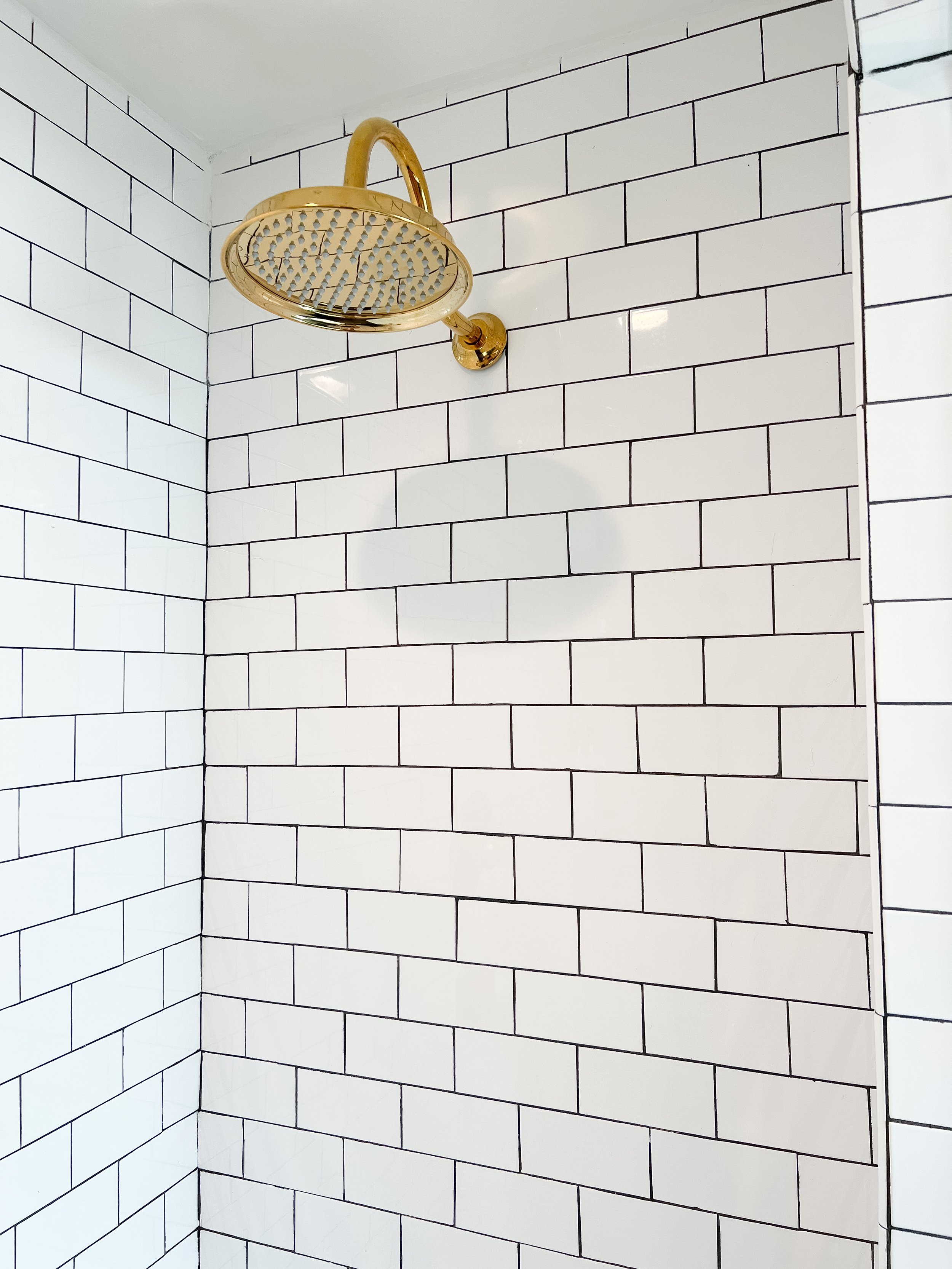
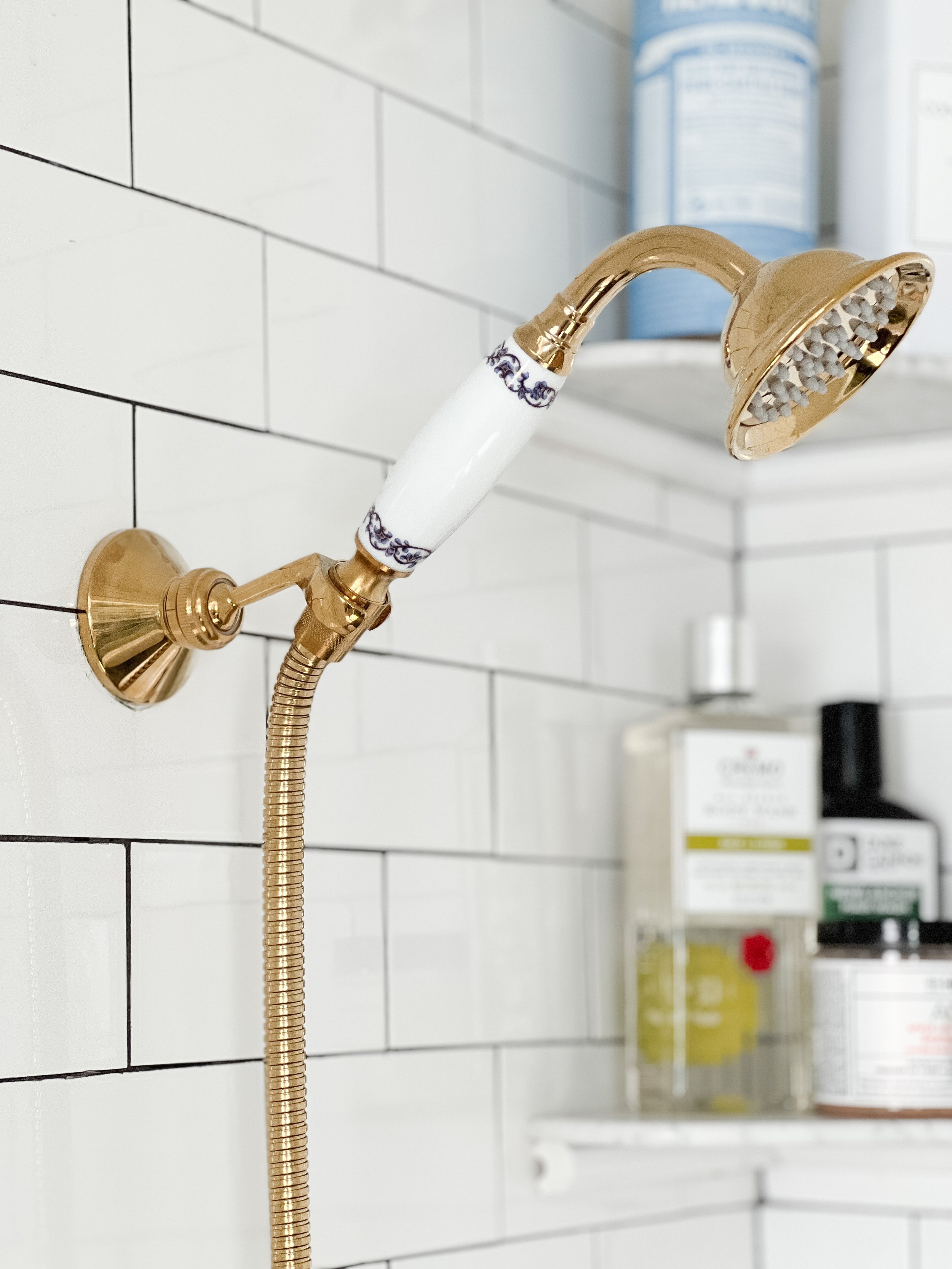
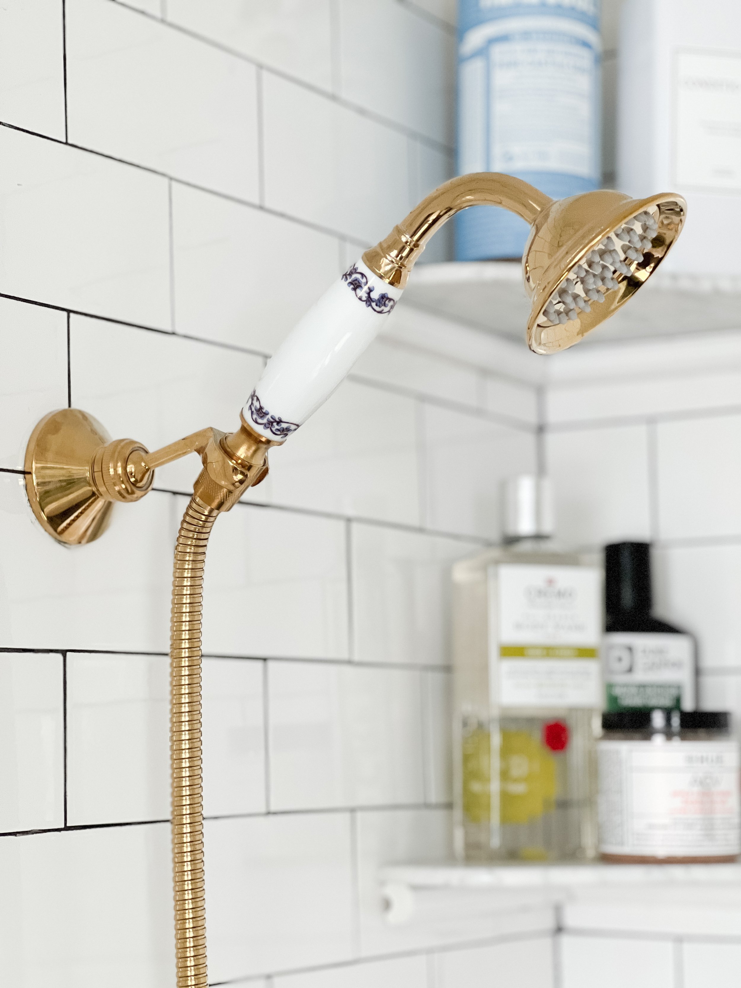
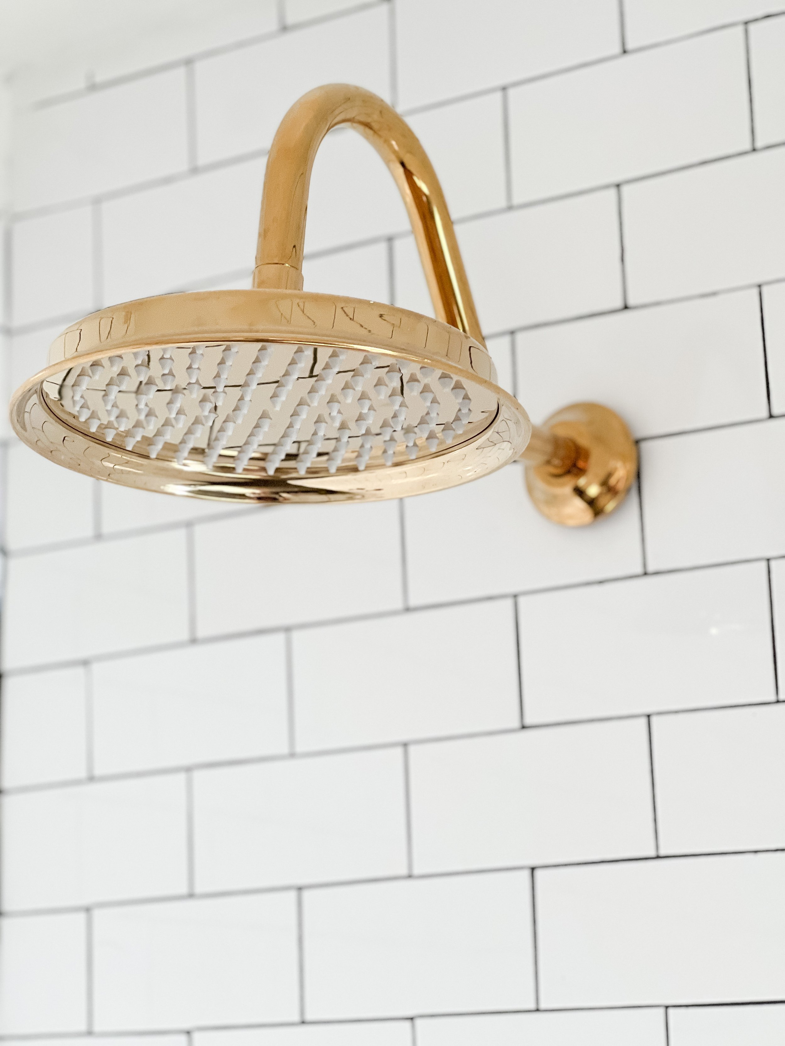
I also wanted to refresh the shower area a little bit too and give it some upgrades! Switching out the fixtures for polished brass made such a difference in here! Thanks to Wayfair for providing me with the plumbing fixtures for this project including my sink, faucet, and shower heads! I will link these below in case you want to shop them!

The glass panel also made SUCH a big difference in elevating this space. Thank you to Glass Doctor of Lexington for making it happen, they were wonderful to work with! I have been wanting glass here since we first renovated, but it was just never in the budget. Since this is an odd size opening, I had been rigging up the most random combinations of curtains/shower urtain liners to make it work in the meantime! If I had known how reasonable and easy Glass Doctor was going to make it, I would have done this years ago!
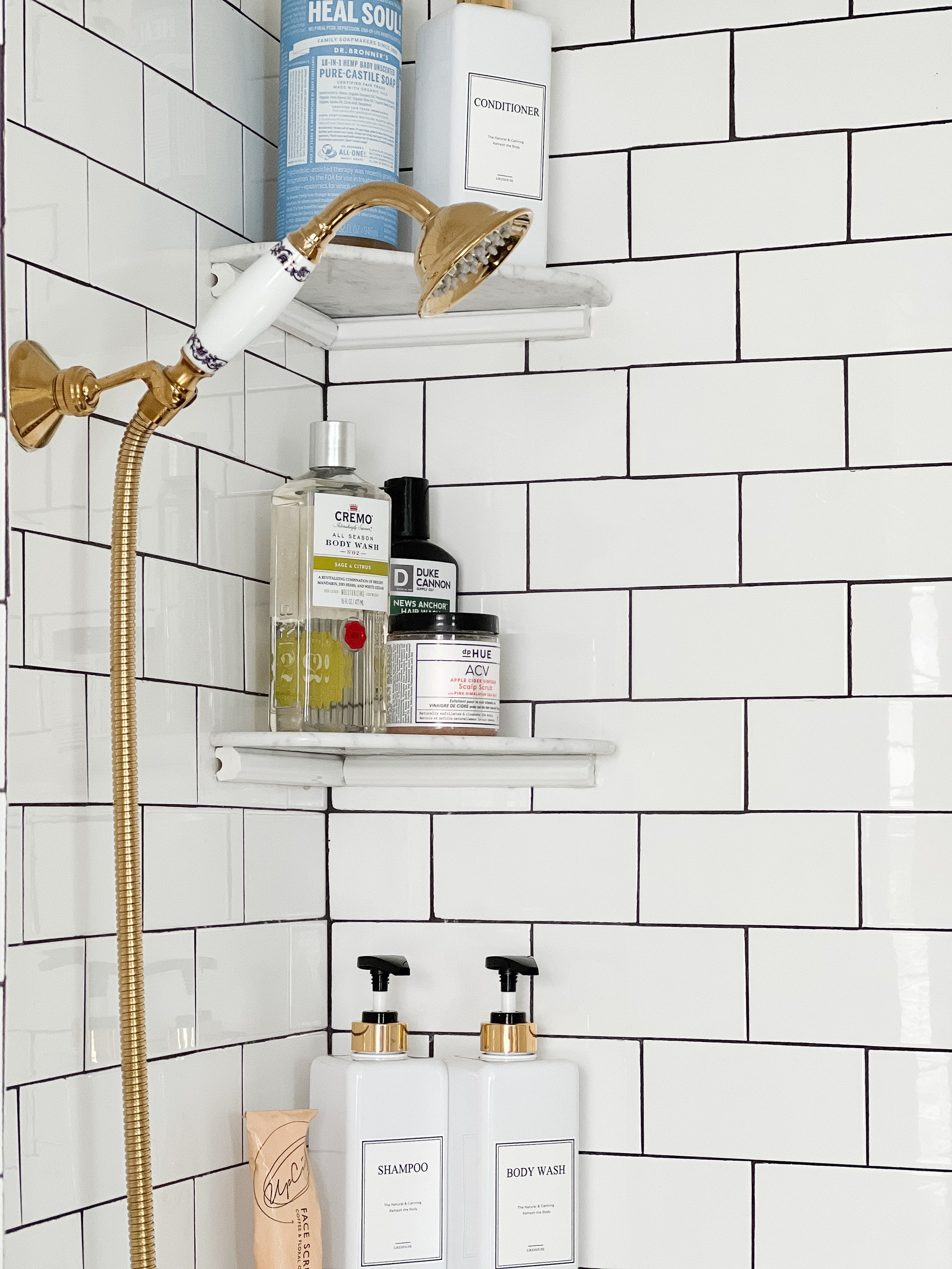
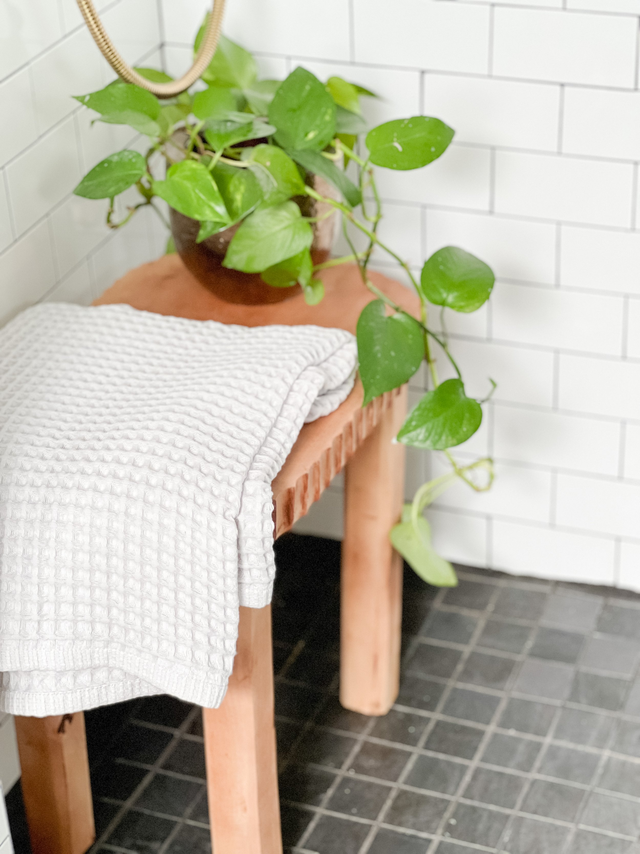
I also added a little bench in here which I love! We’ve always had plenty of room for one and I was able to snag this one at Homegoods and it fit perfectly! We upgraded our wire shelving with some floating marble shelves too- more on those below!

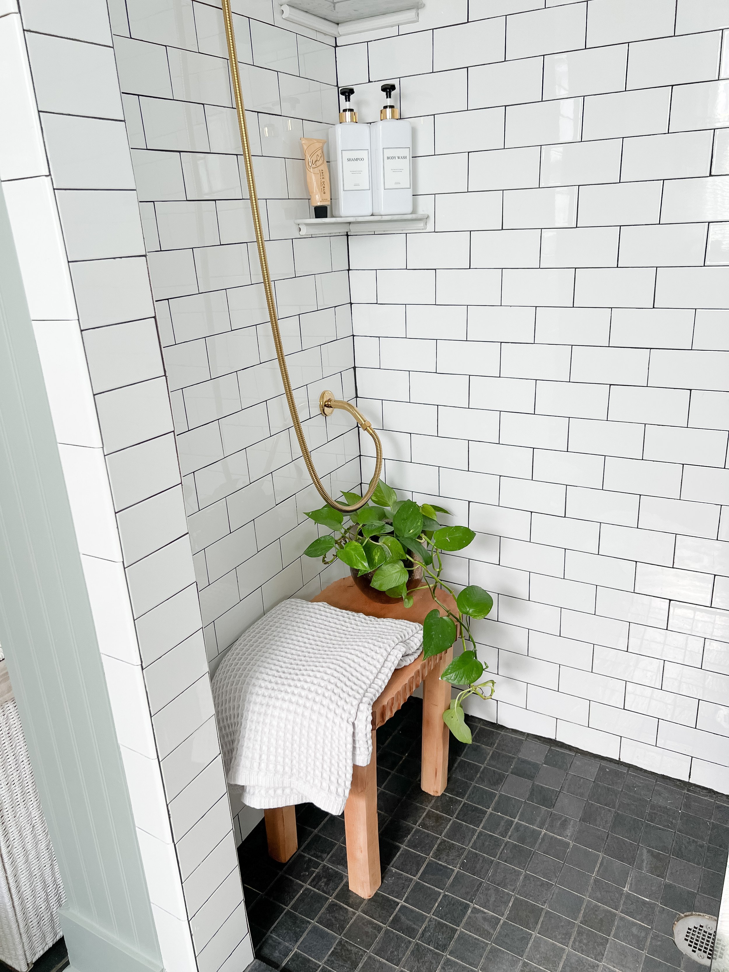
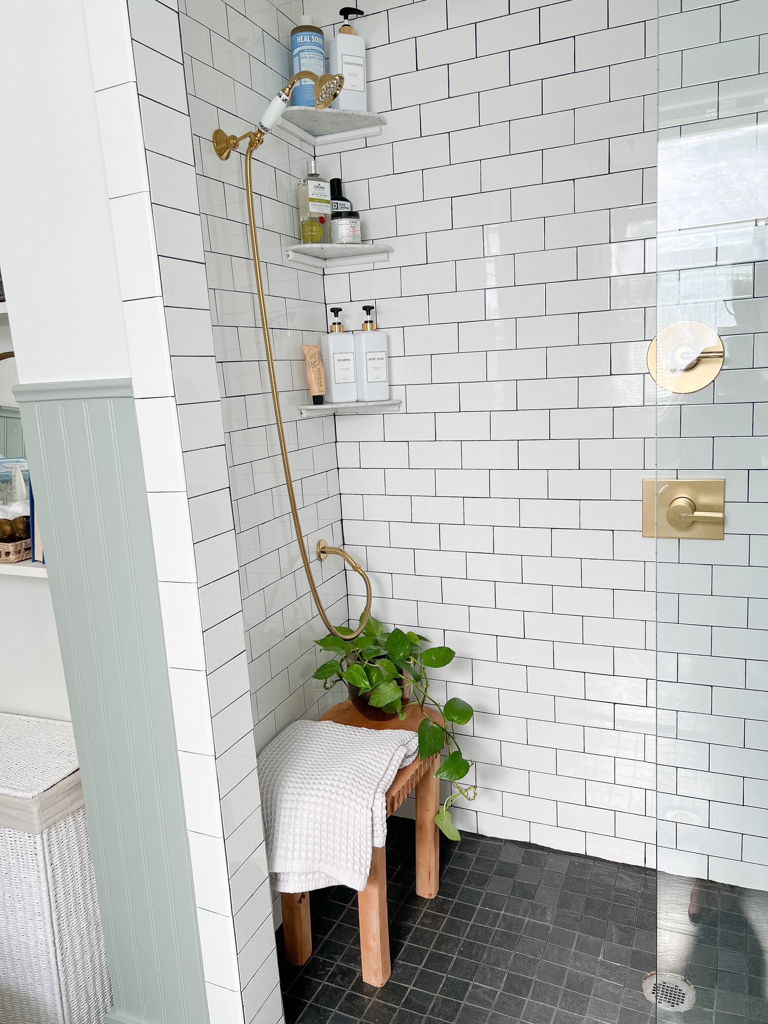
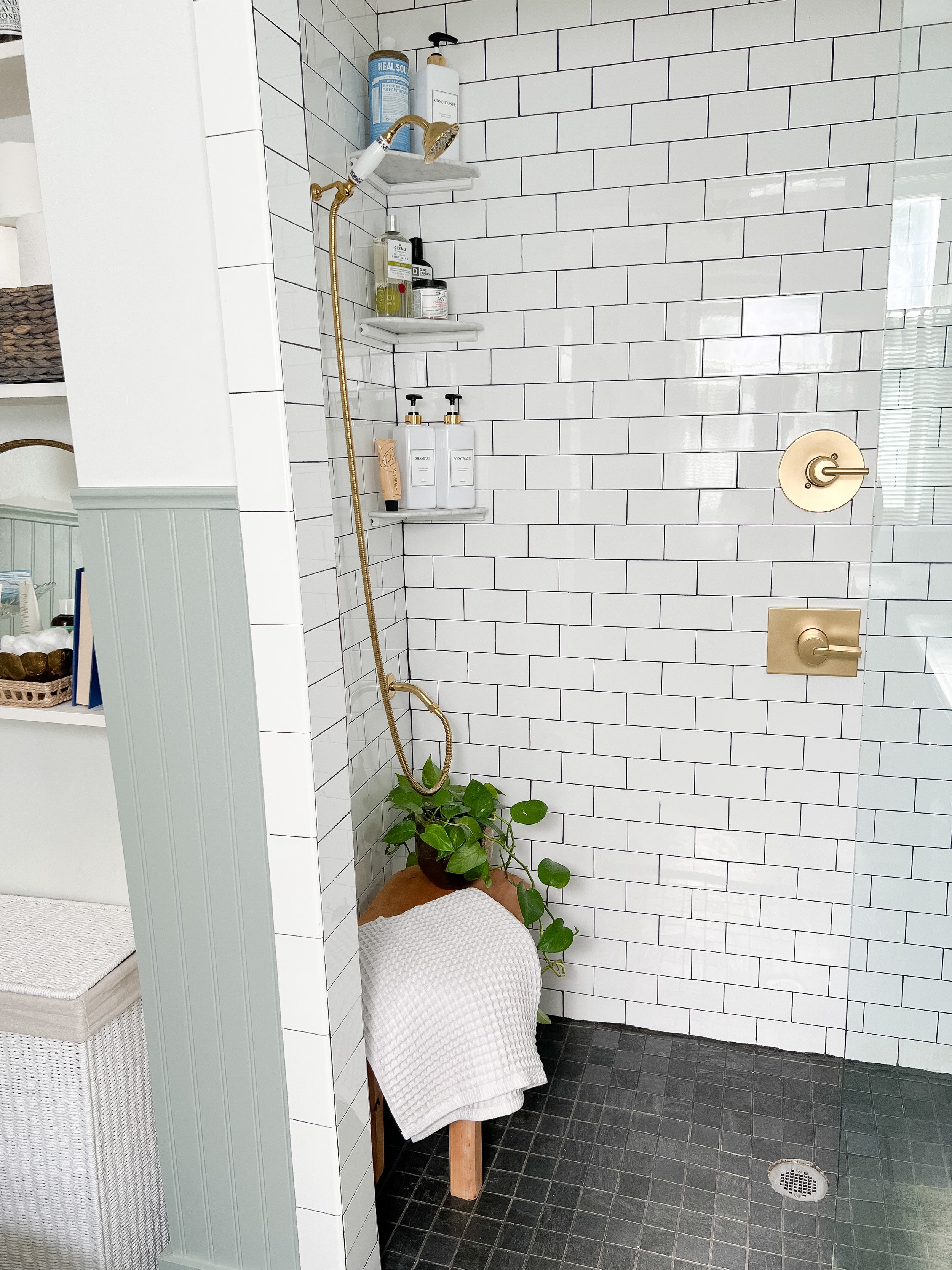
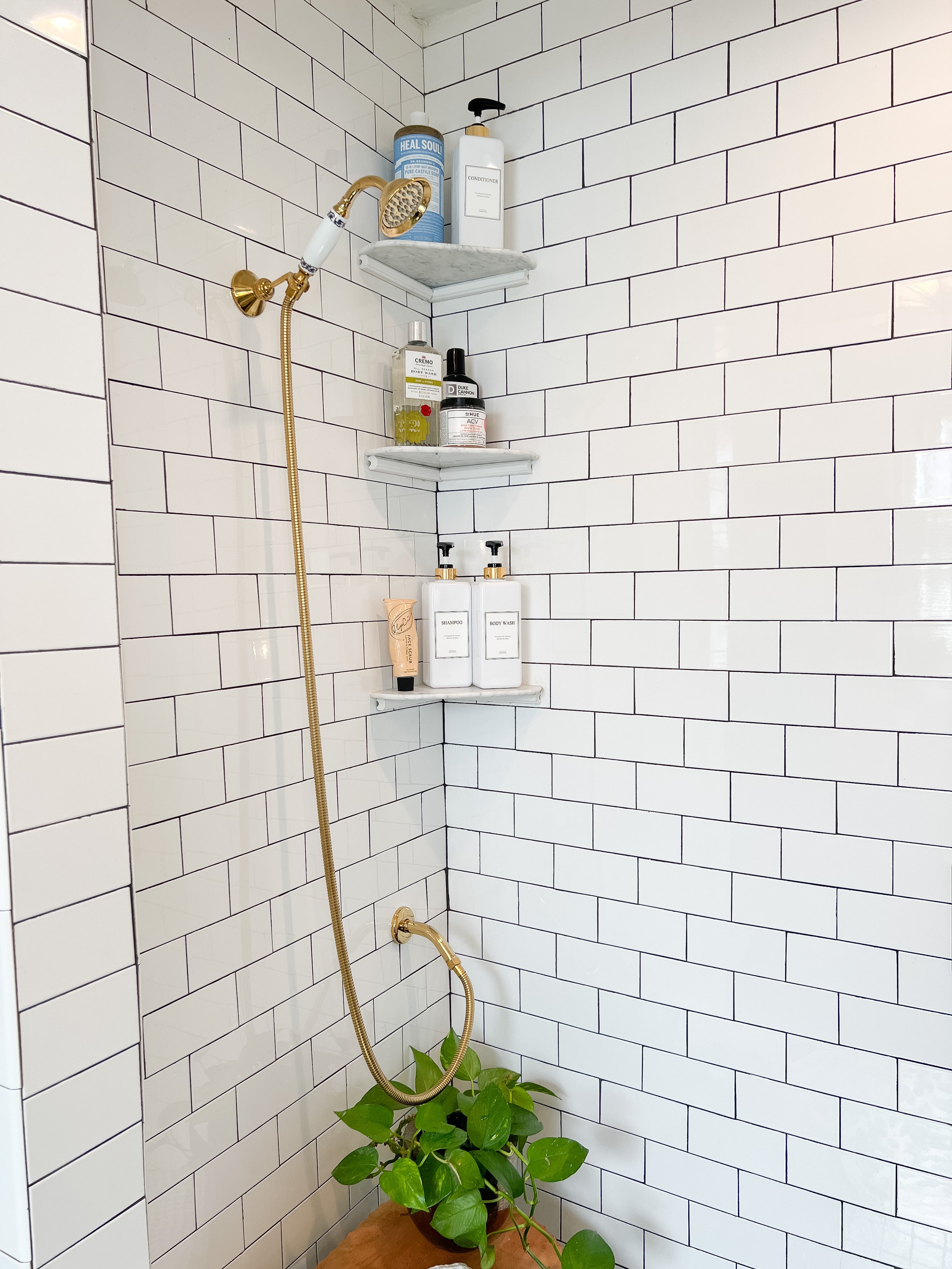
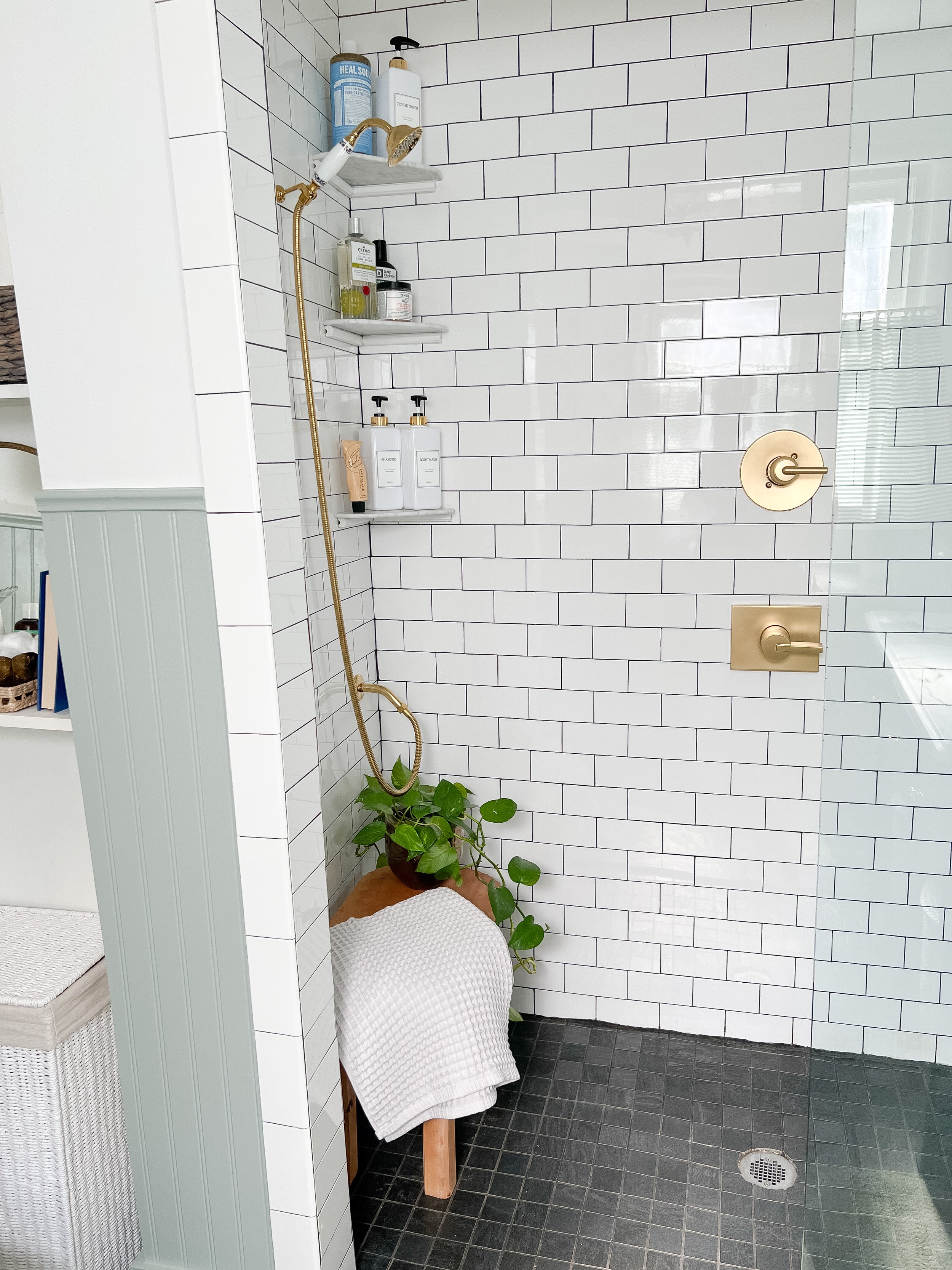

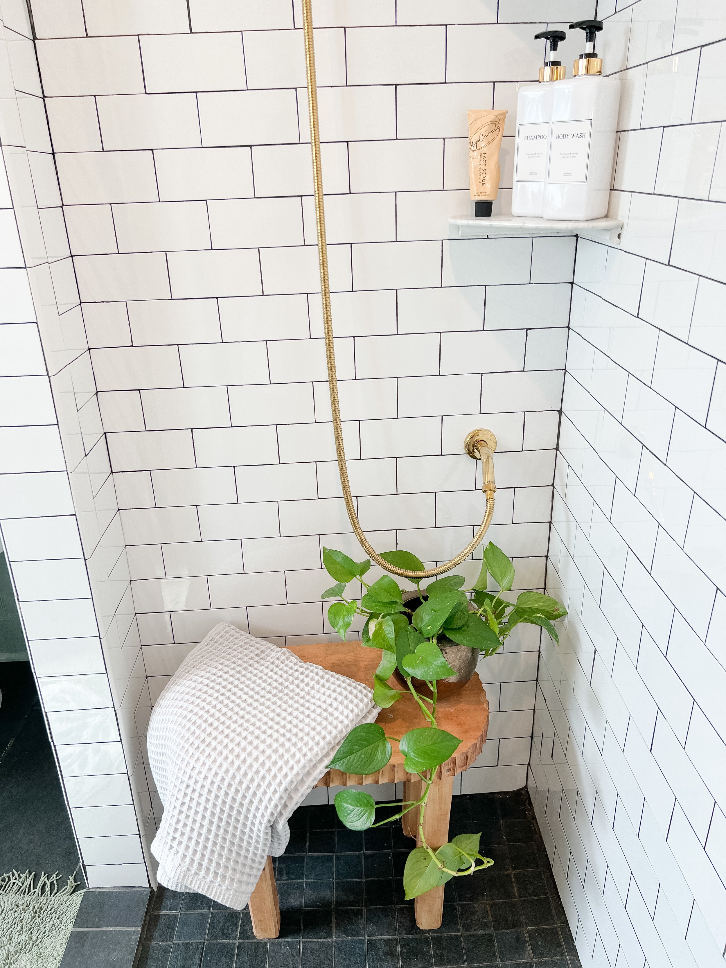
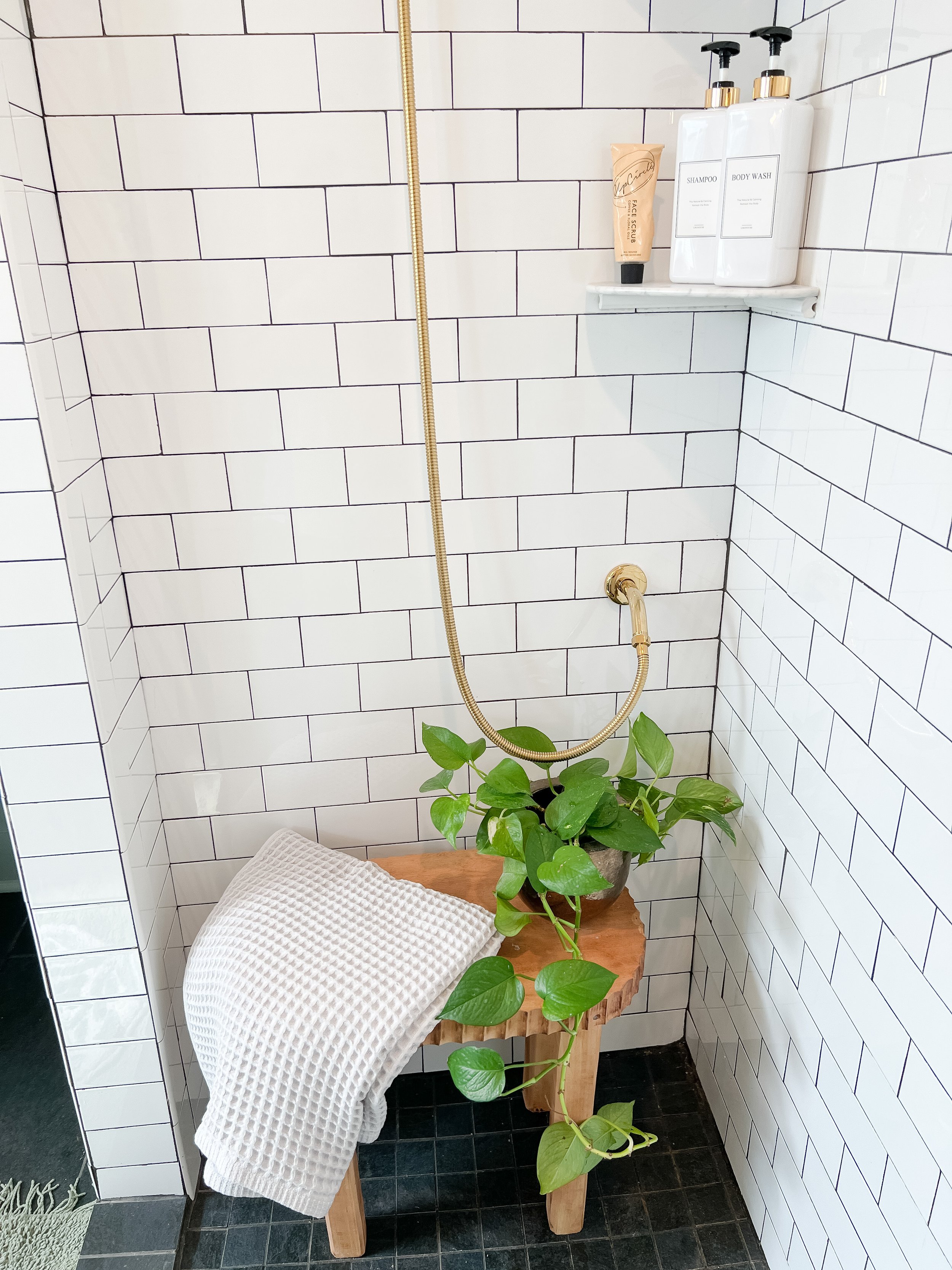
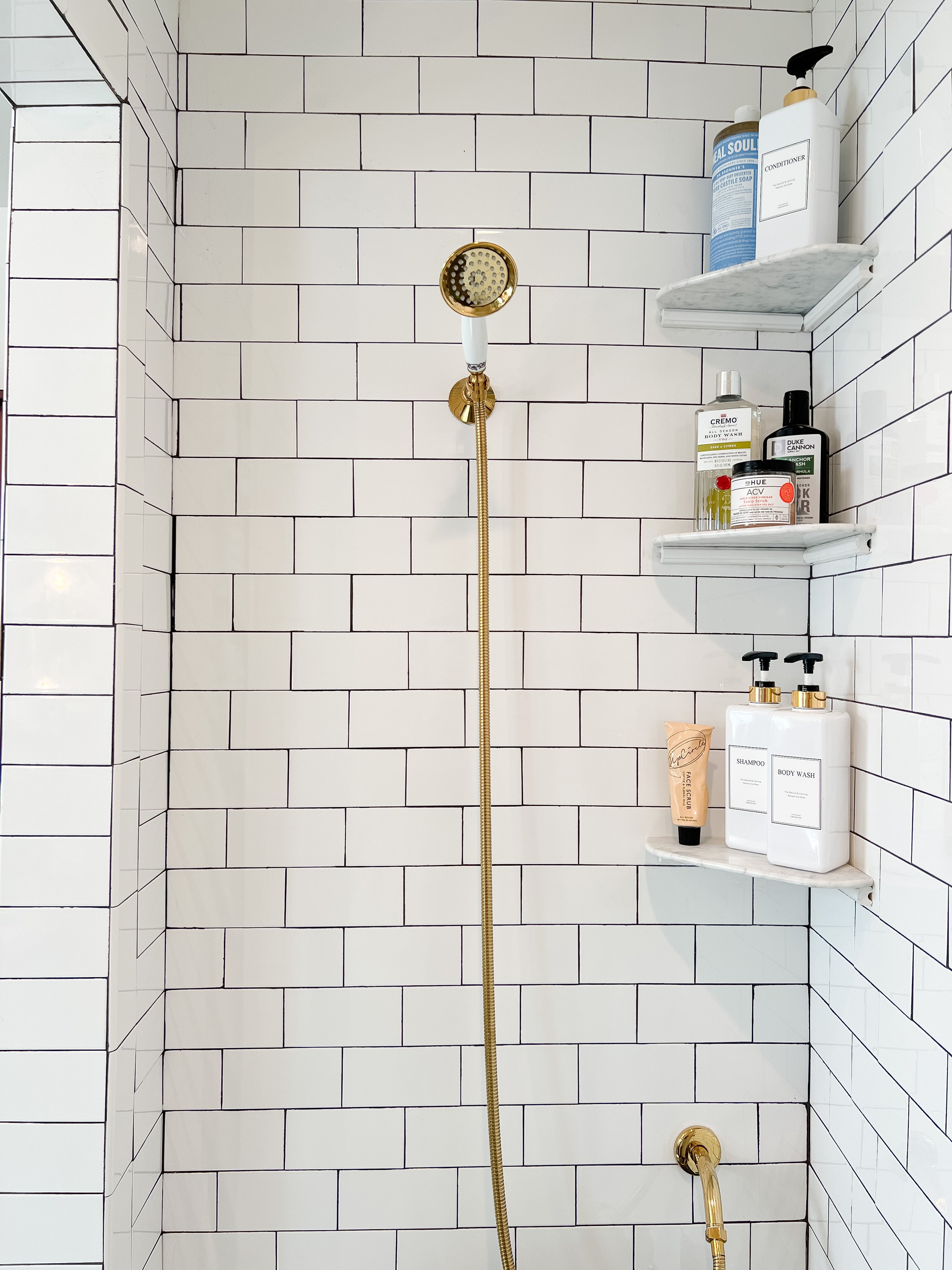
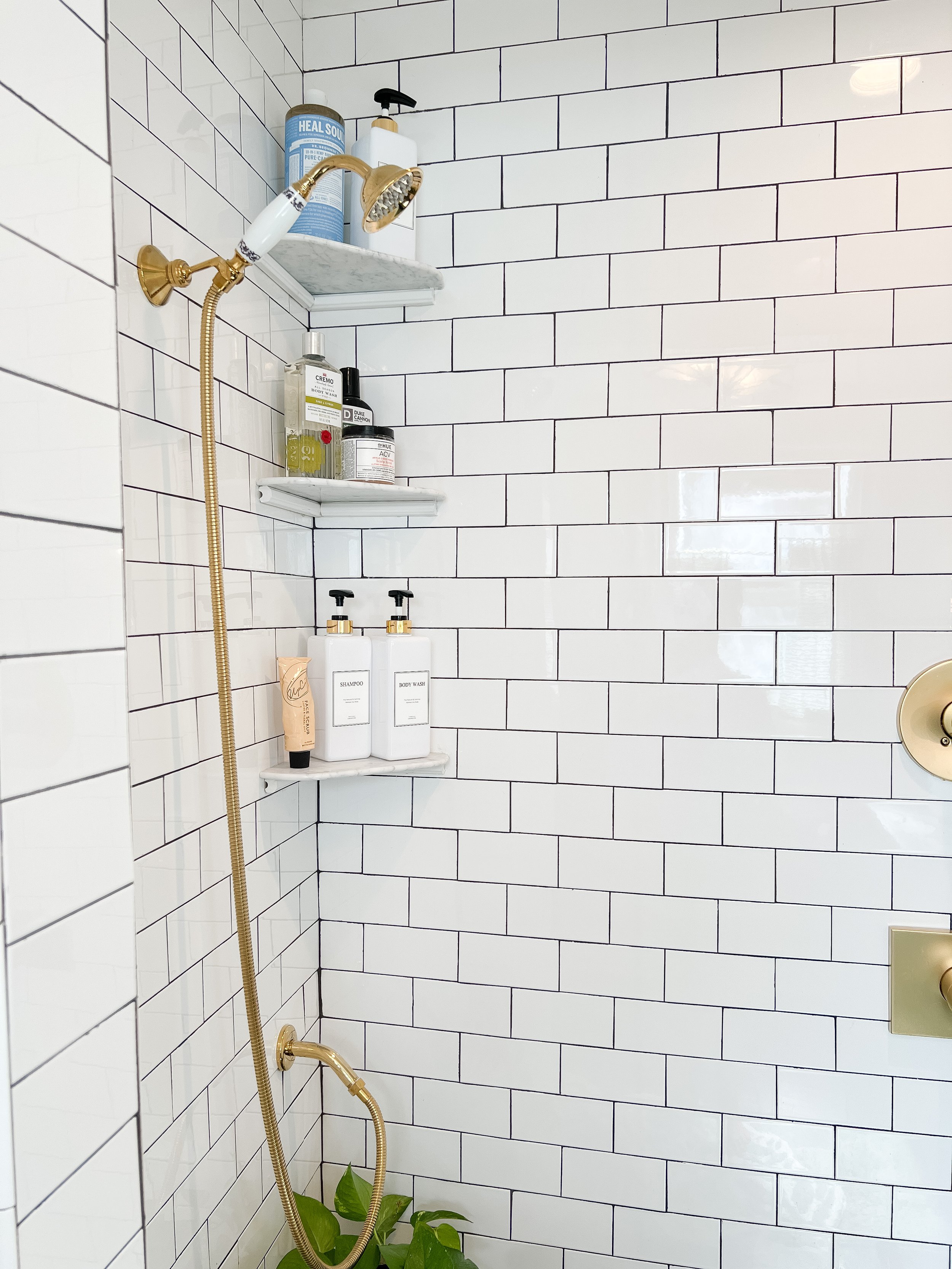
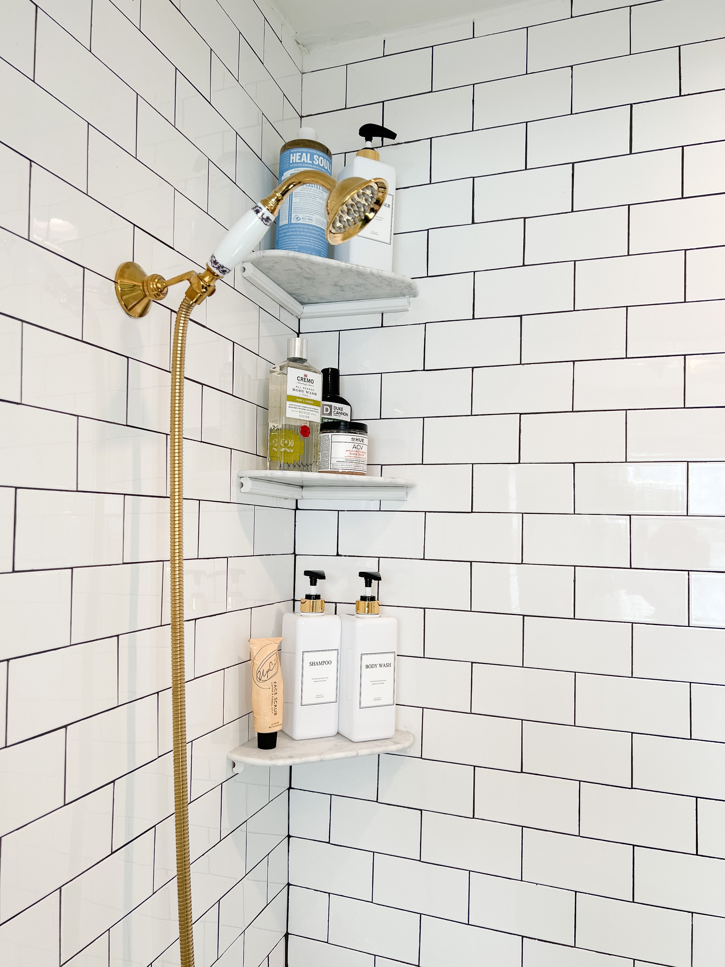
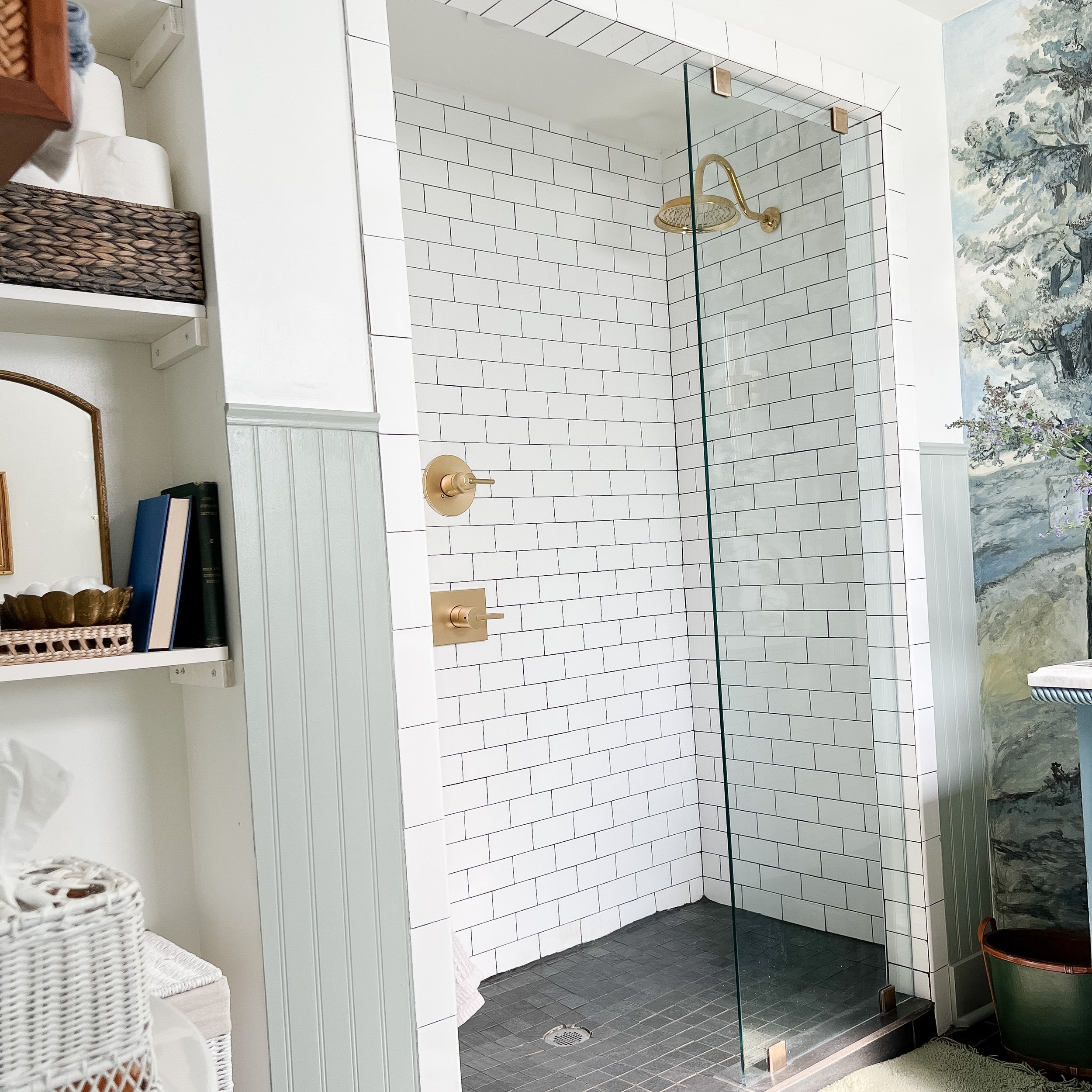

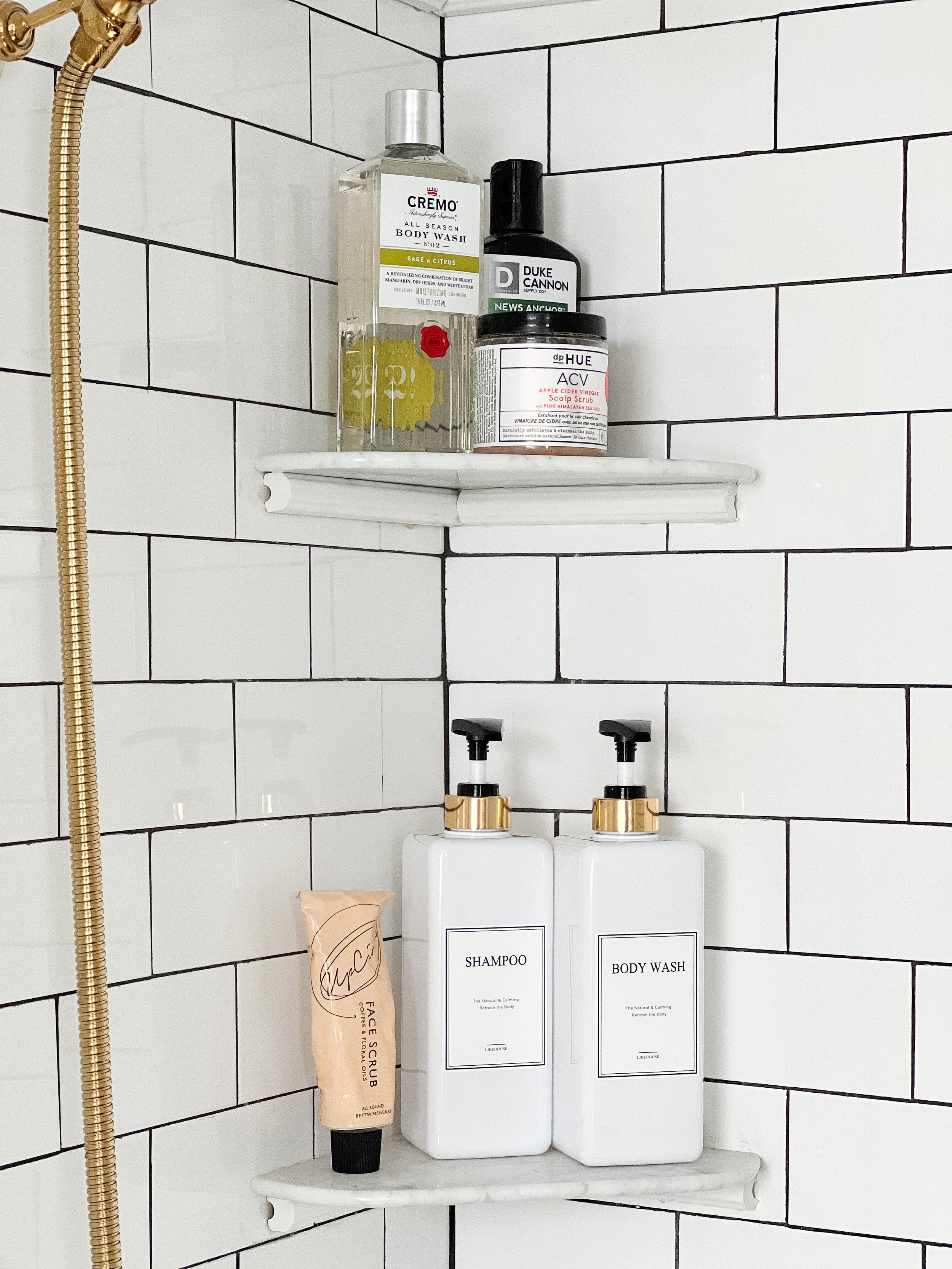
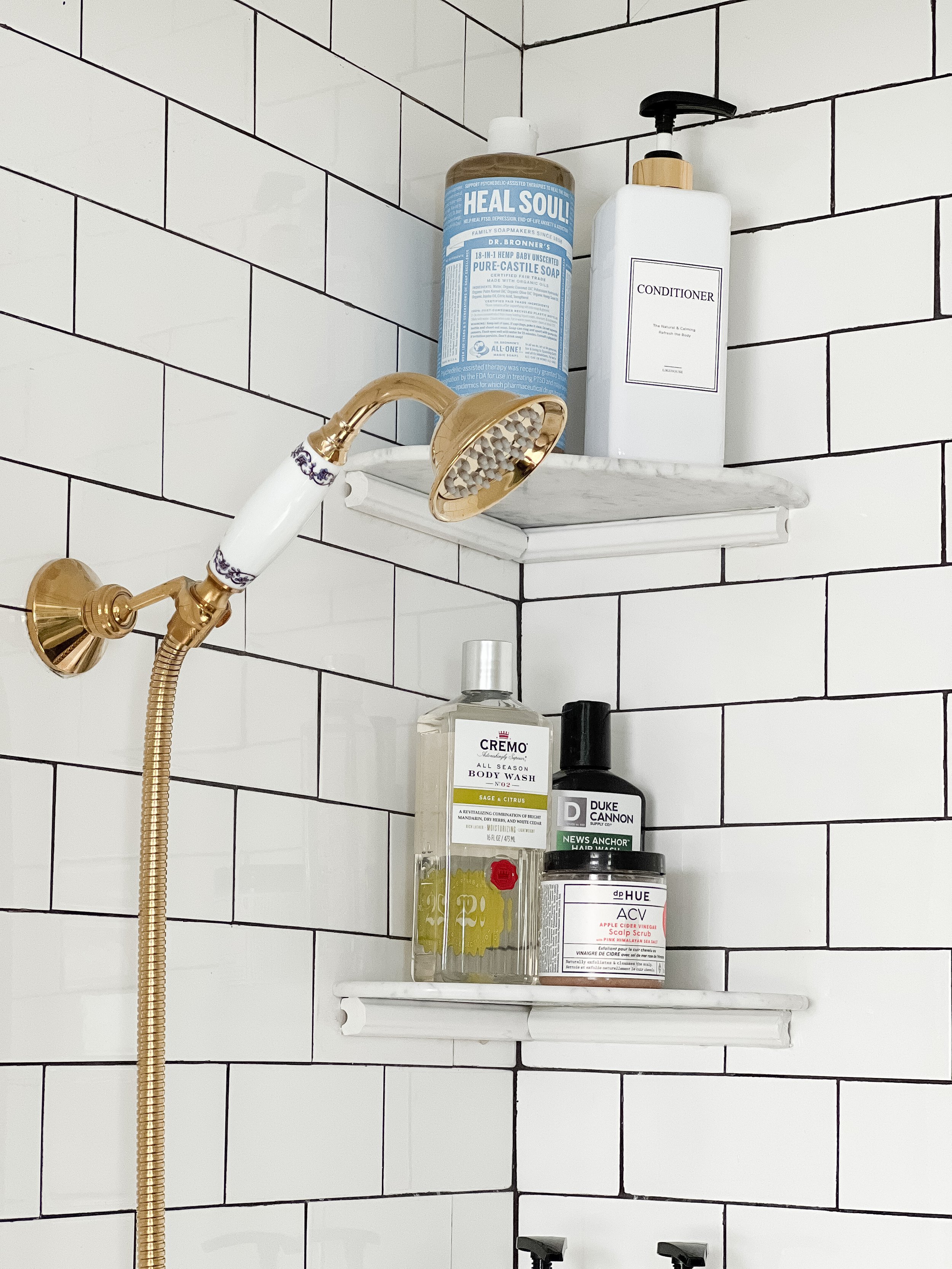
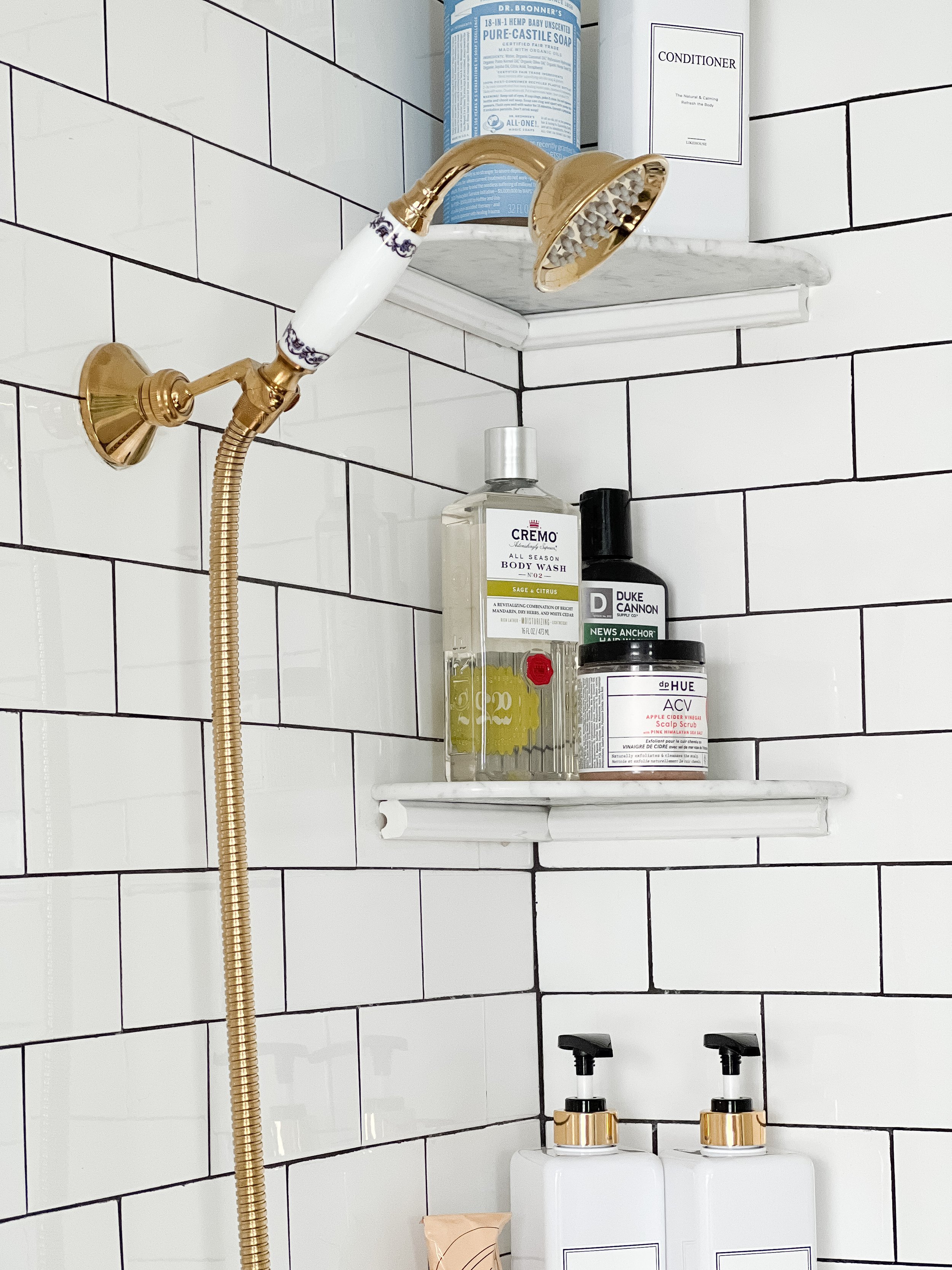
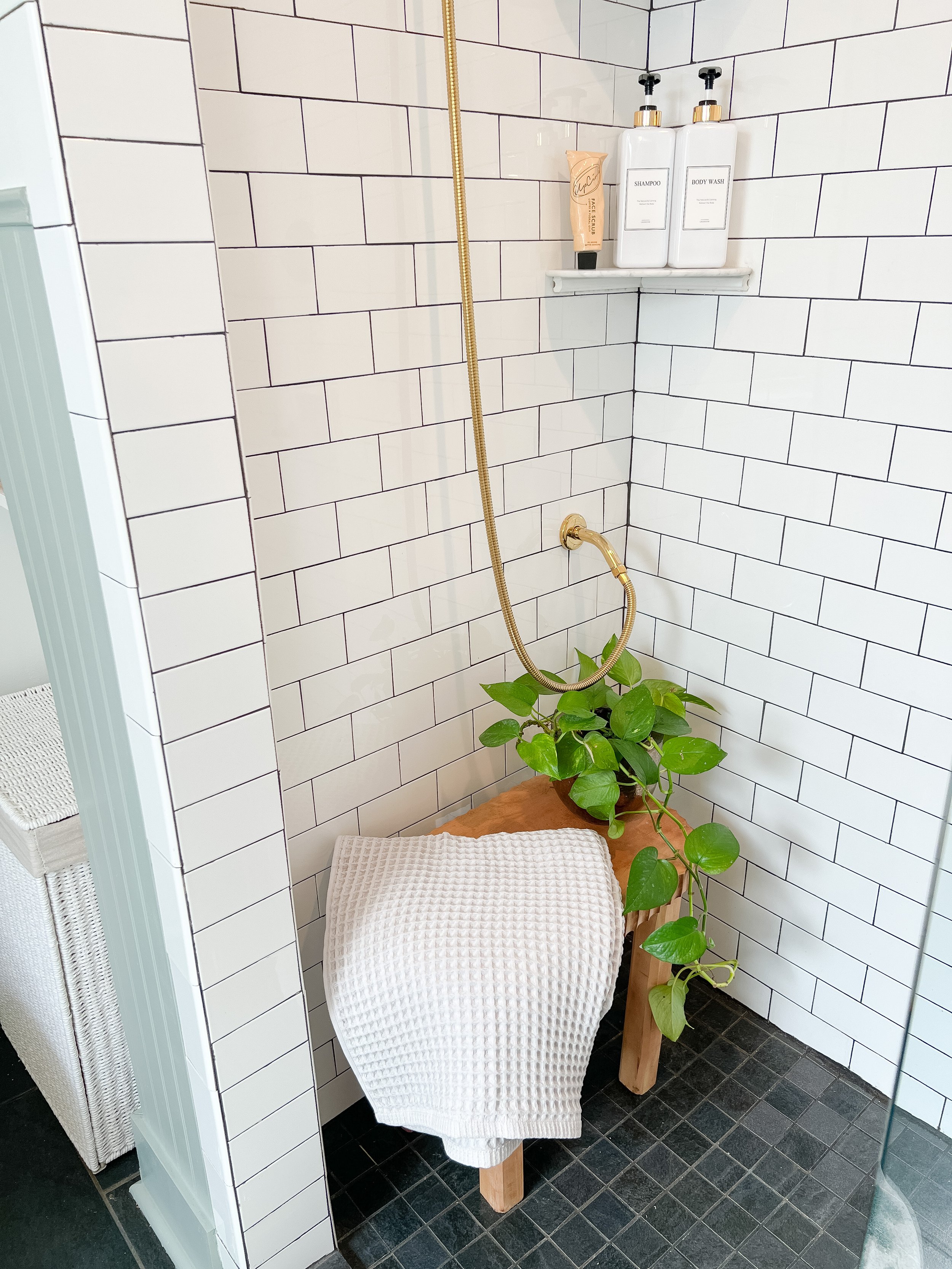


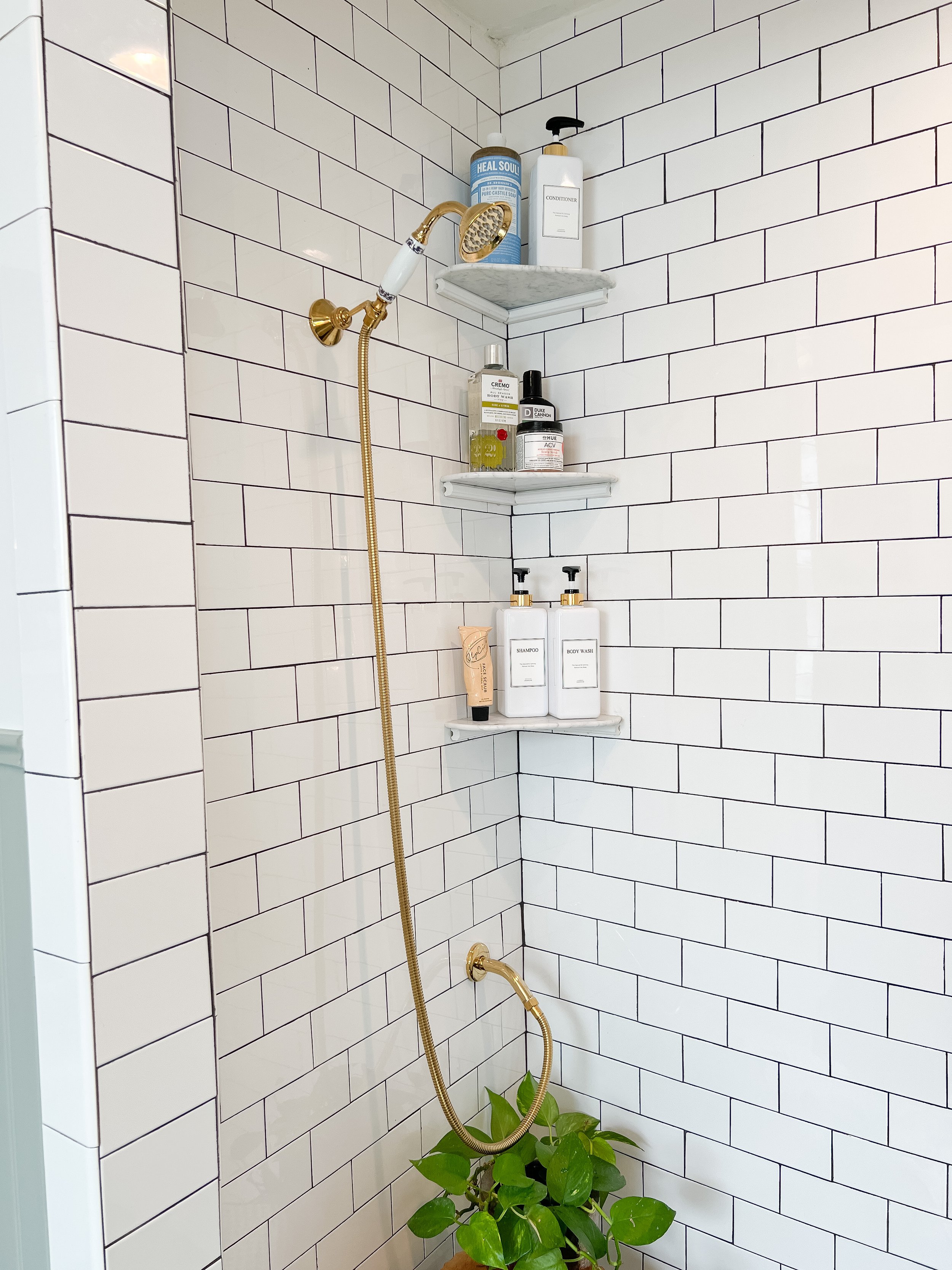

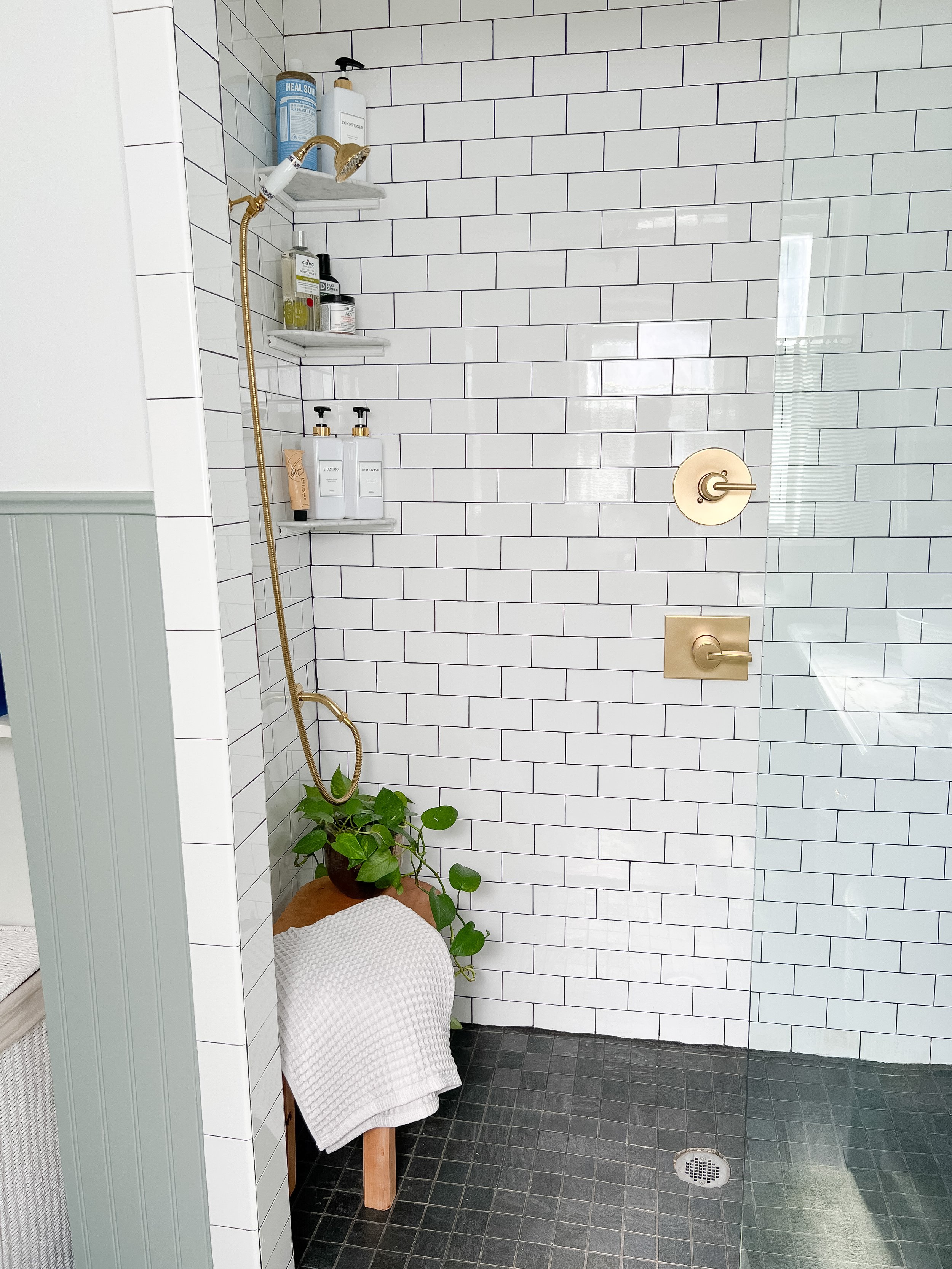
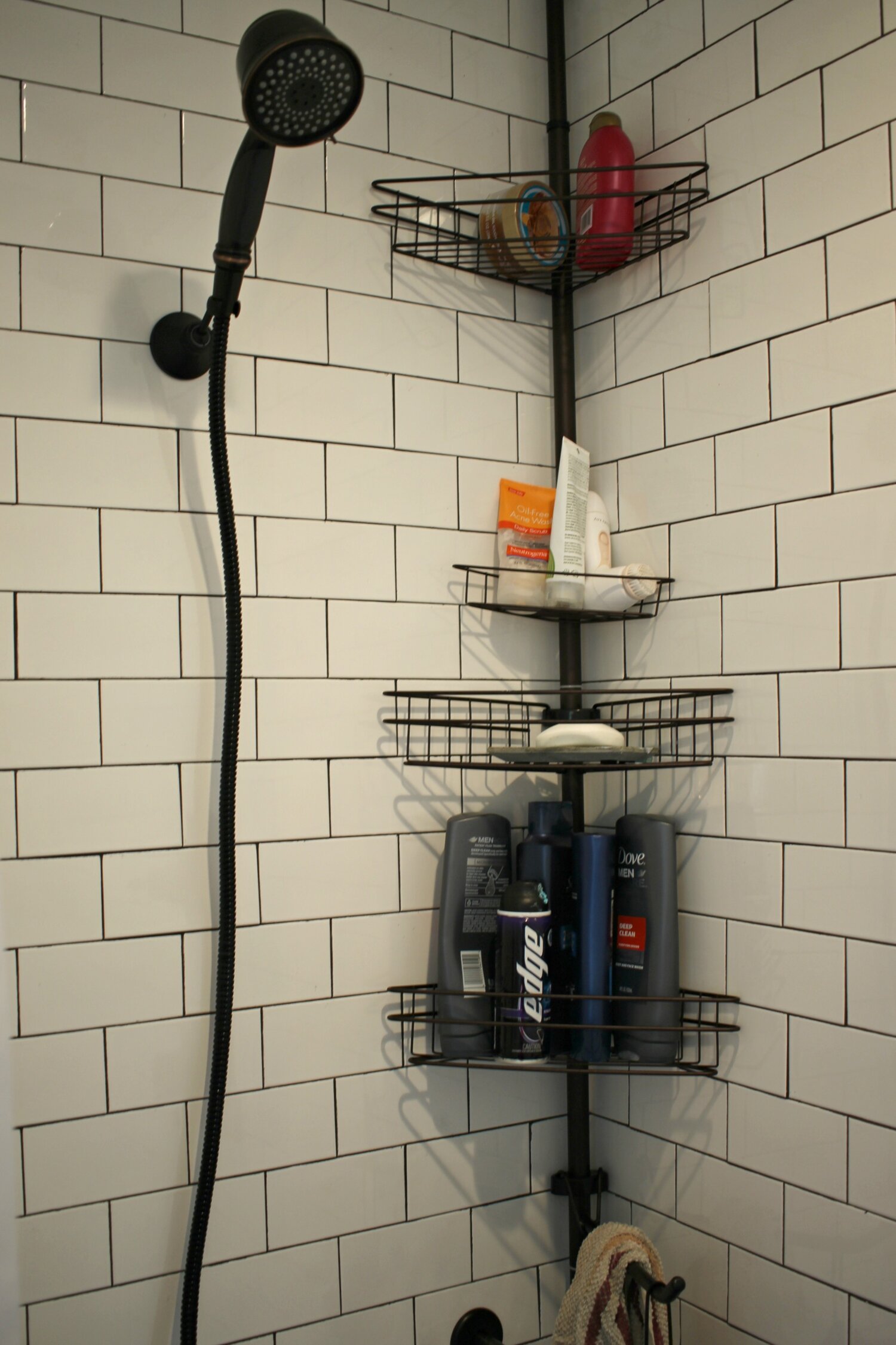
I could not stand that wire tension rod shower shelf any longer! When we first renovated this bathroom, I opted for no shower niches, as I really didn’t like the look of them. I still don’t, but now there are a lot more options to make them more attractive these days (at that time, they were all mosaic contrasting tile and very loud!).
I thought some kind of floating marble shelves would look perfect in here, but we had to figure out how to make them work on top of our existing tile. I had researched a lot and decided I did not want to try to cut into or disturb the existing tile, as that seemed like it would likely snowball into a disaster or another project. I found these floating marble shelves on Amazon that were exactly what I was looking for!
Next I checked out Youtube for tutorials and found this one which showed how to hang shower shelves without cutting into existing tile. He used epoxy to attach them to the tile and some brackets/tape to hold them up while they dried. We followed this process pretty much exactly except our walls were not flush (or course), so we had to improvise a little. We needed a little more support underneath since one side of our shelf wasn’t touching the wall fully so it wouldn’t have a strong enough bond. We went to Lowe’s and found some white tile edging pieces and though those would be perfect to place underneath kind of like support brackets. Alex used our Dremel to cut them to the size we needed (we got a tile saw attachement for it and it worked perfectly!). We then attached the tile pieces to the wall first with the same Gorilla Glue Epoxy he used in the video, making sure they were level. We let those cure and then added the marble shelves on top, also epoxying the edges of those too so it was extra secure! After we caulked around all the edges and scraped any extra epoxy off with a razor blade!
I am shocked at how strong that epoxy is and how it can hold these up completely! I am so glad I found this video and we were able to add these without damaging or touching our existing tile!
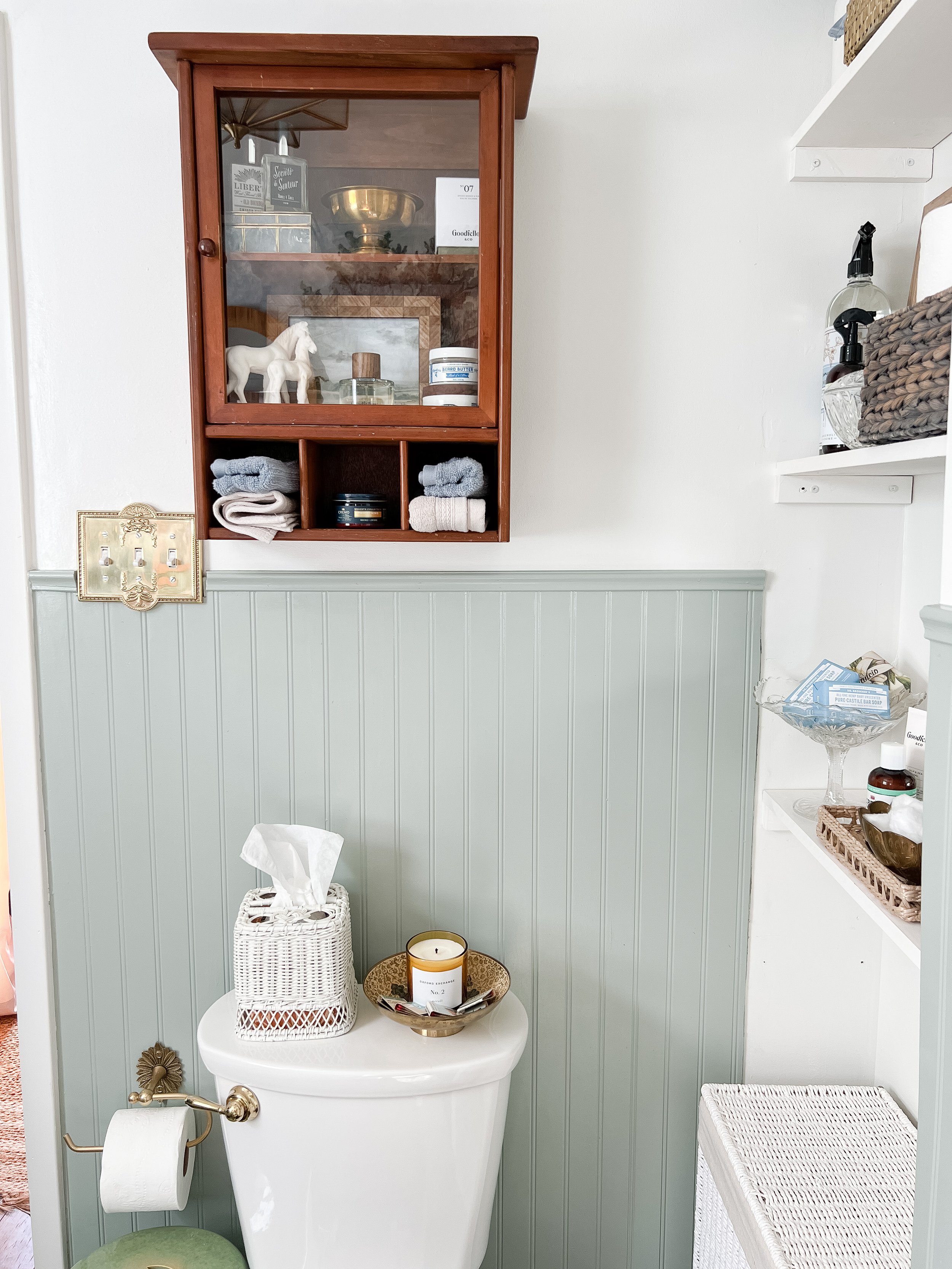
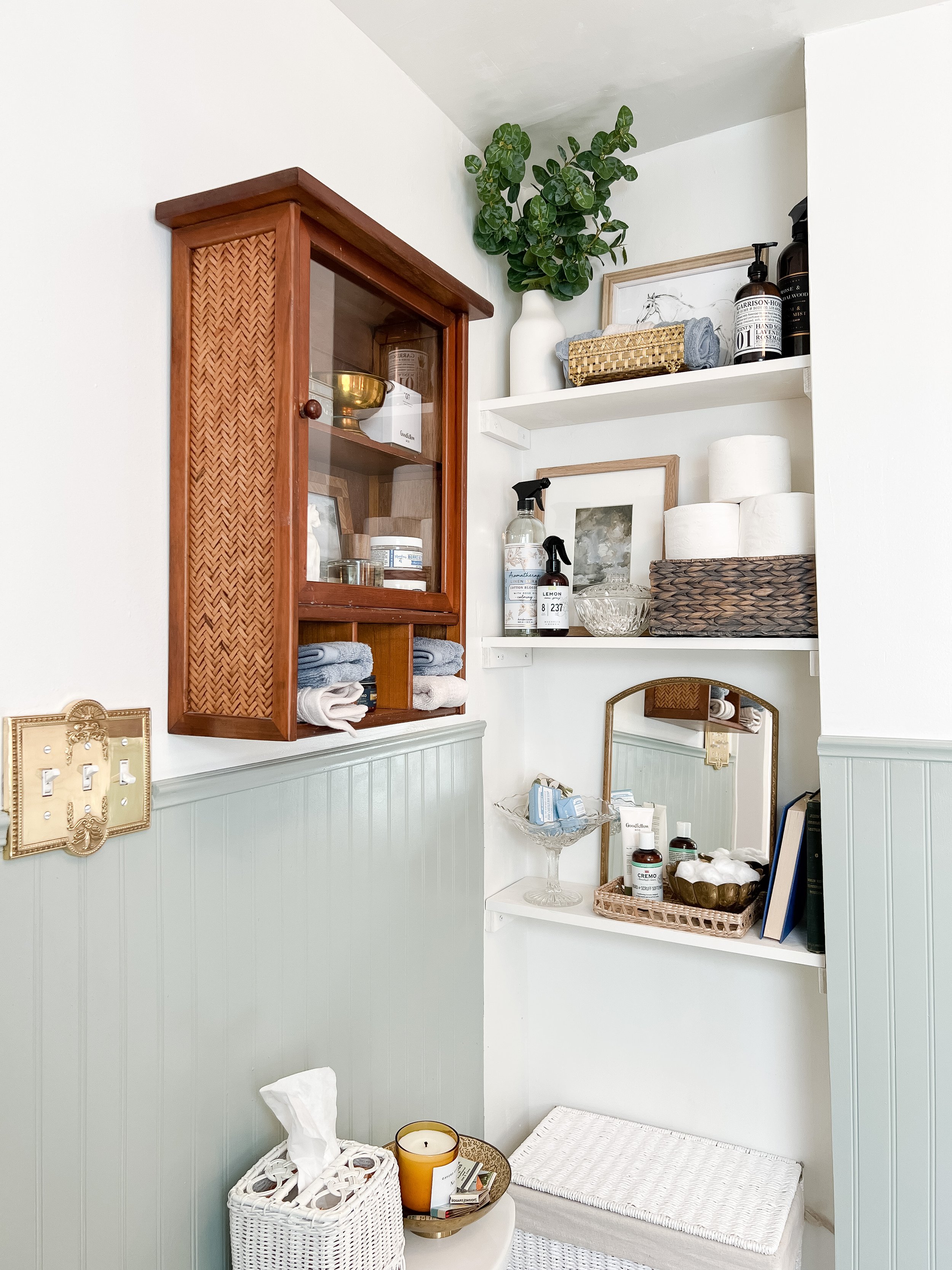

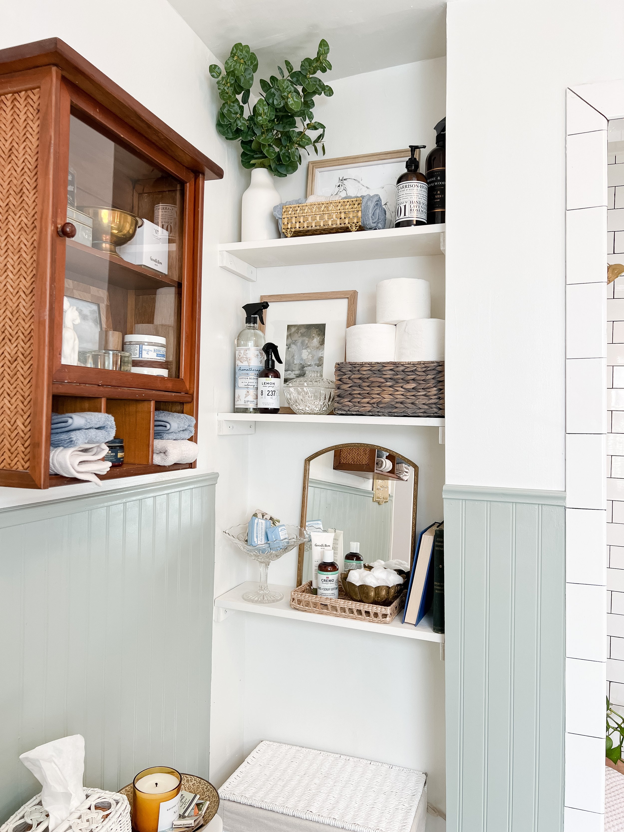
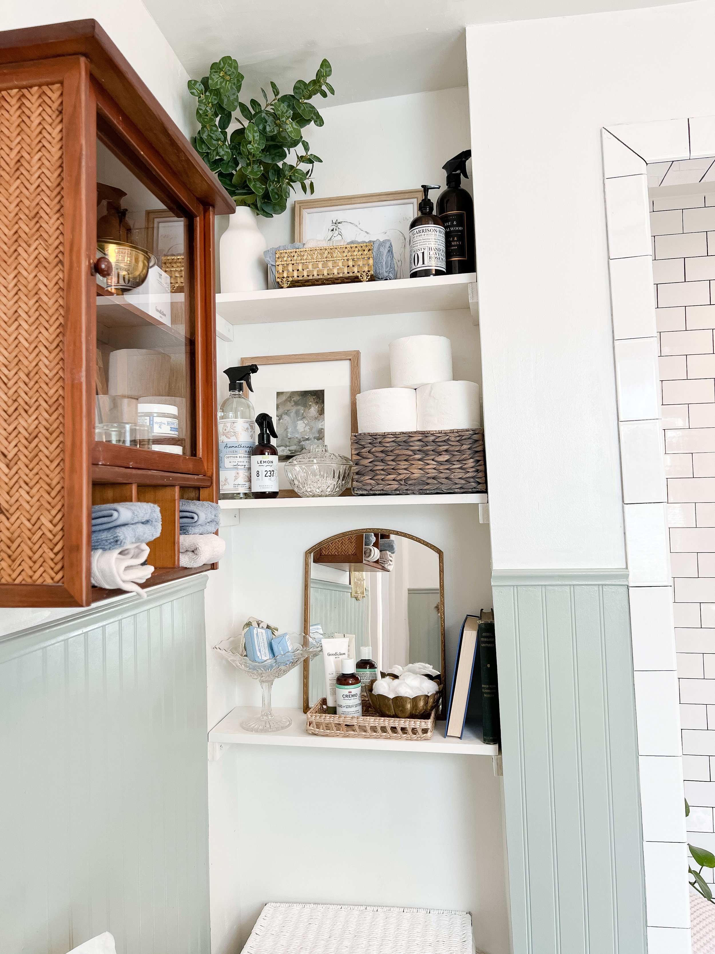
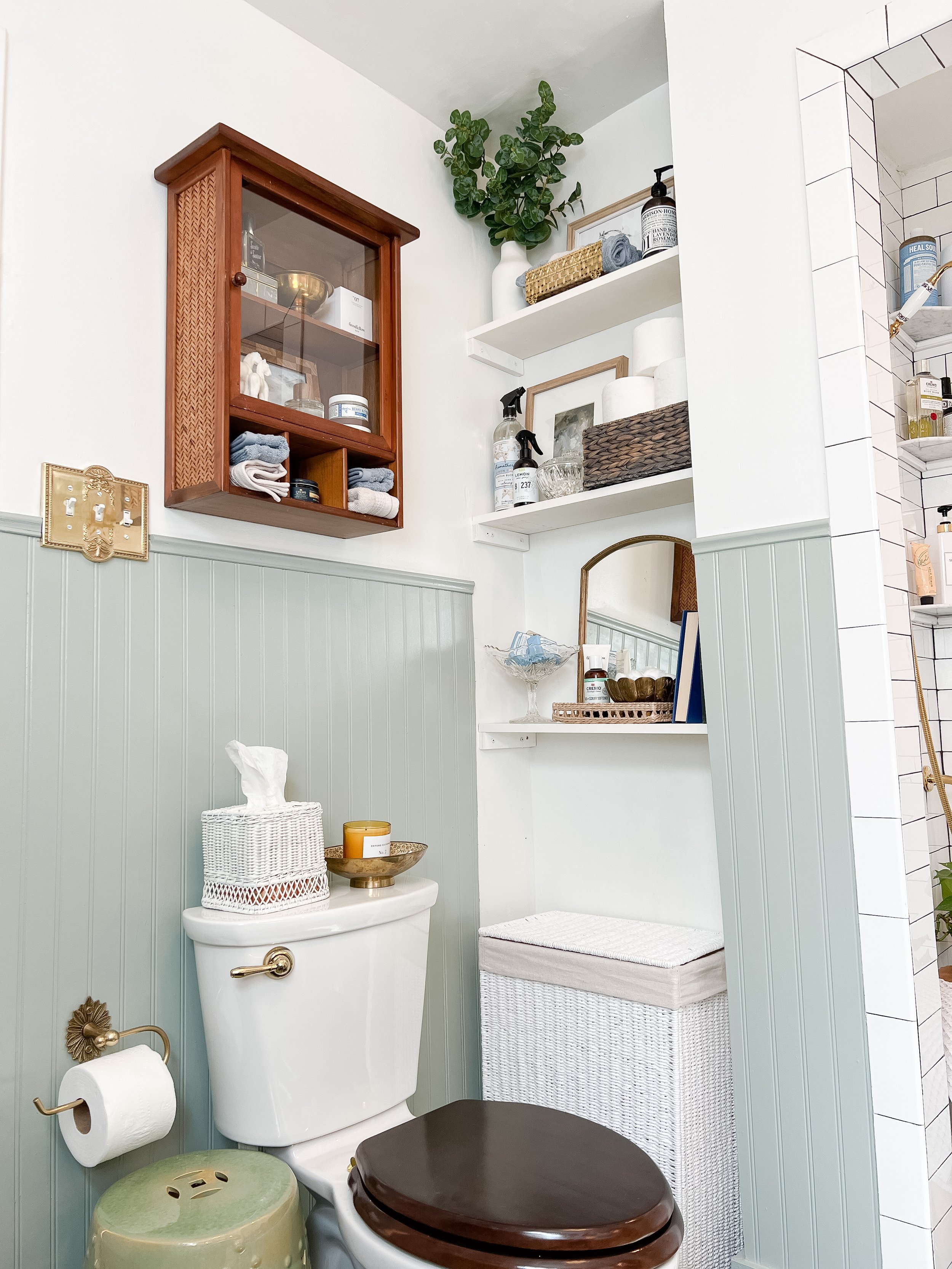
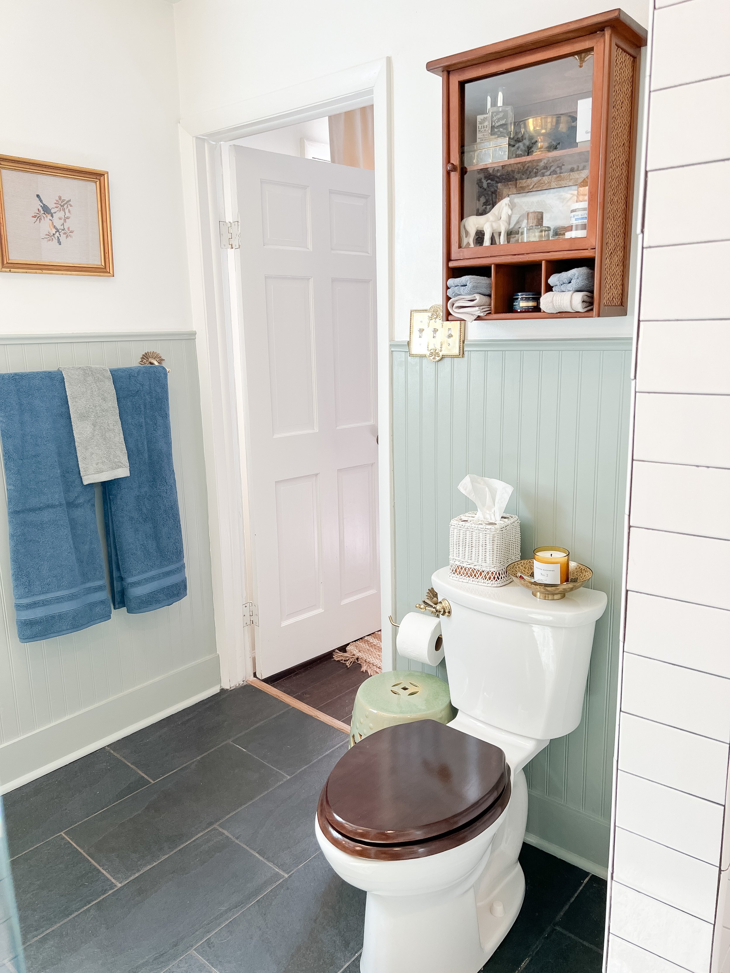
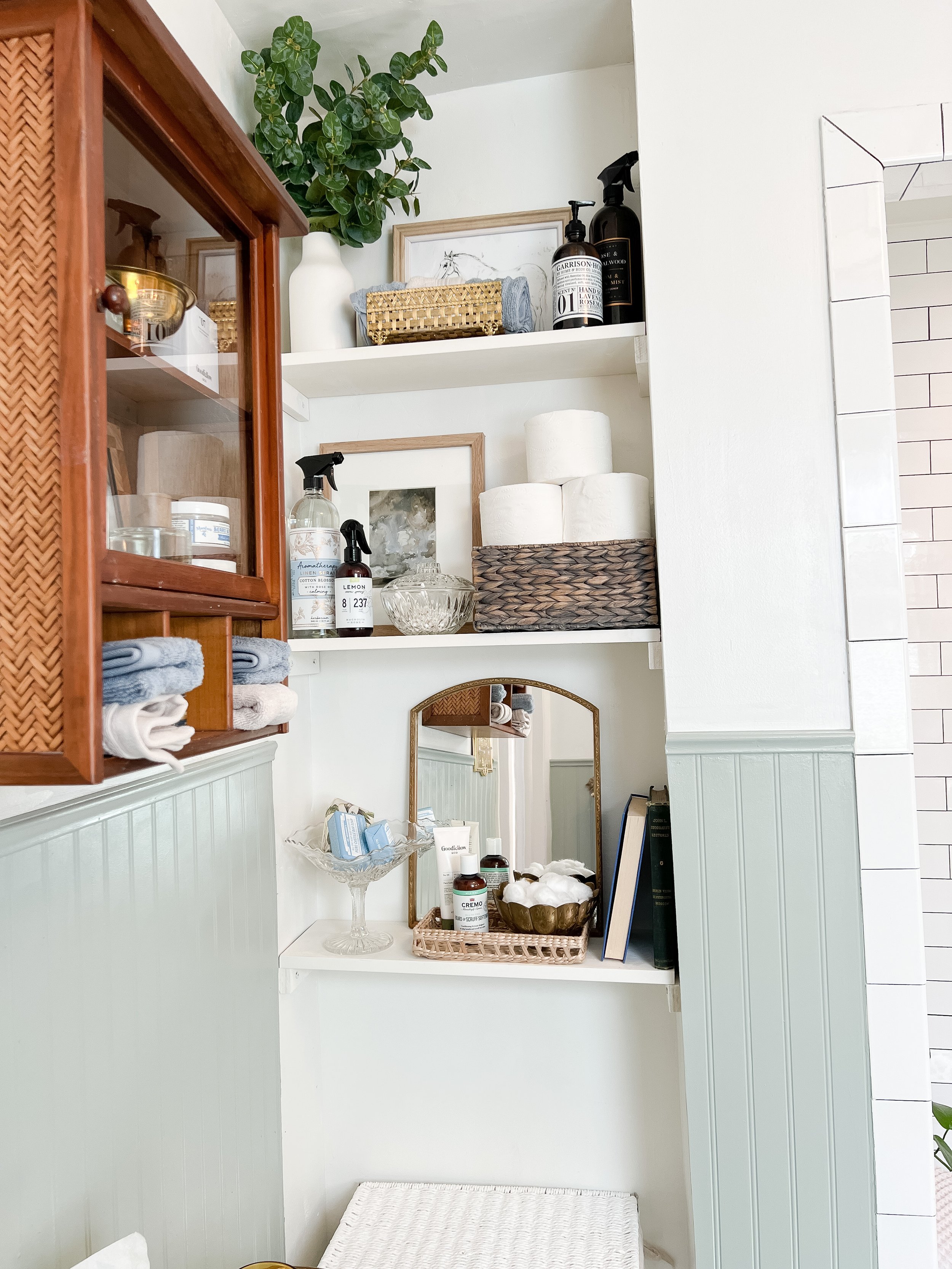
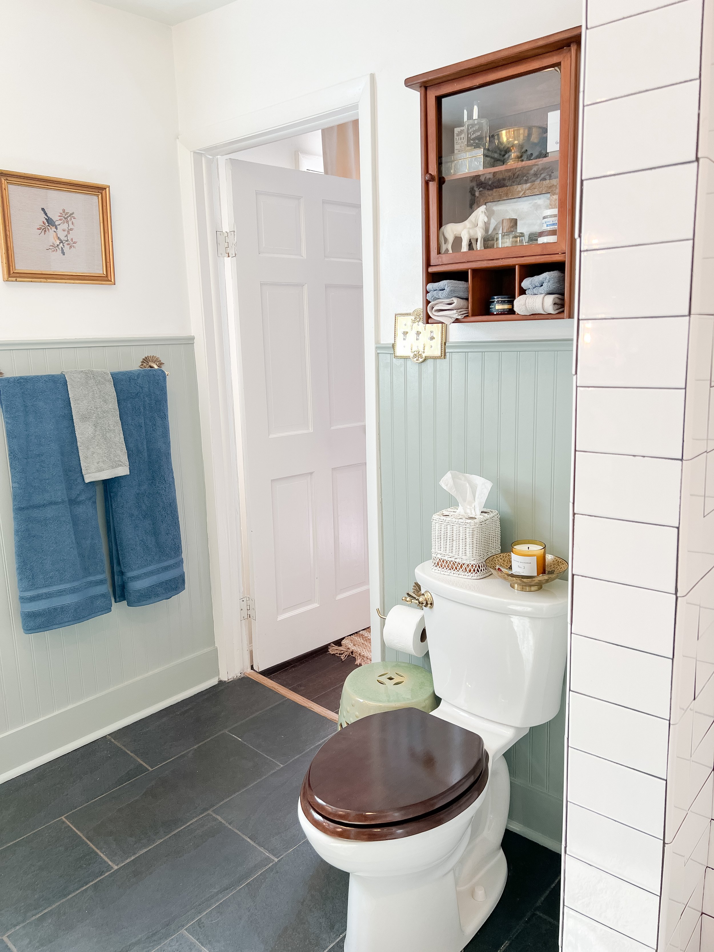
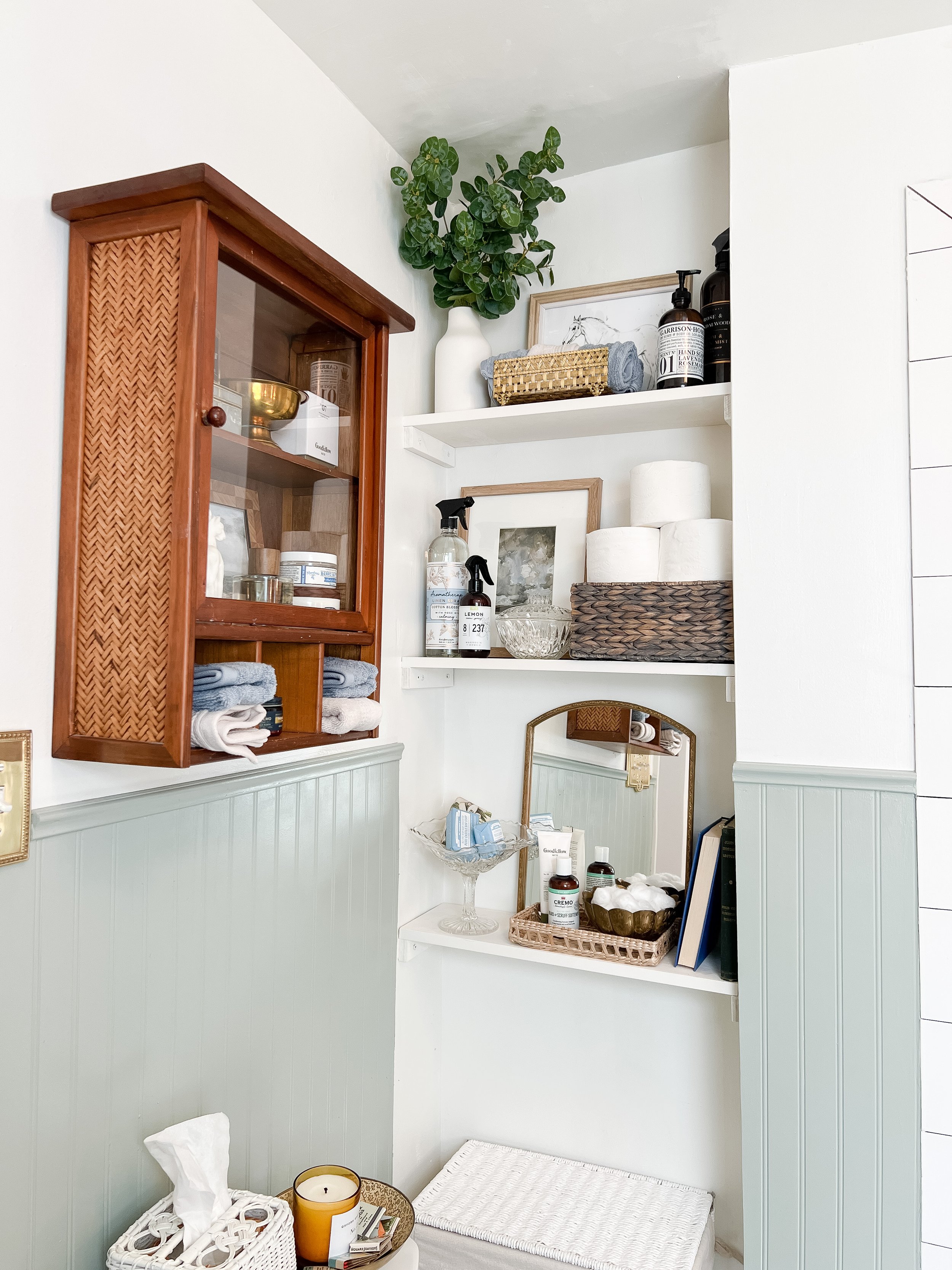
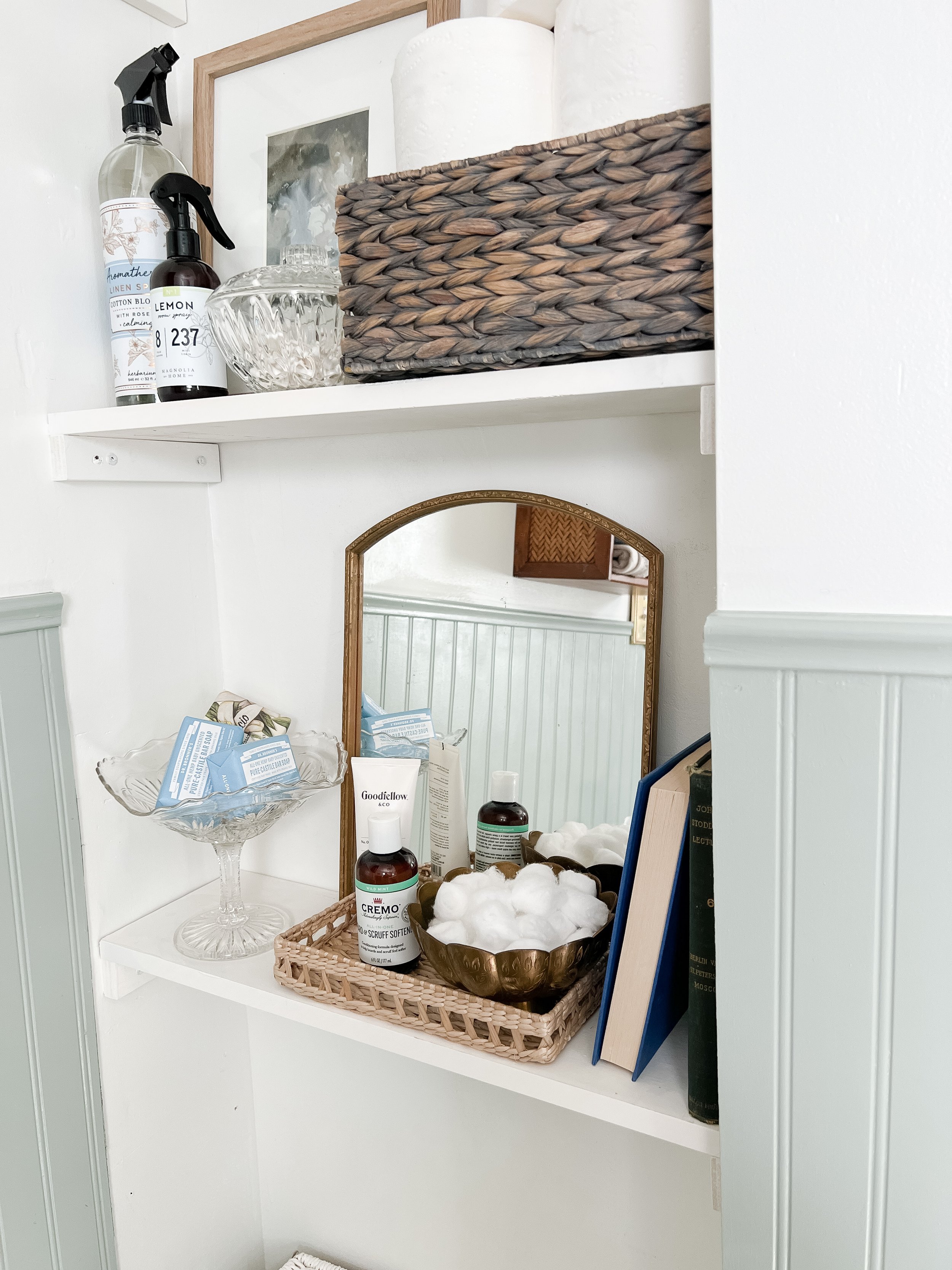
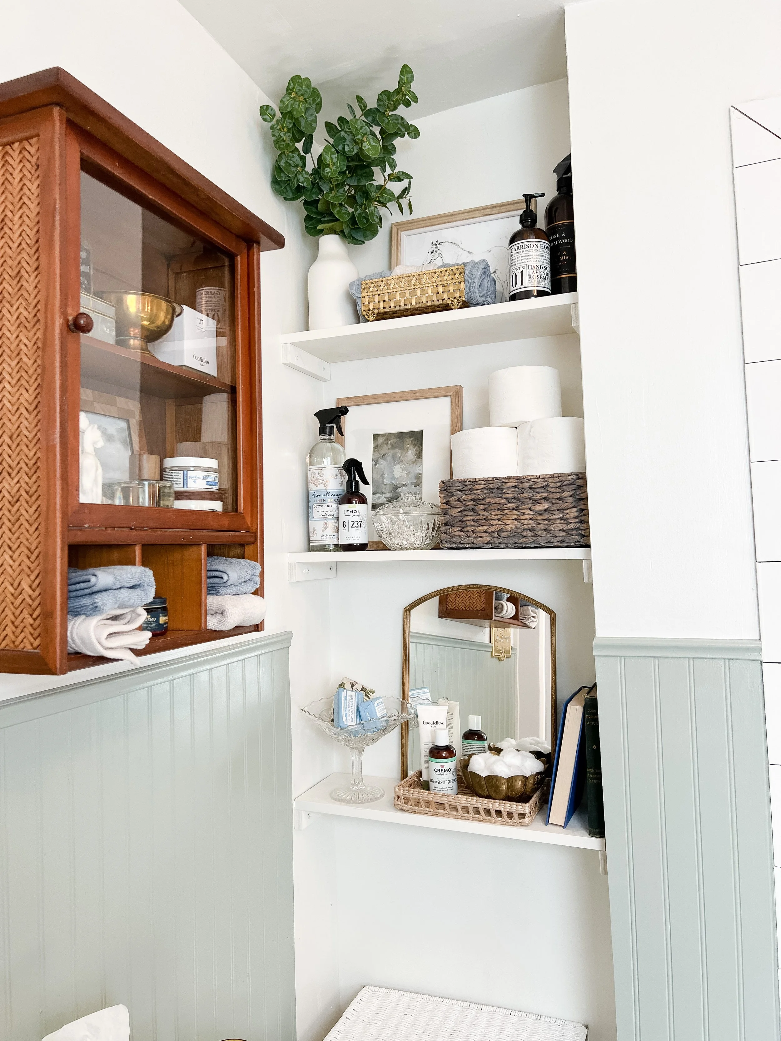
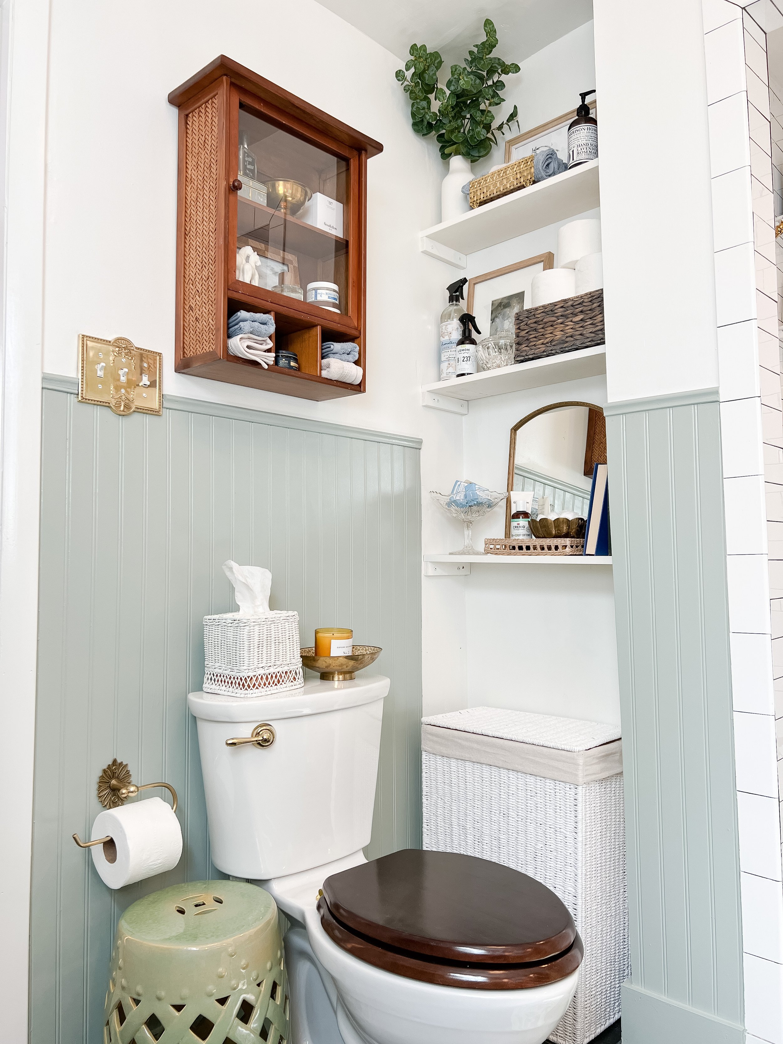
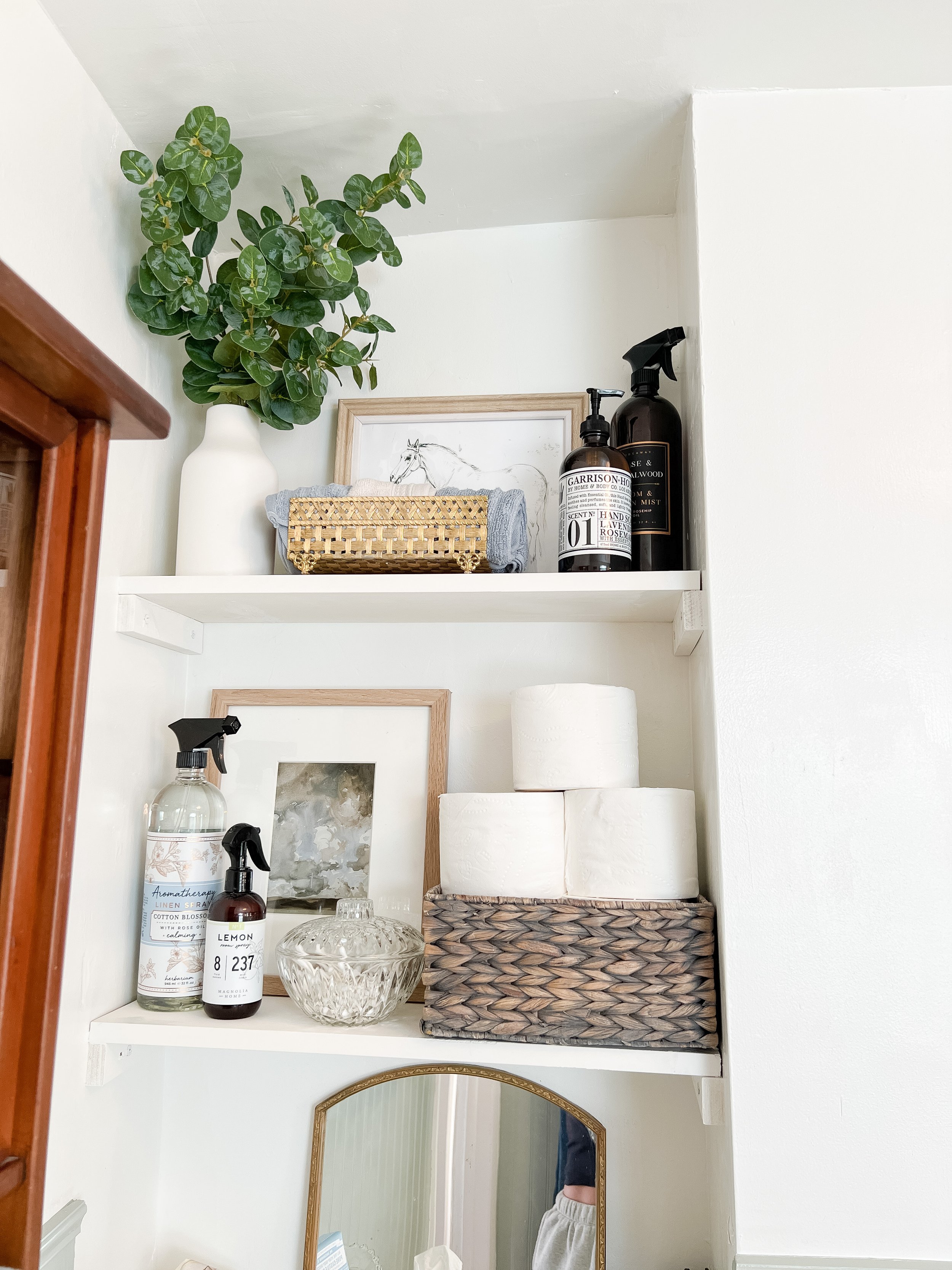
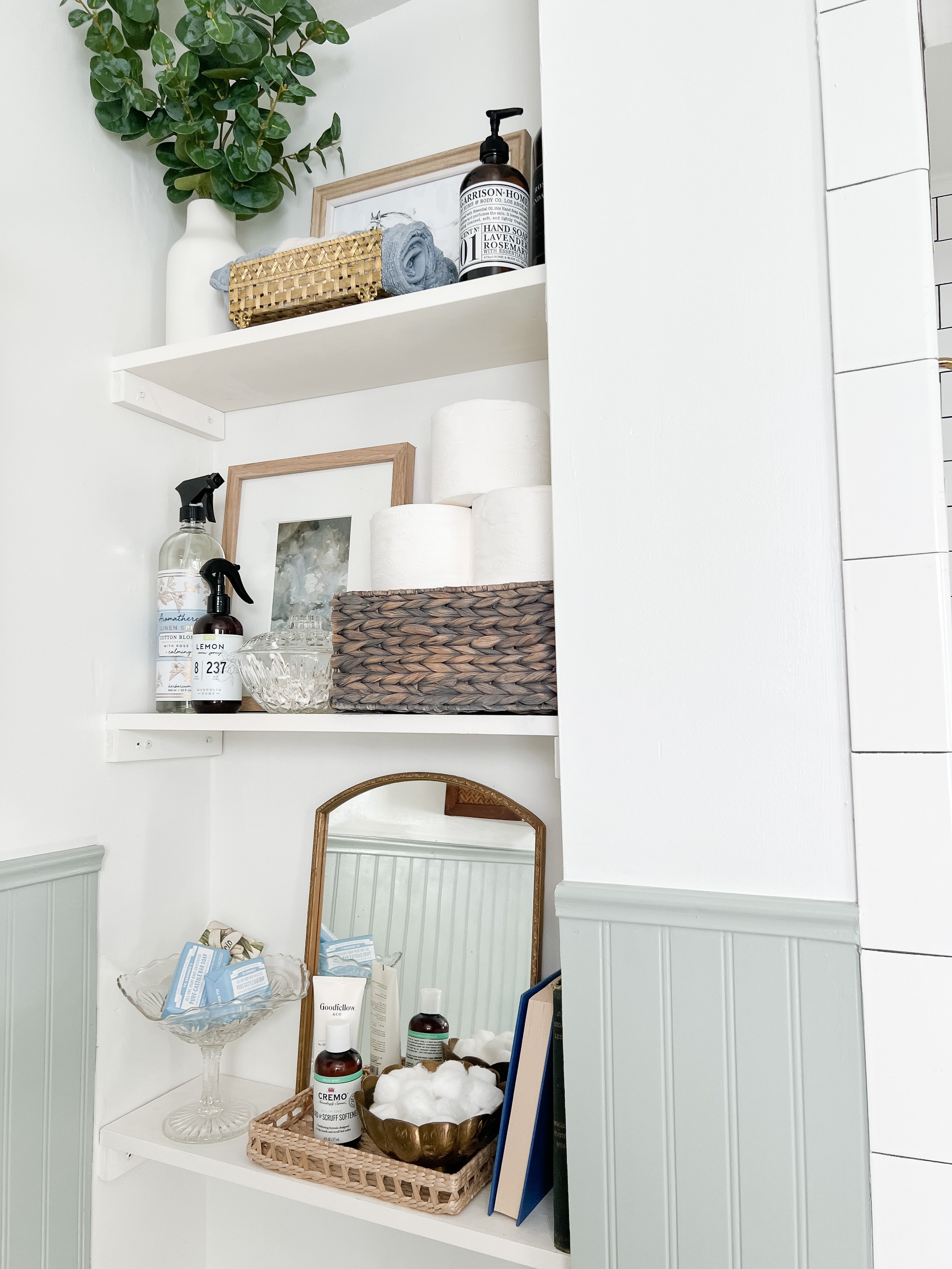
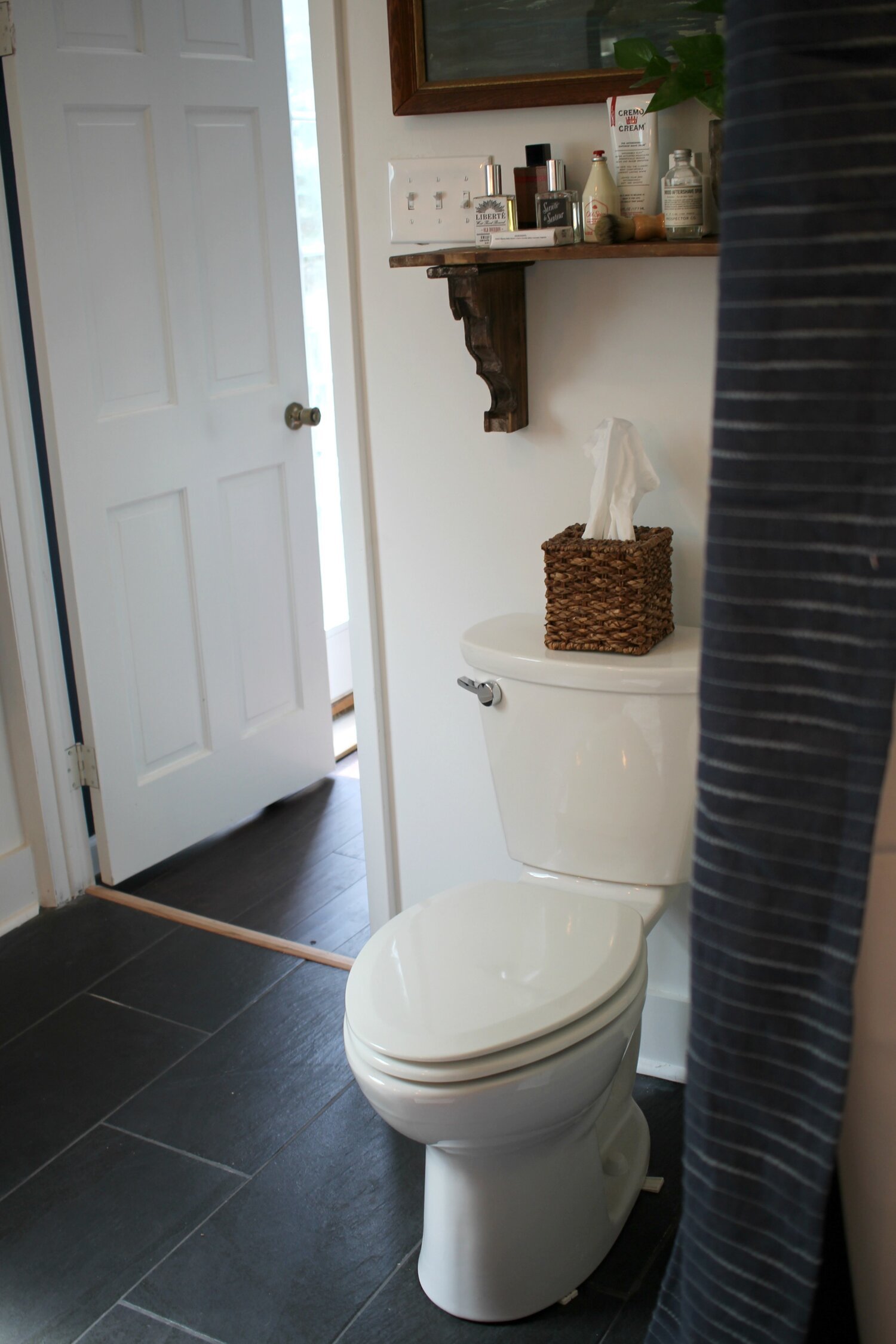
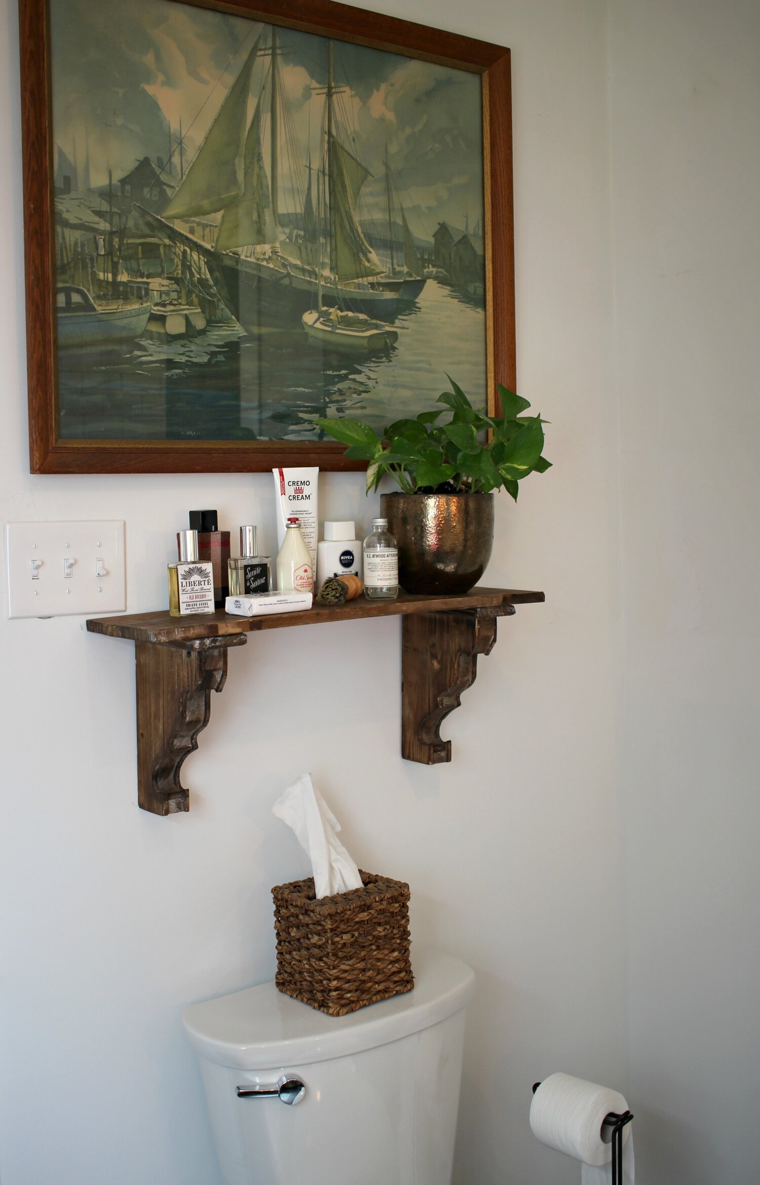
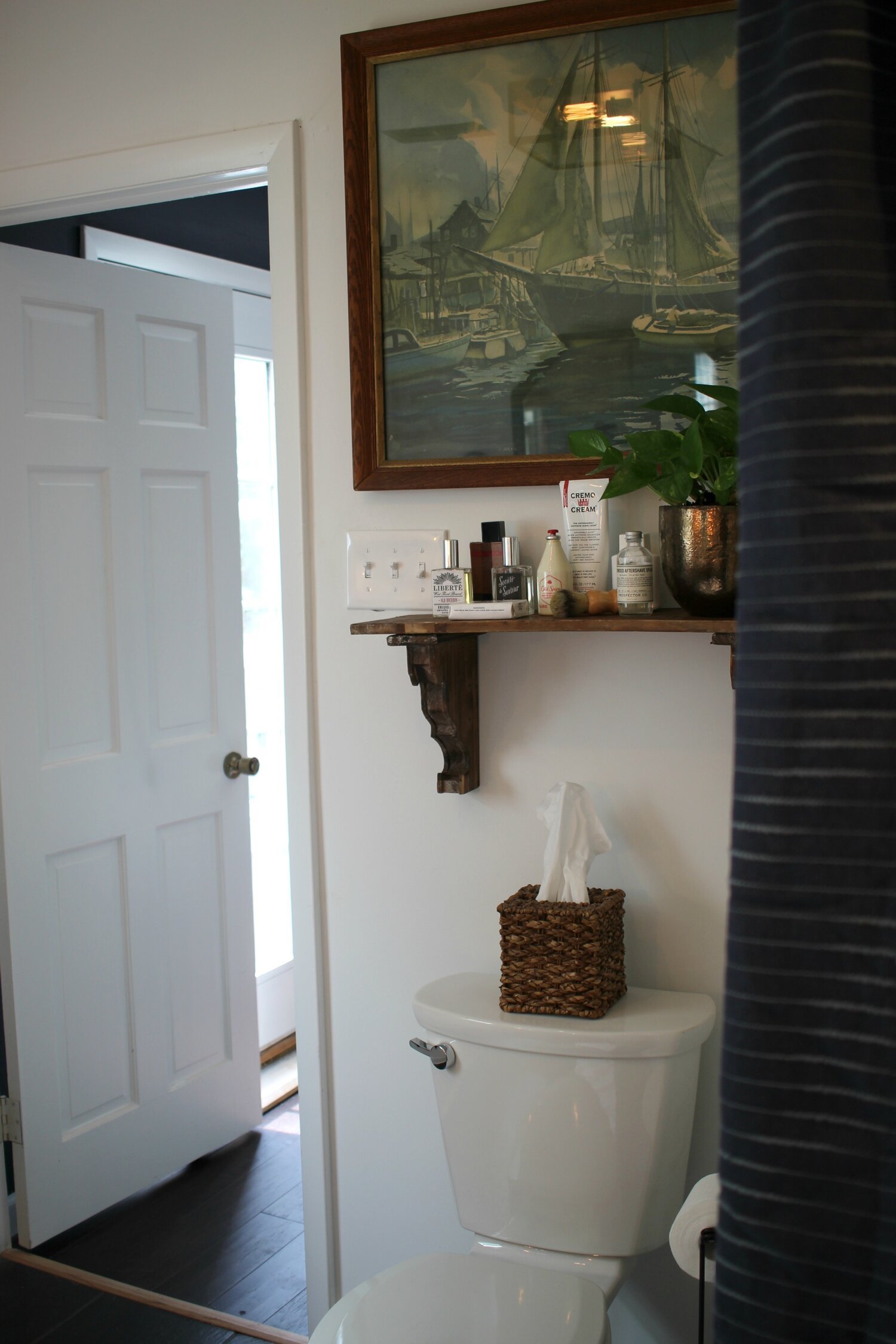
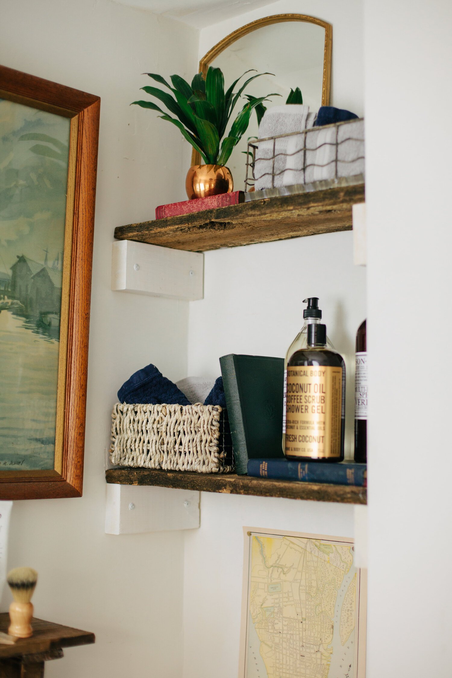
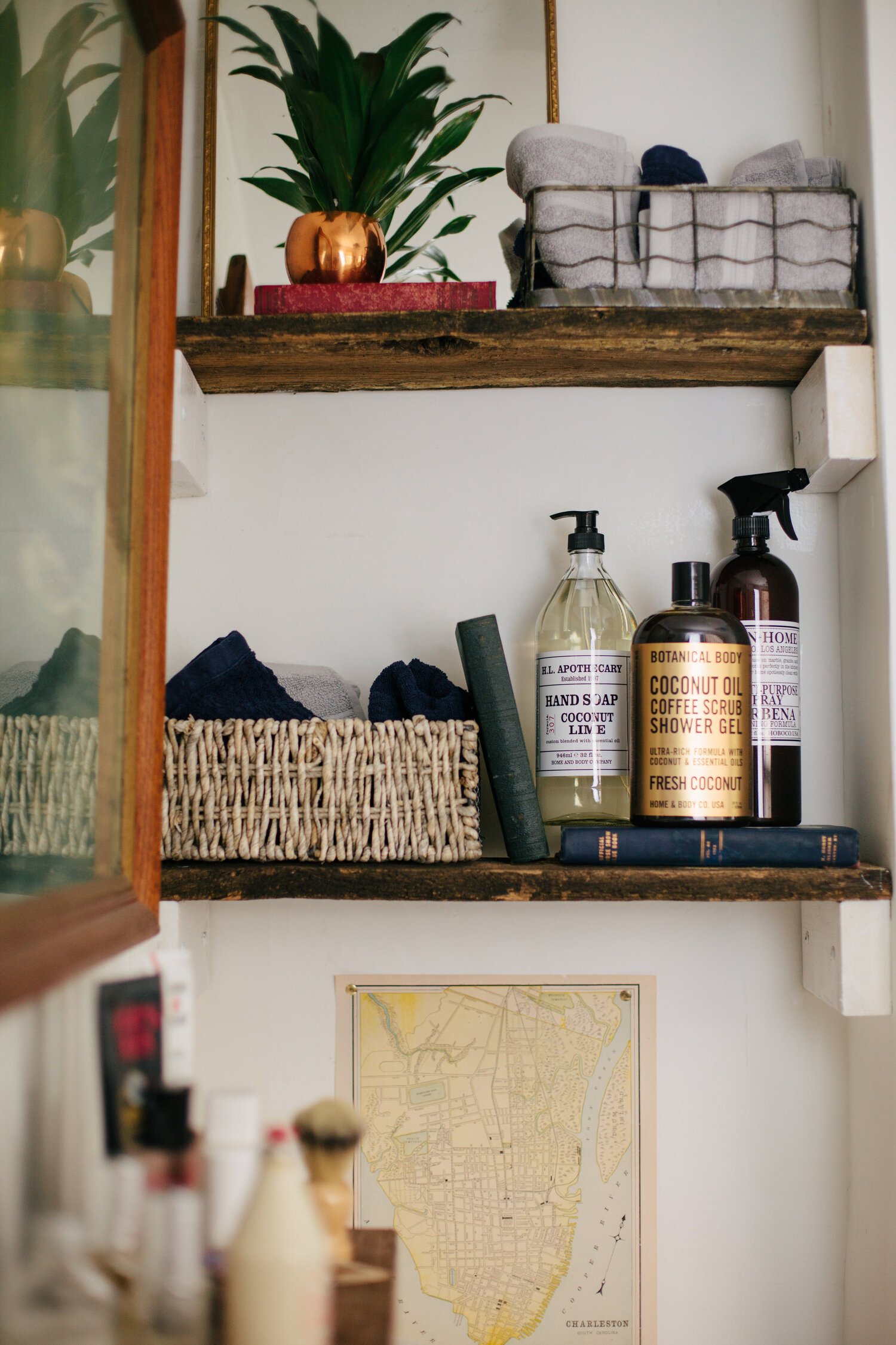
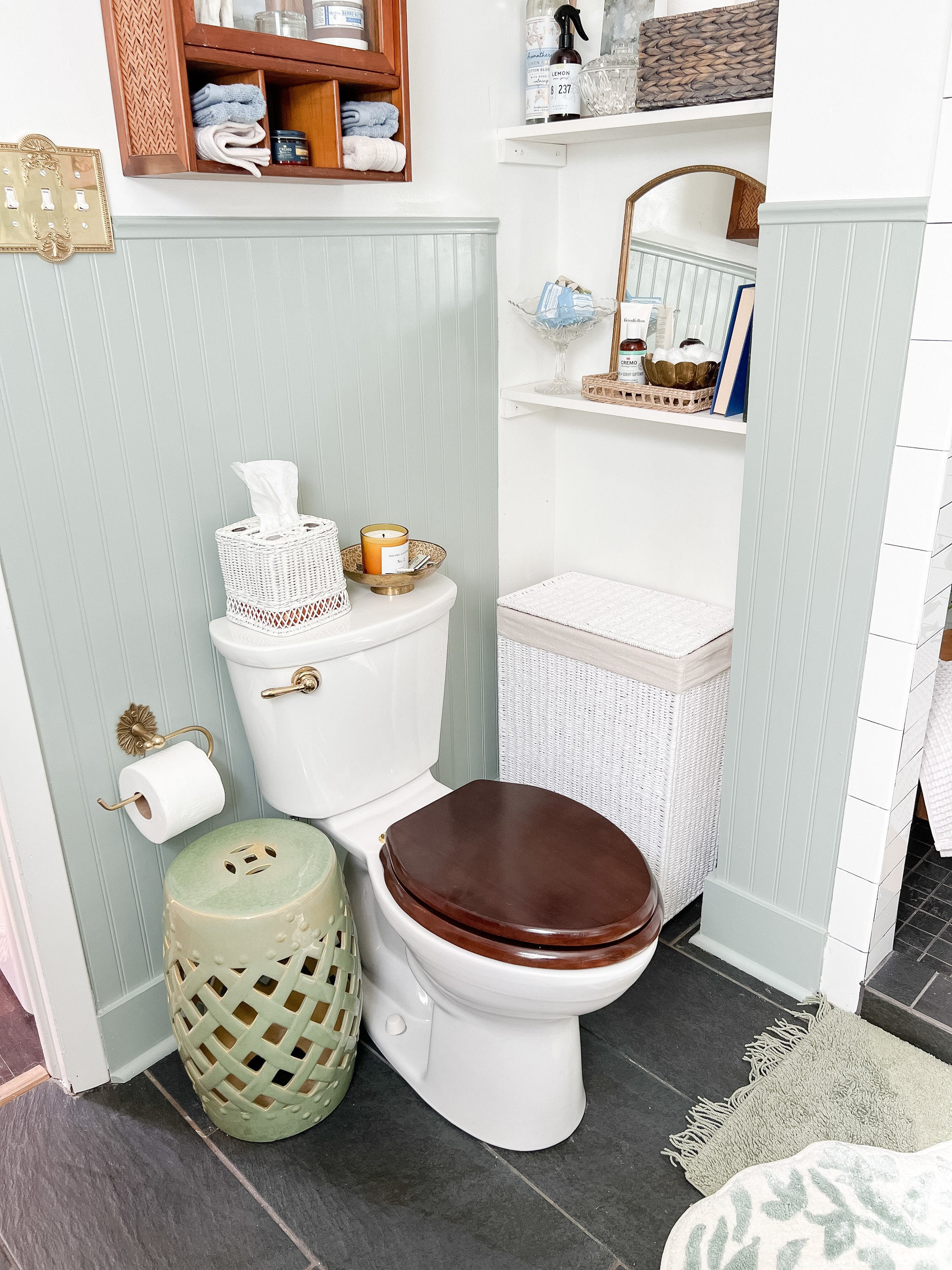
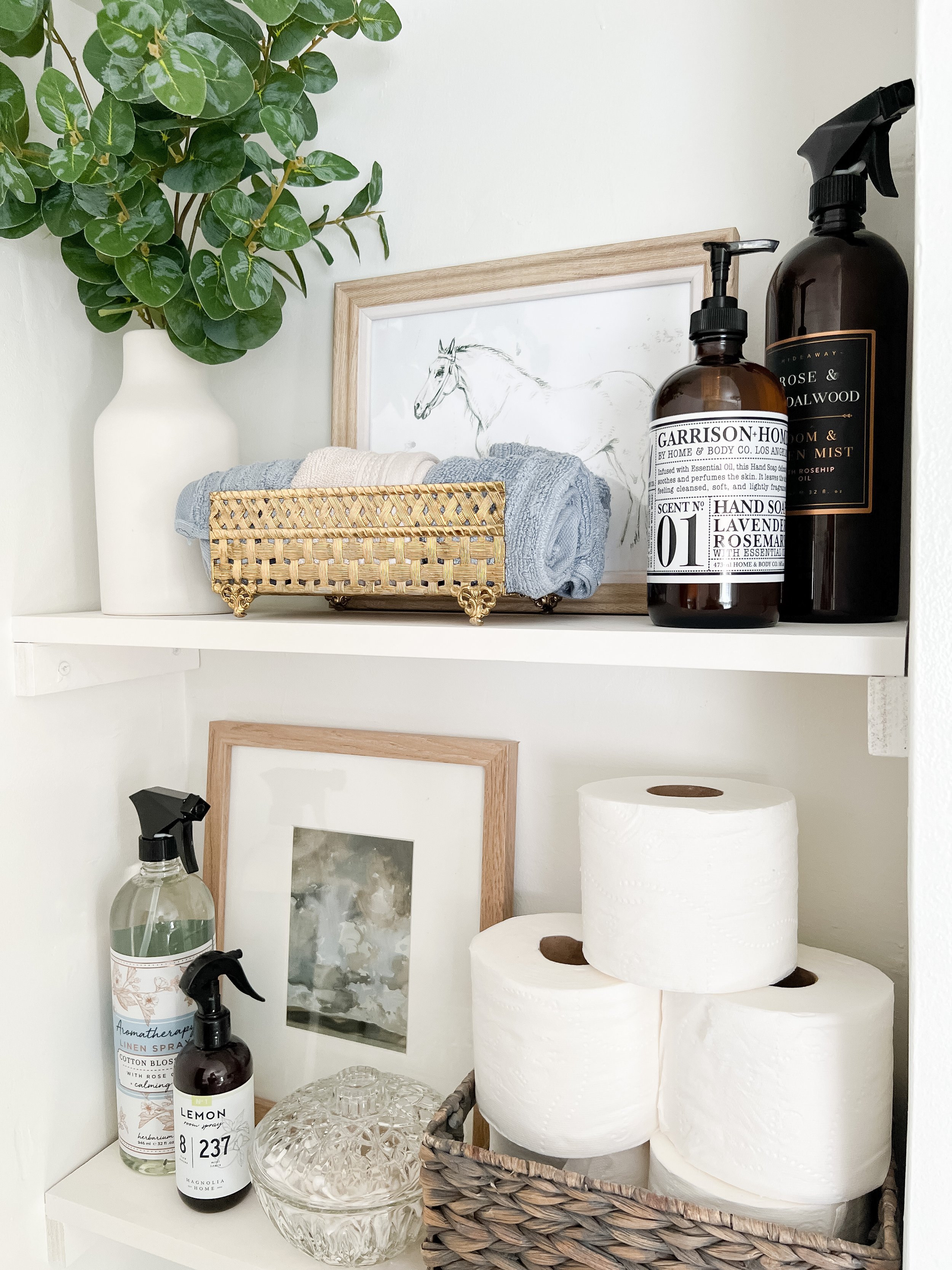
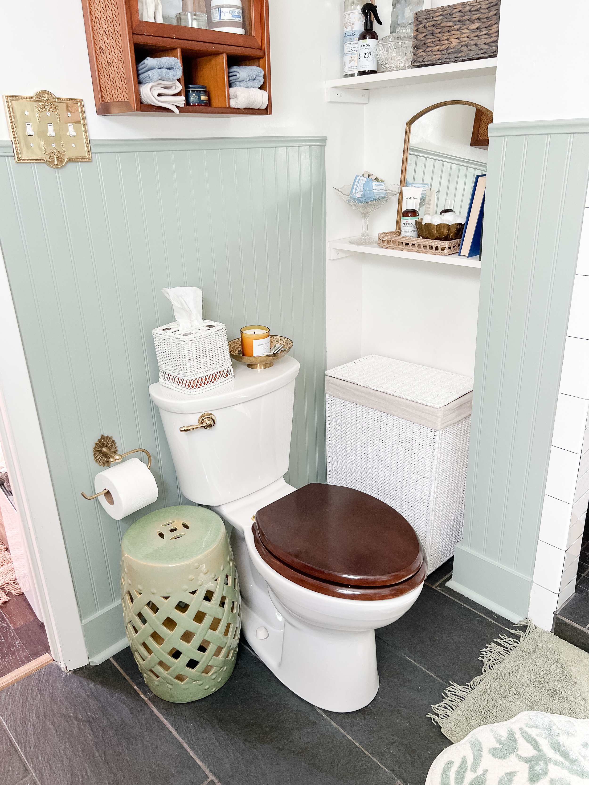
The little nook by the toilet will be getting an upgrade in the next couple of weeks with a custom built-in! I wanted to wait on a professional carpenter for this so it can be customized to exactly what I want and have items like drawers which are far beyond my woodworking skills. I just cleaned up the shelves and restyled them in the meantime- so stay tuned for the real finished product soon! There will still be a nook for a hamper and I found one that fits this area just perfectly!
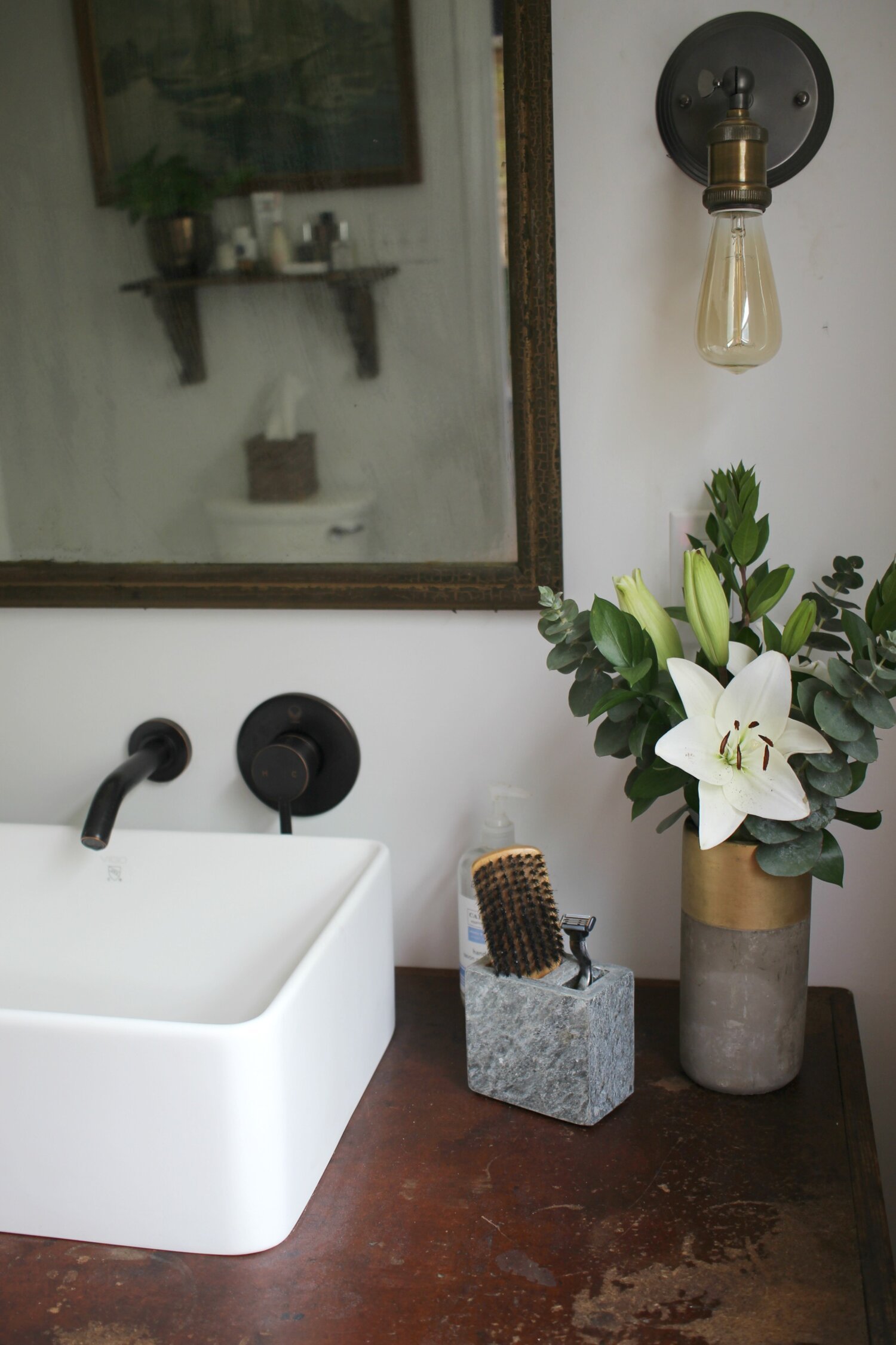
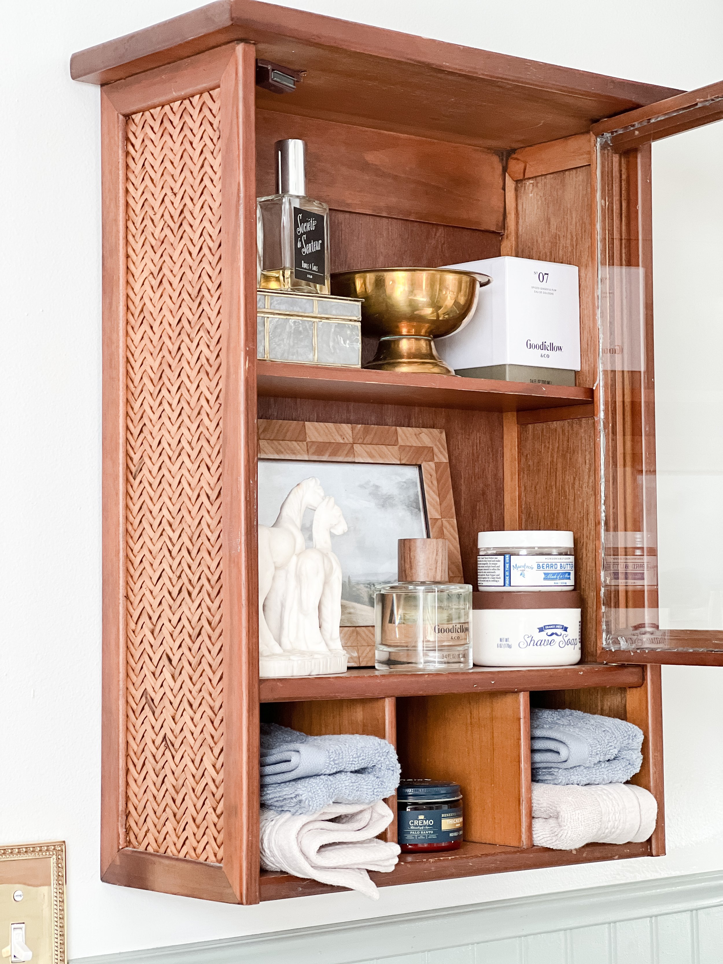
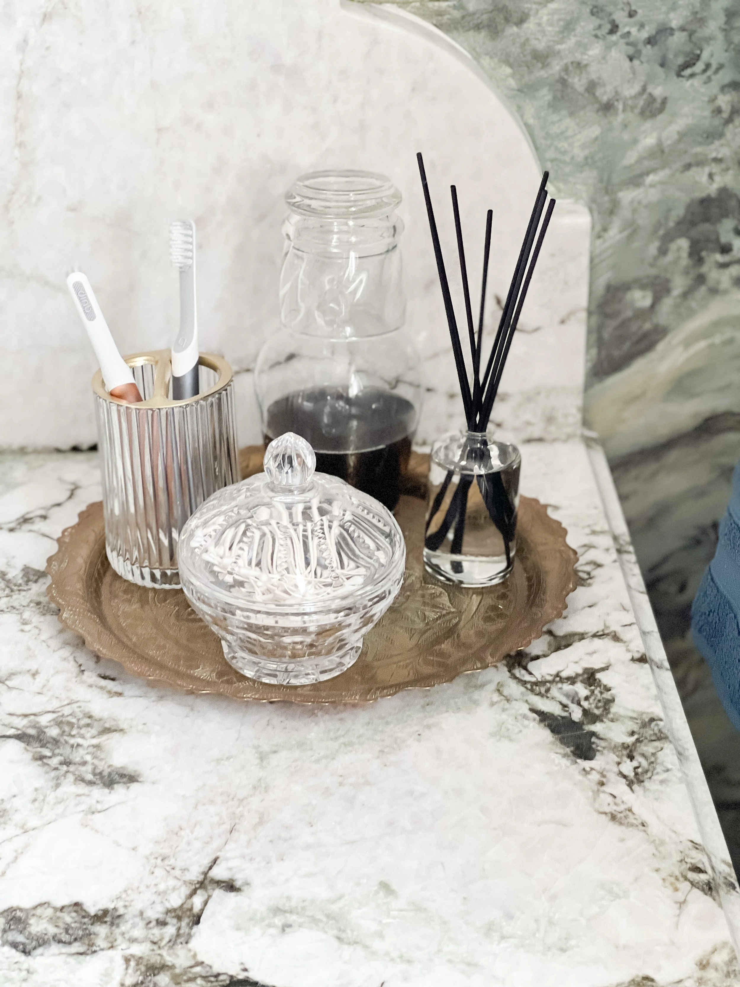
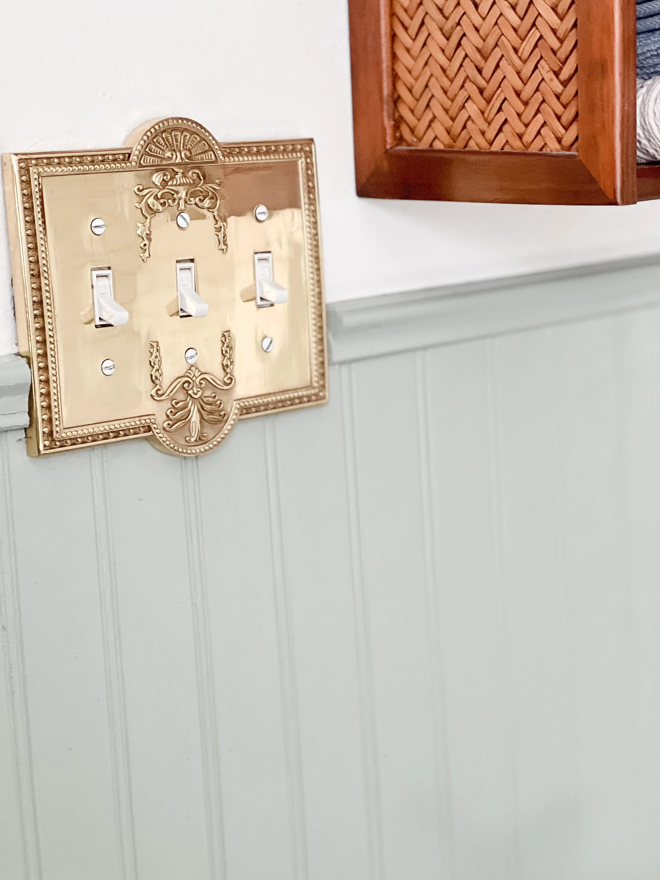
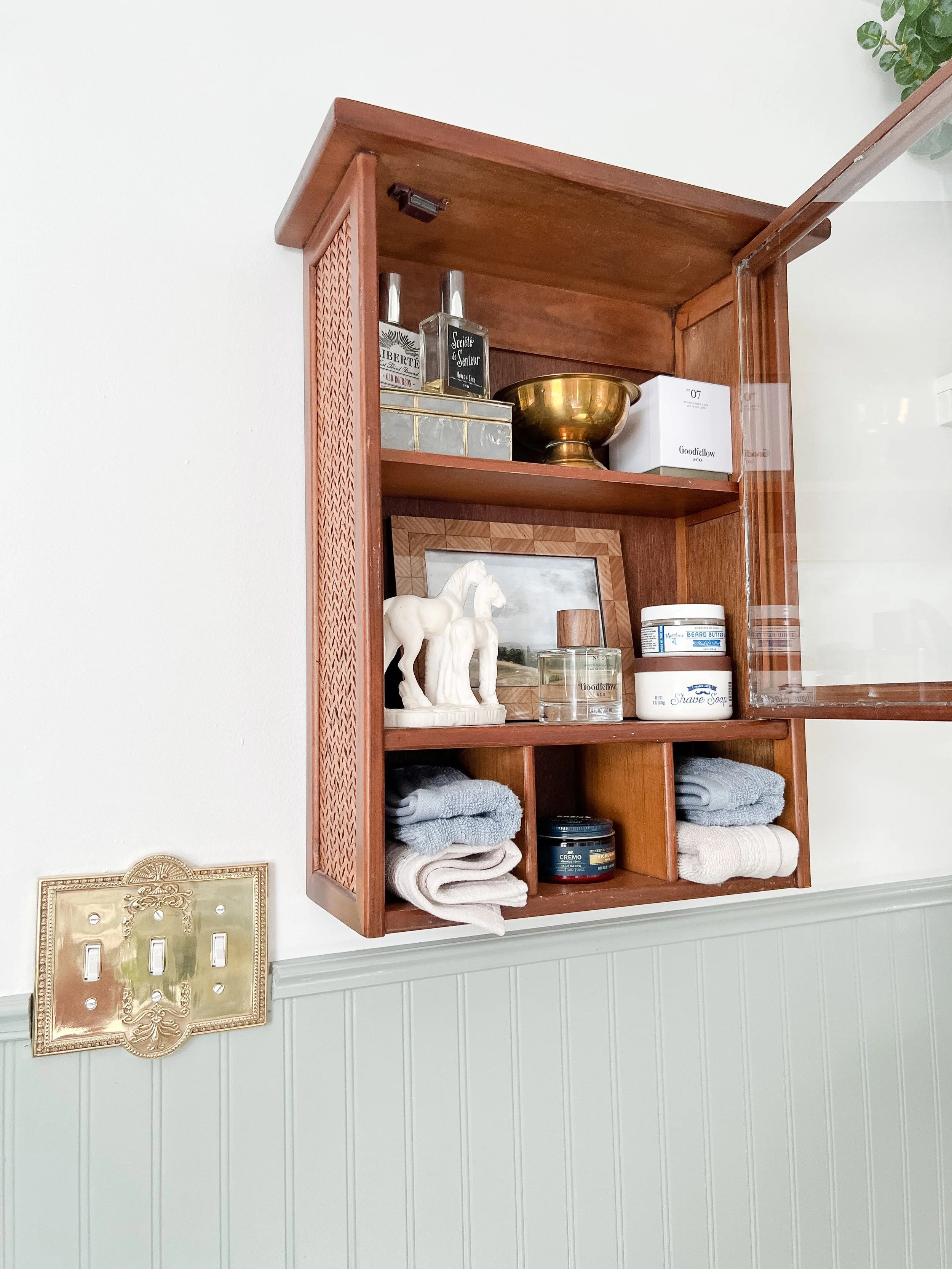
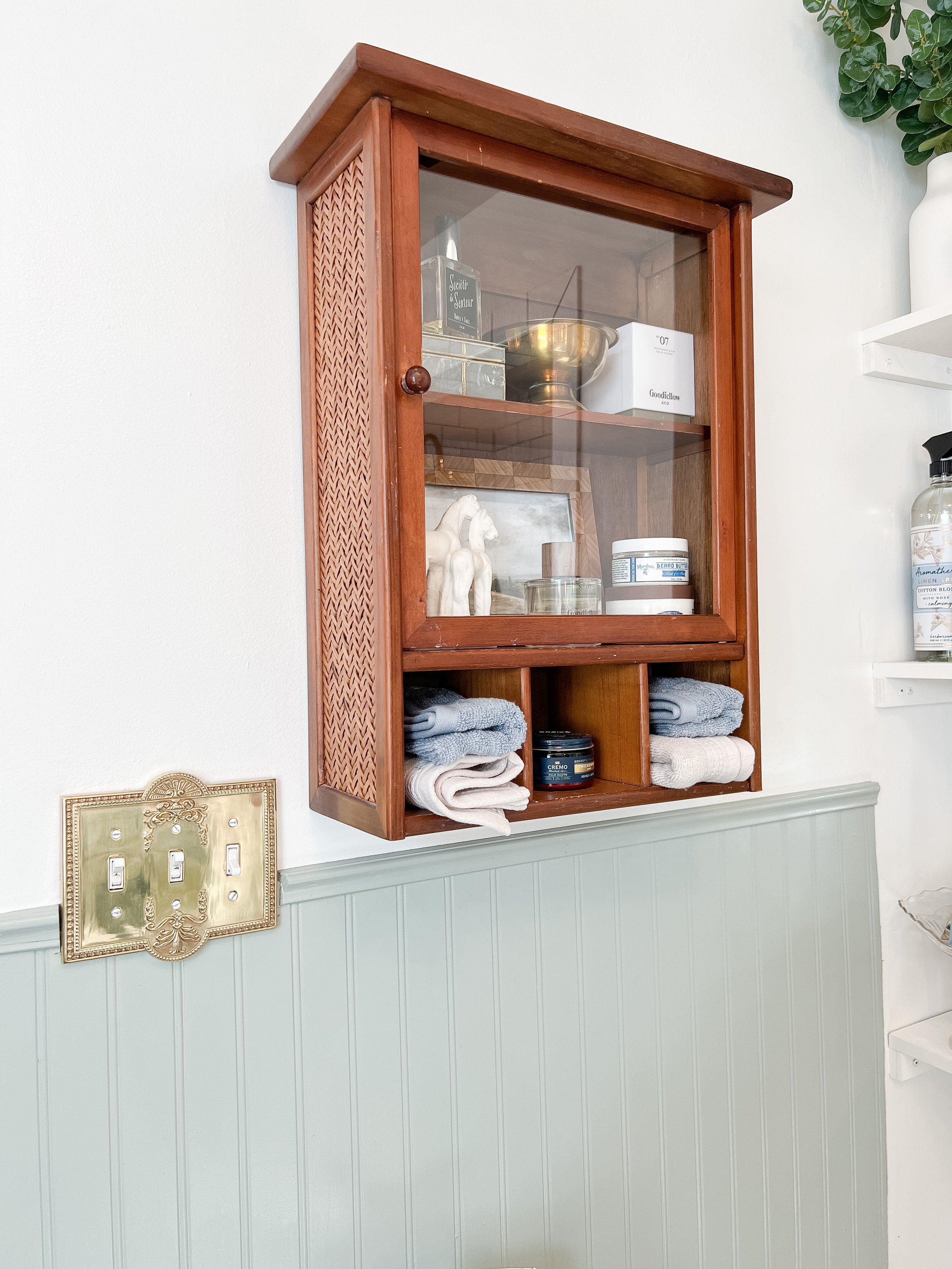
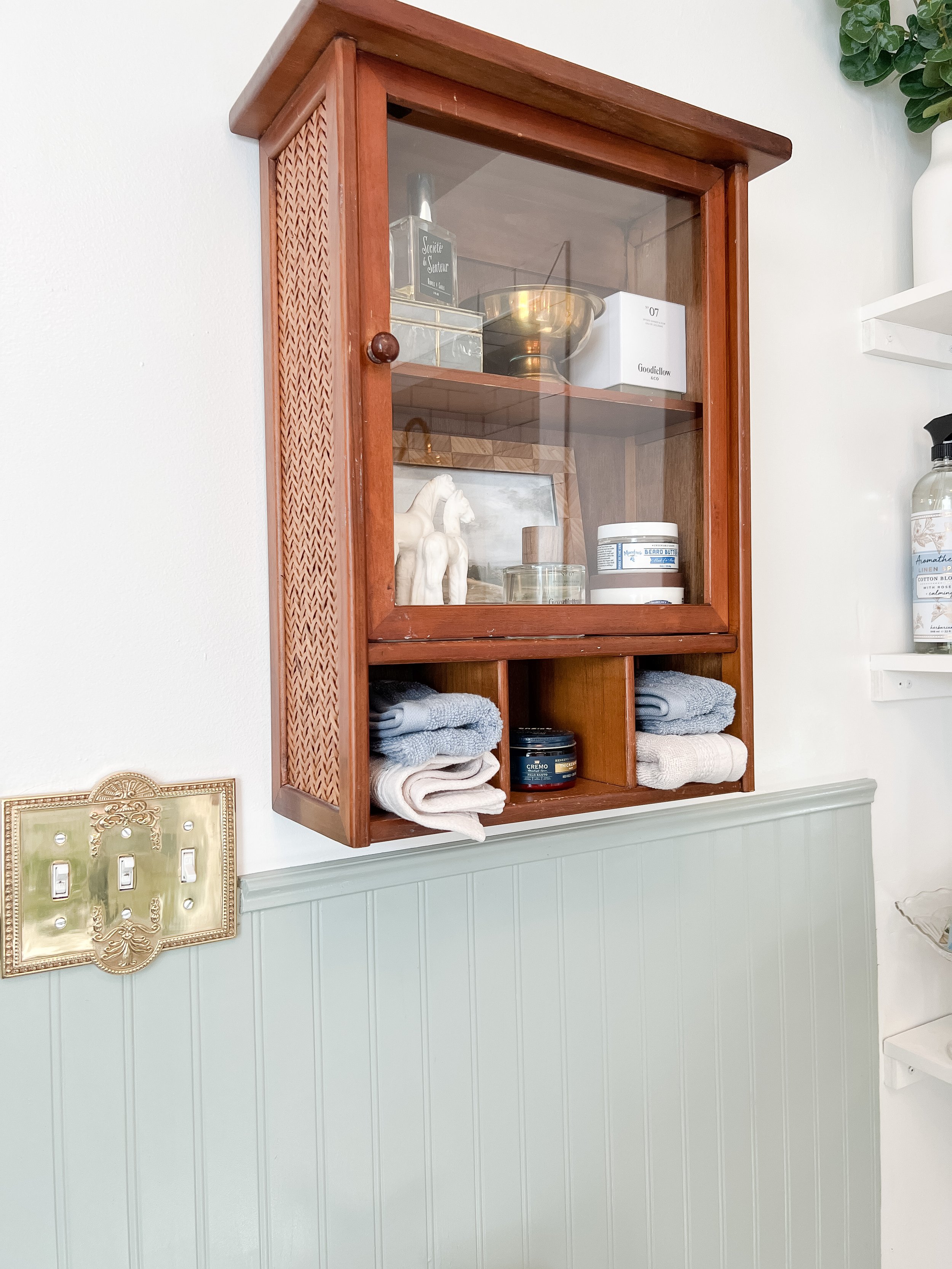
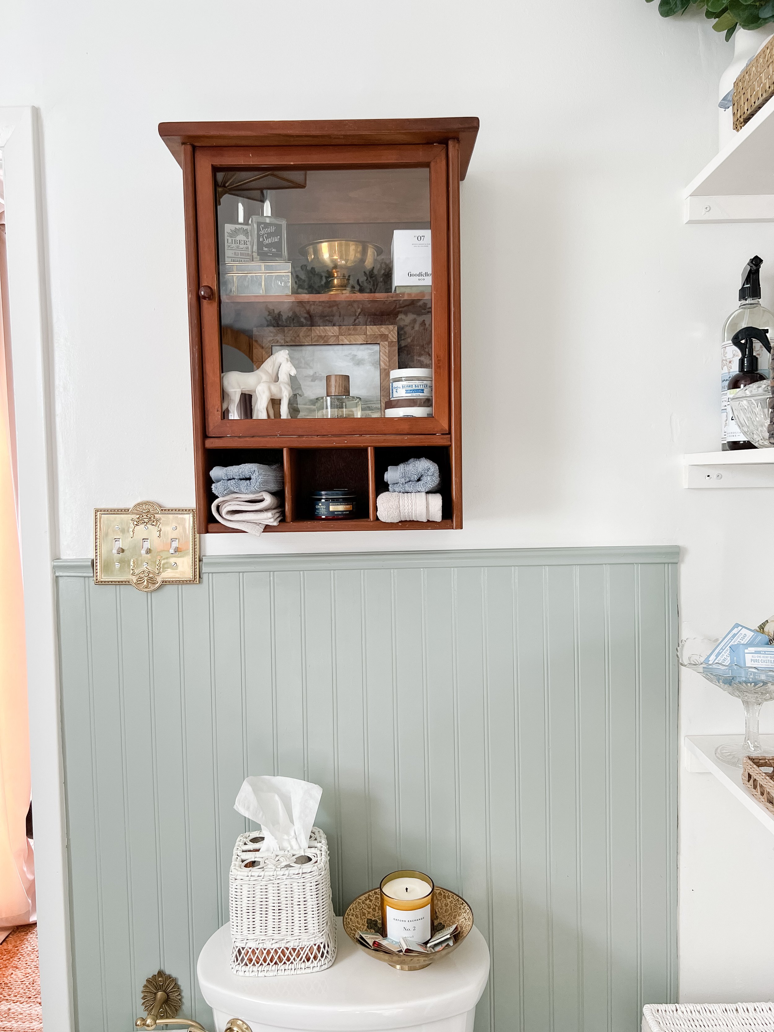
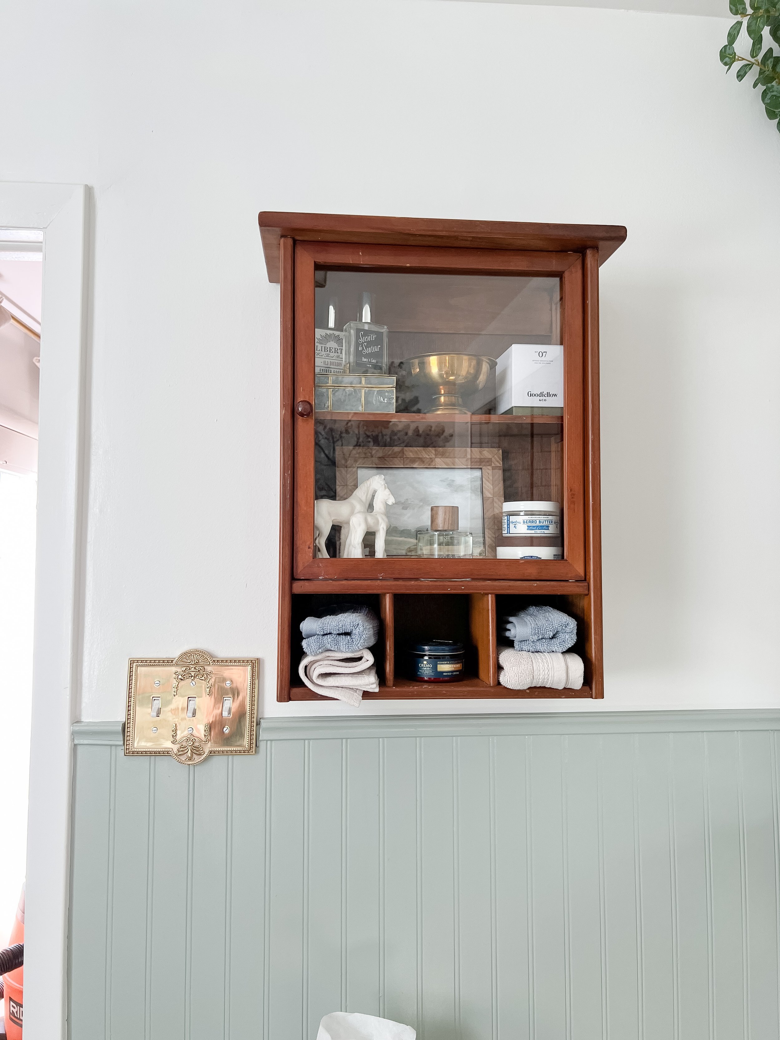
I also upgraded the toilet area with a new brass flusher, new toilet seat, vintage medicine cabinet above, and accessories! It’s amazing what a difference these little changes can make in this little corner!
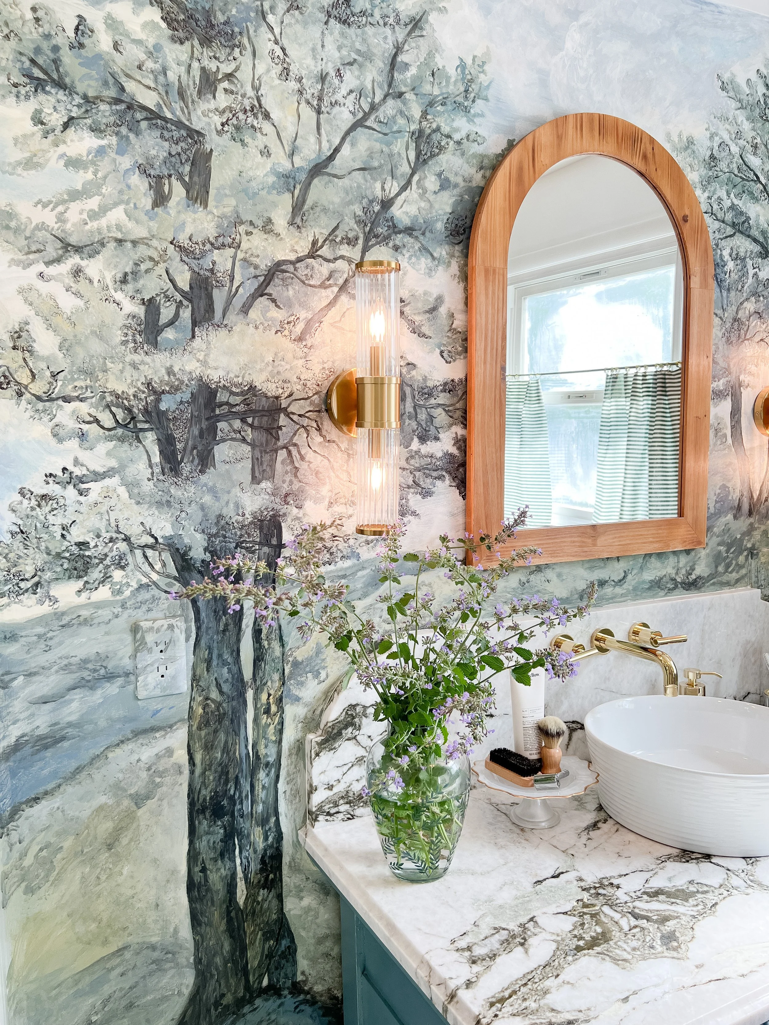
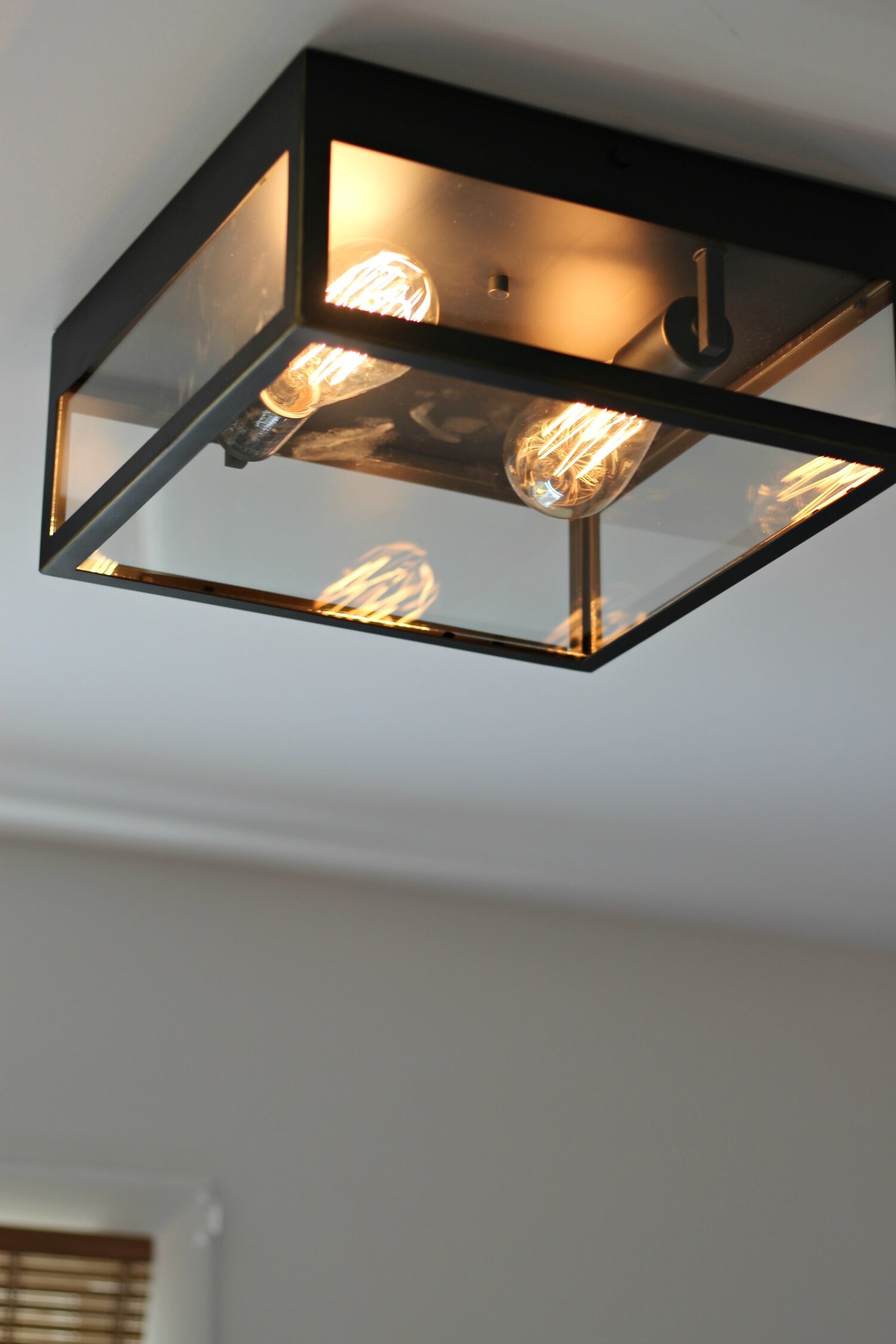
Finally, I also updated this lighting in here- sconces and flush mount. I decided to do slightly more modern lighting since the main elements in here pull more traditional and I wanted to mix it up a little! These give off SO much more light than what we have before and I love how the polished brass pops against the other colors in the room. Shop the flushmount I used here and the sconces I used here!
Thank you once again for following along with me on my third One Room Challenge! This is always one of my favorite times of the year and I love sharing all the DIYs and transformations with you! I hope you enjoyed following along again this year and gained some ideas and inspiration along the way. If you have any questions about anything I forgot to mention in the blogpost, feel free to comment and ask below! Now, it’s time for me to go take a nap!
xoxo
Emily
Check out all of the guest participants posts for One Room Challenge 2022 here.