Modern + Minimal Nursery
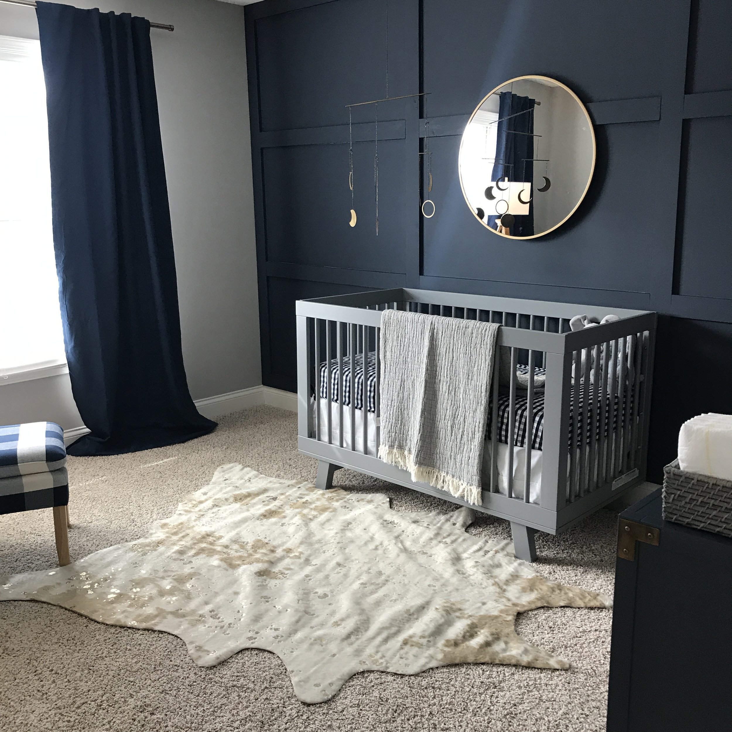
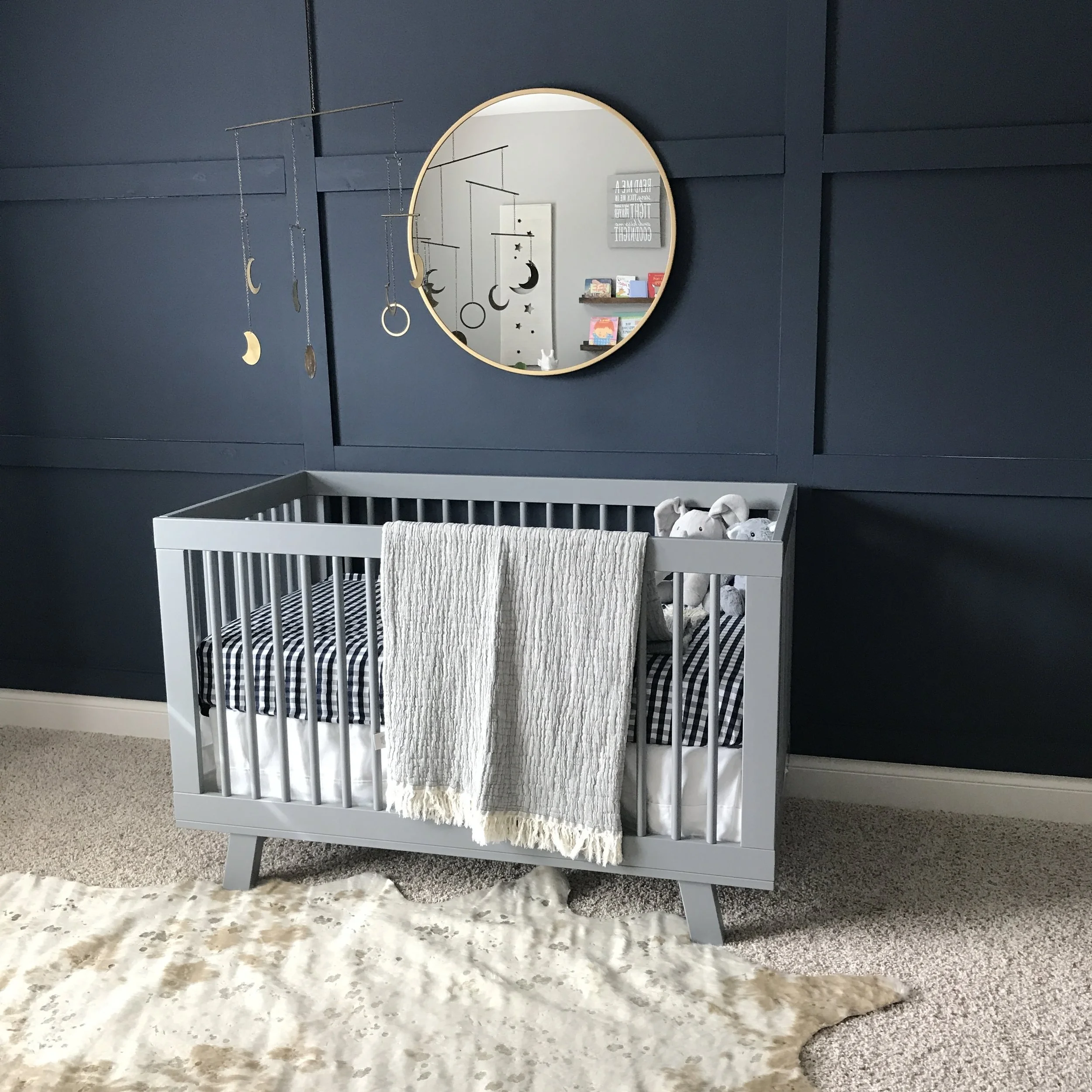
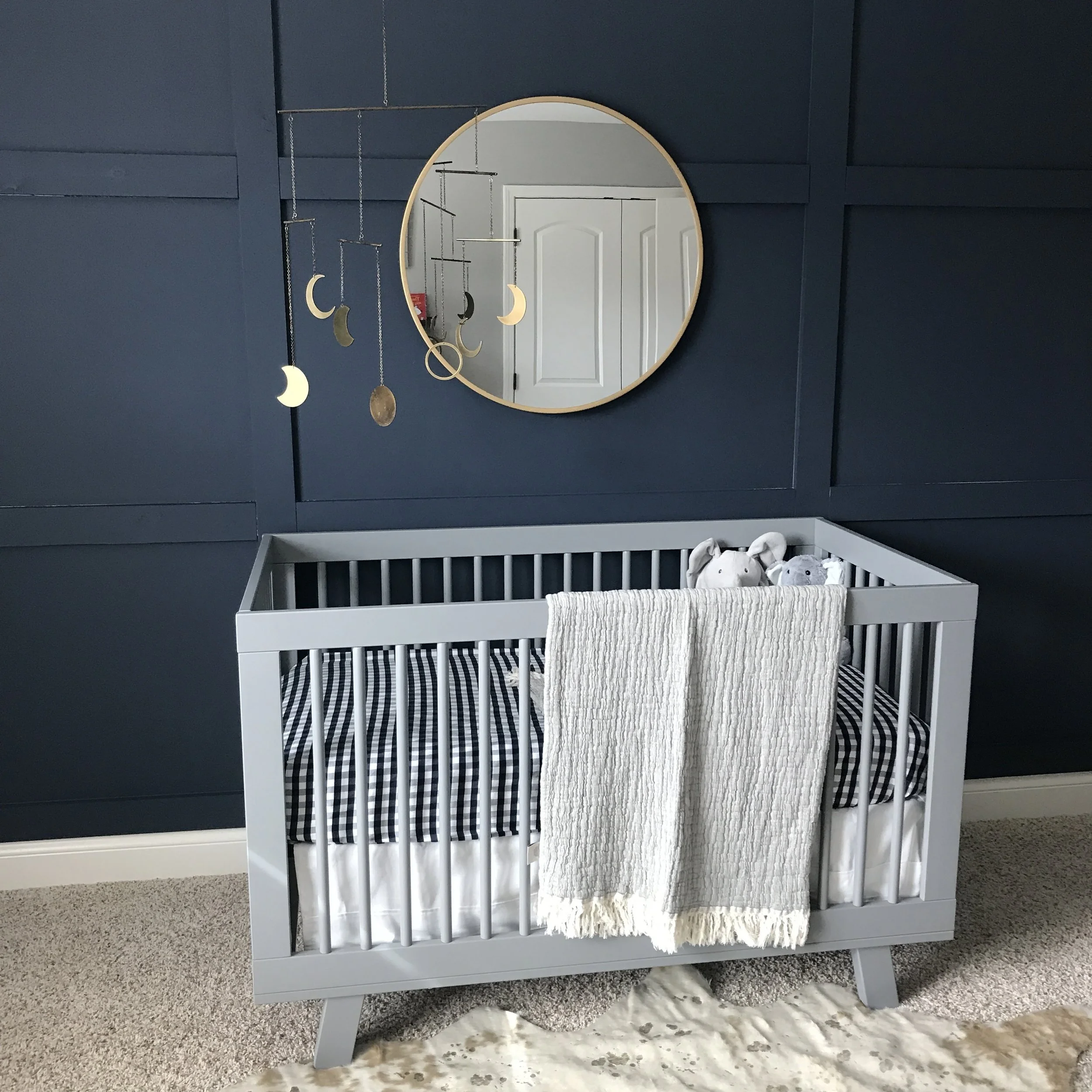
I had too much fun designing my first nursery start to finish for some of my favorite clients! This super chic, modern. and minimal nursery is full of timeless pieces that can be grown into and used for many years to come. My clients knew they wanted a statement wall in Hale Navy (Benjamin Moore), but besides that, they really let me take the reigns on the design. My painter put together the simple gridwork trim on the wall and then painted it all one color. The rest of the walls were already gray which worked with our color scheme and the simple gray crib.
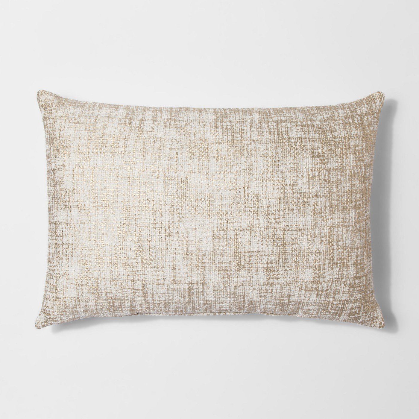
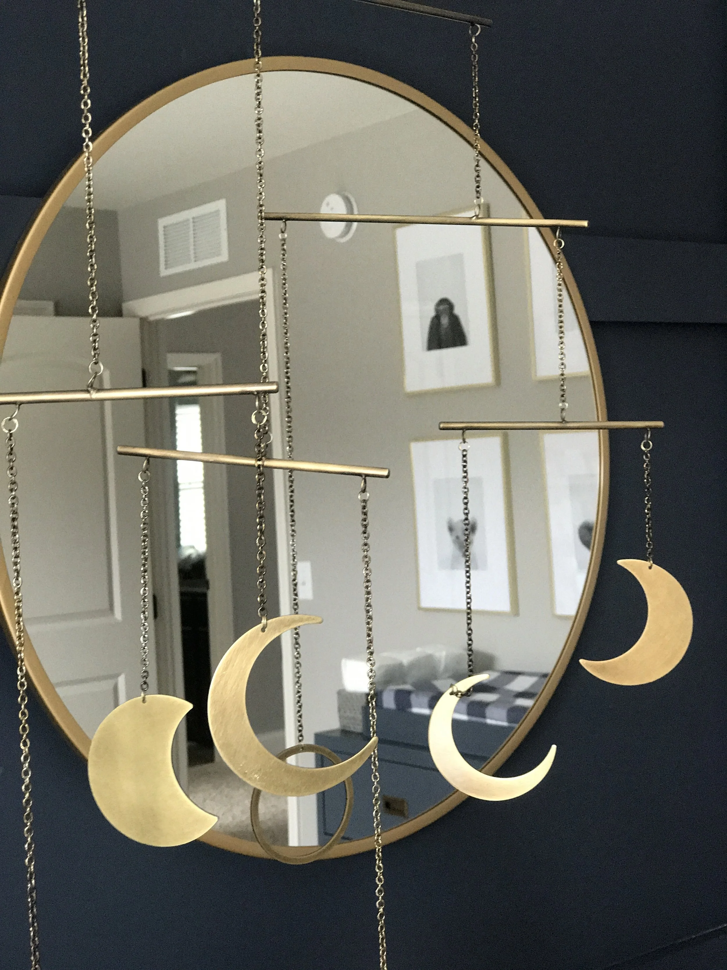
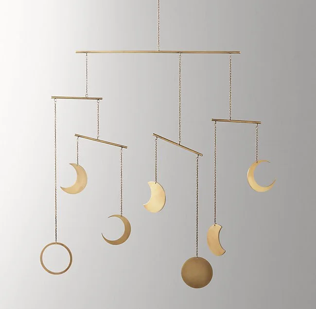
On the crib wall, the hanging decor really is the focal point. I love the simple gold mirror layered on the dark navy paneled wall and the brass moons mobile from Restoration Hardware is the perfect finishing touch. We kept it simple as far as the bedding and just went with a white crib skirt, gingham sheet, and one fringed throw blanket draped over the edge.
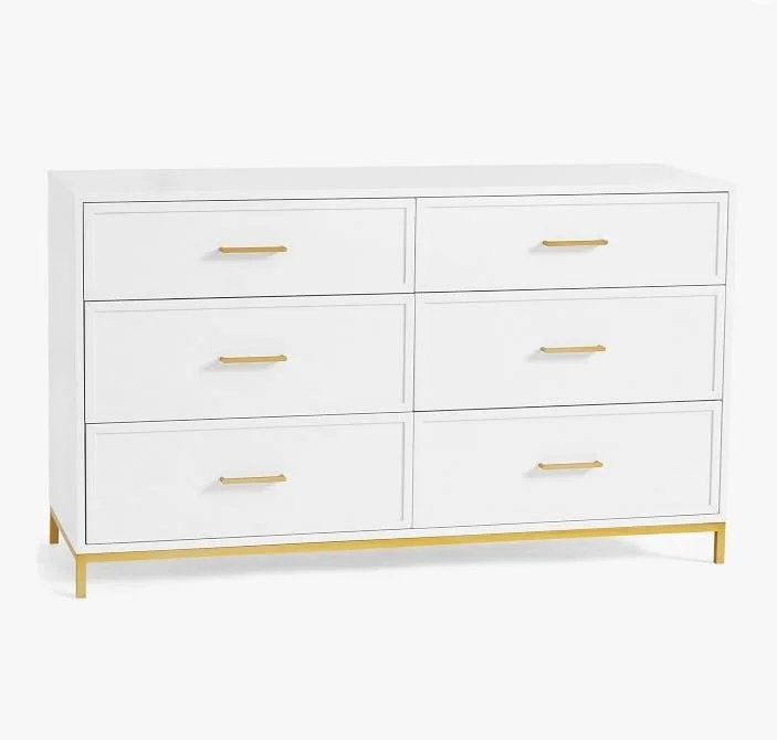
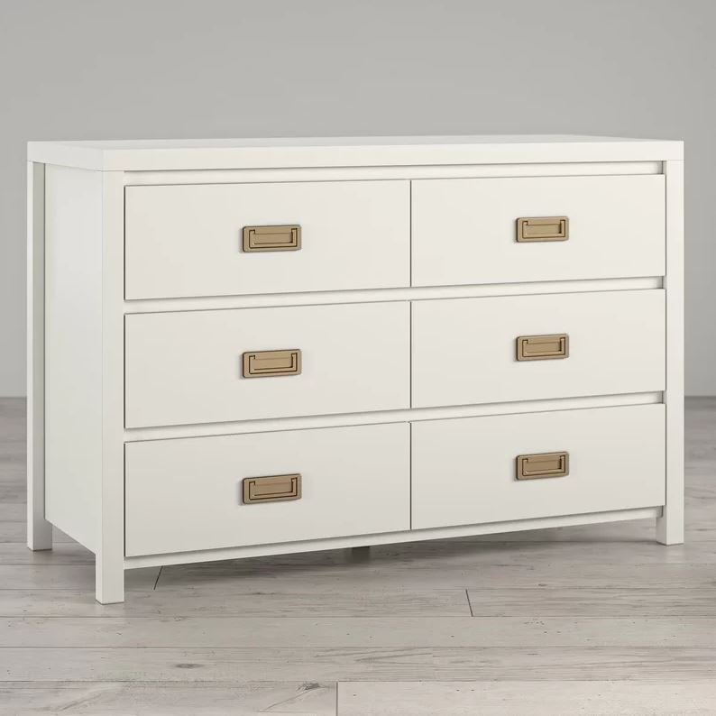
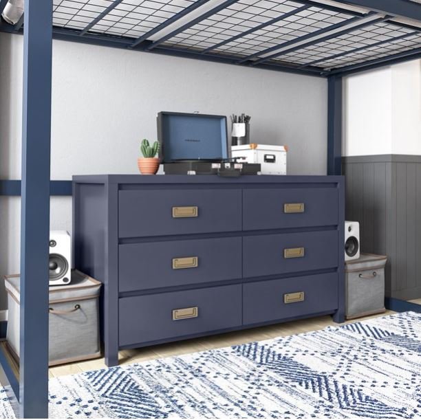
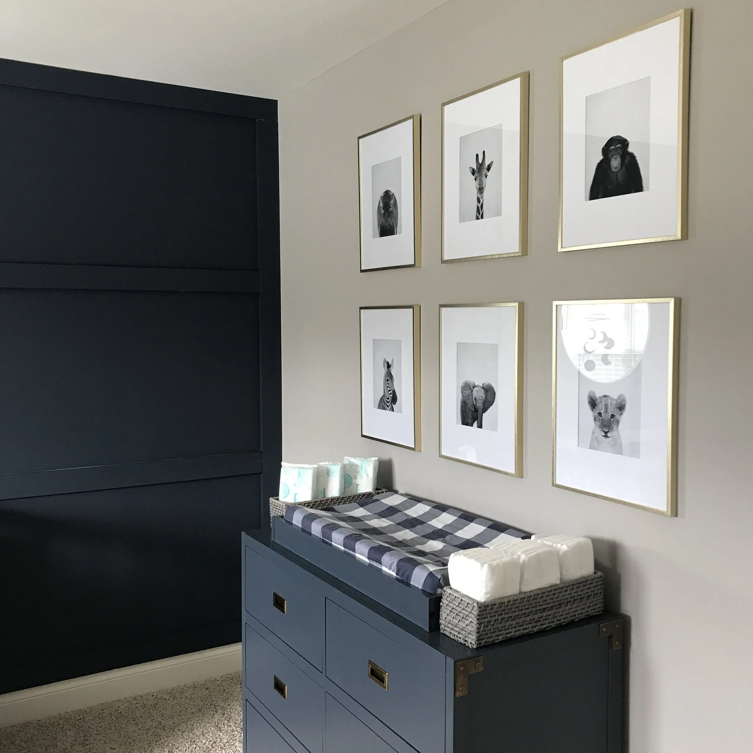
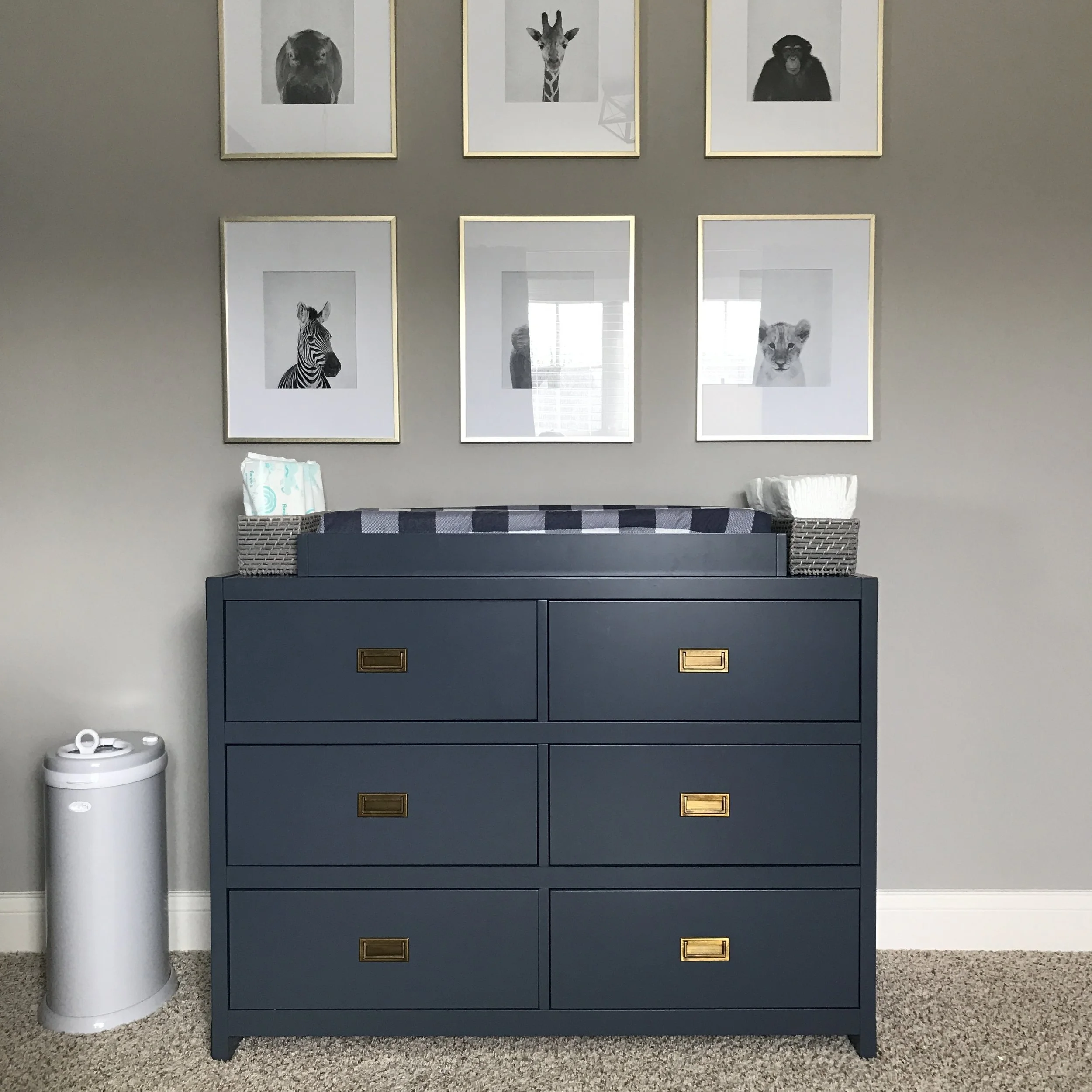
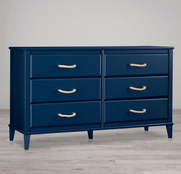
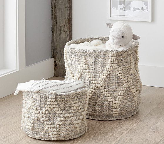
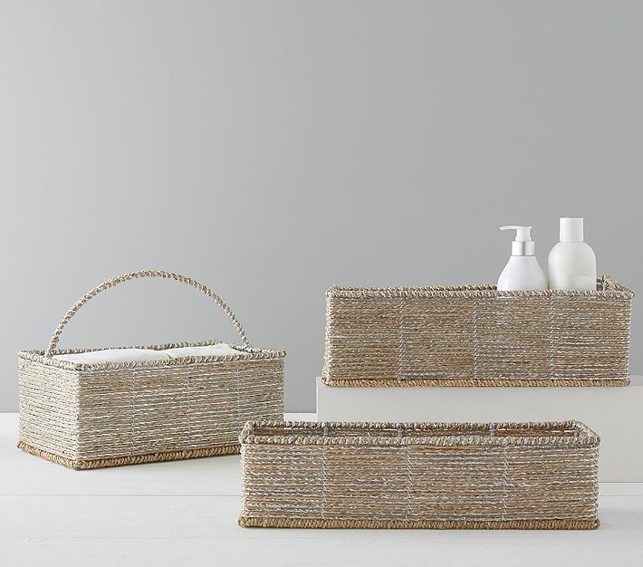
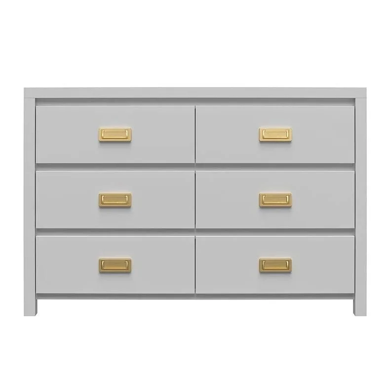
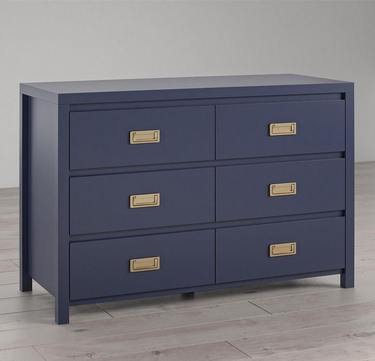
The navy dresser from Wayfair just happened to be the perfect navy color to coordinate with the walls and I love the brass hardware and campaign style details. We set it up as a changing table with some simple, modern animal prints above it (found on Etsy) each in brass frames from Target. I have been loving this more straight + lined-up look for gallery walls lately and it especially works in this space. We were able to easily set the dresser up as a changing table and added some baskets from Pottery Barn for storage.
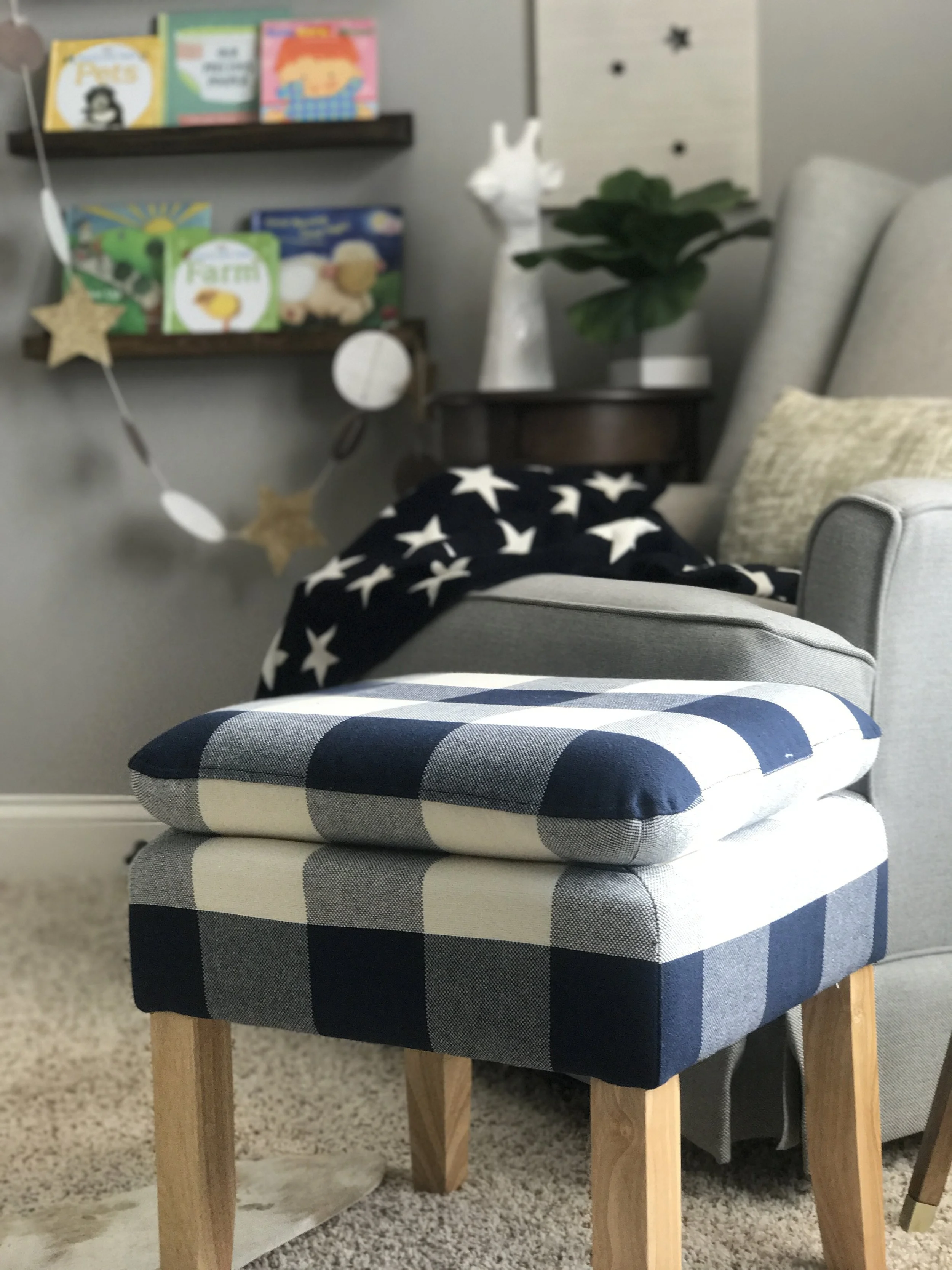
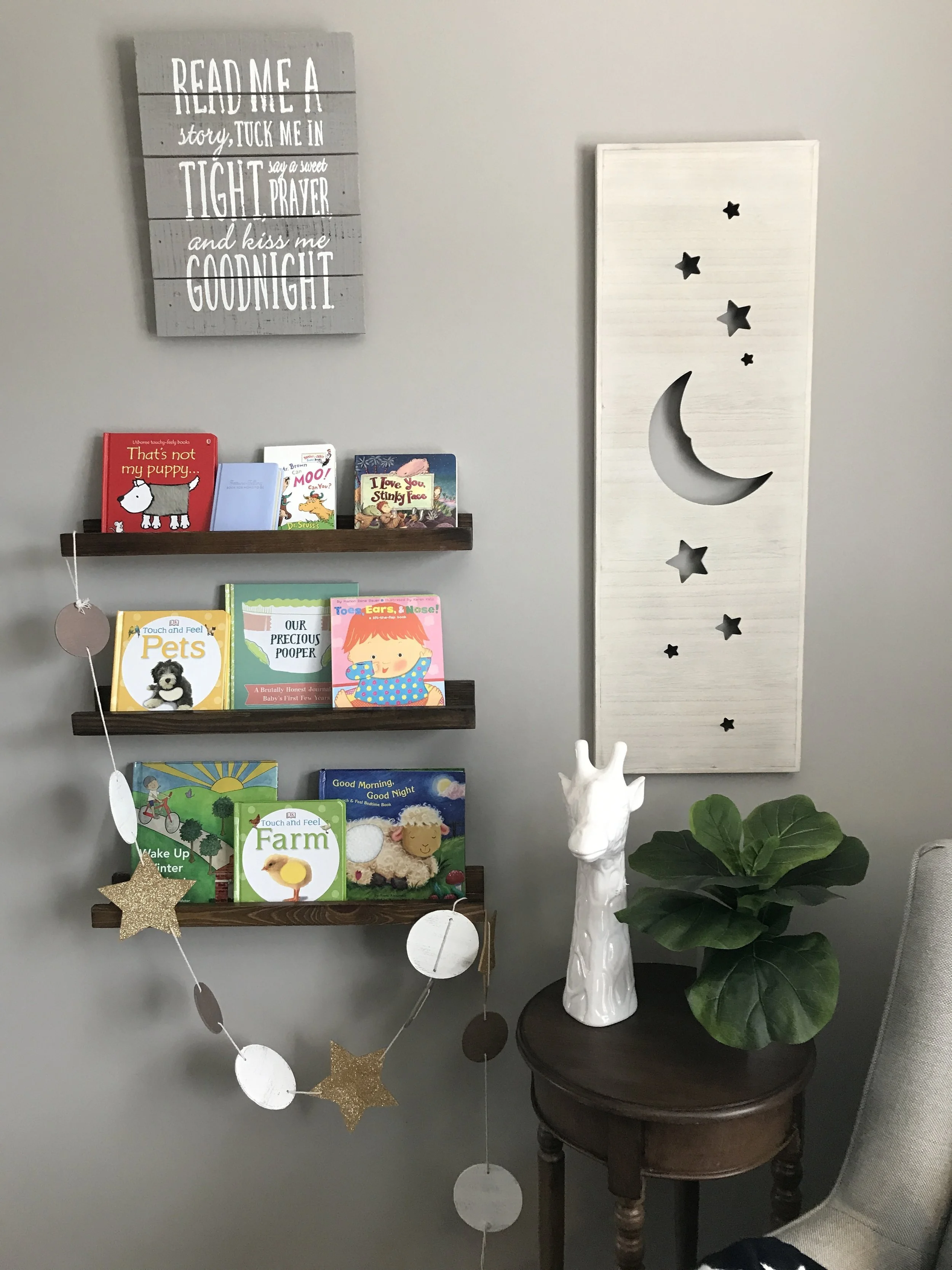
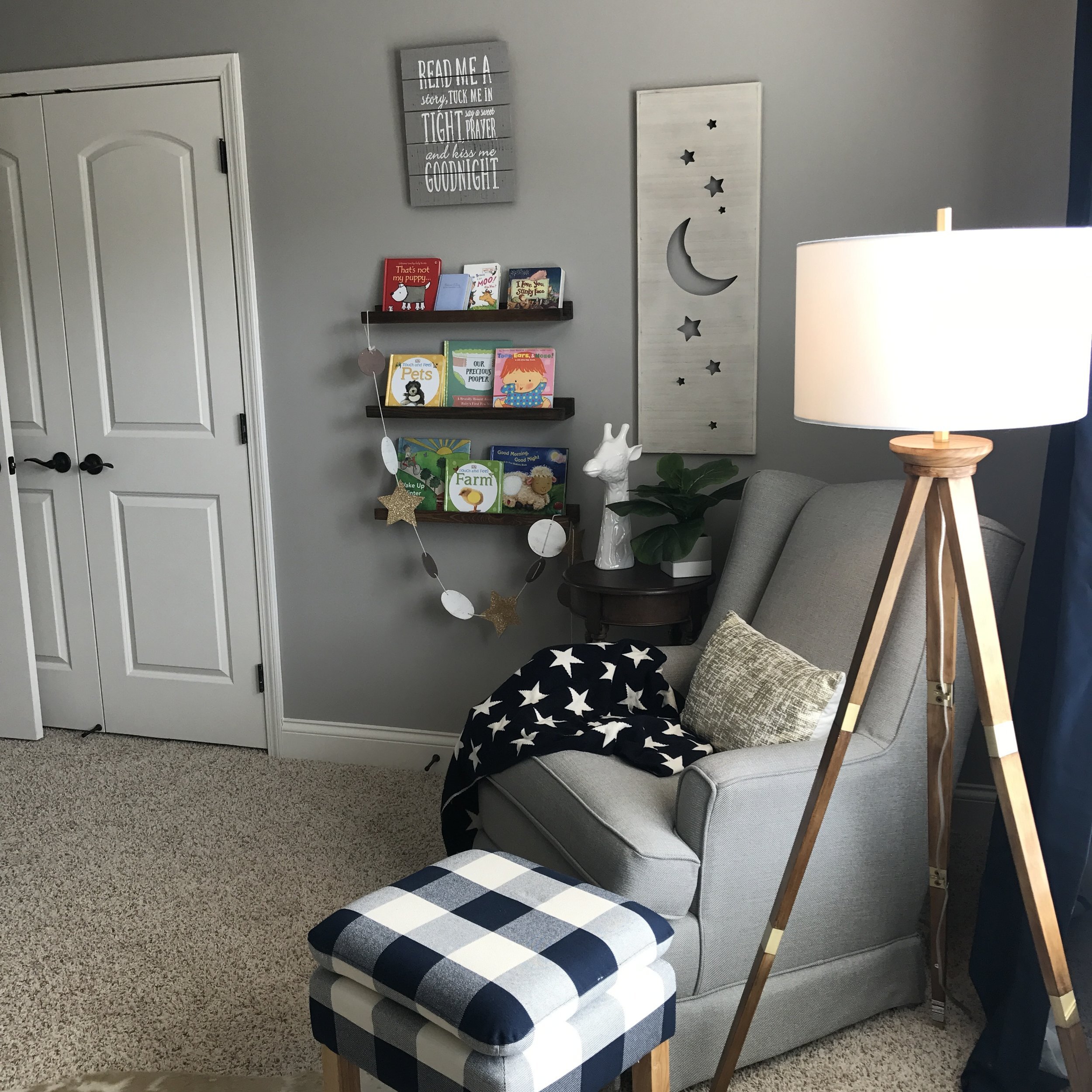
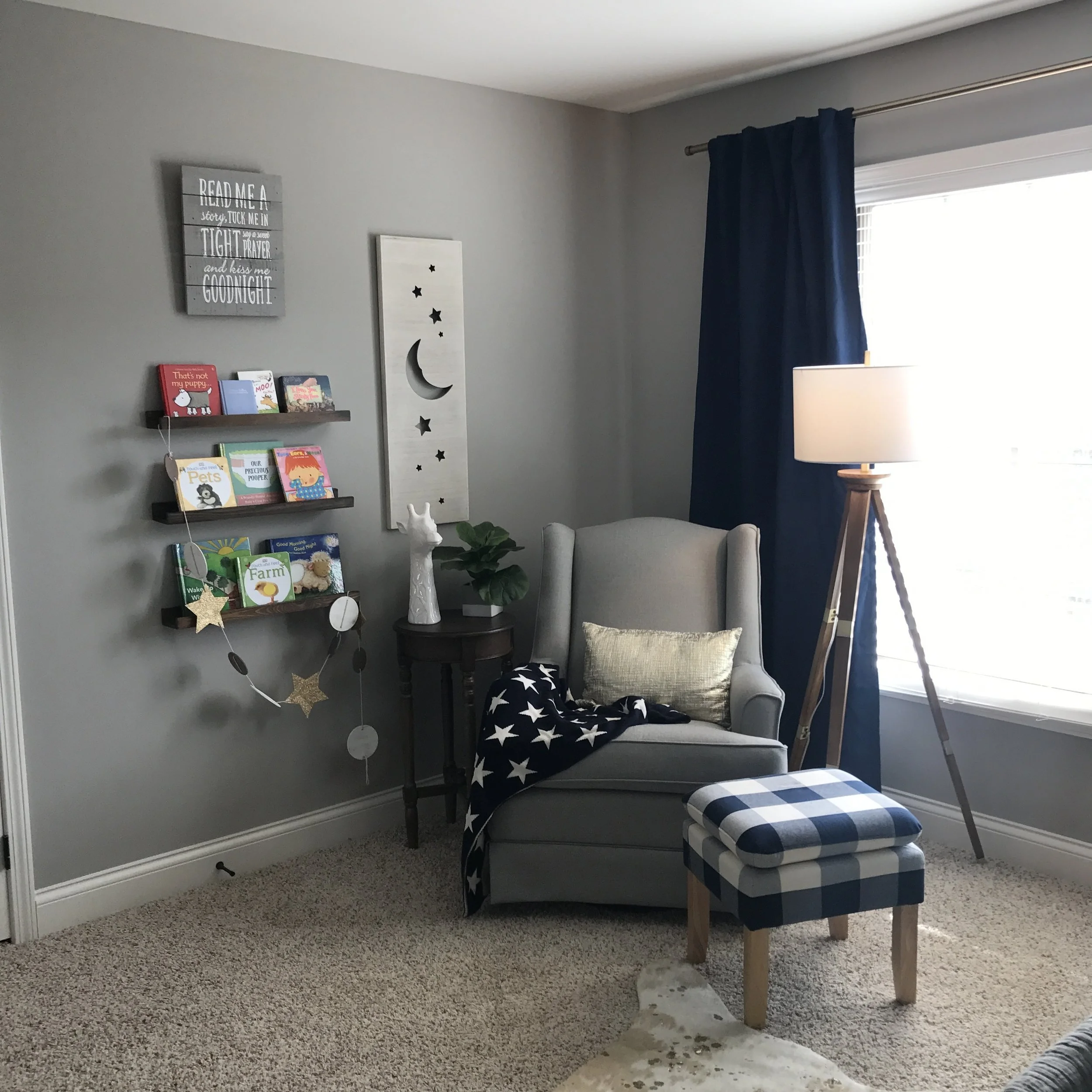
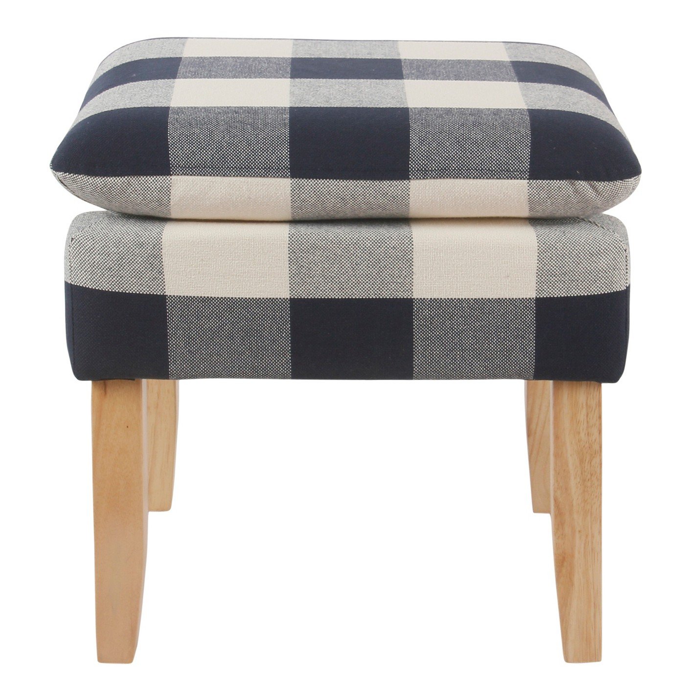
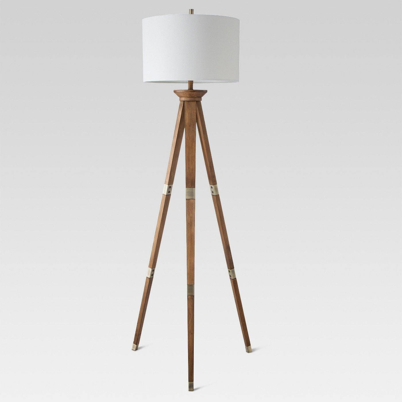
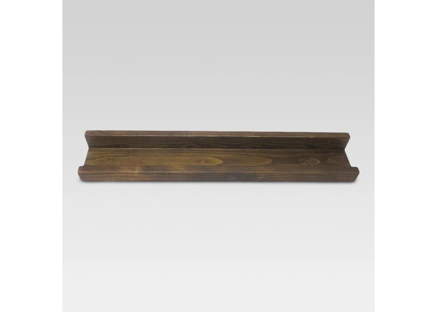
We also created a little reading nook with some book ledges, rocking chair, and floor lamp. I found a perfect side table from Homegoods along with the cute giraffe statue, faux fiddle leaf fig, and knit stars blanket. The book ledges are actually picture ledges from Target but they also work perfectly for leaning books too! I found a cute quote sign from Hobby Lobby for above the books and the moon and stars wood cut-out sign at Homegoods which filled the rest of the space perfectly. One of my favorite little details over here is the plaid ottoman which adds the perfect pop of pattern in this corner.
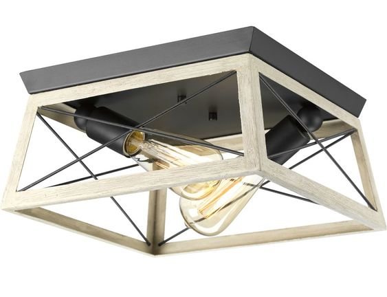
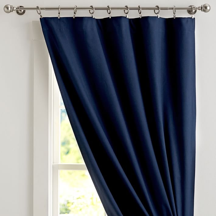
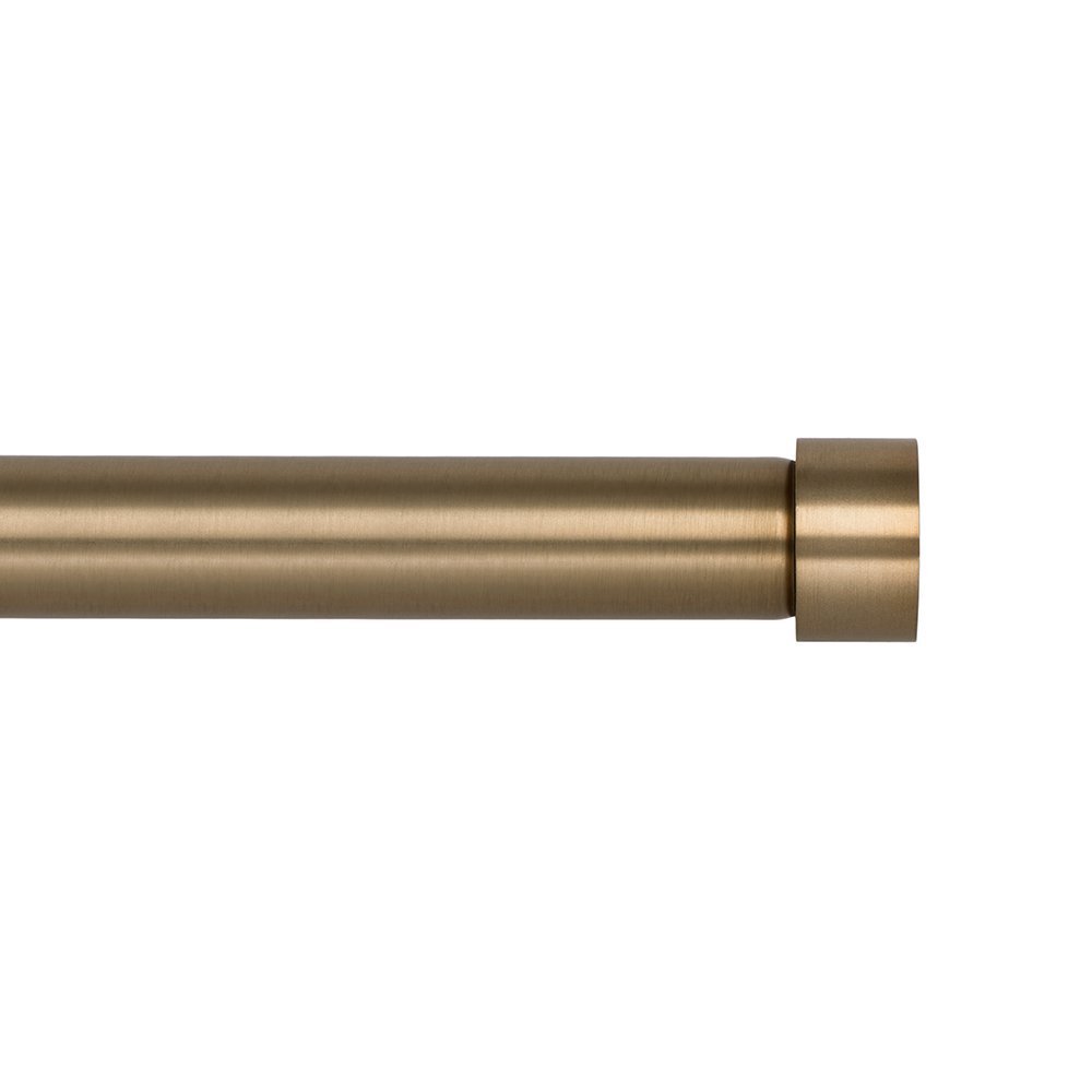
We went back and forth on the window treatments but ultimately a solid color would be best and that we needed some navy over there to balance everything out. I also used my favorite West Elm knock-off brass curtain rod which matched the rest of our brass details perfectly. We also changed out the ceiling light fixture for this super affordable and modern Wayfair flushmount. I love how clean and simple but cozy this space feels and I know it will easily be able to transition as their little one grows up. I've linked all the items I used in this space for you to shop at the end of this post, but if you have any questions about anything else, feel free to ask!
xoxo
Emily






![1293588[6].jpg](https://images.squarespace-cdn.com/content/v1/61705bd42945b34331c1718d/1638504760985-91P63RQ2KSEQSSEPF8HY/1293588%5B6%5D.jpg)
