Our Fixer Upper: Office Plans
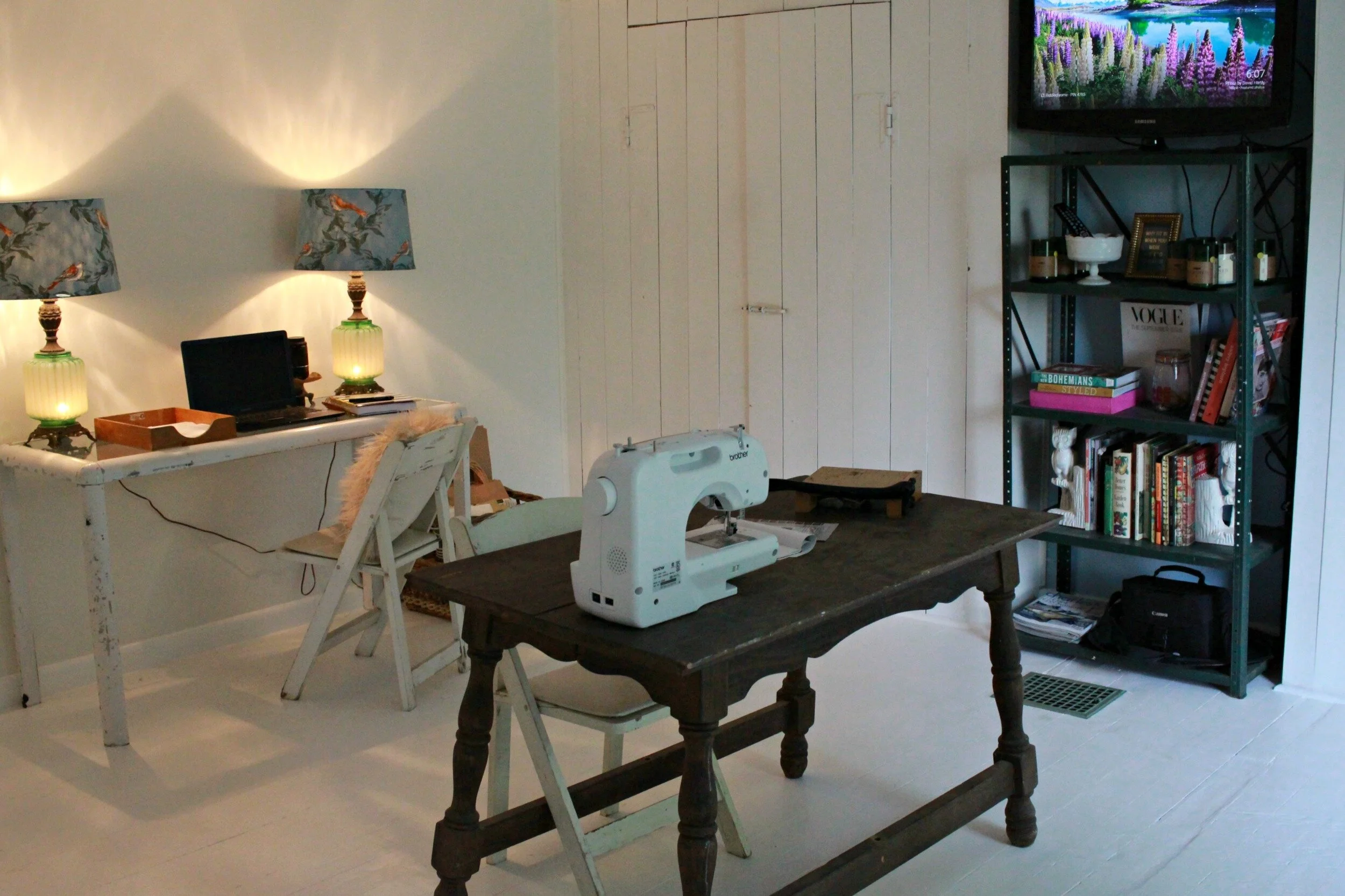
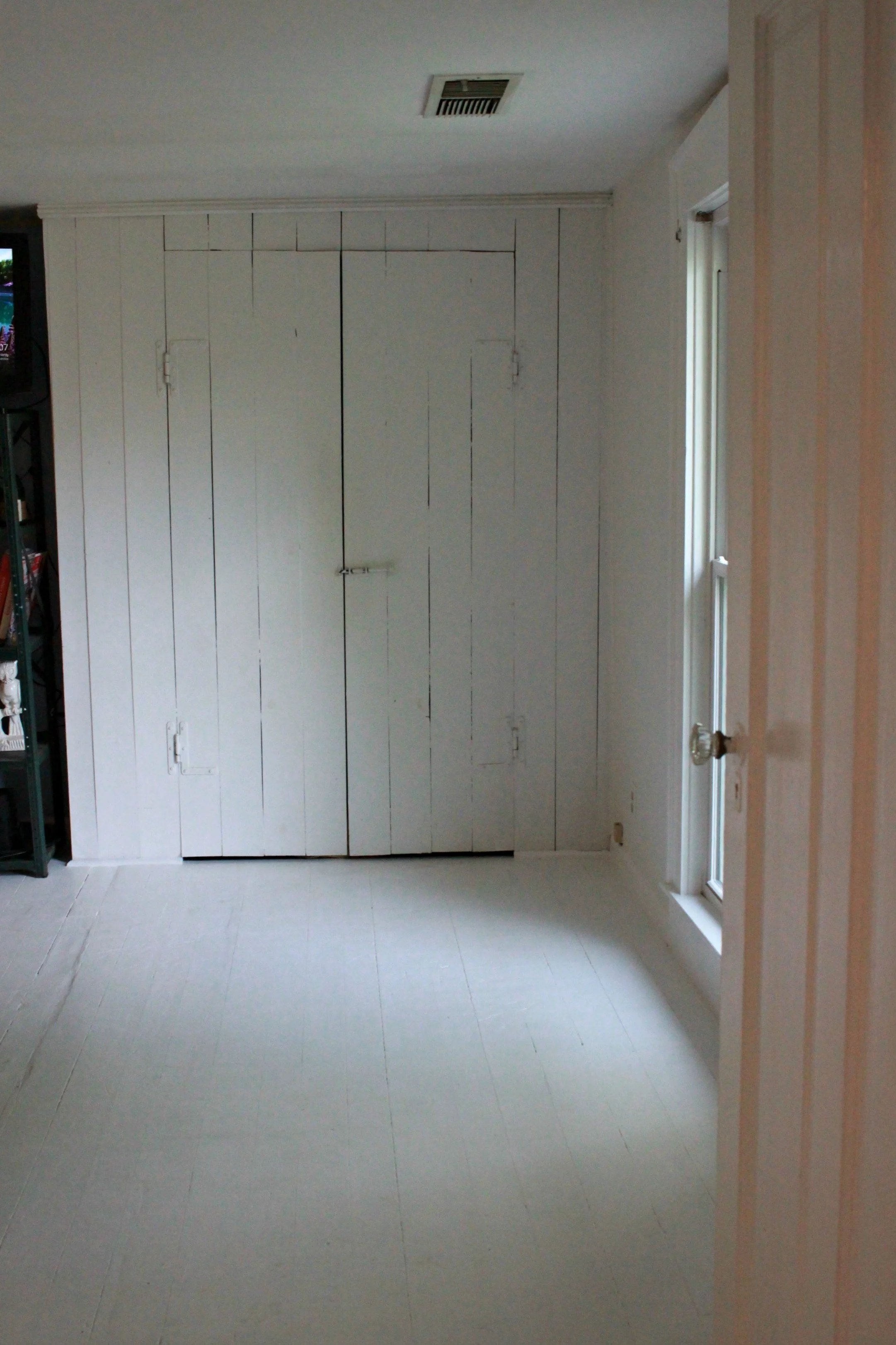
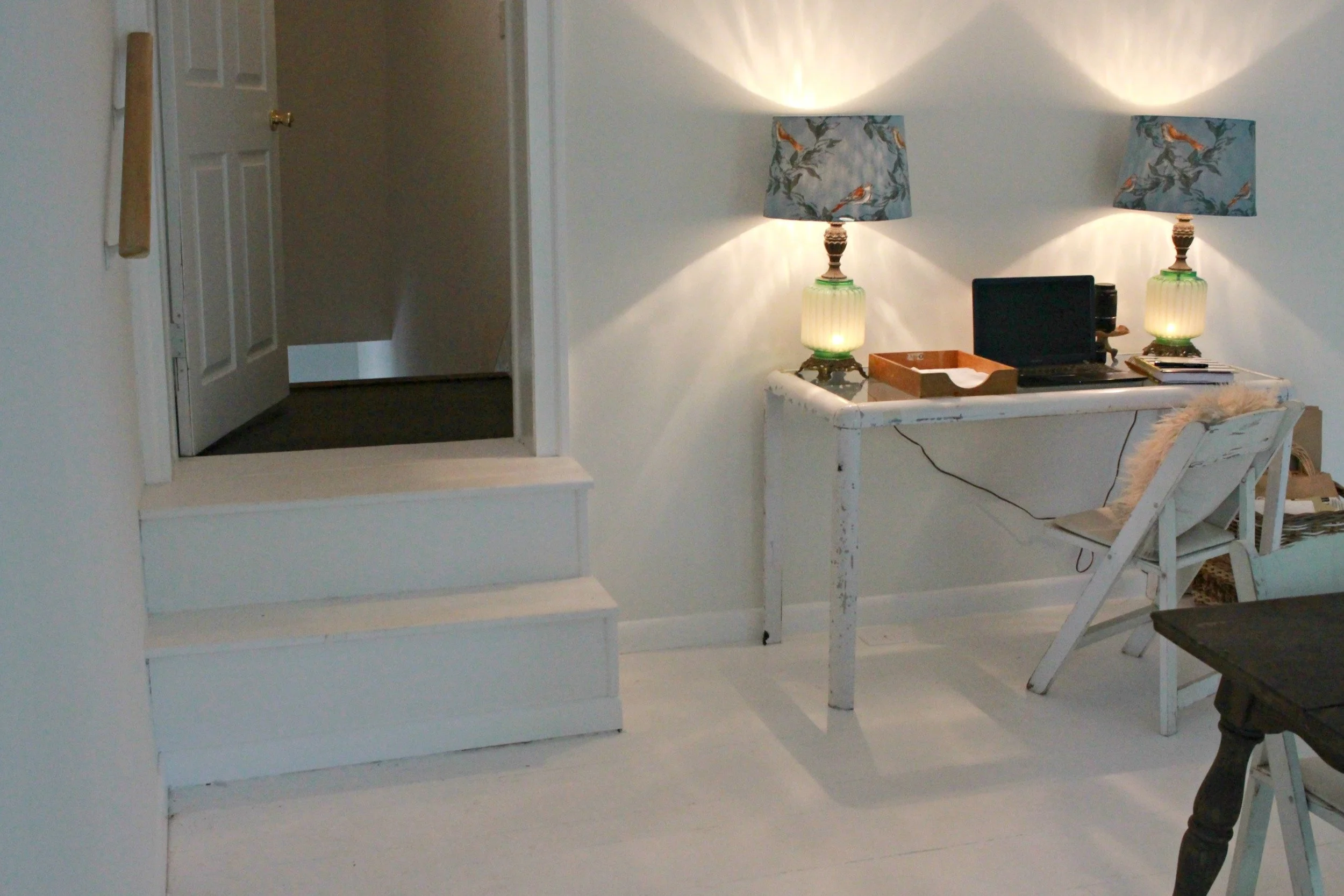
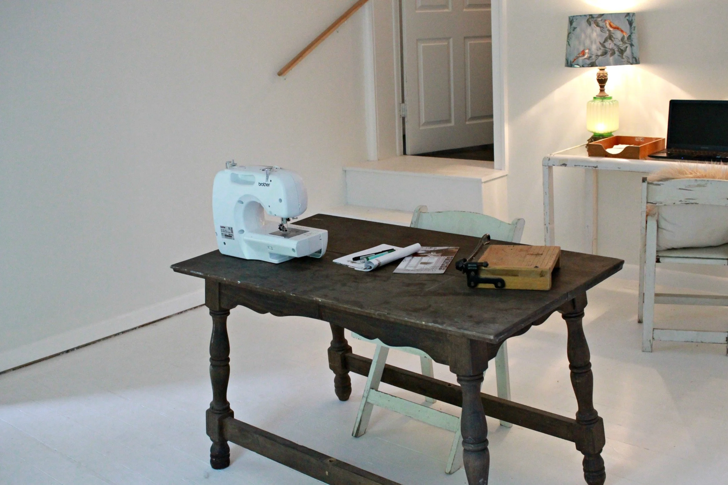
When we began our renovation on such a tight timeline, we had to prioritize all the spaces. Necessary rooms like the kitchen and bathrooms were most important and also required the most time and work. There were a couple of rooms in the house that were not touched during the renovation that I'm just beginning to work on. One of those is my office/studio, which I am super excited about designing. Thankfully this room didn't require any major work as far as construction- take a look at the before photos below:
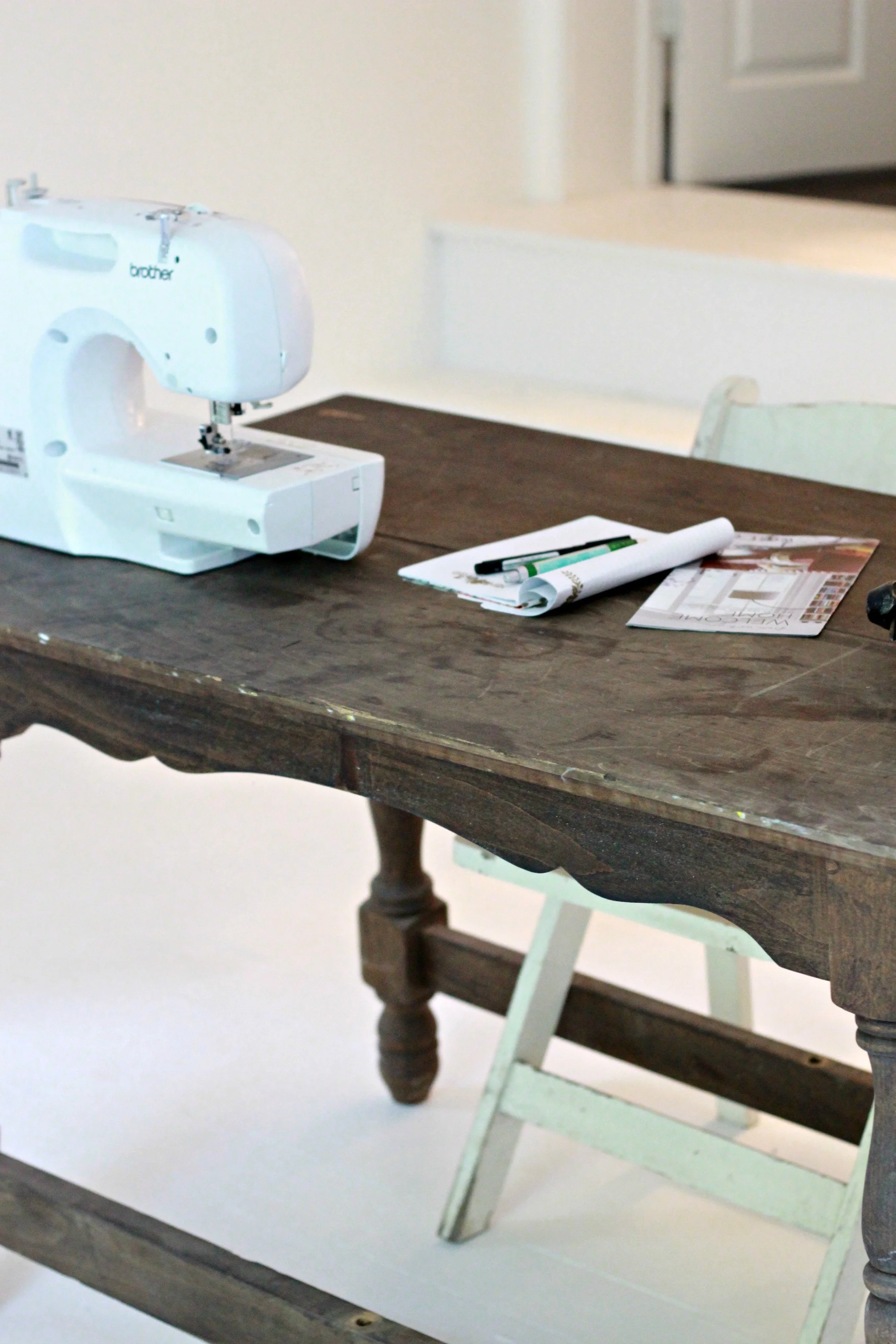
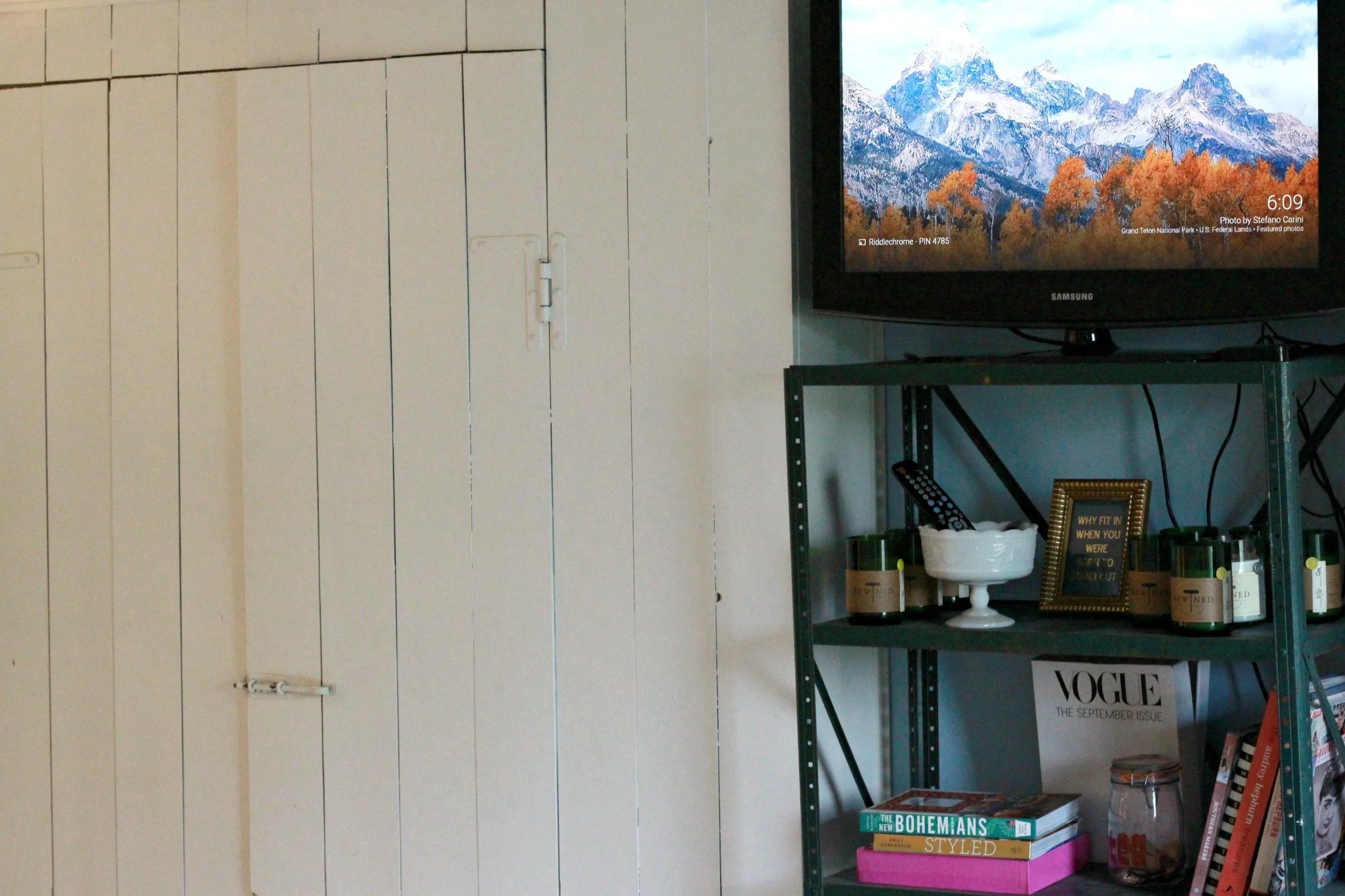
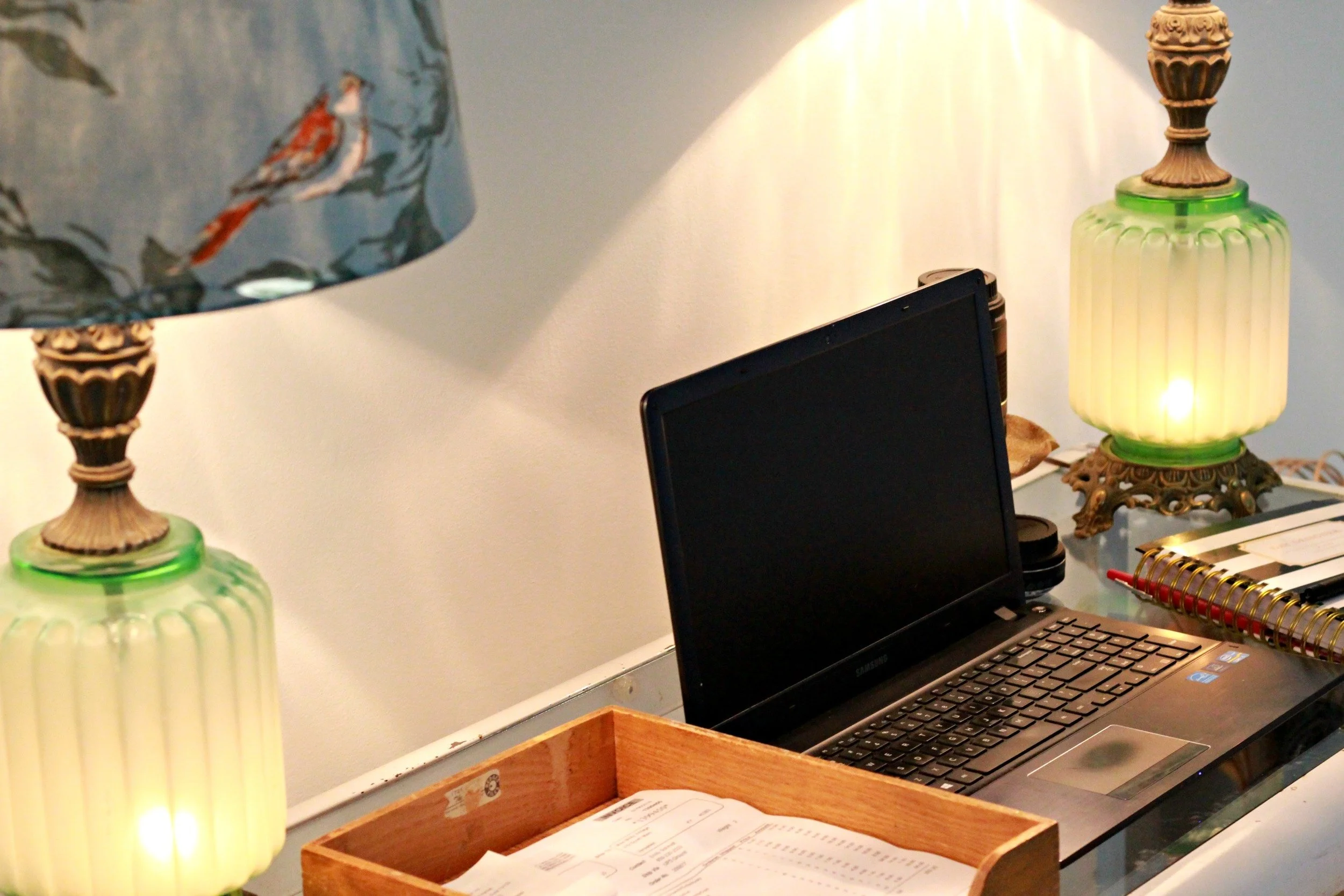
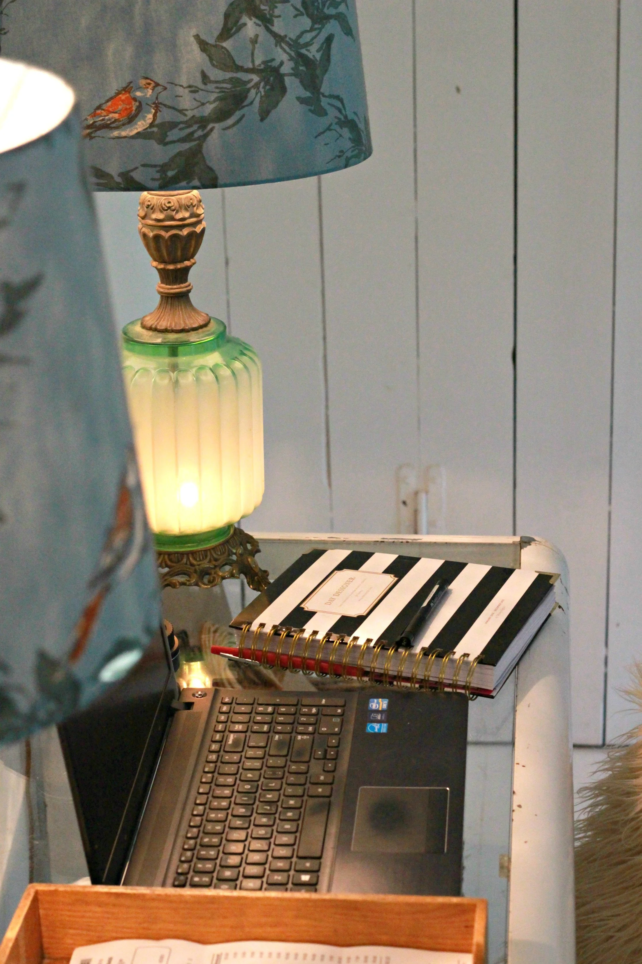
The only thing that has been done in this space so far is a fresh coat of white paint on the walls and floors. The wood floors had already been painted white and I really liked them, especially since I will be doing a lot of photography in this space. My painter added a fresh coat of white oil based porch paint to them that will be more durable and show less dirt. Other than that all the furniture is kind of a mash-up of leftover pieces I had and the closets have just been filled with random inventory and supplies (not organized at all yet!). I do not want to keep the shelf in between the closet doors because I eventually want to do a fun wallpaper on this wall and inside the closets and I don't want it to be completely blocked! These barn door closets are an original feature of the house that I just love and they provide me with so much extra storage. I'm hoping I can set up my TV inside one of the closets so that it isn't such a large eyesore in the middle of the room and can be closed away. I am so torn between styles for this space, so I keep on delaying decorating- check out my favorite inspiration photos below:
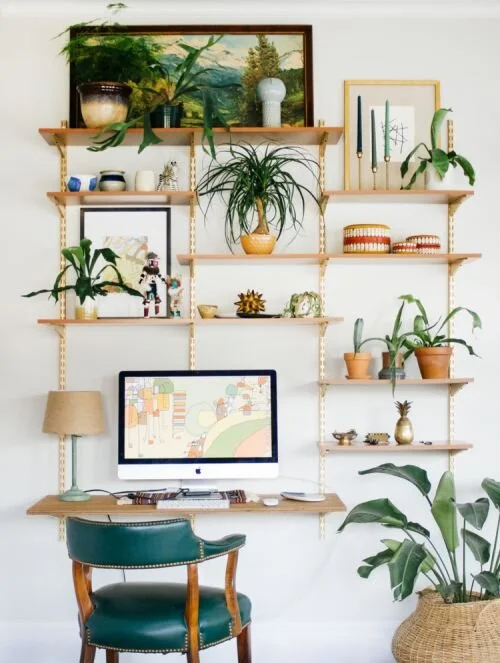
via Britta Nickel
I LOVE this open shelving concept for above my desk- standard bracket shelving that has been painted gold. I even already have a lot of this shelving that was left in the house when we bought it! I think this is a must to fill the space on the white open walls and give me room to keep supplies close by.
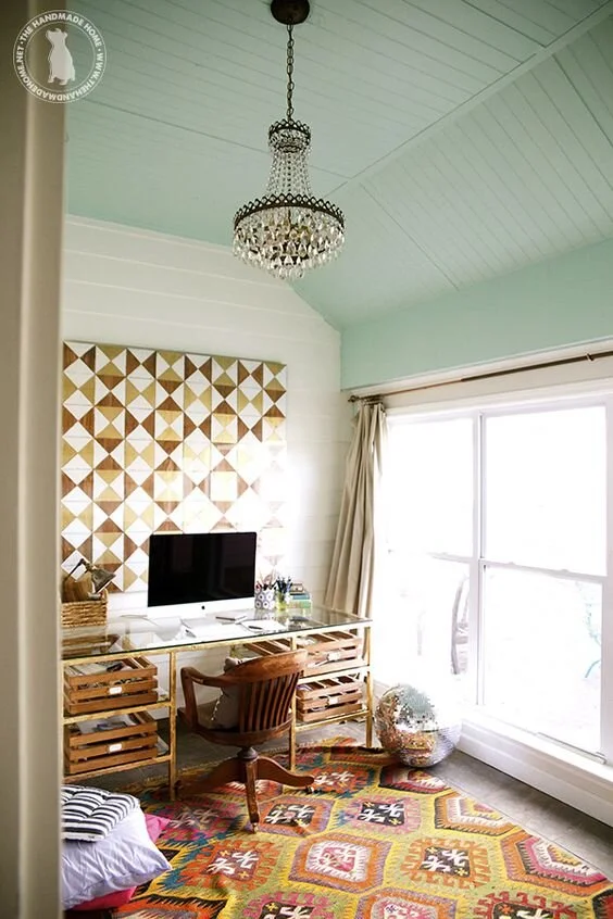
via The Handmade Home
I really like the pop of color on the ceiling in this room. Since the entire room is white this might be a nice touch for this space.
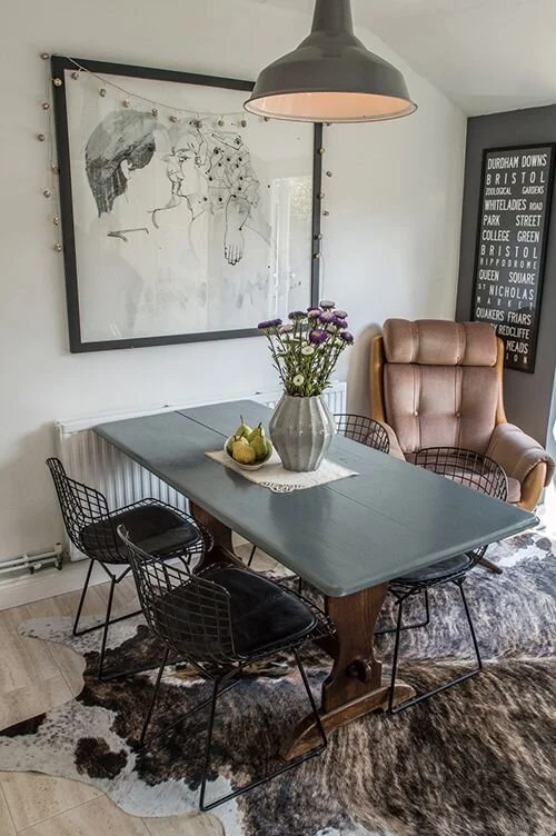
via Design Inspiration
I always love a cowhide rug and I also really like how they painted the top of this old table and left the bottom wood. The table I'm using in the center of the room is very similar to this style. I'm not sure it's exactly what I want for the space but if I decide to keep it, painting it would definitely add a modern touch.
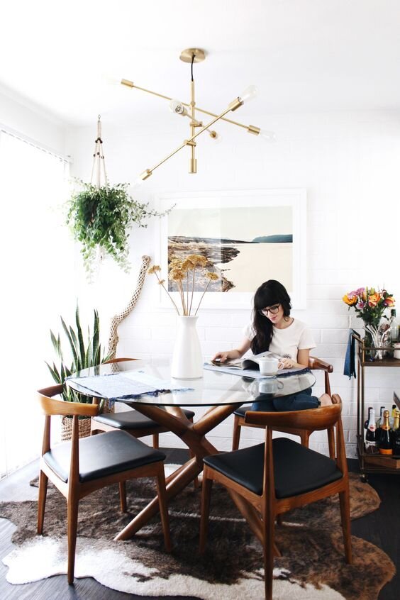
via New Darlings
What I REALLY want in the center of the room is a cool, old round table (maybe a wood pedestal table?). I'm envisioning lots of mismatched stools and chairs around it, so the room really feels like a studio/workspace.
via A Pair and a Spare
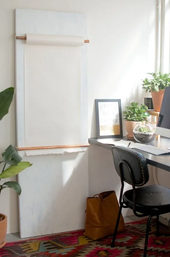
I think this DIY hanging paper roll is a must! A Pair and a Spare always has the best DIYs!
via Icing on the Cake Blog
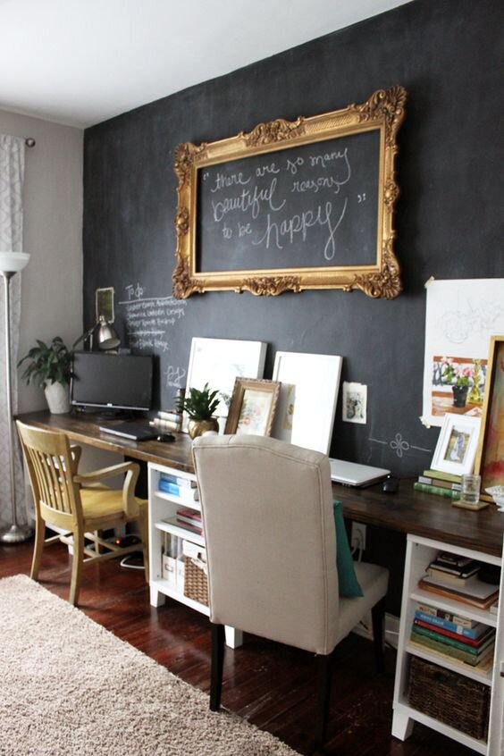
I love this chalkboard statement wall and the super long desk idea with multiple work stations!
via The Glitter Guide
Wallpaper! I decided almost immediately that I wanted a statement wall of wallpaper. I want to do the wall with the closets, wallpapering inside each closet and the wall area in between them. I also may paint the closets a coordinating color so that they really pop. See more of my wallpaper options + top picks at the end of this post.
via New Zealand Design Blog
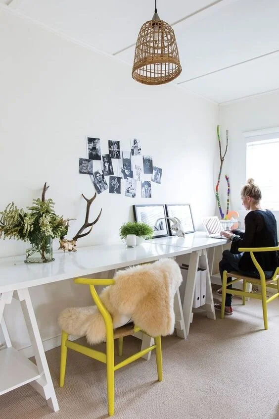
I really love this super clean and modern workspace with the pops of yellow! I have contemplated throwing out all the furniture I have and go with something super sleek like this instead.
via House of Hackney
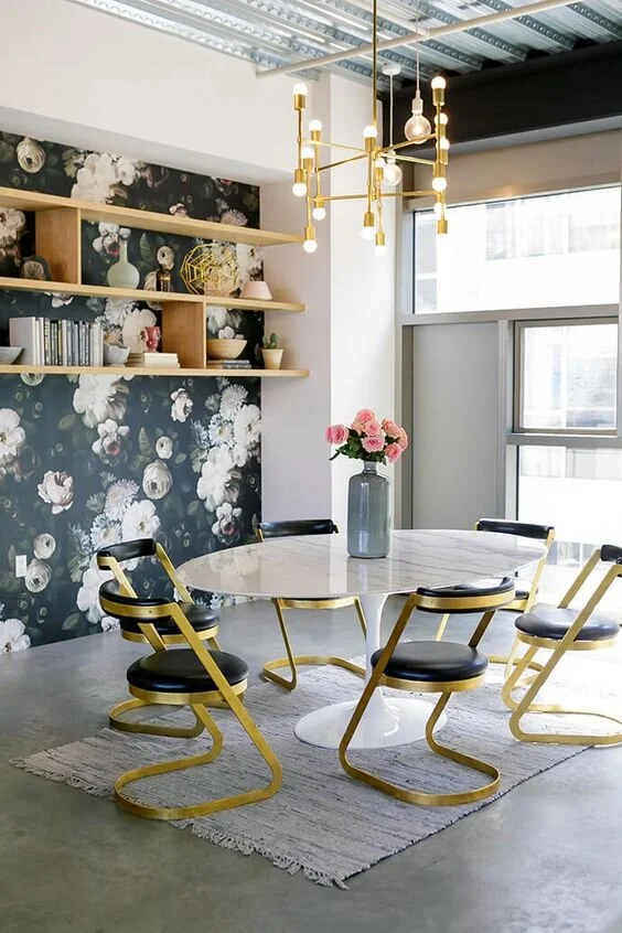
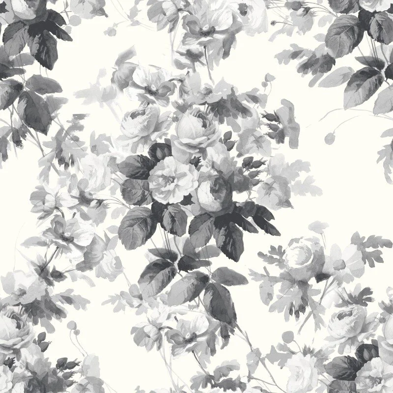
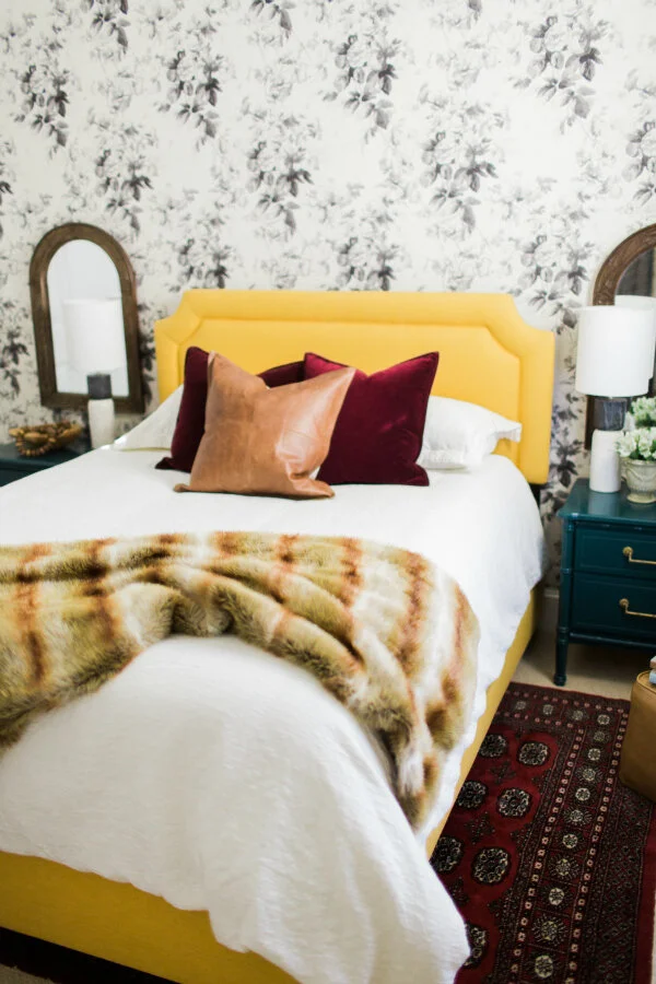
Option number one for wallpaper: London Rose by House of Hackney. I really like the antique look of this floral print, plus it's neutral enough that I could style it several different ways. I could definitely go super sleek and modern for a really cool contrast or really girly and luxe a la Claire Brody's design below. I love how she mixes in all these unexpected colors and jewel tones and I think that could be really fun for an office.
via Claire Brody Designs
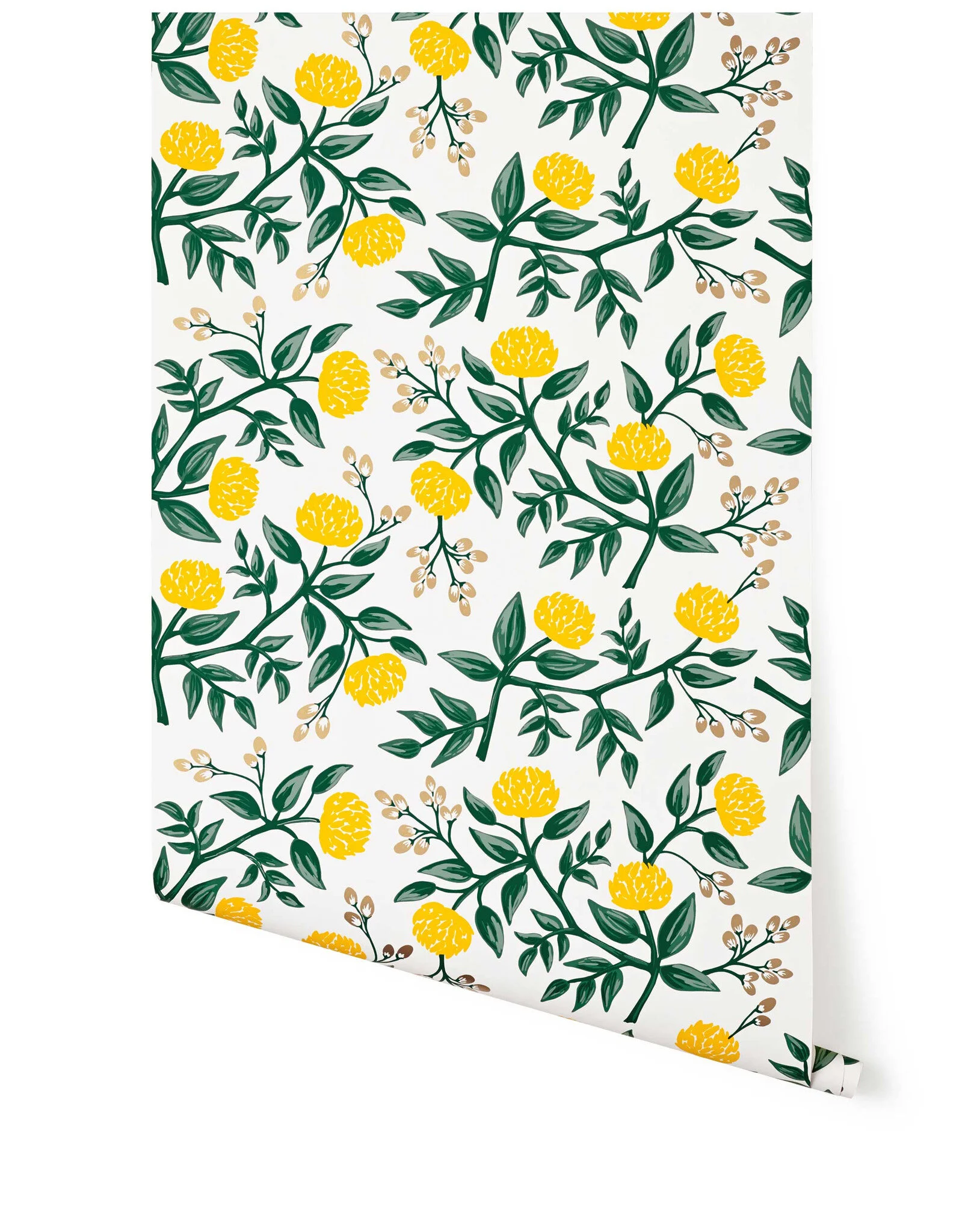
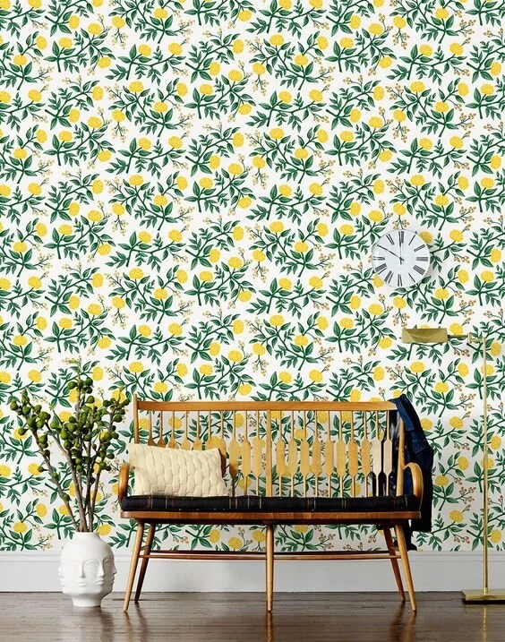
Option number 2: Yellow Peonies by Hygee & West/ Rifle Paper Co. I'm so torn! I know this is kind of a polar opposite from the other wallpaper, super whimsical and vintage, while the other is more mature. I have not really done a fun, bright super-girly room in any space in the house so that makes me lean towards this print. It will just be on one wall (with everything else white) so it will not be too overpowering or overwhelming. If I chose this print I would definitely keep the furniture/style of the rest of the space super sleek and modern to keep it from looking like a children's room.
via Hygee & West
via My Domaine
Which wallpaper is your favorite and which coordinating decor style do you think I should go with for this space? I can't wait to hear what you think!
xoxo
Emily


