Our Fixer Upper: Kitchen Progress
I've been saving this kitchen post for a while for a couple of reasons: 1. I feel so overwhelmed to share this space because of how many details and elements there are to discuss 2. I feel like I still have a lot to do for it to look truly "finished" 3. And finally, it clearly is the biggest project (and best room) of the renovation so I wanted to save the best for last! I finally decided that I have waited long enough and I would go ahead and share some sneak peaks. I have been so busy trying to catch up from the move that I haven't posted any renovation progress in a couple of weeks. While all the big projects are behind us (check out the before pictures here), I still have a ton of decorating work to do in just about every space. The kitchen just keeps evolving as we get settled, find places for everything, and slowly add some decor. I don't feel quite ready to title this the official "before + after," so we will just call it a progress update for now!
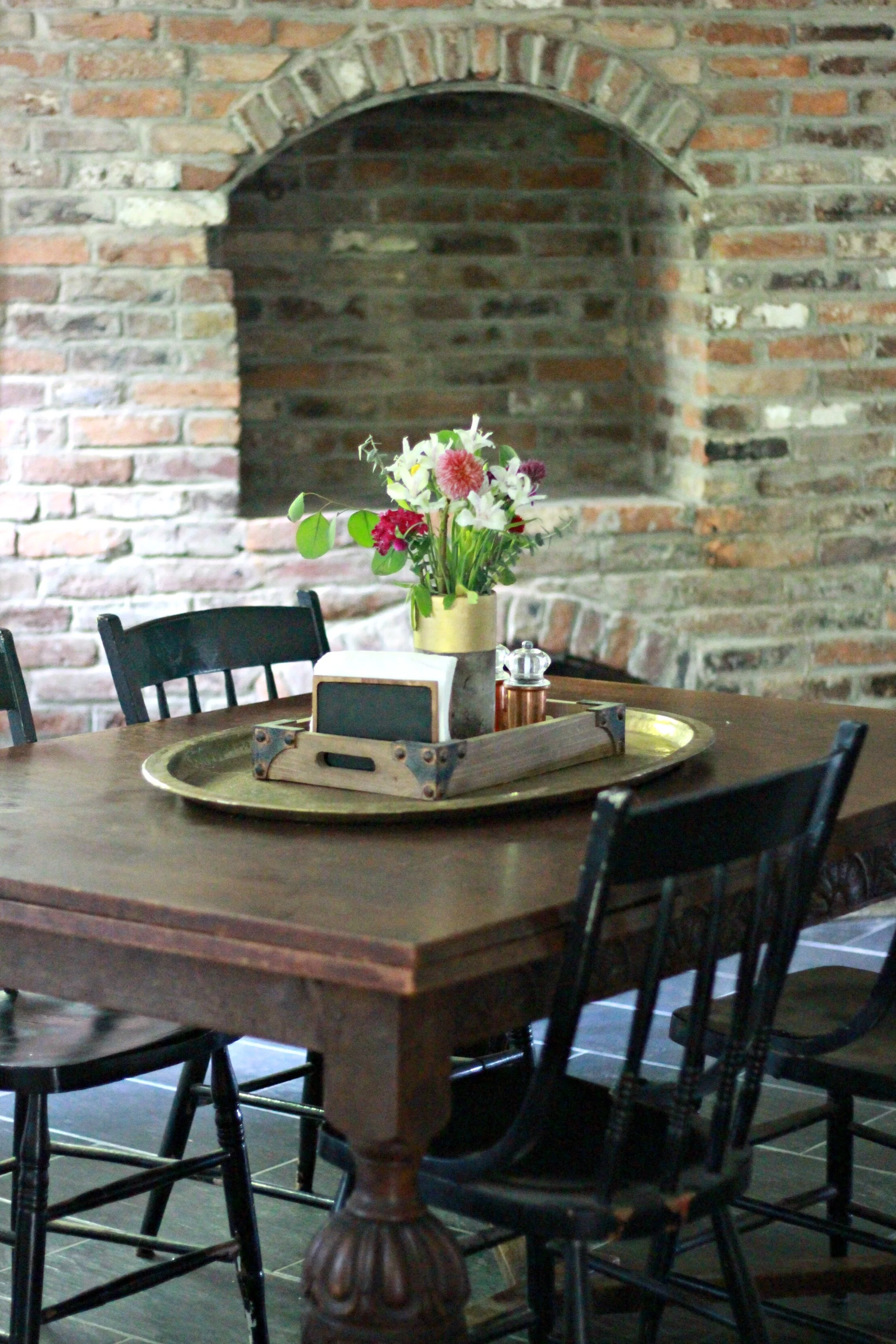
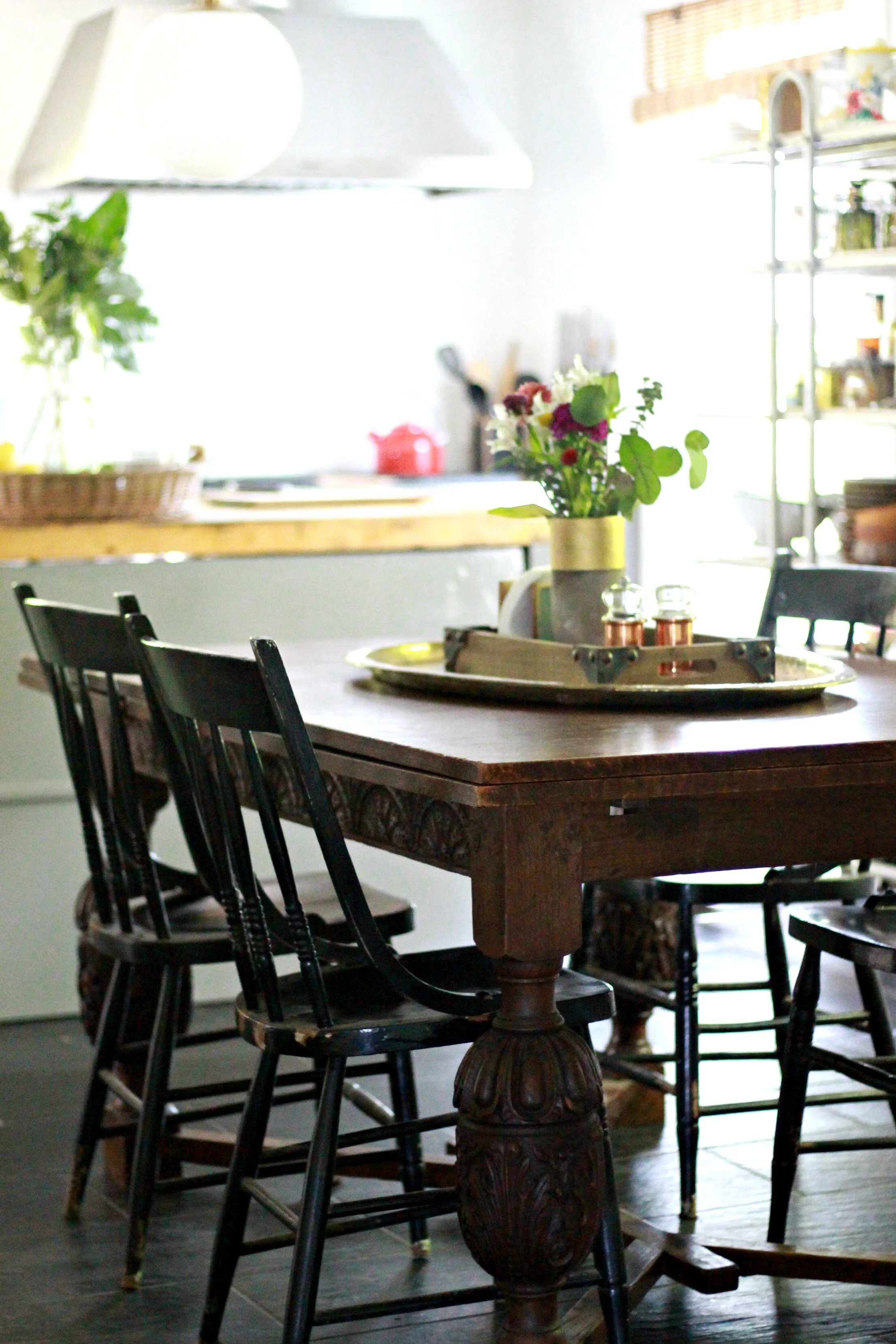
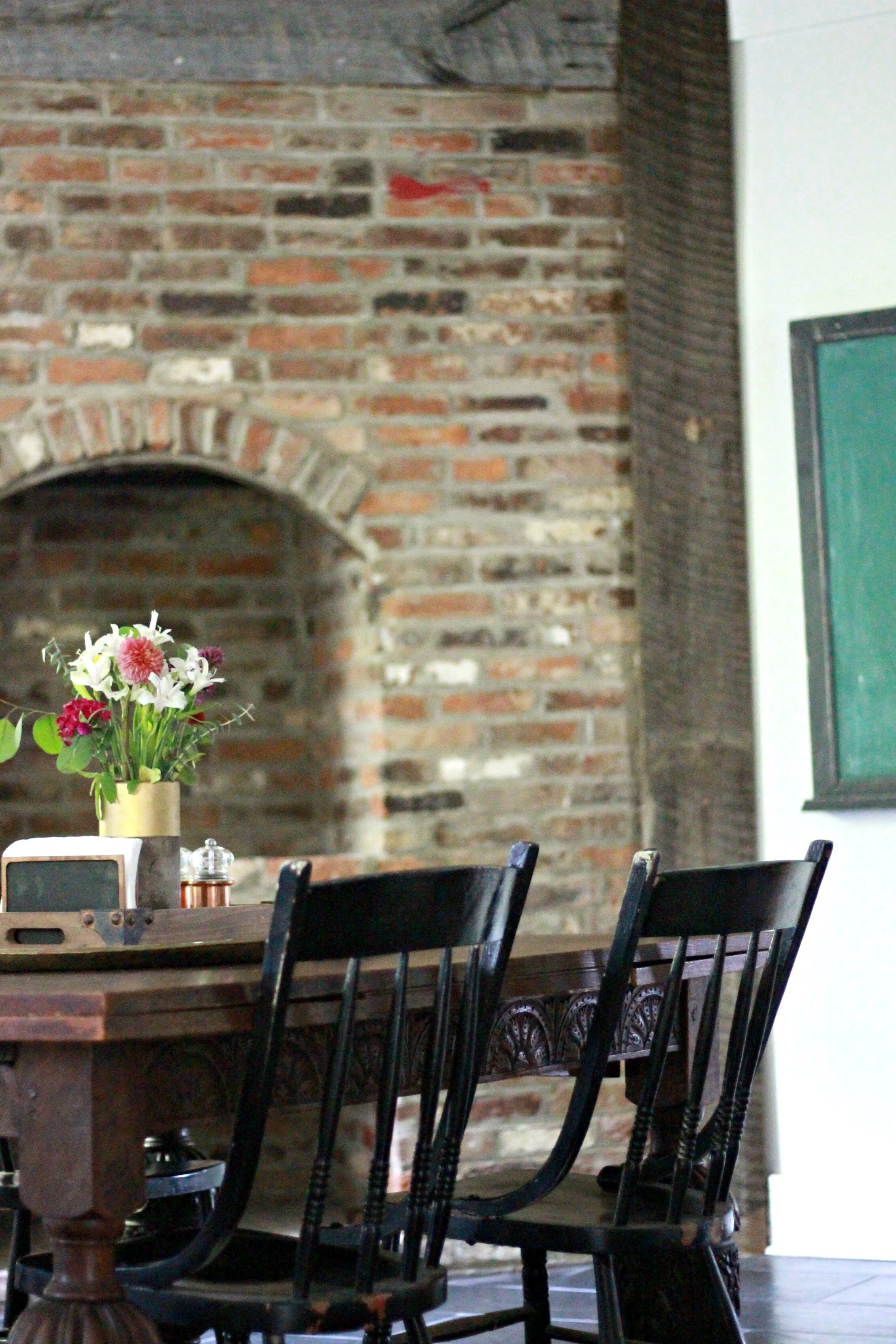
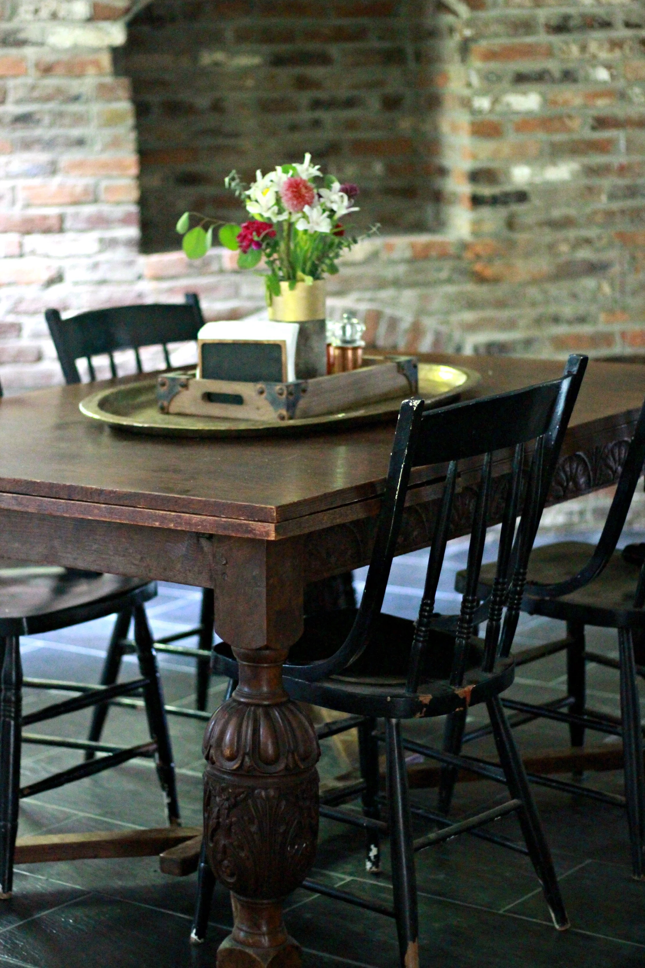
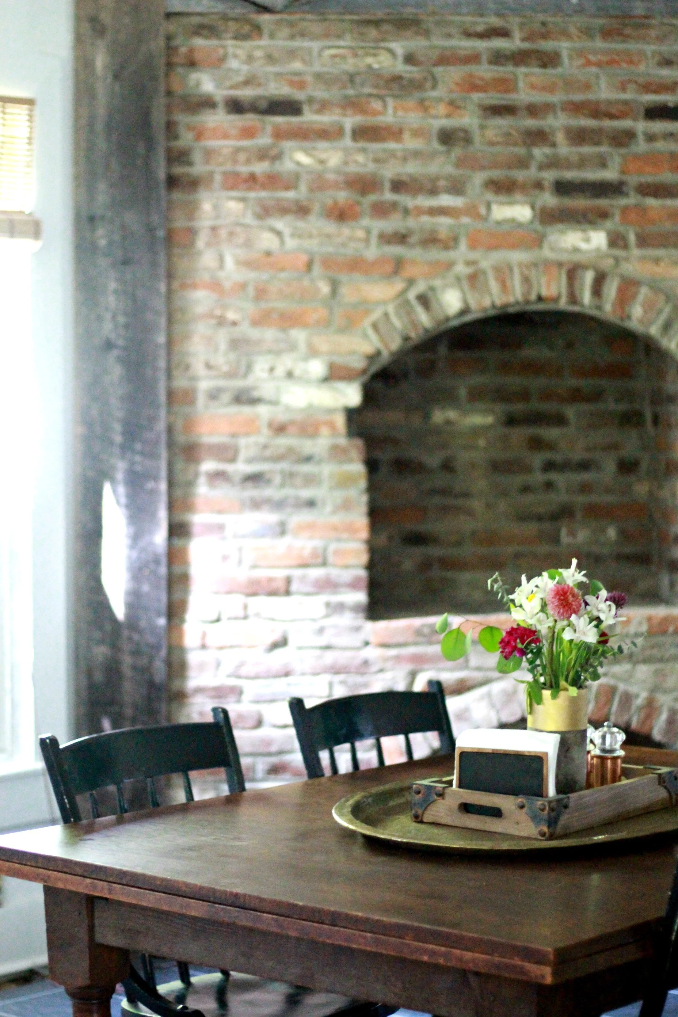
If I'm being honest, this whole renovation adventure started with the fireplace. It is what we fell in love with before even seeing the house in person and the reason we even gave the house a chance. I love having a fireplace in the kitchen and if it was up to me, I'd have this beautiful exposed brick all over the house! We removed the outdated trim that was covering the edges and replaced it with reclaimed barnwood trim. I found our new dining table at our local Restore and it is the perfect style and size that I was looking for! It also has leaves on both sides that pull out to make it twice this size if we need it. New dining chairs are something that is still on my to-do list but I have a few options in mind.
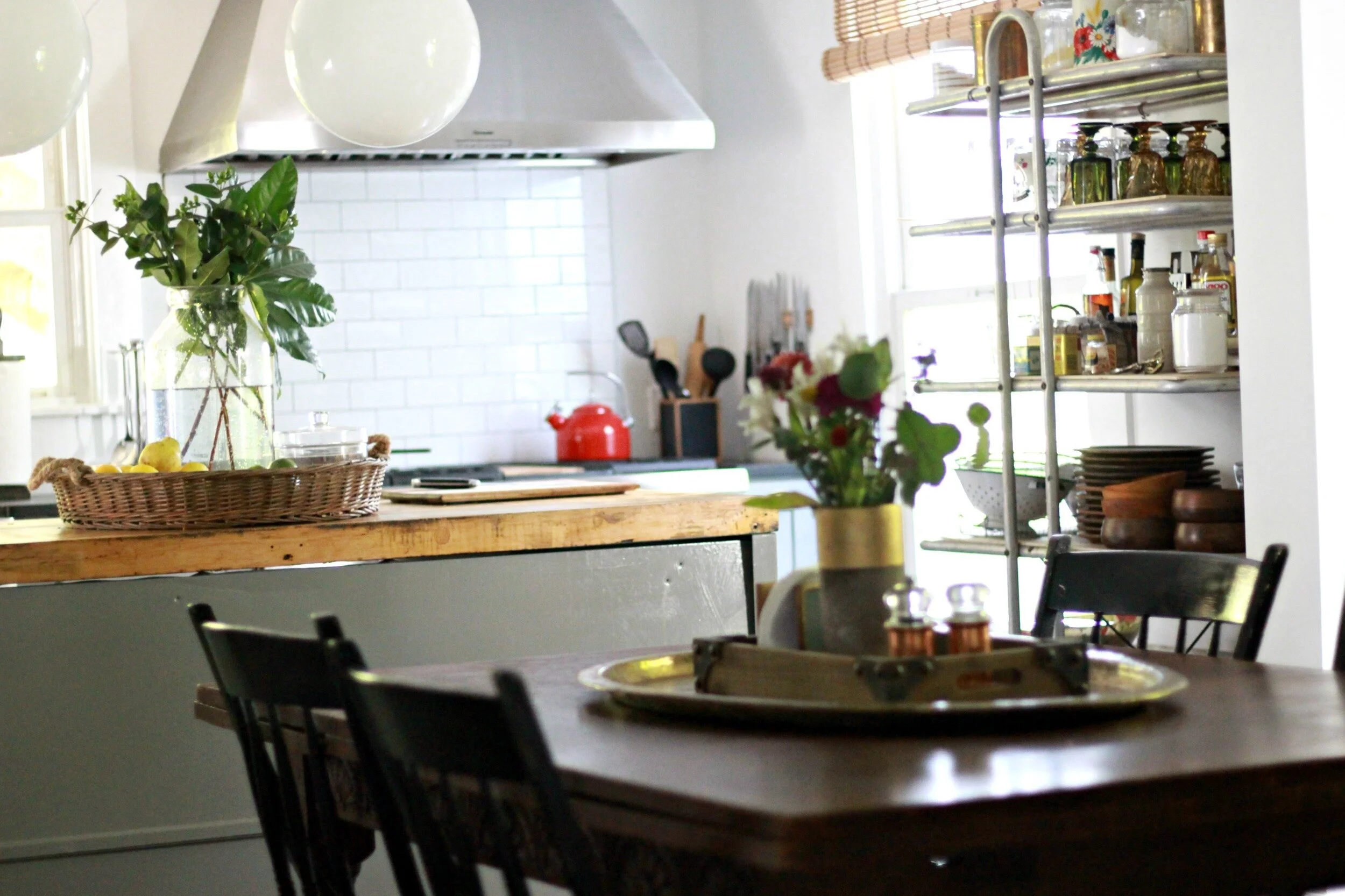
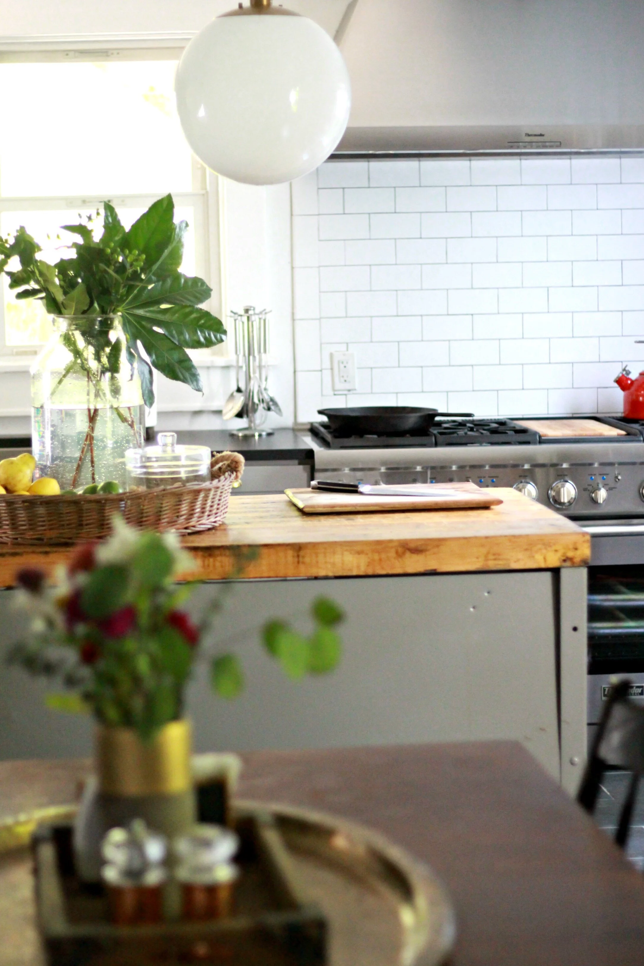
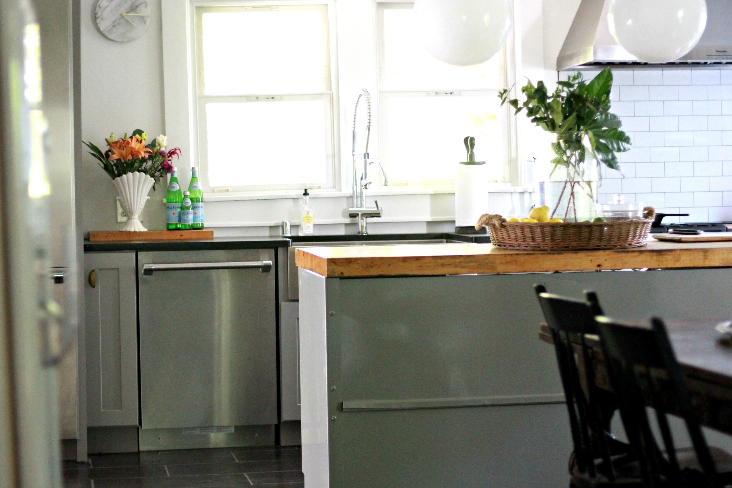
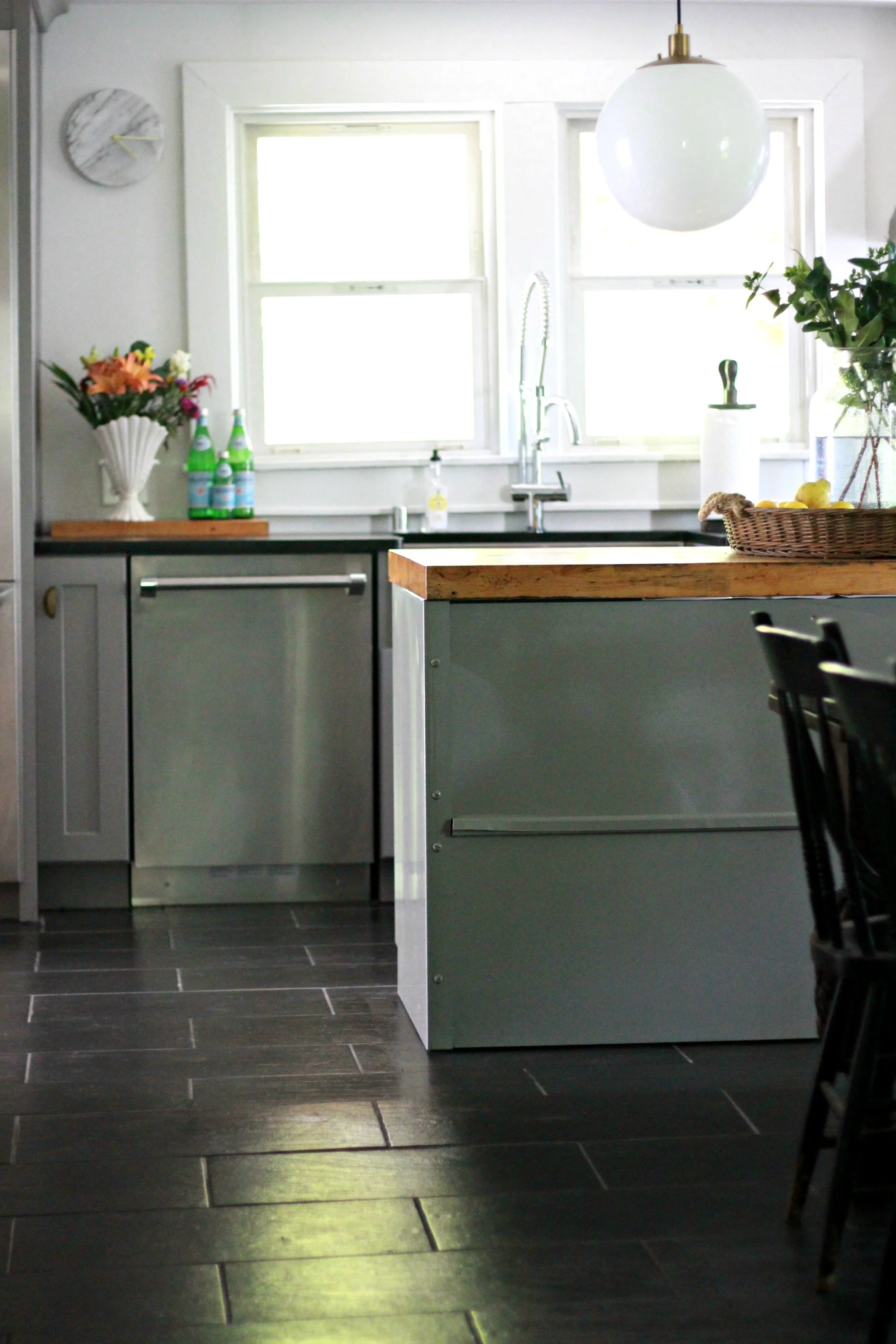
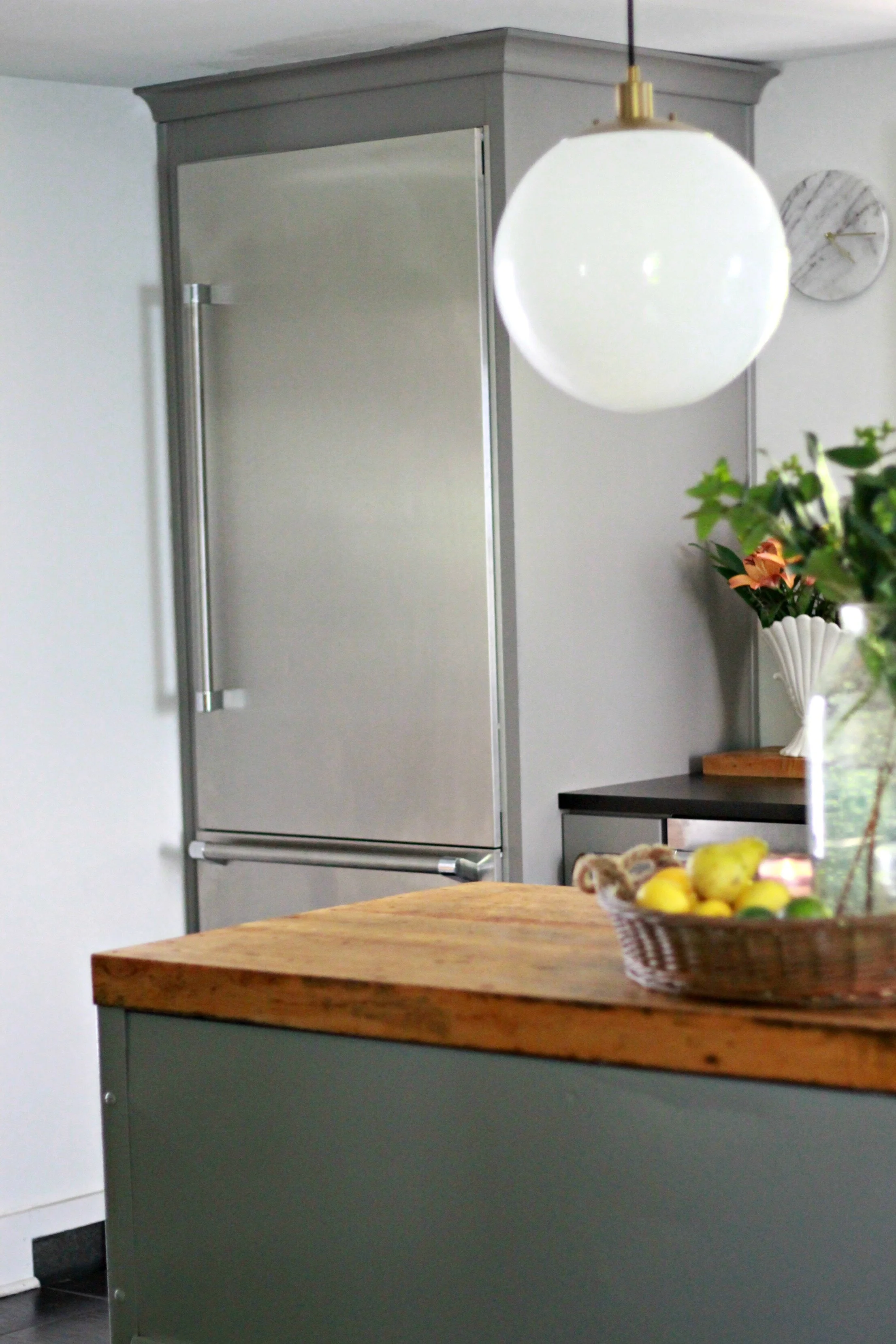
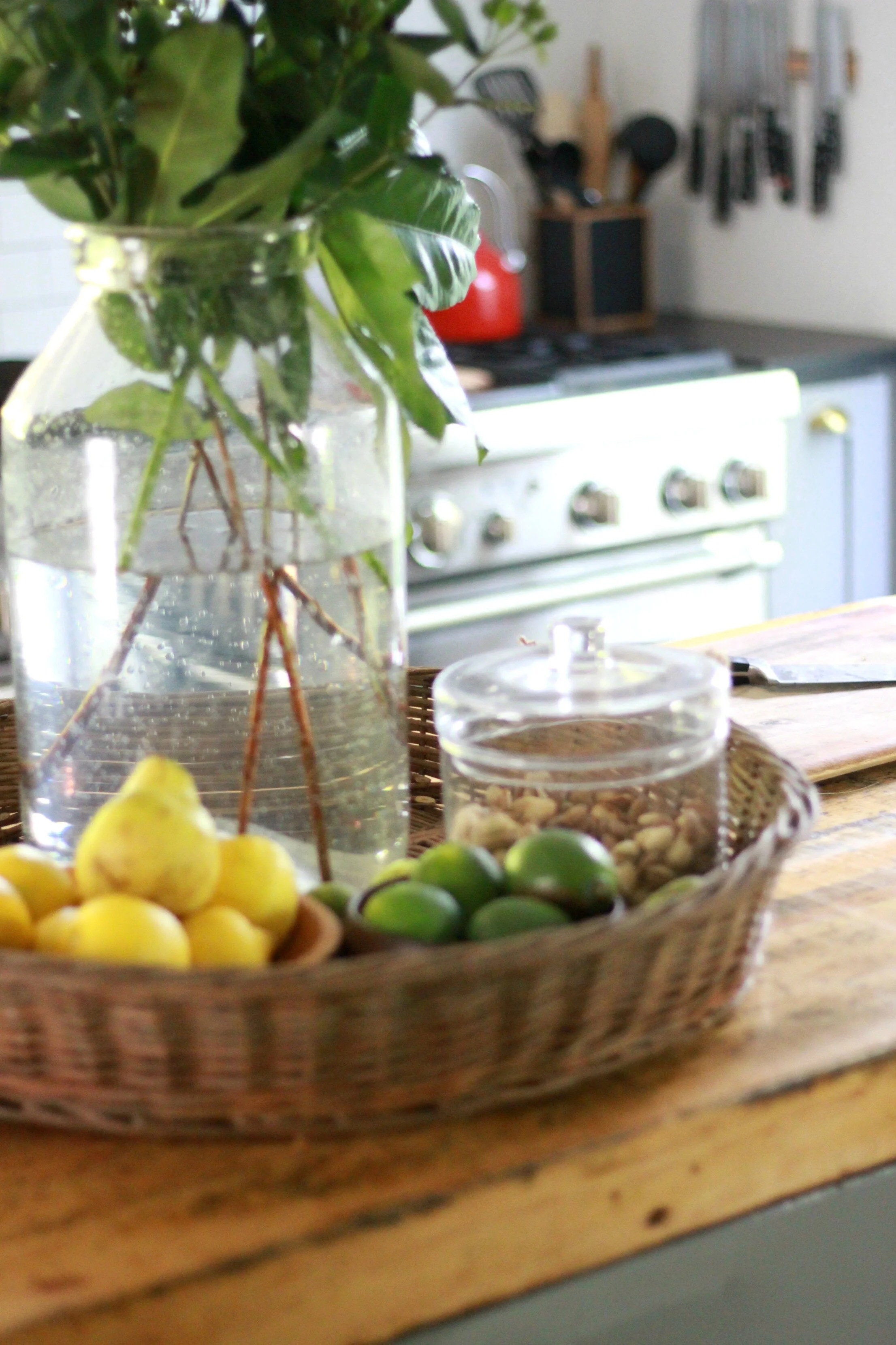
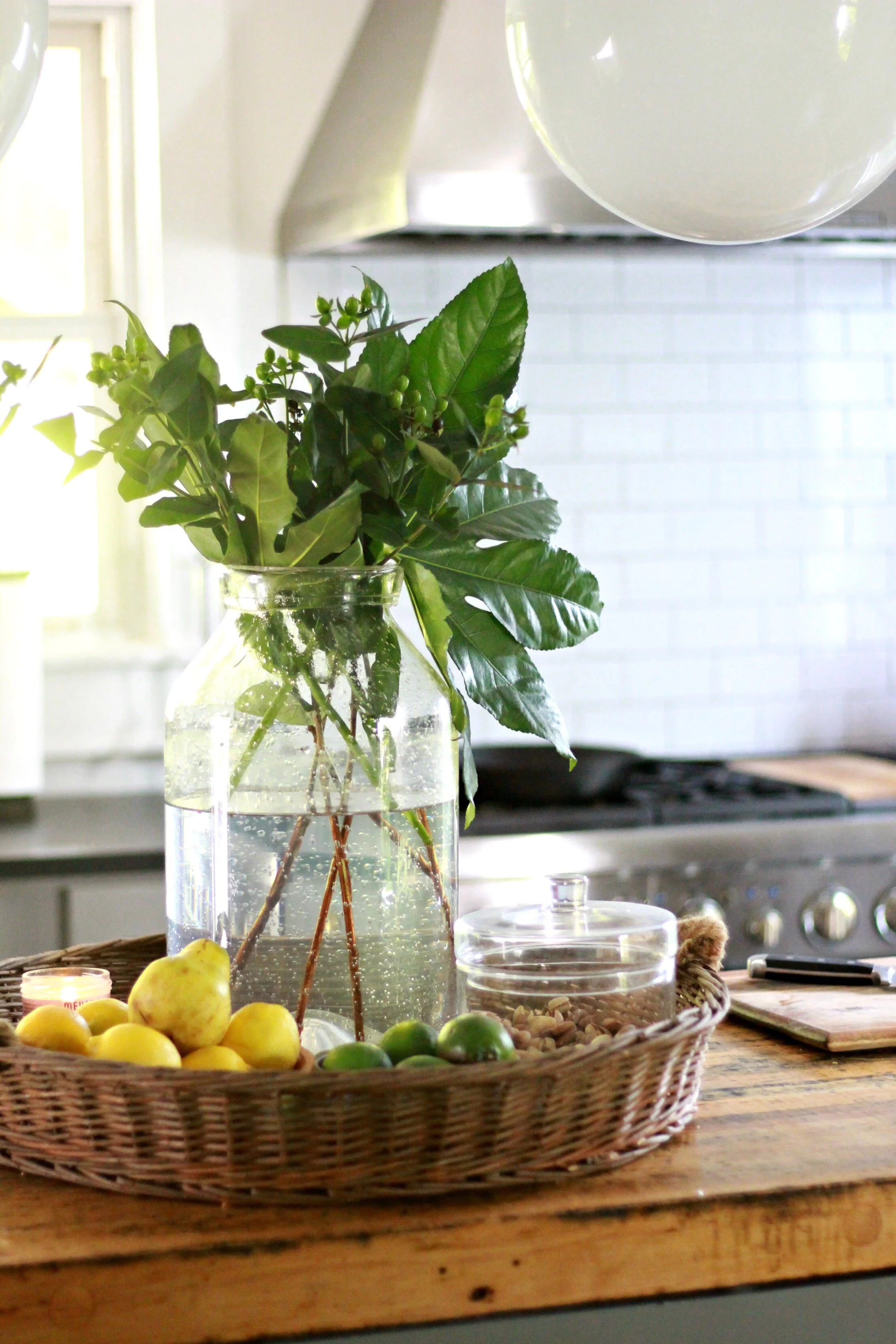
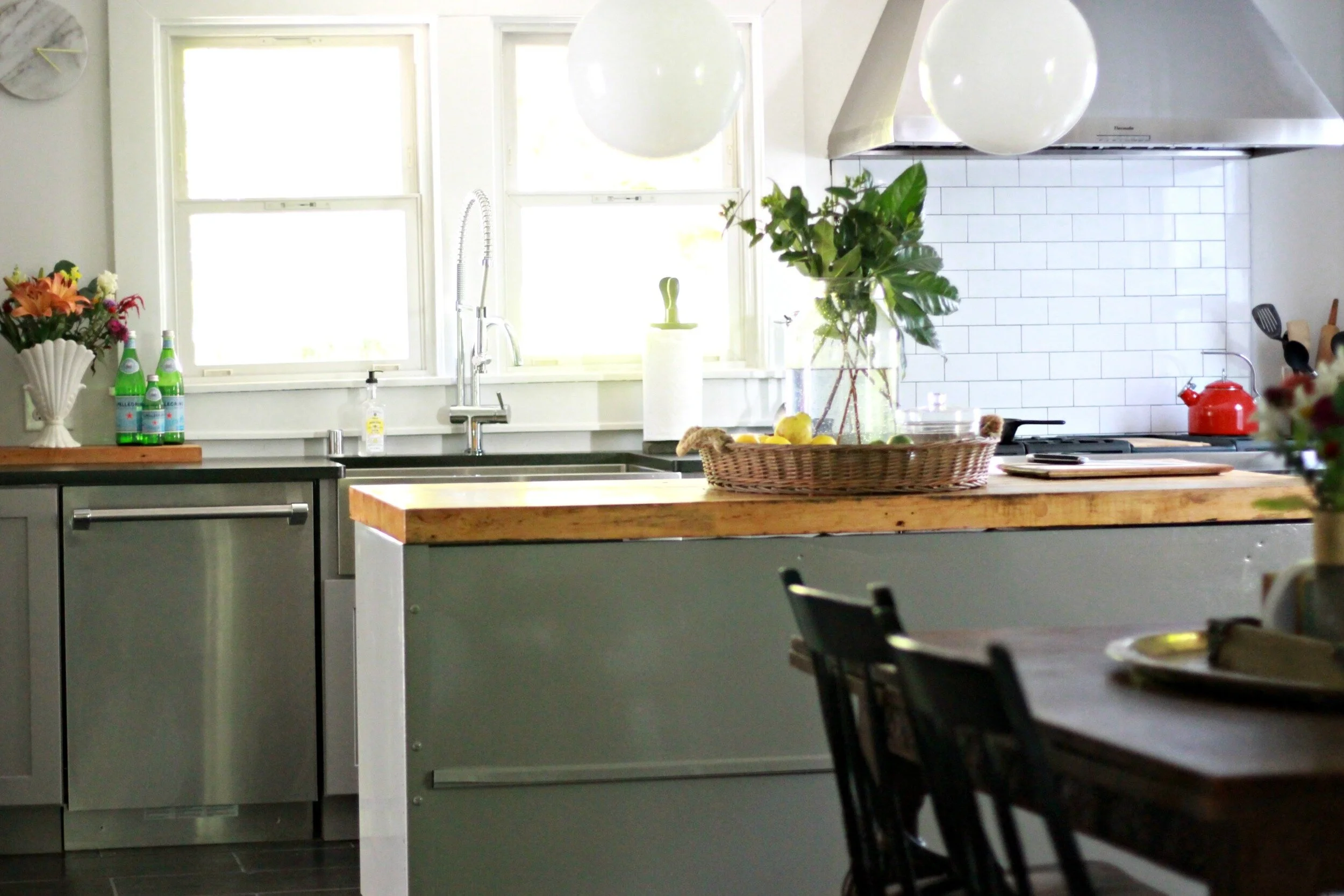
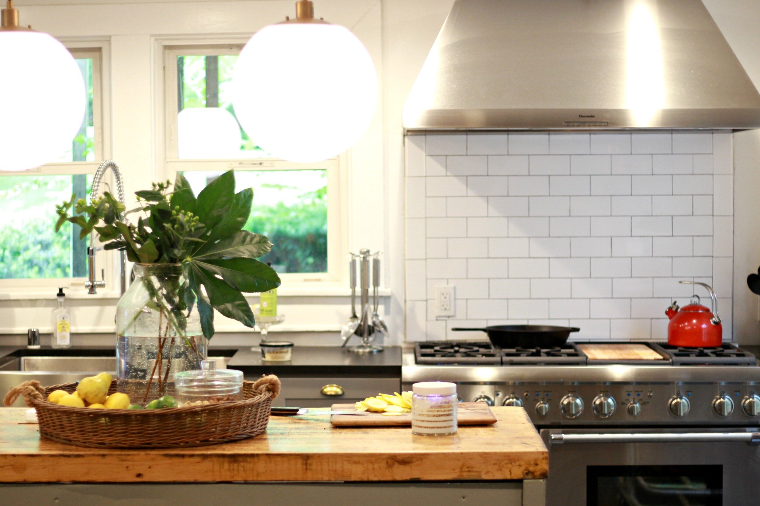
Our kitchen island was one of the last items we finished and I love the way it turned out. The island was originally an old workbench that was rusty and covered in dirt when I first found it (also at the local Restore). We had the metal powder-coated to match the kitchen cabinets (thanks to Electrostatic Painting for working their magic!), and then my husband sanded down and resealed the butcher block top. The front side has tons of drawers on each side and is completely open in the middle. We are wanting to eventually create a big shelf or pot rack across the middle space inside the island. I love having all the extra counter space and it ended up being just the perfect size for the room.
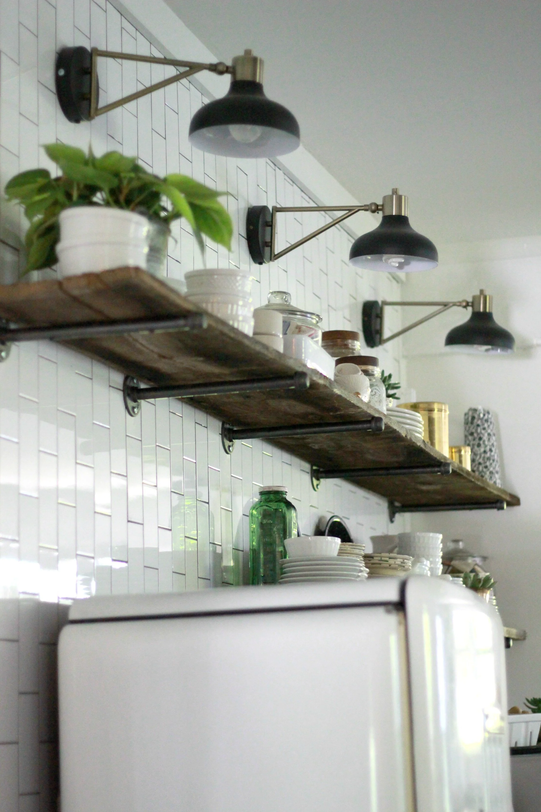
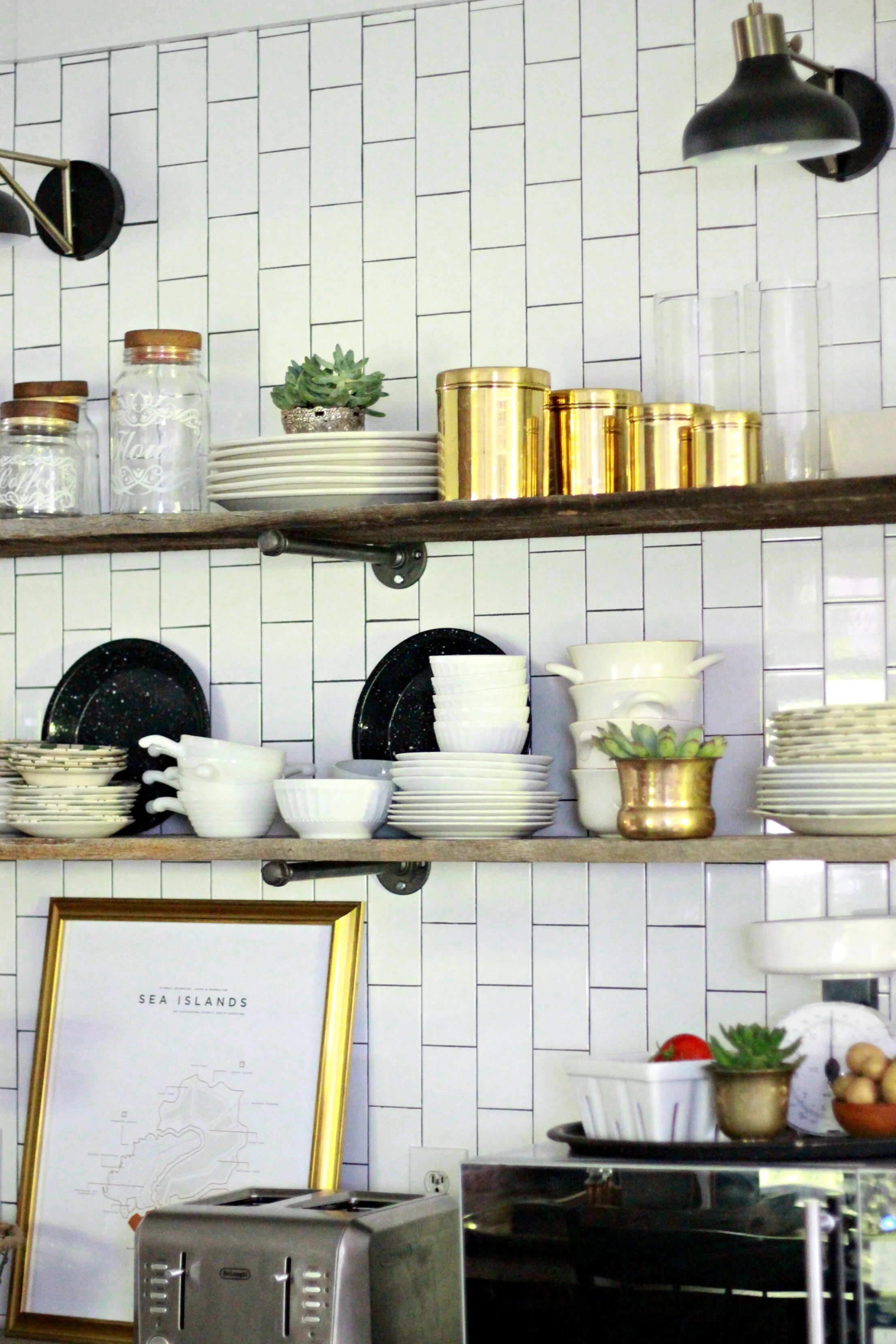
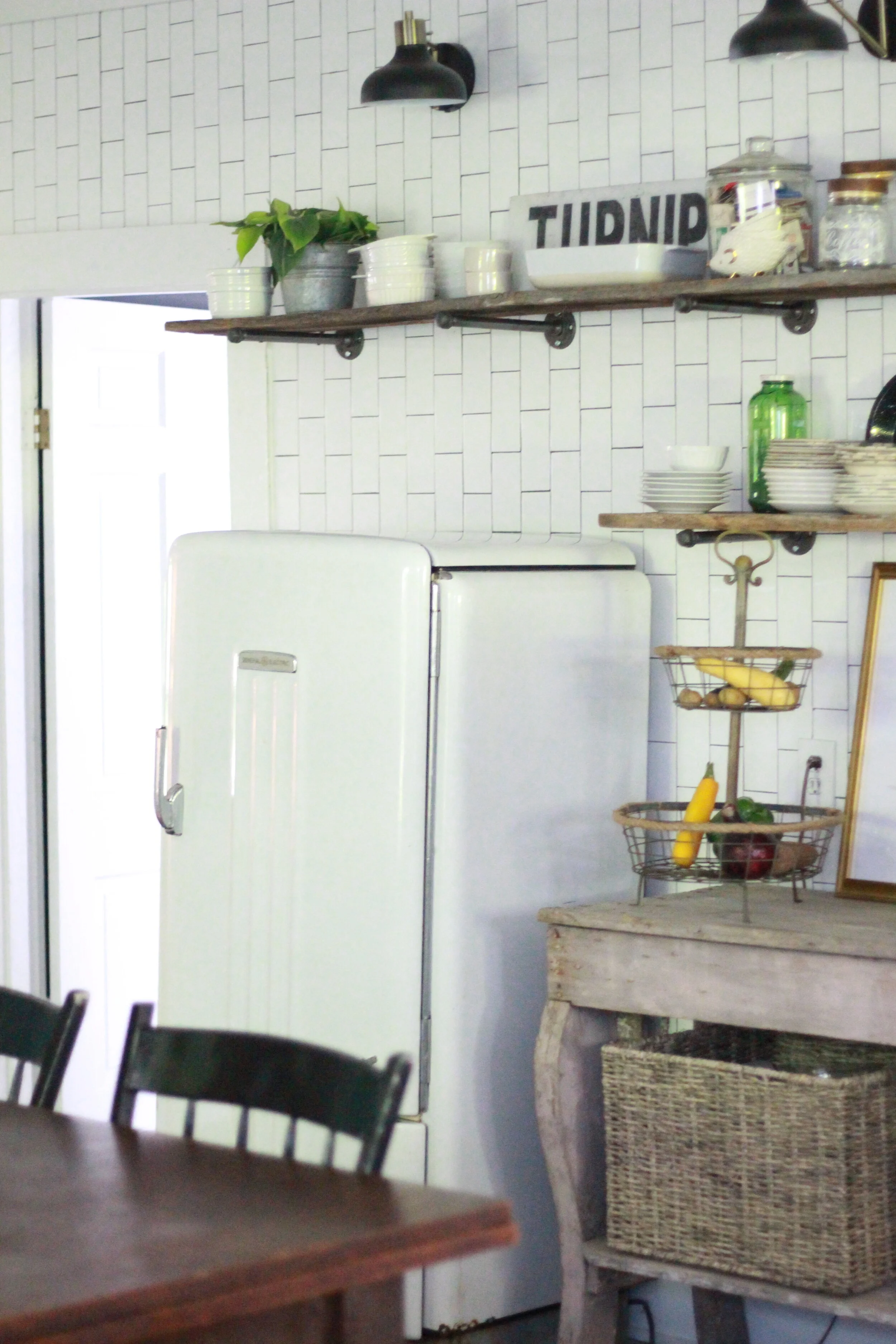
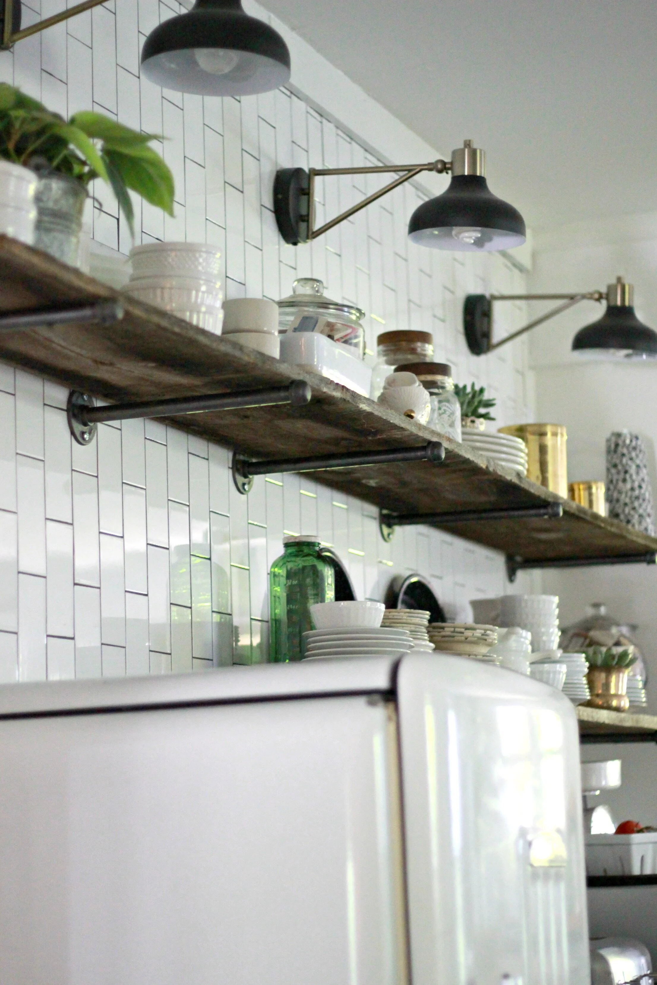
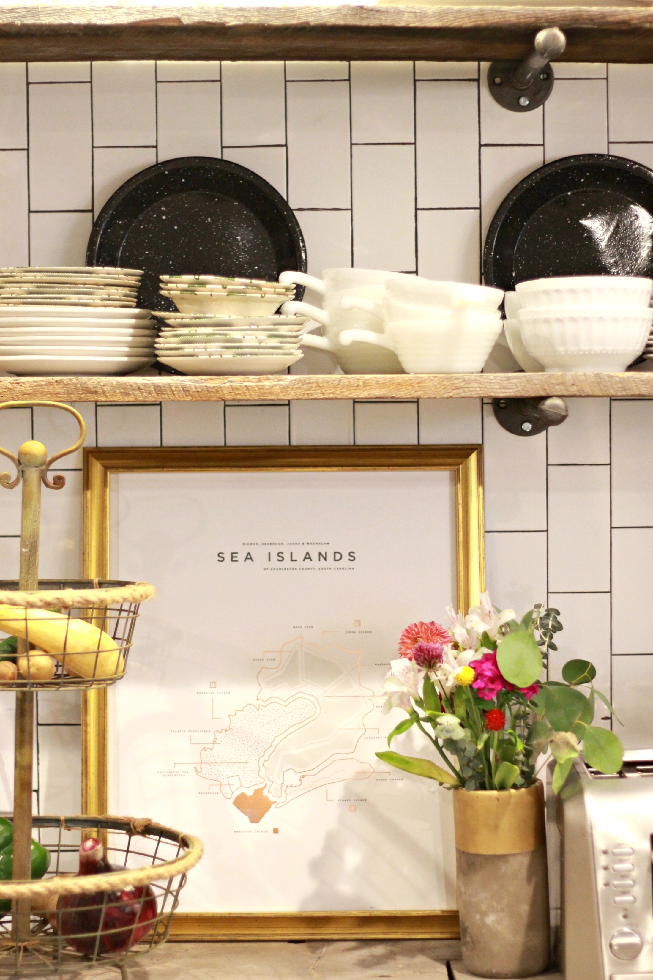
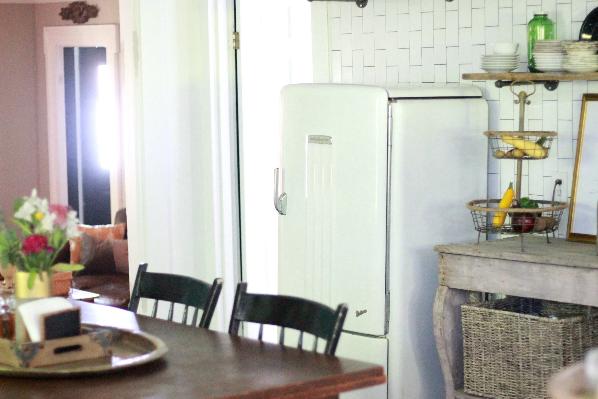
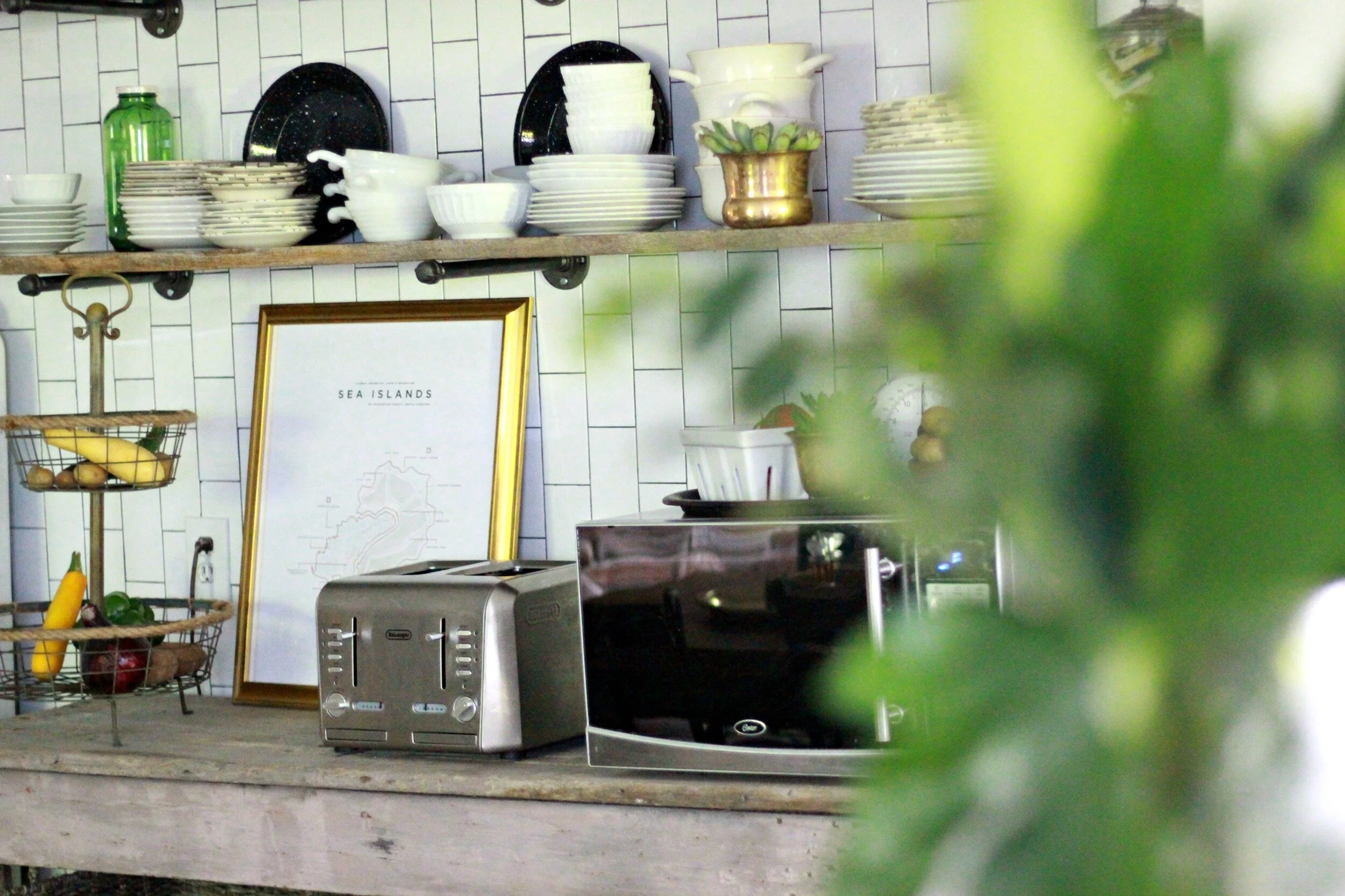
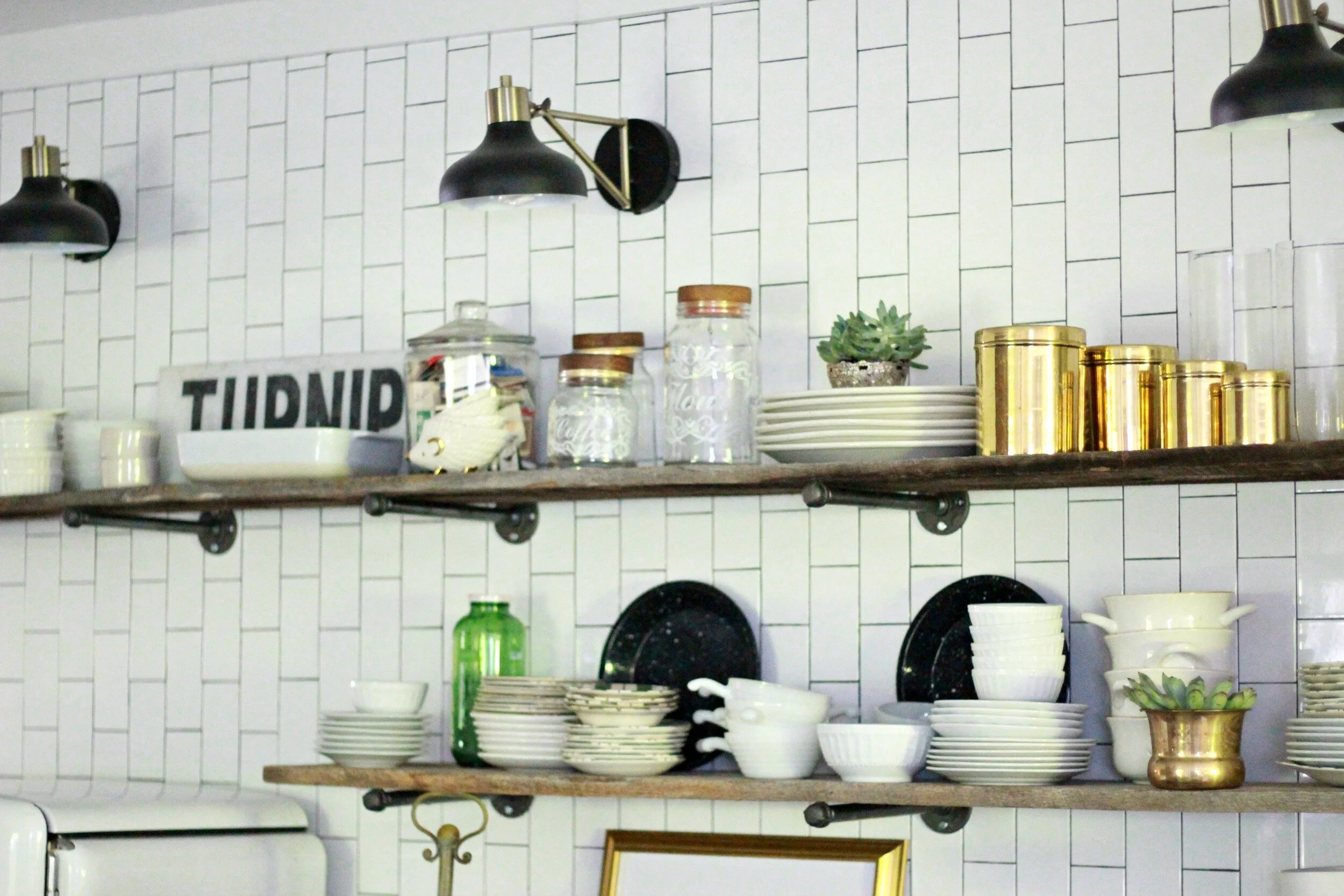
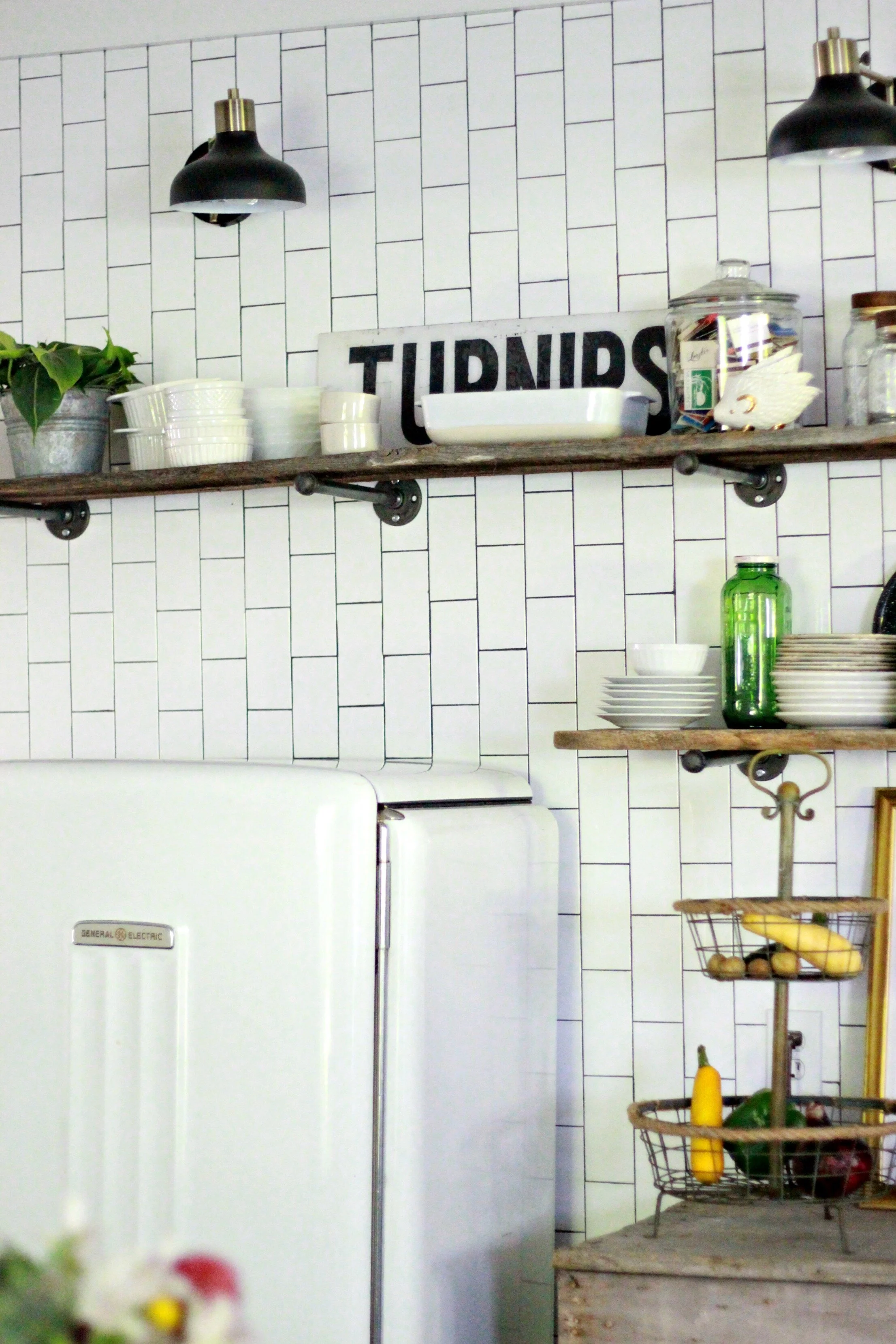
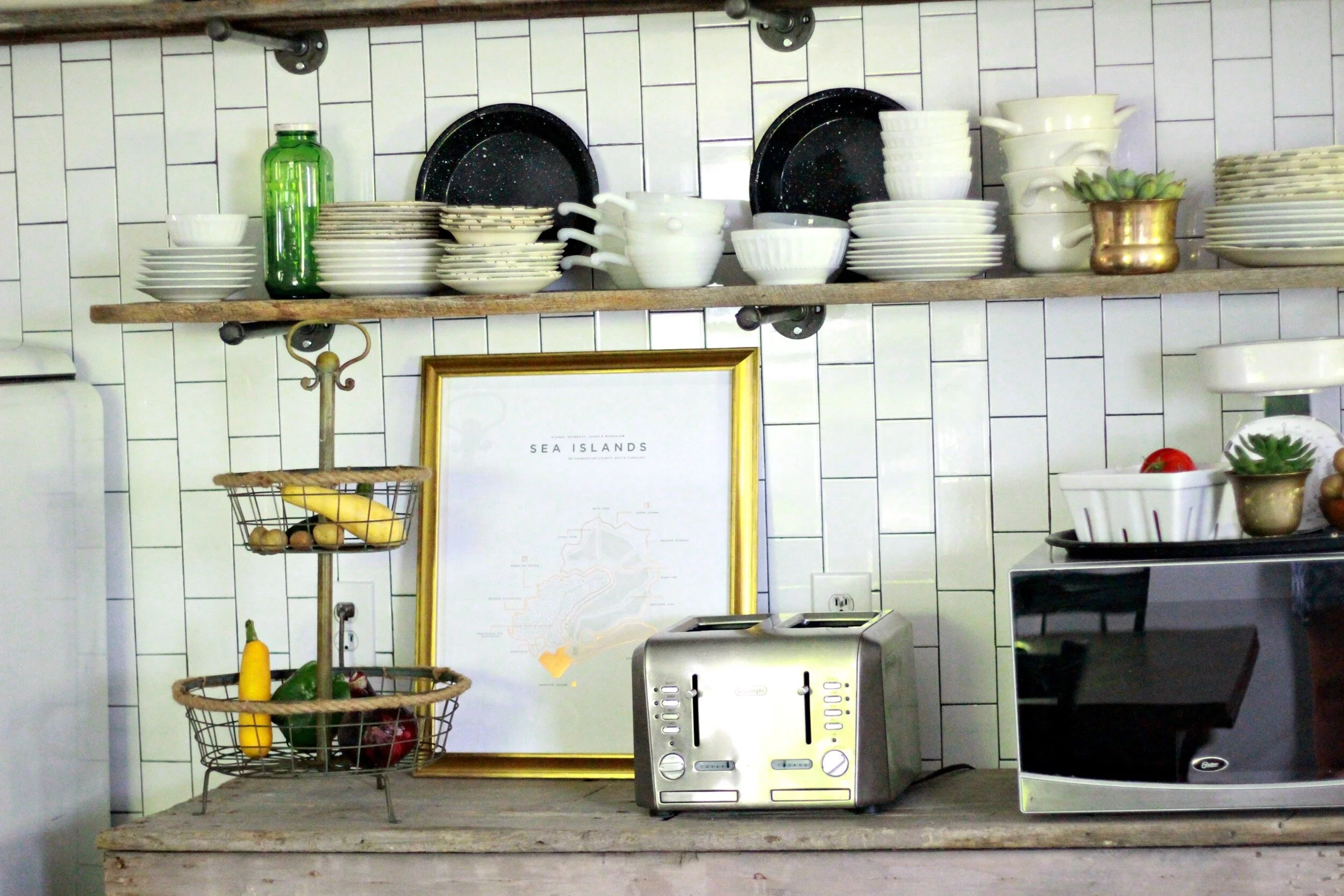
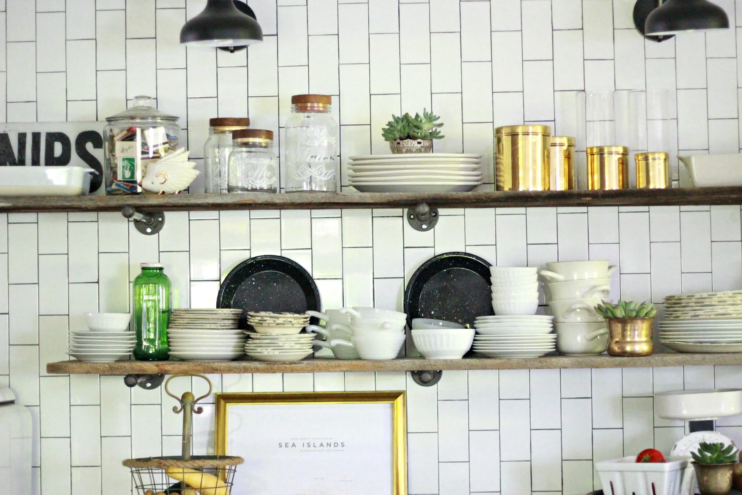
One of my favorite focal points of the room is this subway tile/open shelving wall. This wall holds my beloved vintage refrigerator (a $25 garage sale find that now serves as our "drink fridge"), our microwave, toaster, dishes, and more! We also added some industrial-looking sconces at the top for extra lighting. I'm still playing with the shelf arrangements but I feel like I'm getting a little closer to my original vision every day.
My husband threw out the idea of doing the subway tile vertically on this wall and we just went with it. We both really like how it turned out especially with the industrial open shelving on top. Our contractors built the shelving using plumbing fixtures and more reclaimed barnwood.
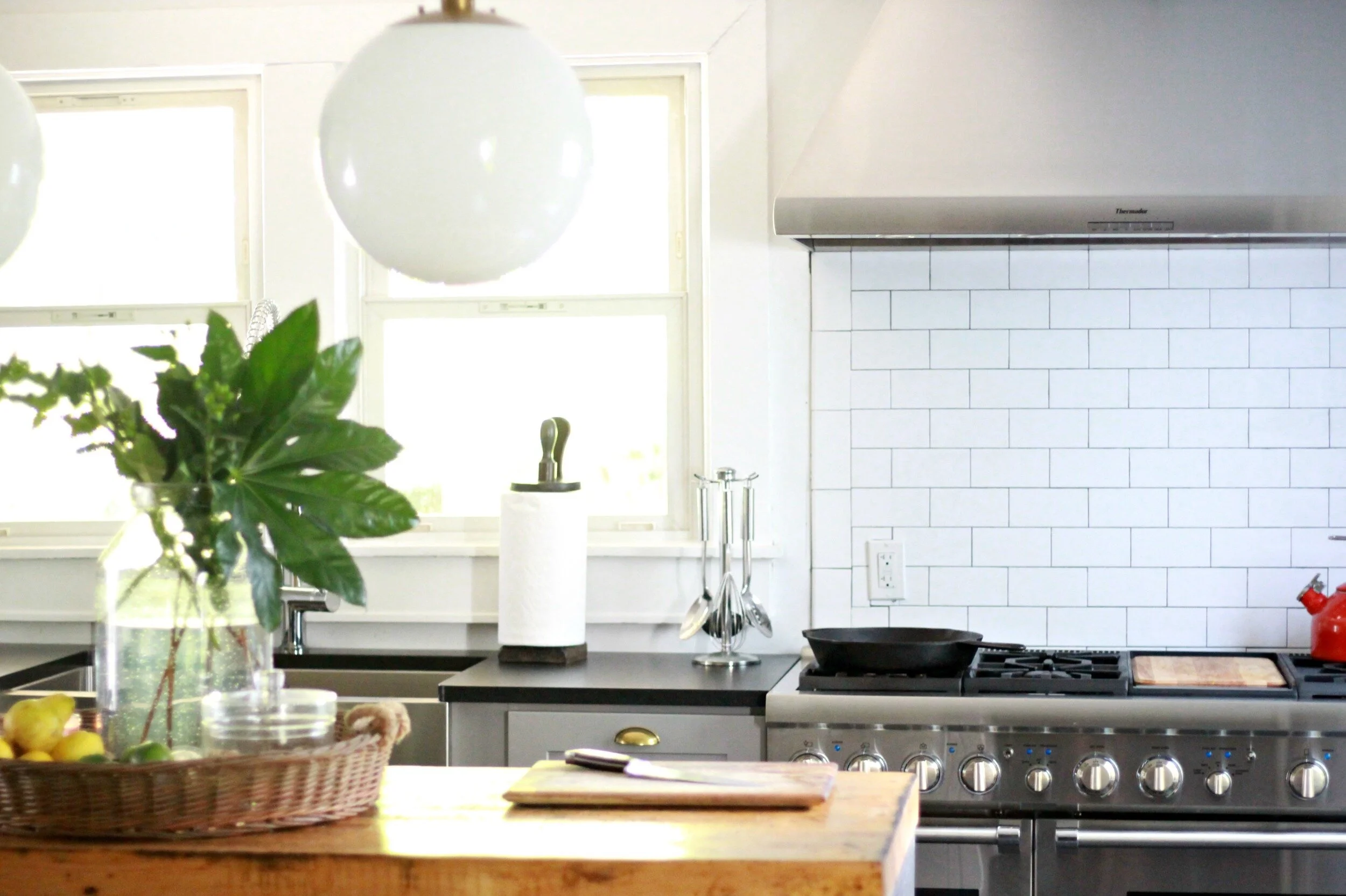
Here you can see the basic layout of the kitchen: fridge, dishwasher, range, and sink are all on the back wall with cabinets below. The island is in the center with the table behind it. On the left side wall is the open shelving area shown in the previous pictures.
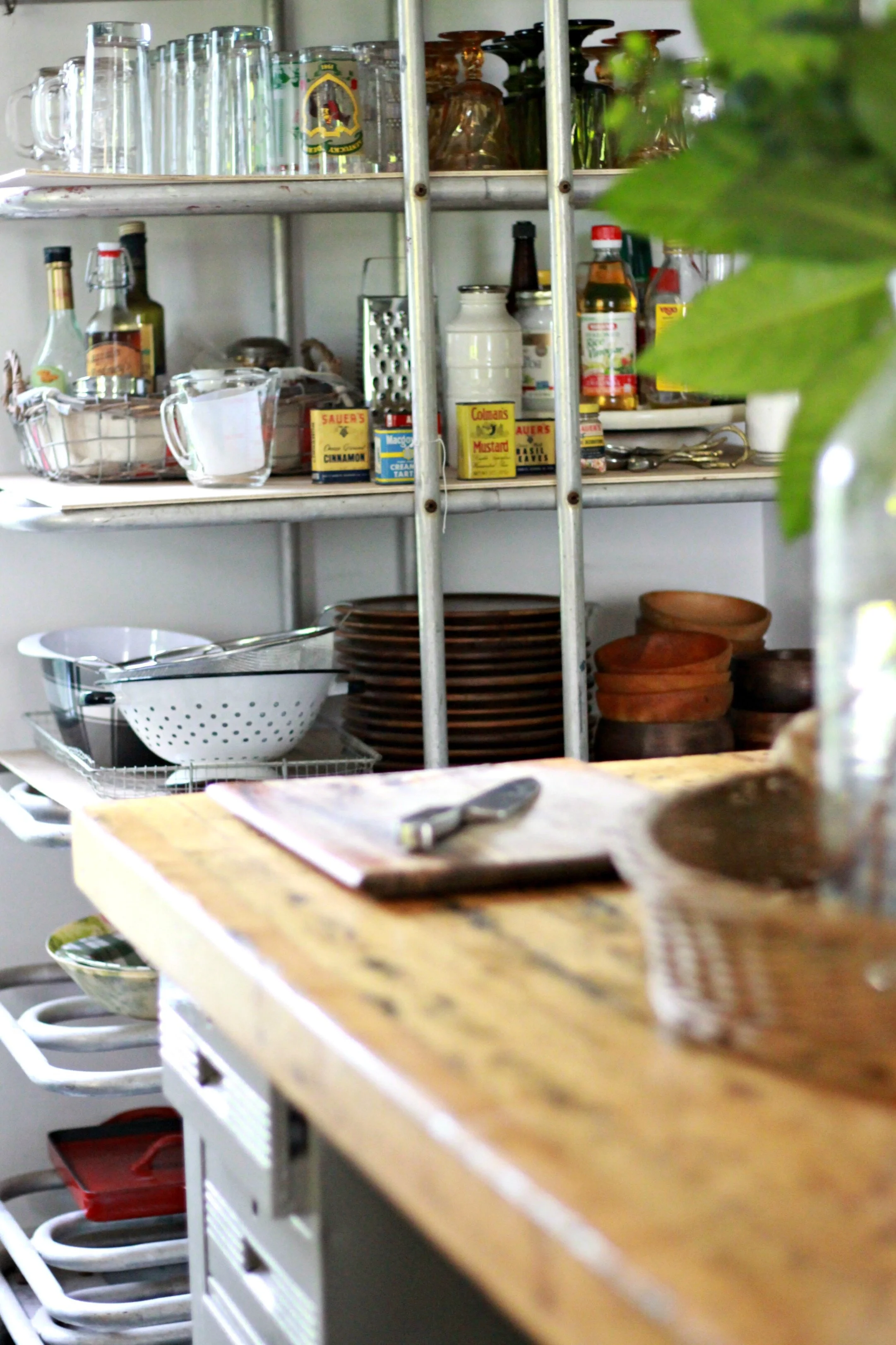
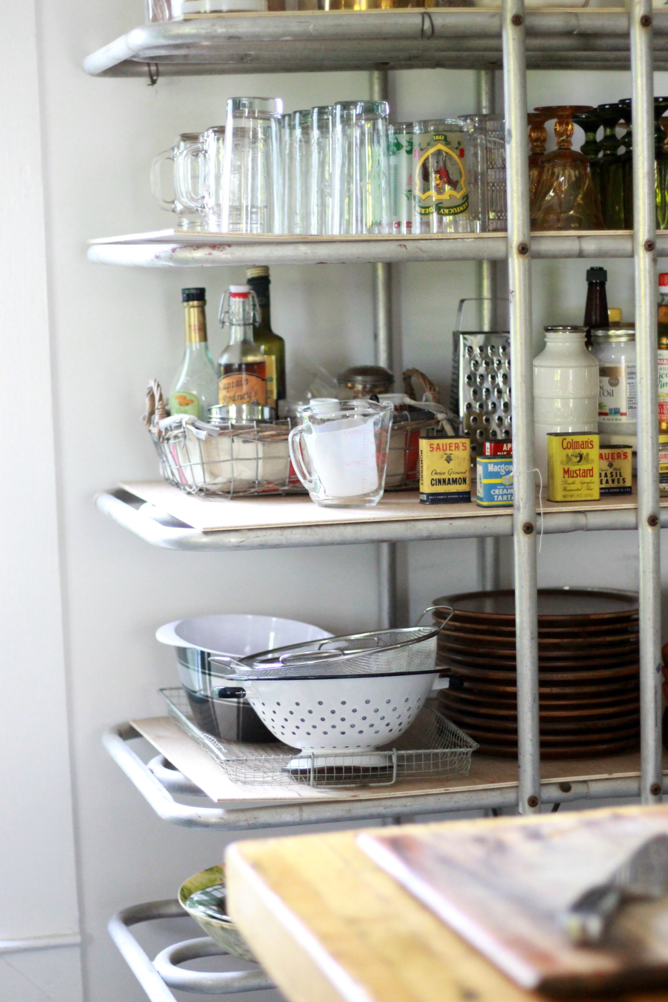
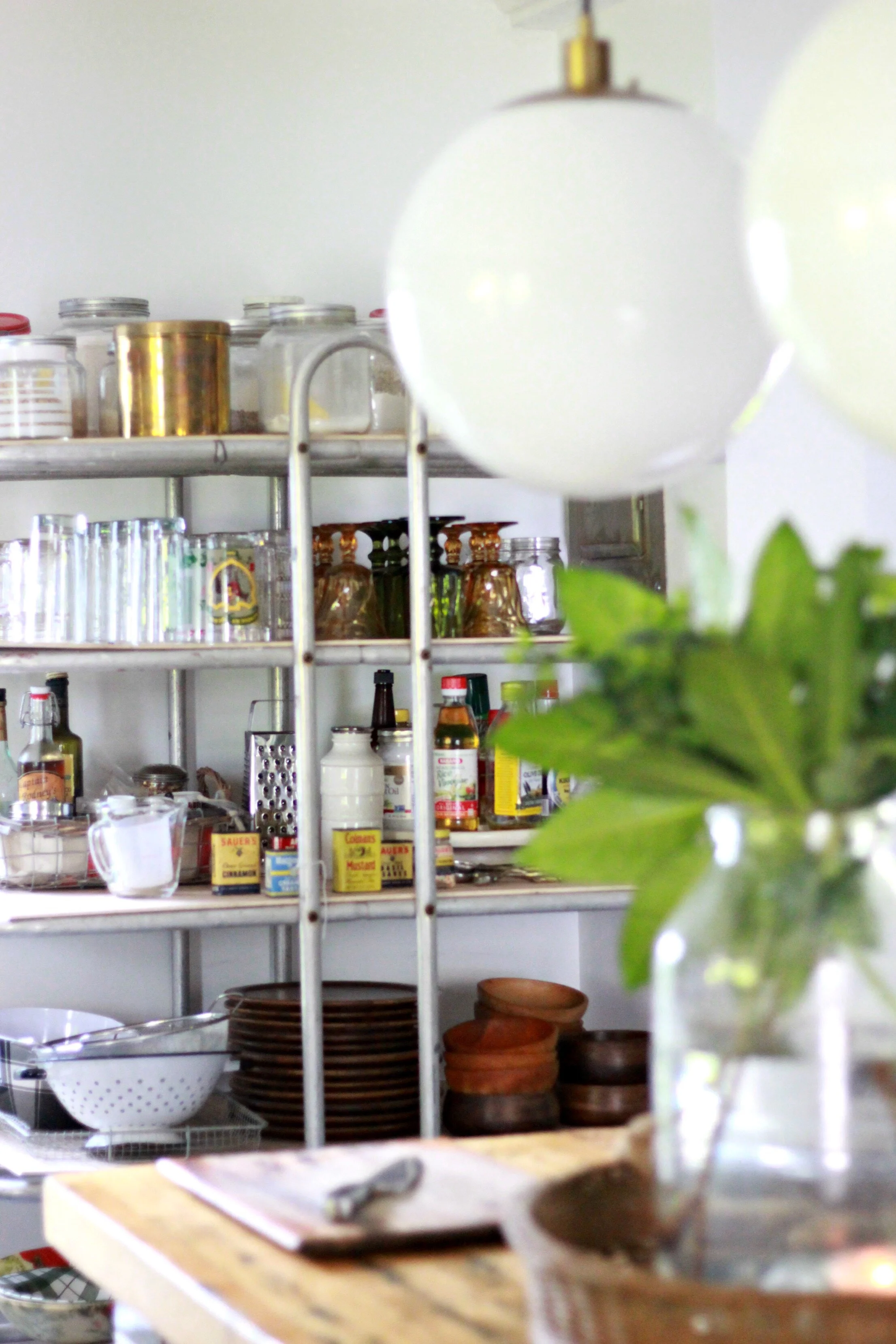
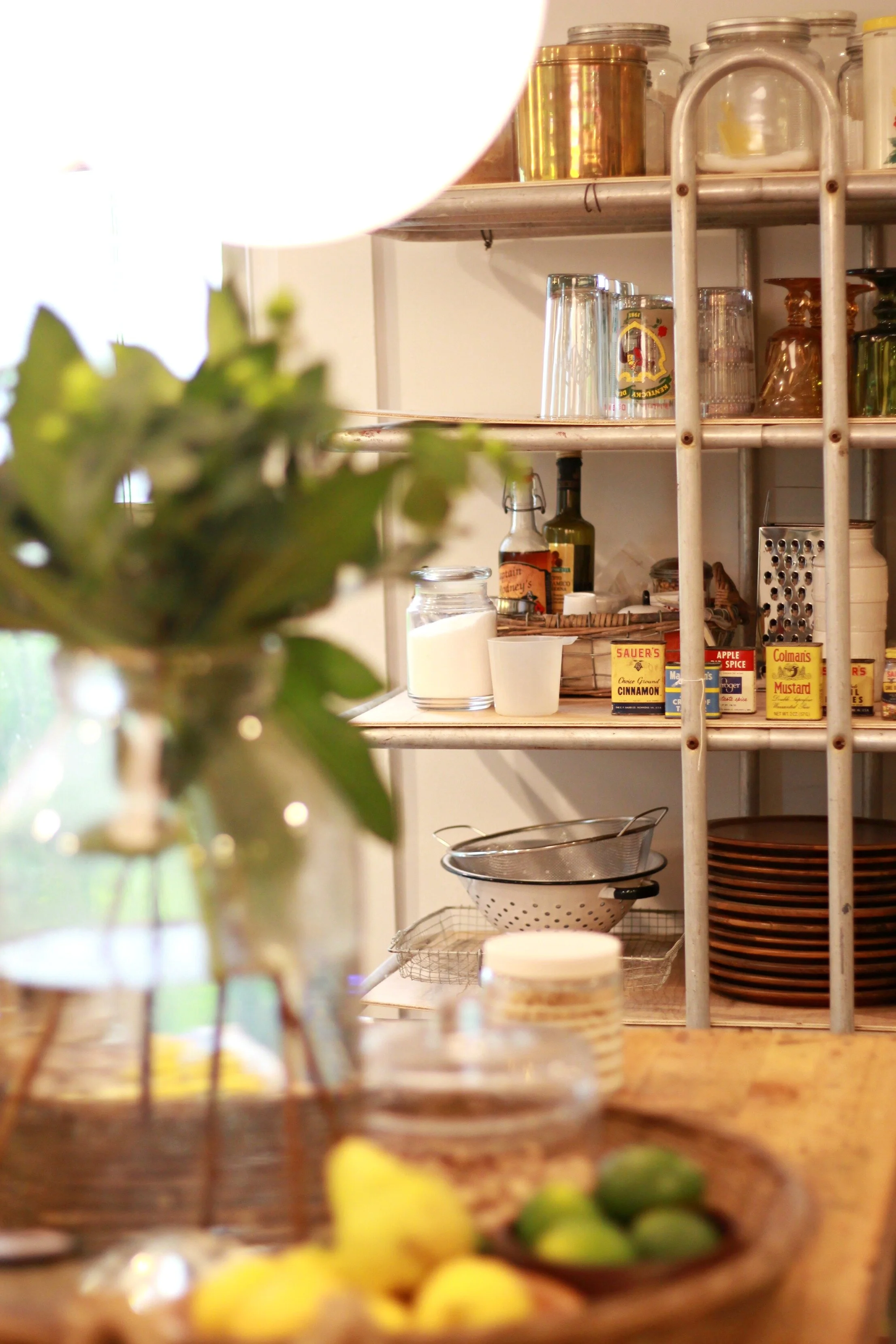
We are using this old baker's rack for more open shelving closer to the back wall. I keep all my drinking glasses, measuring cups, olive oil, vinegar, and anything else I need within reaching distance of the stove and sink. The industrial look of this rack fits perfectly and it has more than enough storage.
When we began this renovation, the kitchen had no floors! The entire kitchen now has new ceramic tile that looks like slate. So far I love this flooring- it's super easy to clean and doesn't show much dirt, dog hair, or paw prints (which is super important in our house)! I'm on the hunt for some rugs to add a little pop of color and pattern. I would like a bright oriental-type runner for in between the sink and island and a more neutral textured rug for under the dining table.
Another thing on my to-do list is window treatments. I'm thinking a little cafe curtain on the windows above the sink and long panels on the other two windows. I would like something simple and neutral- maybe a ticking stripe, burlap, or chambray.
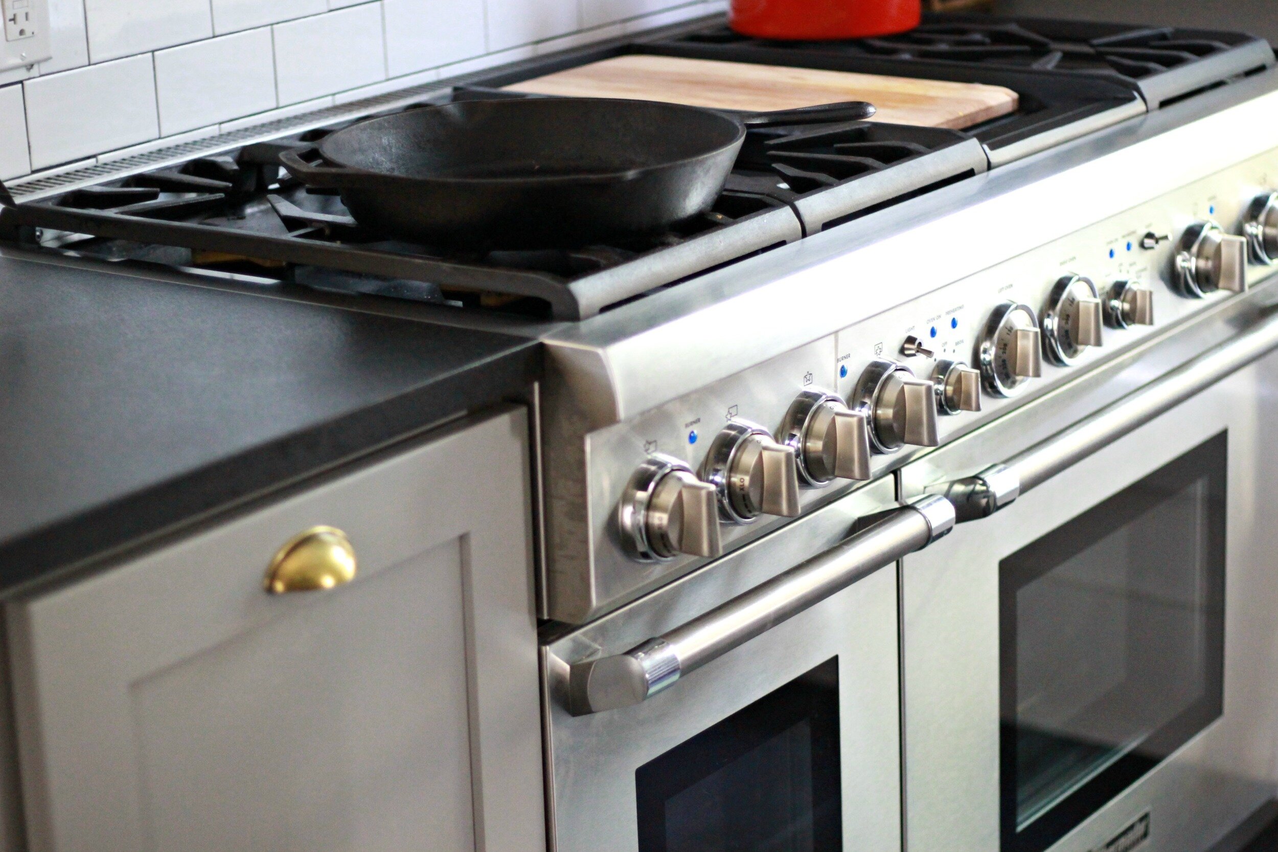
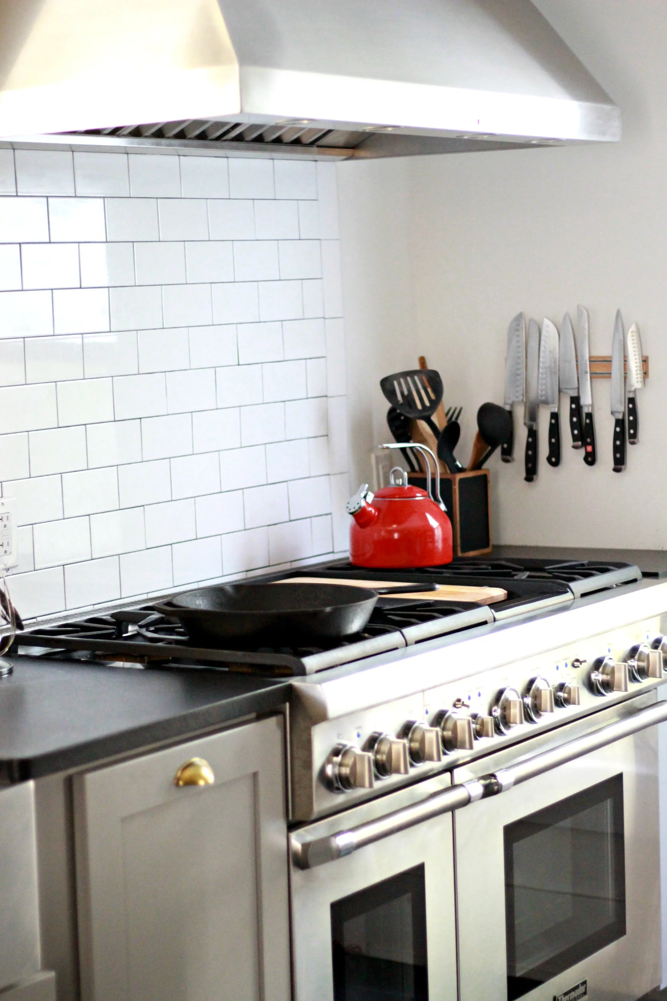
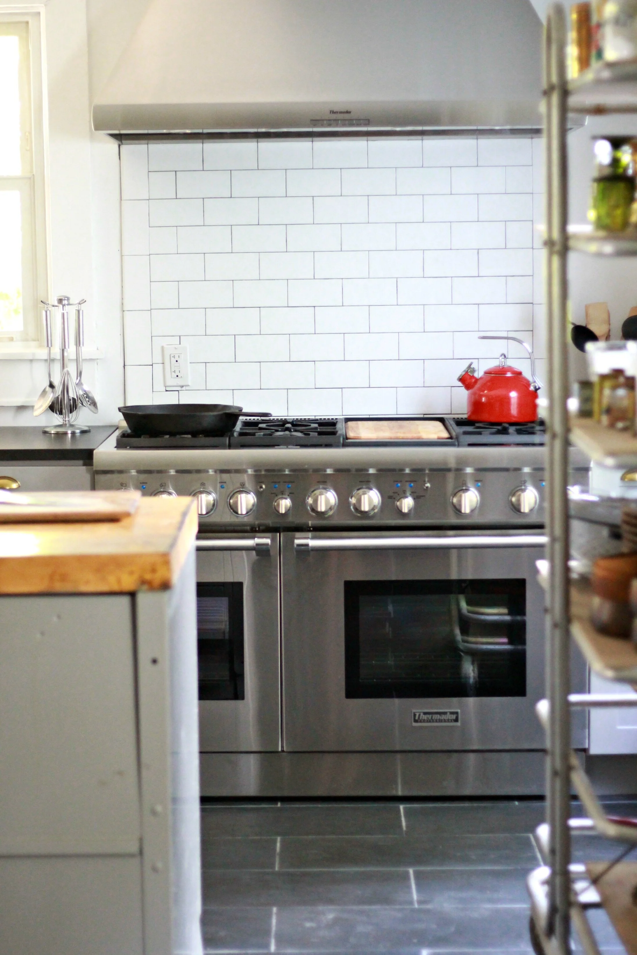
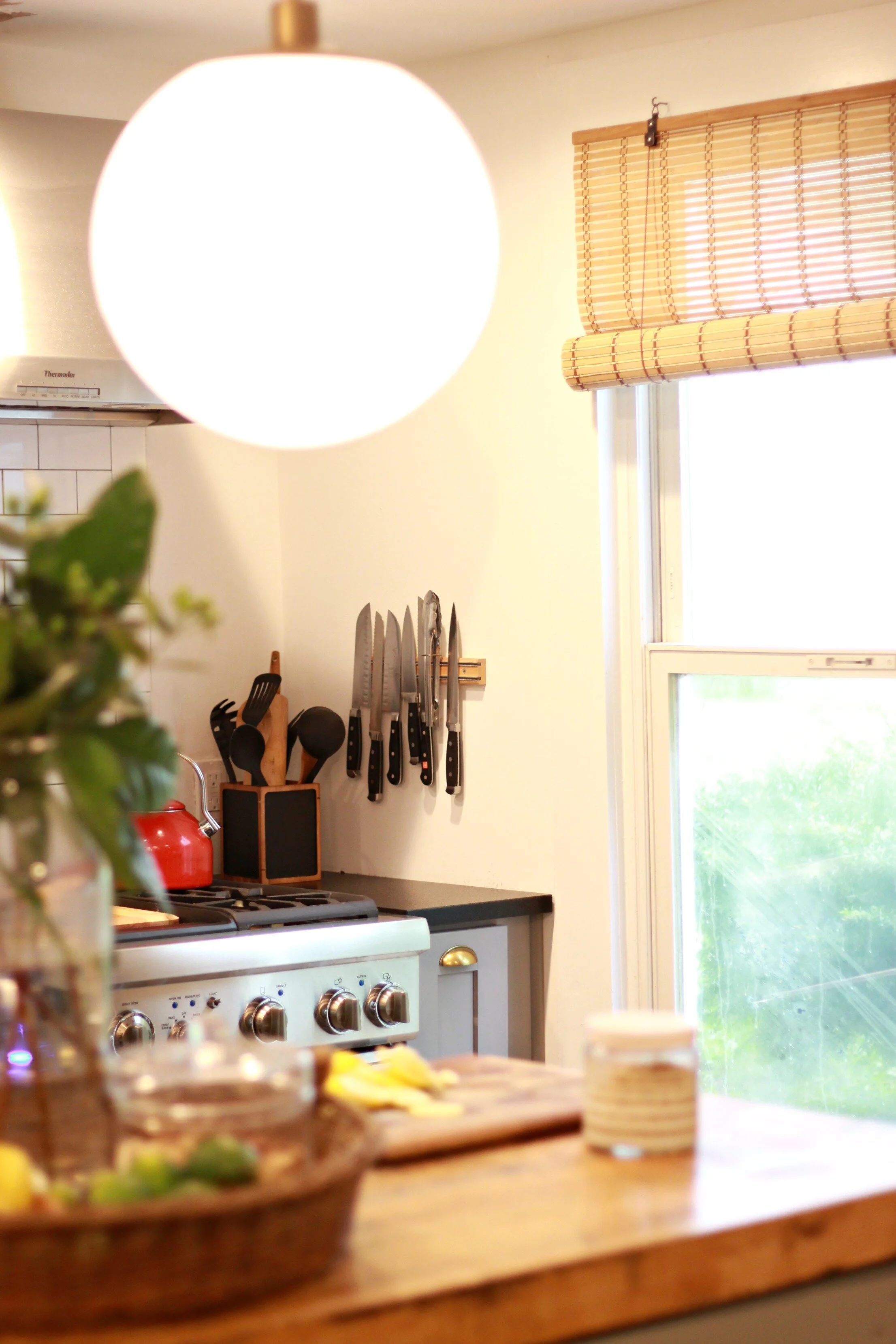
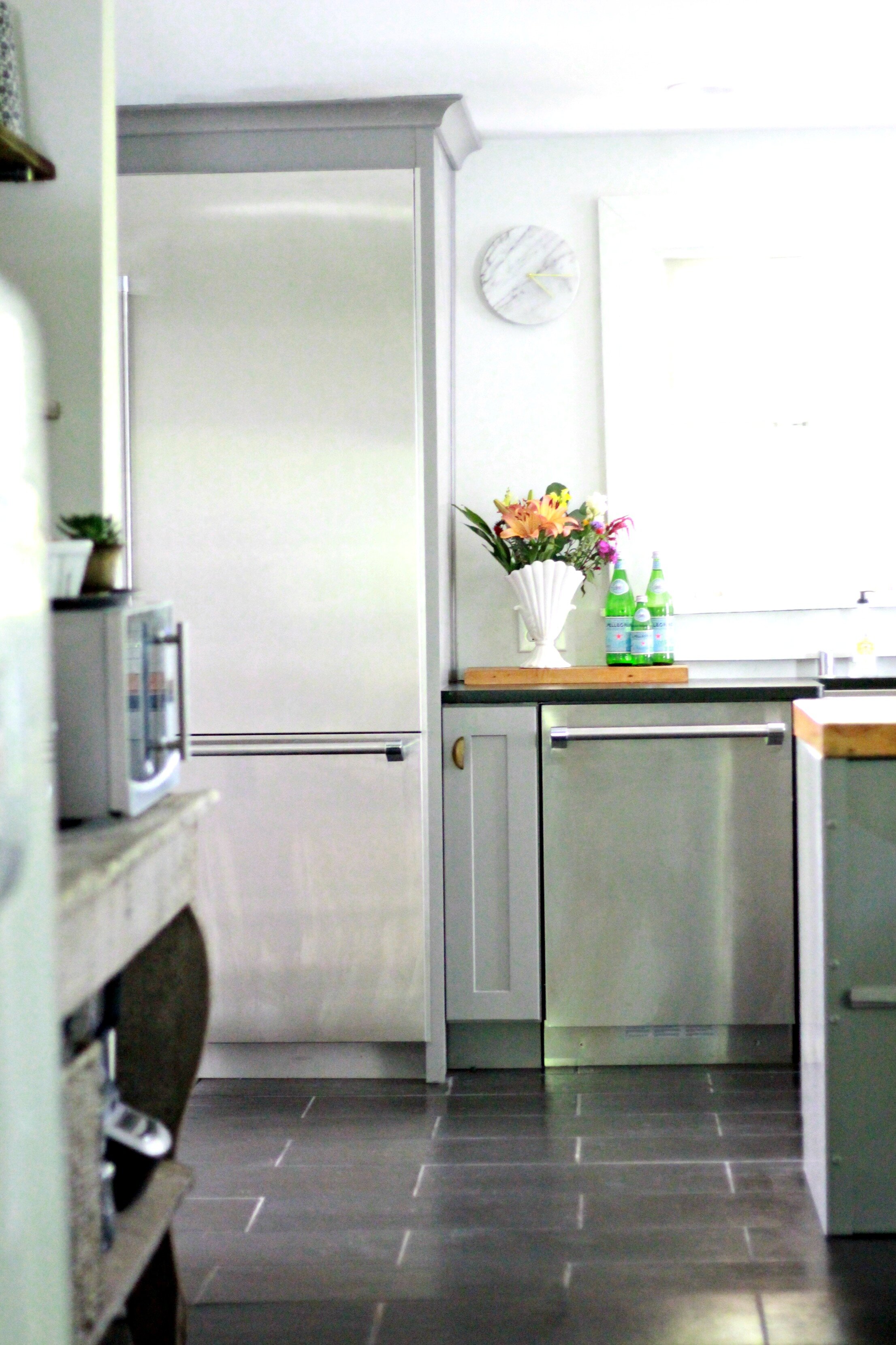
We LOVE everything about our Thermador appliances. They have the refined industrial look we wanted but are also made specifically for chefs, so they have every innovation and feature we could ever want. They were definitely our biggest splurge but so worth it since we both love cooking and entertaining. You can tell just by the weight of the doors and handles that the quality of these is above and beyond anything else on the market.
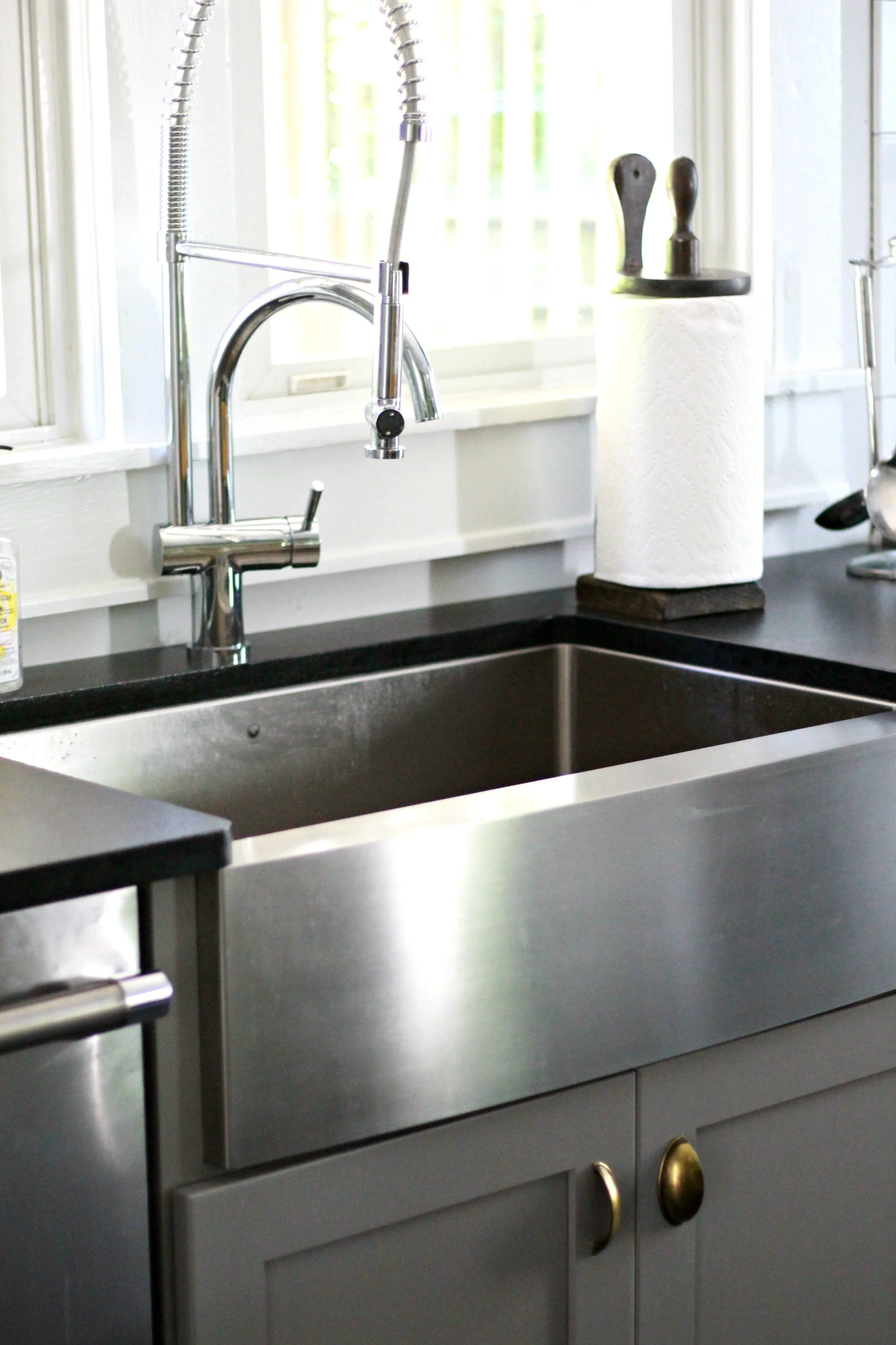
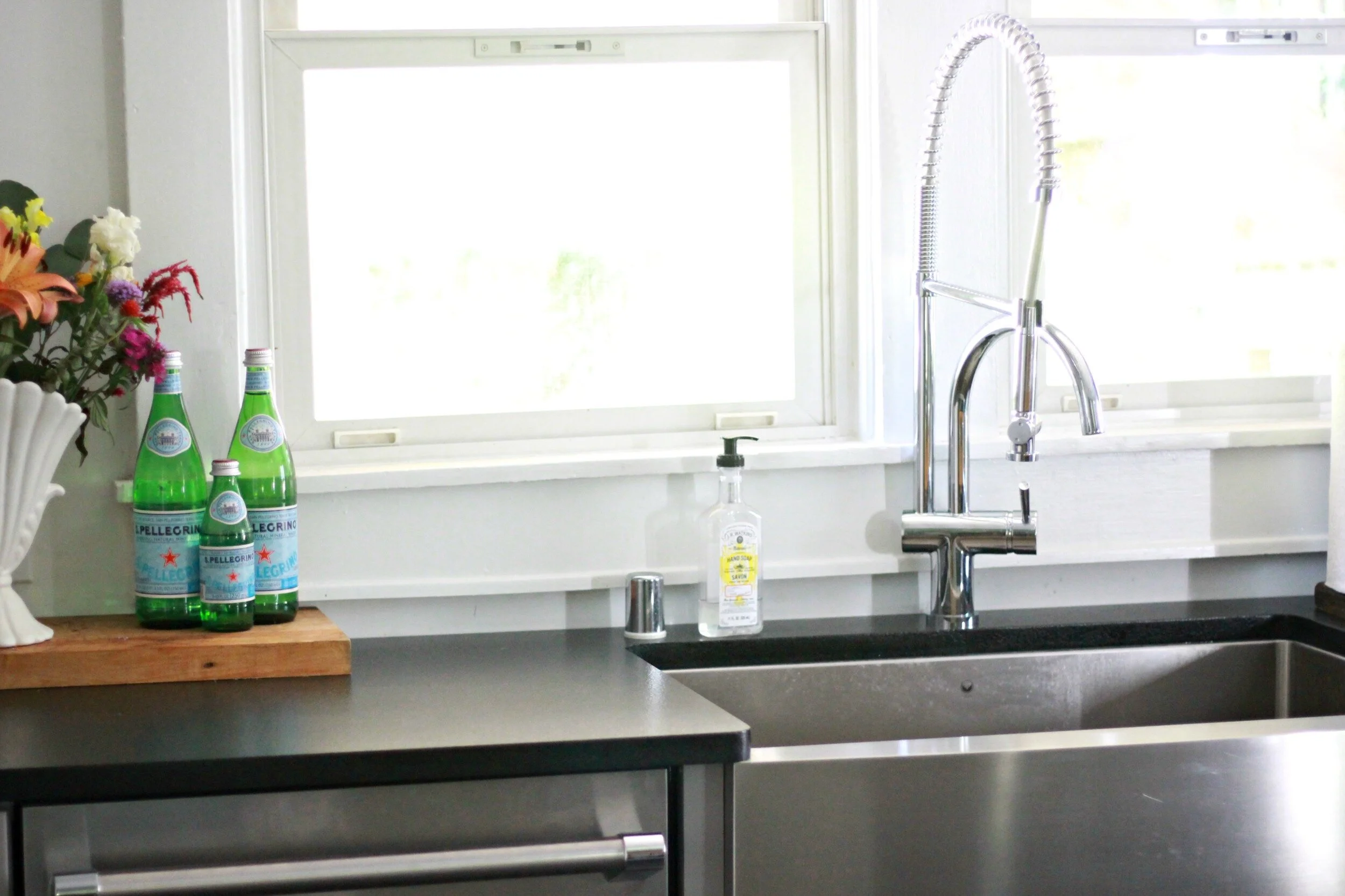
We went with a stainless farmhouse sink and a super industrial faucet, which I love. I'm a little OCD about keeping my sink clean and the stainless is so much easier to clean than the cast iron sink I had at our old house. I also really like having the large open sink instead of a divided one- it's so much easier to wash larger dishes, pans, and water my plants!
TJ at Kitchen Concepts went above and beyond to make sure our cabinets and countertop were exactly what we wanted. I really love the brass hardware against all the gray and stainless and the quality of the cabinets is SO much better than anything I've had before. The countertop is flamed granite which has a subtle texture and definitely fits the industrial style of the kitchen.
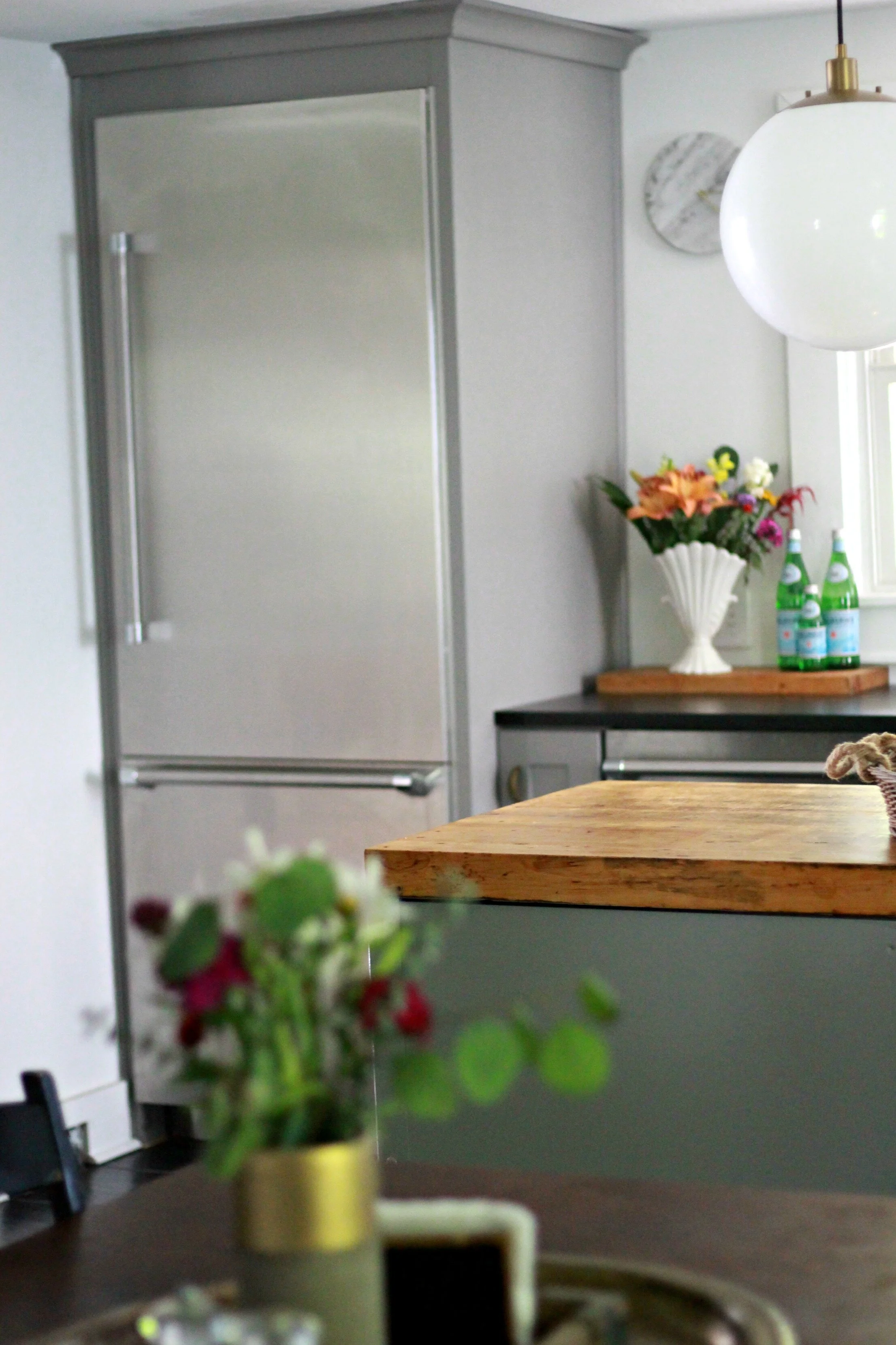
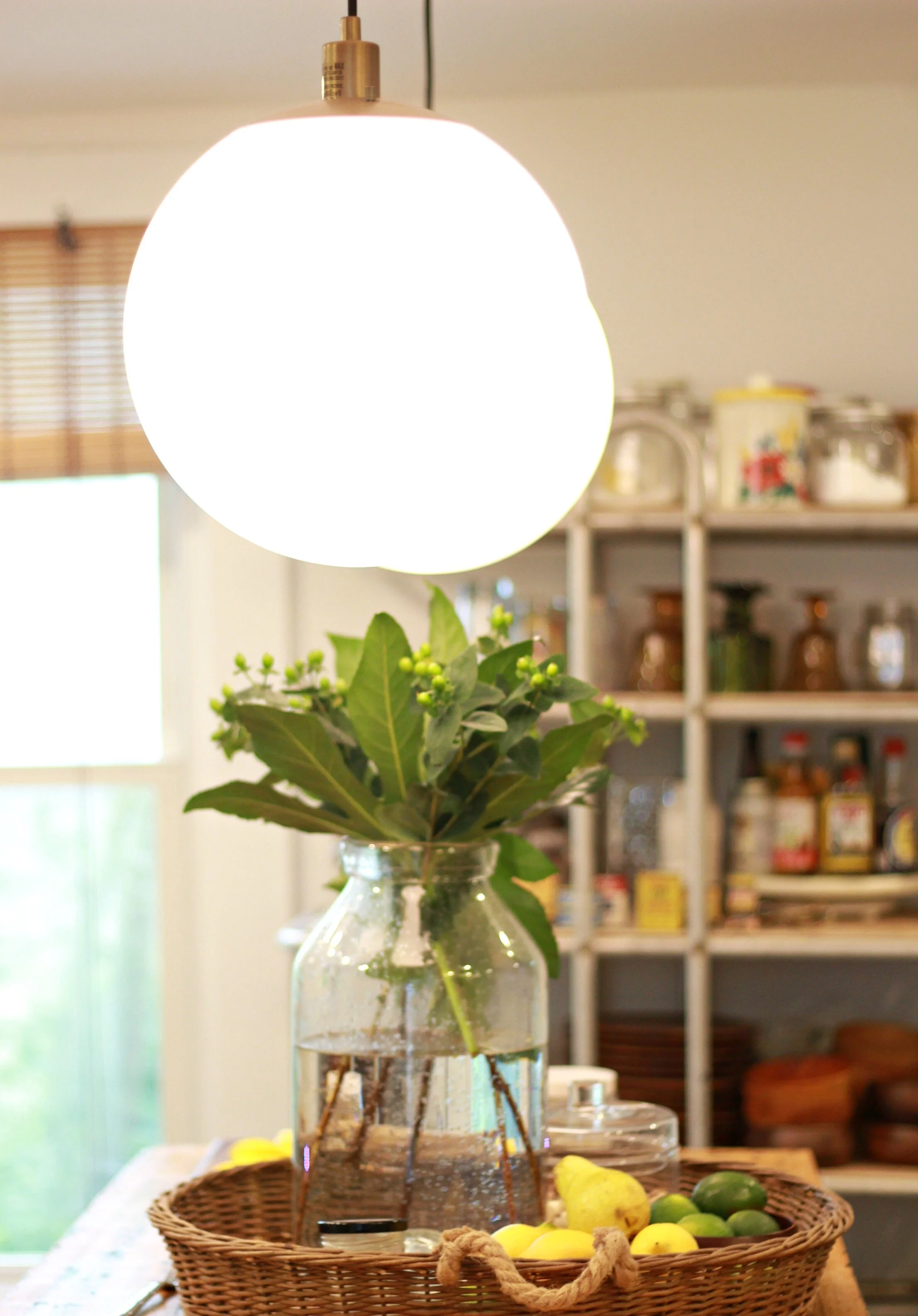
My husband was adamant about his giant range and I was adamant about my tall fridge! Once I saw these fridges in the store, I fell in love and since we had limited space for the fridge, the tall, skinny design ended up working perfectly! I love the sleek simple look of the outside and Kitchen Concepts made sure that the cabinet fit perfectly around the fridge so it wasn't sticking out beyond it at all. My island pendants are from West Elm and I love how they are a mix of modern and industrial styles. The glass shades are milkglass and they have brass accents at the top which ties in with my brass cabinet hardware.
It's still hard to believe that this is REALLY our kitchen some days! It truly is a dream come true and we are having so much fun cooking and eating in here every day. I've added a list of all our sources to the end of the post in case you want to shop any of the items (if you have questions about anything not listed- just ask!). I can't wait to see how it evolves over the next couple of months as I continue to add more finishing touches to warm it up and pull everything together.
xoxo
Emily
OPEN SHELVING SCONCES: TARGET
ISLAND PENDANTS: WEST ELM
KITCHEN CABINETS, COUNTERTOPS + HARDWARE: KITCHEN CONCEPTS
TILE/FLOORING: LOUISVILLE TILE
CONSTRUCTION: TJH CONSTRUCTION COMPANY
APPLIACES: THERMADOR VIA PIERATT'S
STAINLESS FARMHOUSE SINK: WAYFAIR
SINK FAUCET: WAYFAIR
BAKER'S RACK: BLUE OCEAN TRADERS

