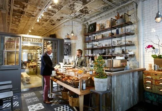
Our Fixer Upper: Coffee Shop Design
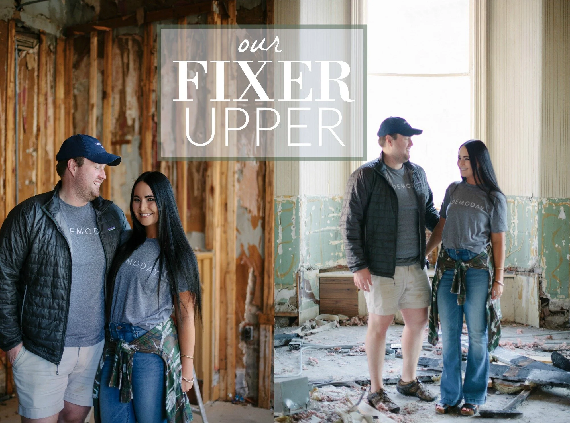
As we continue to wrap up renovations and slowly put everything back together at the Amsden, I have been busy putting design plans together for each of the spaces at our downtown Versailles project. The coffee shop is the first spot I have completed the plan for and feel that I have a pretty clear vision of the design. I wanted to share some of the details of what we're planning and what you can look forward to at the Amsden Coffee Club this fall! P.S. If you need to catch up on our latest renovation- click here for a complete list of Amsden building posts.
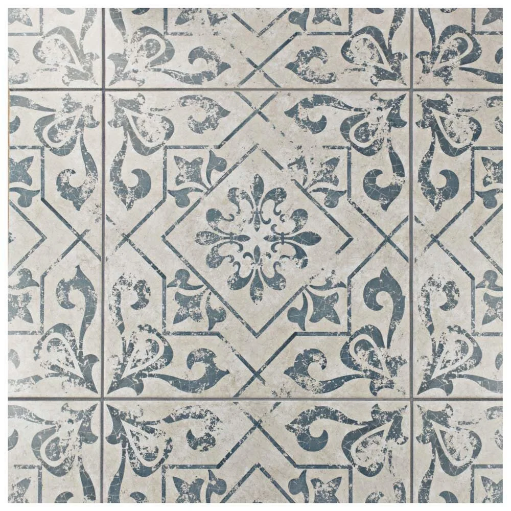
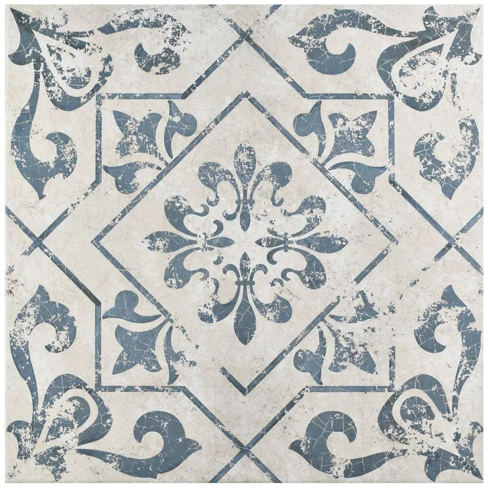
Since the coffee shop is a smaller space, I instantly knew I wanted a fun printed ceramic tile for the floor. My overall vision for the decor is old-world European with a modern twist, so I loved the printed pale blue tile floors I was finding. They remind me of something from a turn of the century Parisienne bakery or cafe, which is exactly the look I want to emulate. Ultimately I chose the style below based on the size of the print, color, and distressed look. Everything else in the coffee shop will center around this printed tile.
via Home Depot
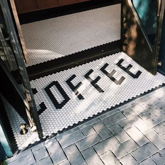
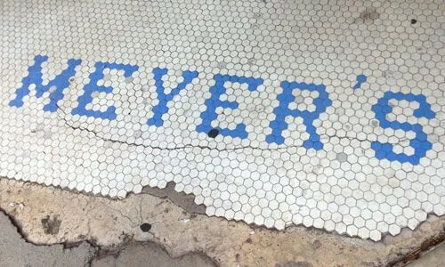
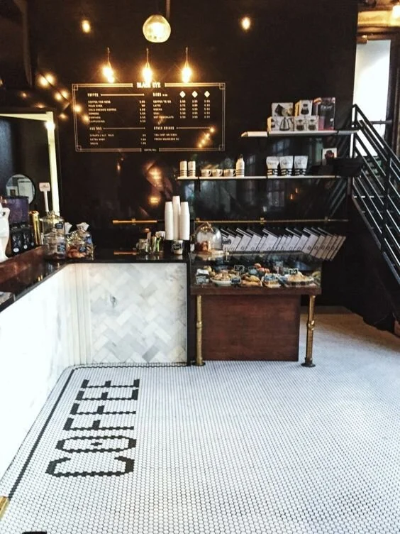
Another flooring element will be in the entrance of the coffee shop, where we are hoping to do a coordinating but smaller penny tile that we can use to spell "Coffee" on the threshold just inside the door (see examples below). I think this will be a super fun and unique element and we hope to even continue this style of tile to the outside entrance as well.
via From Up North
via Visual Lingual
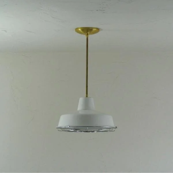
After flooring, my next decision was lighting. I wanted the lights to look old world and industrial but also have a bit of a modern twist. There is no question when it comes to metal, that I must have all brass everything! I chose the pendants below first for over the counter- there will be 2-3 lined up above the front counter.
We will also have some wall sconces on the back exposed-brick wall above the menu board and open shelving. I chose the lights below for the wall sconces because they have a mix of white and gold but also look industrial.
via Wayfair
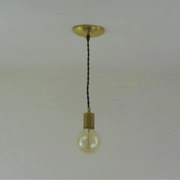
Finally, we will also have these simple cord pendants throughout the entire space and seating area for extra lighting. These that I chose below have the option of ordering with a colored cord, and I think the steel blue (3rd from the right) is the perfect compliment for the blue patterned floors and the brass details.
via Pepe & Carols
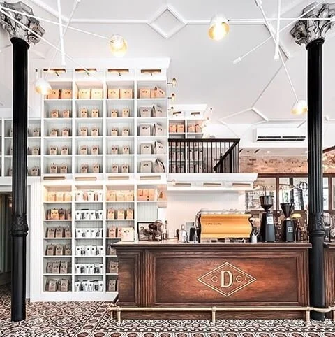
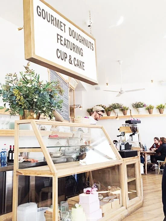
The counter is the focal point of the entire coffee shop and where much of my design focus has been. We will have open shelving and a menu board on the back exposed brick wall above the counter. I want the counter itself to be a beautiful rich wood and look period-specific to the building with lots of ornate trim and antique finishes (see inspiration photo below).
via Instagram
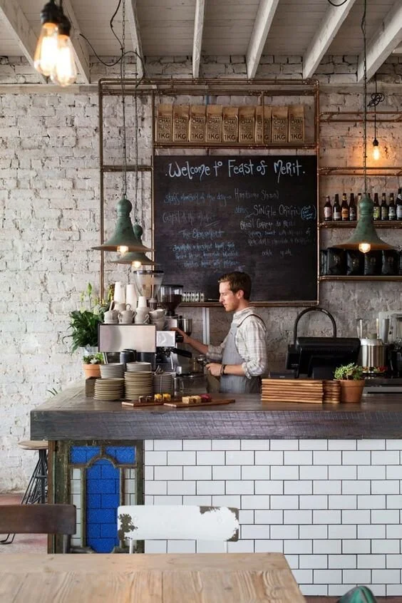
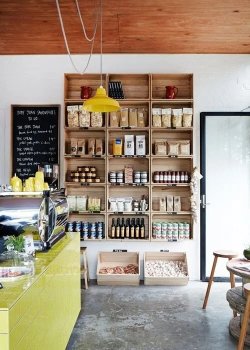
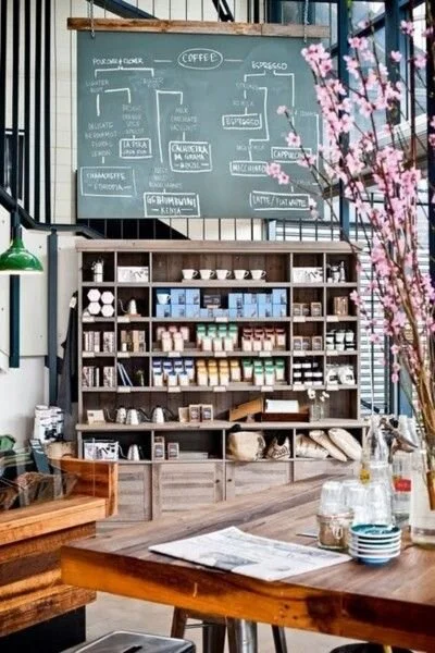
As far as the open shelving behind the counter, I'm using the photos below or inspiration. I'd love a mix of brass metal with rustic woods and lots of different levels and sizes of shelving. I like how the shelving below kind of surrounds the menu board and works around it. I also love the idea of mounting old wood crates directly to the wall for some display storage as well.
via Decouvrir Design
Above is an example of the simple + sleek menu board that I'm using as a template for our menu. I love how bold but timeless this is and think it will be perfect for the space.
via JJJJound
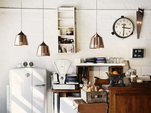
I have also purchased a vintage refrigerator to use for the bottled beverages we will sell in the shop. The fridge is now a pretty hideous purple (!) but I'm going to have it reglazed either white, or a fun color that will pop with the floors! This will be against a wall but out in front to the right of the counter.
via Instagram
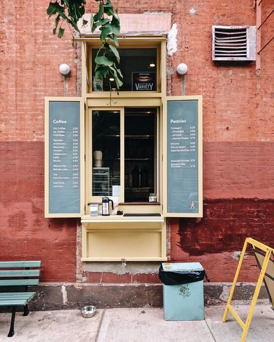
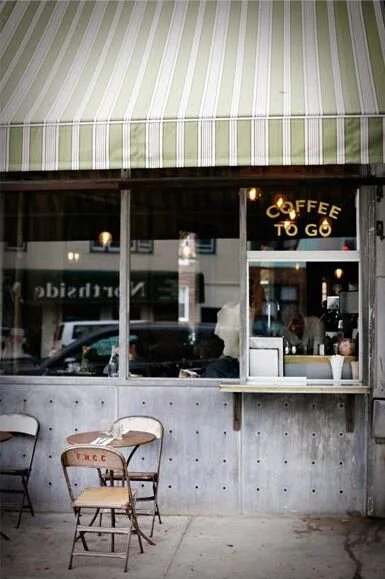
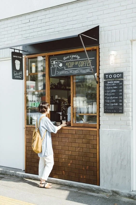
A fun feature that I am super excited about is our "to-go" window. We have a large window behind the coffee counter that also looks out directly to the sidewalk of Main Street, so we are going to use it as a separate ordering space for walk-up, quick orders. I love the inspirations above and below for this cute little addition.
via Sunday Suppers
via You Pouch
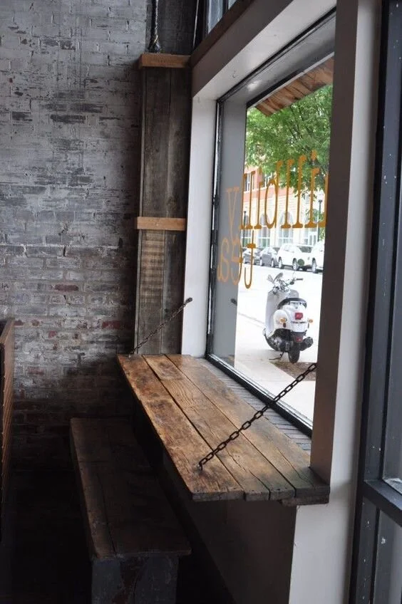
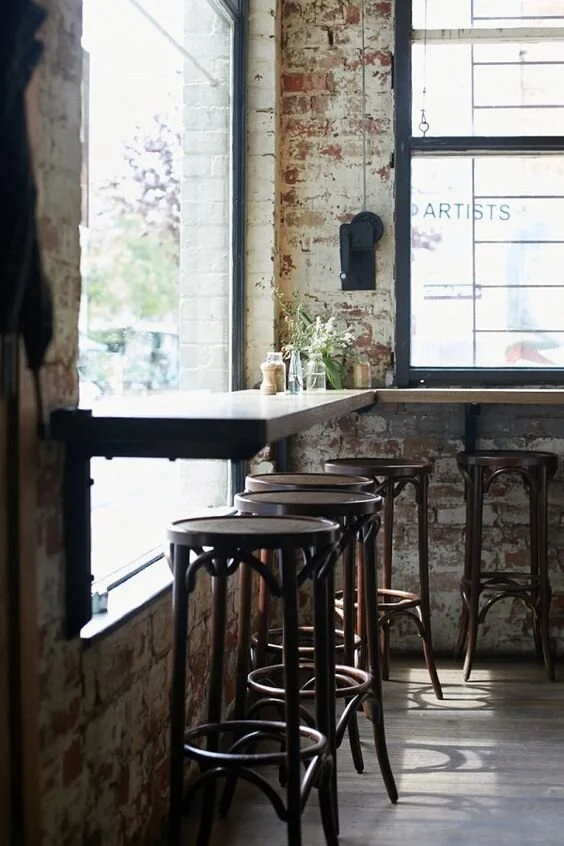
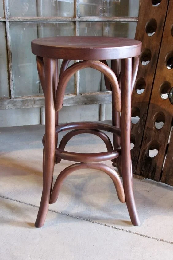
Our shop is very cozy, so we don't need a ton of seating but I also want to maximize the space we do have. We will have mounted window bars with barstools on the large open windows like below. We will probably even have similar window seating outside too, as we have a lot of outdoor space to work with! The bar tops will have a simple reclaimed wood look and I like the classic wooden brasserie-style stool to go with them (see below).
via Design Tripper
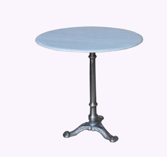
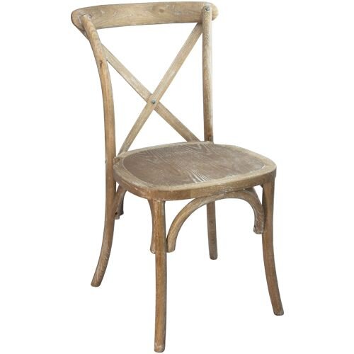
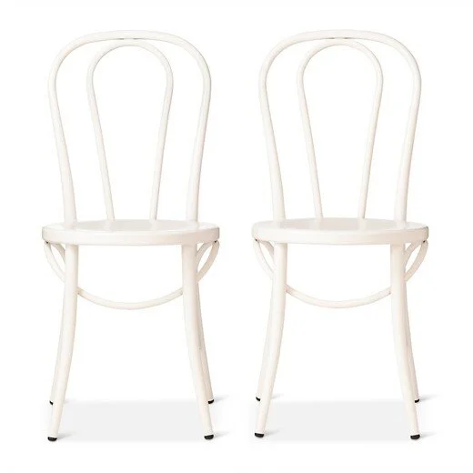
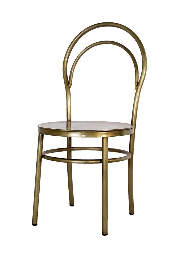
We are also going to mix in some cafe tables and chairs wherever we can squeeze them, as well as outside too. Below are some of my favorite picks for these!
via Target
The dividing wall between the coffee shop and retail space will also have some unique features. We are leaving a large opening at the top of the wall between the two spaces that I want to suspend a large double-sided marquee board or chalkboard inside of (see examples below). That way the space isn't wasted and we can list upcoming events, specials, etc. on the boards for each space too!
via Mr + Mrs. Colors
via Fime
As far as the flow between the two spaces, the photo below is very similar to what I'm picturing. It's still very open between the two, but there is a dividing wall and door that is able to be closed when needed. This is especially important since the retail space will not be open as early as the coffee shop every day!
via Alt for Living
I hope this gives you a little sneak peek and some ideas for what you can look forward to when our coffee shop opens this fall! I'm getting so excited for some of these finishes to start being installed in the next month and I'll be sure to share every step of the process!
To read more about our Amsden building renovation click here.
xoxo
Emily


