Fixer Upper Friday: The Double Decker House
all photos via Magnolia
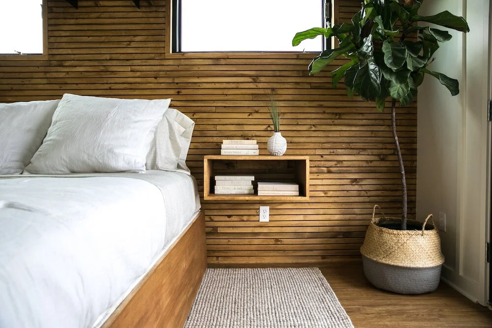
Last week's Fixer Upper was a first, a houseboat renovation! I loved the simple, clean, midcentury look of this design and especially all the exterior updates that they did to modernize this 70's houseboat. The mix of raw wood, unique black siding, and the modern windows on the outside of the houseboat completely transformed the entire look. If I ever have a houseboat, I would want it to look just like this! Check out the amazing before + after below:
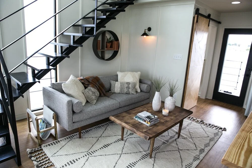
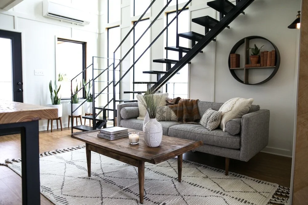
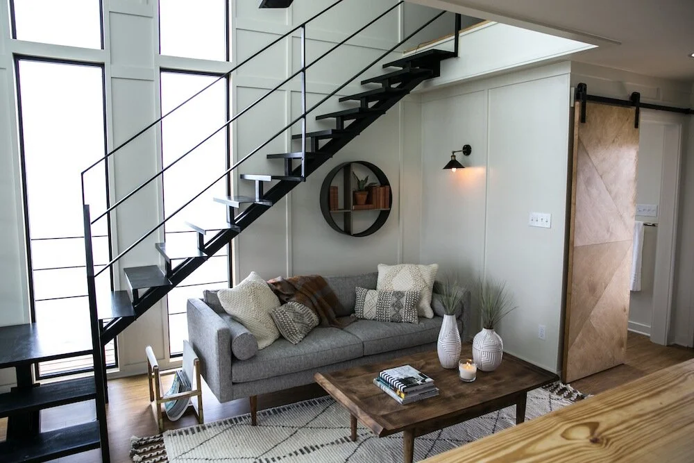
My favorite area of this renovation was the simple, modern living space. It was the perfect mix of midcentury and rustic, while still feeling cozy and comfortable. This home was designed with a more masculine style in mind, but I think that the overall look would work for just about anyone! Not only are all the neutrals easy to work with but the simple, clean lines are timeless, making this space both functional and stylish for years to come.
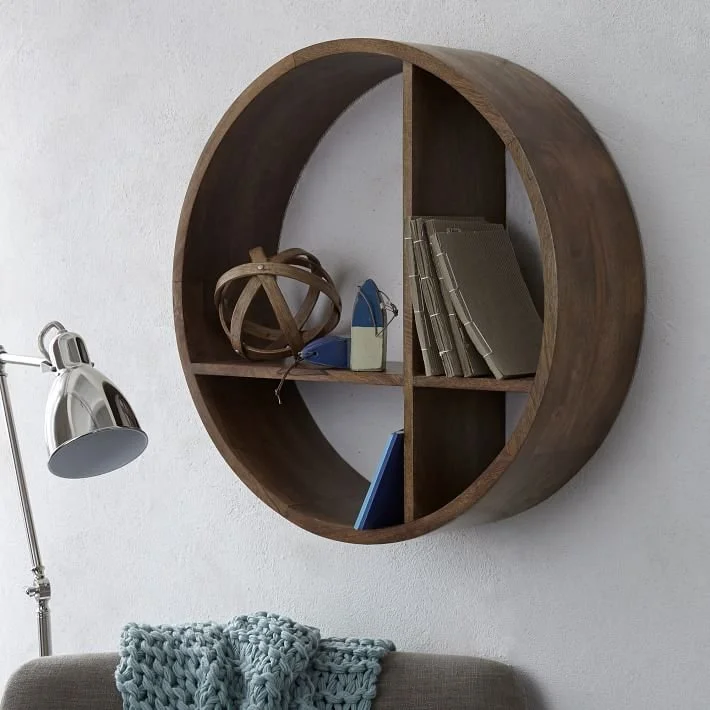
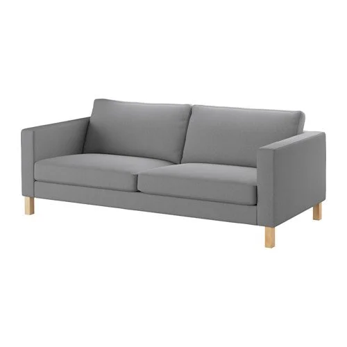
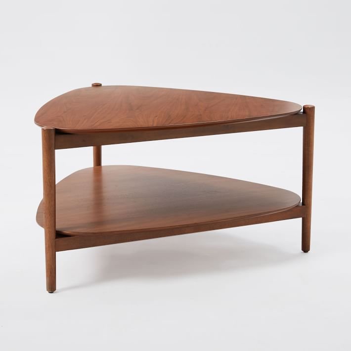
The star of the space is this gorgeous gray midcentury couch- I've linked some similar options below ranging from Ikea to West Elm so there's something for every budget. The metal sconce adds a little industrial touch to the space and I love the little bit of brass on it too (I've linked a lot of options below under $100!). The wood circular shelf is the perfect minimal wall art that also serves as a little storage space too.
My favorite part of the space: that cute little row of midcentury planters by the window! Such a simple way to add a pop of brightness that still fits in with the overall style of the room. The midcentury coffee table is the perfect size for the space and I love the touch of dark wood against all the white. The printed shag rug adds a little texture, pattern, and pulls everything together.
This minimal style is so easy to work with because it doesn't take much as far as accessories to make a space feel complete. Some textured pillows and a throw with a little pattern make the couch feel cozier and less stark. The coffee table is decorated with a simple stack of books, a candle, and some ceramic vases keeping with the clean, mid-century vibe. A mid-century magazine rack provides storage without taking up as much space, or blocking as much window light, as a side table. I've linked many similar accessories below to help you achieve this look, whether you are starting from scratch, or just want to add a touch of mid-century style to a space.
xoxo
Emily













![1254473[5].jpg](https://images.squarespace-cdn.com/content/v1/61705bd42945b34331c1718d/1638511401824-BTANT0B6SBT0IVOJ9GPE/1254473%5B5%5D.jpg)


