Our Fixer Upper: Butler's Pantry Before + After
The next room up on our fixer upper before and after tour is one of my favorite projects of the whole house. When we decided to make this room into a giant pantry, forgoing a dining room, we knew that it was not the most traditional or "safe" route (see our original plans + more before photos here). Now that we have lived here a couple of months, and as this space becomes more and more complete, I could not imagine the room any other way. I fully believe the most important part of designing a home is to make every space function in the best way possible for YOUR family. Who cares about how a house is "supposed" to look?! Do we even really know what is traditional or not when it comes to decorating anymore? The standards and trends are constantly changing, so why not focus on making the people actually living in the house the most comfortable and happy. This is one of the many reasons we are seeing a trend in home design towards layouts with completely open kitchen/family room spaces, essentially eliminating "formal" and less practical rooms like a parlor (formal living) or dining room.
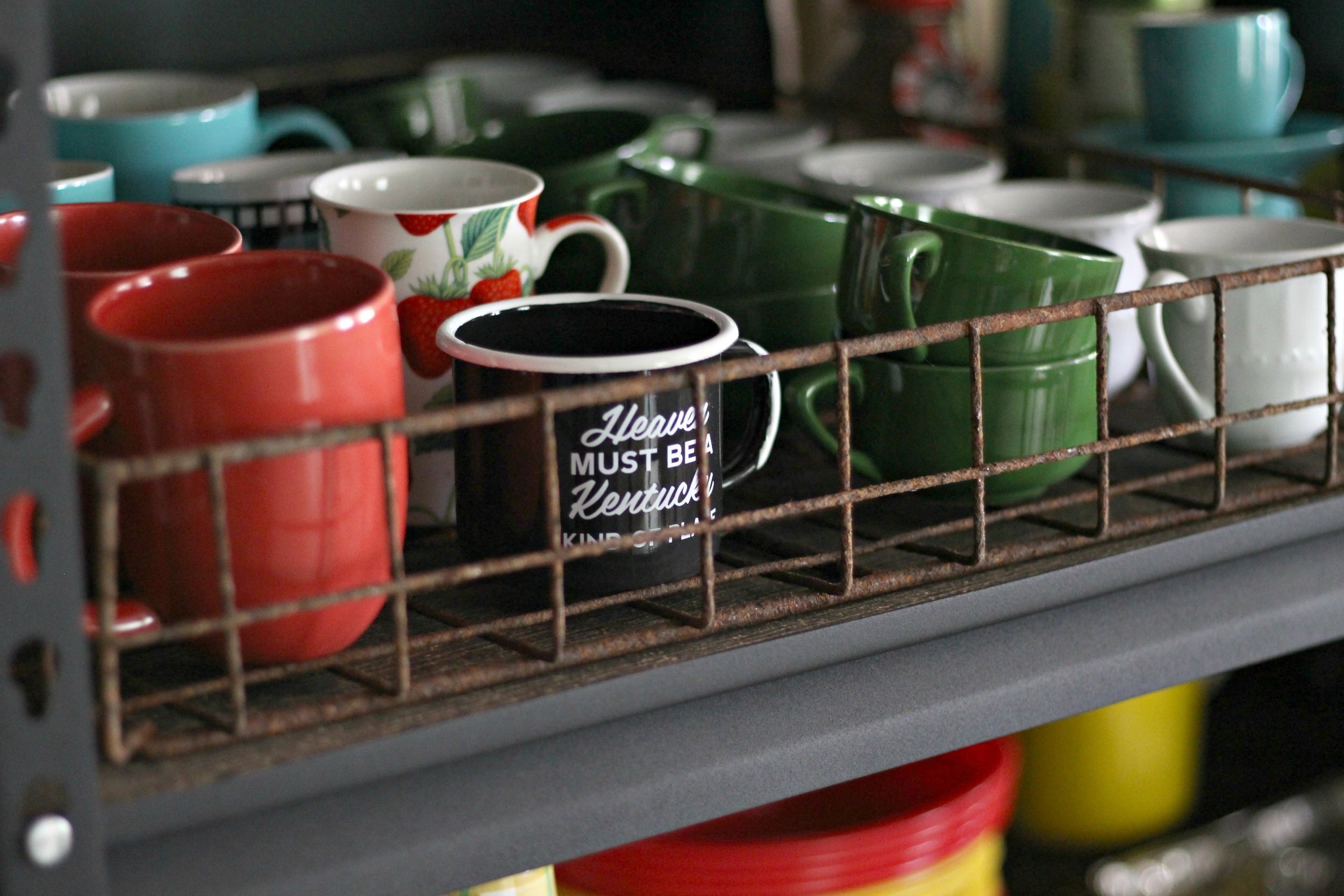
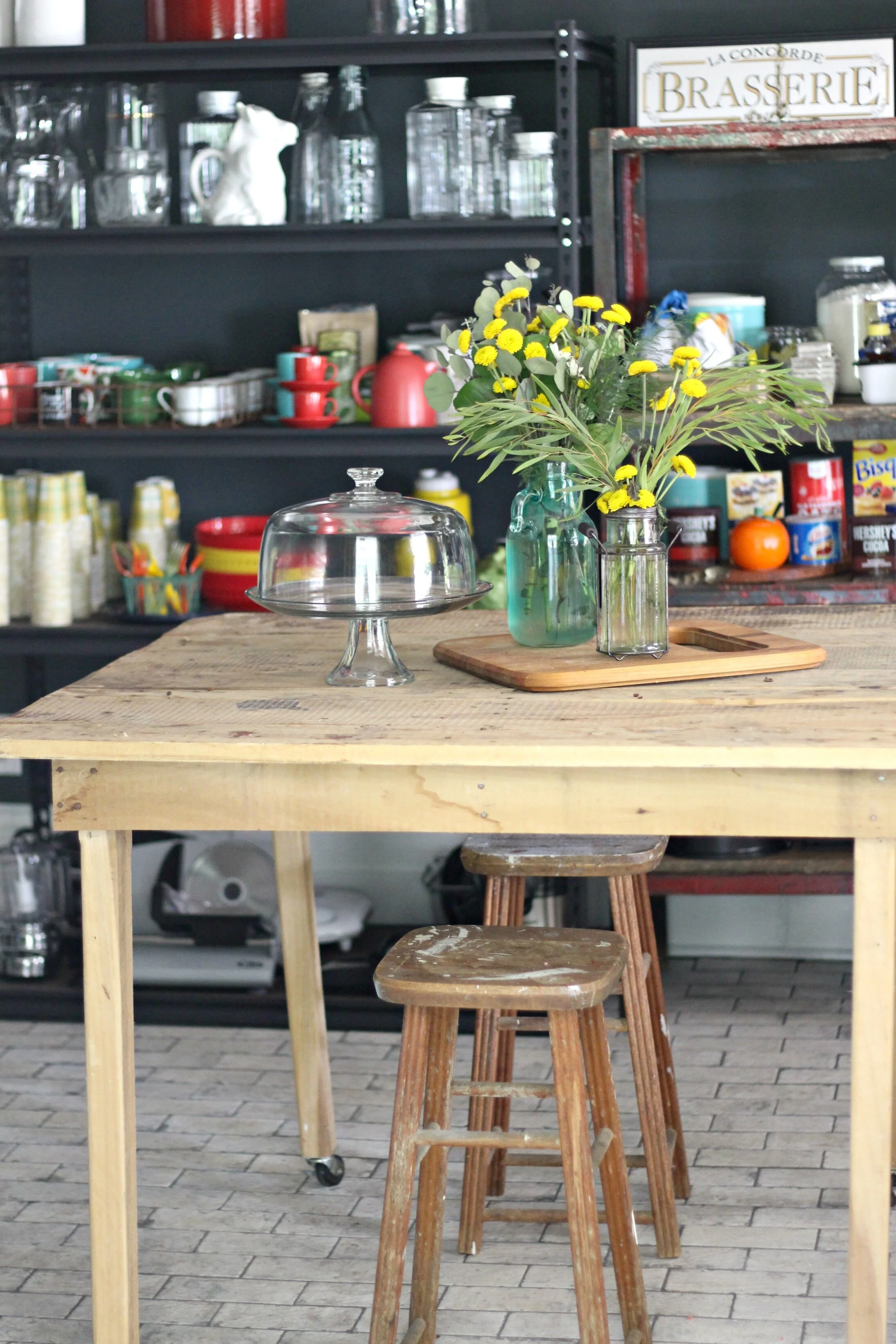
We kept this in mind when deciding what to do with this room. We both love to cook and entertain, so using this room as a pantry was a natural choice and also eliminates clutter and opens up our kitchen. We didn't need to have as many cabinets in the kitchen for closed storage, so we were able to have the more open layout we really wanted (not to mention it saved us a lot of money in cabinets). Let's not even get started on all my dishes, serving ware, and vintage kitchen items I have been hoarding for years. I now have space to display everything where I can see it, so I can actually use it more! This room did need a lot of work to transform into the space it is today- take a look at where we started below:
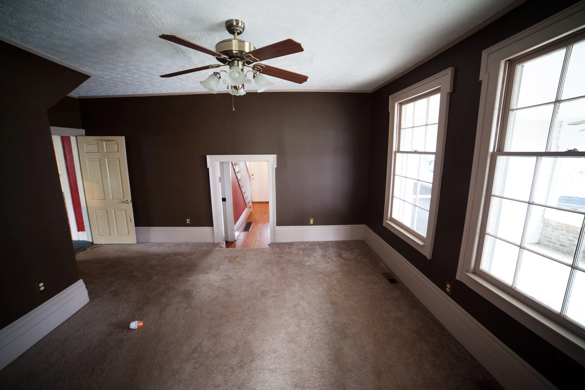
Porcorn ceiling and carpet: two of my least favorite things and two of the major things that seriously dated this room. You will also notice the little awkward doorway I have mentioned several times in other posts. We're not sure why this doorway was put here or why it is such an odd height, but we decided it wasn't necessary and just closed it off. Since we had to do so much plumbing work (basically tearing out the entire ceiling in this room to get to the pipes for upstairs plumbing), we were going to have to re-drywall the ceiling anyways, eliminating the old textured ceiling. The ceilings are a little higher in here than in the rest of the house, which I love. That old ceiling fan was another thing that needed to go to modernize the space.
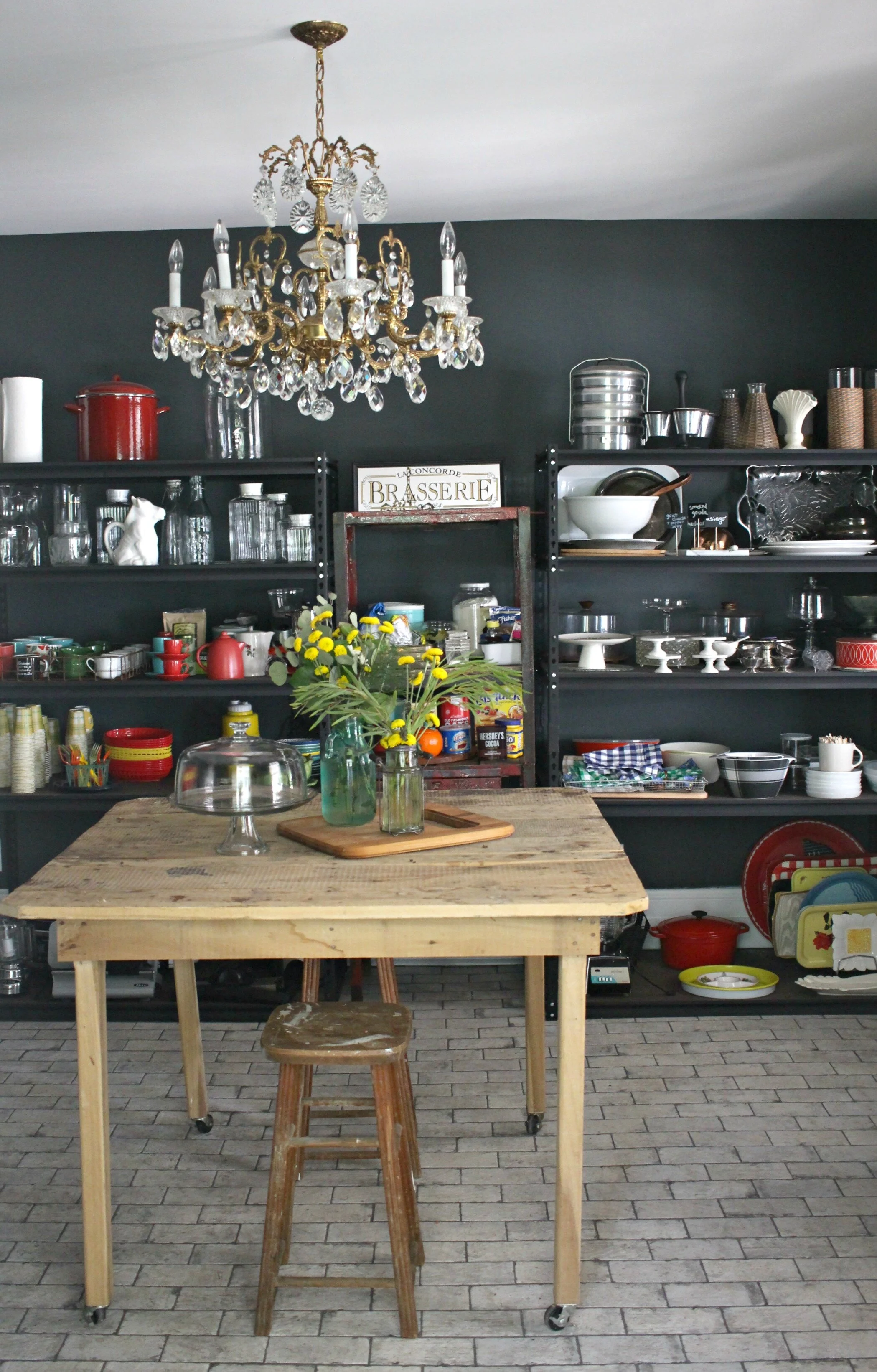
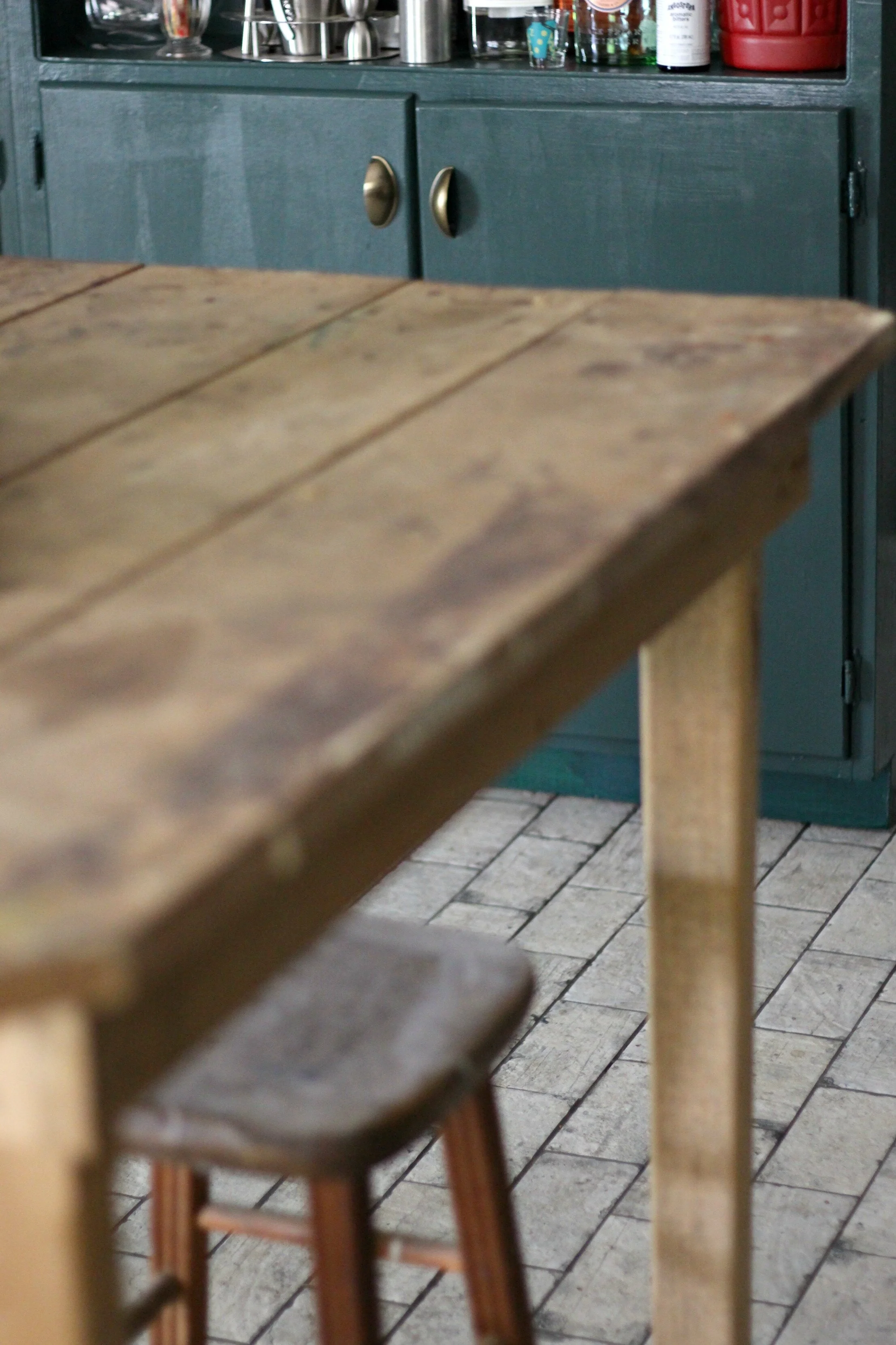
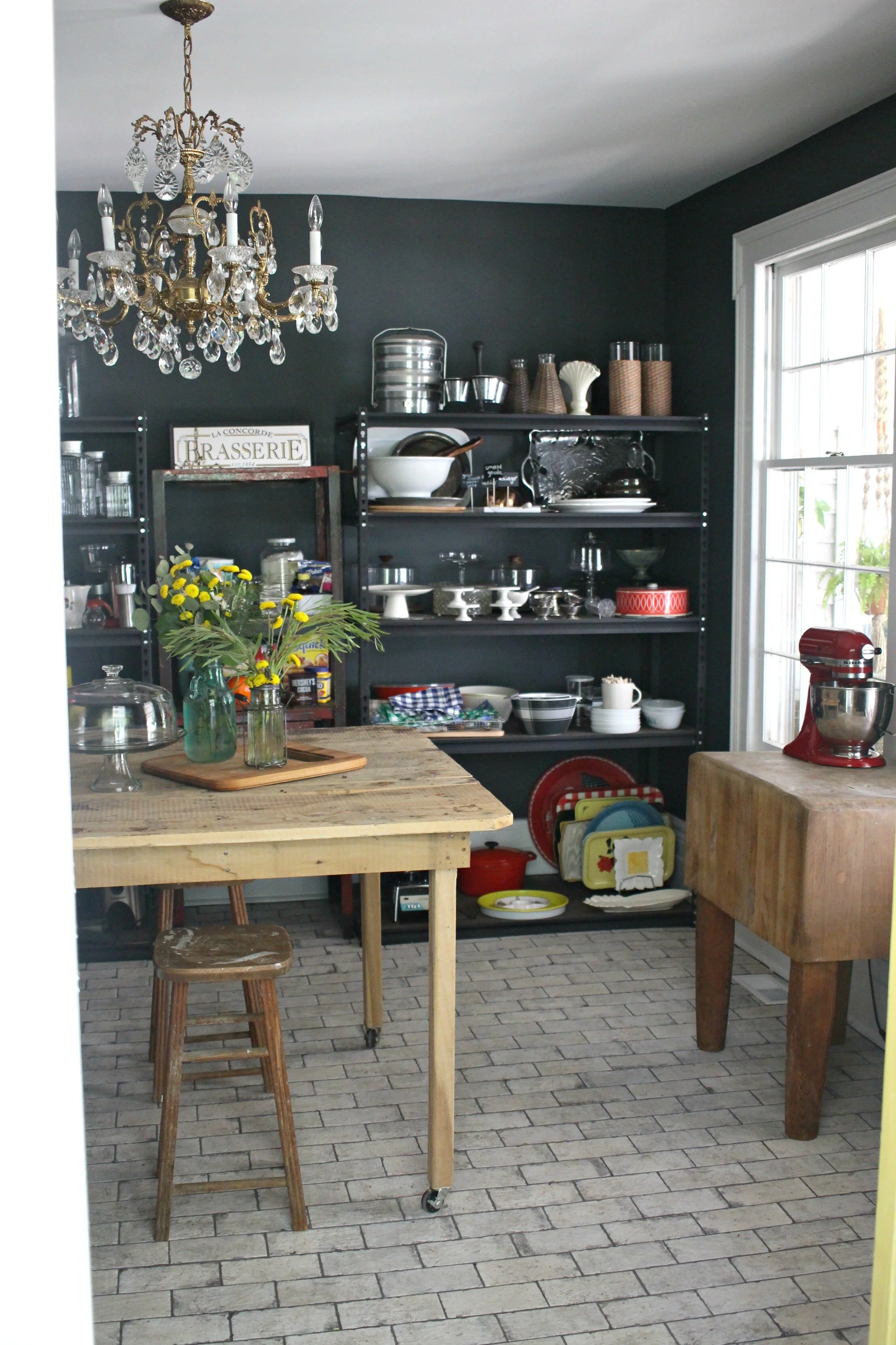
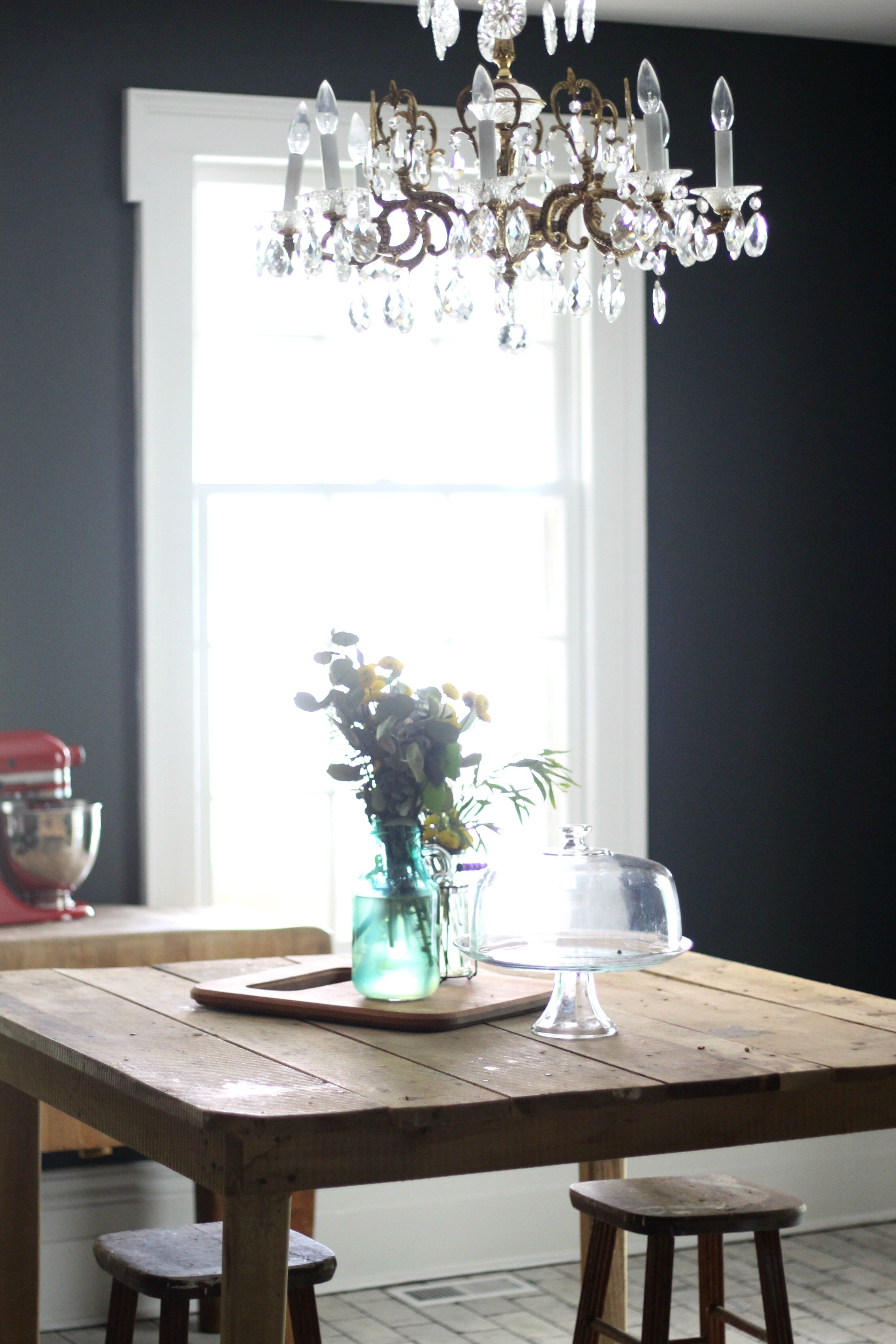
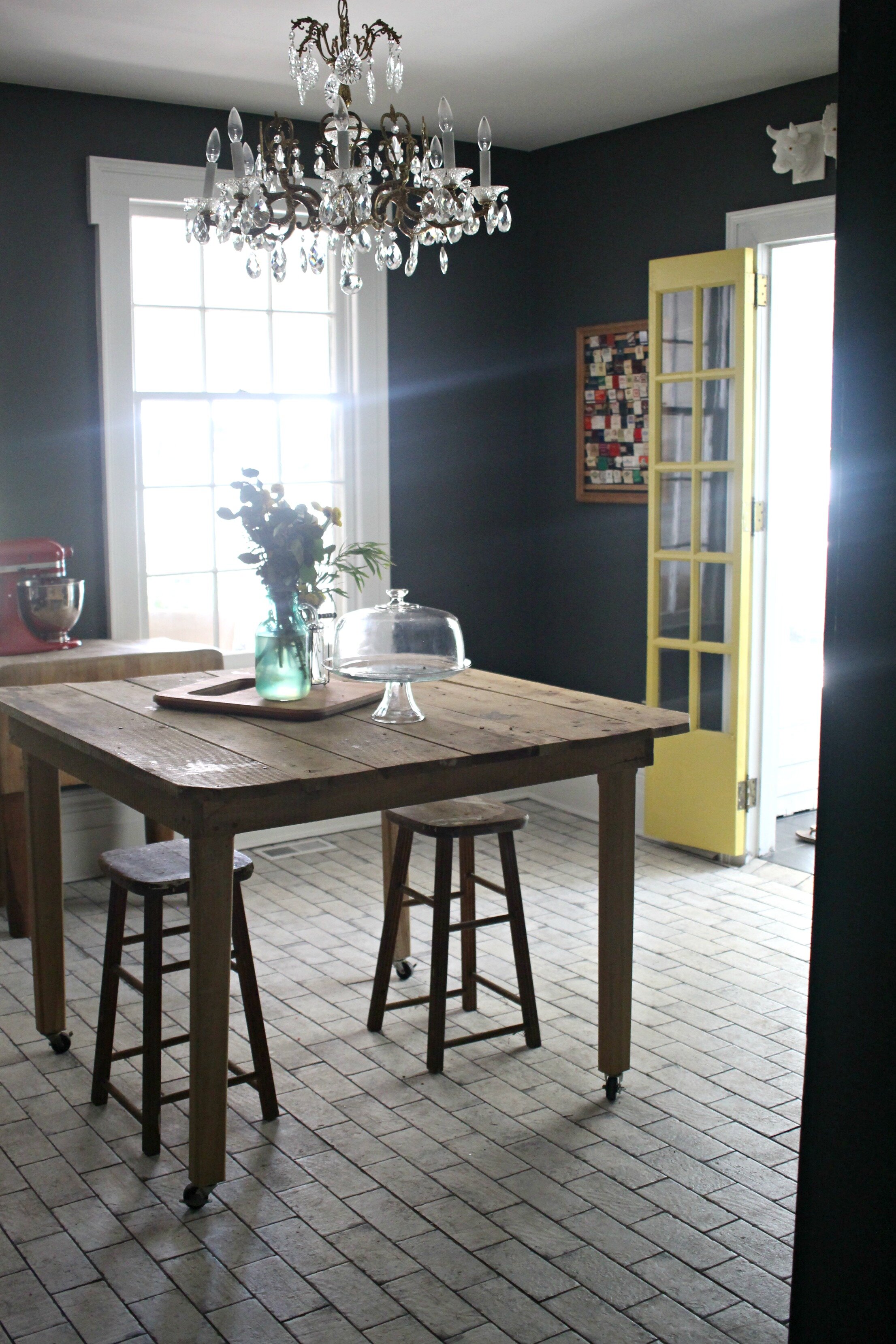
A lot of paint, some flooring, and a vintage chandelier completely transformed this room into the pantry of my dreams! We have lucked out in finding a few of the furniture pieces for this room that happened to fit perfectly. The old table in the center is counter-height, so it's a perfect prep space or serving table AND it's on rollers making it easy to move around! This was another find from the Habitat for Humanity ReStore and I got it for $45! The best part is that it was already perfectly distressed and I didn't need to paint it or touch it up at all!
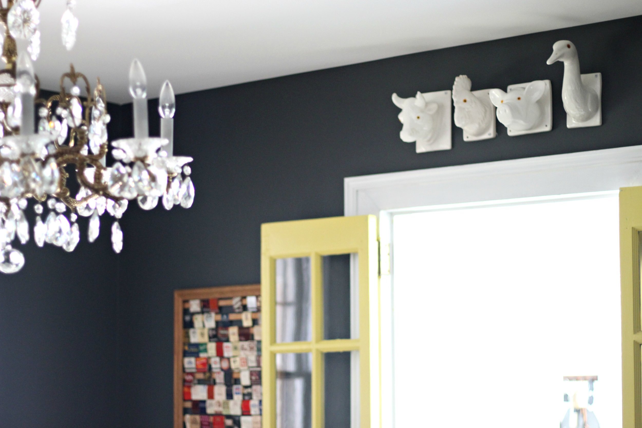
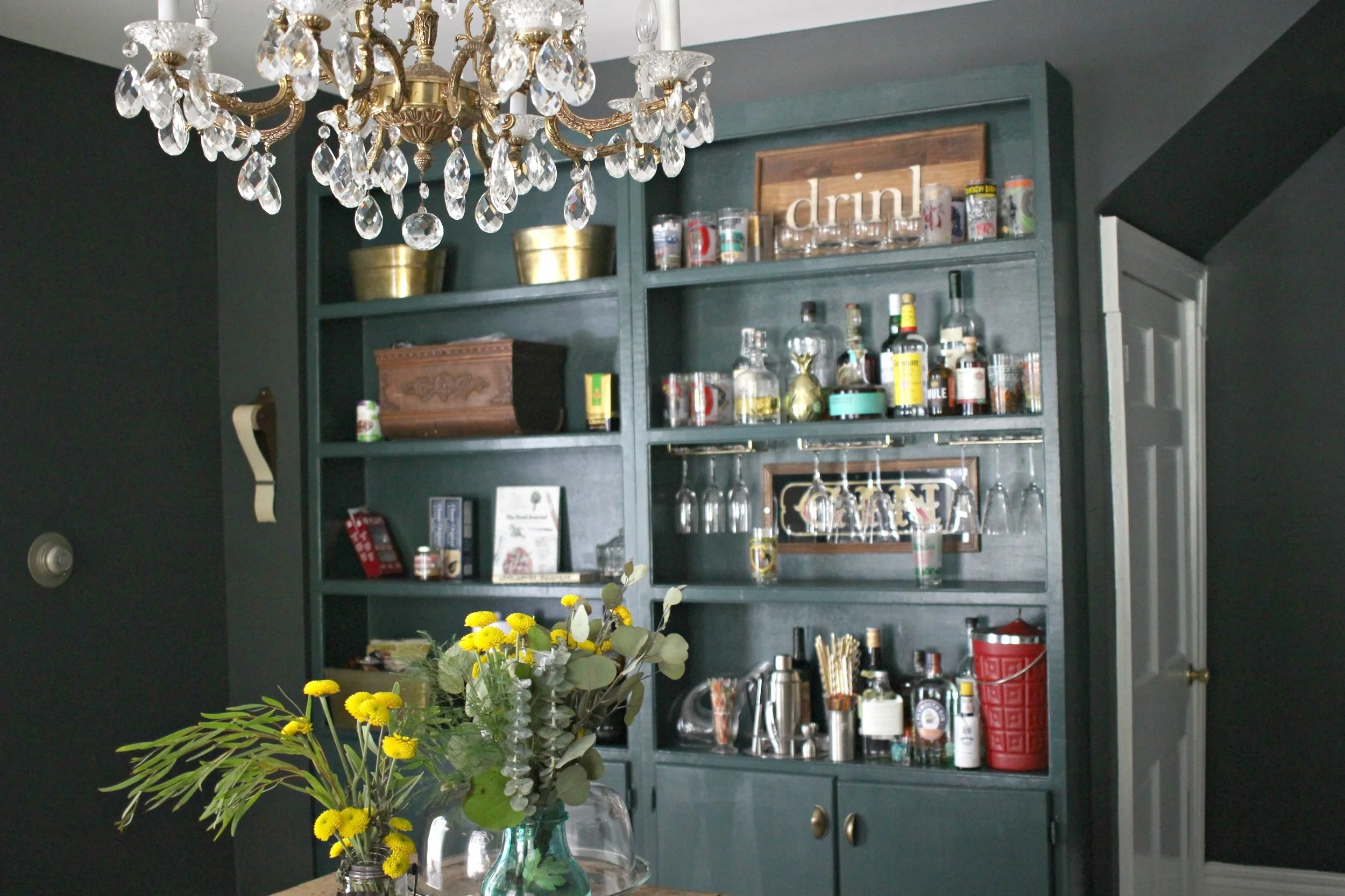
I really love the old original glass doors that were on the doorway leading into the mudroom from this room. I wanted to paint them a bright color ("Crisp Ginger Ale" by Glidden) to really pop against the dark walls and tie in with the French industrial look we were shooting for in this pantry. I even found the perfect spot to place my vintage animal head collection right above them!
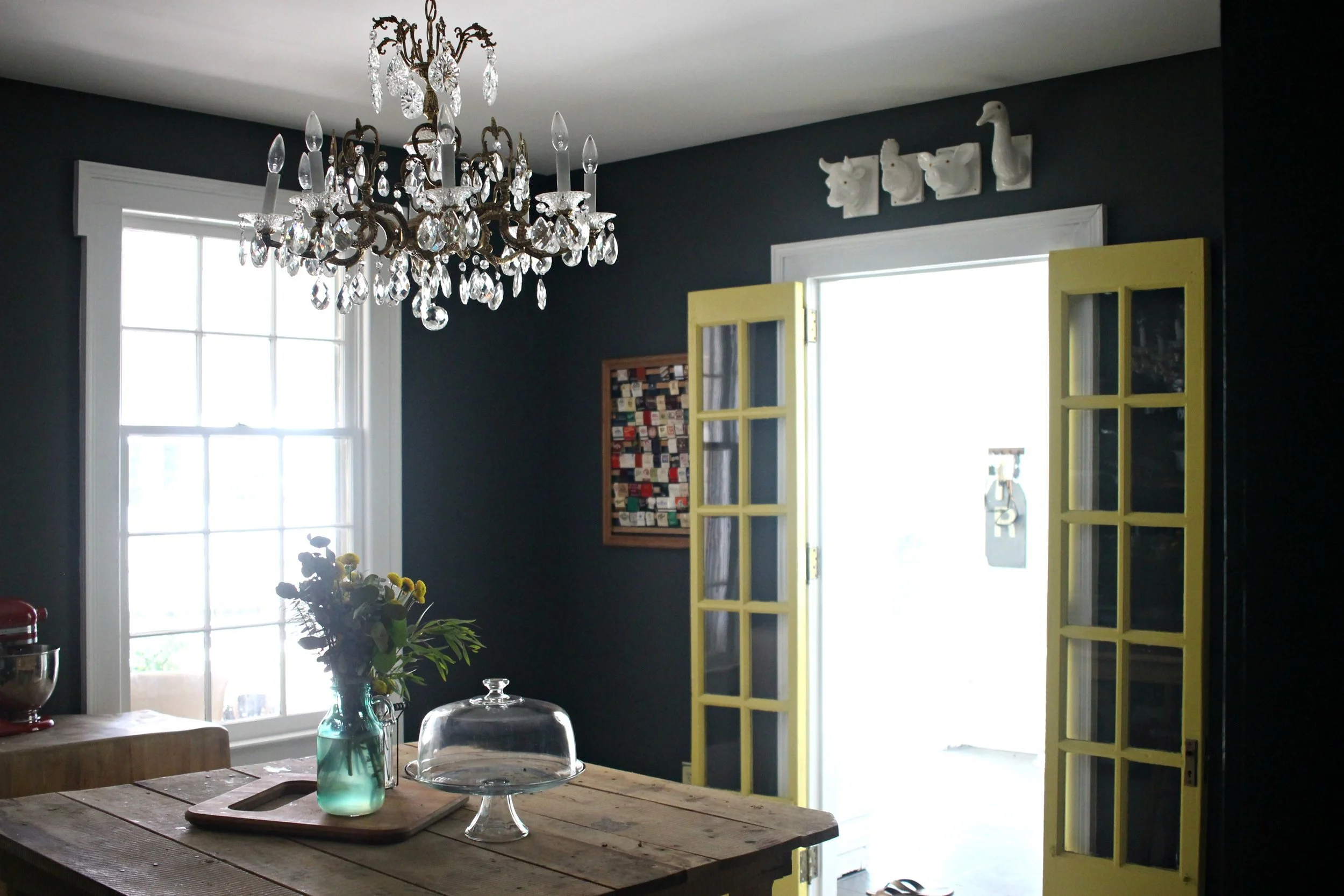
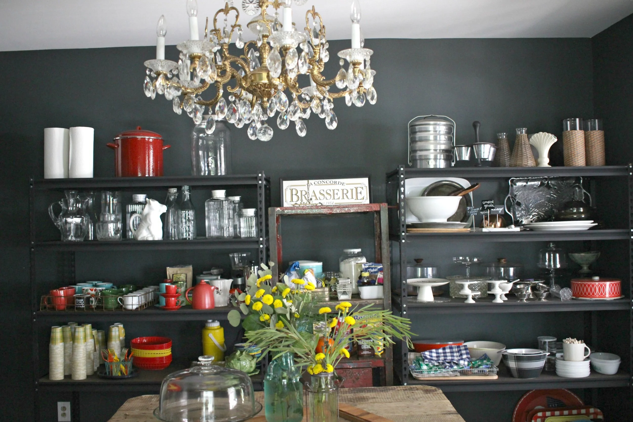
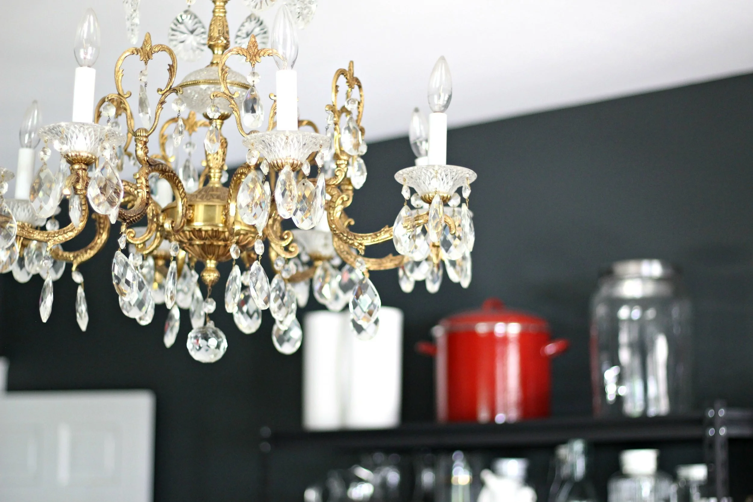
The walls were painted with a dark charcoal "Rock Bottom" by Sherwin Williams and all the trim and ceiling is done in "Pure White." I wanted a dark color on the walls for a little more drama in the room and especially since the floors are so light. It makes everything pop a little more on the shelves against the dark walls.
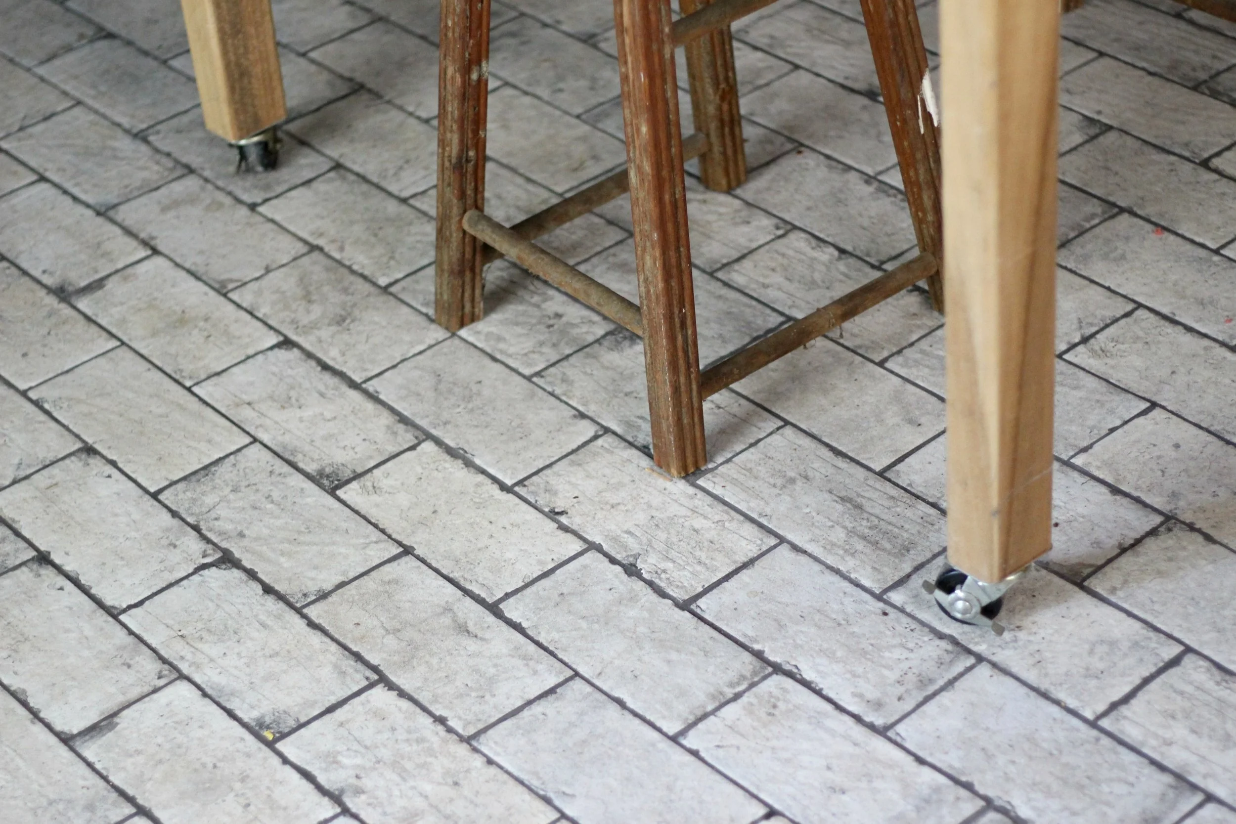
Speaking of the floors, this was one of our favorite projects in the entire house. We knew we wanted something that would stand out in this space and were originally thinking of a black and white checkerboard floor. After not being able to find any of that tile that we liked, we decided to go with this unique porcelain tile that looks just like white-washed brick (from Louisville Tile Company). I think it is the perfect choice for the space because it is so unique but also timeless. To me any kind of exposed brick screams French farmhouse which is the look that I'm always aiming for in my kitchen spaces. My favorite part of this tile might be that it NEVER shows any dirt or dog hair and is super easy to clean.
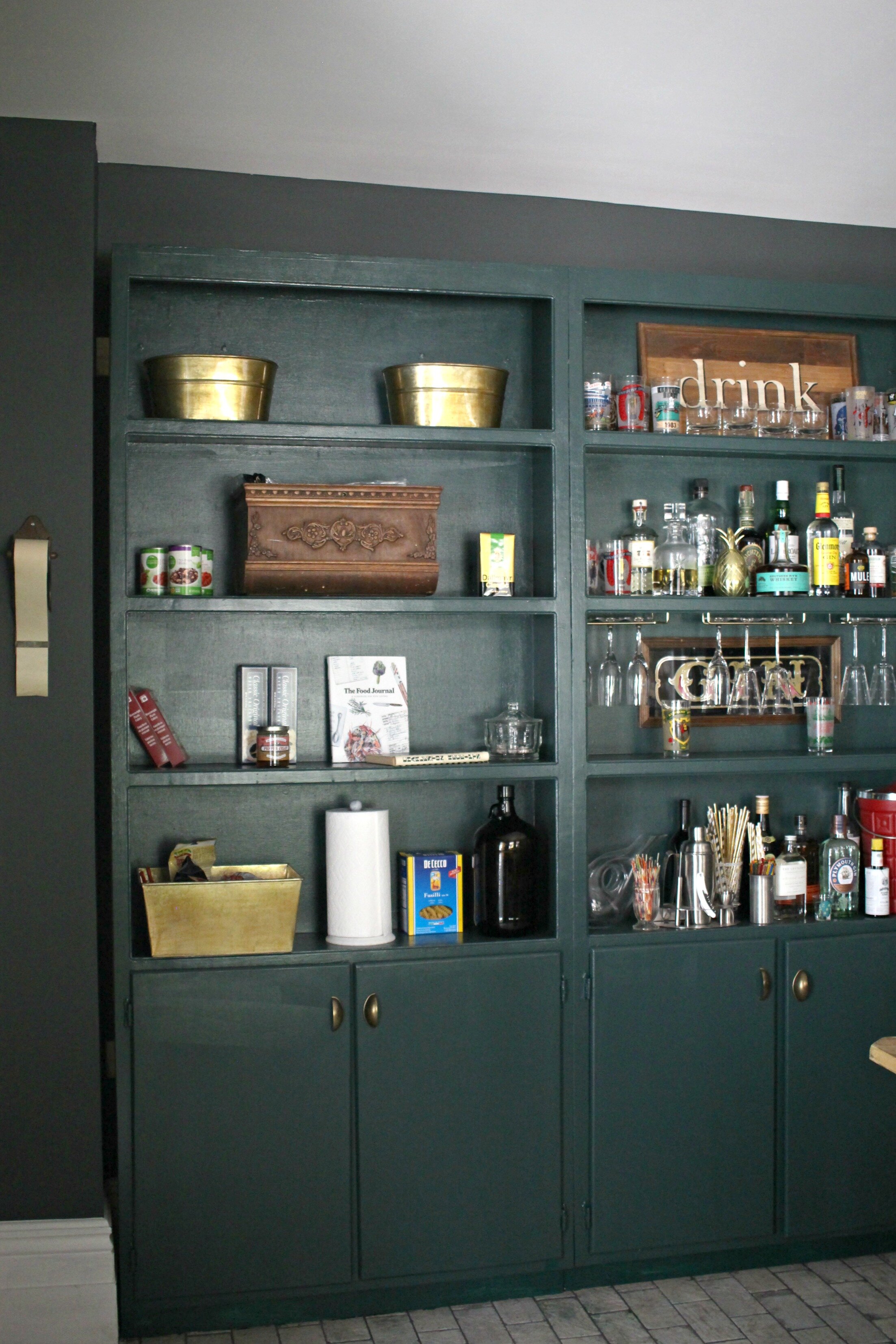
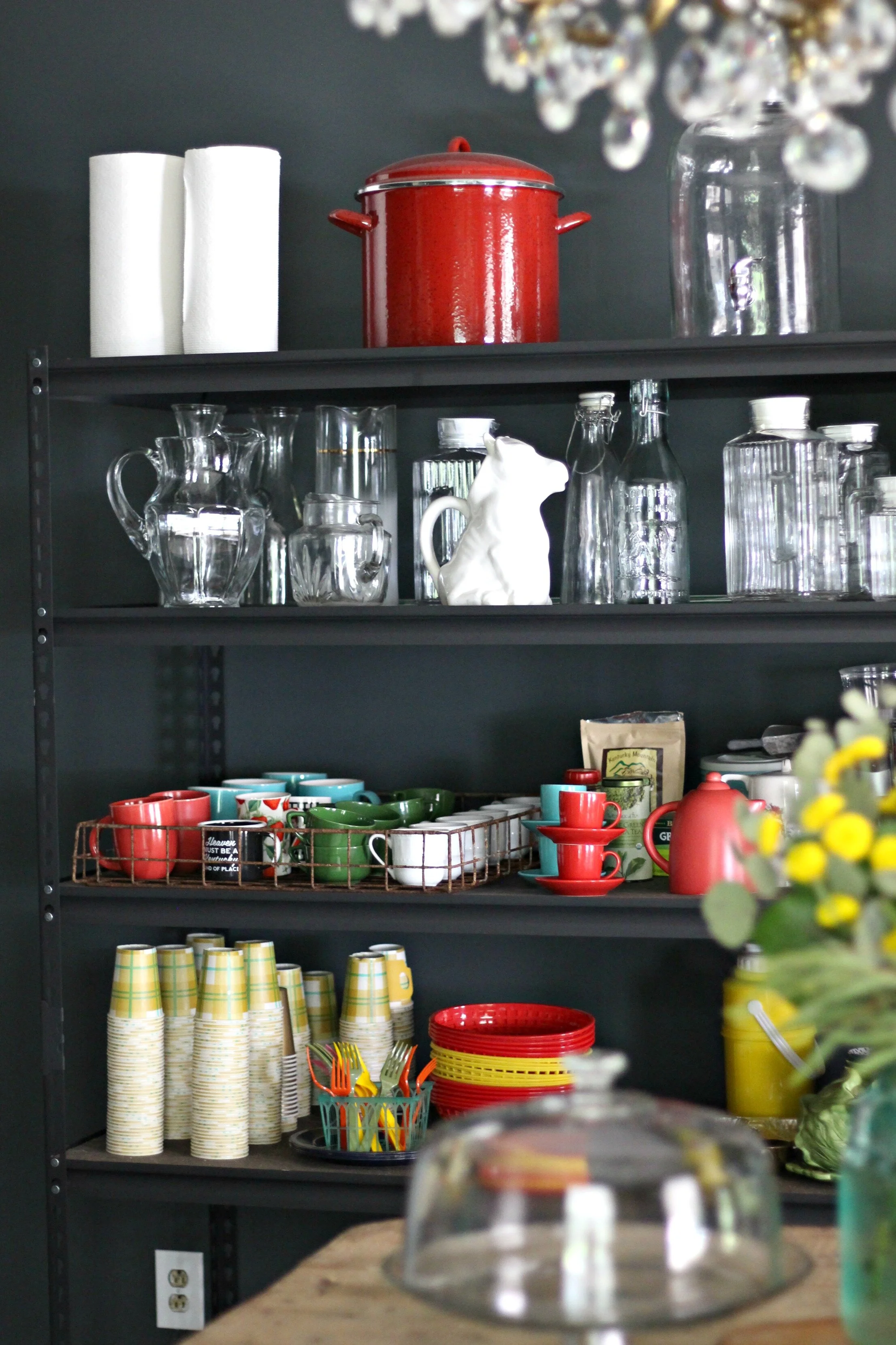
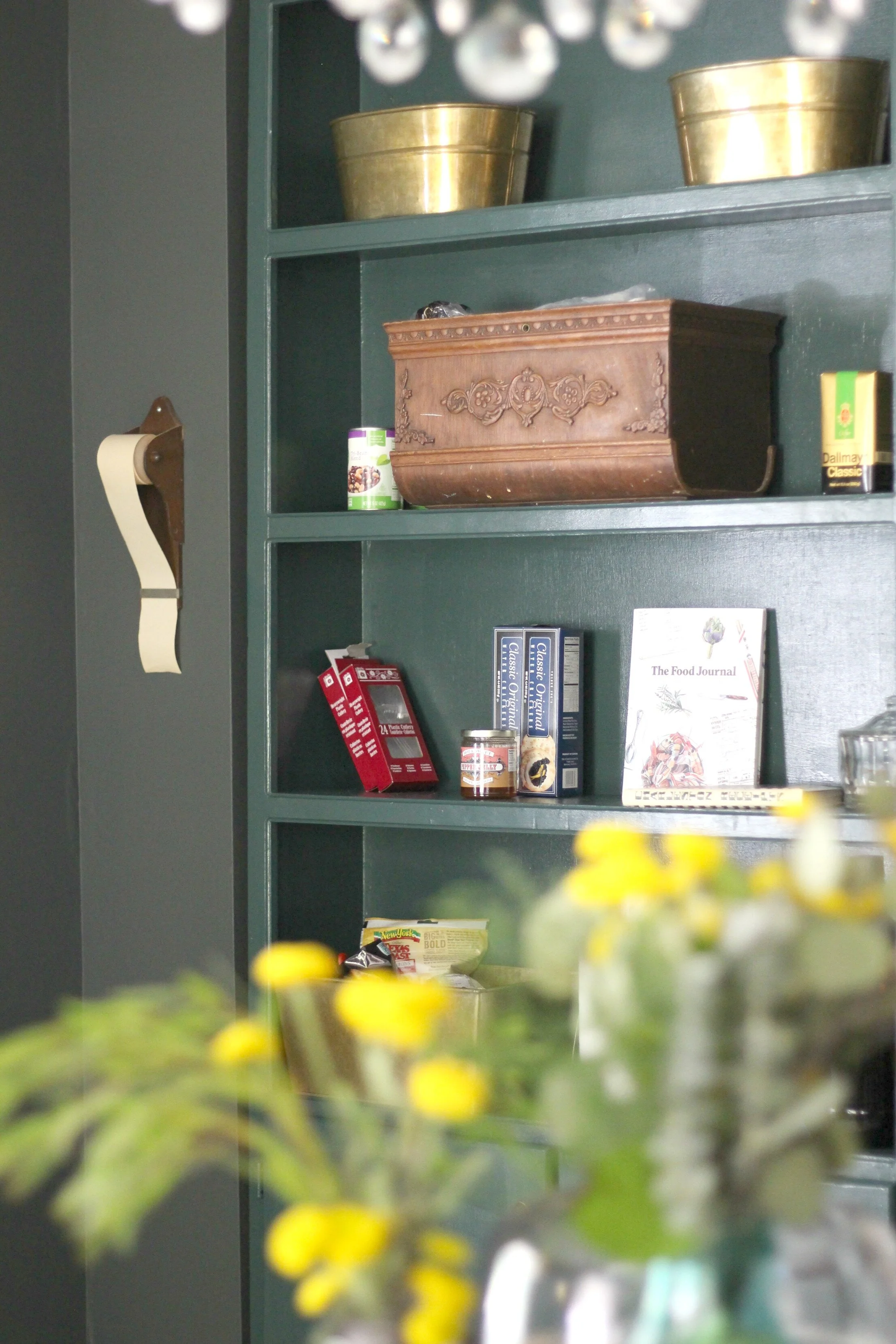
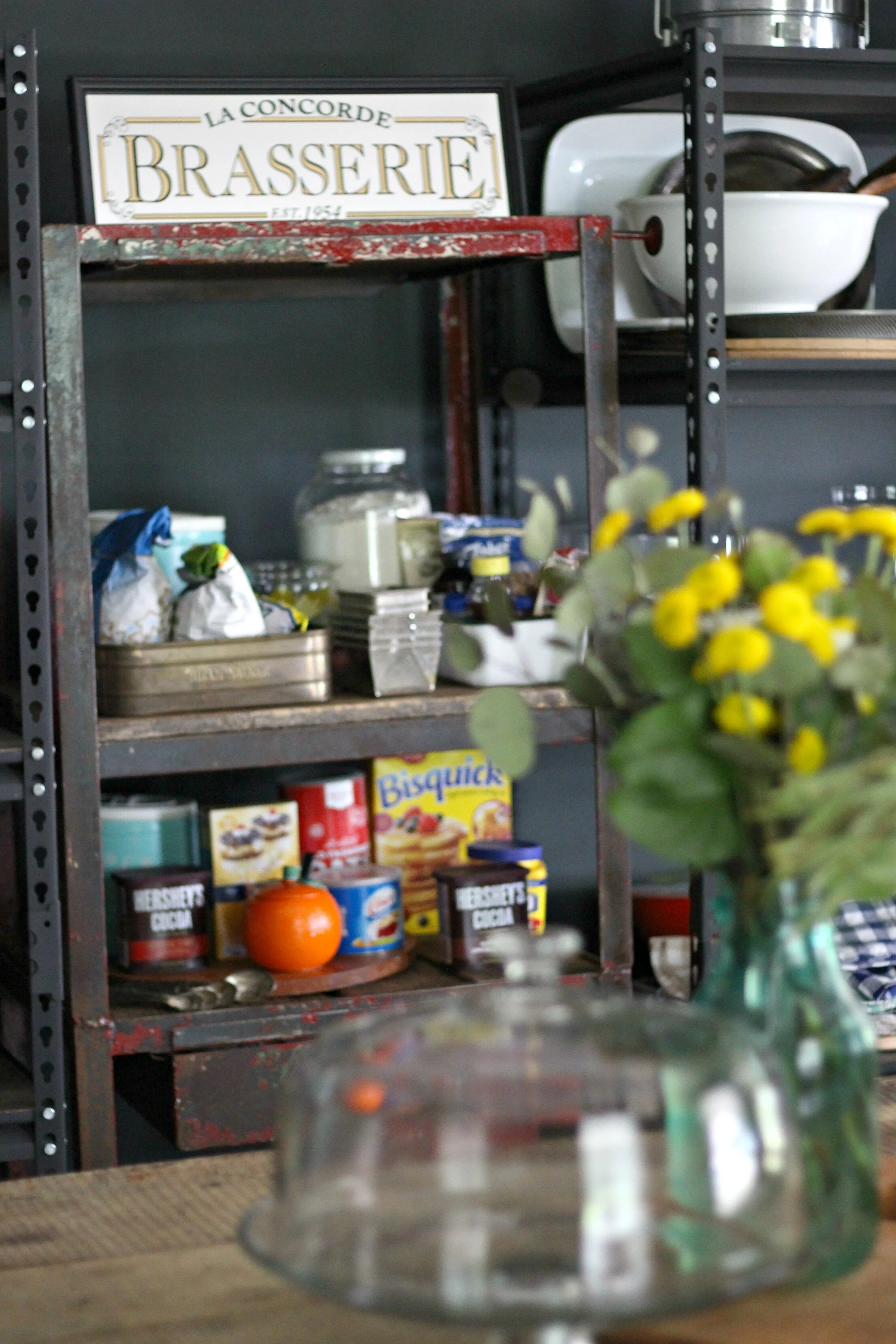
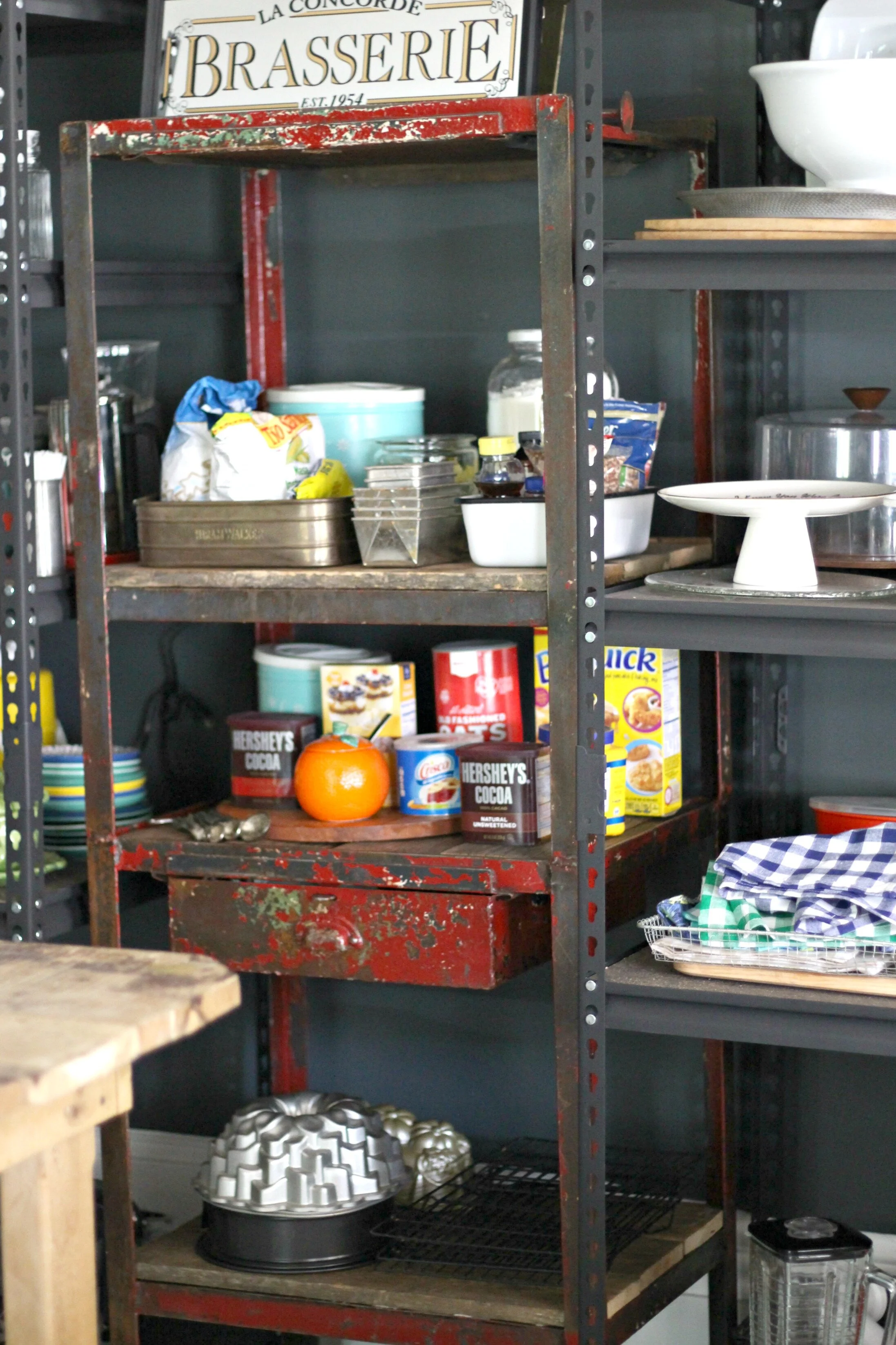
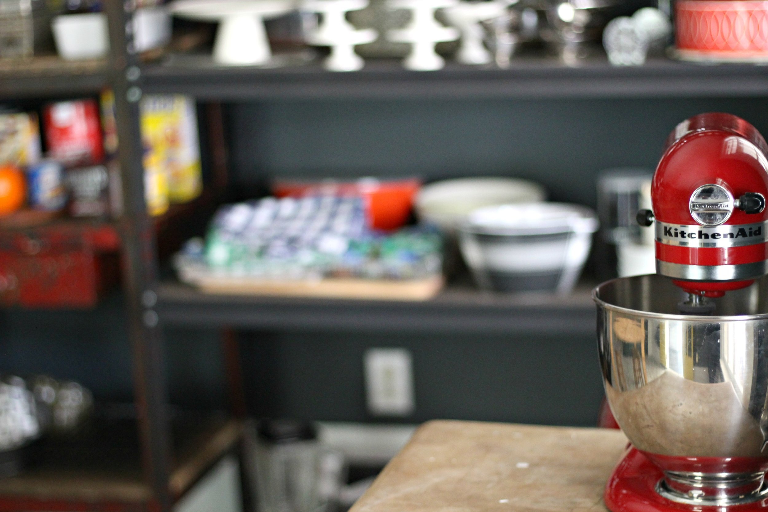
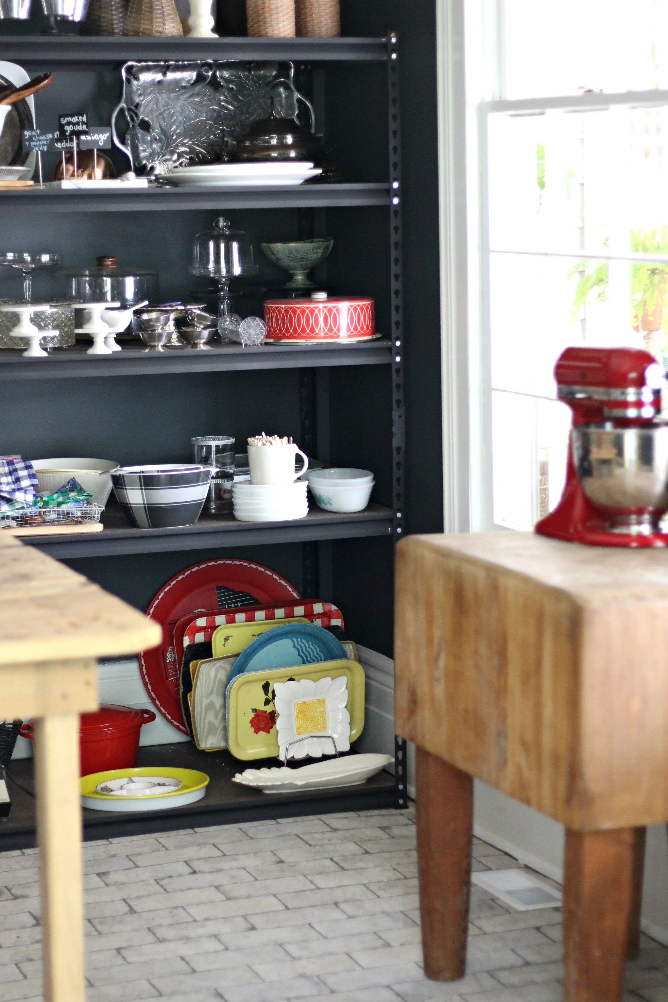
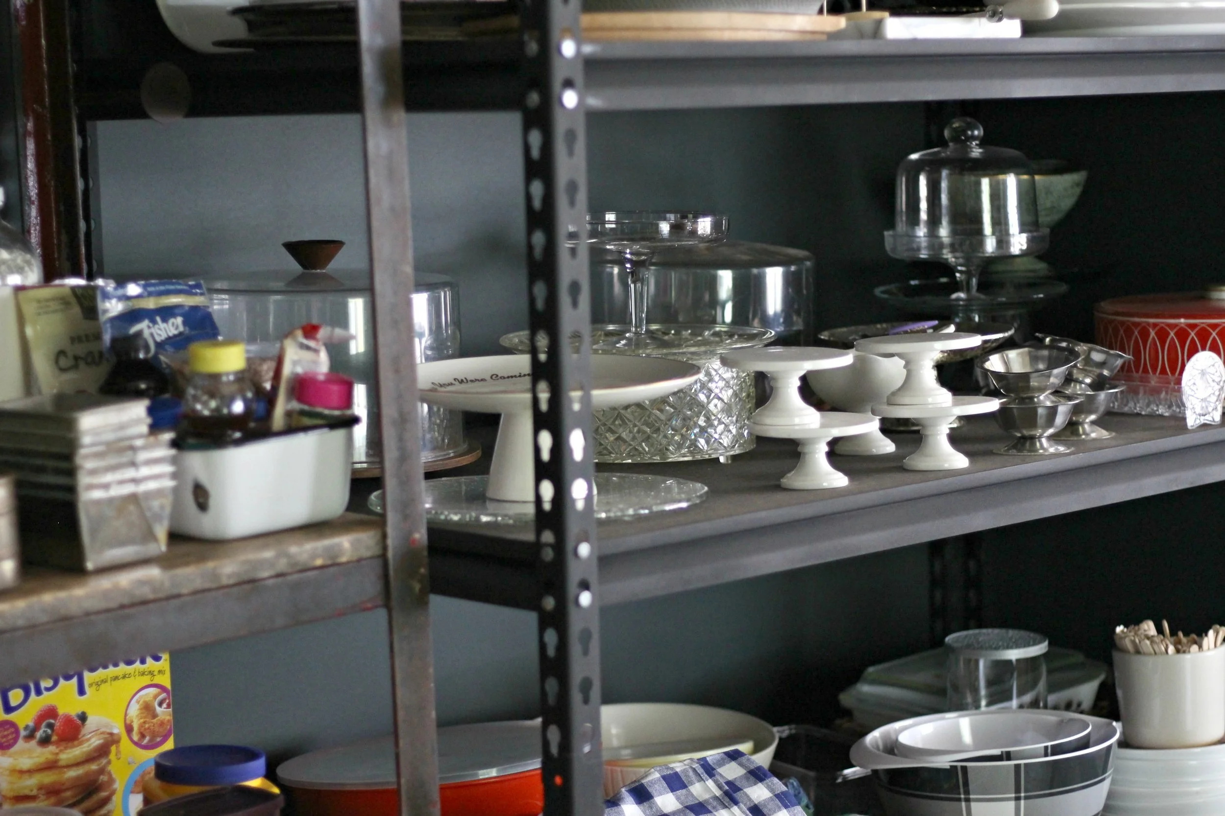
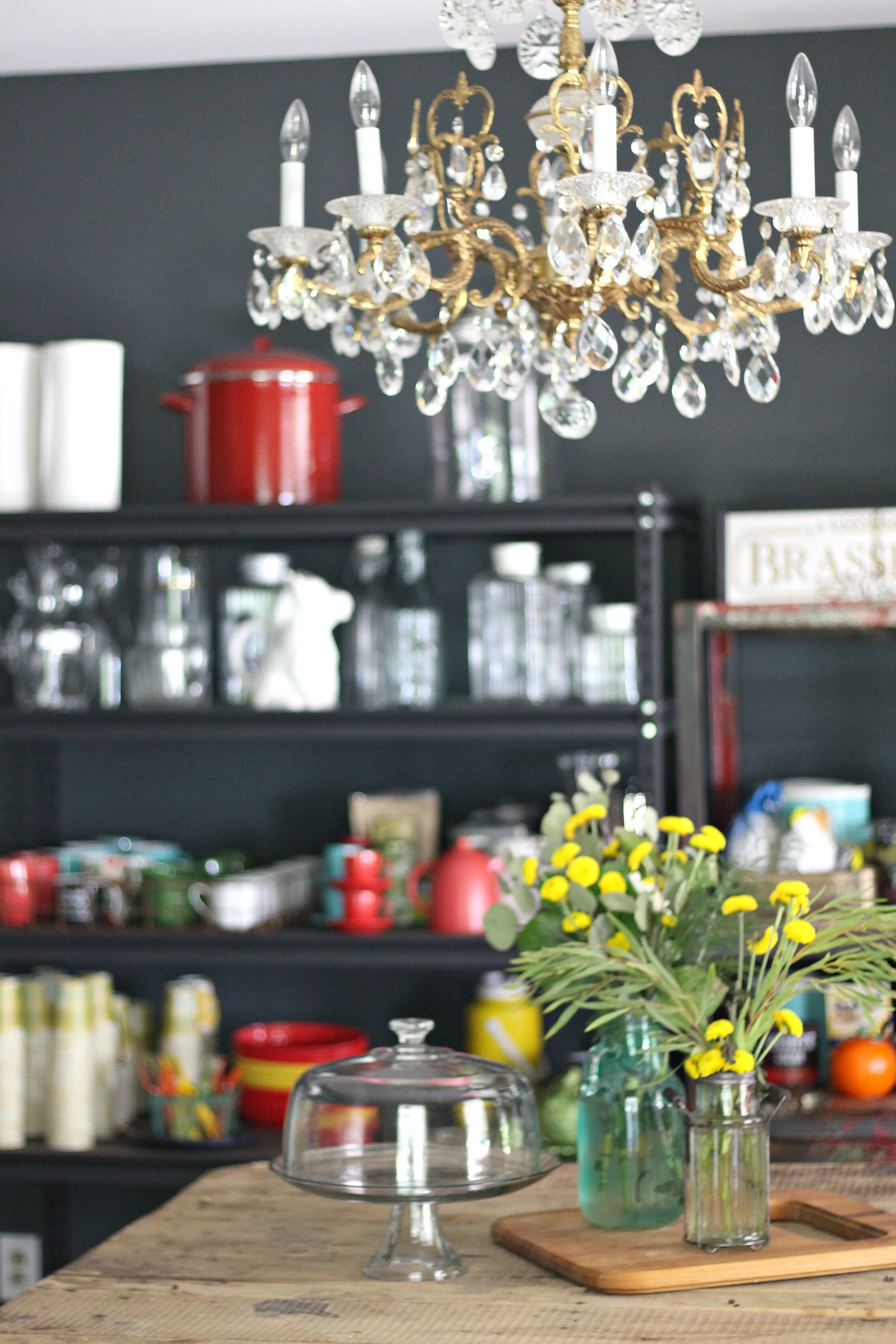
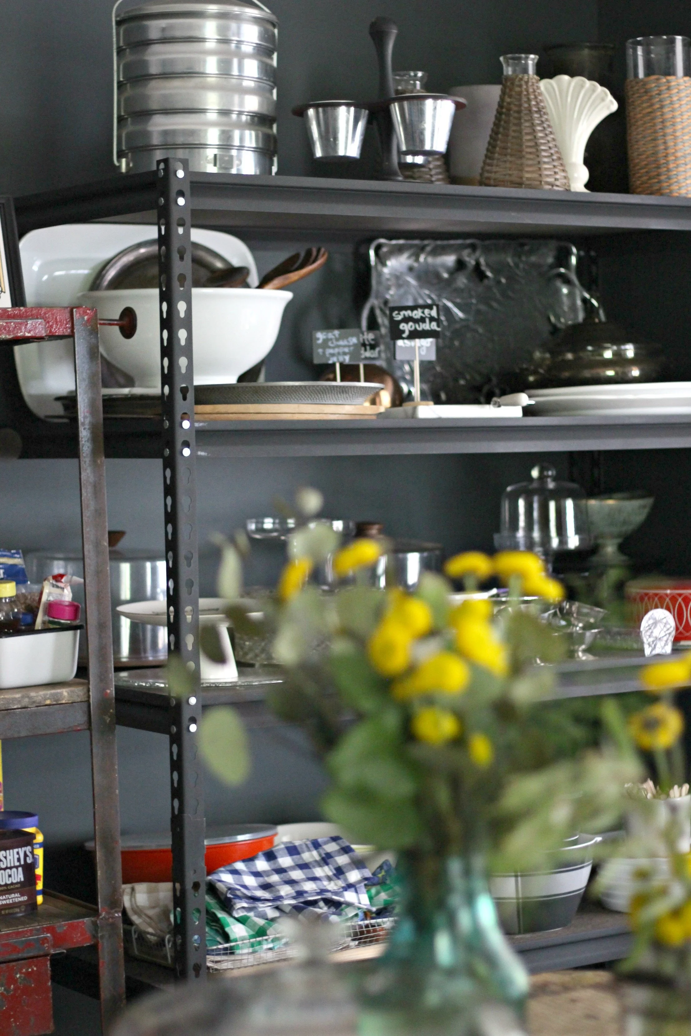
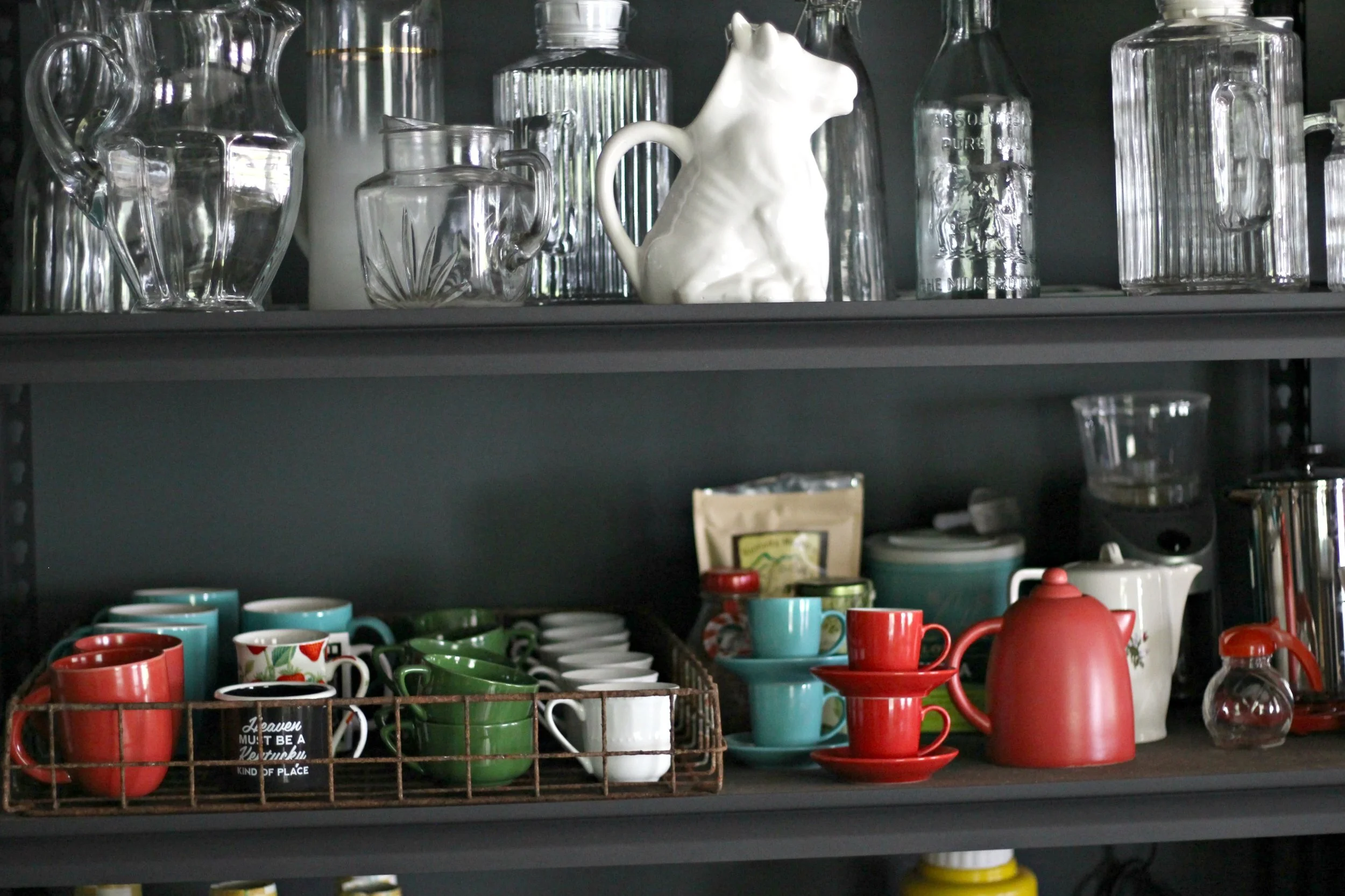
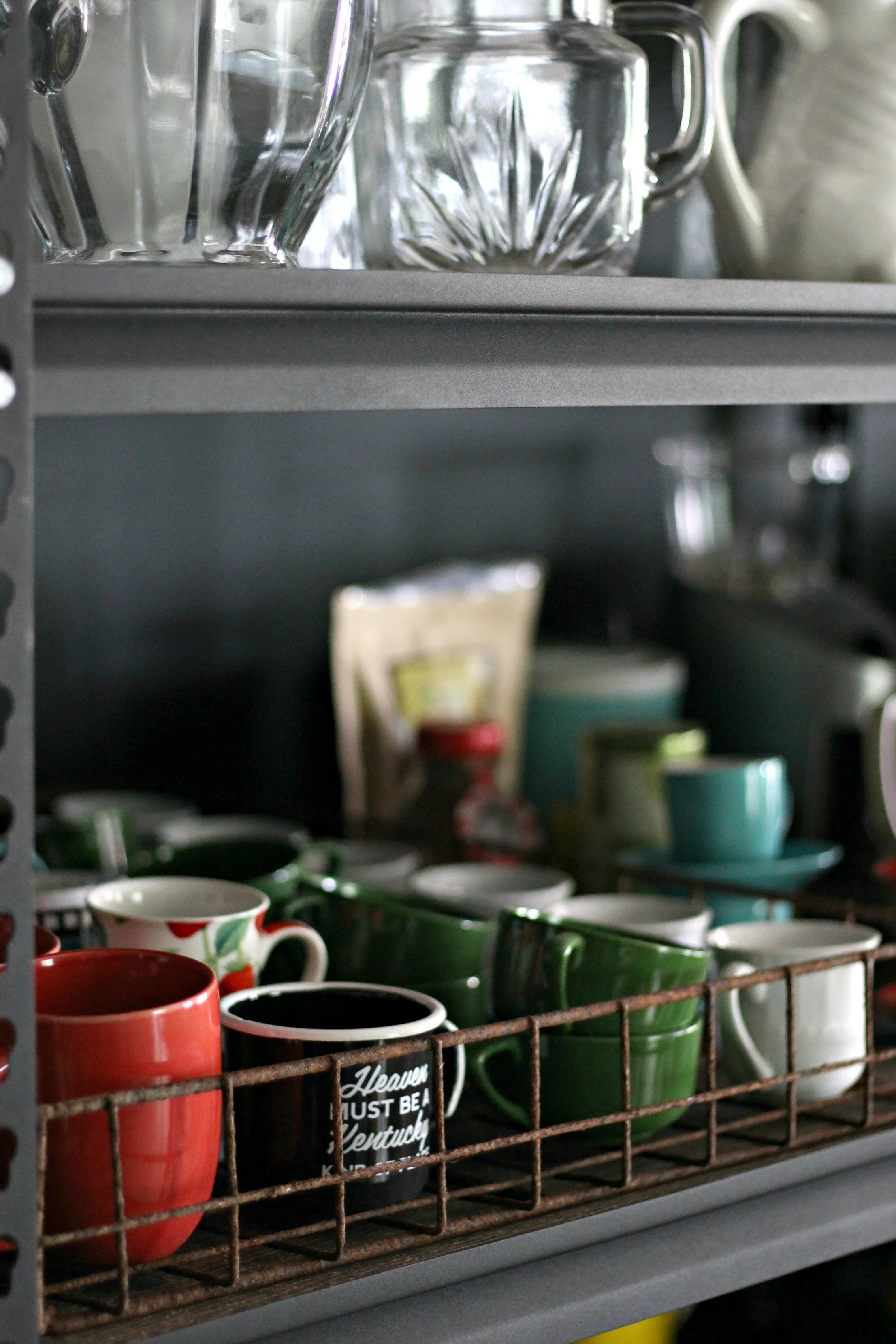
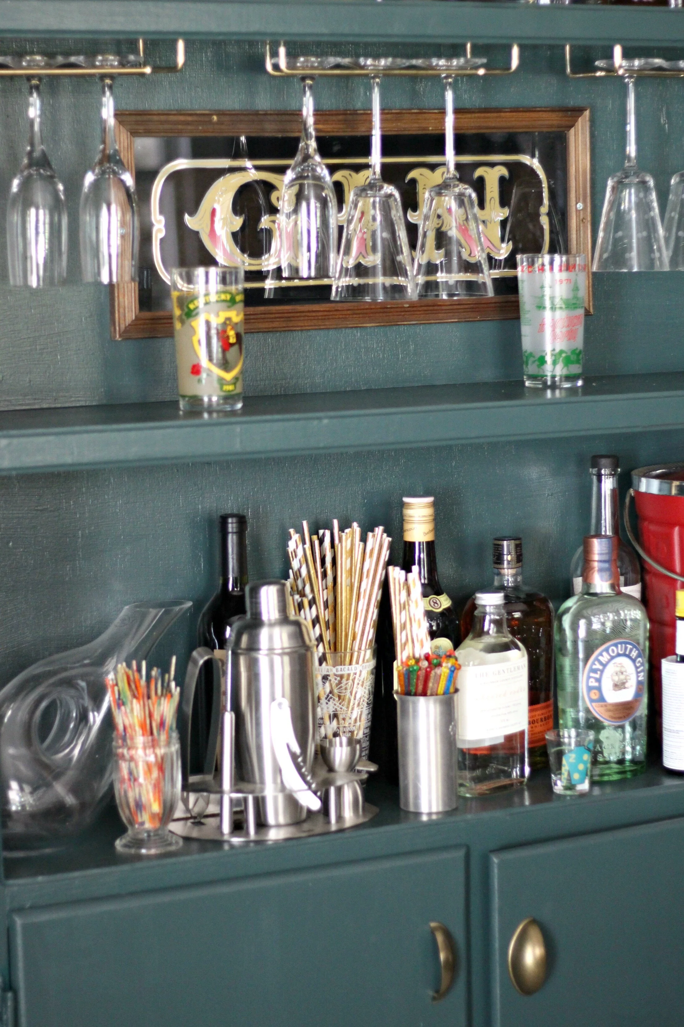
The back wall of our pantry holds two large metal shelves (from Home Depot) that flank a smaller vintage industrial shelf. These shelves house all my dishes, serving ware, baking supplies, and any small appliances that I don't need in the kitchen. We're not in love with the metal garage shelves and would like to replace them with something old with a little more character. For now they are an inexpensive option that we can use to hold everything (and later use in our garage when we find something we like better for in here).
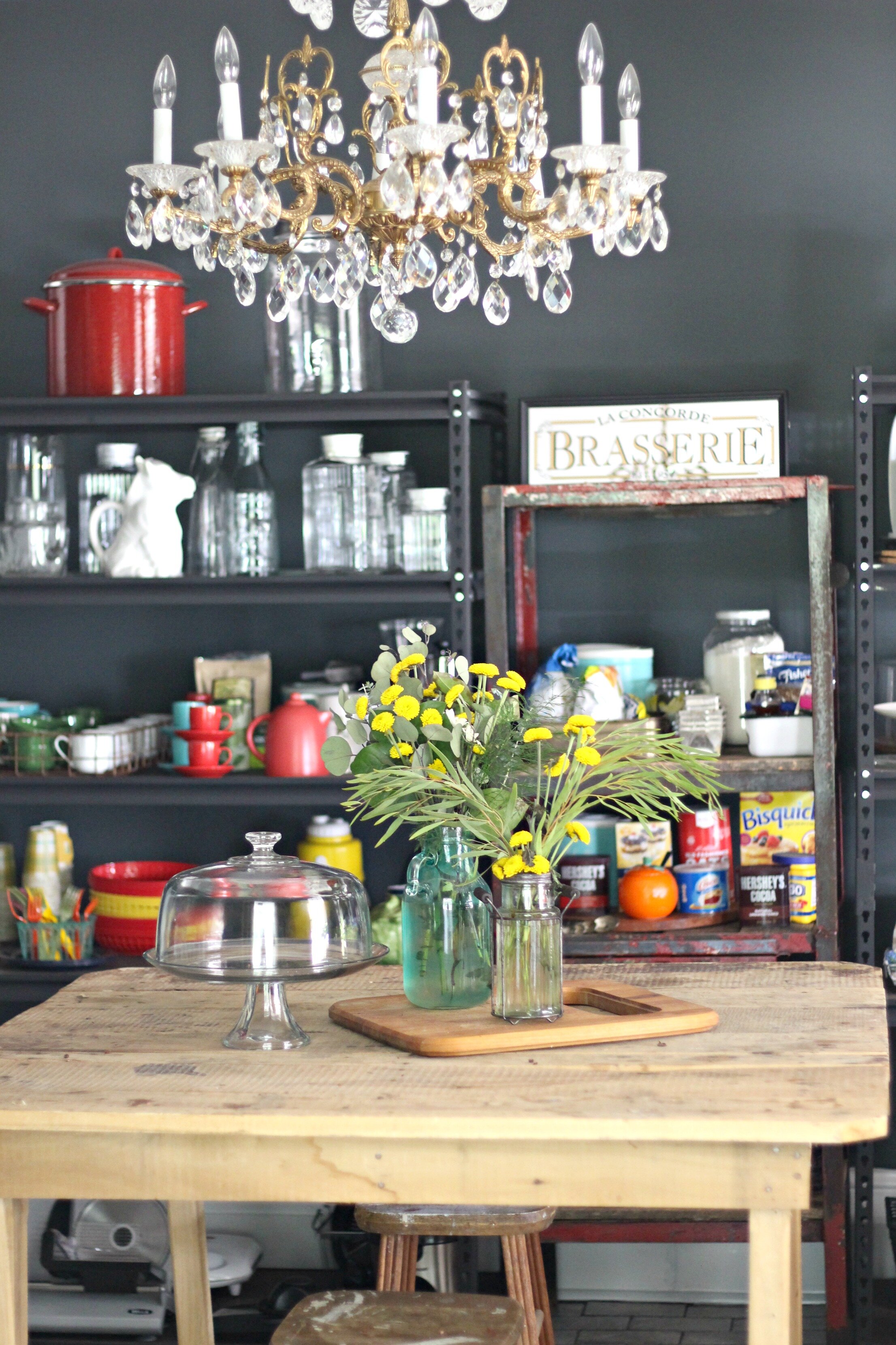
One of the focal points of the room is this beautiful antique chandelier that belonged to Alex's grandparents. We are so thrilled that Alex's family saved this and allowed us to use it in our home. I love the eclectic mix that it adds to the room, a more formal touch in an otherwise industrial, rustic space. The gold also pops perfectly against the dark walls and shelving.
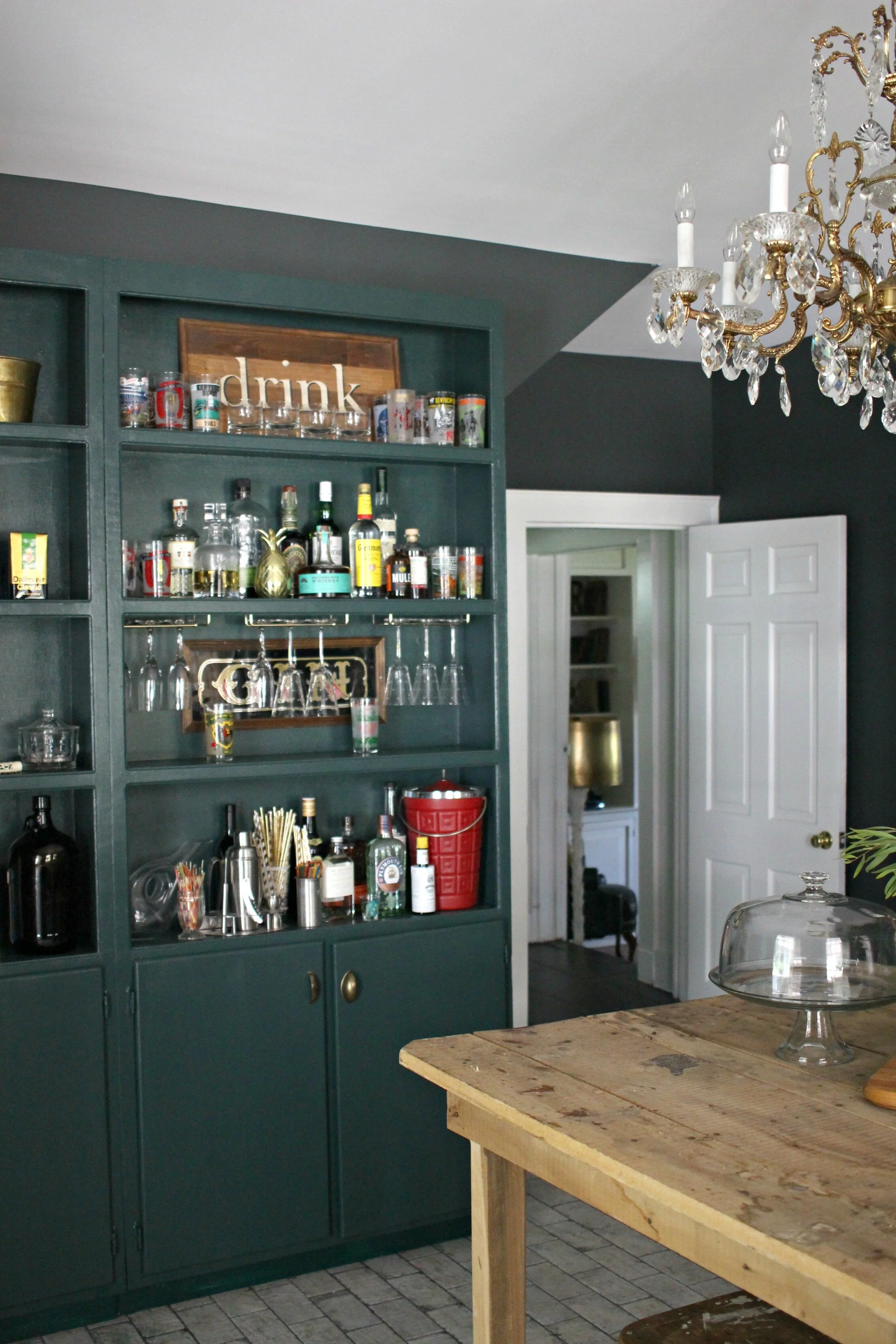
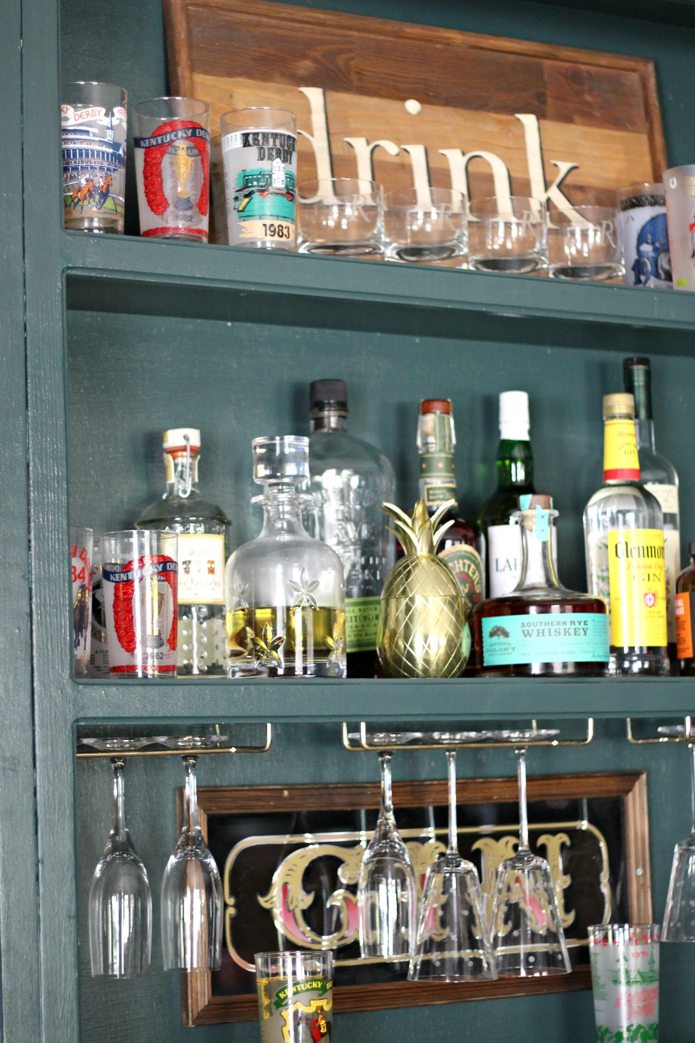
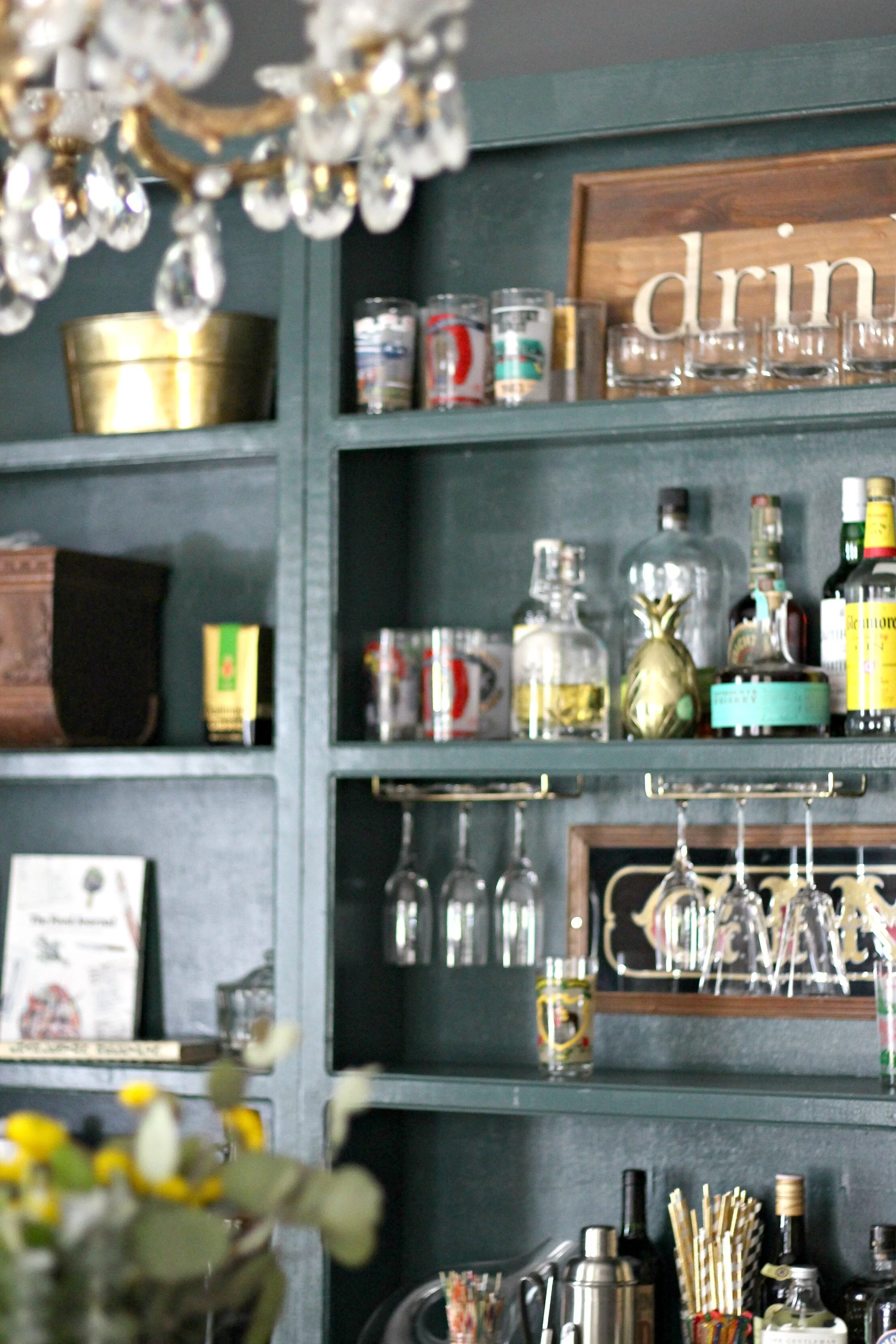
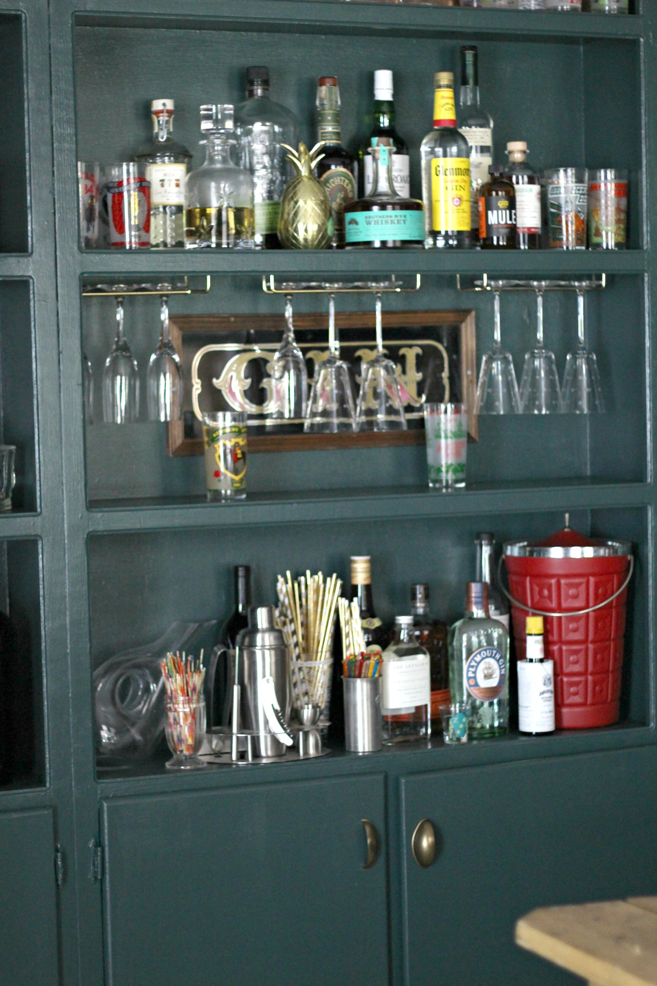
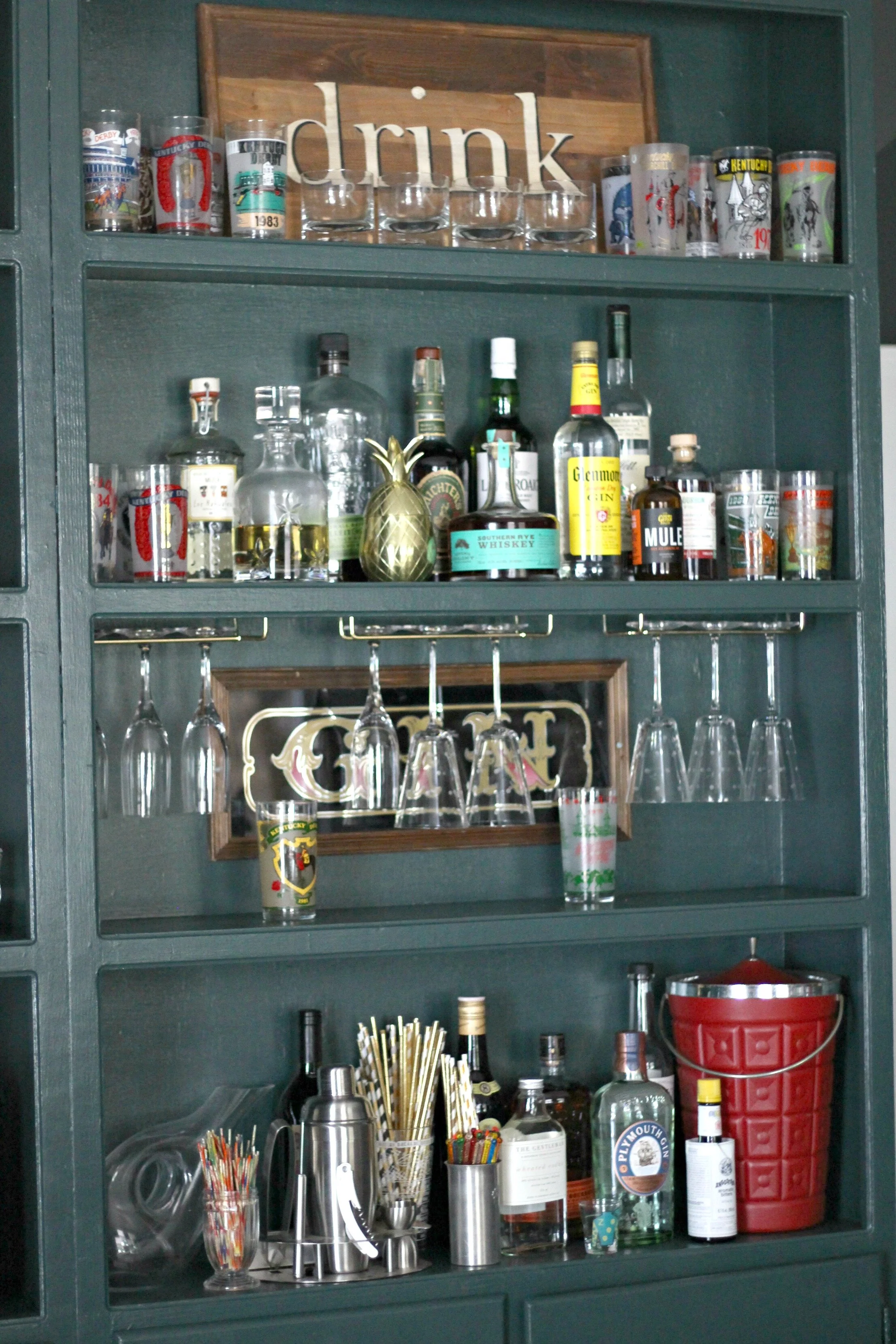
Another lucky find we picked up along the way for this space were these cabinets. I spotted these at the Restore and was immediately drawn to them because they had such unique dimensions- very tall but shallow, and they wouldn't stick out very far from the wall (another steal at $45 each). I originally thought we would put them on either side of the double glass doors that go into the mudroom, but they were just a little too big. Luckily they just happened to fit so perfectly on this other wall, so much so that they look like they are actually built-in! We attached them to the wall and then I freshened them up with a coat of paint- Black Evergreen by Behr. I love this sophisticated but unexpected dark emerald color and was inspired by this gorgeous kitchen to incorporate it into this room. These are perfect cabinets for this space because they have also have plenty of closed storage at the bottom for food or items that I don't want to display on open shelves. I also was able to get brass cabinet pulls that match my kitchen cabinet hardware to tie everything together.
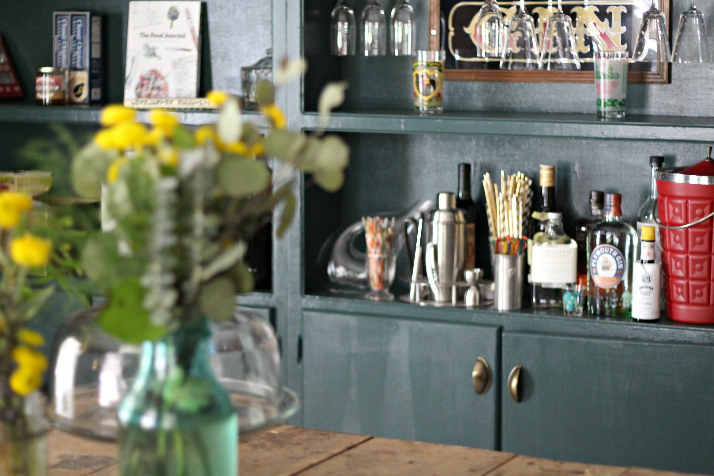
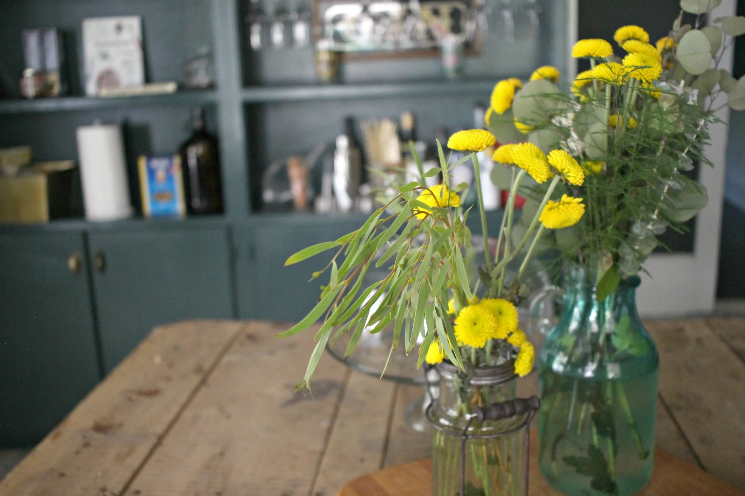
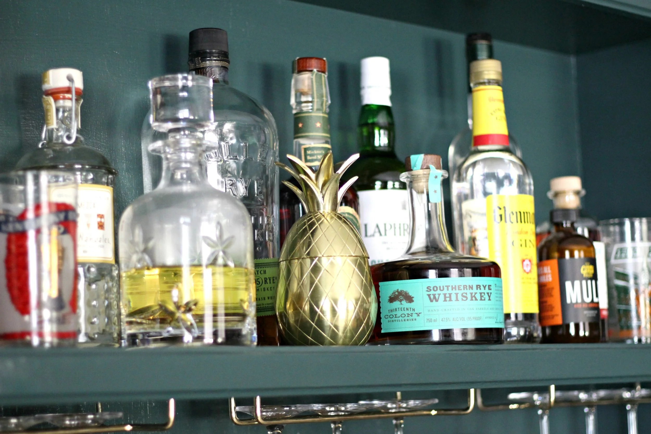
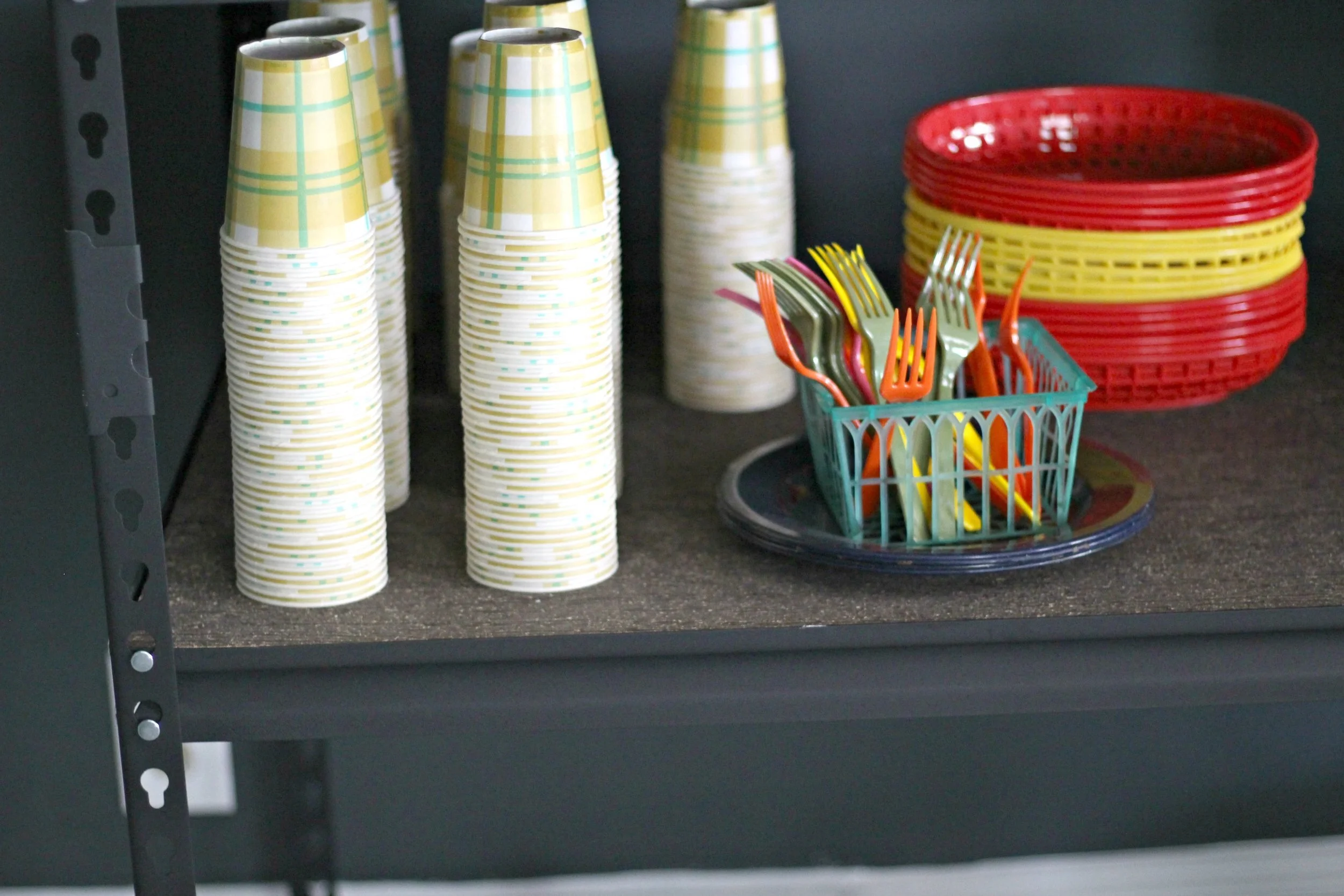
We've set one side of the shelves up as a bar/drink storage and the other side for food storage. I still have a lot of space to fill on these but I'm having fun styling them (and looking for unnecessary "cute" food items to display on all the shelves).
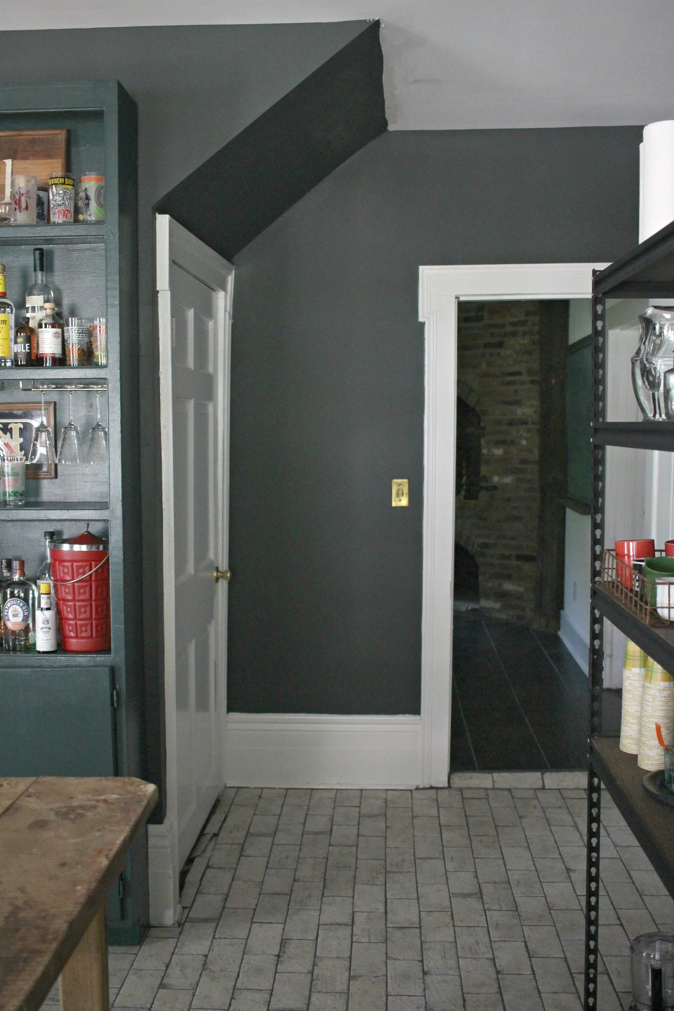
Above you can see the other entrance into this room (from the kitchen) and the door to our basement/cellar. It is nice to be able to access this room from both sides of the kitchen easily and it is also right off the mudroom, so unloading groceries is a breeze!
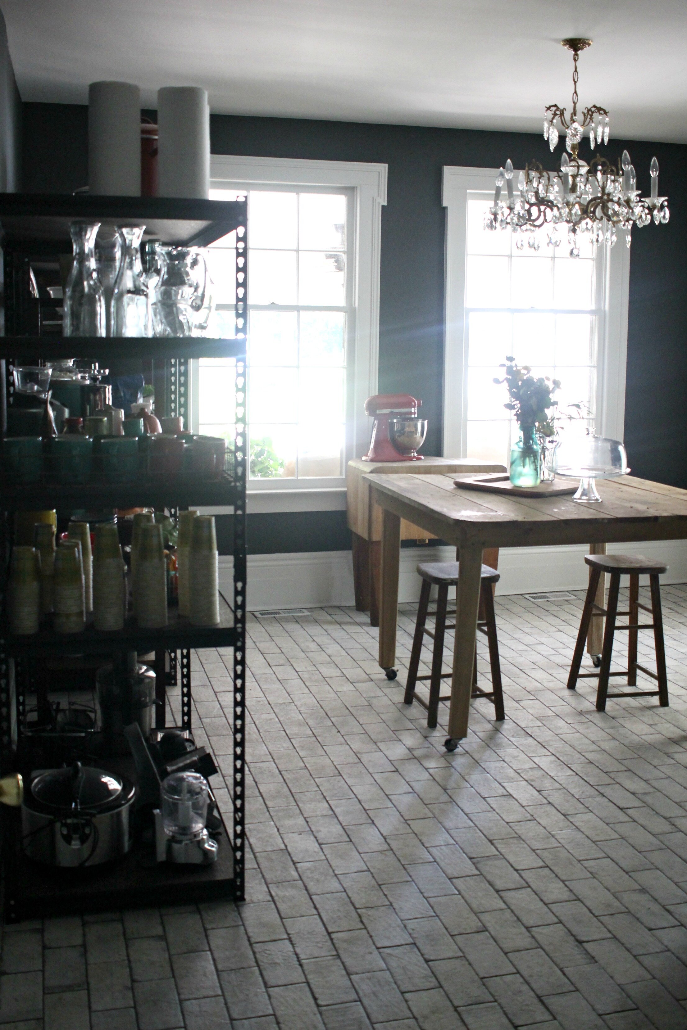
Another angle of the room showing the giant windows that overlook our side porch. I'm still deciding if I should do curtains on these or leave them bare- what do you think? You can also see our vintage butcher block that was another item belonging to Alex's grandparent's that we are thrilled to have. I'm wanting to get some giant rolls of butcher paper and wax paper to hang on the walls near it. I still have so many ideas for this space but am enjoying all the progress we have made so far. The few times that we have entertained, we have used this room to serve appetizers or set up drinks to keep the kitchen from getting too crowded. I'm so glad we decided to go with our "unconventional" plan and I'm predicting that walk-in pantries might just become the next big trend! {As always you can find all my sources for this room at the end of this post}
xoxo
Emily


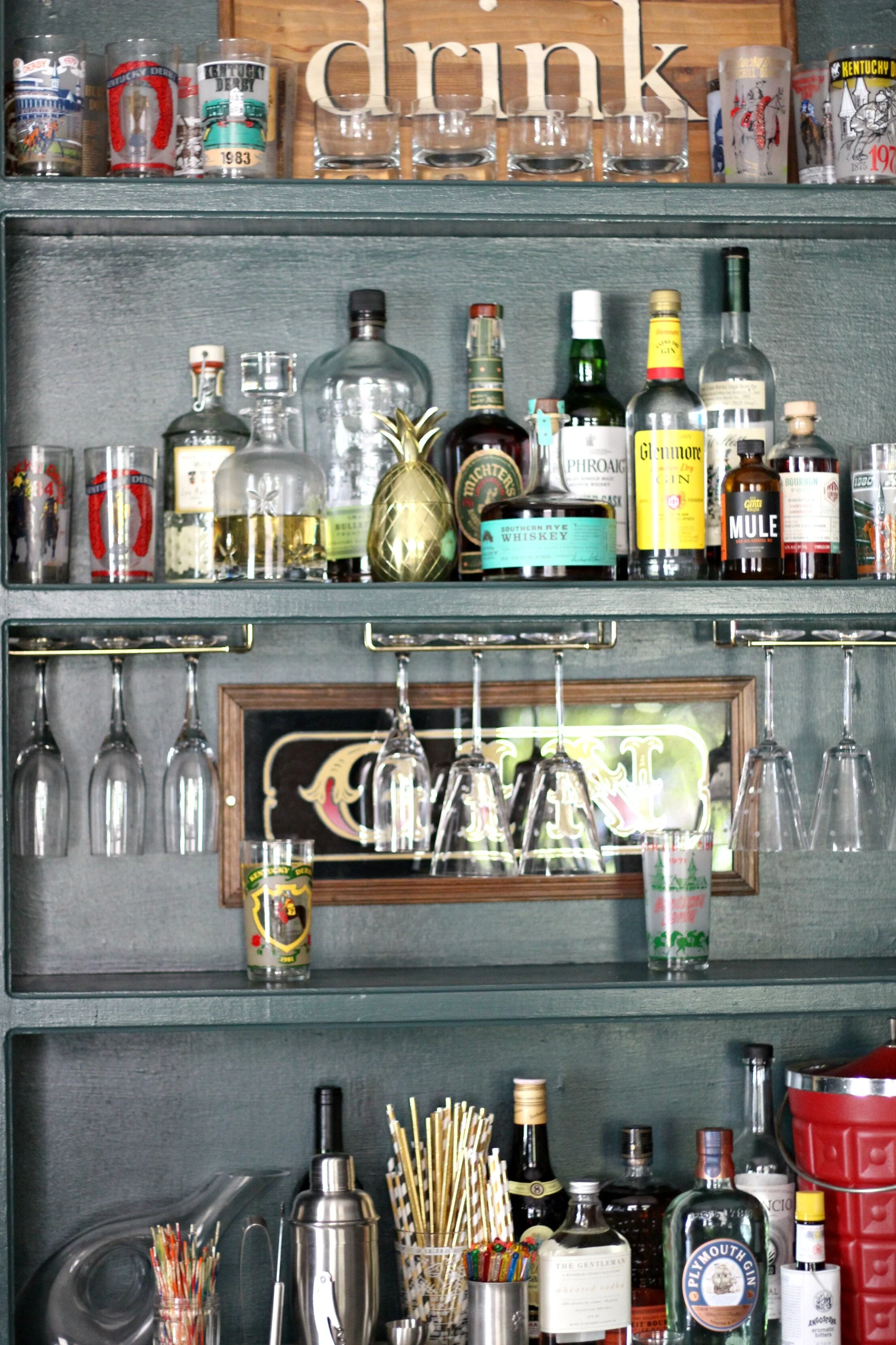
Flooring: Porcelain tile via Louisville Tile
Wall color: Rock Bottom by Sherwin Williams
Trim color + ceiling: Pure White by Sherwin Williams
Glass door color: Crisp Ginger Ale by Glidden
Cabinet color: Black Evergreen by Behr
Cabinet hardware: Lowe's
Mirrored Brasserie sign: Target
Chandelier: vintage
Metal shelving: Home Depot
Butcher block: vintage
Cabinets: Habitat for Humanity Restore
Rolling counter-height wood table: Habitat for Humanity Restore
"Drink" sign: HomeGoods
Brass bins: HomeGoods
White ceramic animal heads: vintage
Construction: TJH Construction