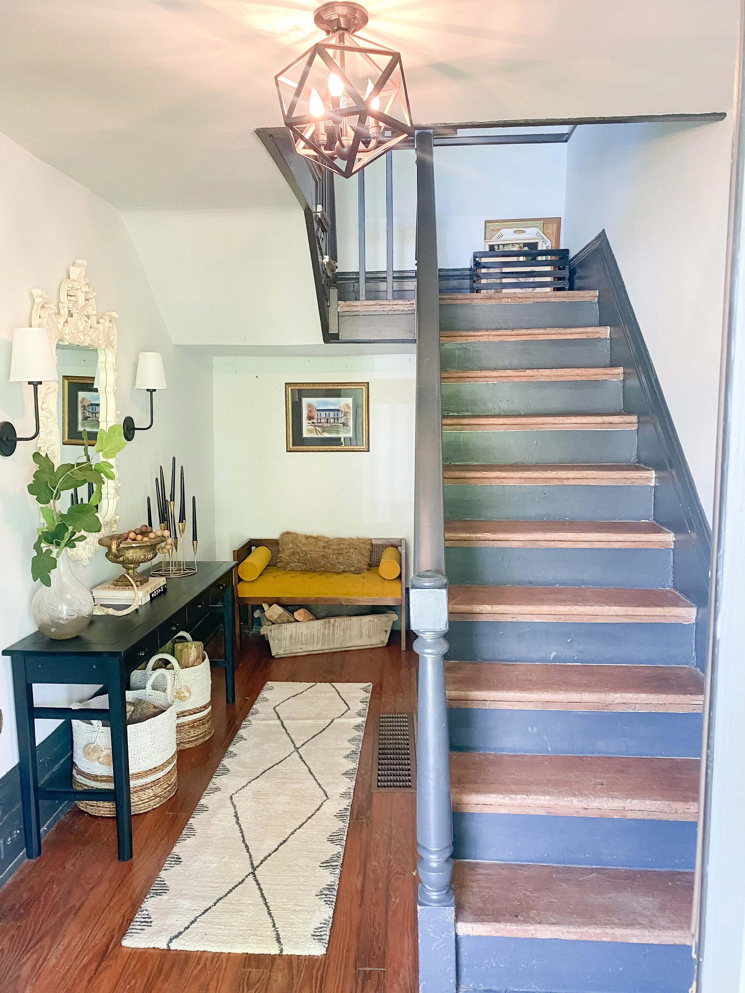
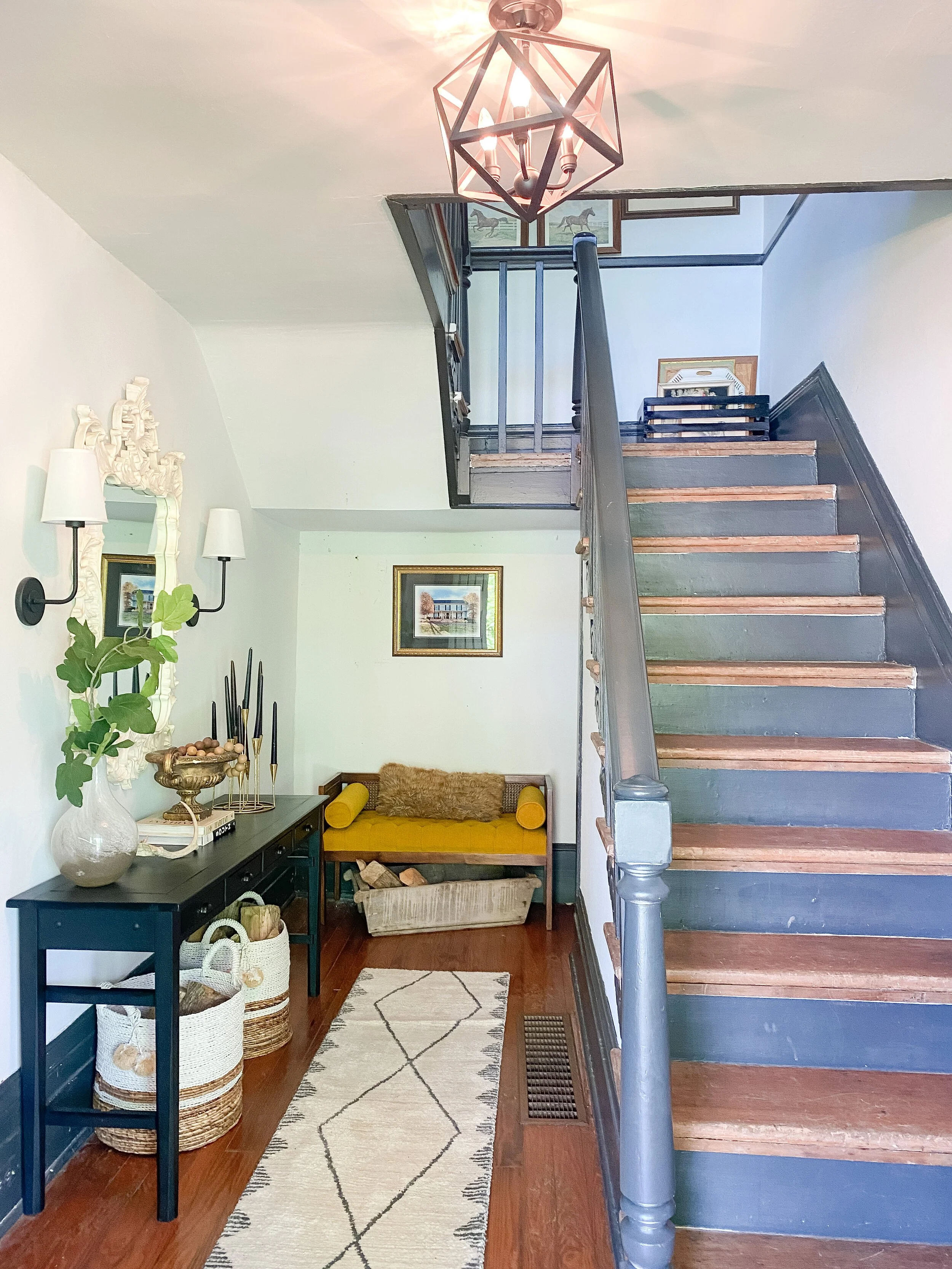
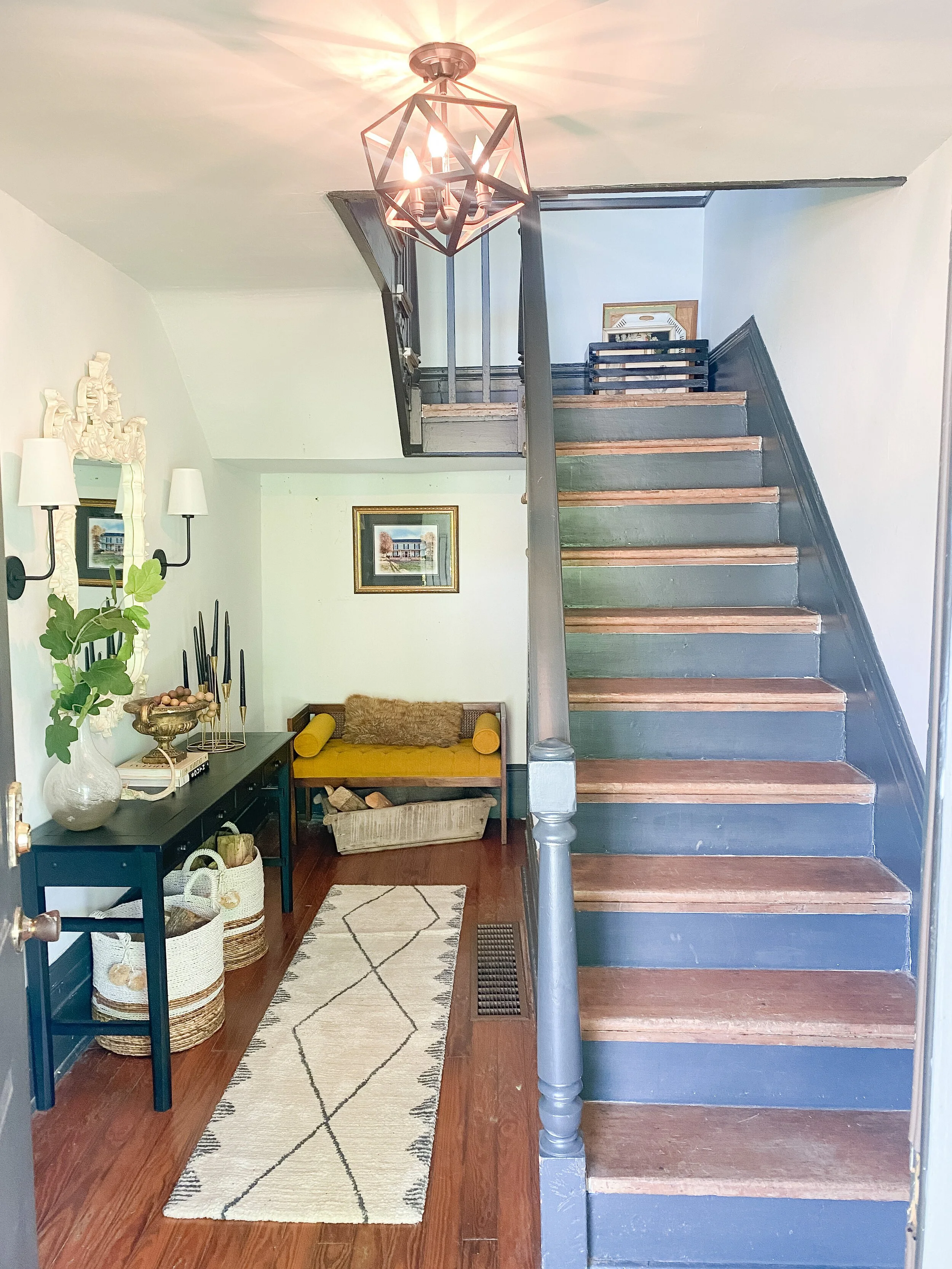
One Room Challenge 2021: Final Reveal- Entryway Makeover
I am so excited to share the FINAL REVEAL of this year’s one room challenge space, my entryway. From the wallpaper, to the dutch door, to the vintage rugs, and gallery wall, this space is totally ME and it now makes a statement when you open the door. This was definitely one of the most challenging projects I have ever taken on and it seemed like I just was hitting setback after setback at the beginning. I am so happy with how everything ended up coming together though and it all ended up being worth it in the end. I literally worked down to the last minute possible and took photos right before the good light went away on Thursday!
There are so many different details and nooks and crannies of this space so I will do a little section on each to share a little bit more about them and the process. I also plan on doing separate posts in more detail about my wallpapering experience, tips, and tricks for that and also my DIY vintage stair runner and the entire process for that as well and all the tools I used!
Be sure to follow along here to see all the One Room Challenge posts in one place! You can also follow the hashtag #oneroomchallenge on Instagram to discover all the projects and progress !
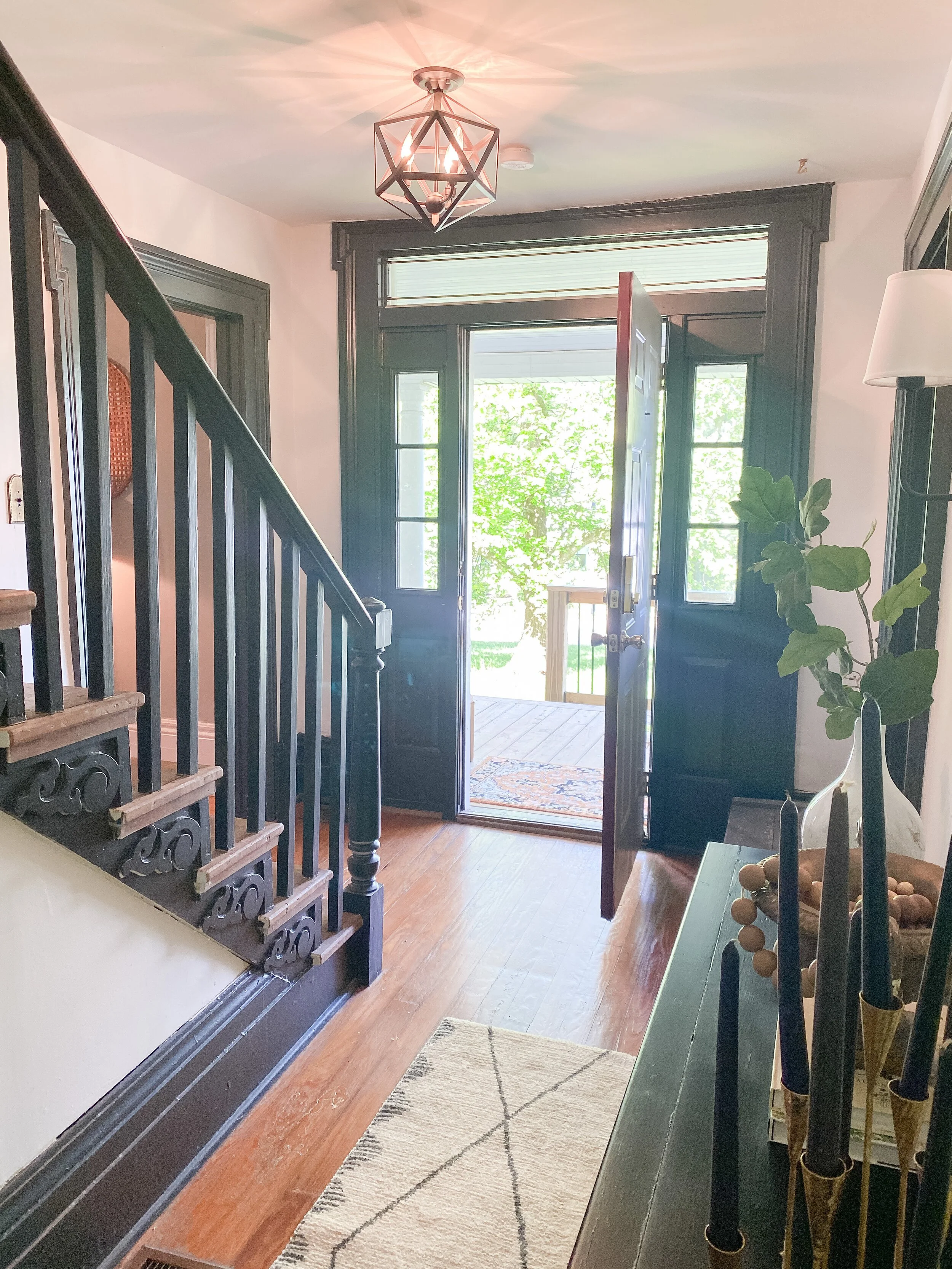
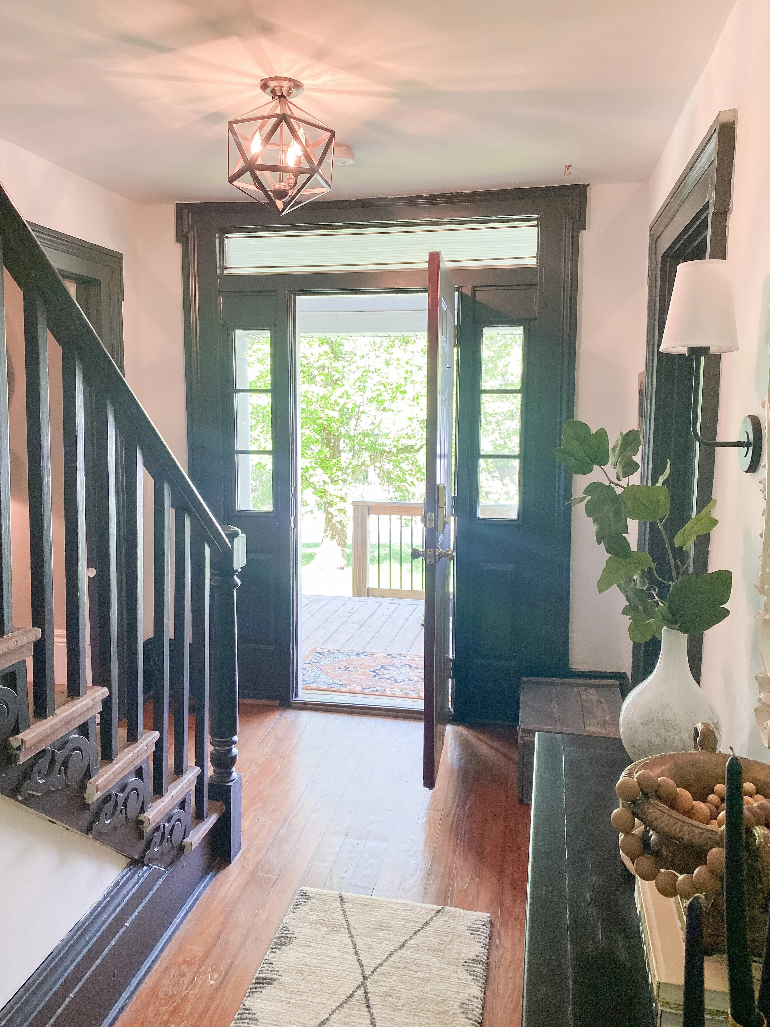
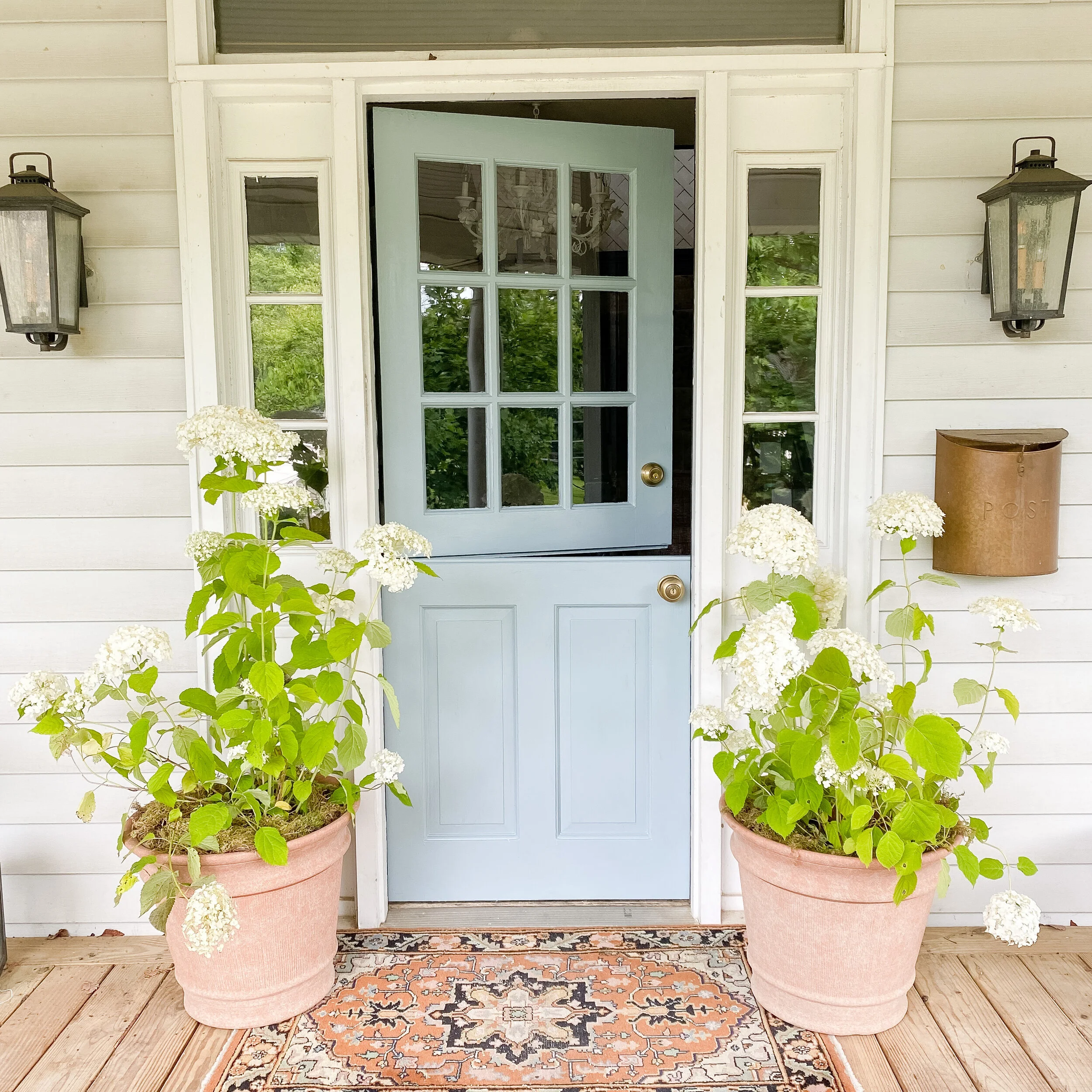
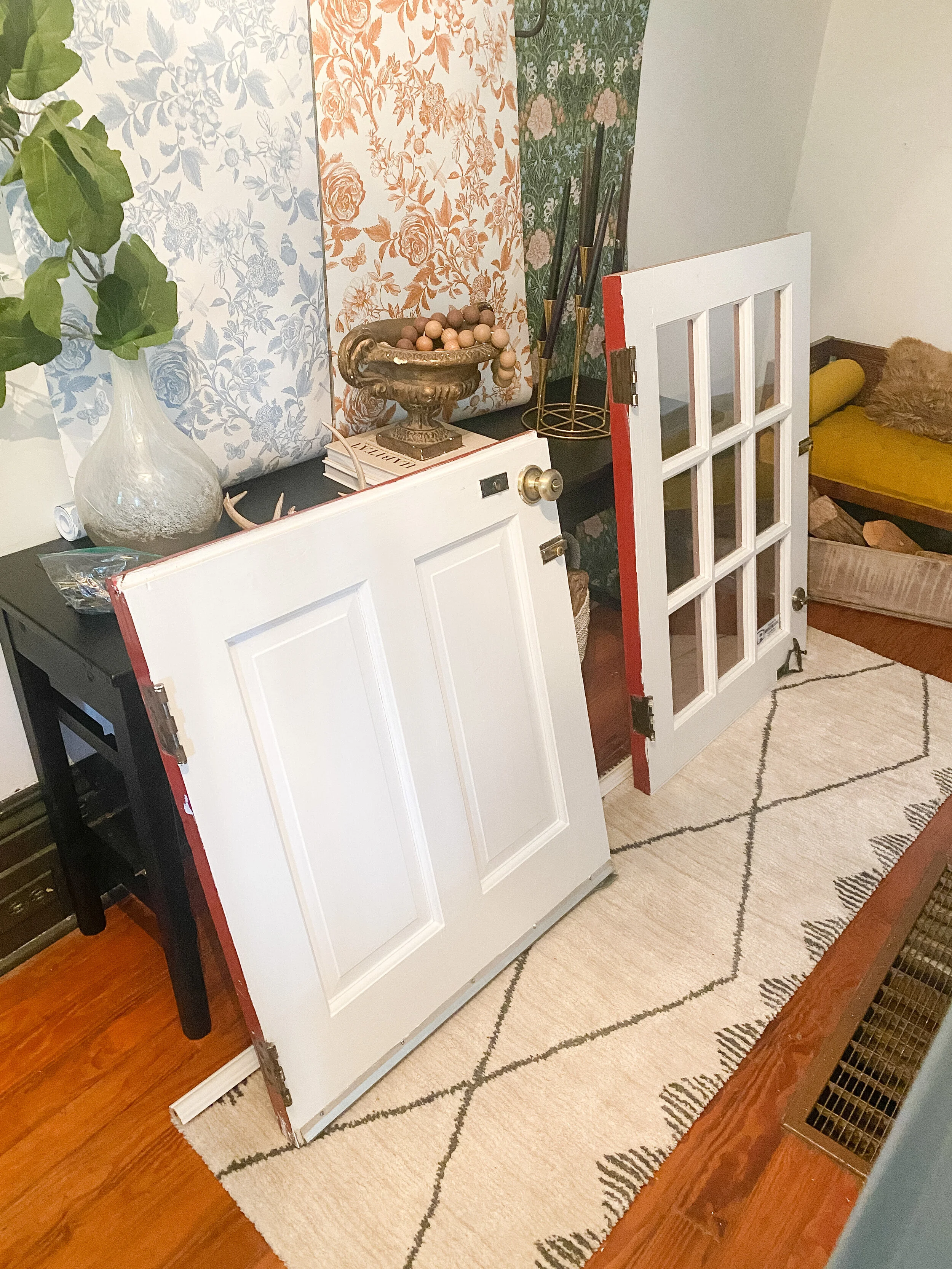
I have dreamed of a dutch door in my home for as long as I can remember and when I chose the entryway as my project, I knew I needed to make it happen for this space. I had also been longing for more light, and our big solid, dark door was not helping with that at all. I hunted for affordable dutch door options and wasn’t finding anything under $1K and that didn’t include any installation, customization, or painting/finishing. Finally I decided to just try Facebook Marketplace to see if I could find a regular door we could maybe cut in half and DIY our own version. I got super lucky and happened across an ACTUAL dutch door that was the exact measruements of my doorway (it was fate!) in Louisville. I paid $350 and we had a fun day trip up to go pick it up. It came with all the hardware and I was so thrilled to have lucked out with literally the only dutch door I had ever spotted on there.
When we got home, I realized one problem though. All the hinges and doorknobs were backwards and on the OPPOSITE side of our current hinges/doorknobs. What I thought was going to be an easy swap out between doors, now became another big project. Do we switch the direction our door opens, or go through the trouble of switching everything around? We decided the door needed to stay opening in the current direction just for flow purposes, so we began searching for a handyman/trim carpenter who could help us make it work by switching the hardware and filling in the old holes. After many failed attempts, we ended up finding the perfect handyman and he was able to make the door work just perfectly. This was an extra expense we hadn’t planned for, but so worth it as hanging a door is probably one of the most difficult jobs around and we wanted it to be level, swing perfectly, and look professional.
DOOR BEFORE
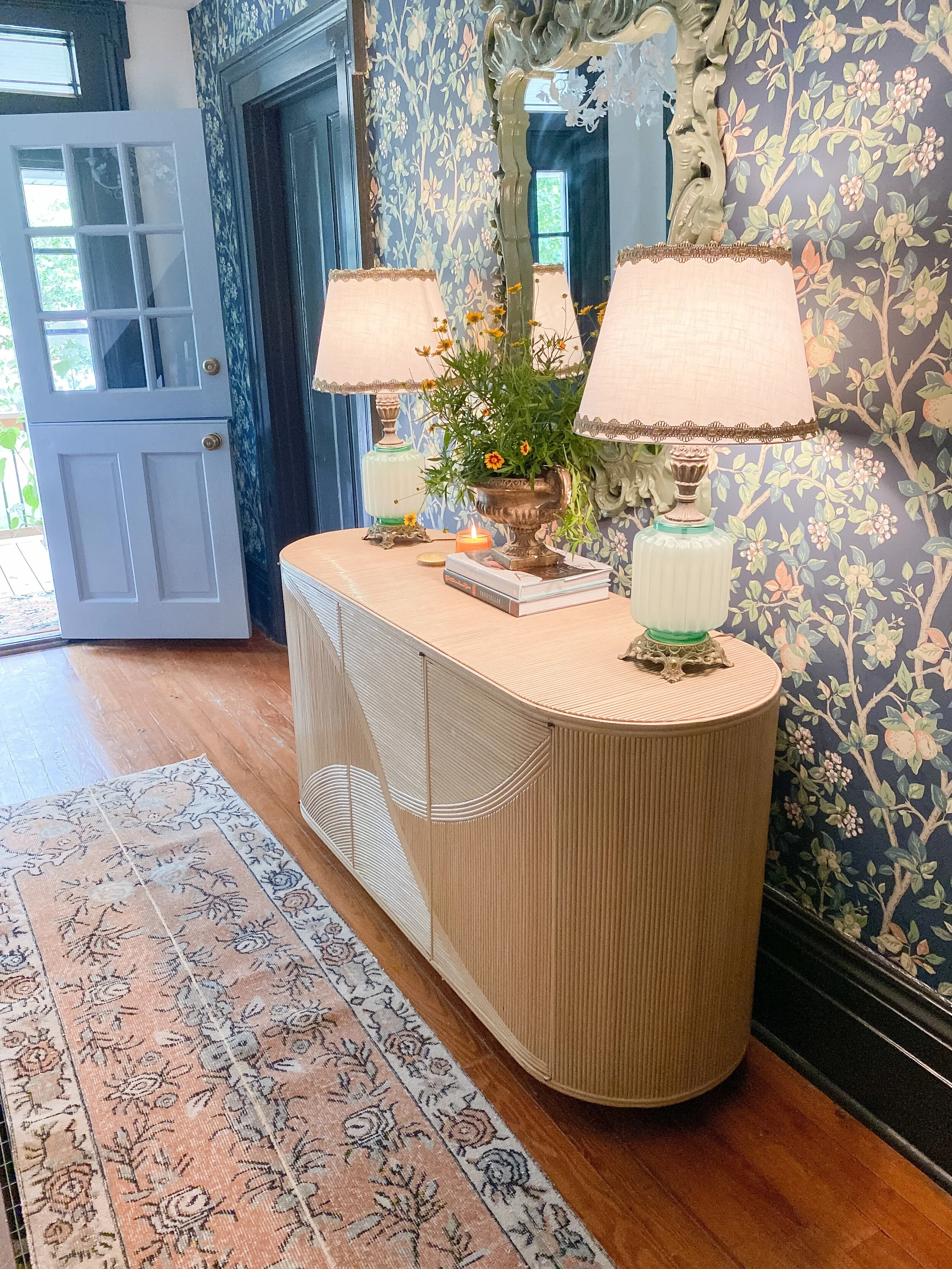
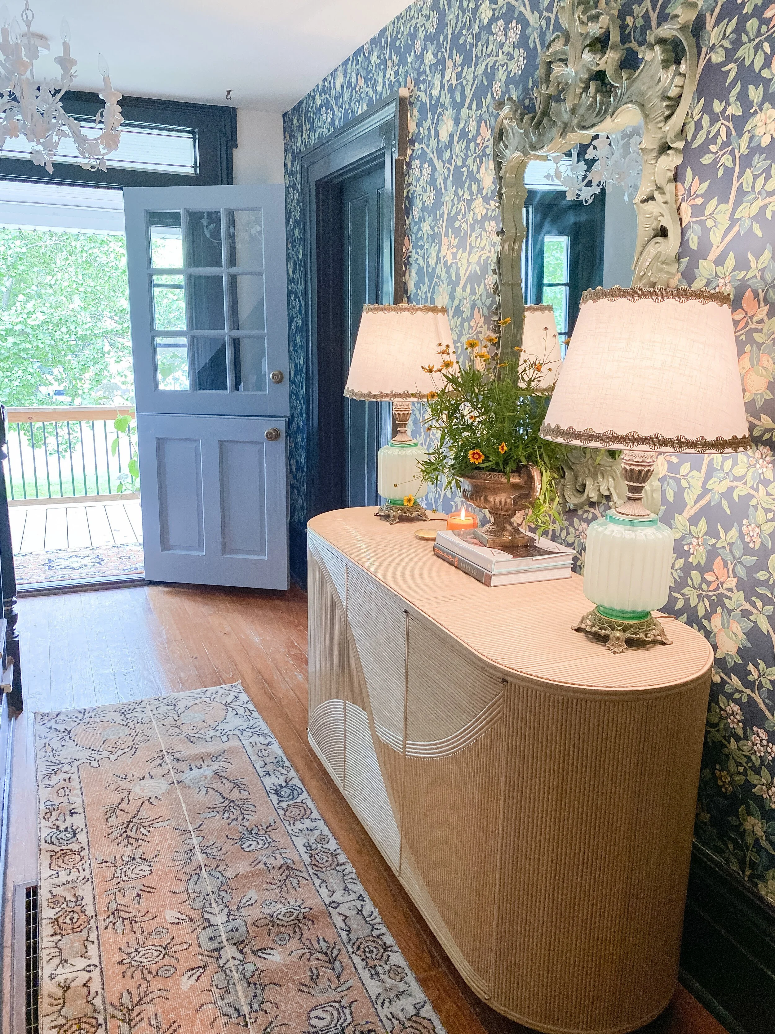
After the door was hung, you would have never even known we had to switch all the hardware around. It looks like it was original to the home and fits the house so much better than our old door in my opinion! I painted the entire door front and back in our soon-to-be new trim paint (coming in phase 2 of this makeover), Evening Eclipse by Valspar. It’s the perfect subtle pale blue with a touch of grey undertones. I love how it mixes with the wallpaper and colors in the vintage rugs. I would love to eventually update the door knob to something a little more pretty and special, but for now the original hardware that came with the door works!
I already love having this extra light in the entry from the windows so much and the option to open up the top is so handy for grabbing packages, mail, and deliveries while keeping dogs and kids inside! The old-fashioned charm of a dutch door is something I had always been drawn to and now I think I need them on all the entrances of my house! If you’re looking to add one to your home, my advice would be to consistently scour Facebook Marketplace and your local Habitat Restores. You might be lucky like me or find a regular door in a style you like that you could have a carpenter rework into a dutch door style. I read lots of tutorials on this on Pinterest before we got started as I thought that might be our only option, so it’s definitely very doable!
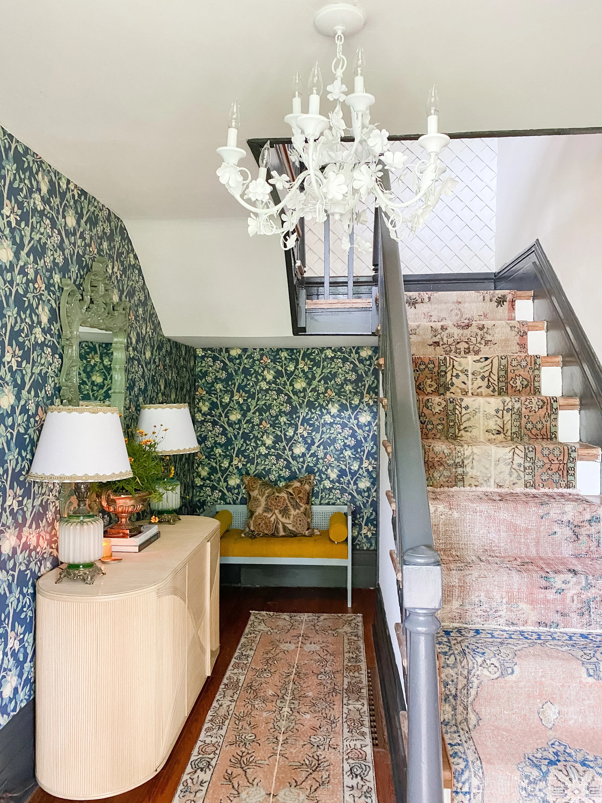
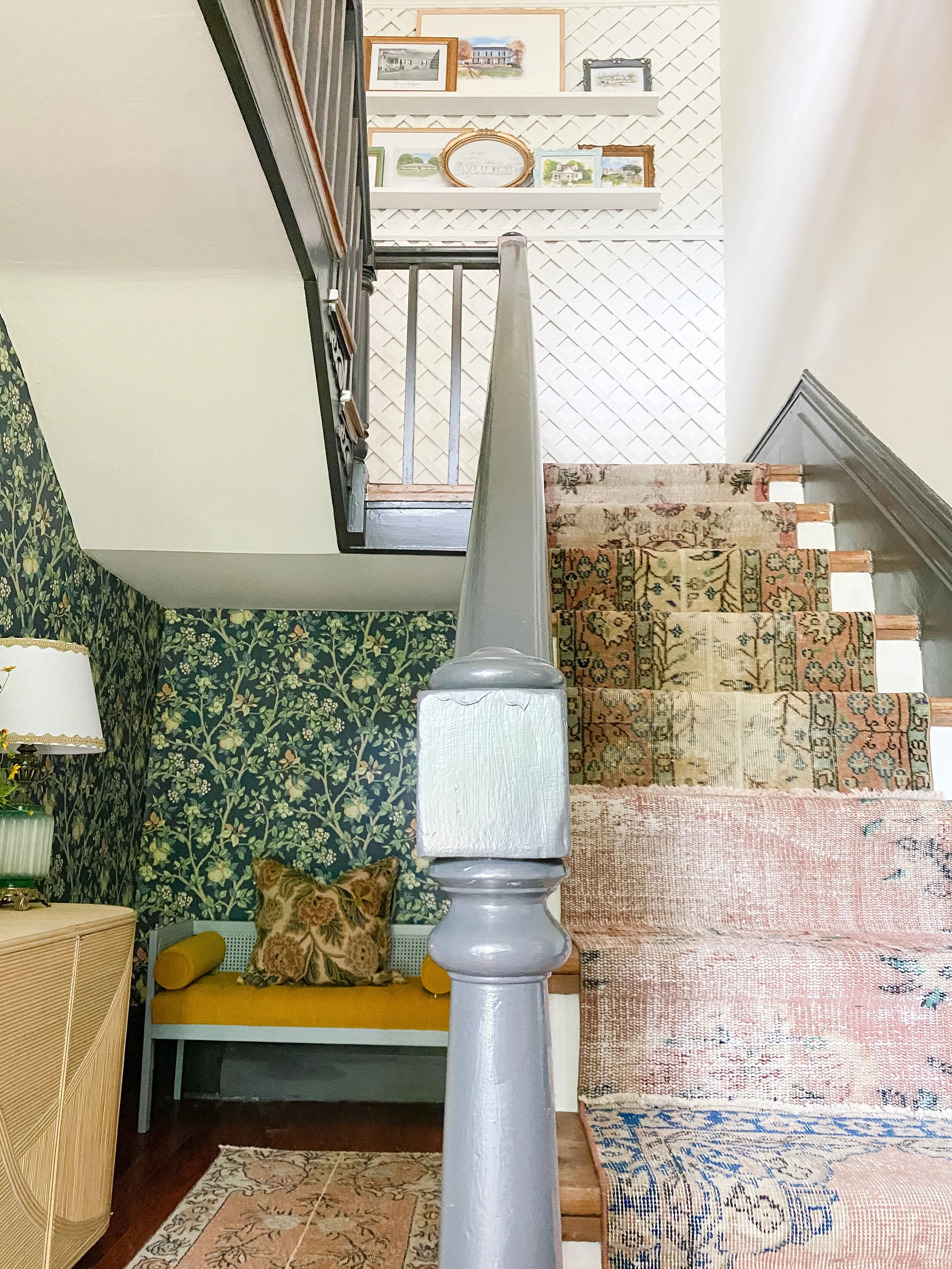
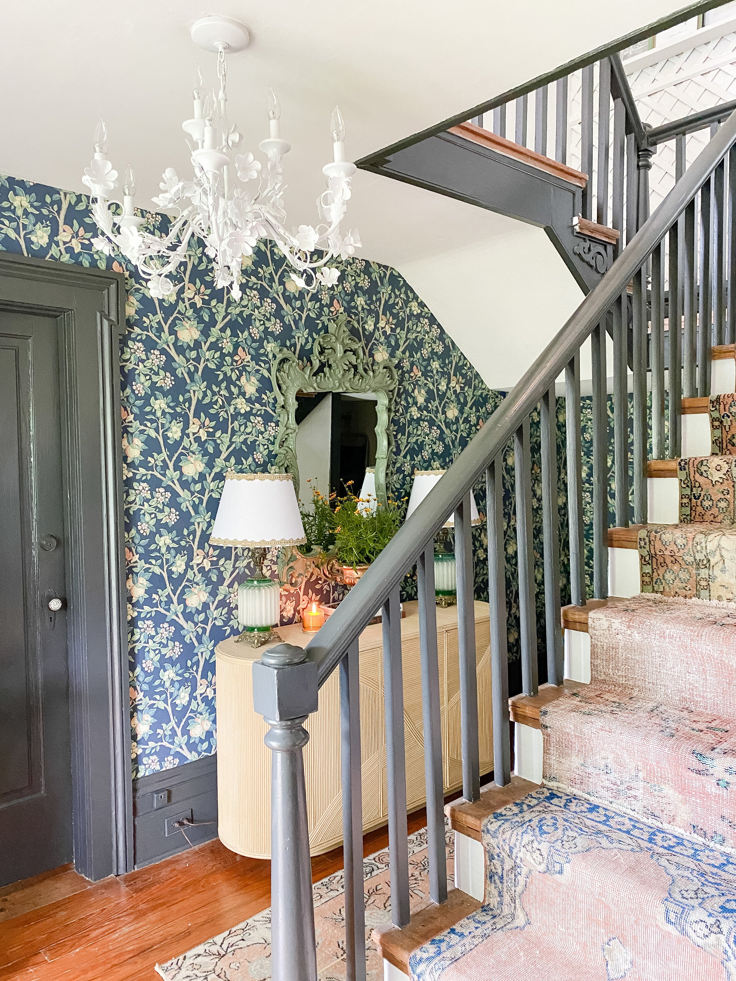
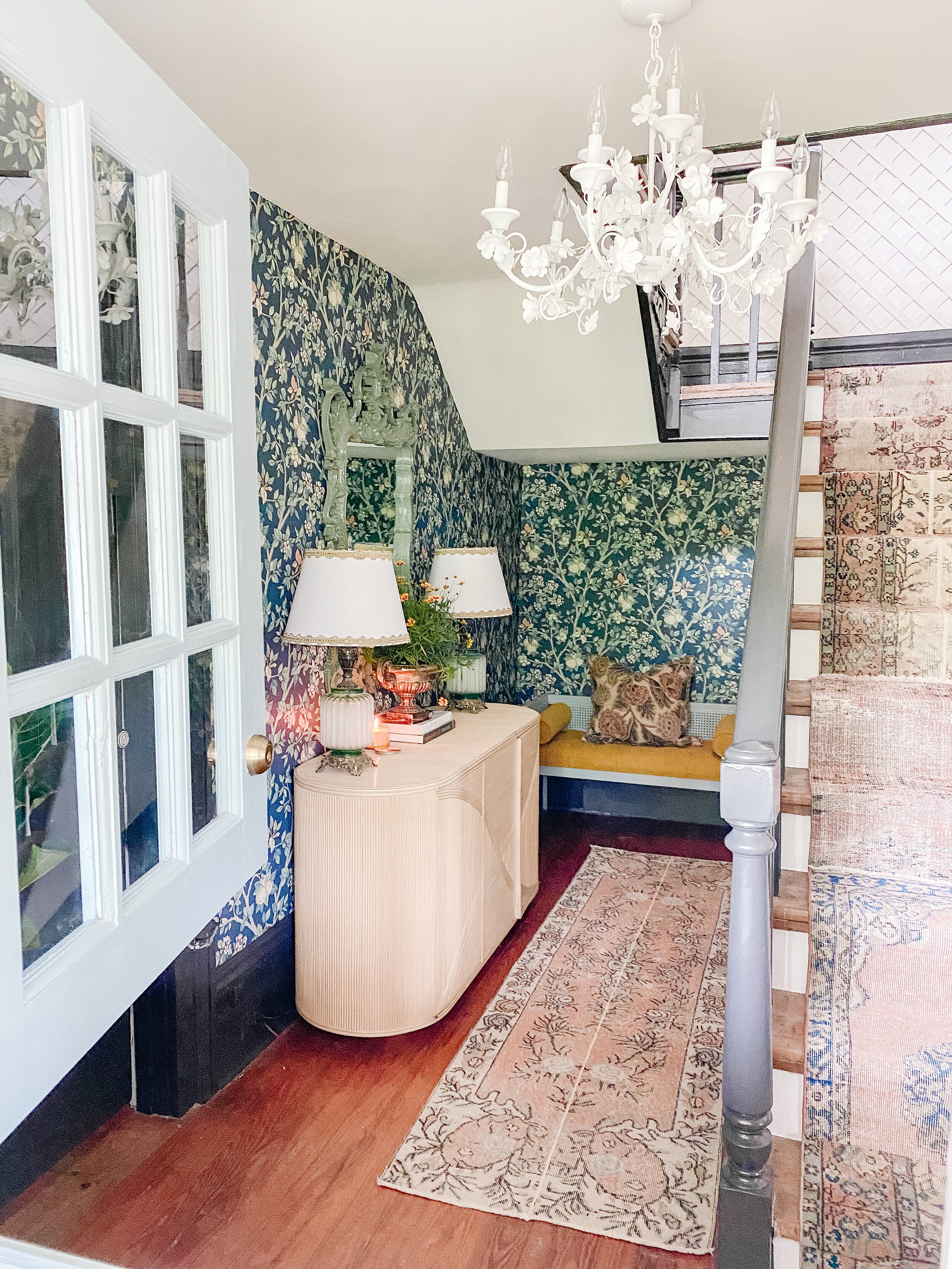
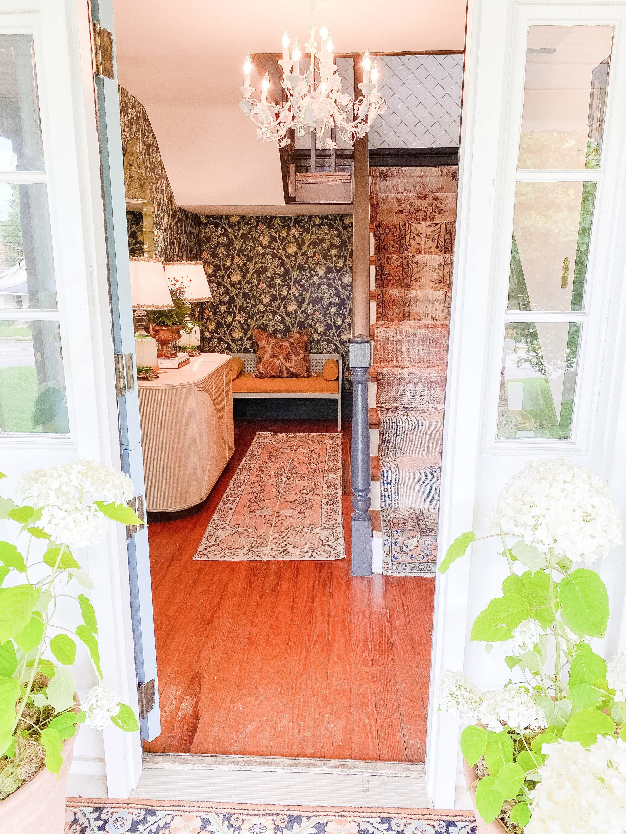
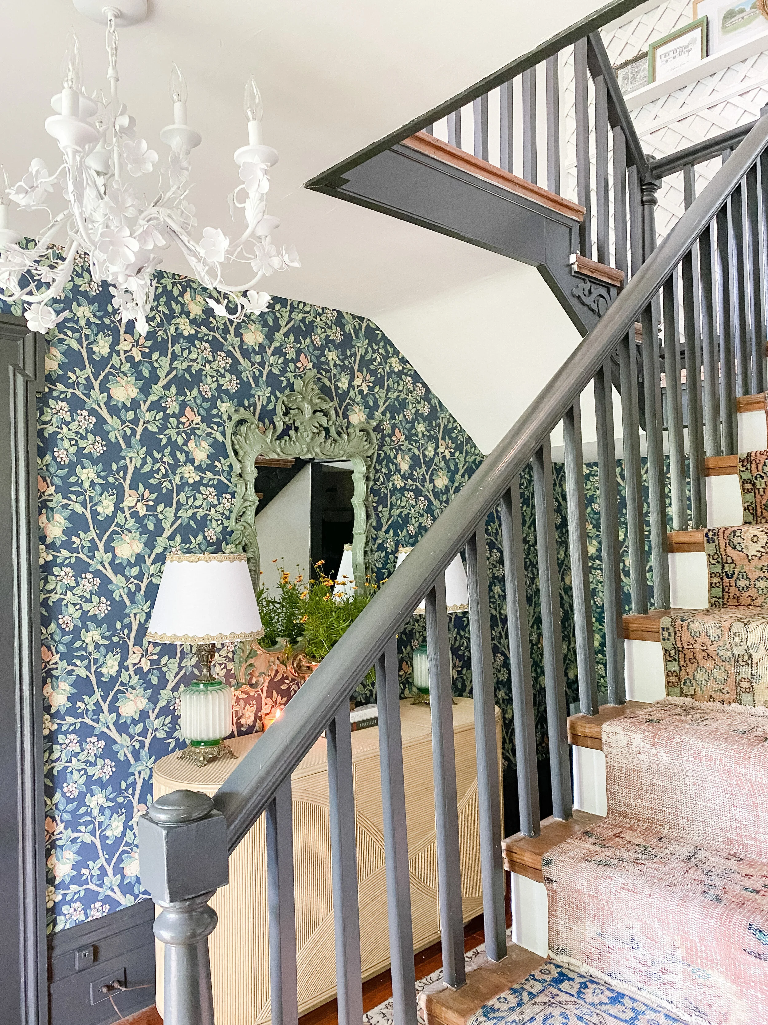
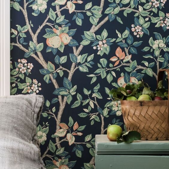
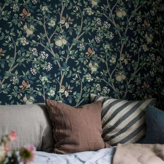
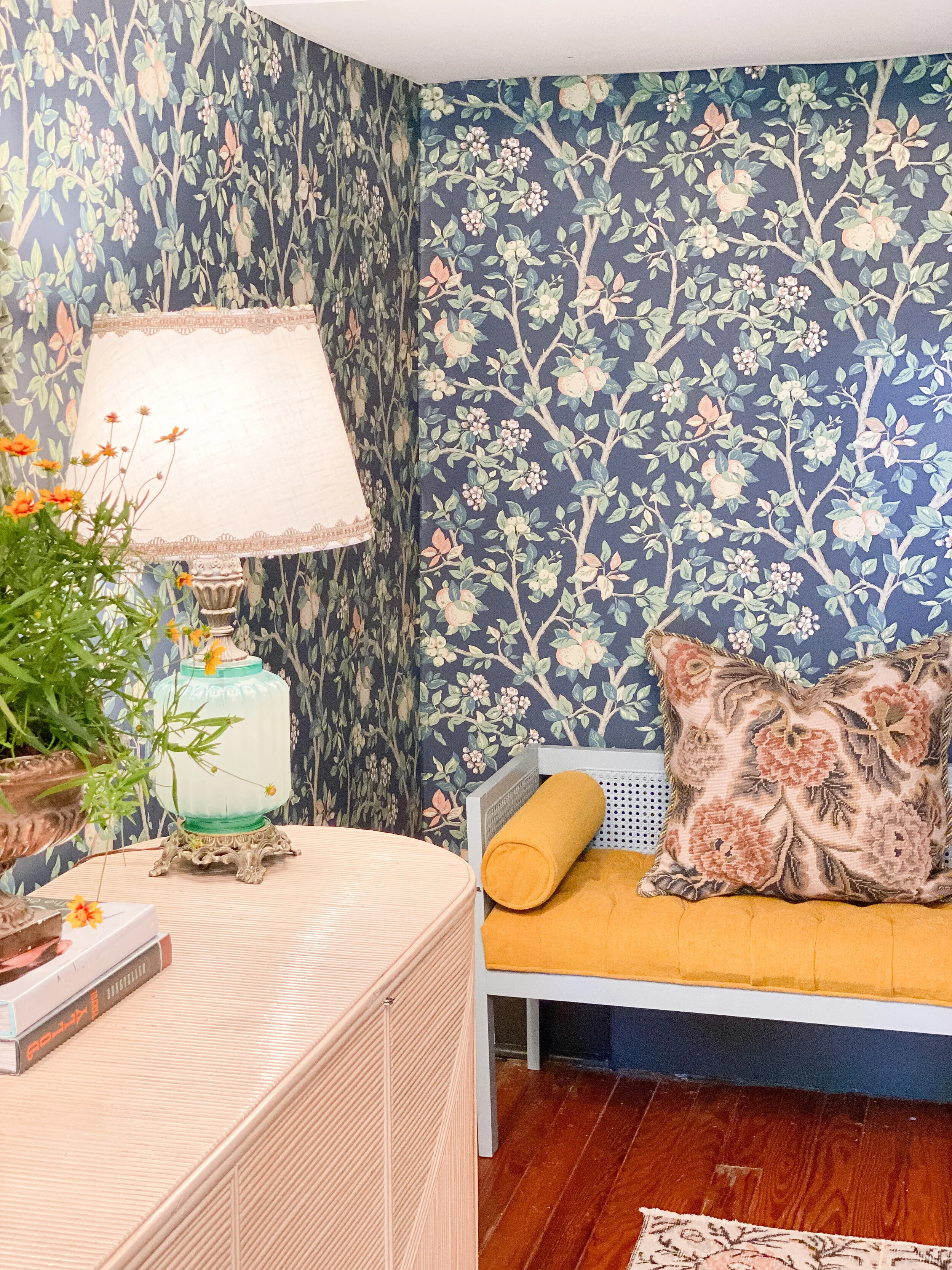
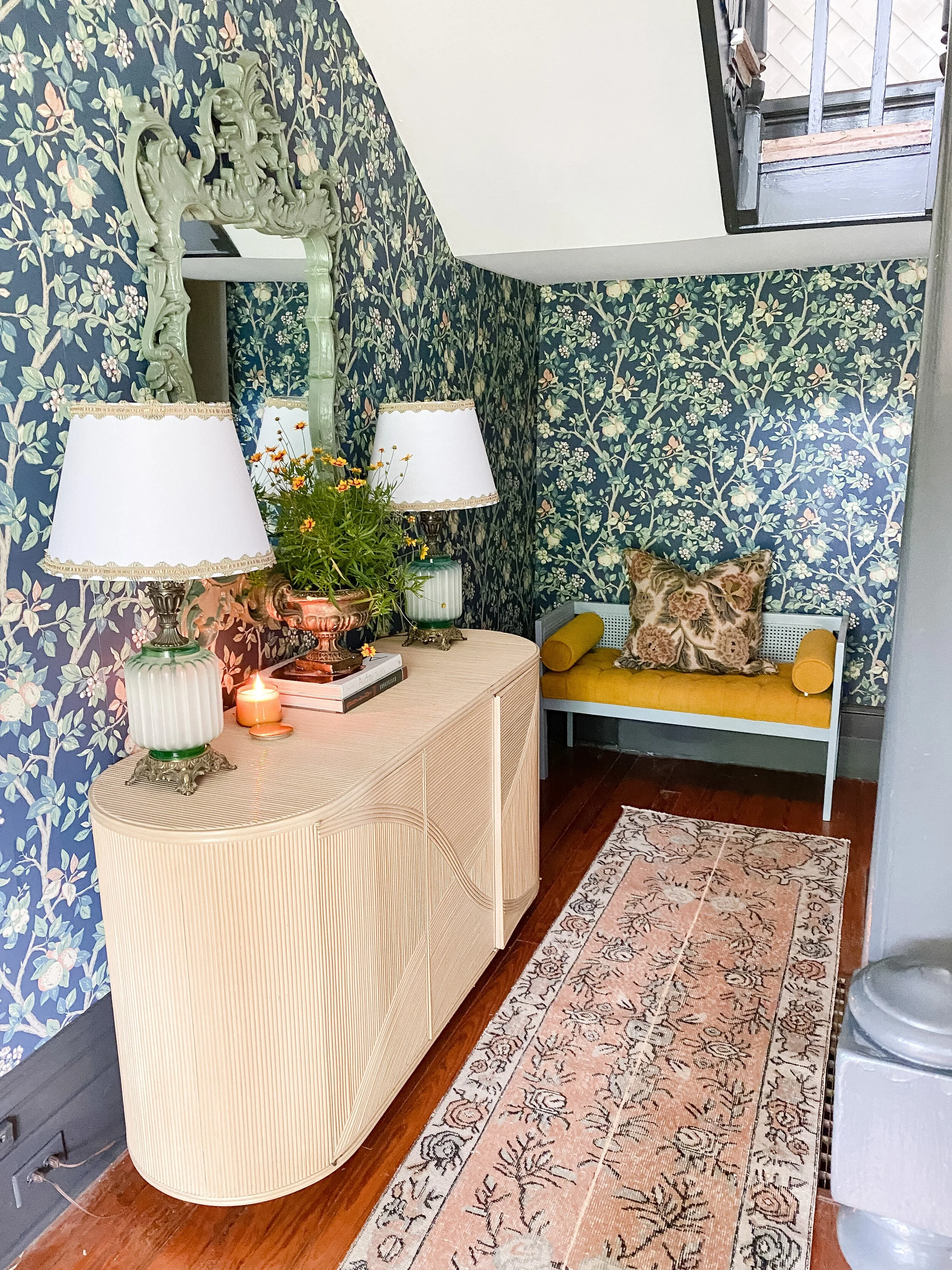
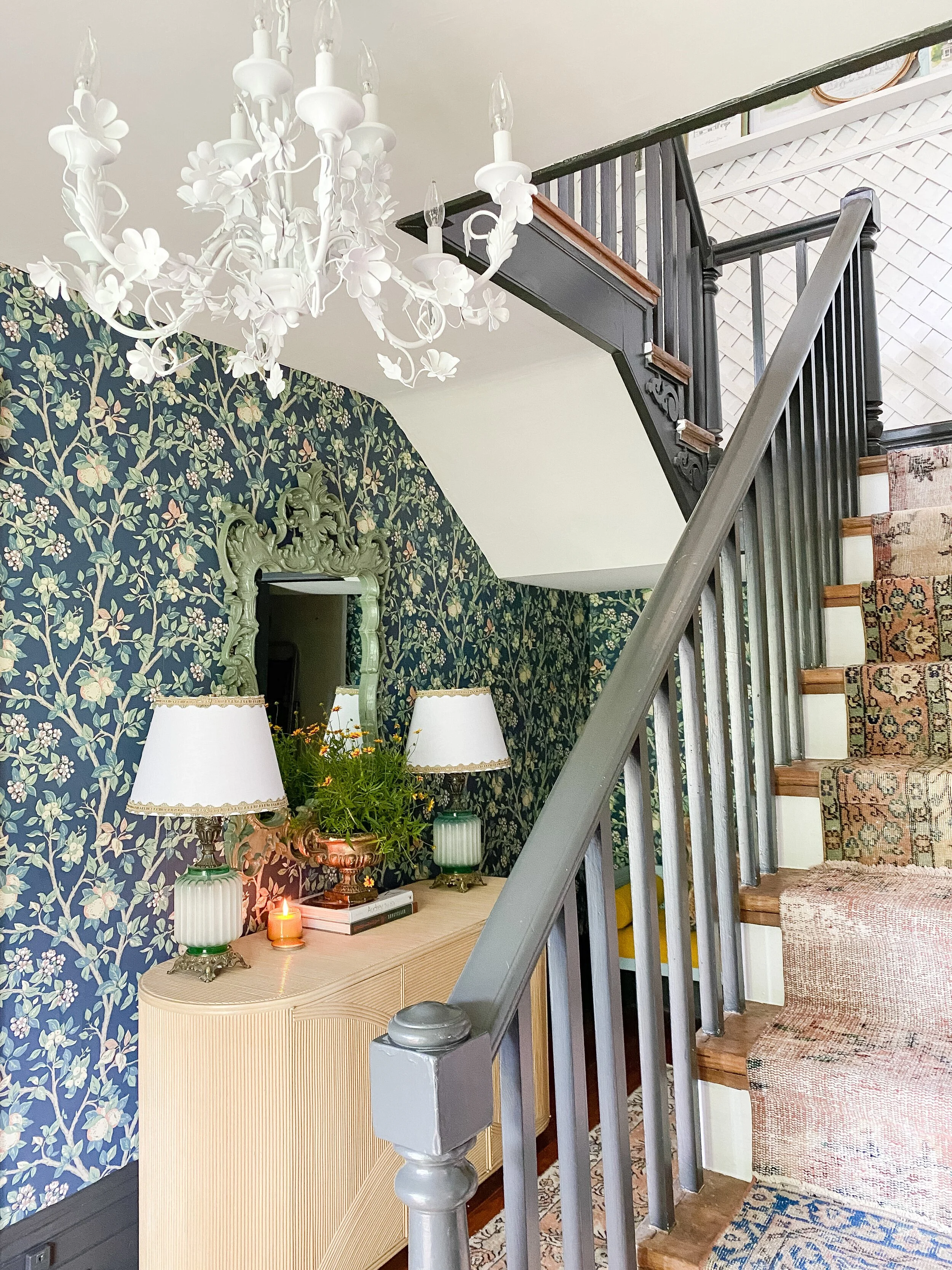
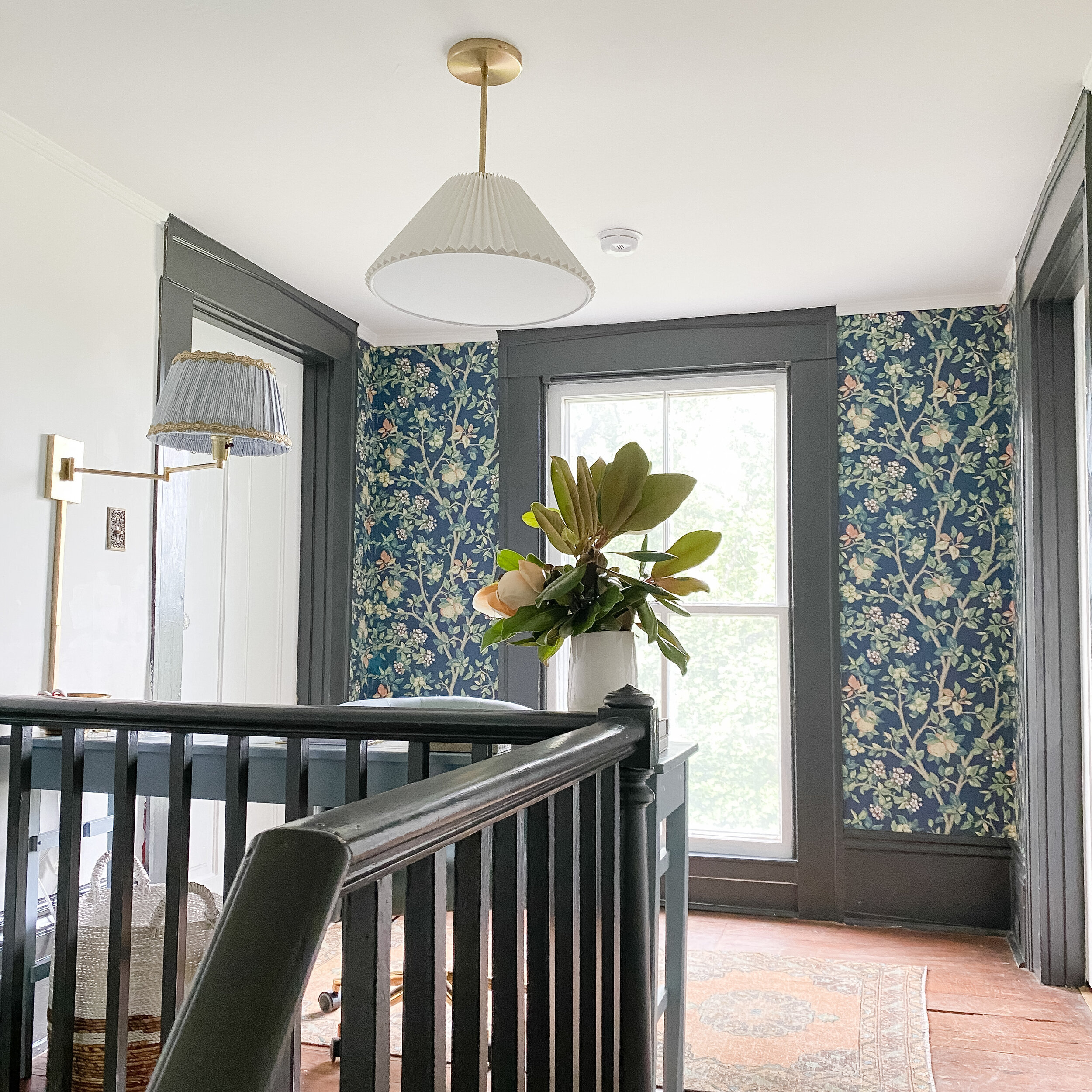
The wallpaper definitely makes the biggest impact on the room but was also the HARDEST decision to narrow down. I just kept finding more and more beautiful options and I loved them all for different reasons! In the end, this one had everything I wanted and more, and I loved the authentic antique/cottage feel. I also had to take into consideration which wallpapers would flow best with the vintage stair runner I was wanted to do and that really helped me narrow it down a lot, as some of the more cutesy, kitschy prints just weren’t going to work well with that combo. I ended up doing the wallpaper on the large left hand wall and wrapping it around the back. In phase two of this project, we will be doing a large built-in L-shape bench around the back wall and under the stairs, and when that is done the wallpaper will wrap all through that nook as well. I also repeated it upstairs on the back wall around the window too, just to carry the pattern throughout the space.
My mom came over and helped me with the wallpaper as she has done quite a bit of wallpapering in all our homes and has a ton of experience. I definitely recommend always having someone to help if you’re wallpapering, as it’s SO much easier with two. This was my first time working with “paste the wall” wallpaper and I seriously never want to do anything else! It is SO much easier to work with than any other wallpaper (and I’ve done them all before!), mostly because it requires very little smoothing after and hardly ever has ripples or bubbles as you’re laying it down. For this method, you simply roll the wall with some wallpaper paste, just like you would if you were painting. Then you apply you wallpaper directly to the wall on top of the paste, smoothing it out all the way down, while also ensuring it lines up perfectly and straight on both sides. Finally I used a razor blade to trim the edges as clean as possible. It is essential to get a very sharp, brand new razor blade with lots of extra blades as you’ll want to change them on every run or two, so you always have the sharpest cuts possible. The only difficult parts are going around things like doorways or corners, which I thankfully only had a few of. We ended up figuring out some tricks for cutting those tricky areas the further along we got, and also did some patching in a few spots by just placing a small scrap of wallpaper behind any small gaps to fill in when needed (you can’t even tell if you match it up well).
I will do a whole separate post in more detail with wallpapering tips and tricks and all the tools I used that I would recommend. If you are in Lexington though, definitely check out Perspectives right behind Southland Drive. They have been in business for years and are THE wallpaper experts in town. That is where I went to get all my supplies and they can always answer questions and help you get exactly what you need, They also have tons of wallpaper samples and books there that you can look through and even check out and take home.
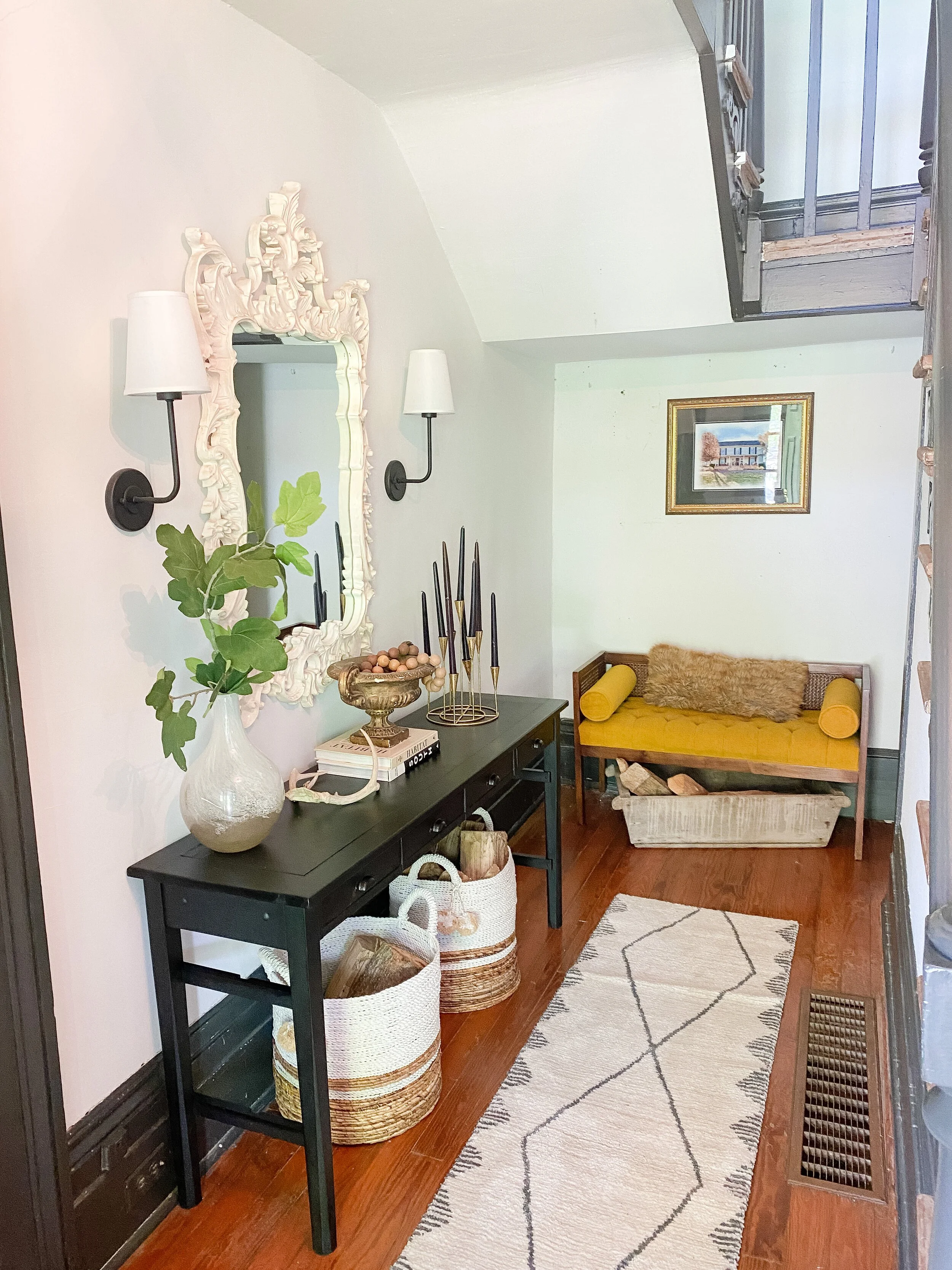
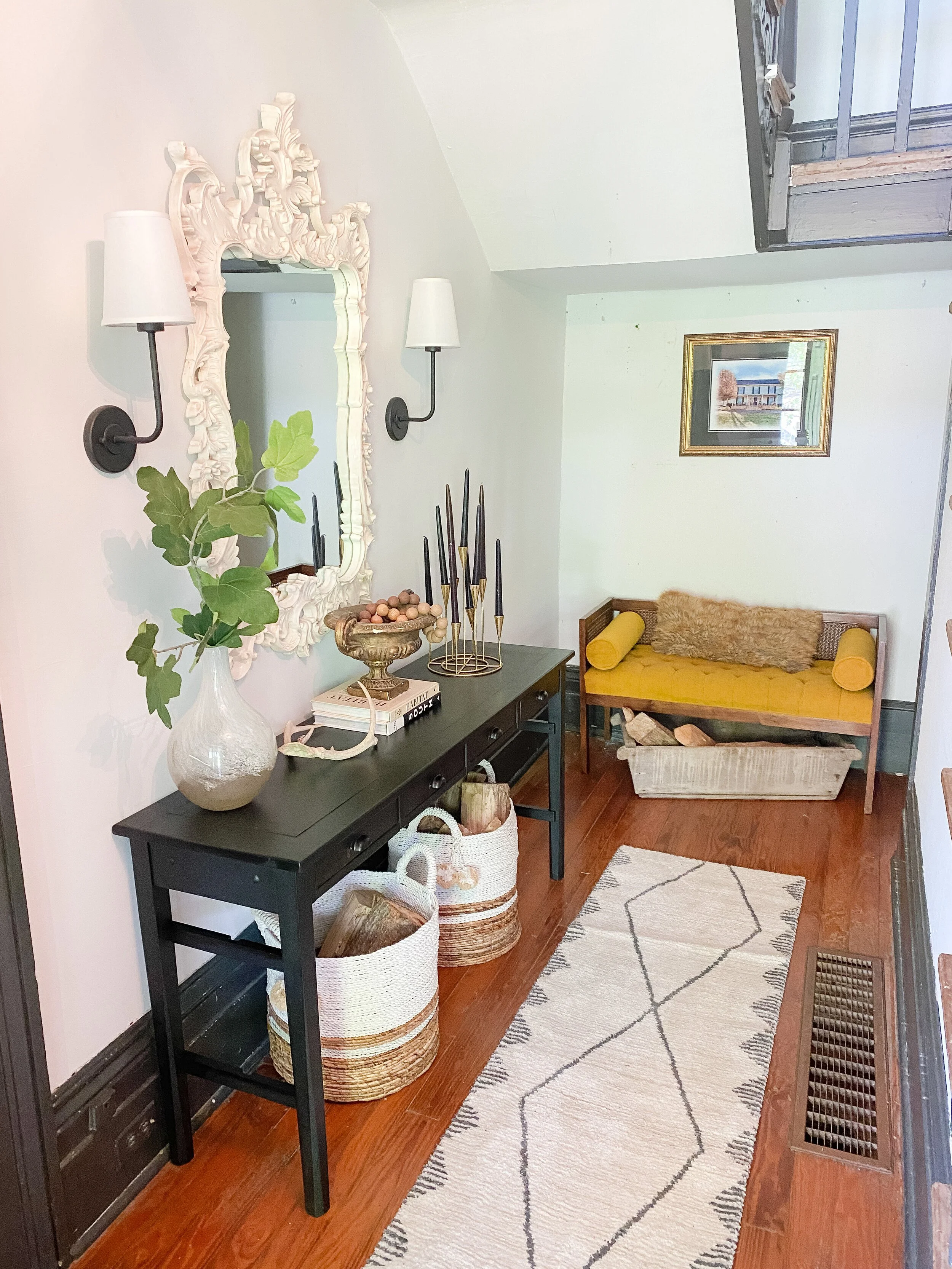
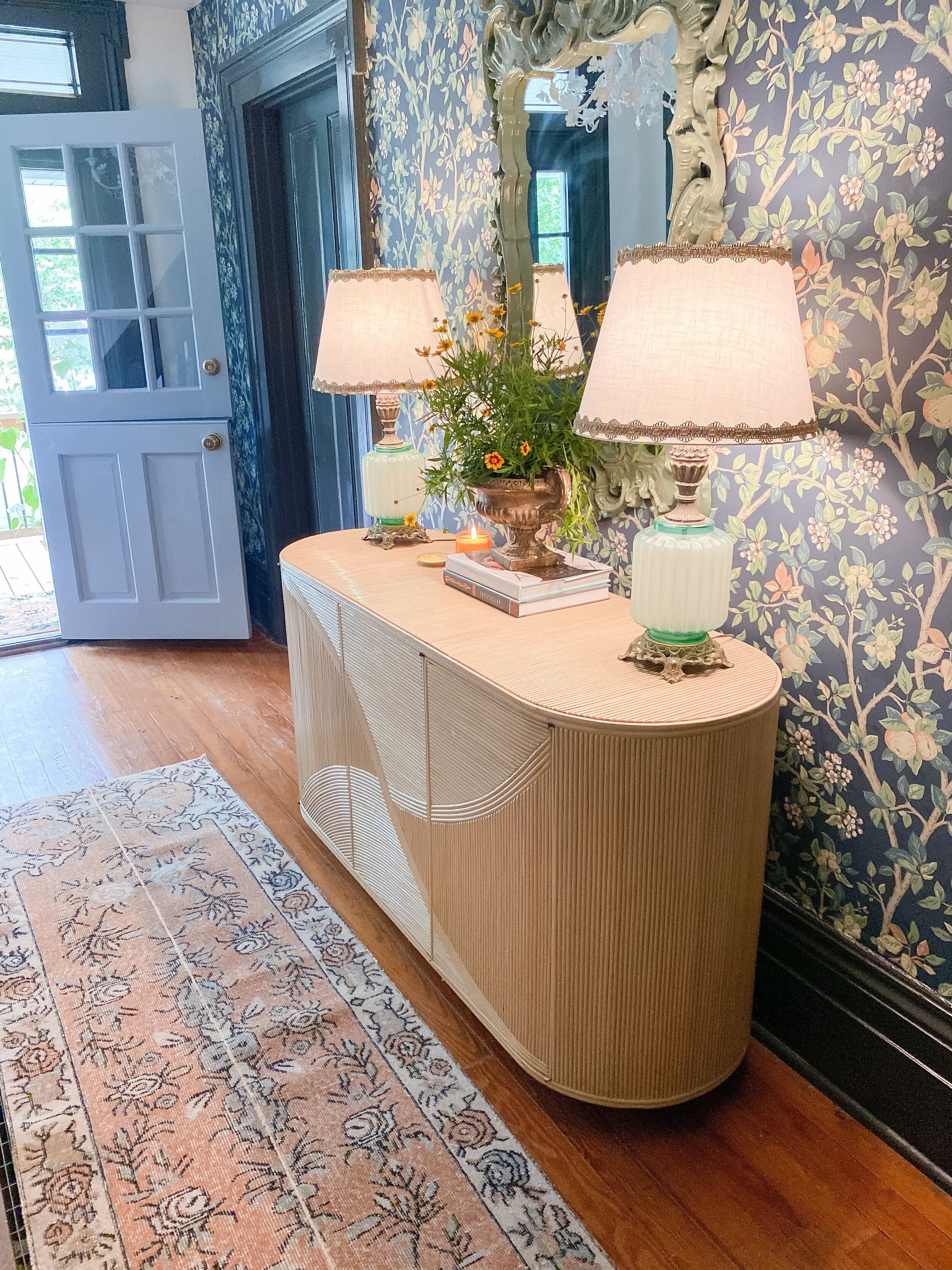
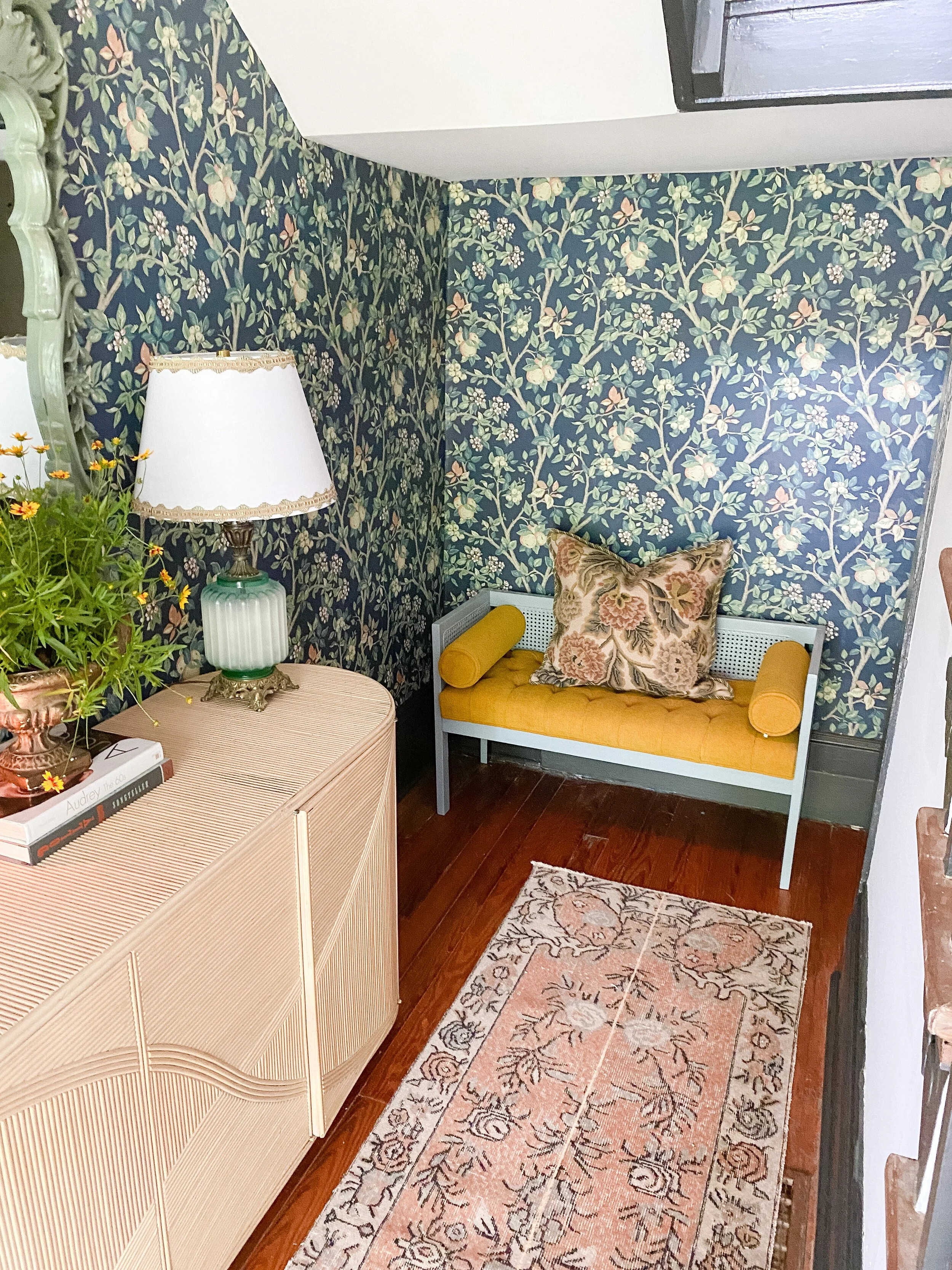
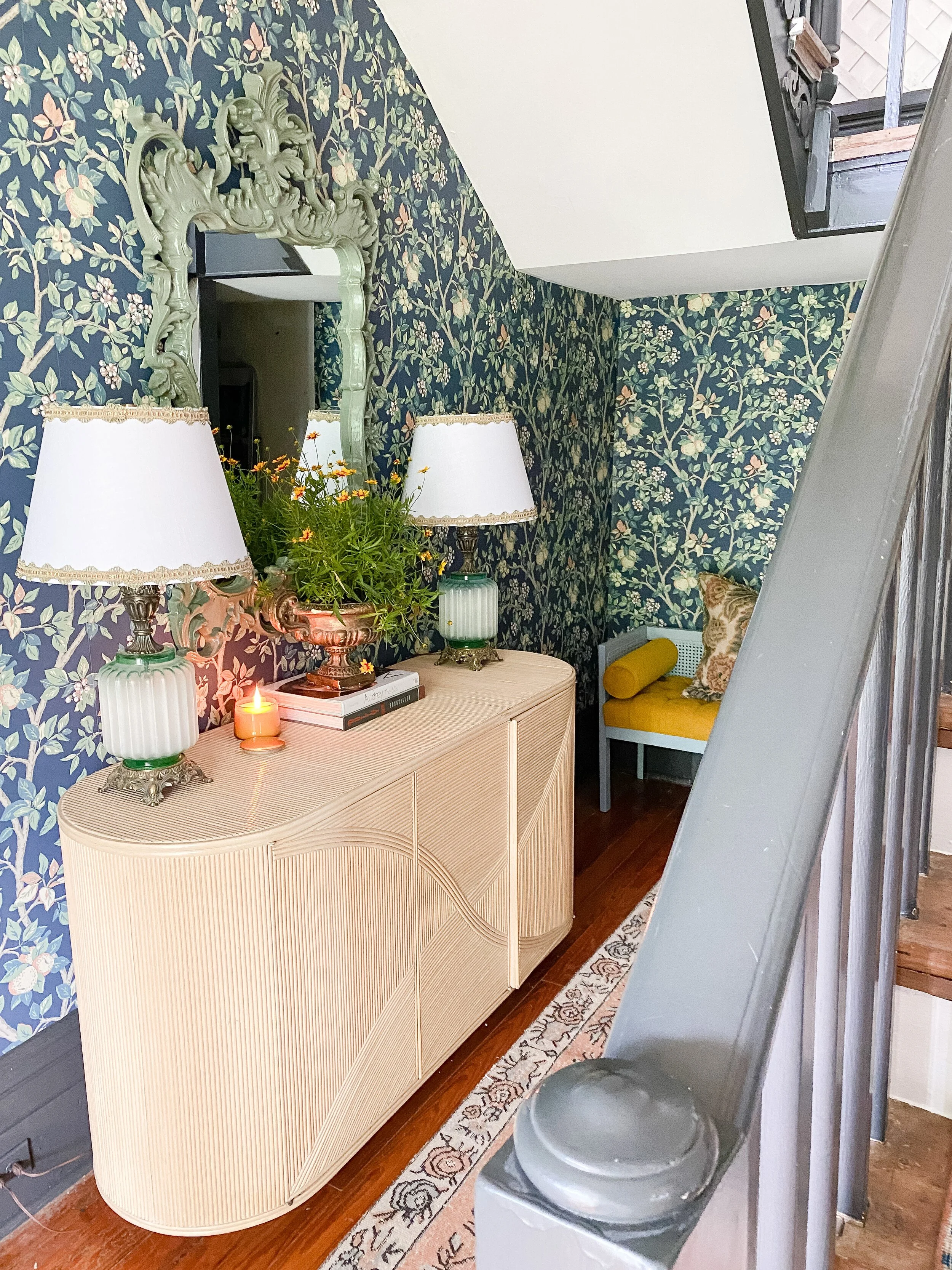
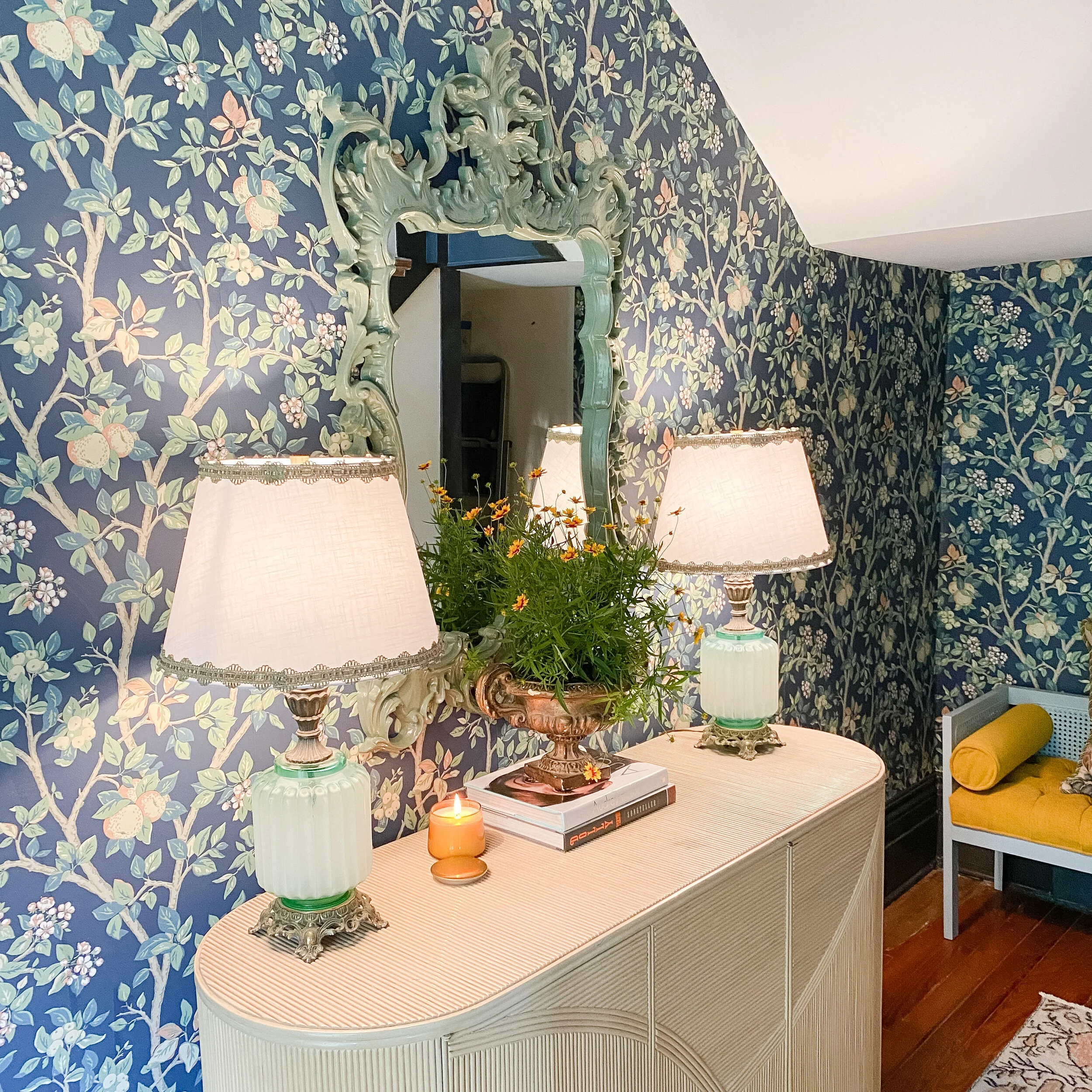
In the main entry, I always like having a console table but I wanted something special that really made a statement here. I had my eye on several curved rattan/wicker style consoles online but couldn’t bear to pay the massive shipping prices on a vintage piece, which would nearly double the price. I decided to look locally first before pulling the trigger on anything online. I must have manifested this piece because it’s exactly what I was looking for (maybe even better) and I found it at Bluegrass Stock Exchange in Lexington. This was probably my one big splurge of the space as it was $800, which is one of the most expensive pieces I have ever personally purchased for my home (I’m truly a bargain furniture hunter!). It has pop out doors, tons of storage, and beautiful rattan reed detail goes around the entire piece. I was planning on painting it, but the color ended up coordinating perfectly with the wallpaper, so I left it for now.
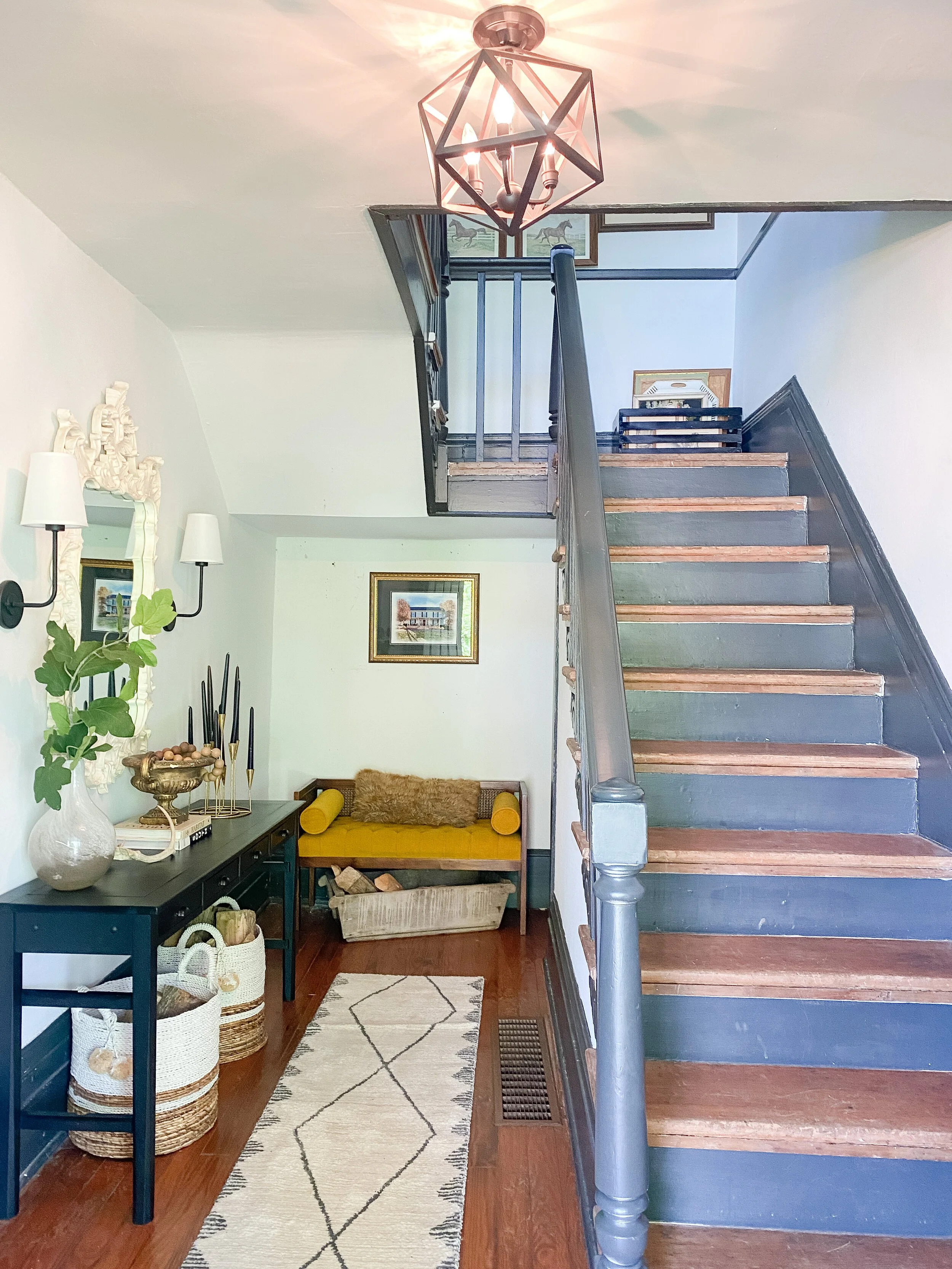
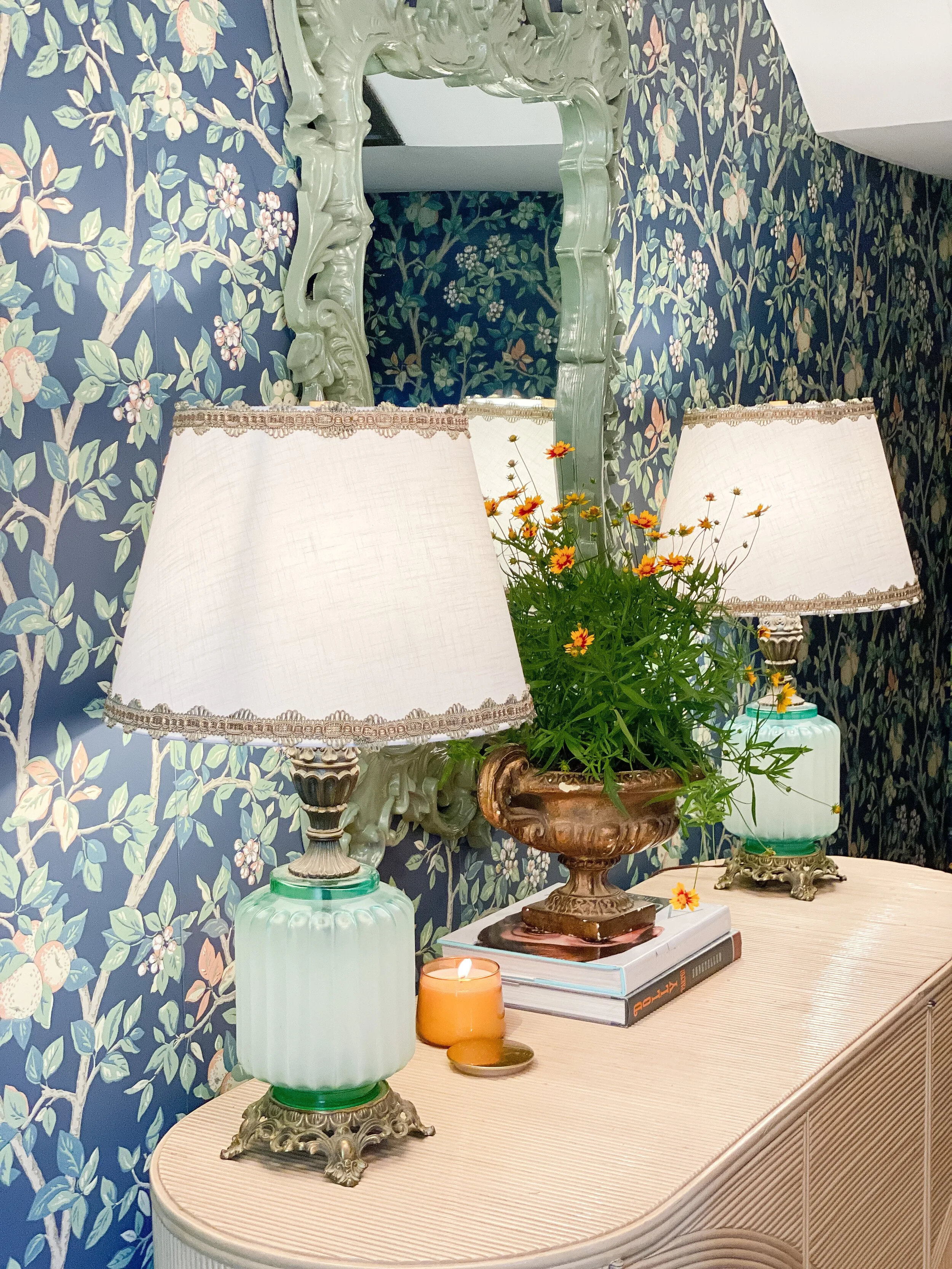
The size and style really fits this entry so nicely and provides the statement I was looking for. I also painted the mirror I had here previously a glossy olive green that also pulls from the wallpaper color. I love all the pops of green with the lamps, mirror, and plant on the console. In the back of this space, I left the bench I had there for now, but gave the frame a coat of Evening Eclipse by Valspar, which I love with the velvety mustard fabric! Eventually all the trim in the entryway will be painted Evening Eclipse too, so I think once that happens it will look EVEN better! The bench is just temporary as eventually there will be a big built-in L-shaped bench in this back wall space that wraps around under the stairs (opening up the closet under the stairs), which will make this spot even cozier!
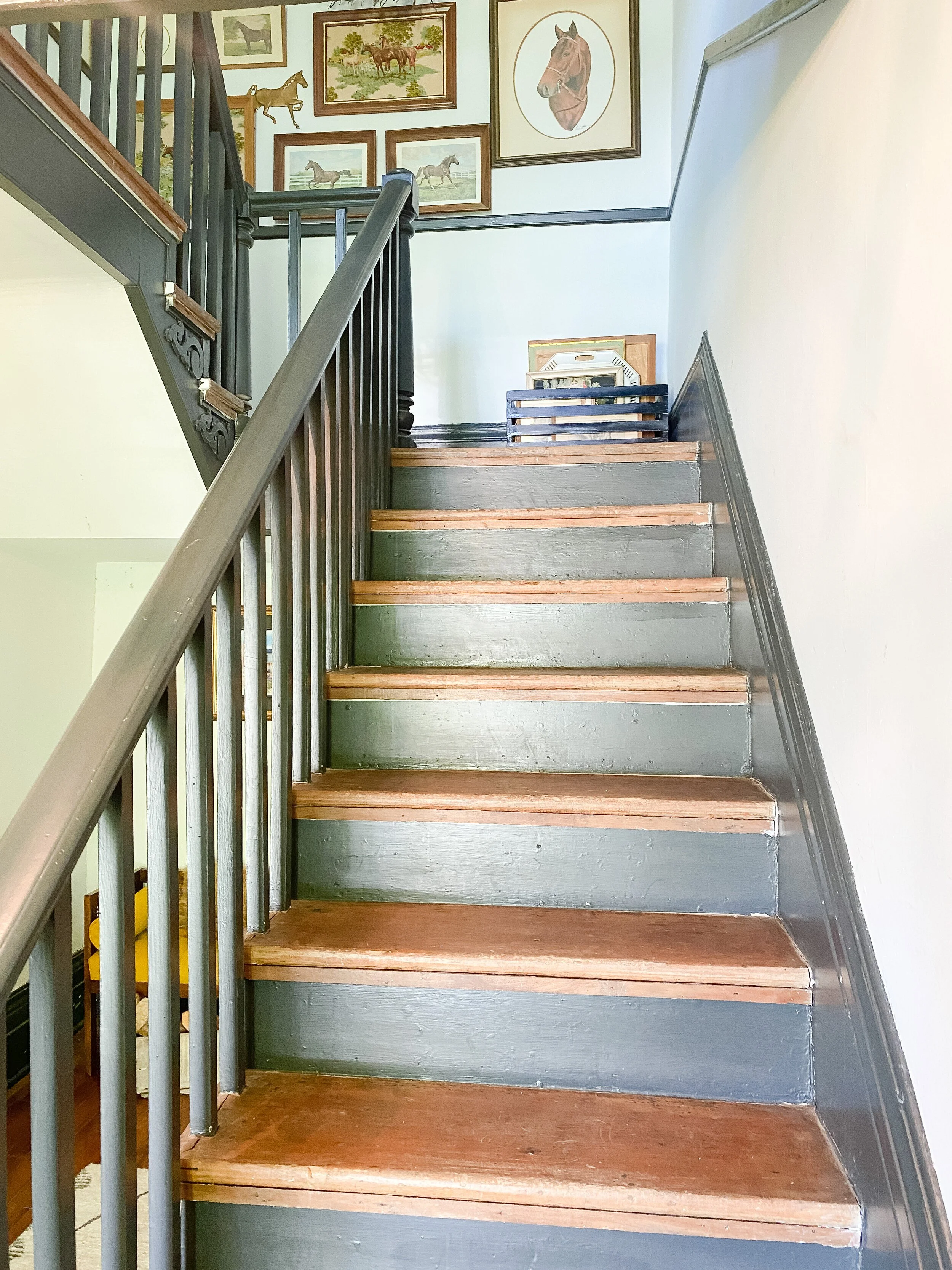
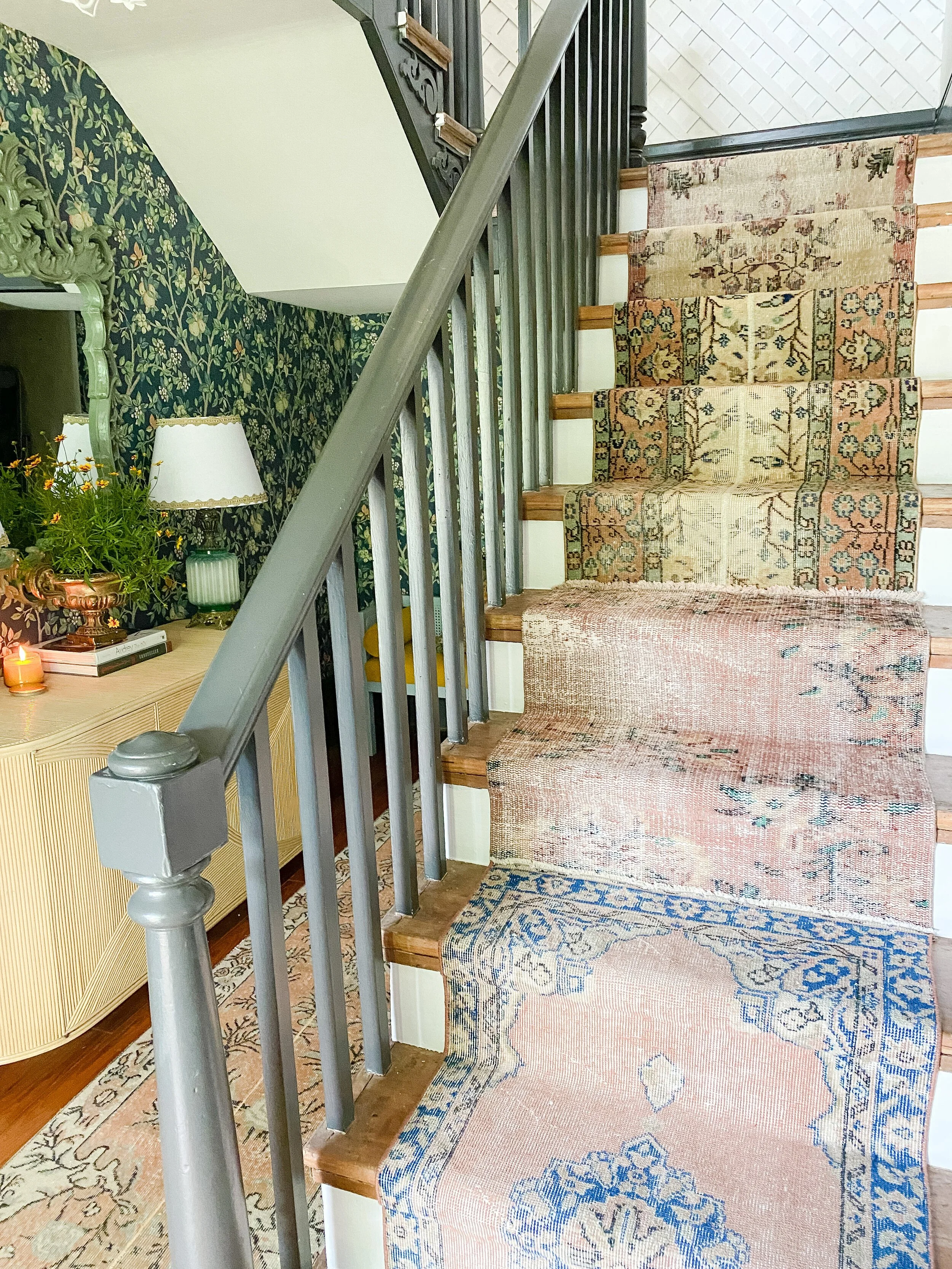
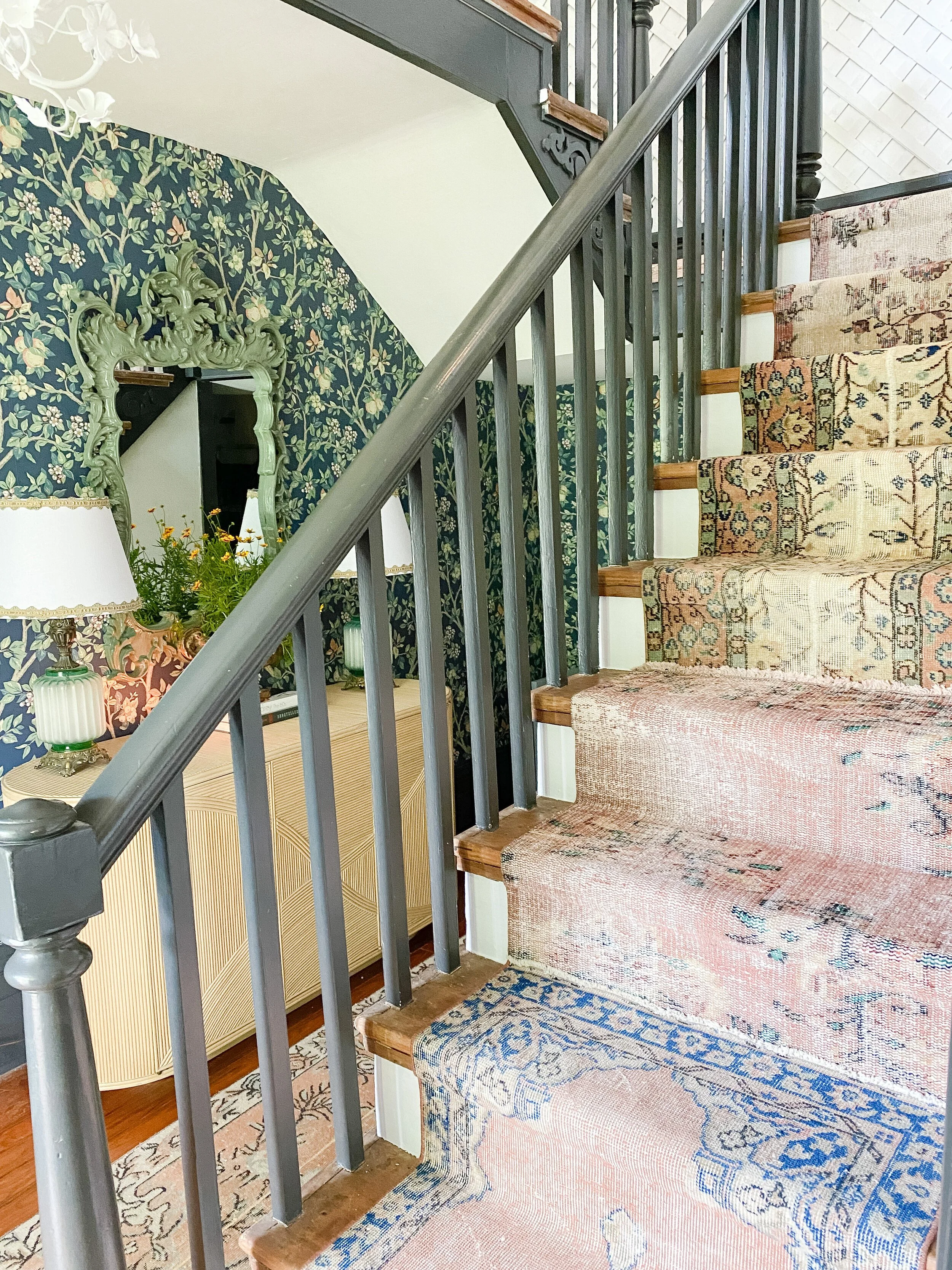
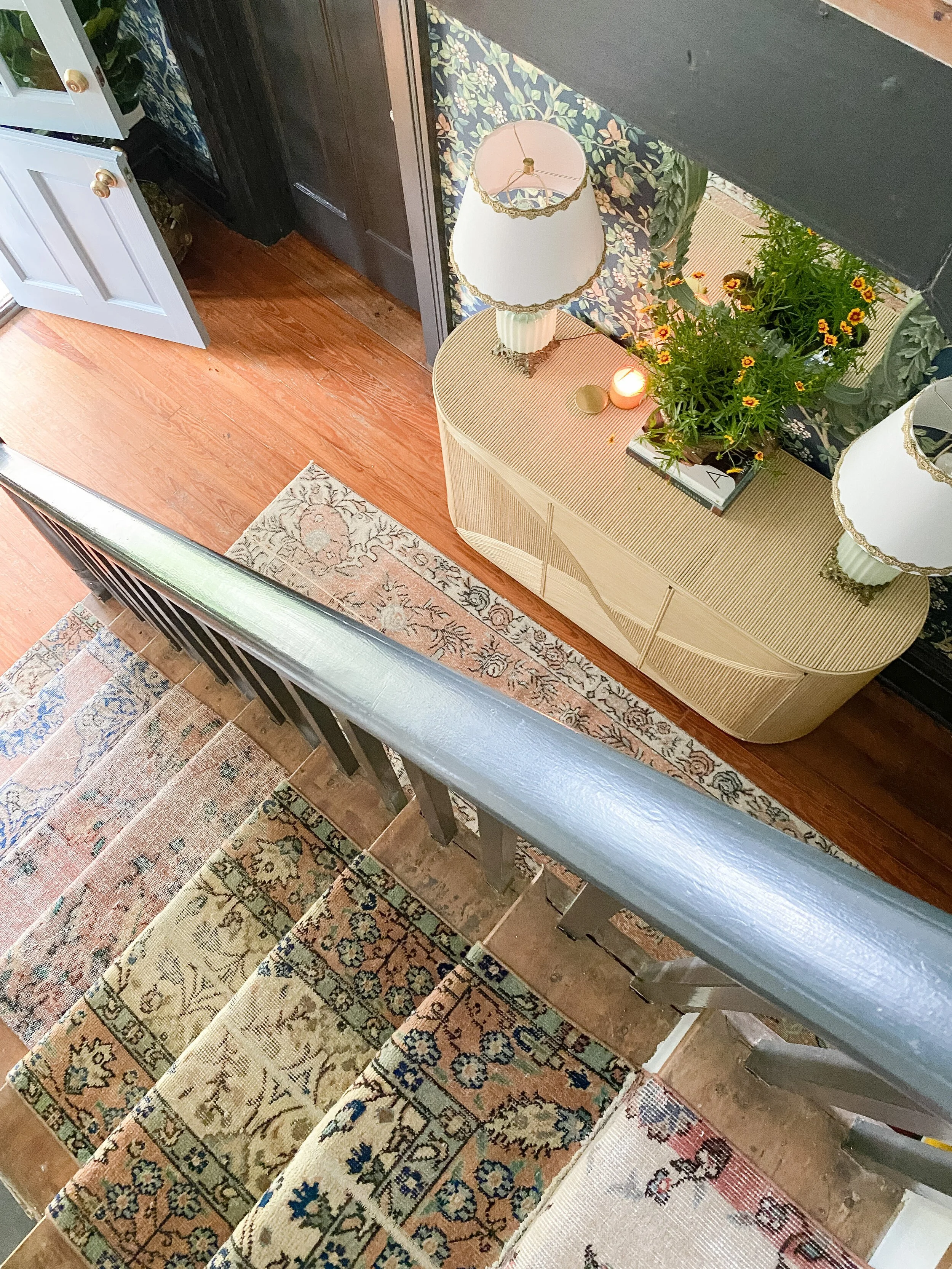
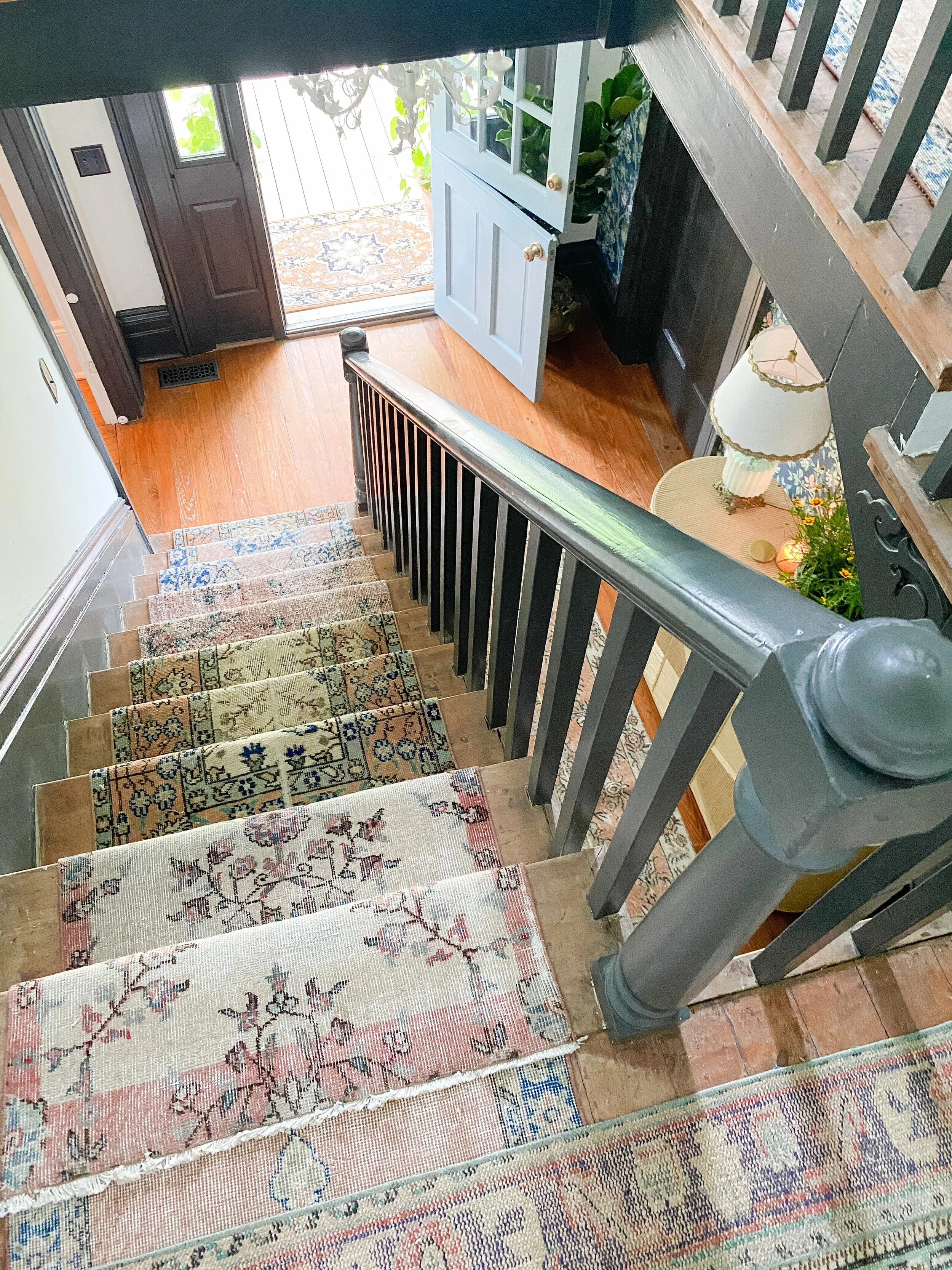
Probably the most fun project of all for me was the vintage rug stair runner. I have been dying to do this for years and had multiple inspiration photos saved. I knew it would fit so perfectly in this space and add such character as well. I ended up finding all the rugs that I used on Etsy, all from different vintage rug shops. There are TONS on there and all have different sizes/offerings, so I really don’t have one in particular I prefer. I really just hunted for the best colors, sizes, and decent prices for what I needed. The best part is that most of these ship FREE and FAST even thought they have to ship internationally, which is so nice. All my rugs arrived within a couple of days and I was so impressed by that!
My recommendations for shopping for vintage rugs on Etsy is just take your time and really sift through all the options available. It can be overwhelming but I initially searched by the color I was looking for (“vintage rug runner blue” for example) and then from there narrowed down more by the size I needed. I would add a ton to my cart each time I saw something that might work. Then I went to my cart and narrowed down my favorites. Sometimes I would find one shop with a lot I liked which is always a plus, because you can message the shop owner and ask for a discount if you’re ordering several at a time.
Another reason why this was probably my favorite part of the project was because the process actually went ACCORDING TO PLAN, unlike any other DIY project I took on in this space. I did a ton of research before starting and read every tutorial I could find online about DIY stair runners. I compiled a list of all the supplies they used in each and ordered it ALL on Amazon. The main supplies i used was an electric staple gun, carpet scissors, rug padding/mats, and rug tape. Again, I will do a separate post on this with additional details and step by step instructions because I feel like after some initial trial and error, I really mastered the process!
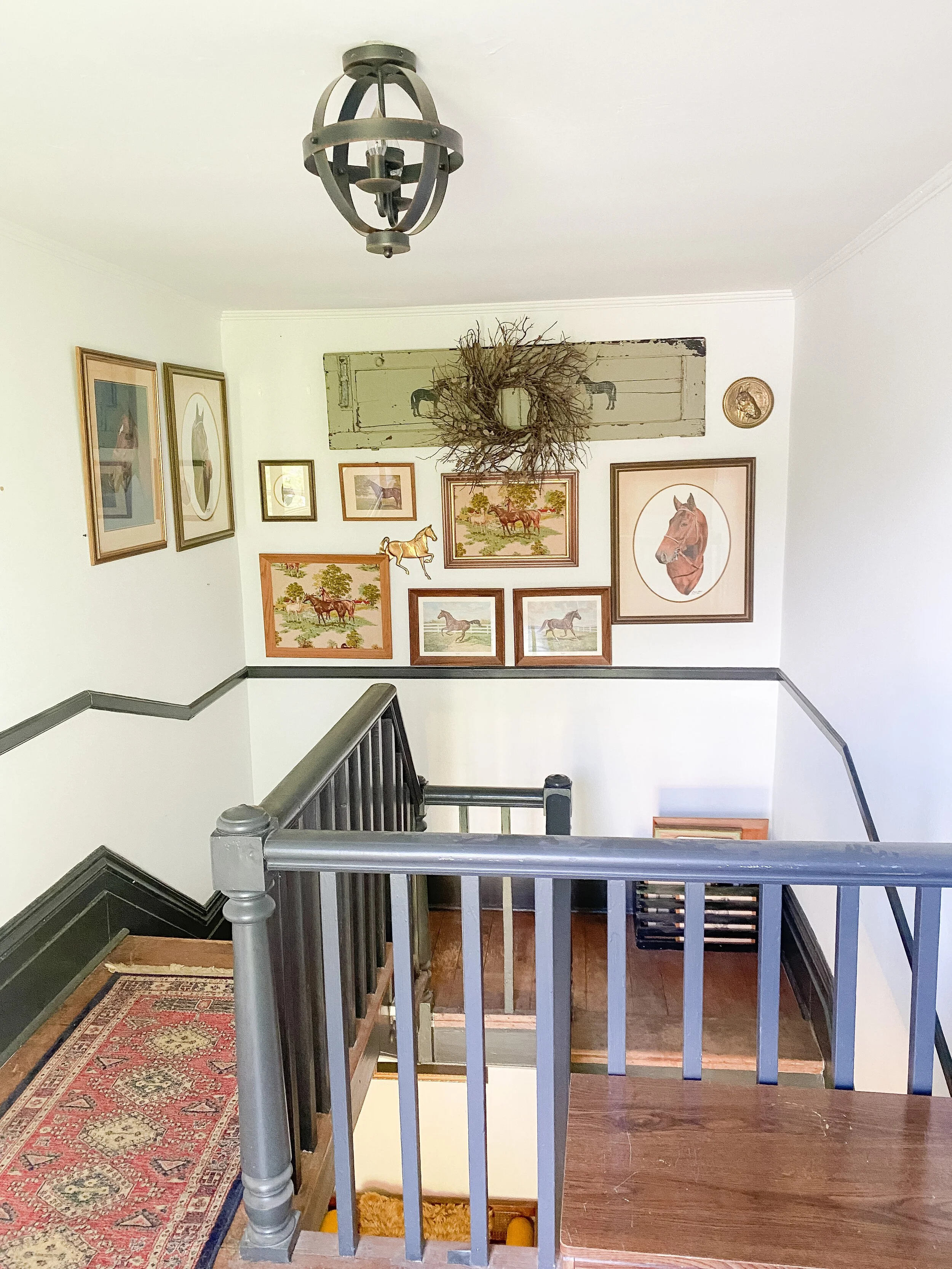
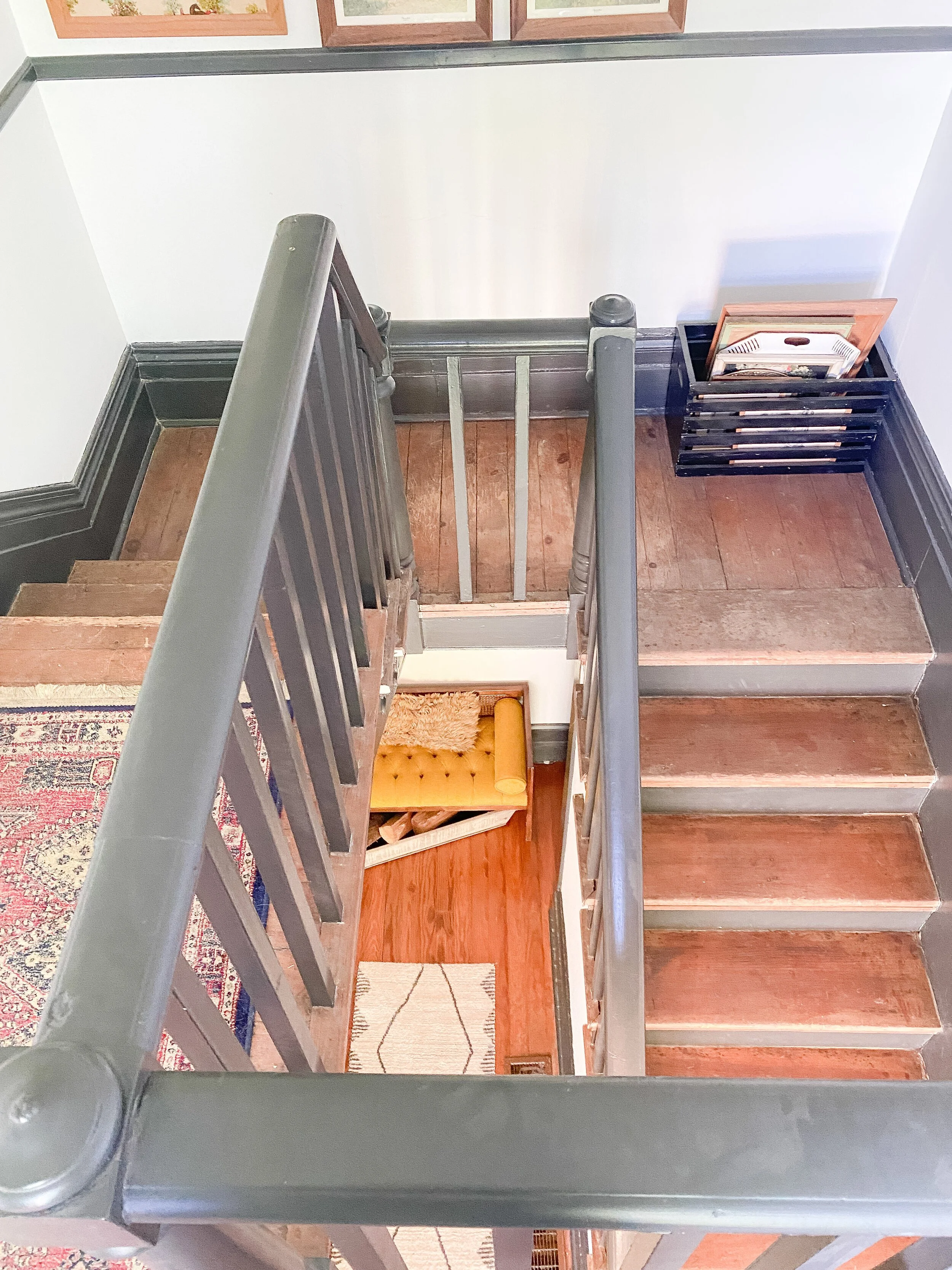
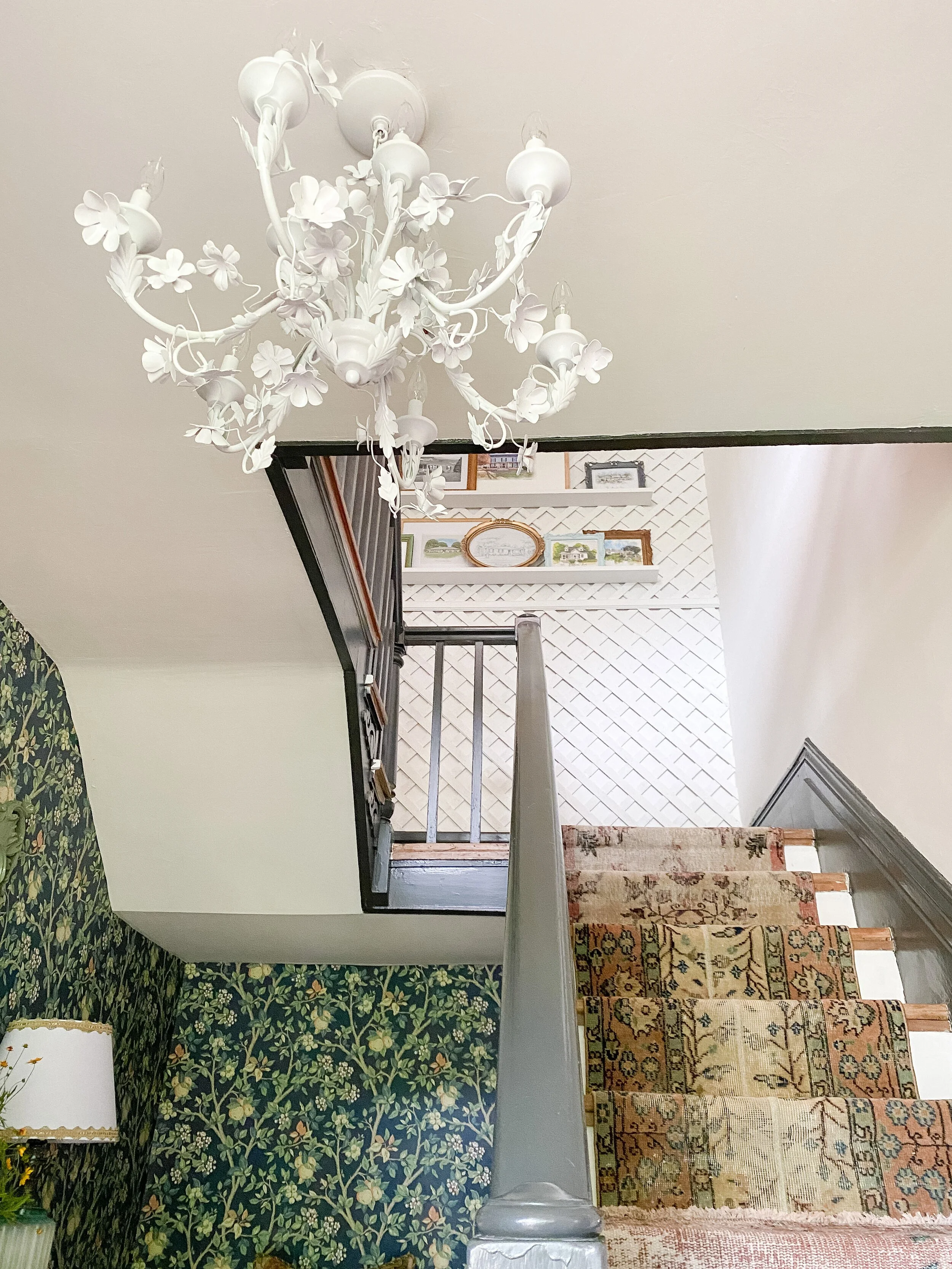
I love vintage rugs and wanted more of a mix and matched look as opposed to just 1 or 2 longer rugs. The hardest part of the project was trying to order just the right colors/styles to mix and match with each other online and trusting that the colors were true to real life. I ended up ordering some extras for that reason, knowing I could resell if needed, so that allowed me a lot of extra square footage that I was able to use elsewhere! I used one on the landing to connect the two sets of stairs, and then another on the main floor alaongside the console table.
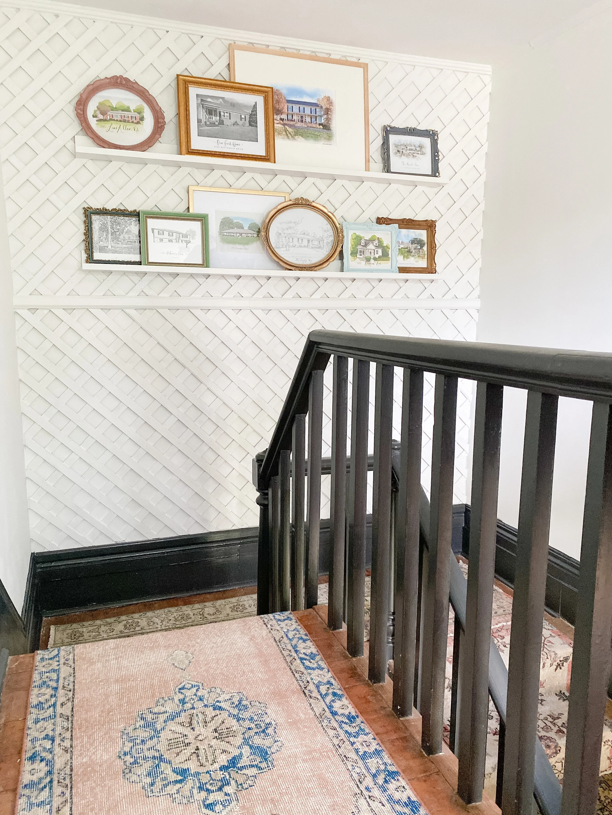
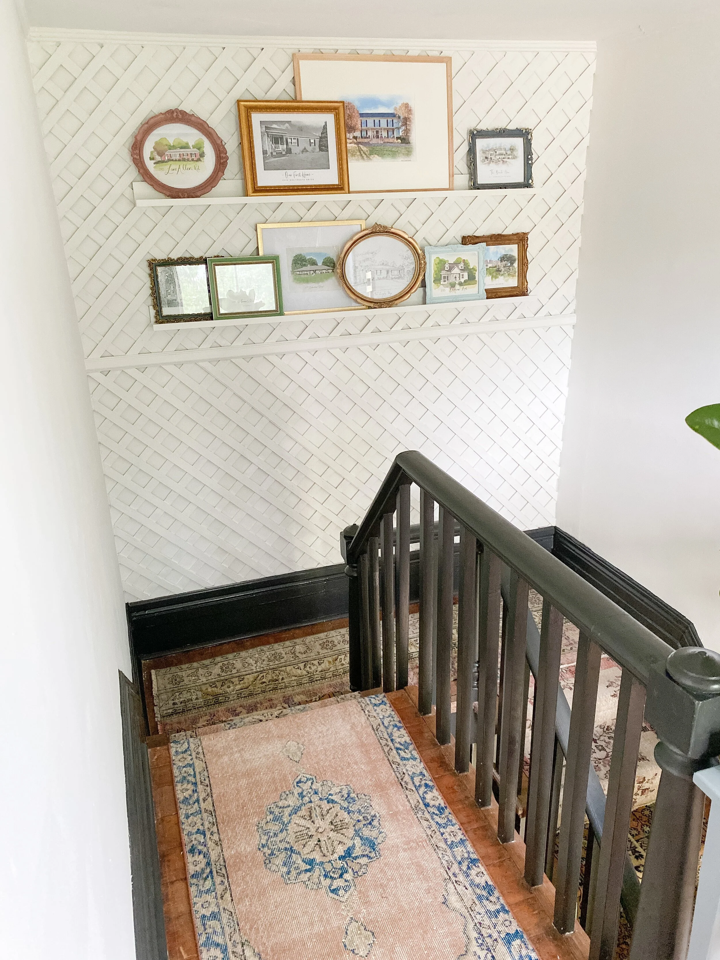
I have always loved lattice walls and had wanted to incorporate this detail for a while somewhere in my home. I love the statement it provides but also the kind of retro, cottagey feel which was the perfect compliment to the style of this space. This was without a doubt the most frustrating and hardest part of the project, when in the beginning I thought it would be a super quick, 1 day thing! Unfortunately I forgot one important detail, nothing in our house is square, or even close to being square! I actually had messaged a little bit with another designer on Instagram who had recently done a lattice wall that I loved, and she told me she just bought the regular in-stock lattice at Lowe’s, painted it, nailed to the wall, then added some trim on top to hide the seams- seemed easy enough right? So on week 2 I headed to Lowe’s, purchased the lattice for the wall, and prepared to paint it. The wall is 8x8, and the lattice came is 4x8 pieces- it was perfect because we only needed two pieces and would have one seam to deal with!
I did roll also roll the wall with a fresh coat of paint before adding anything on top as I wanted a fresh, blank slate. I was going to paint the lattice the same shade of white as the wall so that made it easy. I would definitely recommend painting your wall and lattice the same color as it gives more of a seamless look and is much easier painting wise.
When we got home we brought them up and remeasured as we knew the walls weren’t perfectly square and we would need to trim a little on each side to accommodate. Alex was able to do that and then I took them outside to spray paint as I figured it would be easiest with all the crevices to at least get 1-2 coats on before attaching to the wall, then touching up. After I painted, we were ready to add them to the wall. I had purchased some white trim pieces at Lowe’s to go around the edges and hide the seam in the middle. Alex attached everything with white trim nails so they would blend in too, adding them throughout the lattice so that it would lay as flat as possible.
We got everything attached to the wall, but it just wasn’t looking right at all. I hadn’t considered the existing top and bottom trim we had on that wall and the new trim I had bought did not match up well with it either. The lattice was sticking out further than that trim which made it look weird and like it was just tacked up and not finished. We realized we needed to get the trim off, and place it ON TOP of the lattice on the top and bottom instead to really make it look right. This seems like something you would assume to do from the beginning, but we were really trying to avoid it as we’ve had horrible experiences trying to remove this trim in other rooms, and the trim and wall just crumbled into a million pieces. I knew if that happened again, neither of us were qualified to repair it.
Thankfully Alex was able to talk to someone at the lumber store who gave him very detailed instructions about removing the trim that helped us keep it all in tact with minimal damage. He cut through years of built up paint and caulk with a utility knife first and then used a putty knife to help create space and loosen up the nails carefully before inserting the pry bar at all. He was also careful to only use the pry bar right near where the nails were located. By taking these extra steps, we were able to remove the existing trim all in one piece, place a few small blocks of wood behind it to make it stick out a little further from the wall, then place it back to where it laid on top of the lattice perfectly. We also were able to use a piece of the original chair rail we had ripped off the middle part of this wall to hide the seam in the middle, which looked WAY better than the random trim I had bought at Lowe’s.
After we got all the existing trim attached back on top of the lattice, we did a lot of caulking to fill in the gaps around the trim and the edges where the lattice met the side walls to make it look seamless. I also went through the caulked any little imperfections, nail holes, or gaps I found in the lattice. Then I used a Dremel tool with a sanding attachment to sand everything down before touching up paint. This tool was perfect because it’s a small size and can really get into all the crevices I needed. The lattice from Lowe’s comes ROUGH so it did need a lot of sanding to smooth out some of the edges. The primer spray paint I had used actually held up really well with the sanding too. Finally I did 1-2 more coats of paint to finish it up, especially along the new trim pieces we had ripped off and added back on. Once the paint was finished, it all looked finished and good as new!
Moral of the story: we should’ve just taken off the trim from the beginning, but again we were just trying to avoid any additional damage to the wall. Thankfully it worked out, although this seemed like the project that would never end, as we had to try several things to get it perfect. If you are doing this on a wall in your home and you live in a newer home without a lot of detailed trim or where the walls are actually straight and square, this would be such an easy and quick project! Getting the trim on top along the edges is the most difficult part and then the finishing work of sanding, caulking, and painting as well. You don’t even necessarily need trim along the top of bottom either if you don’t have existing! The only trim needed is just to hide the seams in between the different trellis pieces.
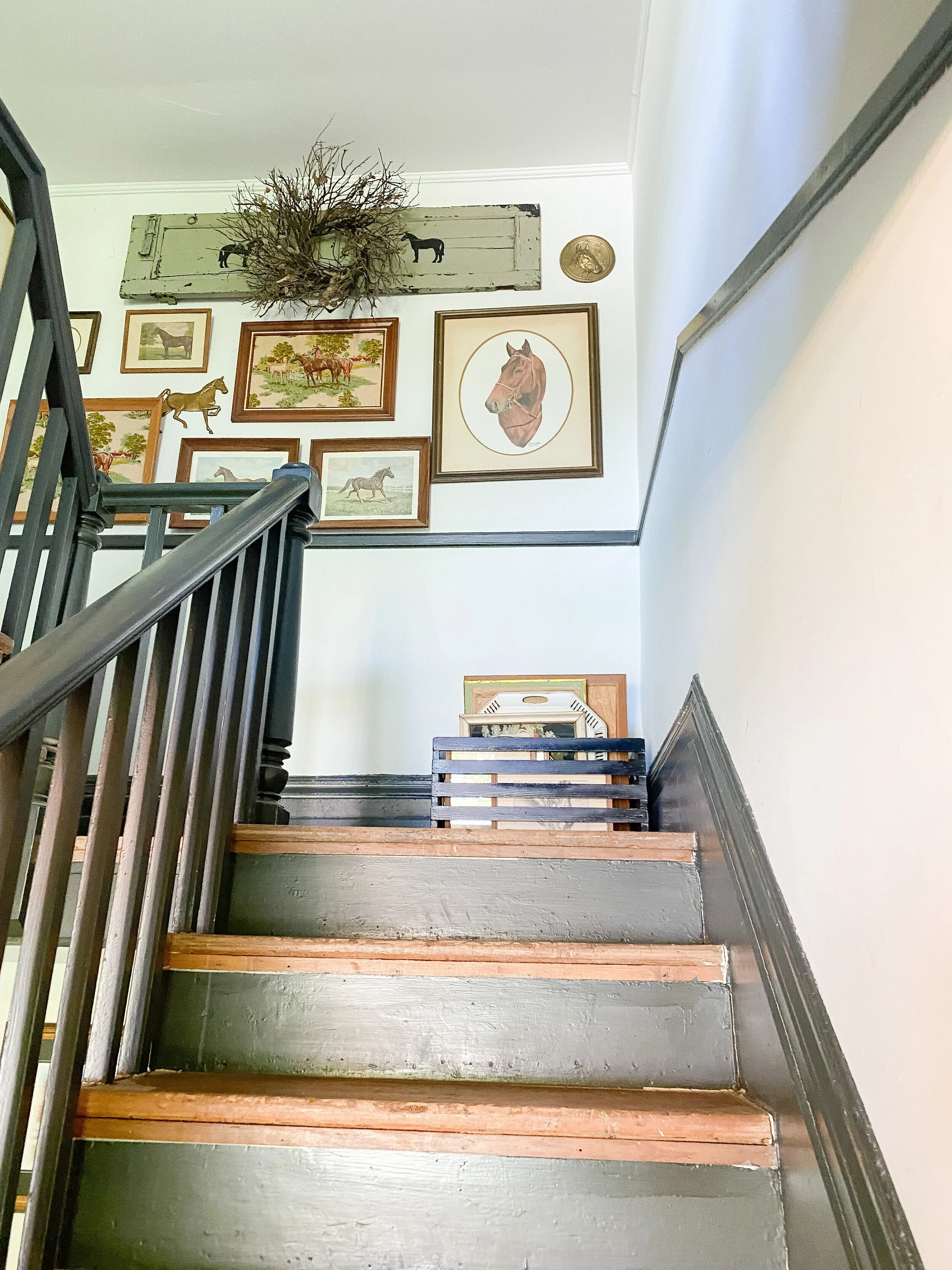
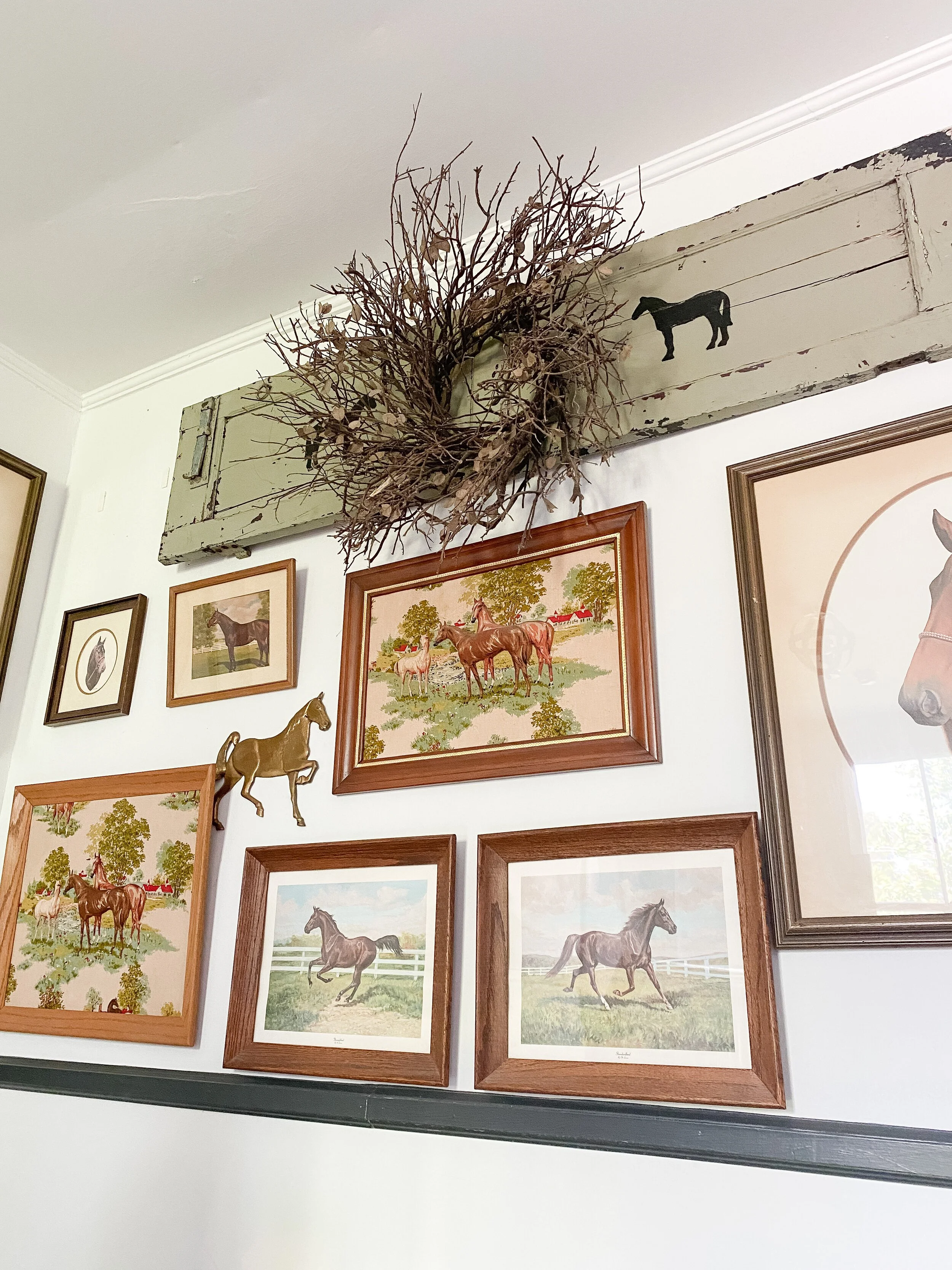
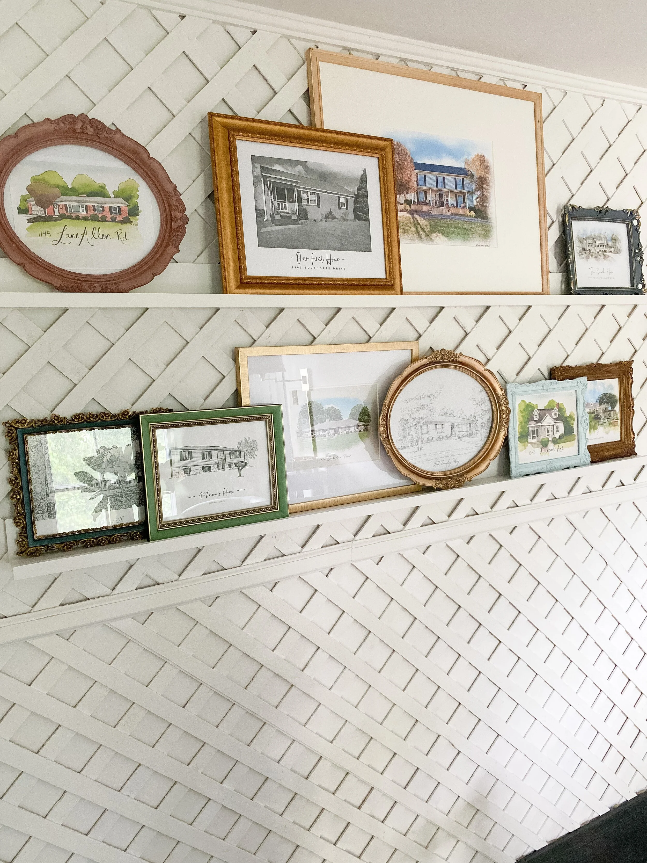
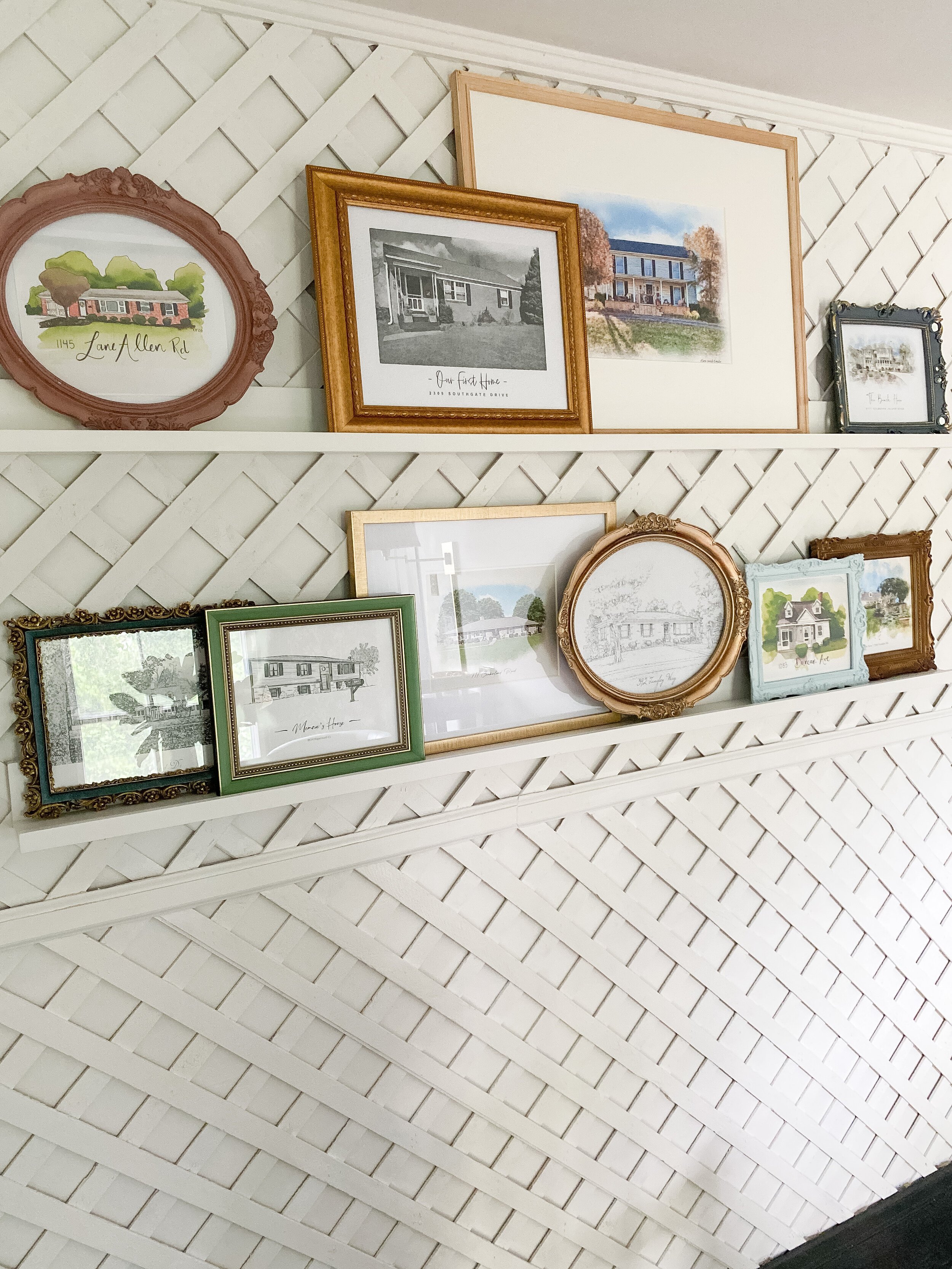
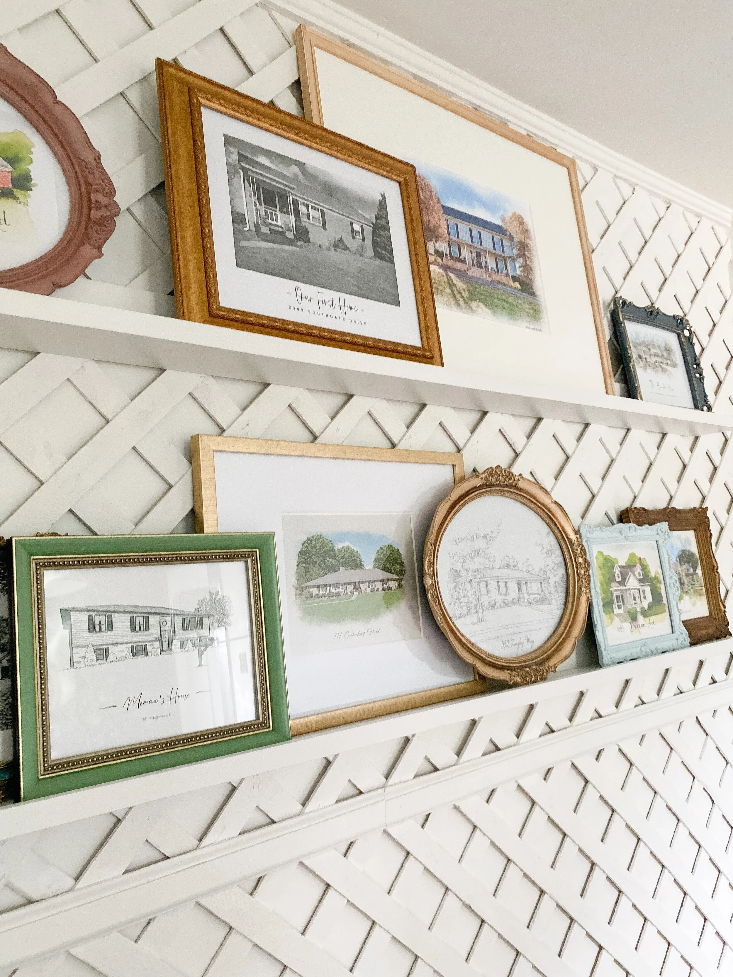
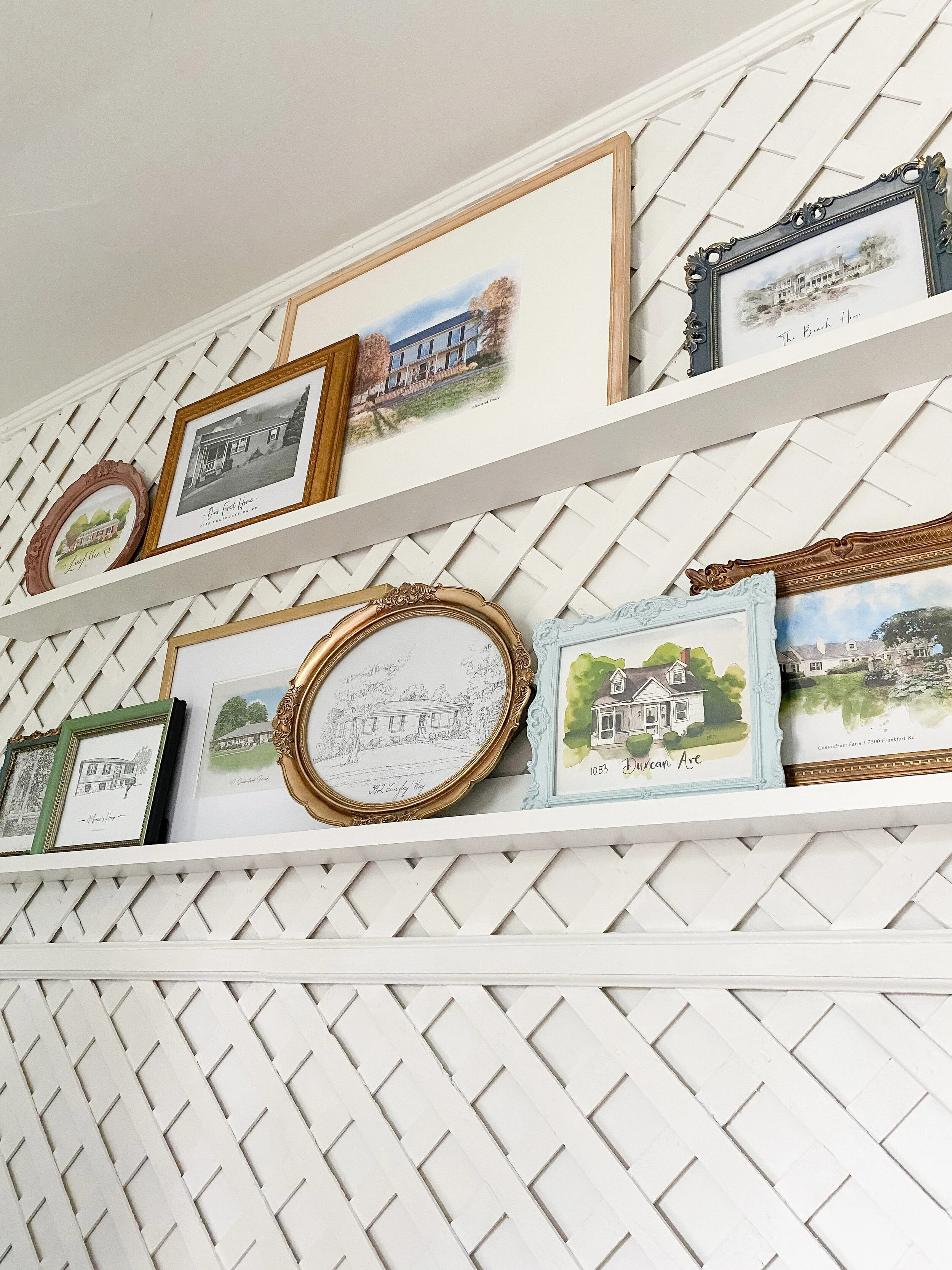
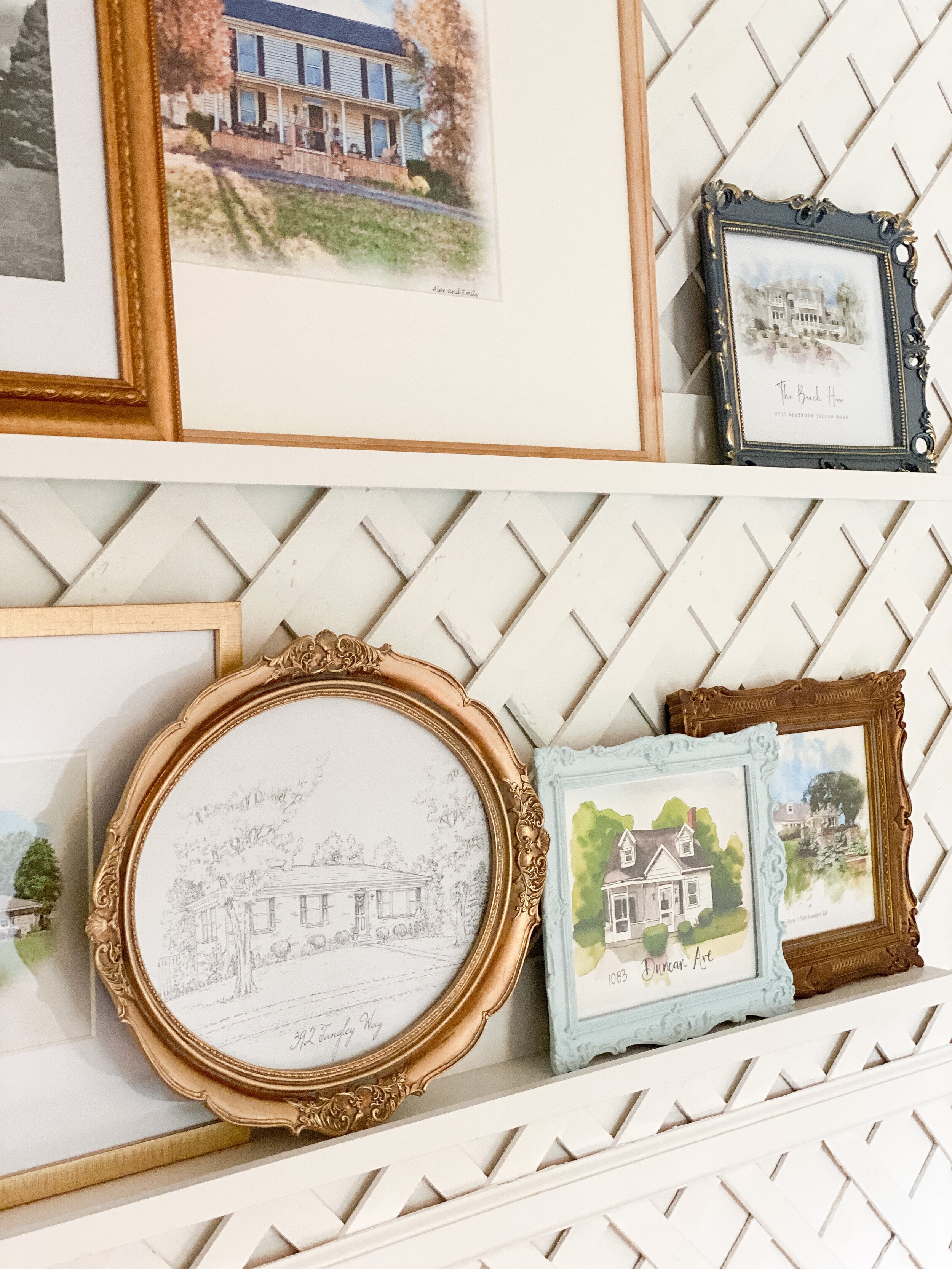
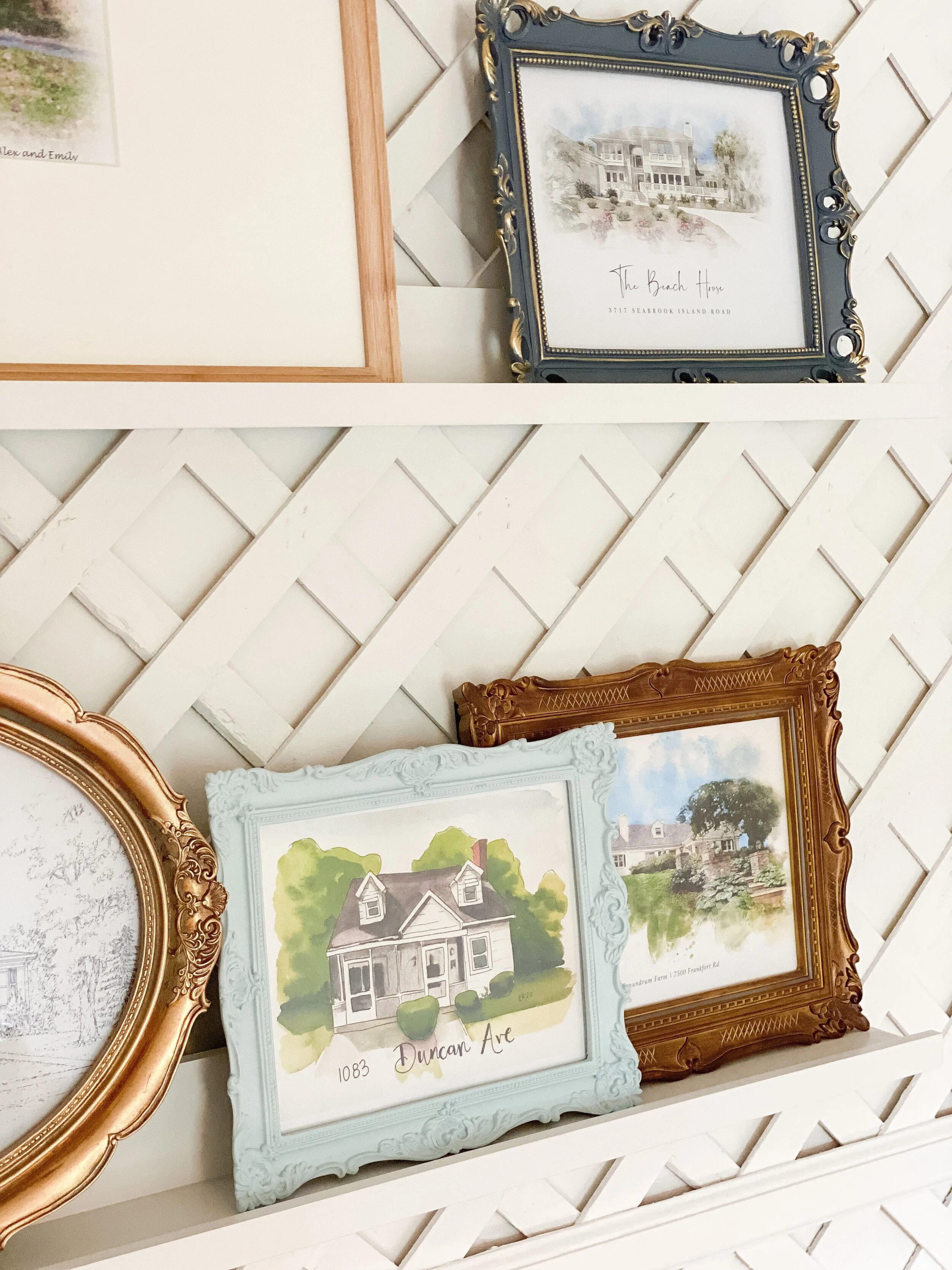
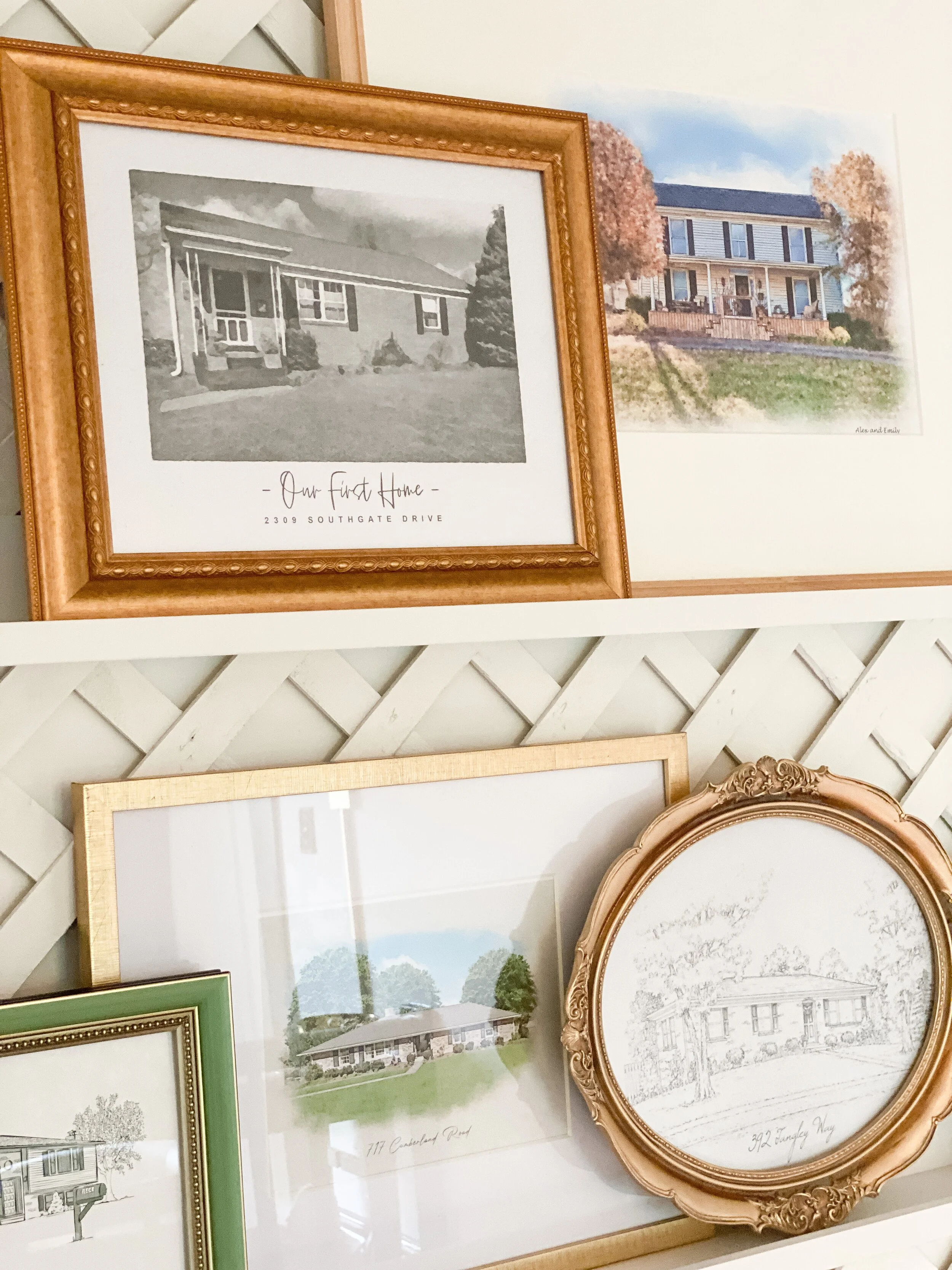
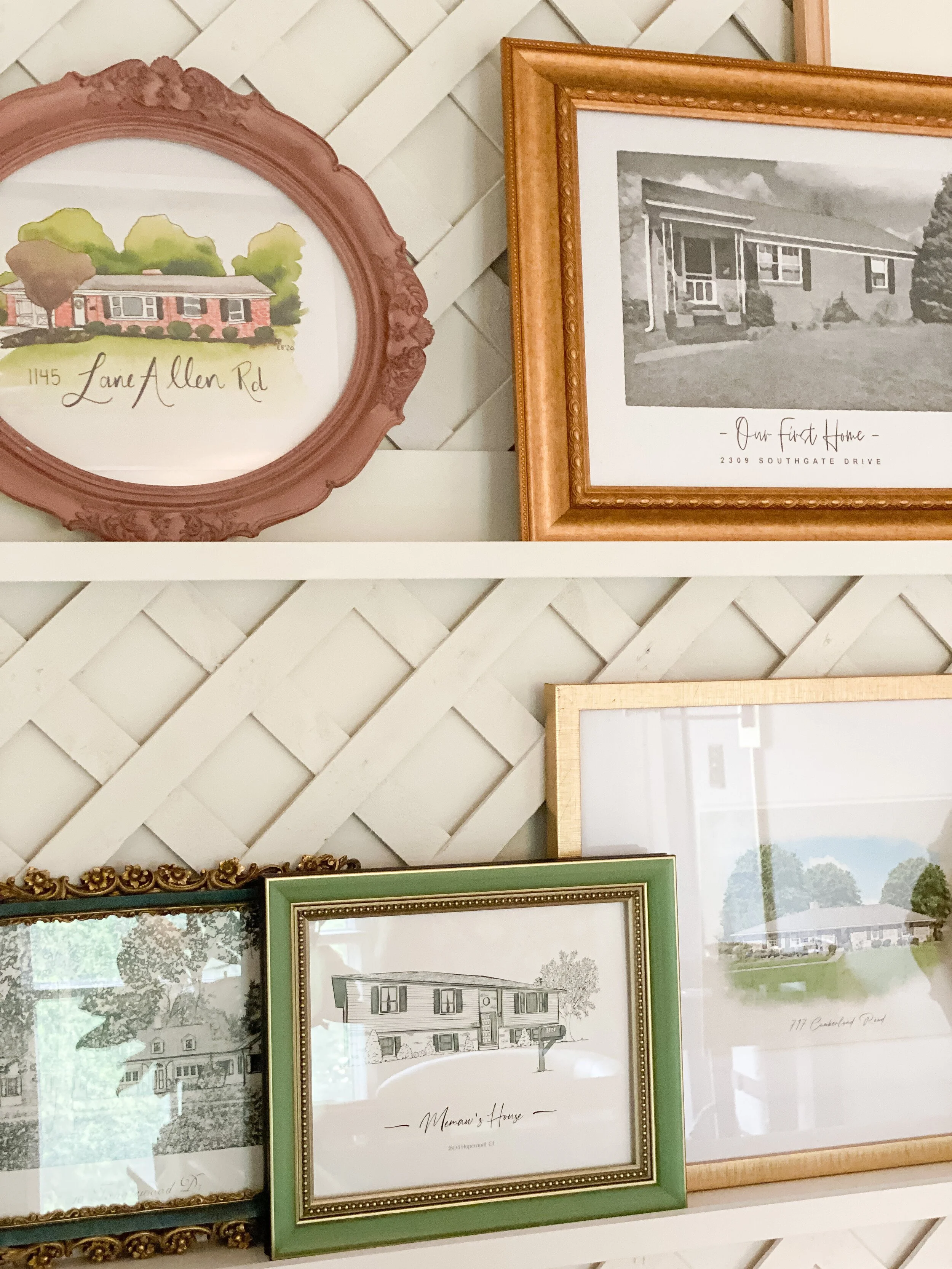
On top of the lattice wall, I knew I wanted to incorporate a new take on a gallery wall. I had previously had a horse-themed gallery wall here that leaned very rustic/farmhouse. I wanted something a little more clean and simple, but still with a lot of character and meaning. I had received a couple house portraits for Christmas this year, one of my grandparent’s house from my parents and another of our current home from my in-laws. It gave me the idea to do a big wall full of ALL the house portraits of homes that we have owned, lived in, and that are special to our family.
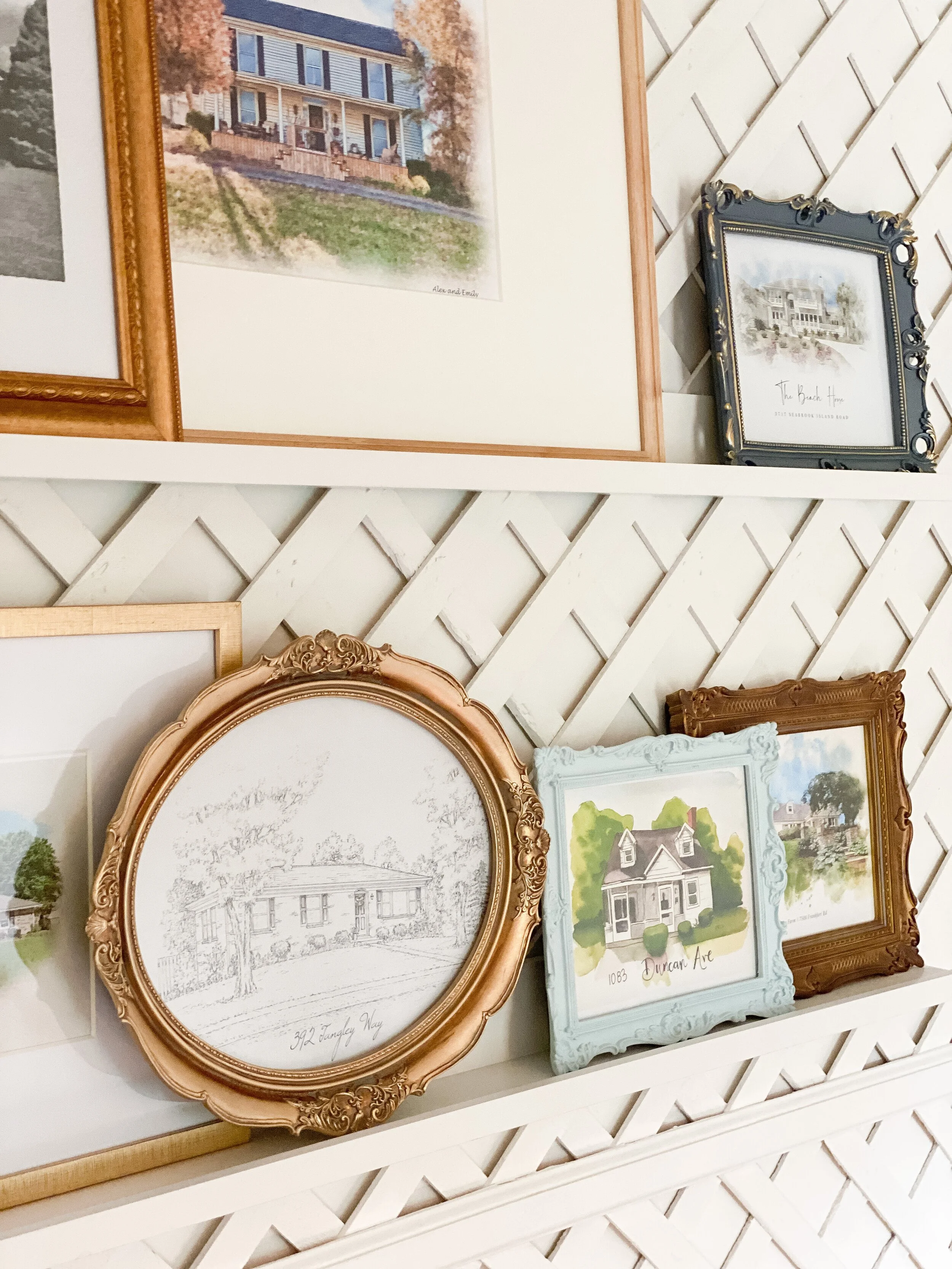
I hunted down photos of all the houses I wanted to include from both sides of our family- our childhood homes, parent’s current homes, our first home, grandparent’s homes, and Alex’s family’s beach house. I ended up having around 10 houses to work with which was a good amount. For any house photos I couldn’t find, I was able to do a google search or get some photos on Zillow. I then went to Etsy and searched for “custom house portraits.” I wanted each to be unique so I chose different shops and artists for each, some color and some black and white. Even better, most artists on there have a digital download option for purchase so you can purchase once and print as many copies as you like, in different sizes. There also was a quicker turnaround this, usually 2-3 days.
After I had gotten all my art together, I had them printed at Staples in a few different sizes, mostly 8x10s and 11x14s, and a few 16x20s (you could do slightly smaller/larger depending on the size of your wall). I found a lot of great frames that included some pops of color that coordinated with the rugs and wallpaper in the space (will link those below!). I wanted to add some color with the frames since the rest of the wall was all white. I also wanted to use photo ledges instead of attaching directly to the wall, so that these would be easy to switch out, move around, and update as needed! I will also link the ledges I used below!
Overall, this is the most special and meaningful area of the entire entryway. I love getting to see these special places everyday and the story behind each frame and photo. I don’t feel like you can ever go wrong with a ledge gallery wall, and I love the flexibility and simplicity it offers especially with the statement of the lattice behind it.
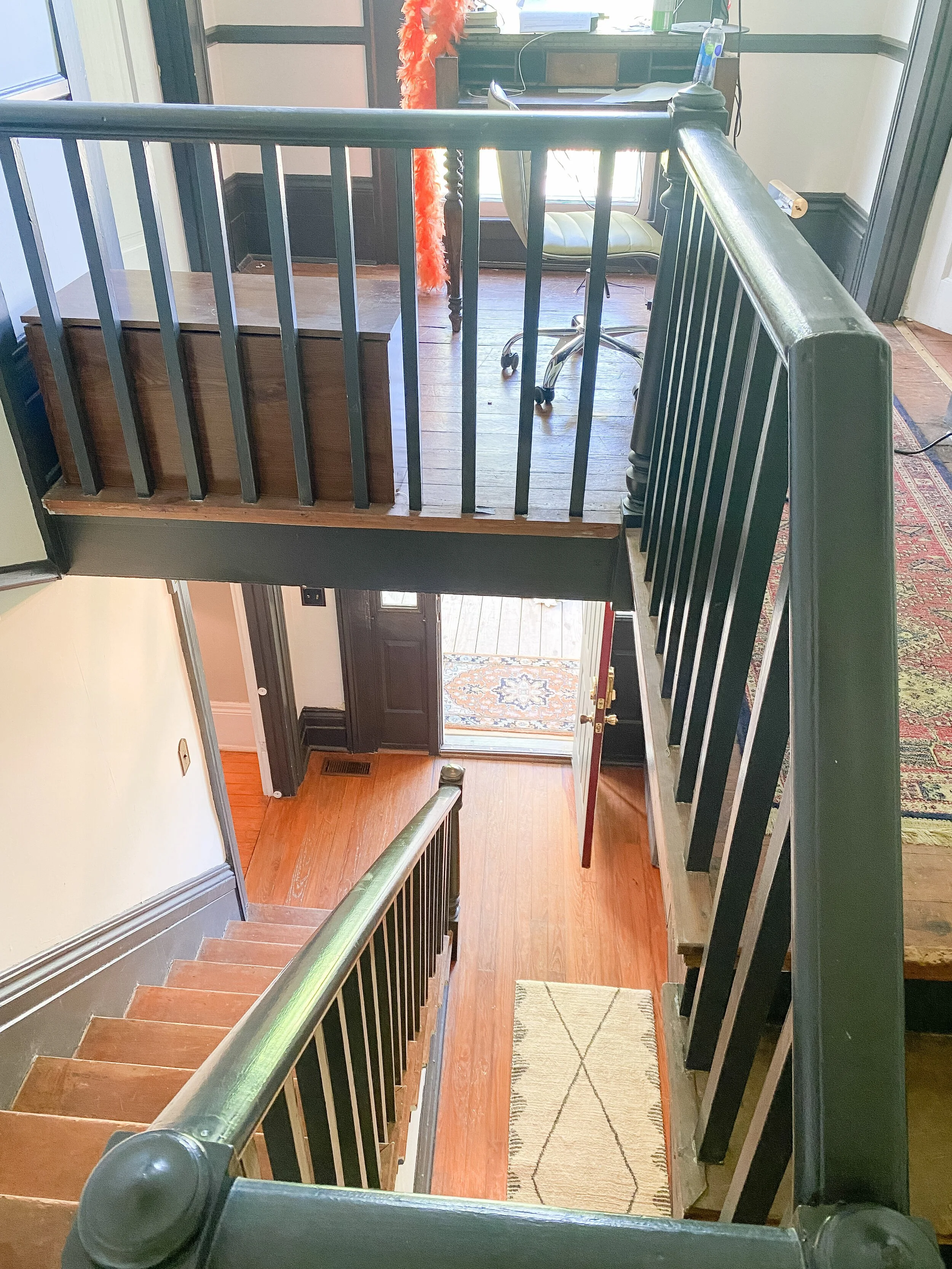
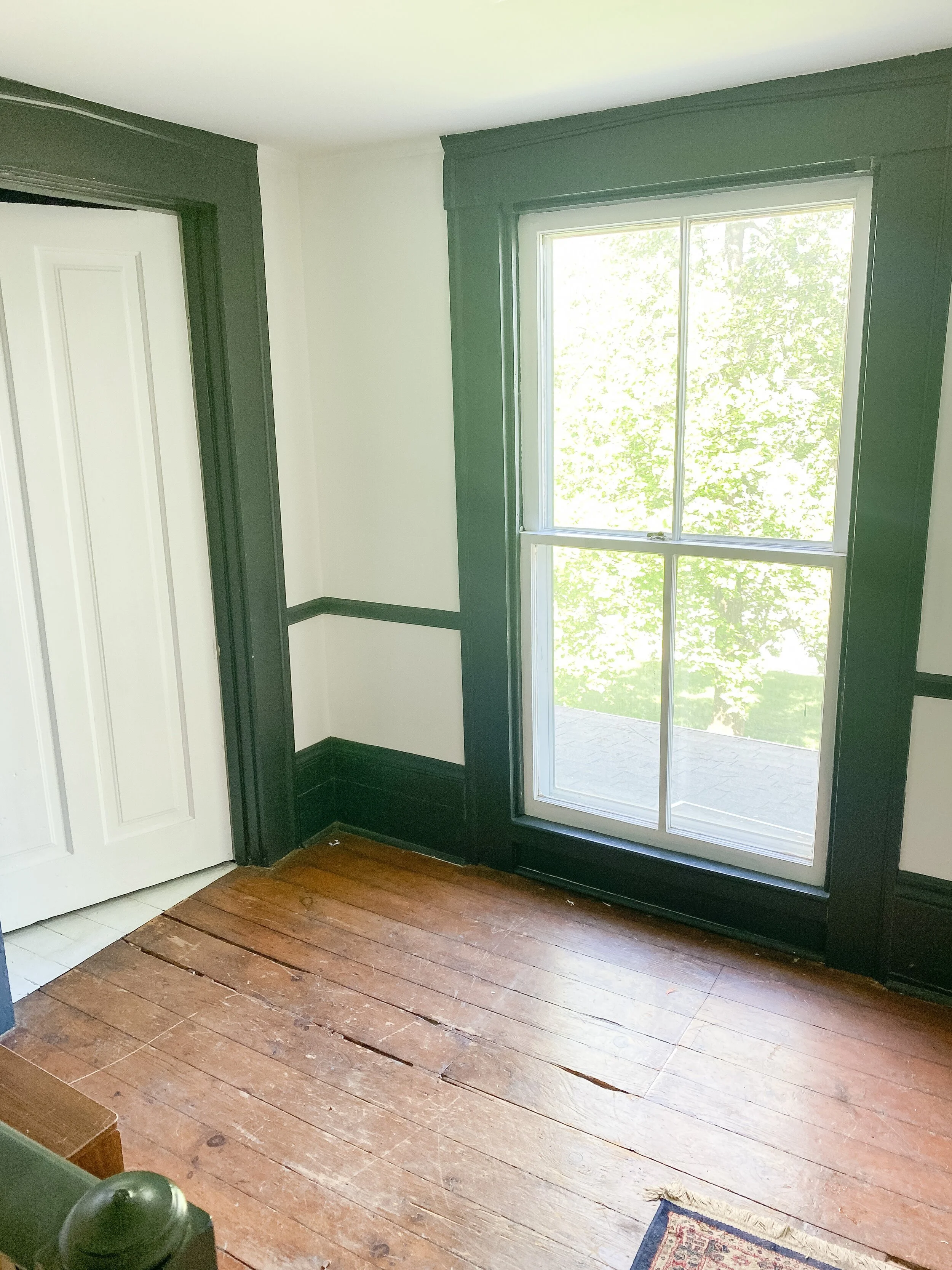
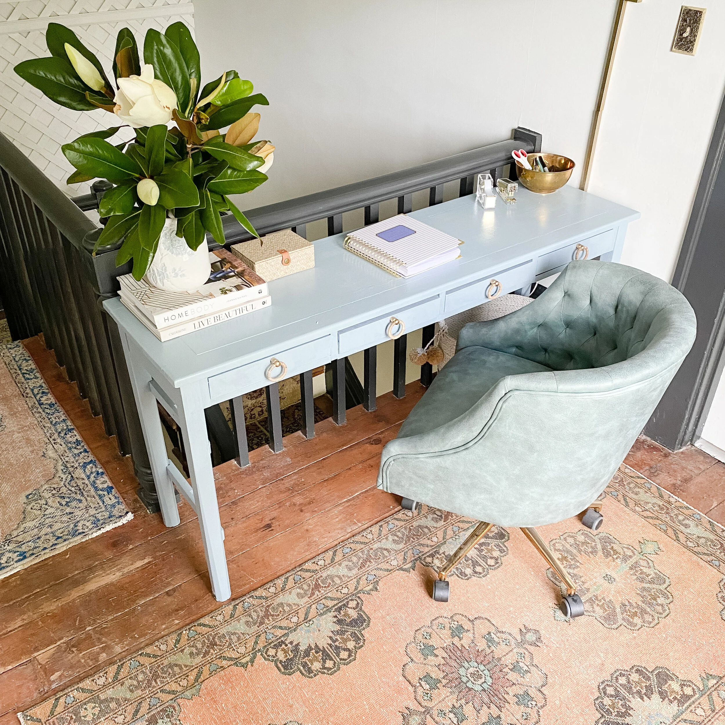
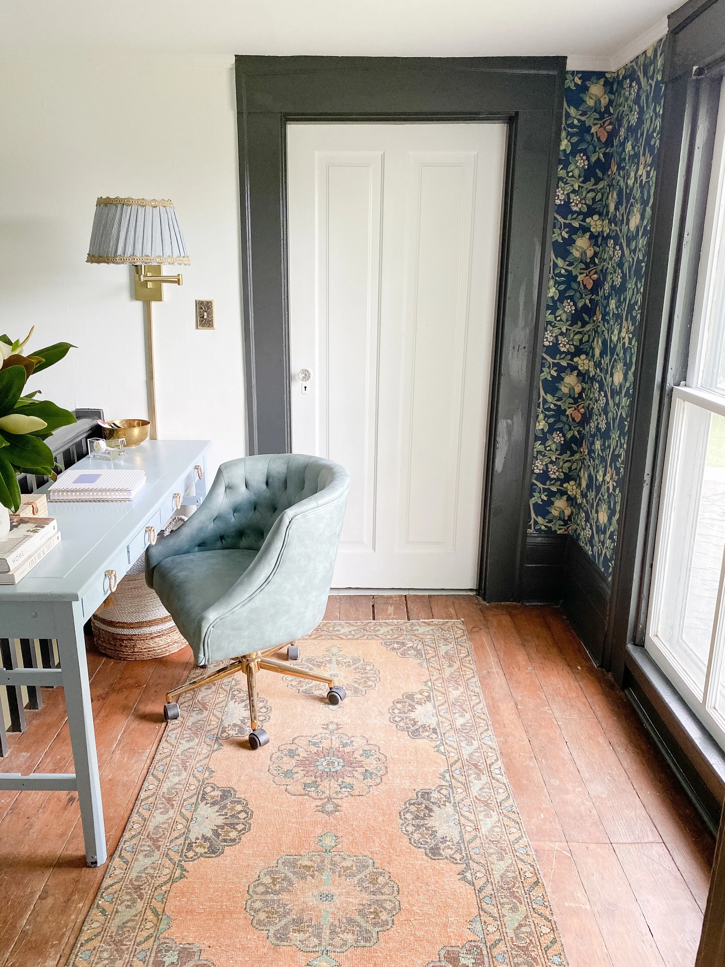
I wanted to maximize every little nook of this entryway space and the upstairs landing had never been used for anything but leftover random furniture. During 2020, Alex had actually set up a temporary desk space up here as he was working from home more, and we really ended up liking the idea of having a workspace here. Safety wise, it also made sense to have something like that up against the stair banister, as opposed to a chair or bench that JW could crawl on.
This came together pretty easily- I put down a rug to protect the floors and add a little color, adding a desk that fit the space perfectly, and a rolling chair. The “desk” is actually a console I was using downstairs in the entryway but the size was perfect for what I needed up here- it fits the length exactly but isn’t too deep to where it blocks off the space. I gave it a fresh coat of paint in Evening Eclipse by Valspar and added new knobs from Hobby Lobby. We also switched out the flush mount fixture up here to something a little more modern and I added a sconce to the wall beside the desk that can be pulled out and adjusted as a desk light. I DIY’d the pleated lampshade using cloth napkins as fabric, a glue gun, and some trim to make it a little more custom looking!
I eventually want to do some simple built-in shelving on each side of the window which will really complete the space too and provide a little more storage. I love being able to maximize this space at the top of the stairs though and we’ve already been working here often!
Desk- The Domestic in Lexington
Rug- Scout Antiques and Modern in Lexington
Knobs- Hobby Lobby
Wallpaper: Wallpaper Direct
Light Fixture: West Elm
Desk Chair: Wayfair
Sconce: Amazon (fabric for sconce here; trim from Hobby Lobby)
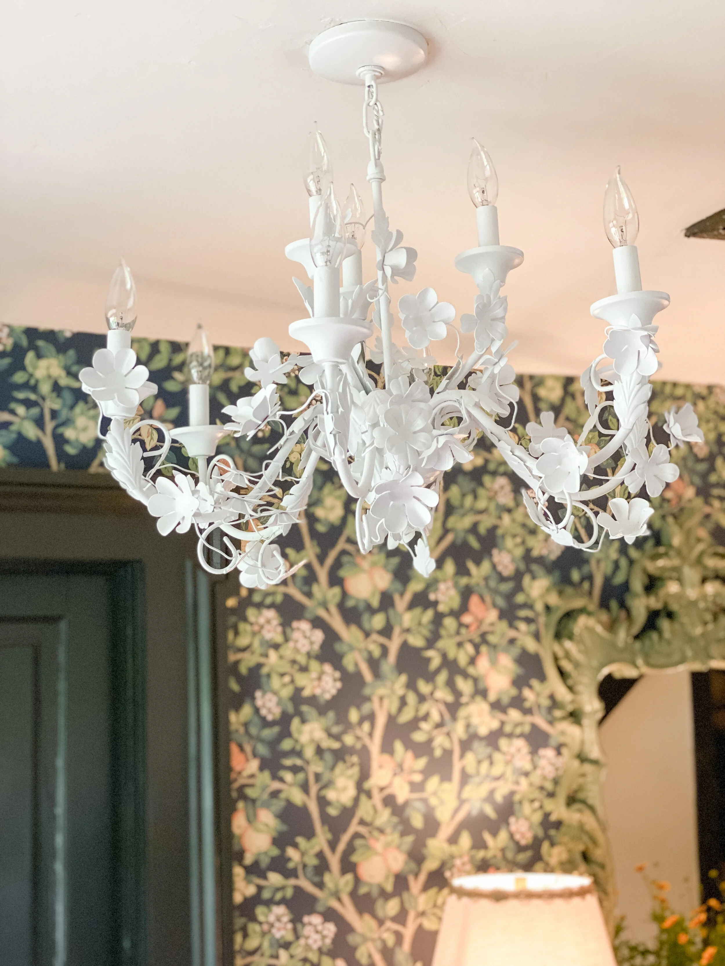
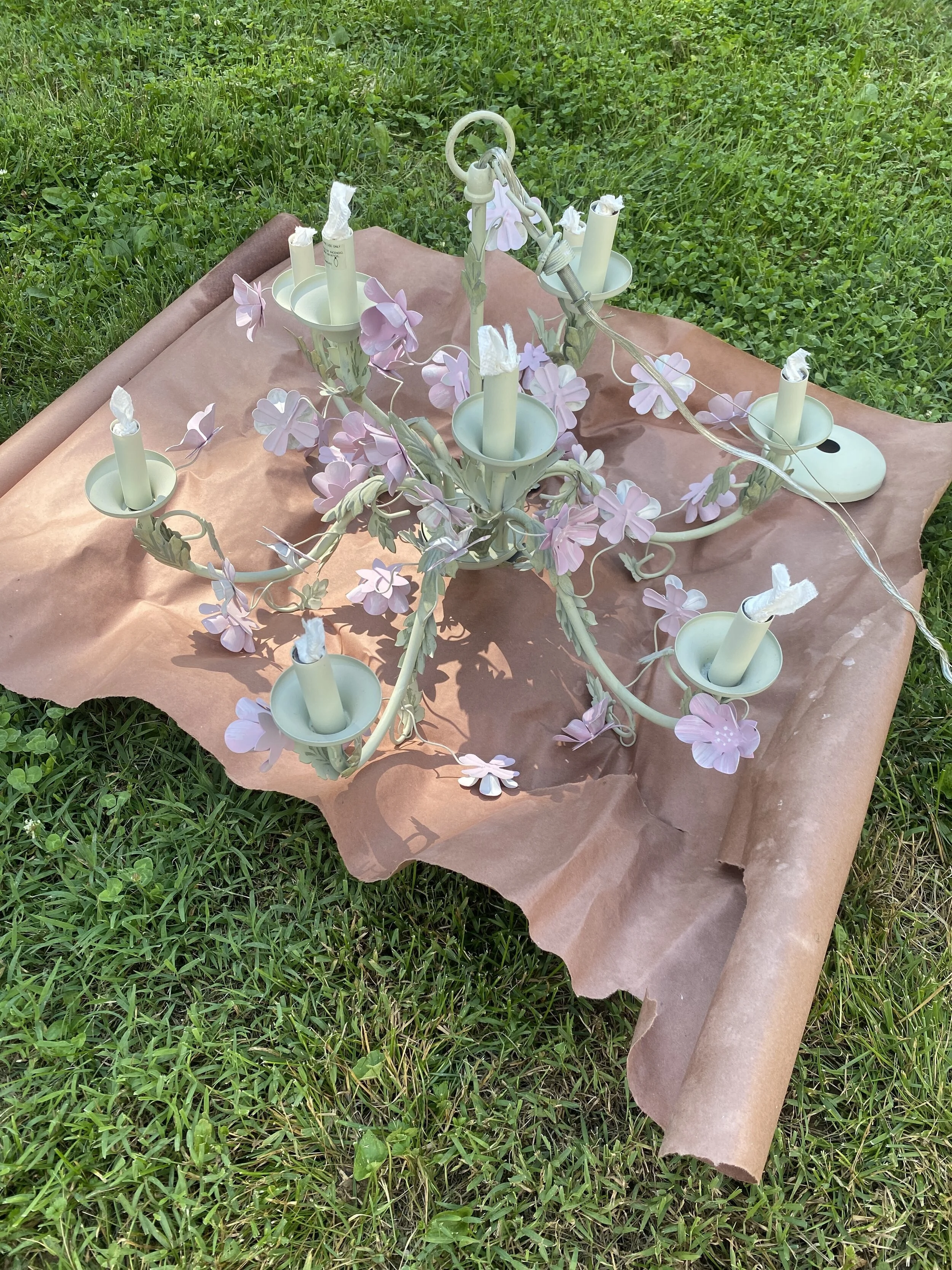
All the lighting throughout the space got updated including the ceiling lights and lamps. Downstairs I wanted more of a statement light fixture at the entry. I was looking at several vintage and antique floral options on Etsy and then happened upon one on Facebook Marketplace for 1/4 of the price AND it was local! I got the light fixture for $50, and while it looked more like a “:little girl’s room” light at first, I could picture how chic it would look painted all one color. I gave it a couple coats of white glossy spray paint and it was perfect! I wanted to add some more bright white downstairs to bring in the white from the lattice wall upstairs.
Light Fixture BEFORE
I had been saving the two vintage green lamps that are on the console downstairs and I loved how they matched and popped against the wallpaper colors. I got two empire style shades for them at Lowe’s and added some trim from Hobby Lobby to the top and bottom edges.
I used the same trim on the lampshade on the sconce upstairs too! As mentioned above, I DIY’d this custom lampshade using cloth napkins as fabric and a glue gun. I just glued the edge and about one inch of the napkin to the lampshade, then would create a pleat by folding the fabric back, glued the fold down, then repeated all around, to create the pleated look. It was very easy (although I did burn myself with the glue gun a few times!), but you will use a lot more fabric than you expect to get the pleated look! I think I ended up using about 4 of the napkins, but they came in a pack of 8 so it was perfect!
Upstairs we also updated the flush mount with a new more modern light from West Elm that I love! It’s so simple but adds so much to the space and I love that it hangs down a little lower than our old light.
Be sure to follow along here to see all the One Room Challenge posts in one place! You can also follow the hashtag #oneroomchallenge on Instagram to discover all the projects and progress !

