Our Fixer Upper: Living Room Before + After
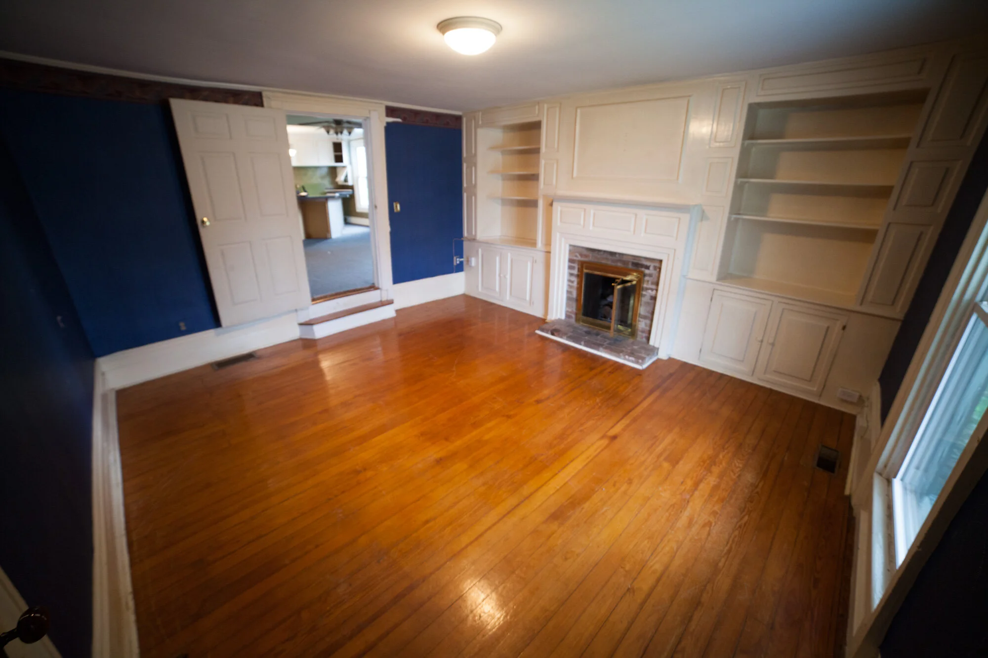
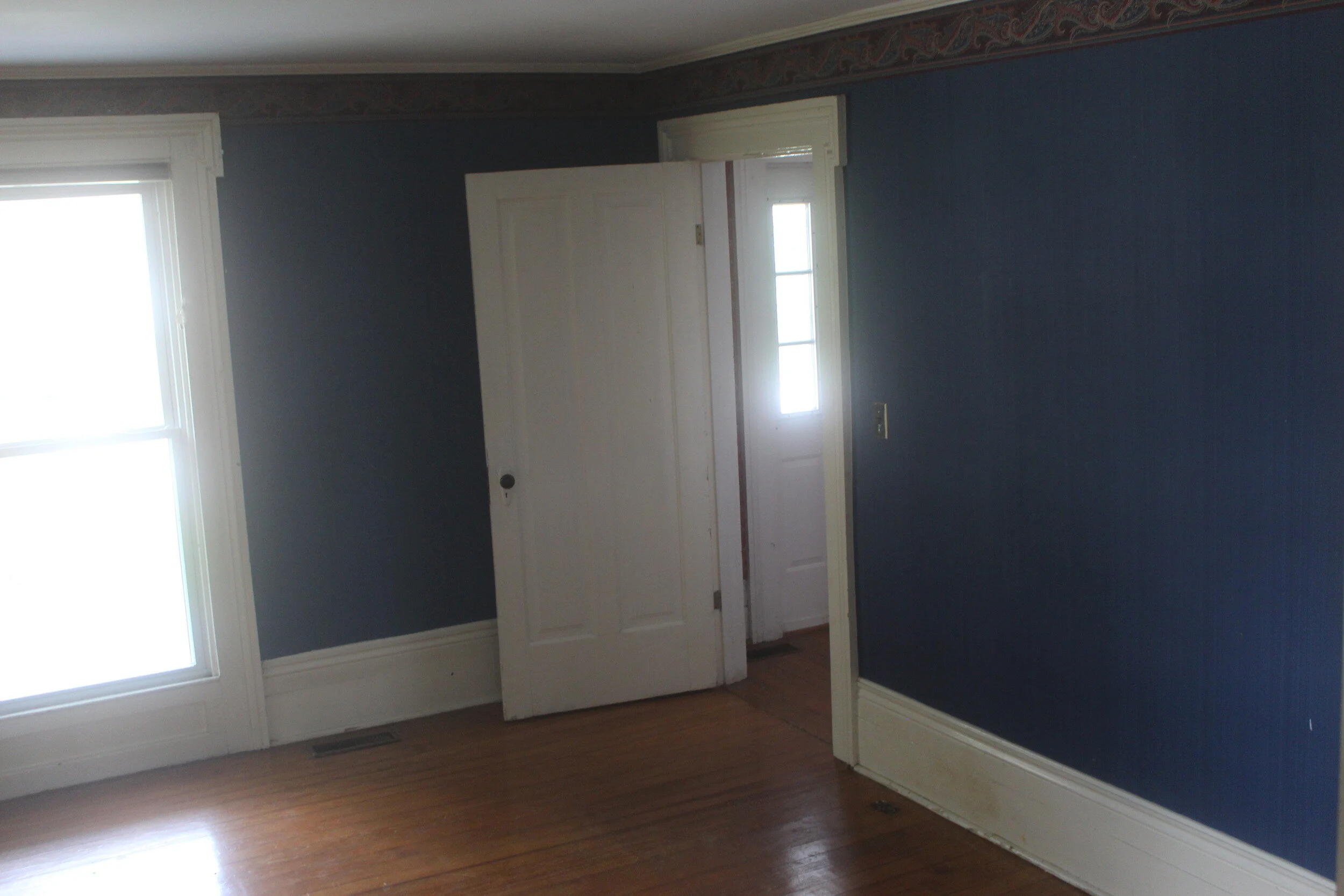
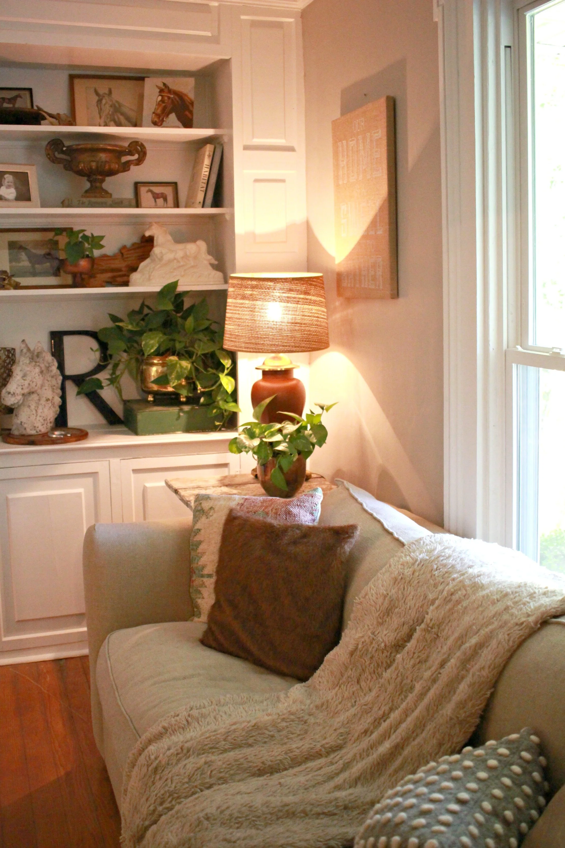
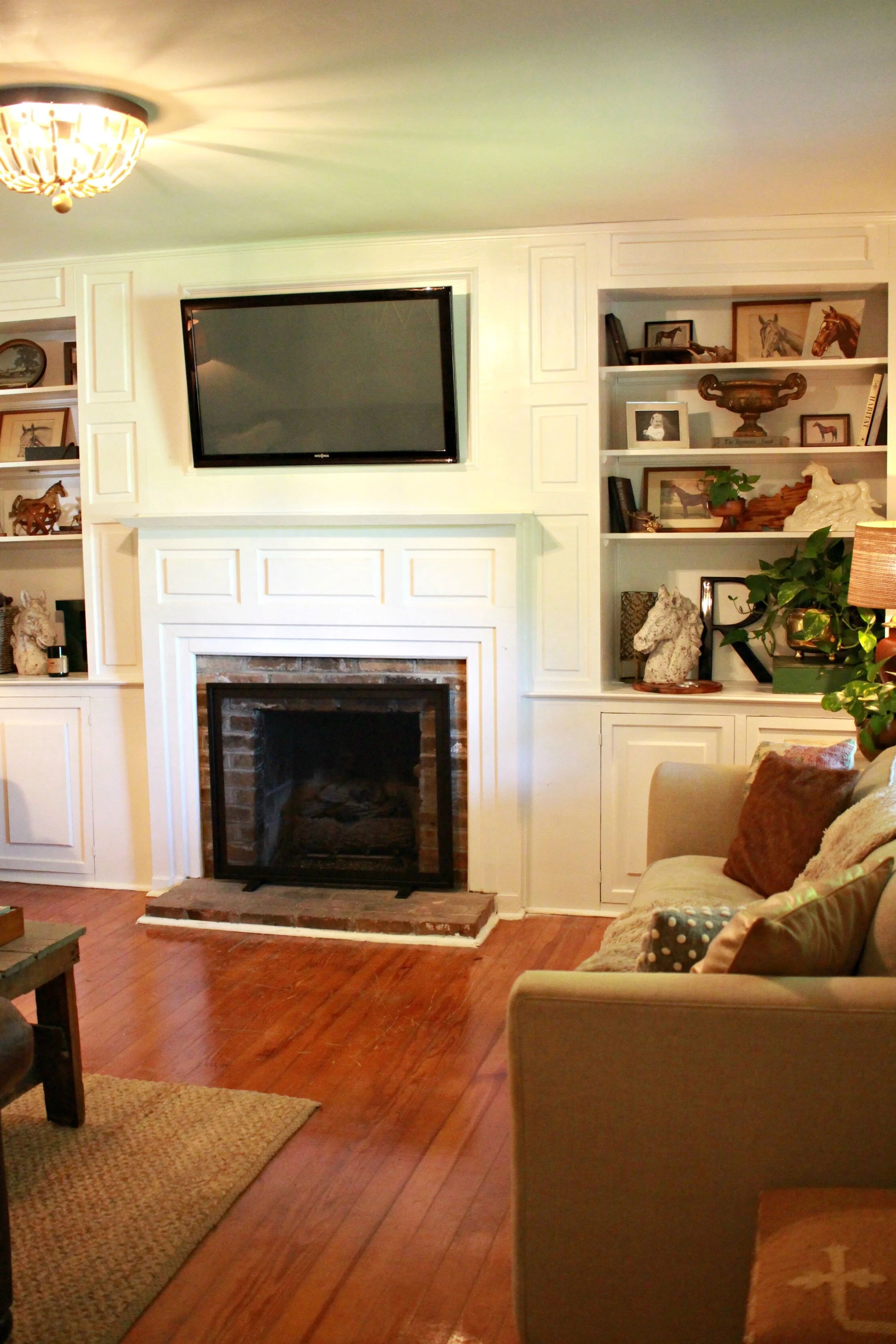
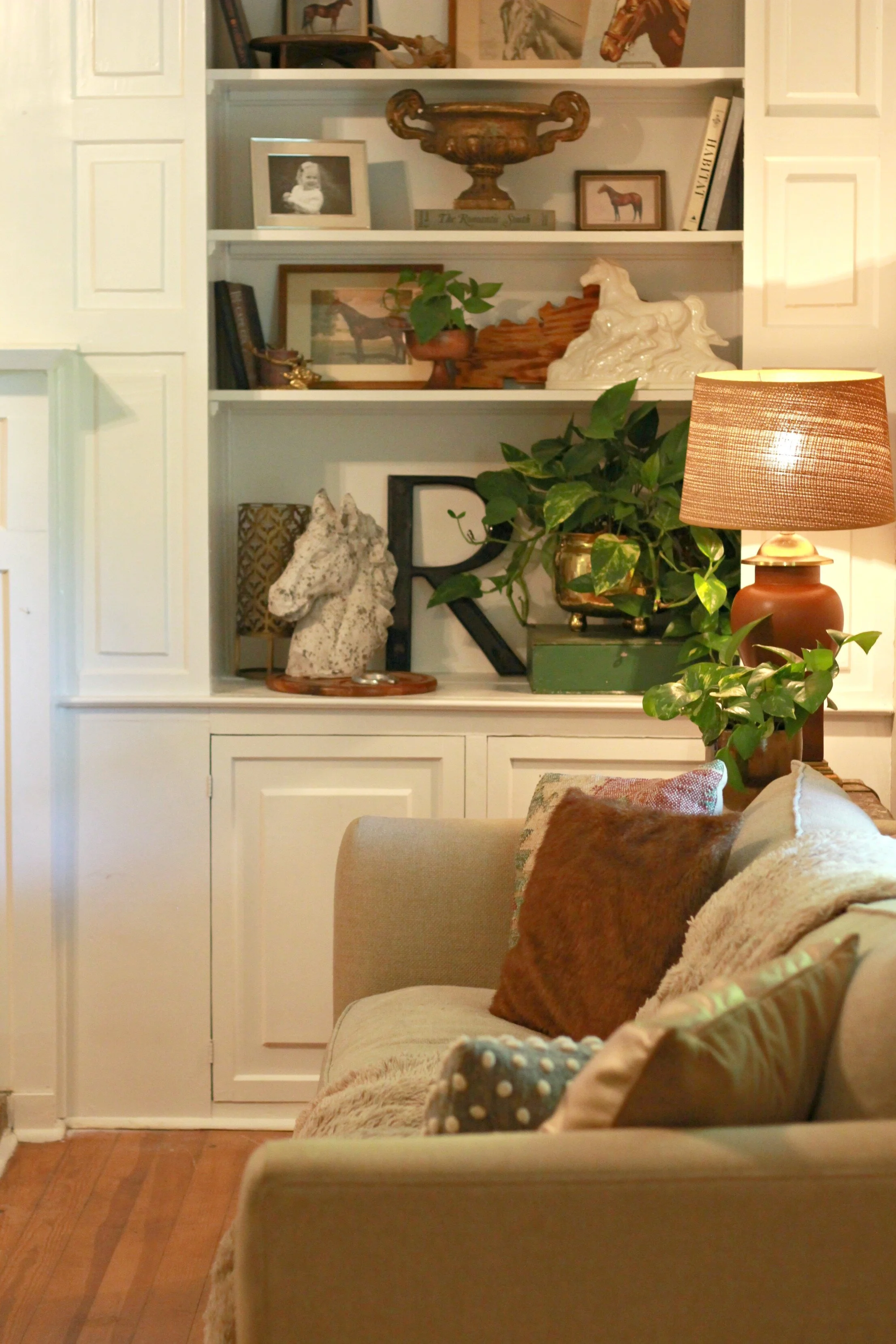
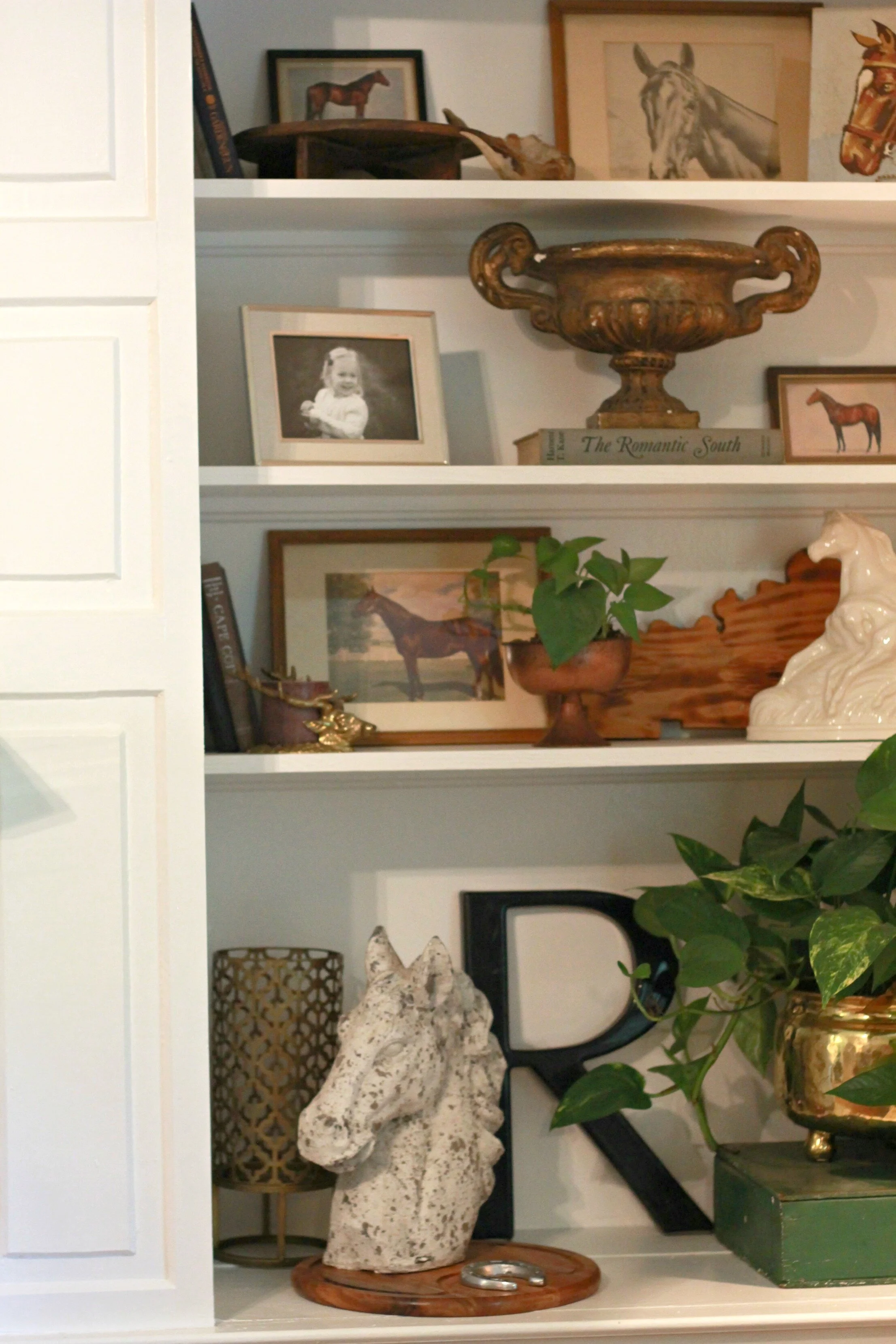
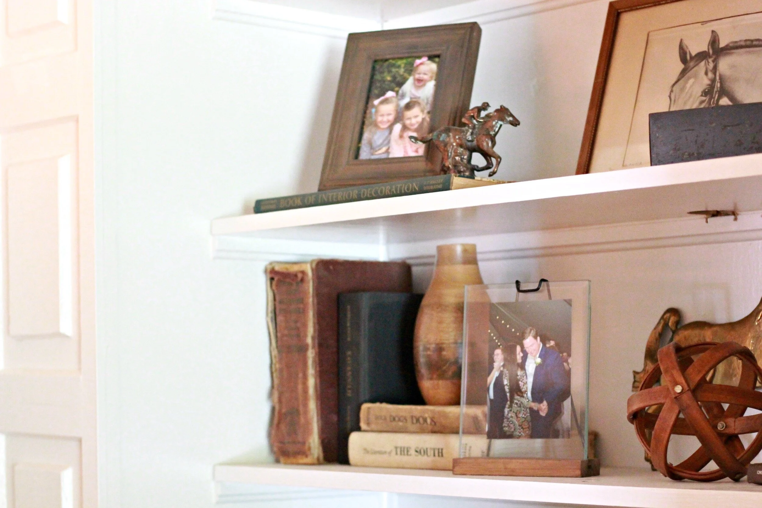
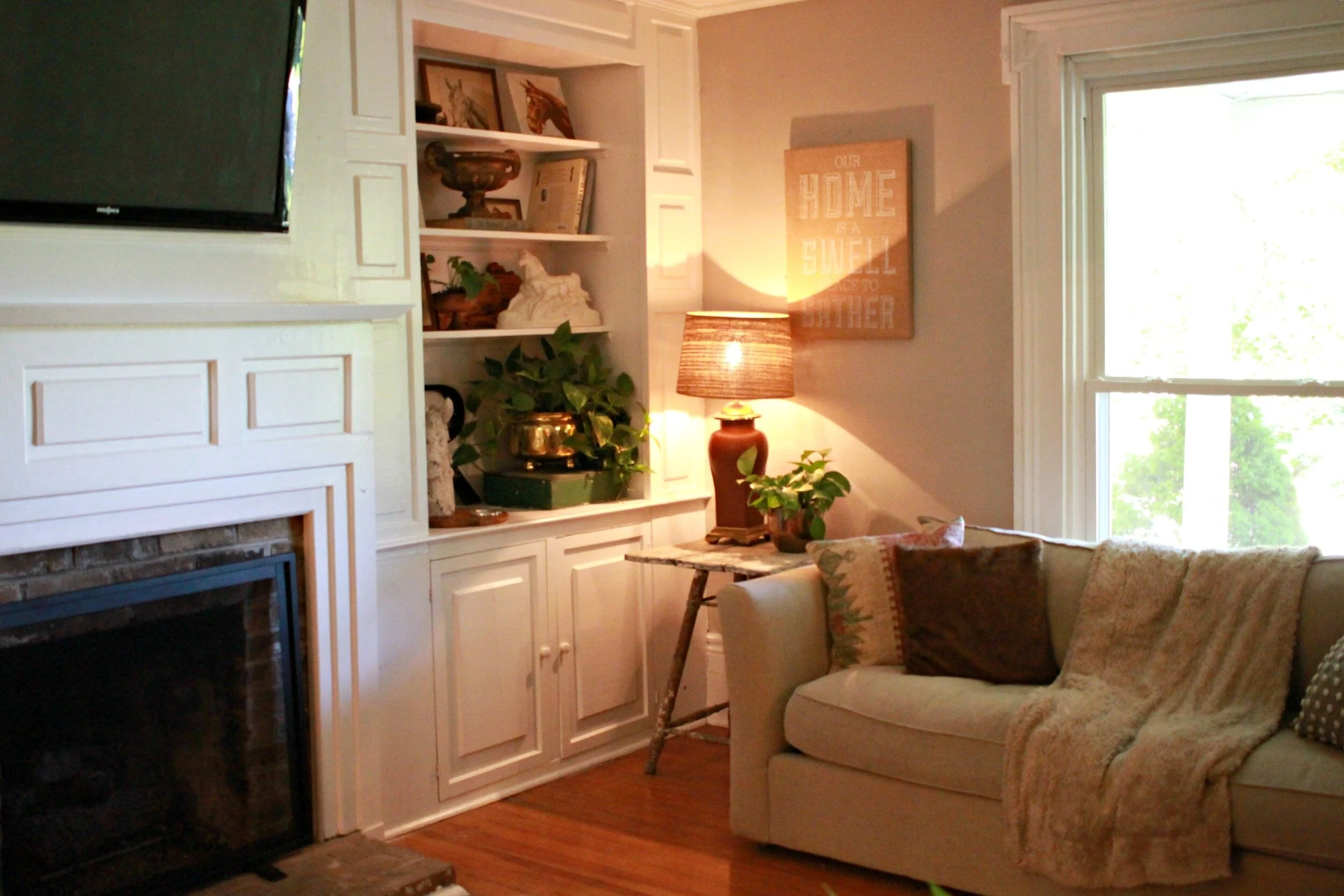
The next room up on Our Fixer Upper before/after reveal was actually a relatively easy project, which is hard to come by in this 100 year old house. Our living room came together very easily and most of our furniture and decor from our old living room worked just perfectly in this space. It is the perfect size and feels so cozy and I am loving having these built-ins to style and decorate. You can take a look at what our living room looked like before renovation below:
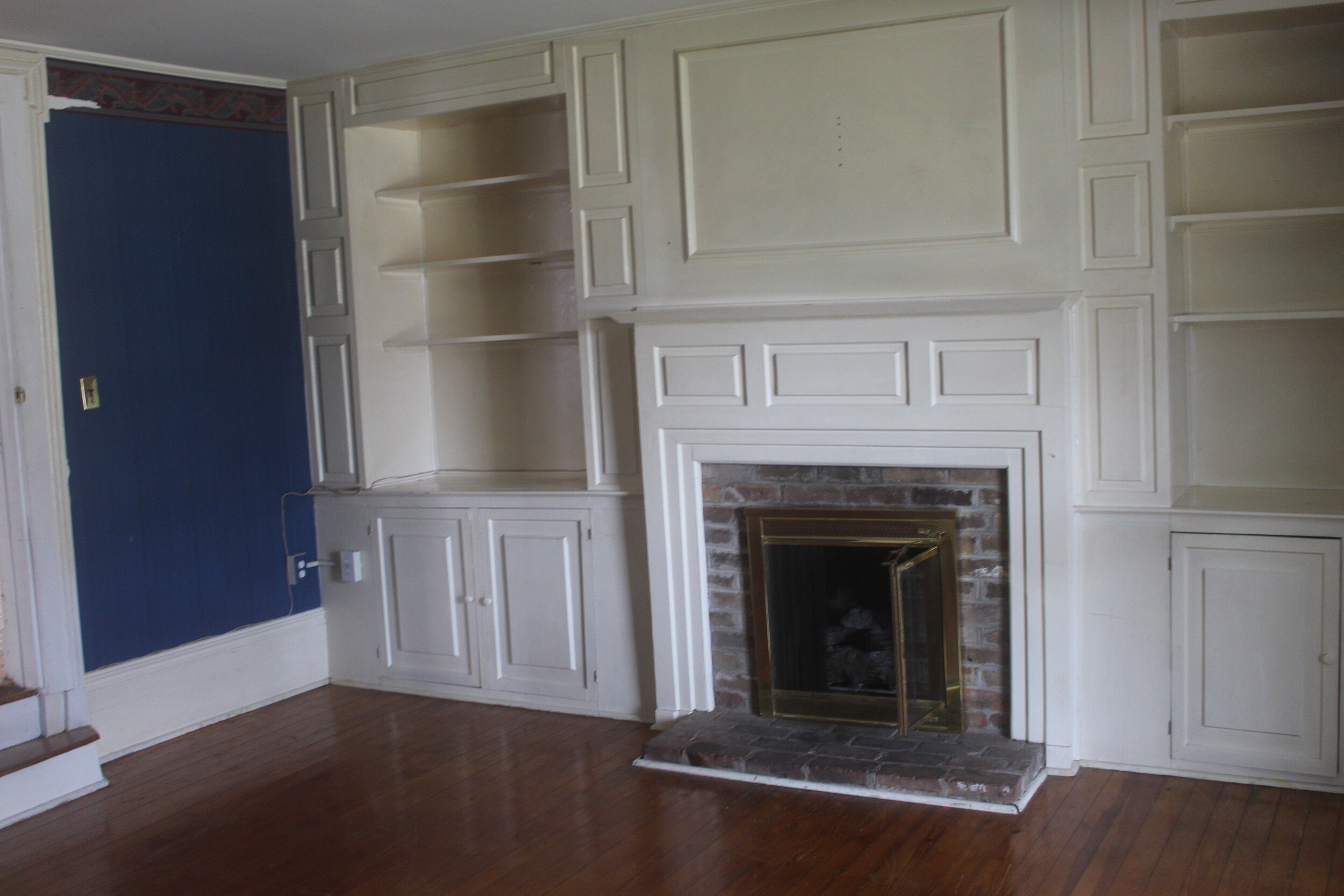
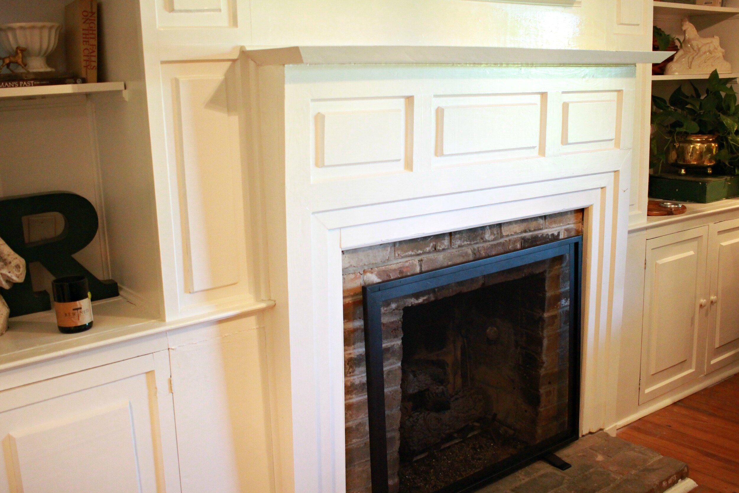
It's hard to tell from photos but the biggest change that needed to happen in this room was the trim and built-in paint. They were an off-white but the combination of that color and the age of the paint was making the built-ins look old and dirty. We were thrilled to have original hardwood floors in this room so this is one of the few spaces we did not have to worry about flooring for.
I ended up removing both of the doors on the separate entryways into this room just to open up the space a bit more. I don't think we will ever have the need to have this room completely closed off and they just made arranging the furniture a little more difficult.
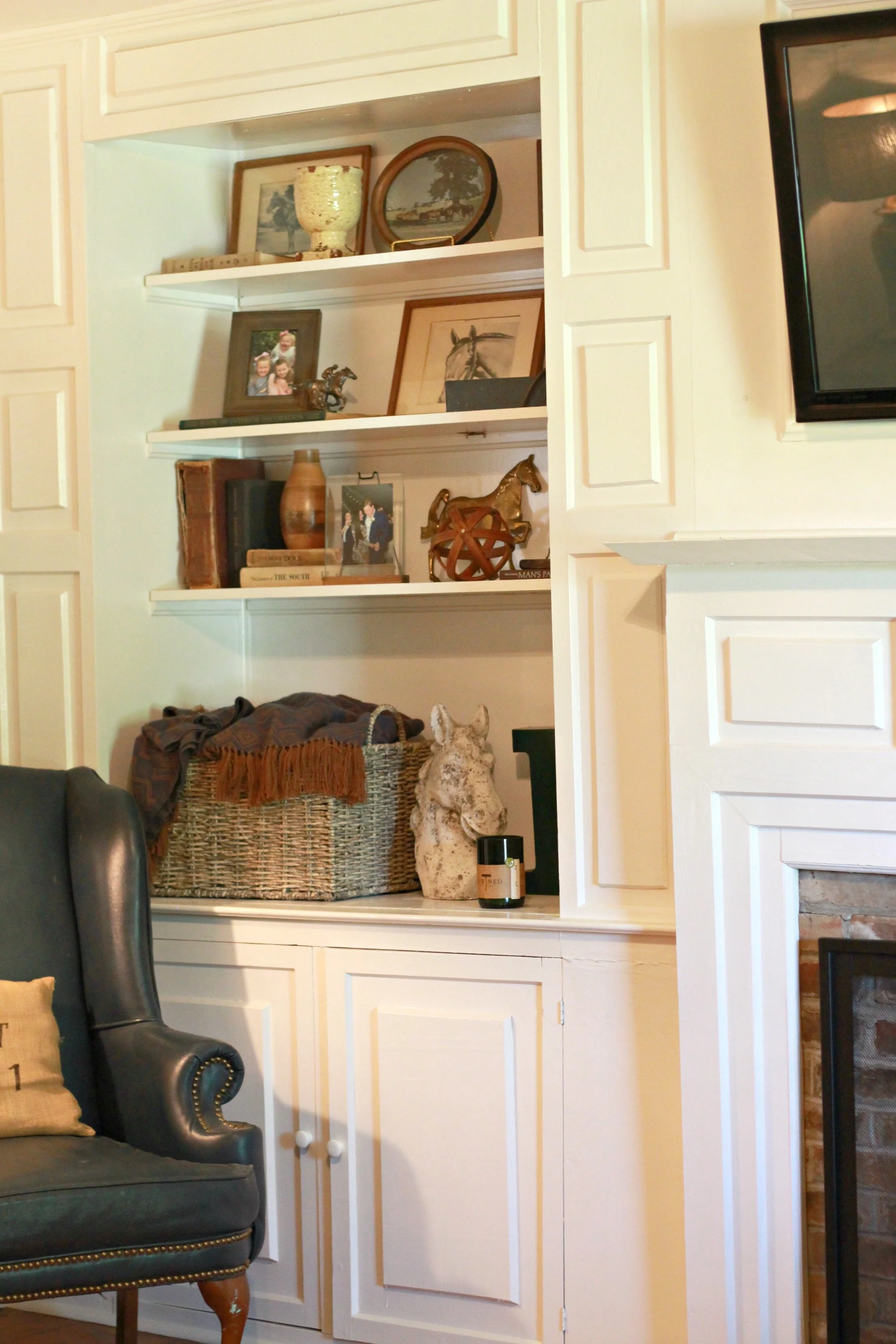
We also removed the old brass fireplace insert that was dating the entire fireplace. For now I just have a simple fireplace screen but I am contemplating maybe painting the brick in the future.
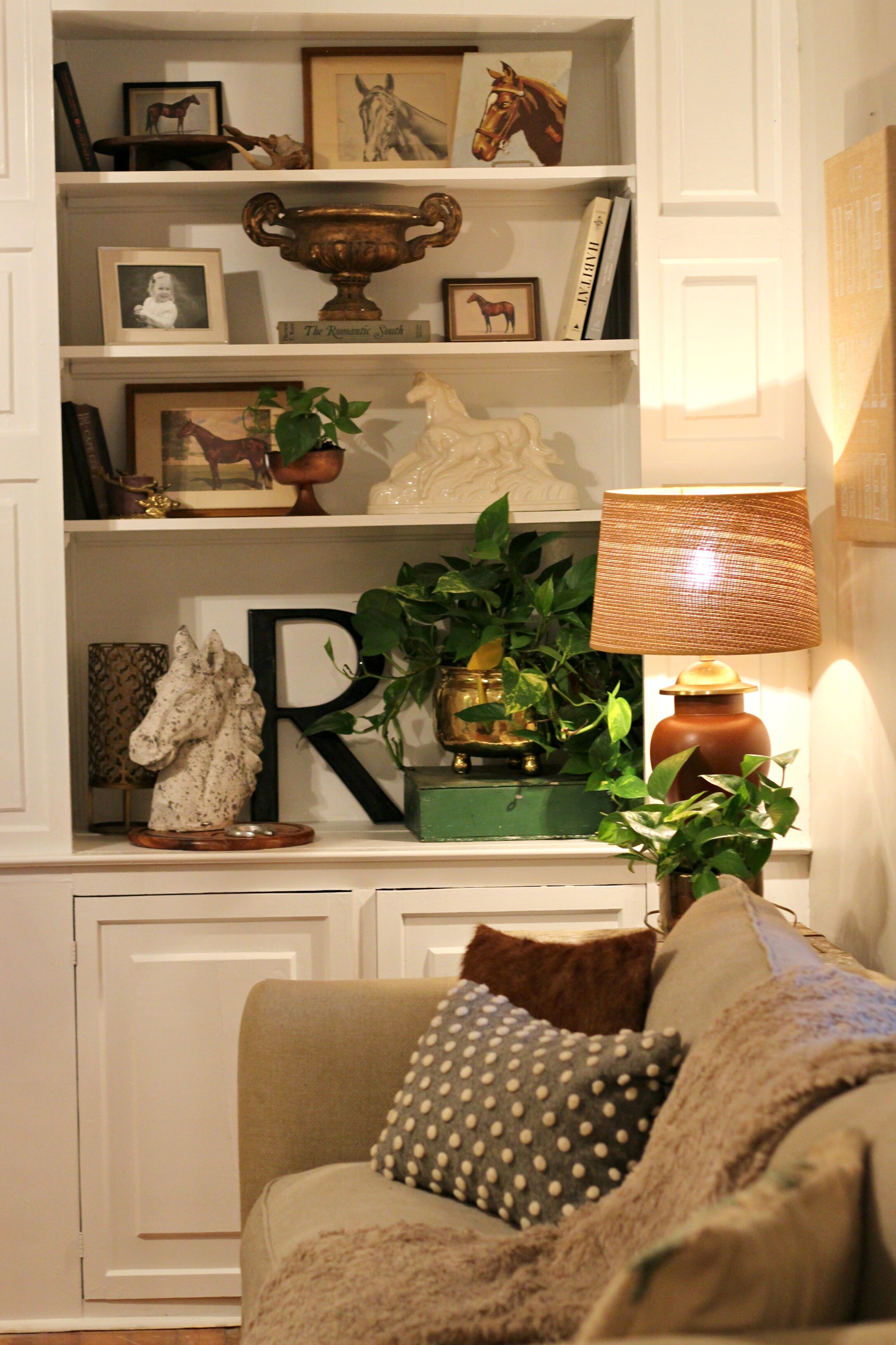
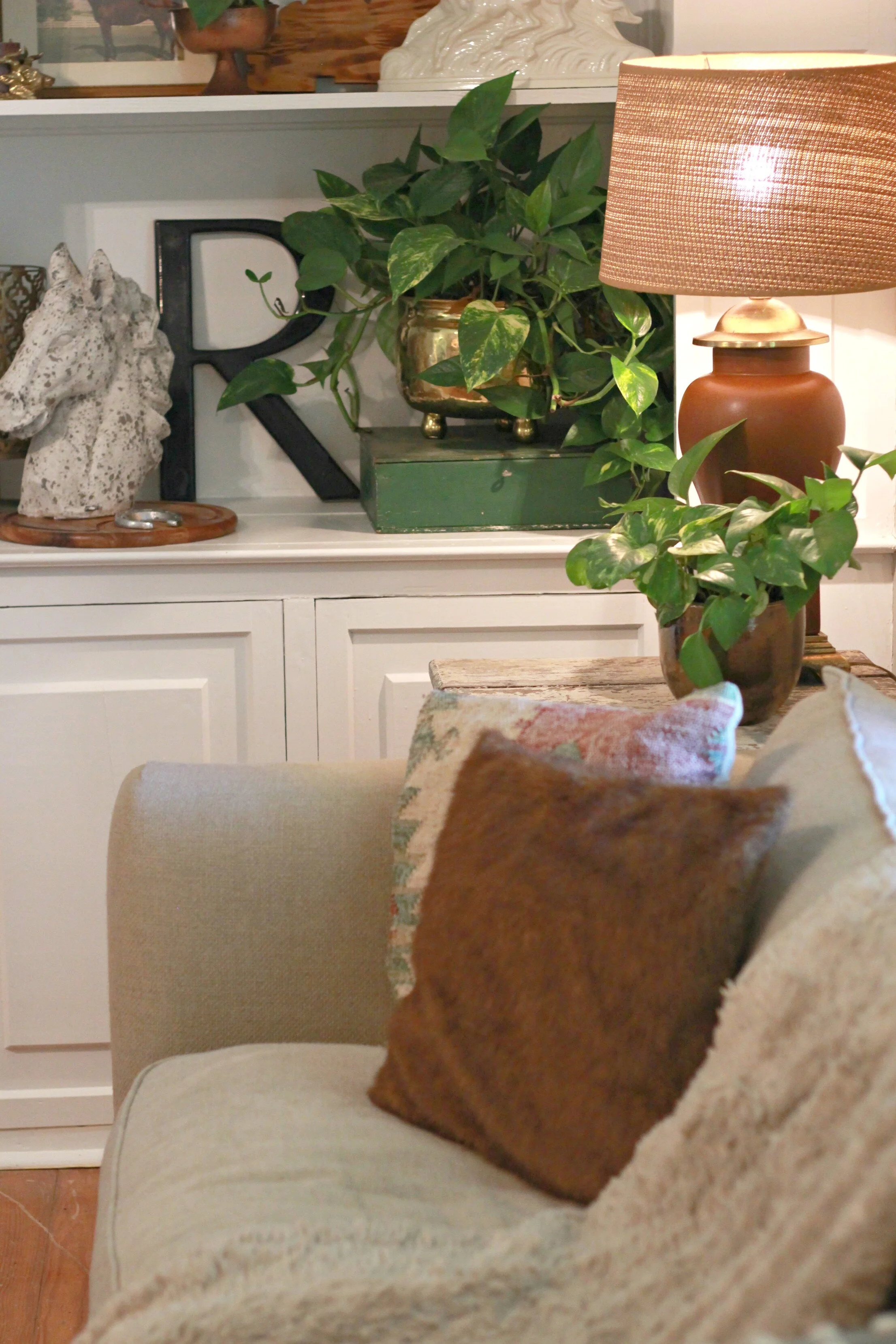
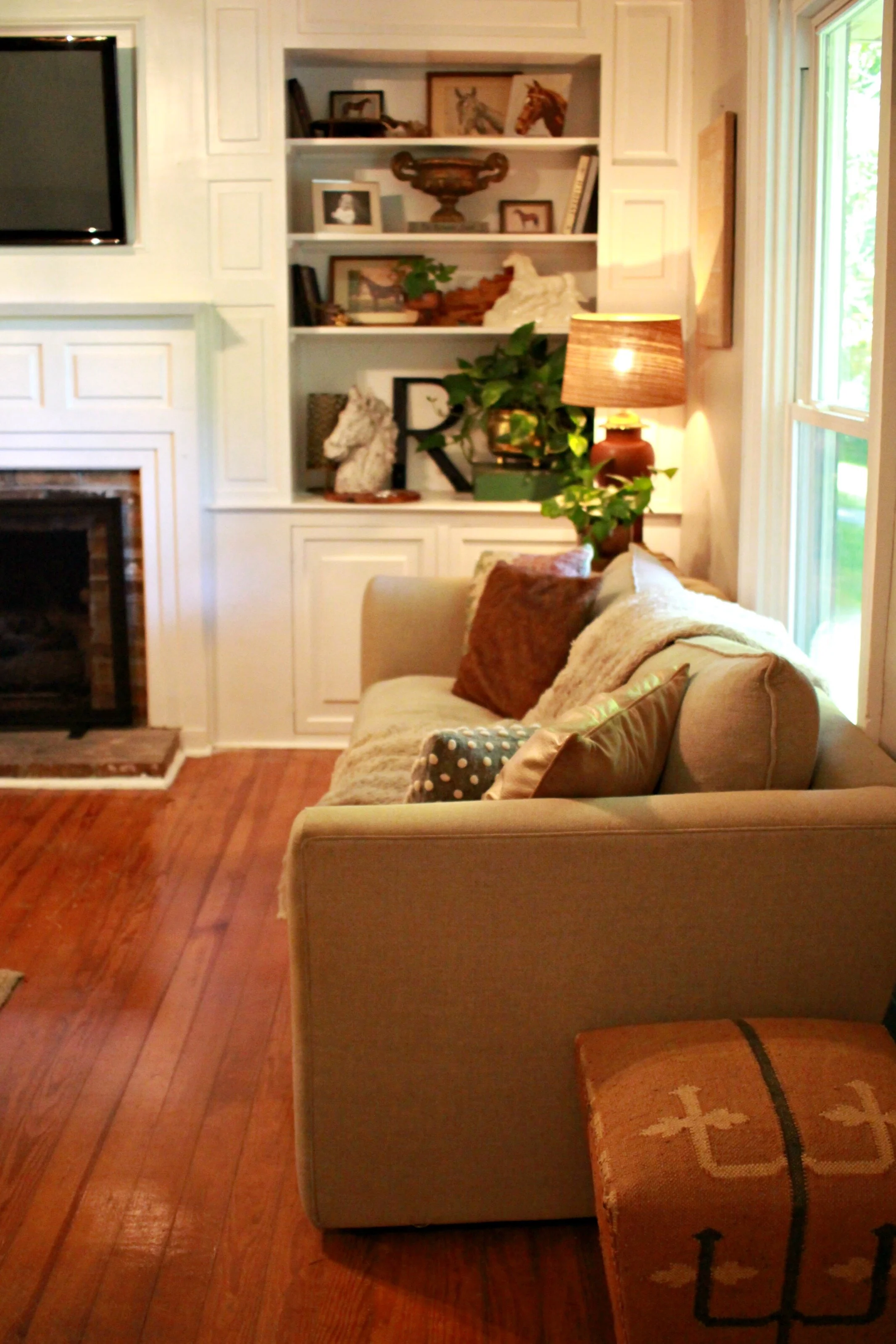
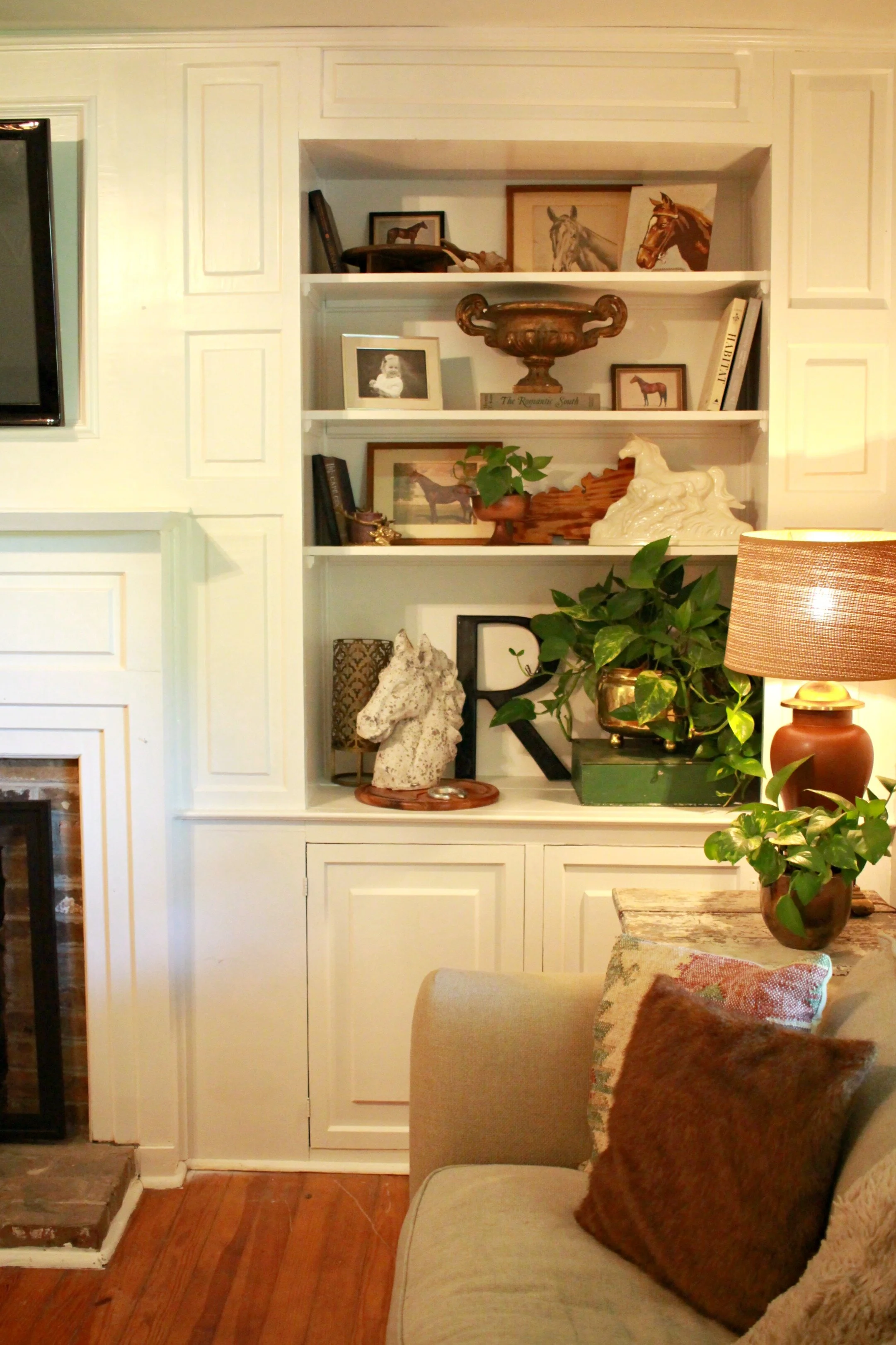
All the built-ins and trim were painted bright white and it really made SUCH a big difference in the space. Now the room feels much cleaner and more modern. I love all the detail and moldings on these original built-ins too! Eventually I would like the paint the back of the shelves a dark gray just for extra contrast but for now they are fine all white.
The other big change in this room was the light fixture. There was an 80's style flush-mount here before and I was determined to find a more stylish flush-mount light that fit with the style of my decor. I was thrilled to find this light fixture on Wayfair that has the look of a rustic wood-bead chandelier but in the flush-mount style. It was even under $100 and it looks even better in person- super high quality and a good size too. I think it is just the perfect light fixture for this space!
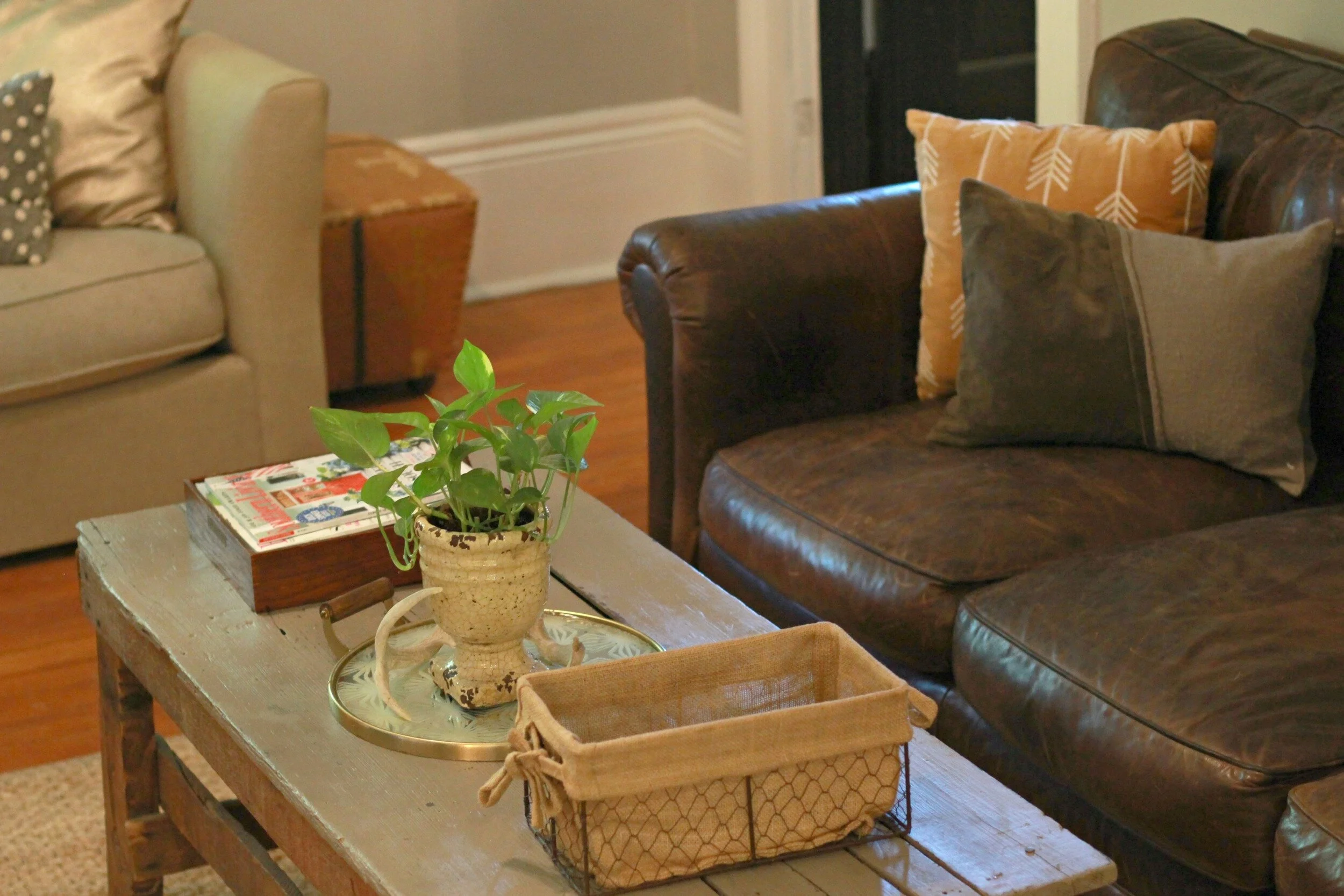
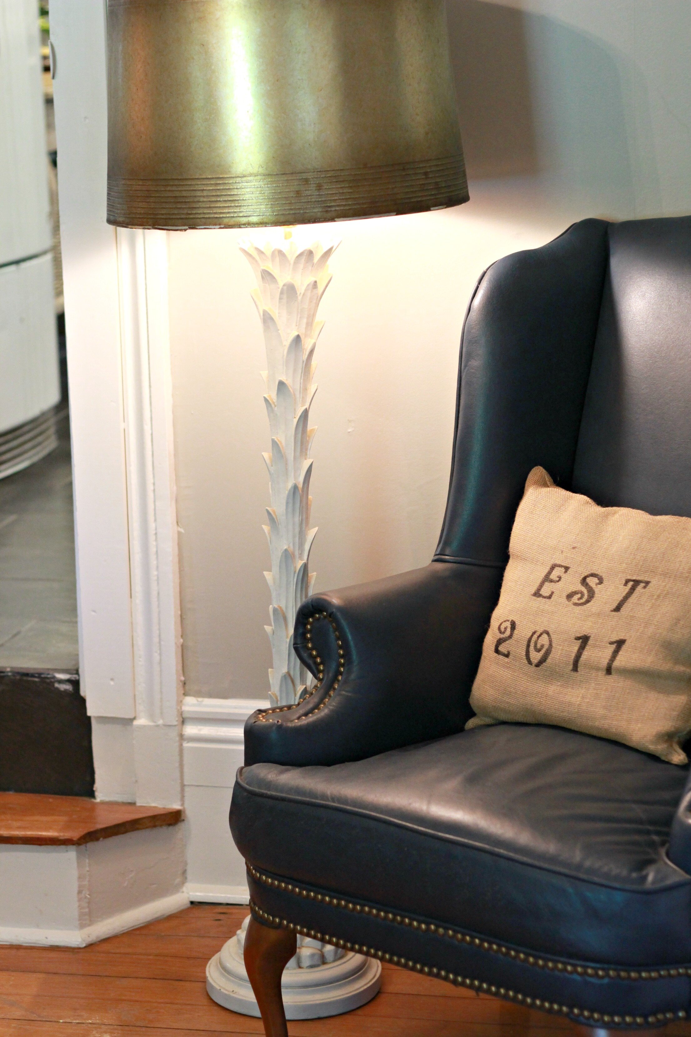
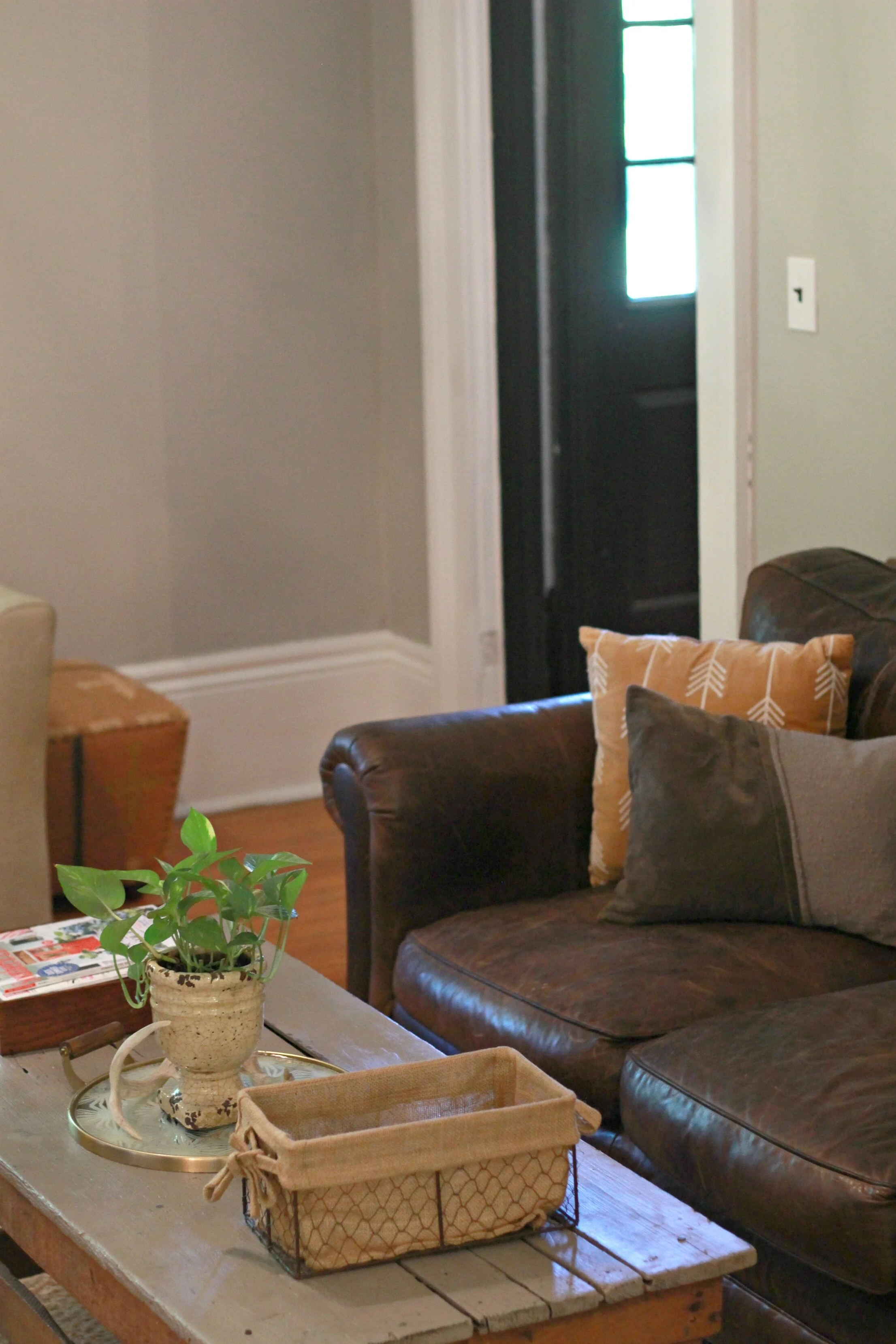
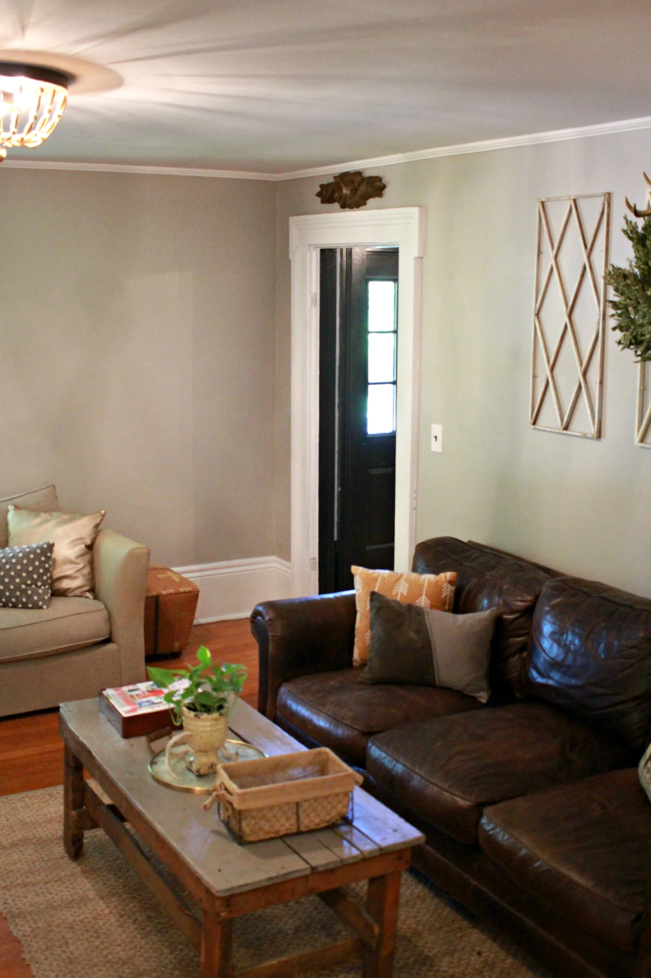
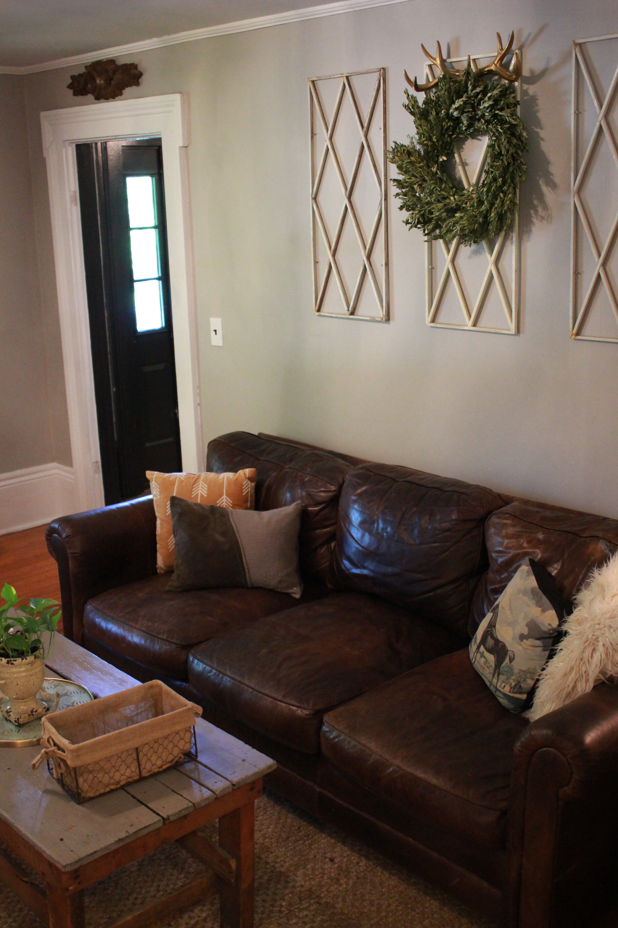
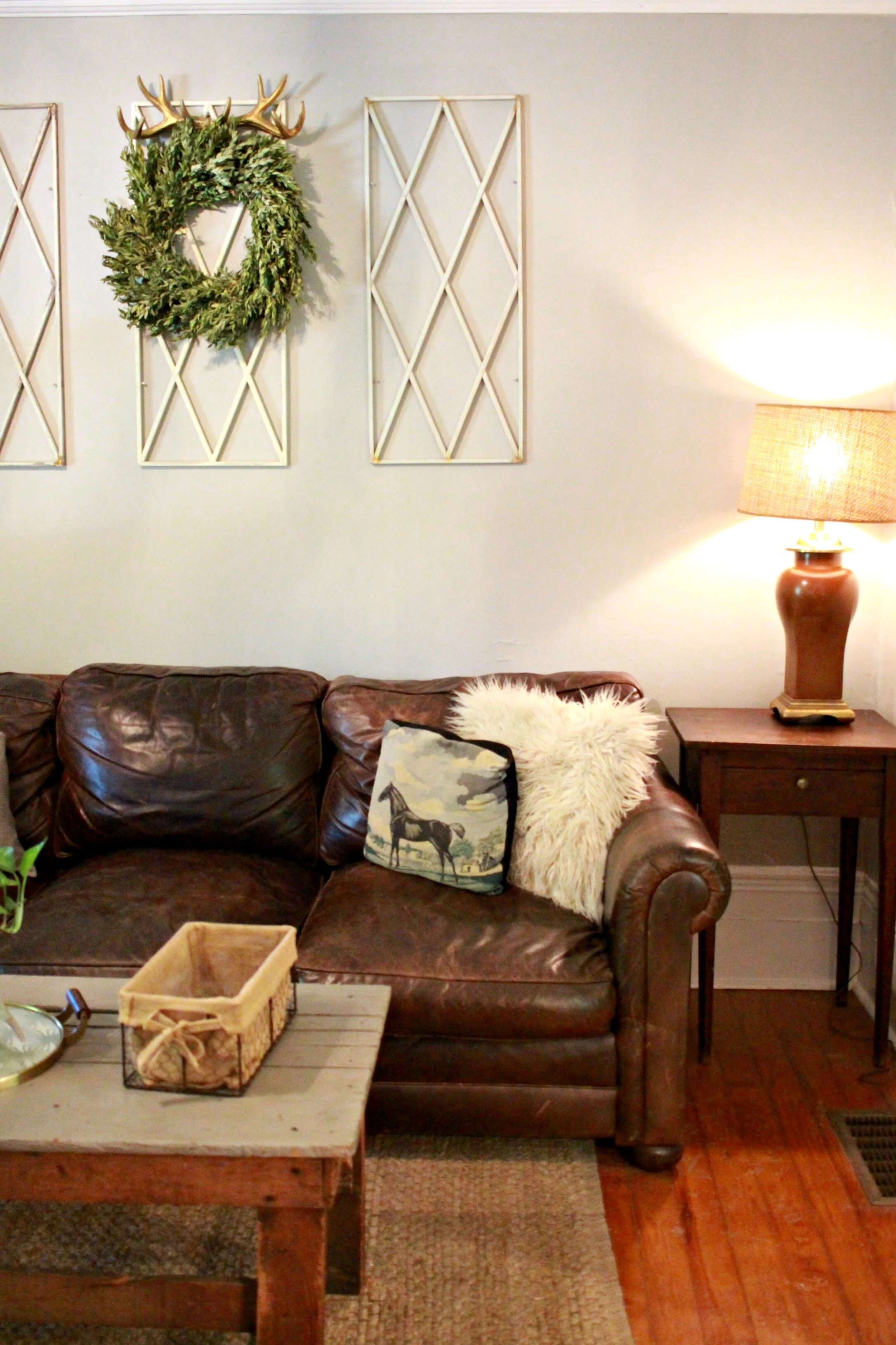
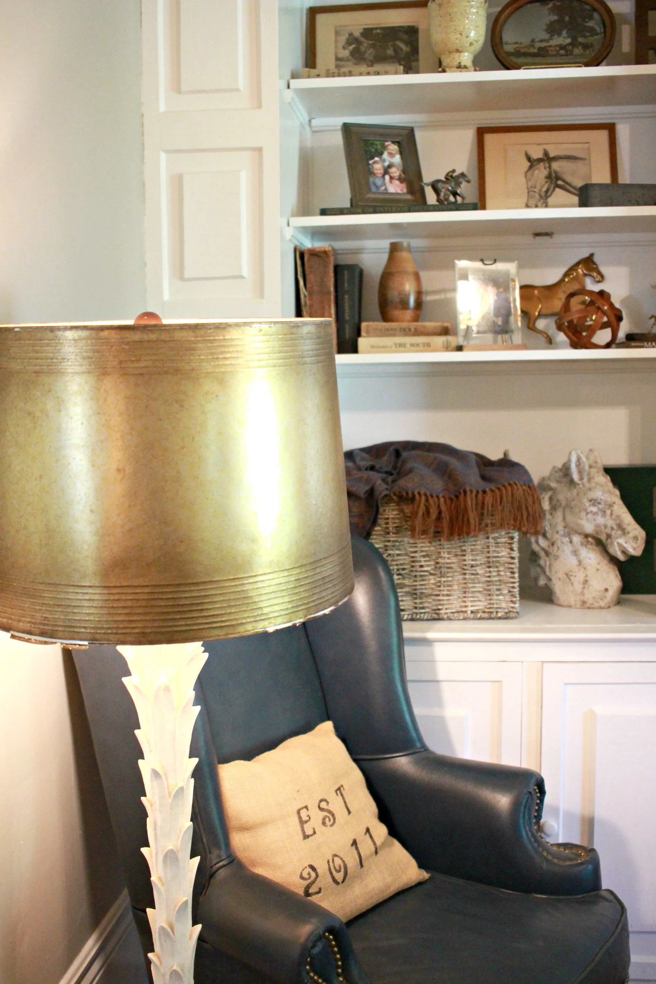
Besides those two elements, the rest of the room just came together so easily. I was worried about our couches/coffee table being too tight in the space but they ended up fitting perfectly and we even have room to add a chair in the corner. I put a navy leather wingback there for the time being but would like to get something more neutral and petite, maybe with some pattern. We had the television mounted above the fireplace by a local company, TDO Home Entertainment, who did an amazing job and was able to hide ALL the cords (one of my pet peeves). We got lucky that the size of television we already had just fit perfectly into the molding that was already above the fireplace.
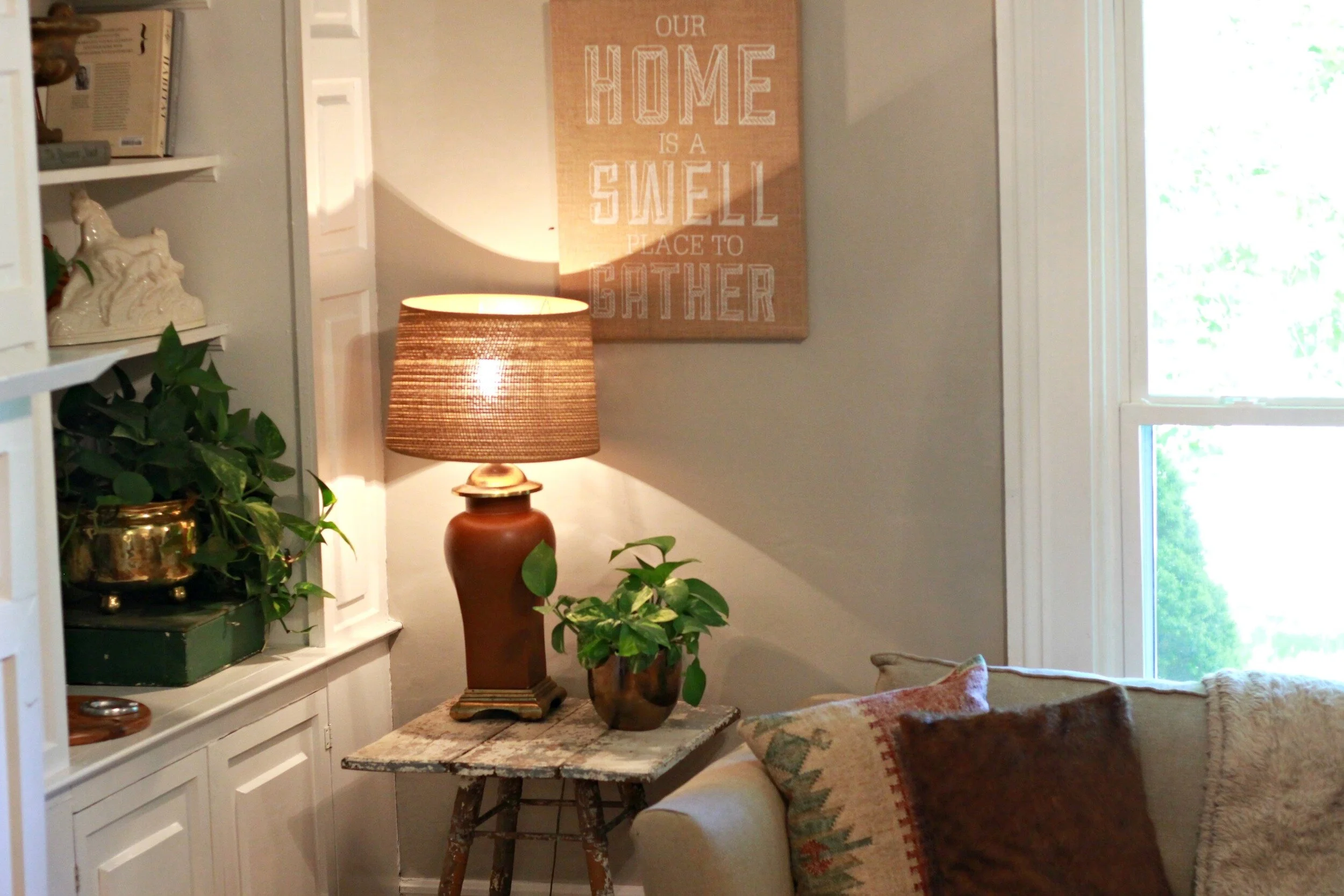
I still have a few more pictures to hang on the walls but overall this room is pretty complete and feels like home! Can you imagine the decorating that will be done on all these shelves come Fall and Christmas?! I can't wait!
xoxo
Emily

