Downstairs Half Bath: Before + After
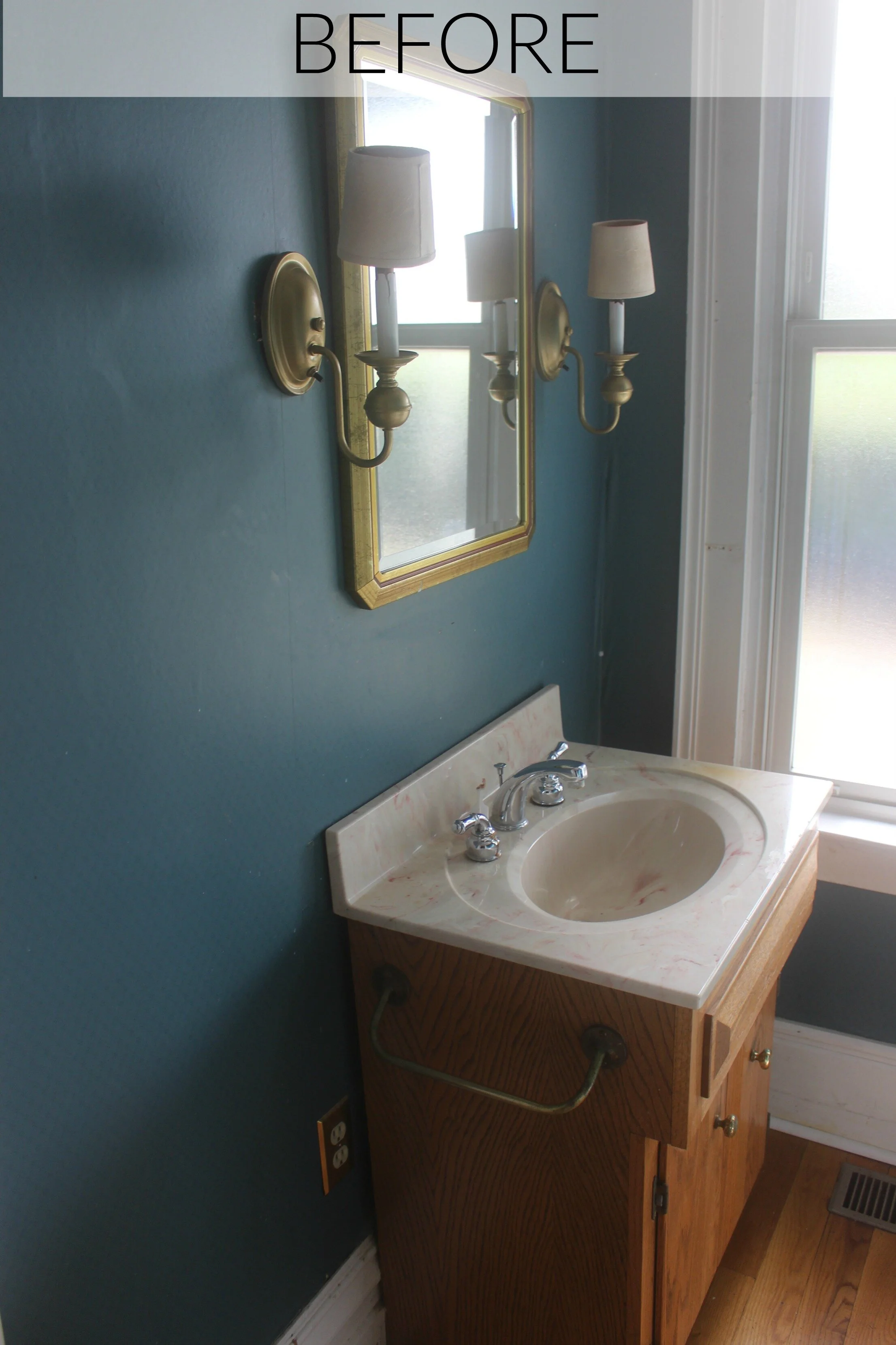
Even though this little powder room is by far the smallest room of the house, it still went through a major transformation! The main problem in this room was lack of space! There was hardly enough room to maneuver and it felt very tight and uncomfortable. I knew that simply switching out some of the fixtures would really open up the space since it already had such great original features like the moldings, large window, and high ceilings. Here is what this half bath looked like before:
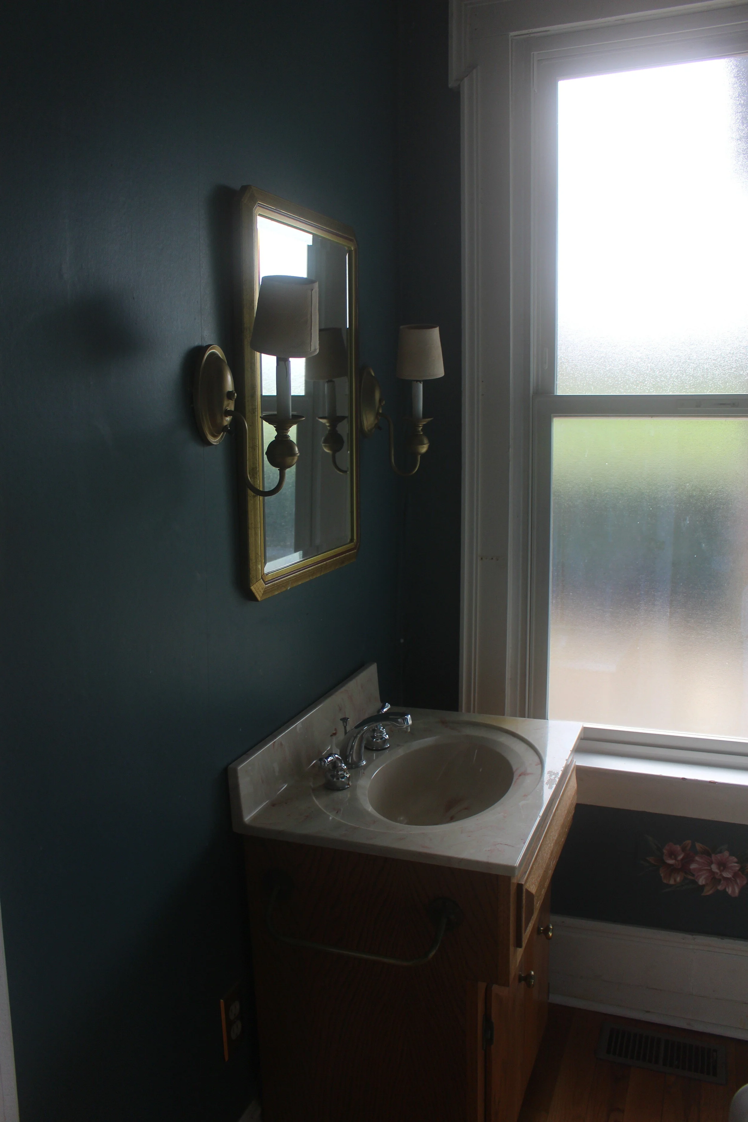
This clunky 80's style vanity wasn't helping the space situation at all. It was taking up way too much unnecessary space and blocking part of the window which visually made the room seem cramped. There were original floors in here but they had significant water damage from the bad plumbing so we unfortunately were not able to save those.
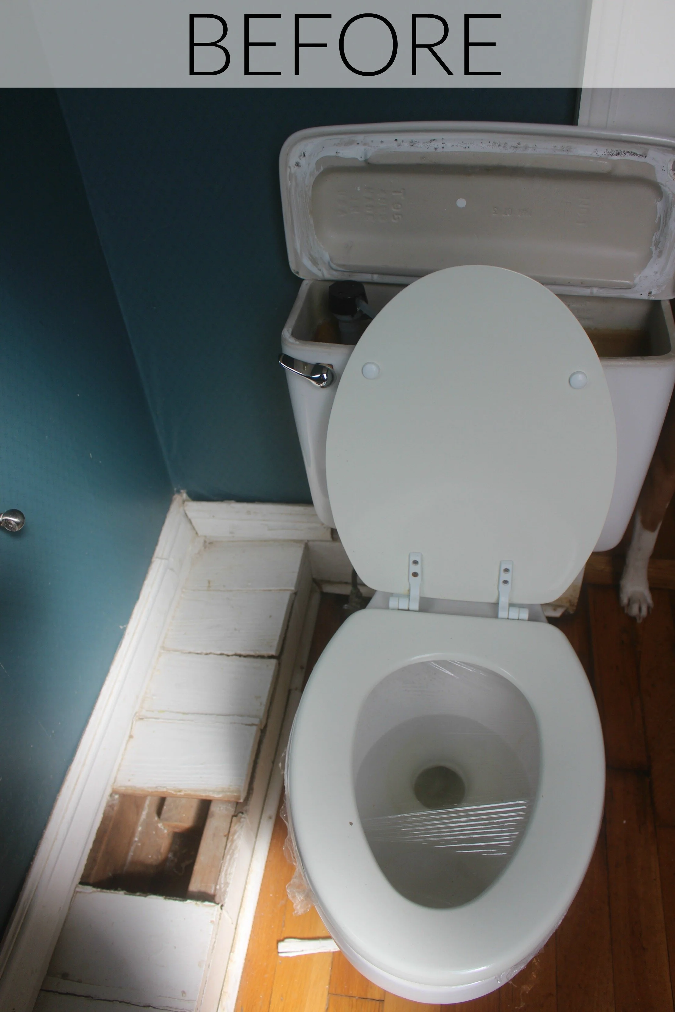
Another problem was this large ledge along the right wall which was causing the toilet to stick out over the doorway! After tearing it apart our contractors found that it was just some lazy plumbing that should have been under the floor all along. Since we were already replumbing the entire house we were able to get the pipe that this ledge was hiding back underneath the floor and have proper space to move the toilet over away from the doorway.
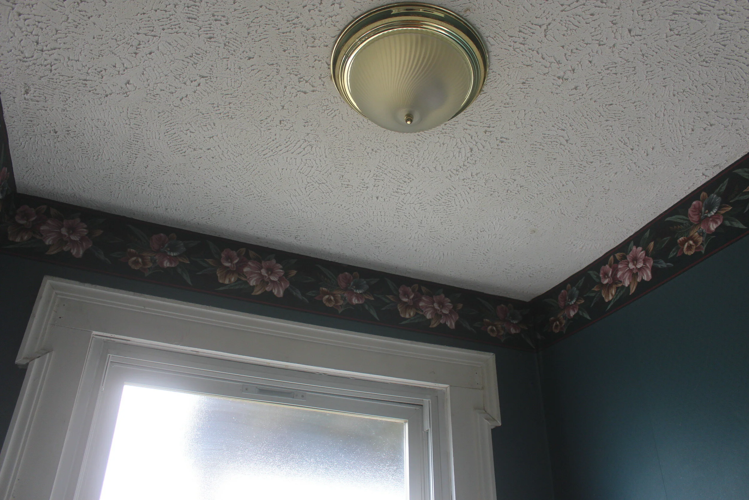
The room also was covered with some lovely wallpaper but since there was so much plumbing work in here we ended up having to basically re-drywall the entire room. The walls and trim were all painted which also opened up the room even more.
This was one of the few rooms in the house that had this textured ceiling. This was covered with new, smooth drywall and painted as well and we switched out the old light fixture.
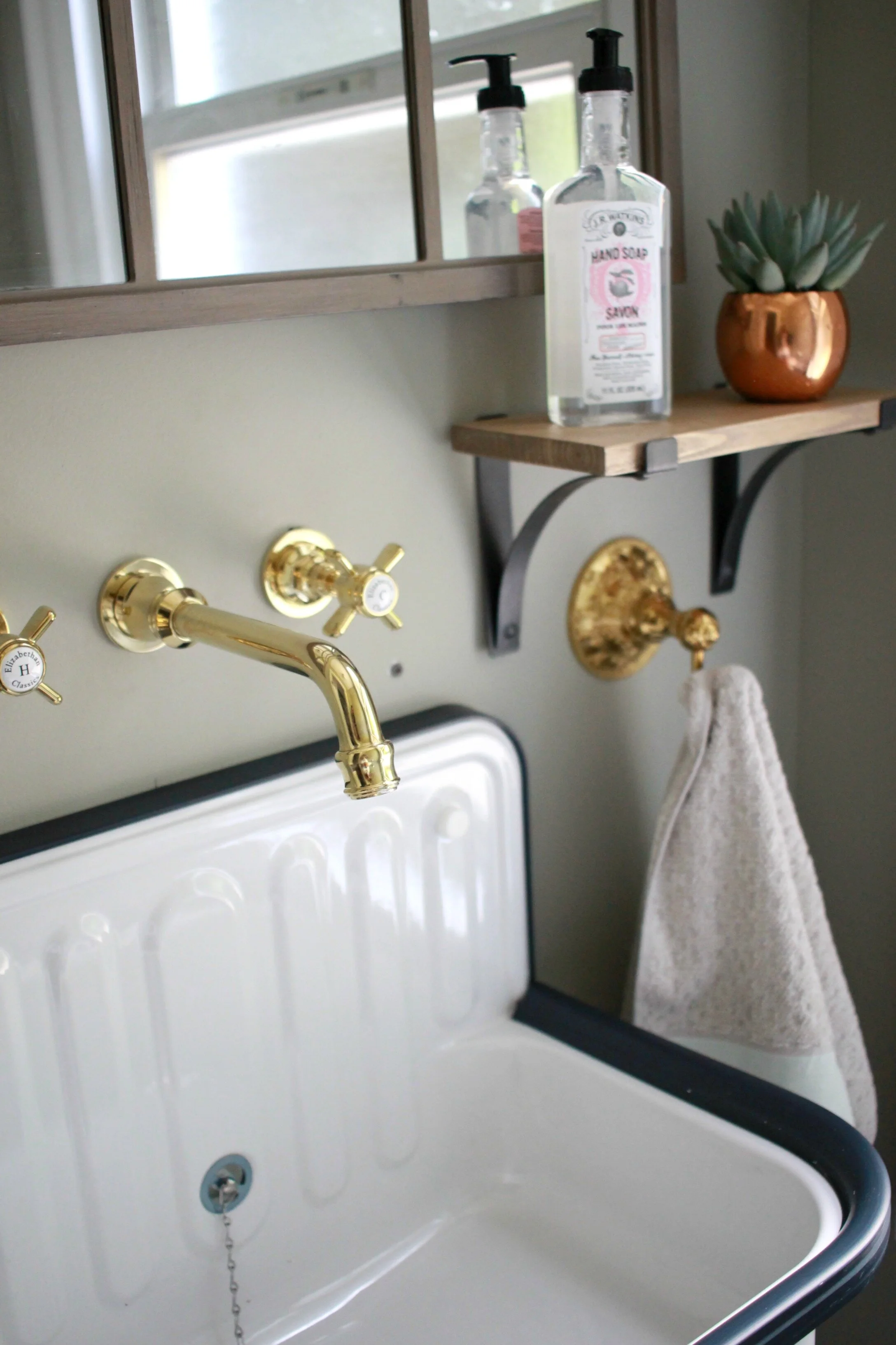
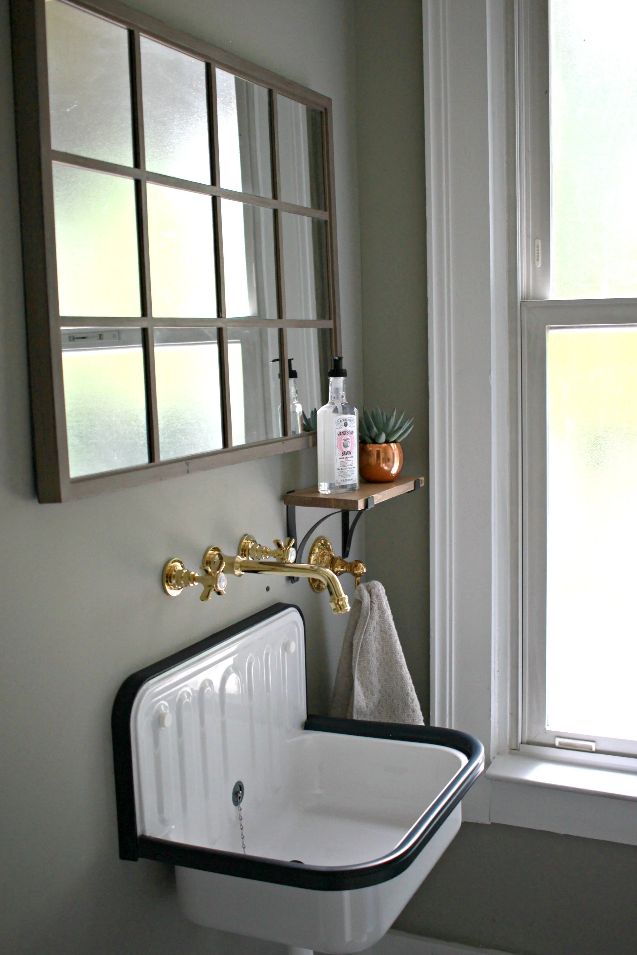
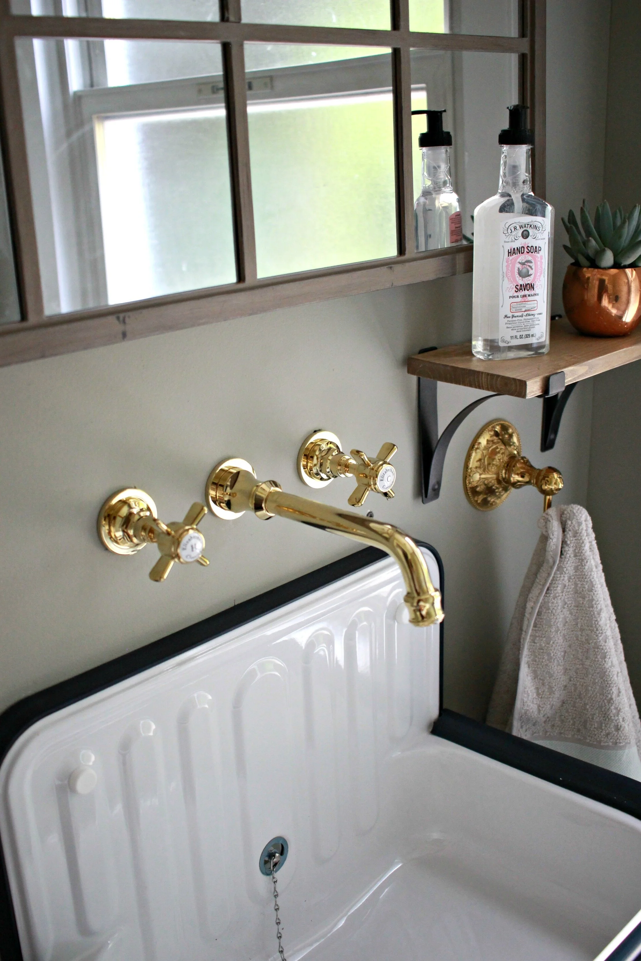
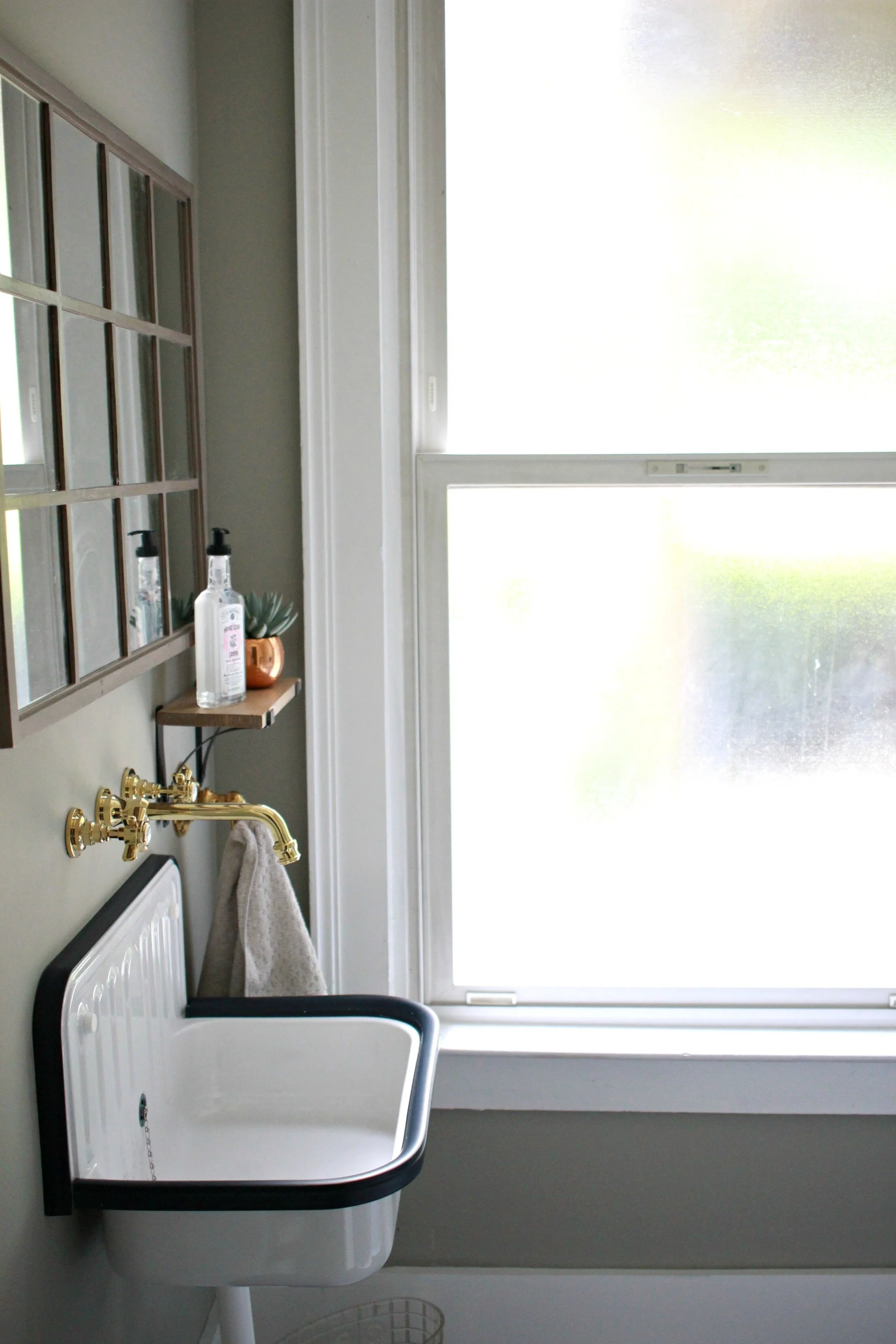
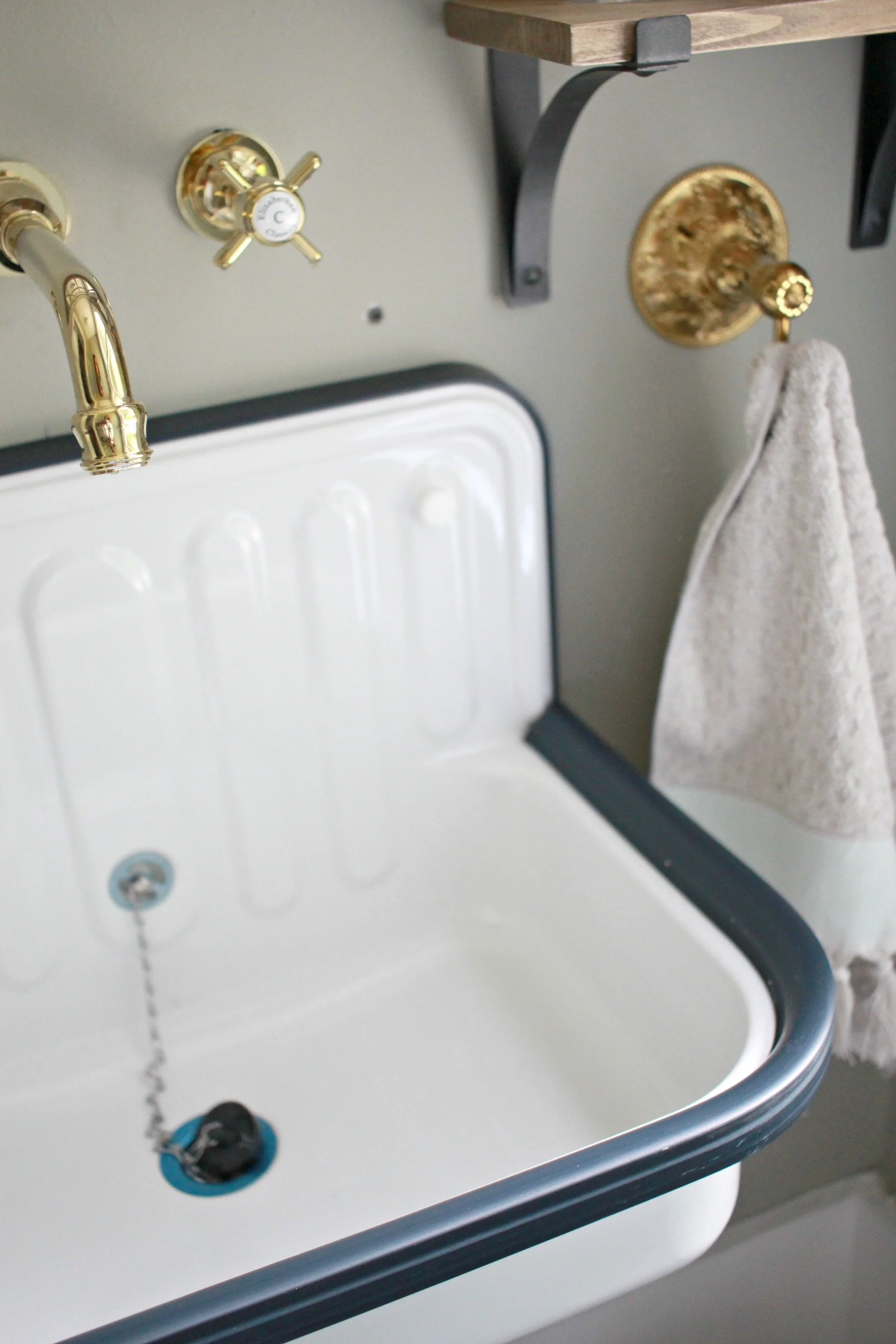
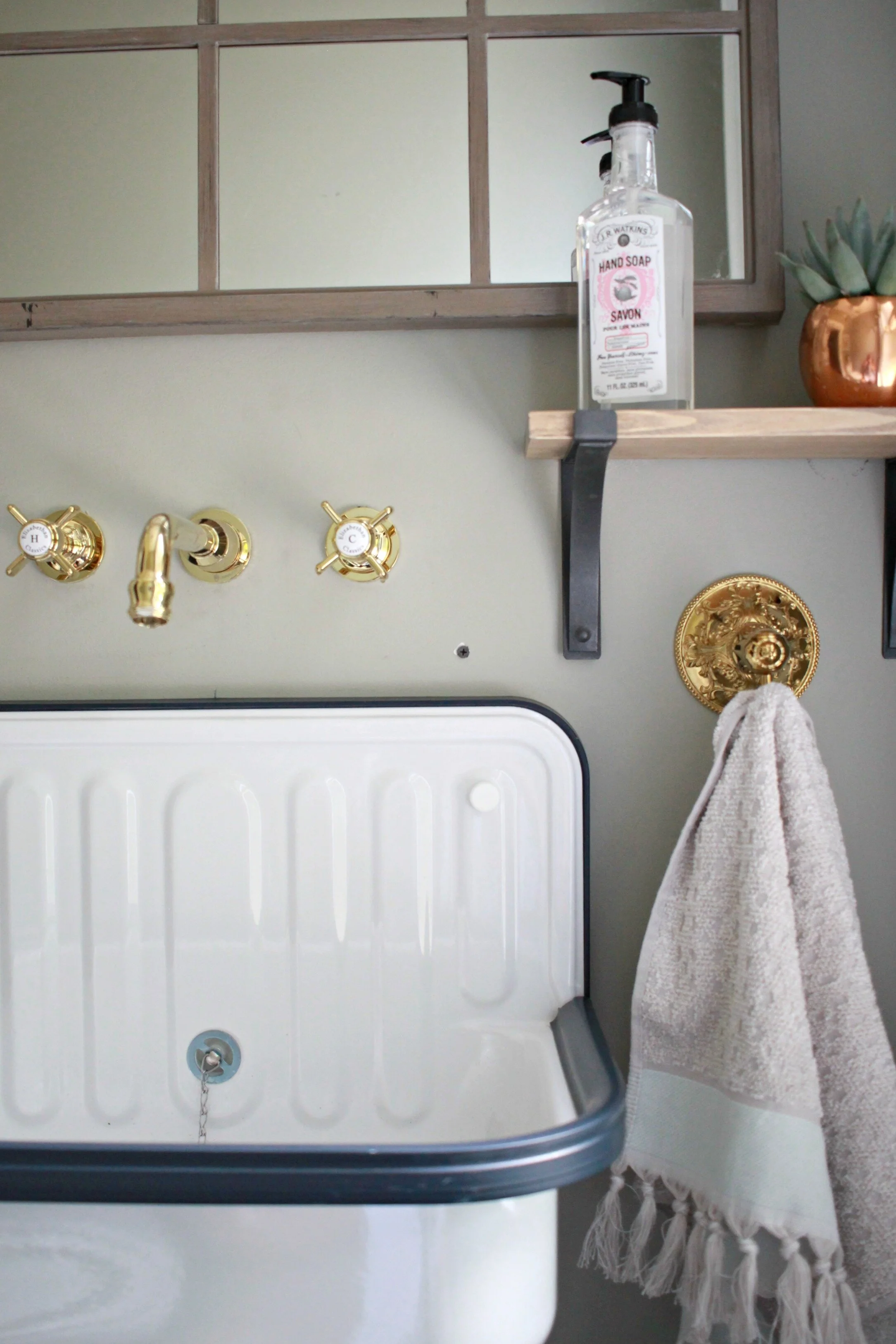
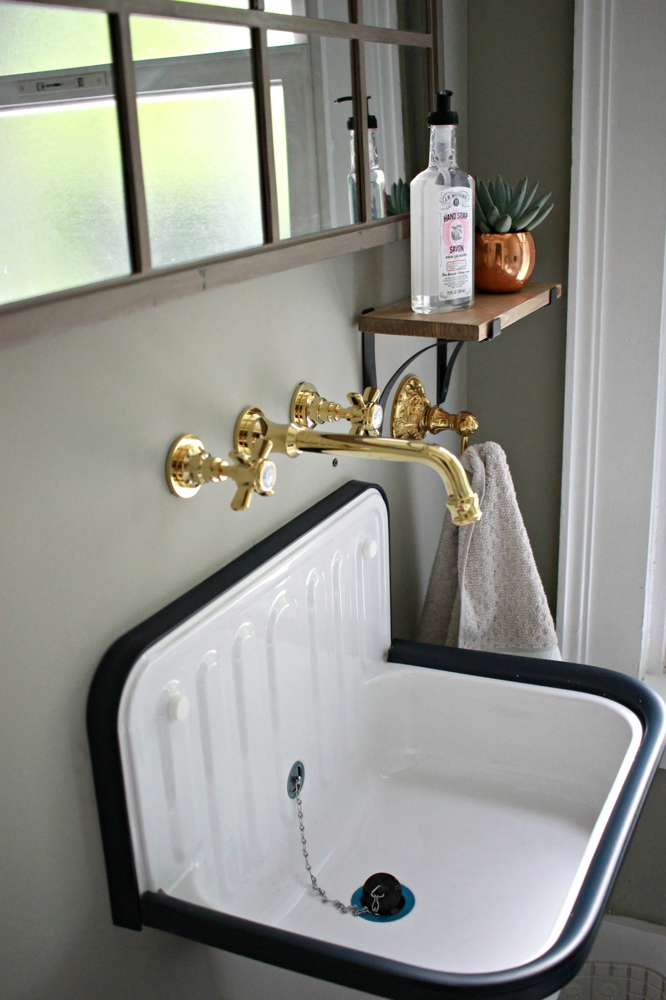
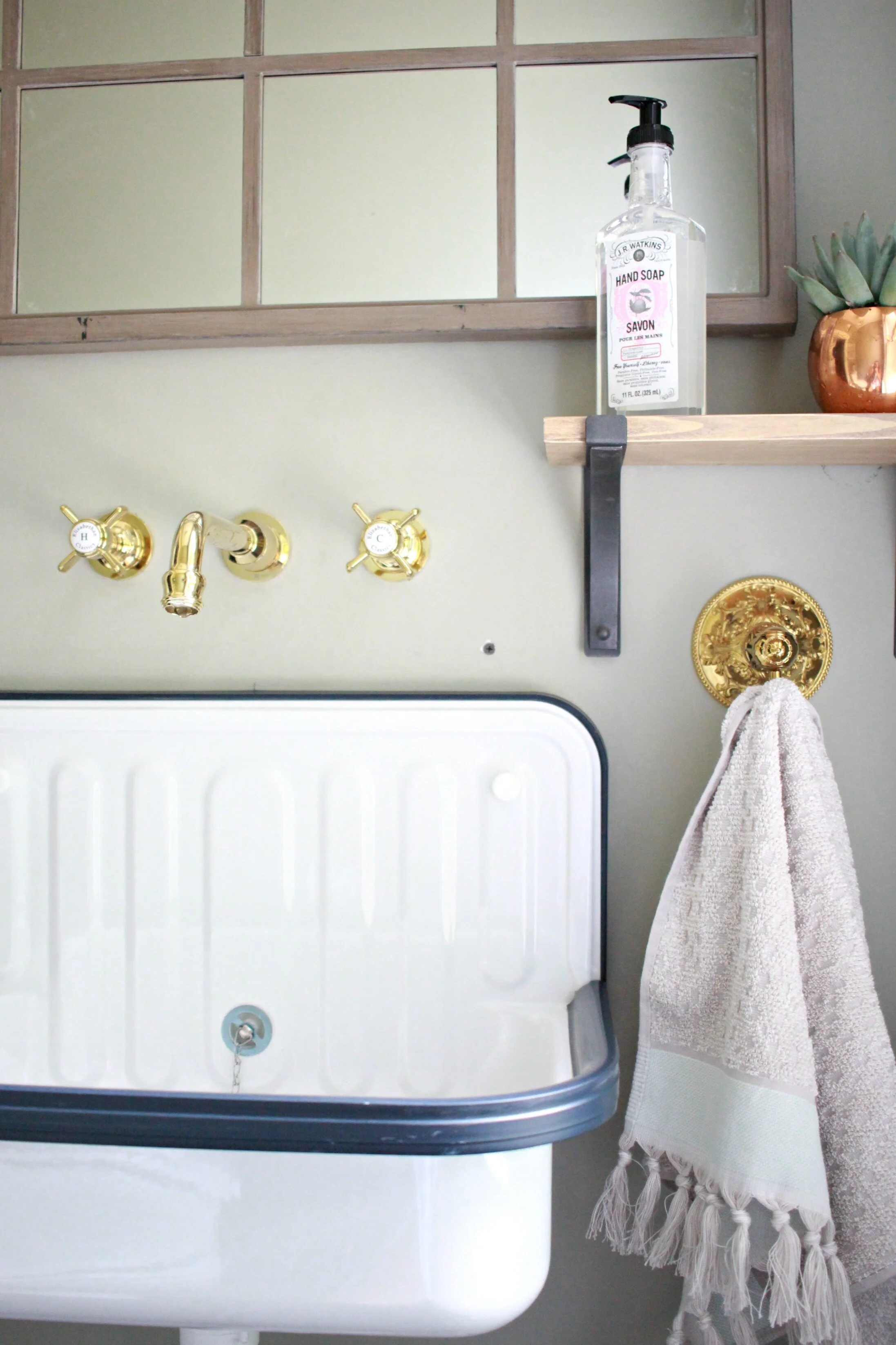
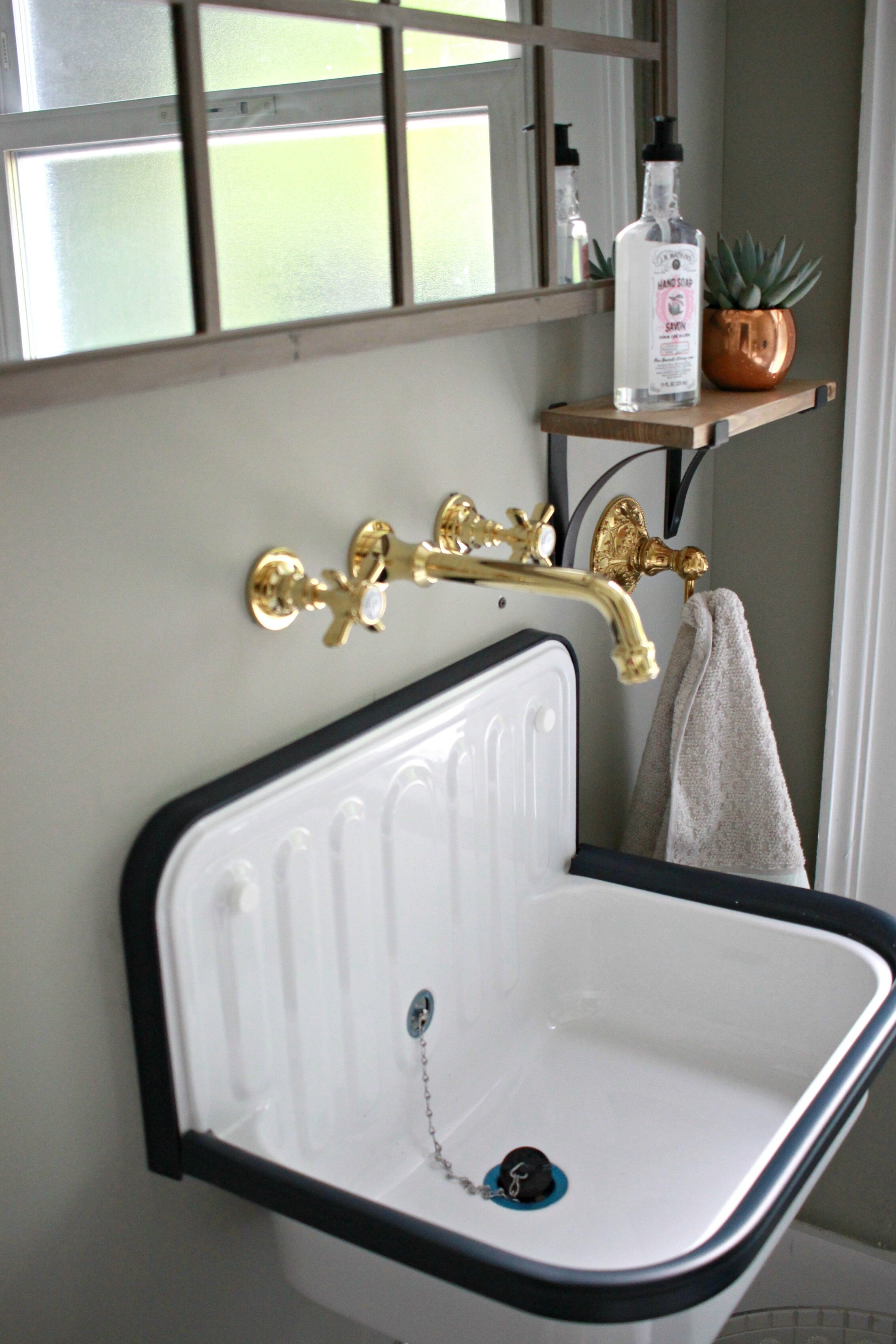
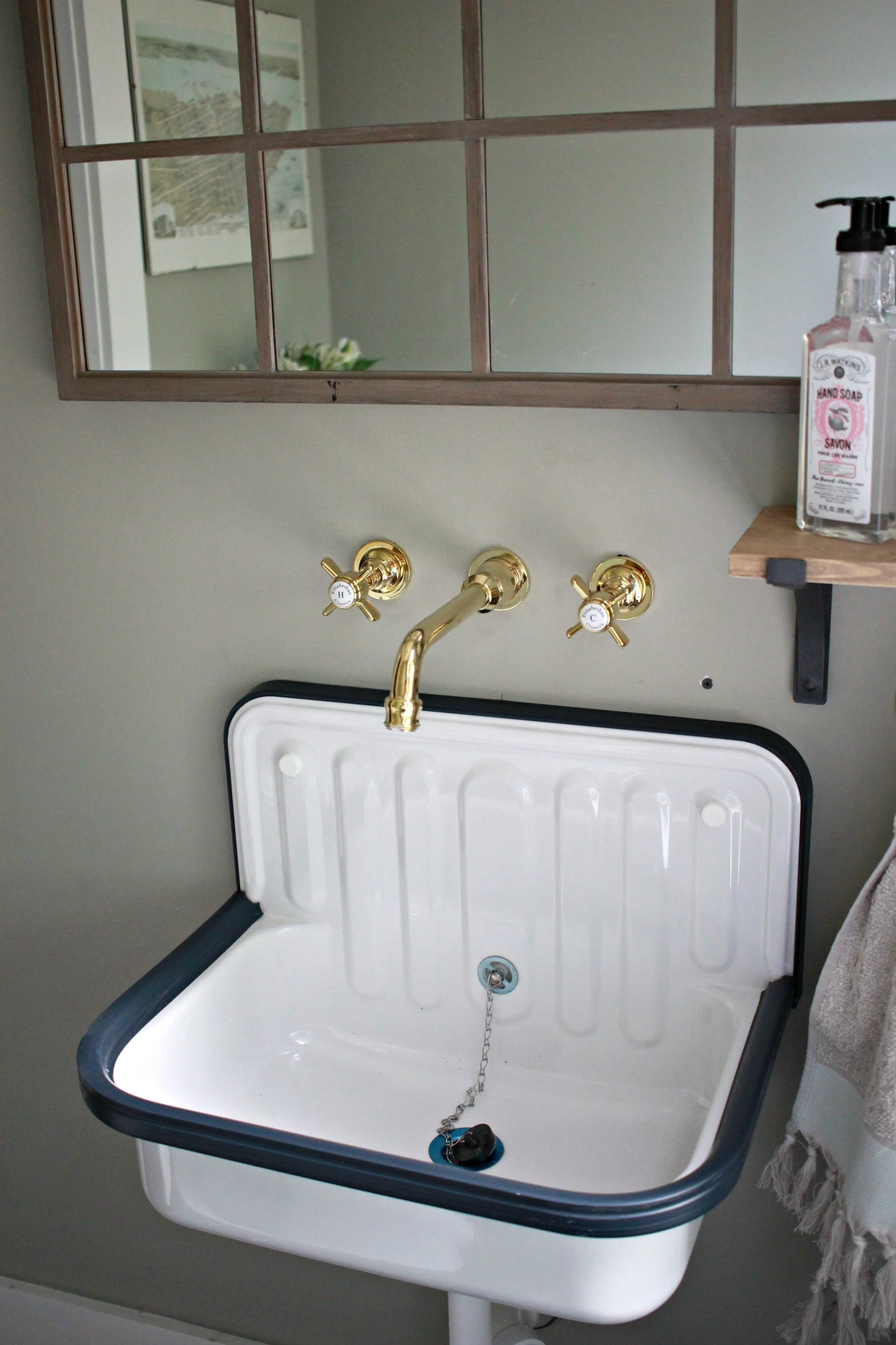
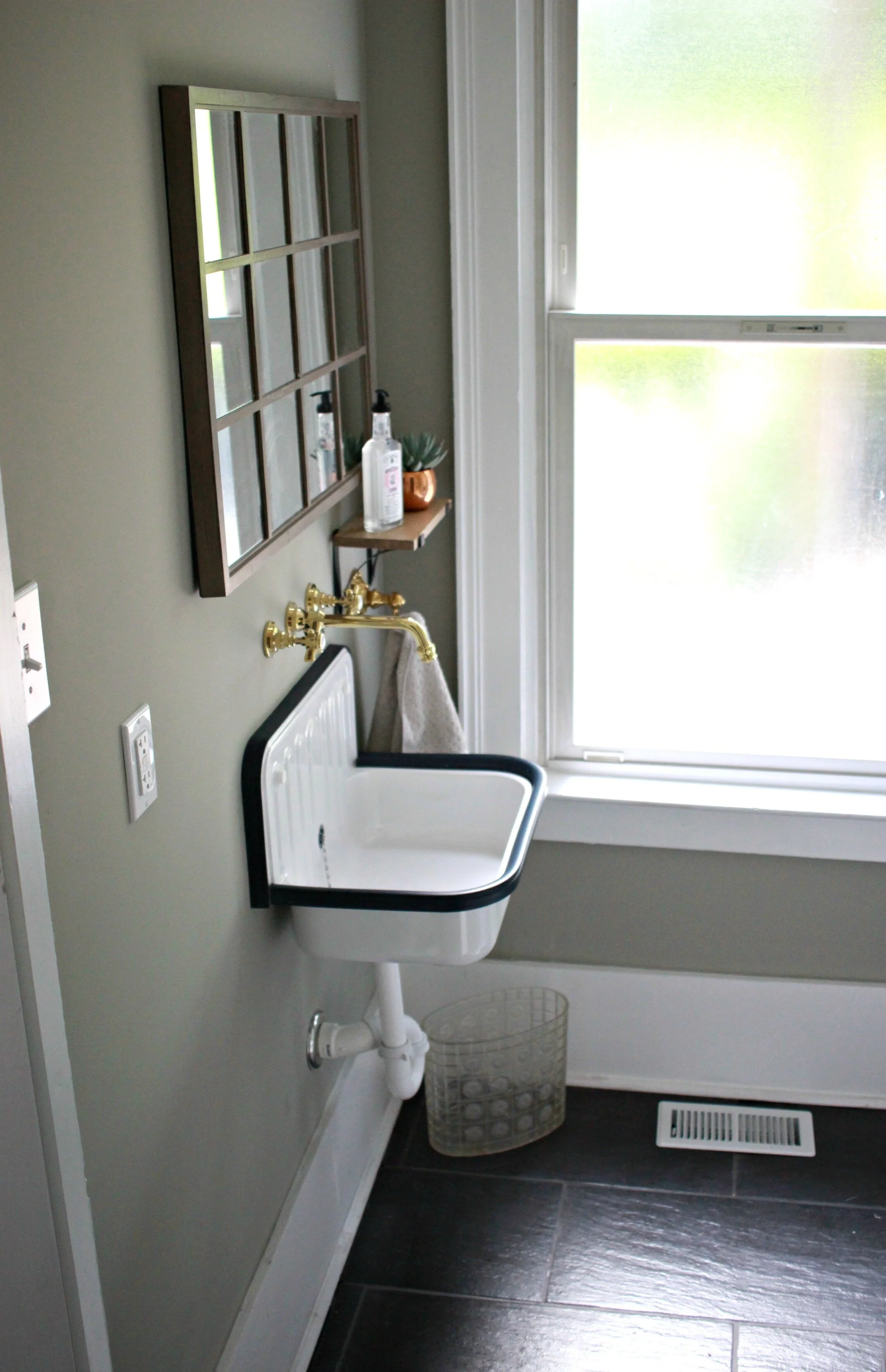
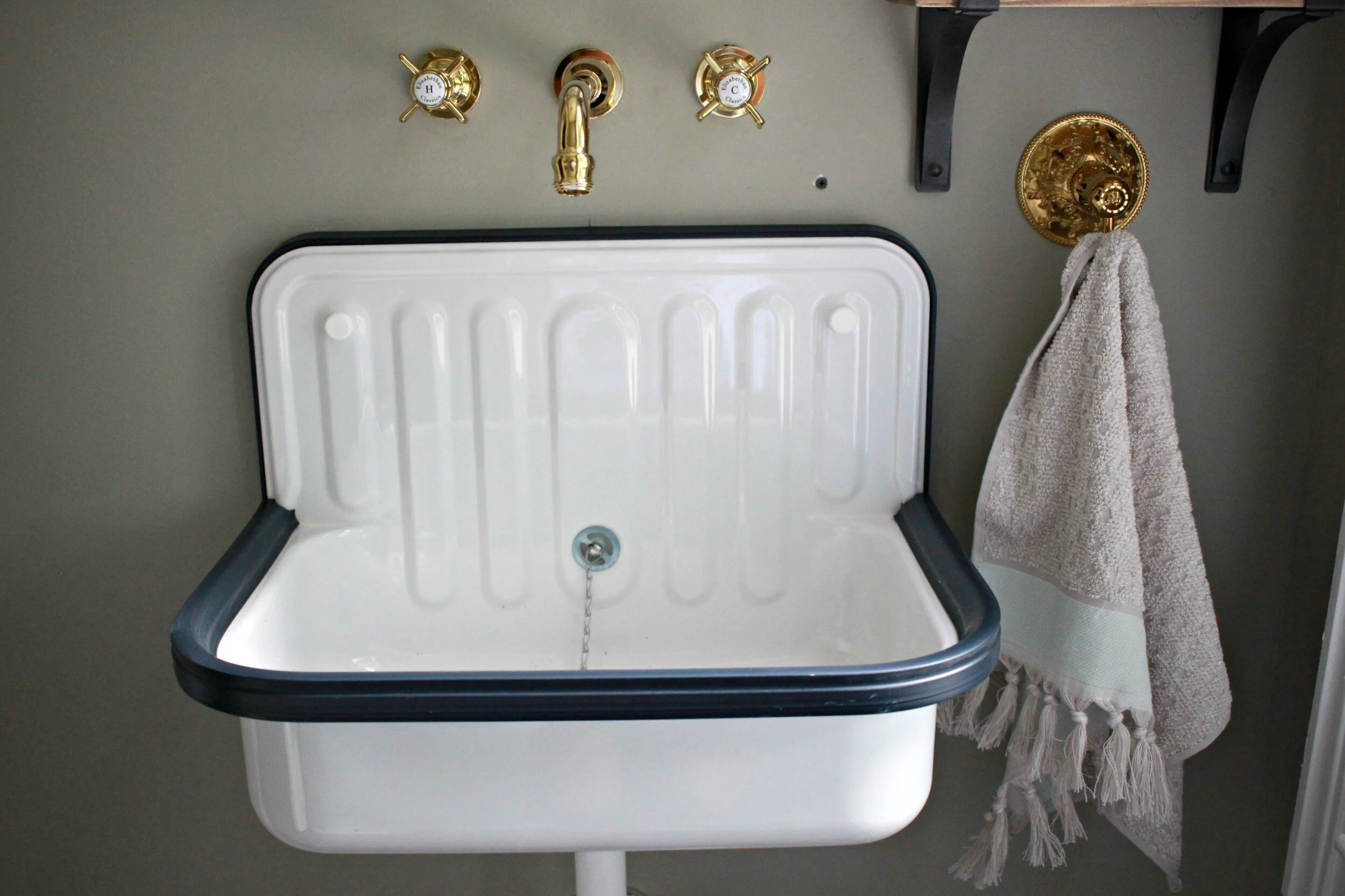
I knew immediately I wanted a wall-mount metal bucket sink for this bathroom. I searched online for hours and just when I thought I would never find one within my budget, I happened across this sink from Rejuvenation. If you have never visited the Rejuventation site, it is part of the Pottery Barn/West Elm family and has SO many amazing reproduction fixtures and vintage-inspired finds (this is about the only thing I could afford though!).
I needed a wall-mount faucet to accompany this style of sink and I really wanted to try brass for something different. Wayfair has a great selection of brass faucets and I liked the simple, industrial style of this faucet. Since there isn't any kind of countertop or ledge with this sink I added a little wall shelf next to it from Target and a towel hook that matched the brass faucet.
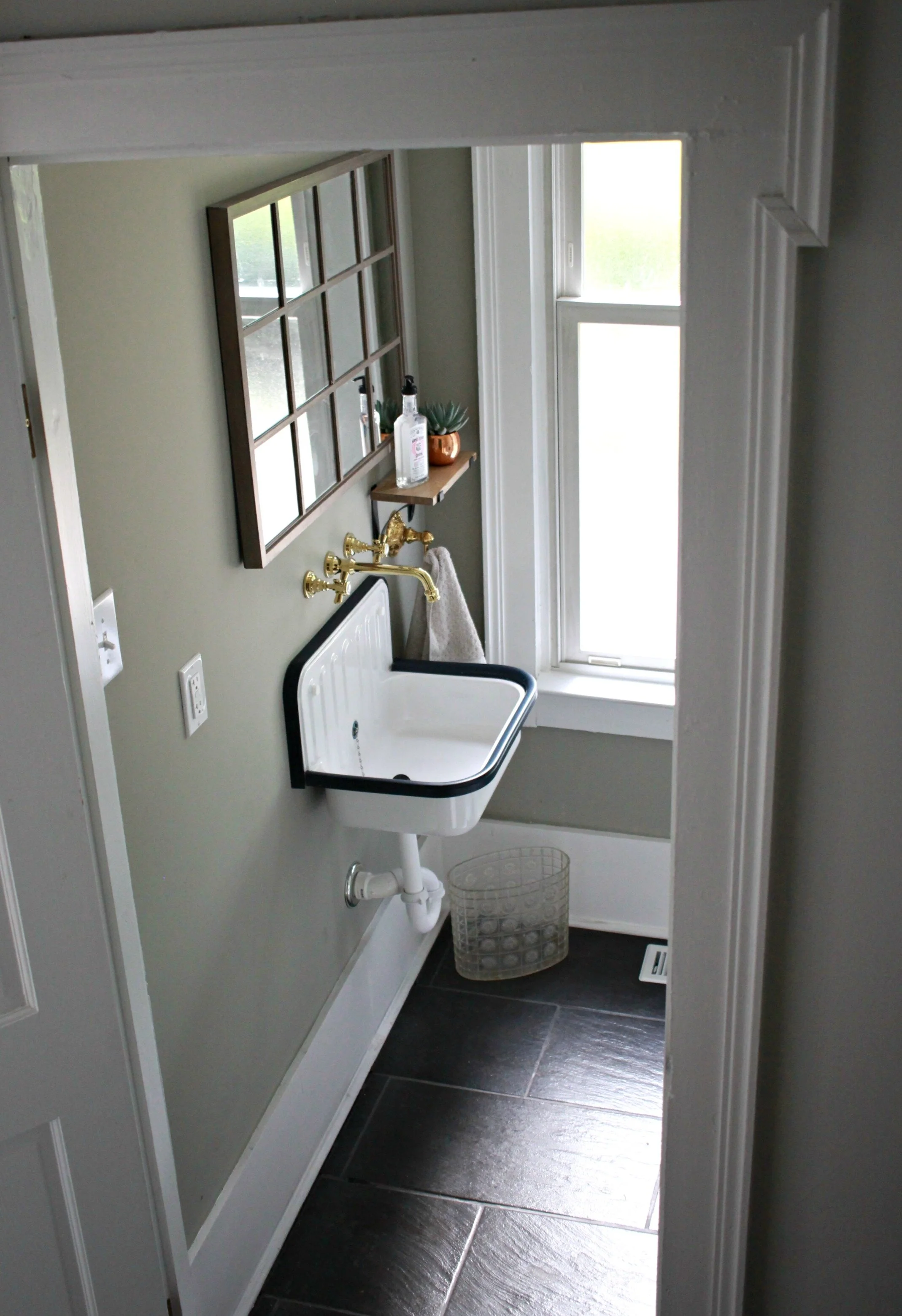
We used the same ceramic slate-look tile in here that also is in our kitchen and mudroom/laundry. So far I really love this tile- it's super easy to clean and doesn't show much dirt/dog hair in between cleanings (which is a total win in my book!). This is one of the perks of ceramic tile vs. true slate tile, which is very difficult to maintain and actually sheds a little throughout the first couple of years. I already have two shedding dogs, so the last thing I needed was a shedding floor too!
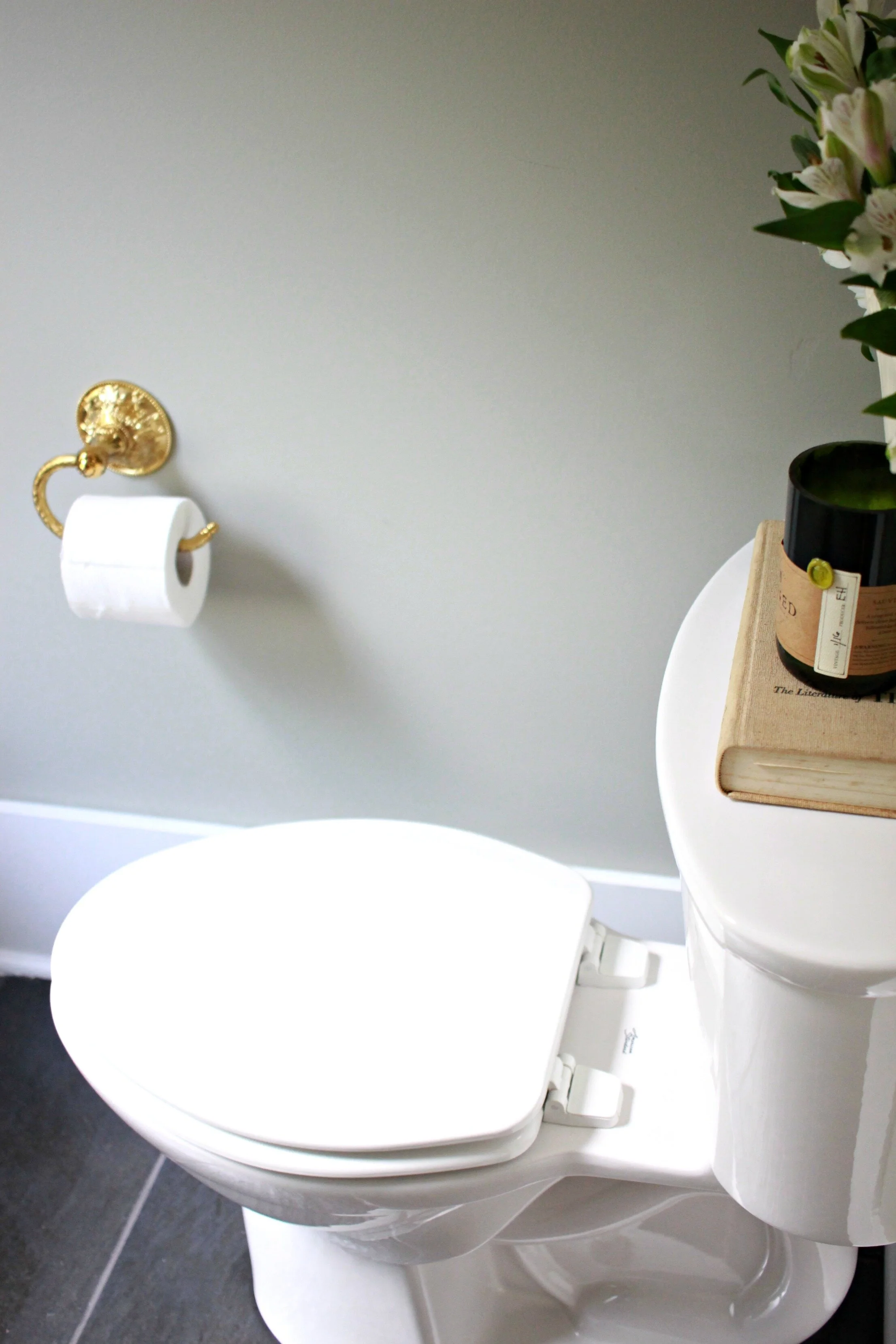
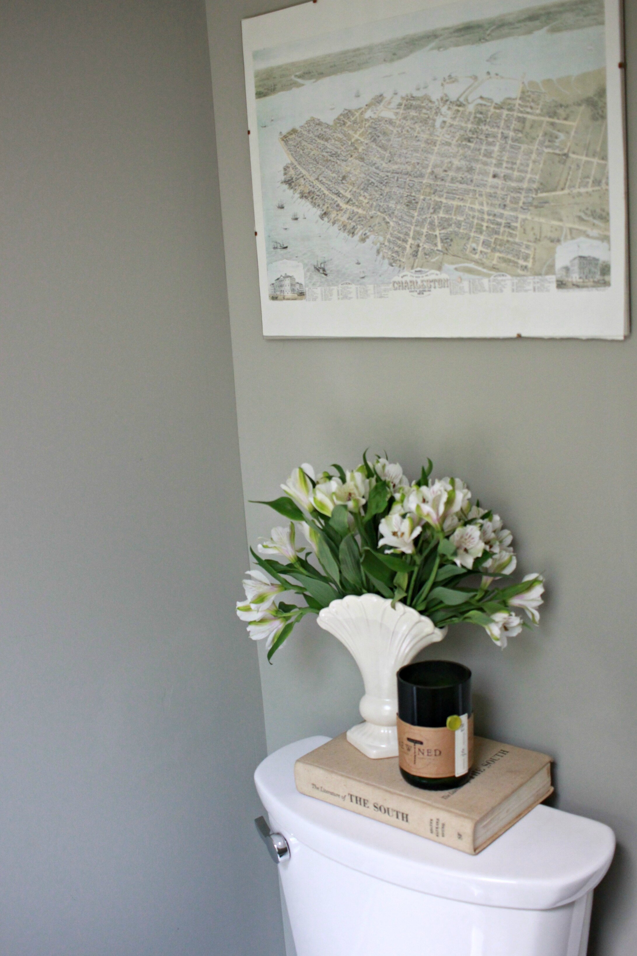
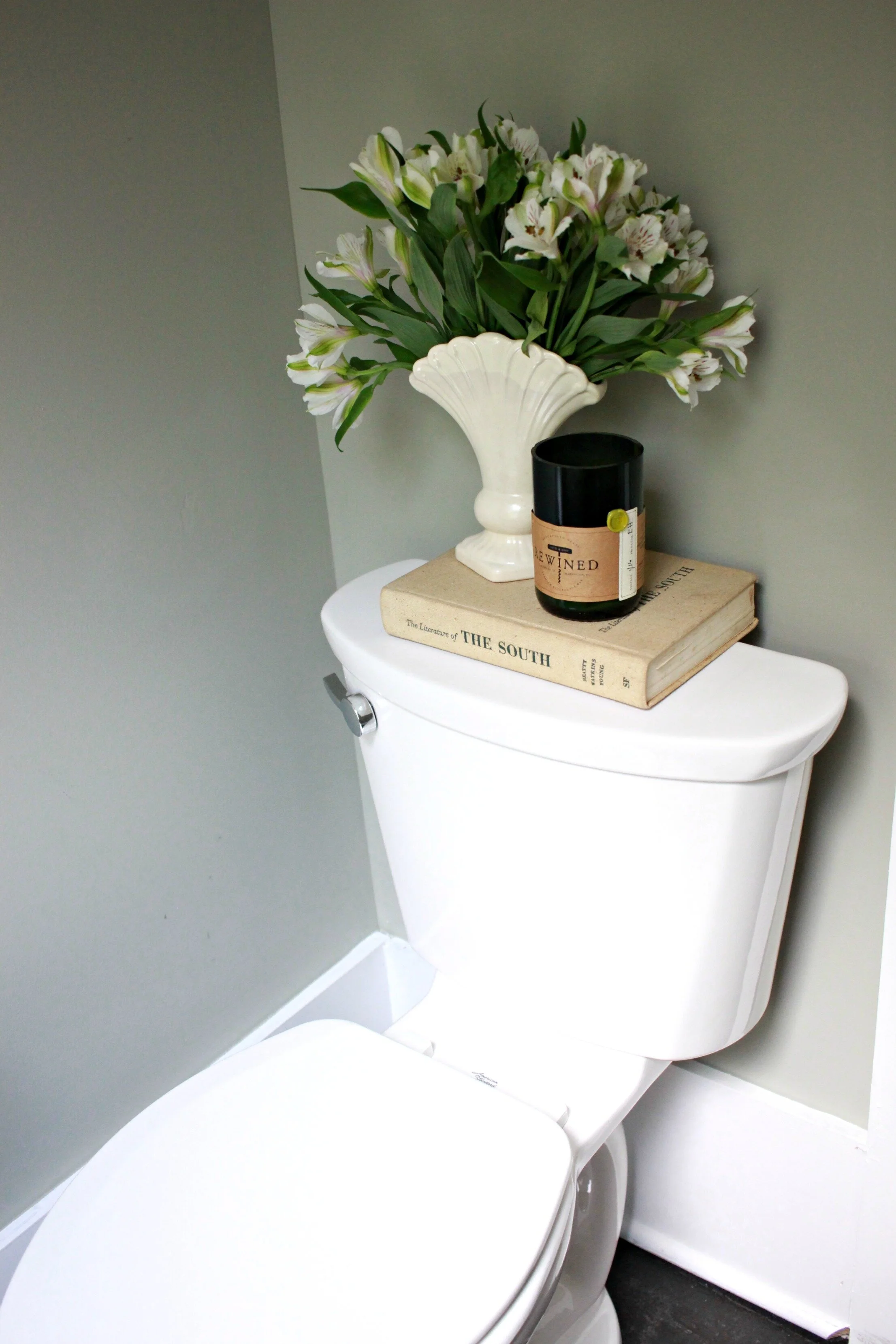
Here you can see our new toilet which is actually centered on the wall now like it should be! Just moving it over those couple of inches made the biggest difference in the overall flow of this small bathroom.
I wanted a neutral wall color that also complimented all the industrial/vintage elements of this bathroom, so I went with a light gray color that has some green tones and new bright white paint on all the trim and the ceiling.
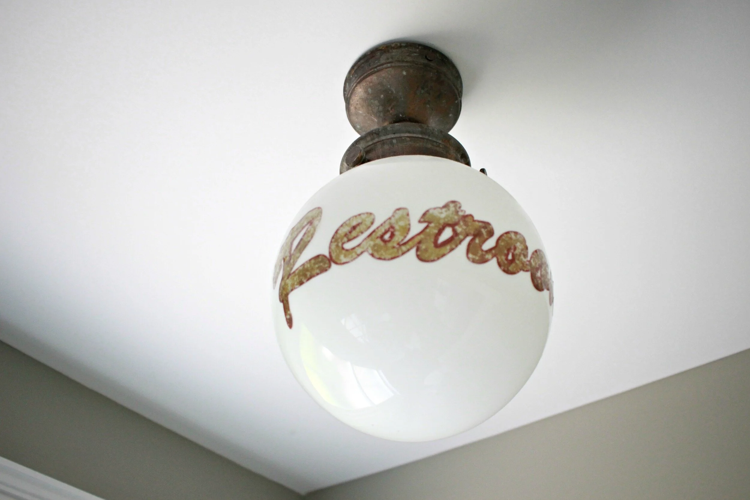
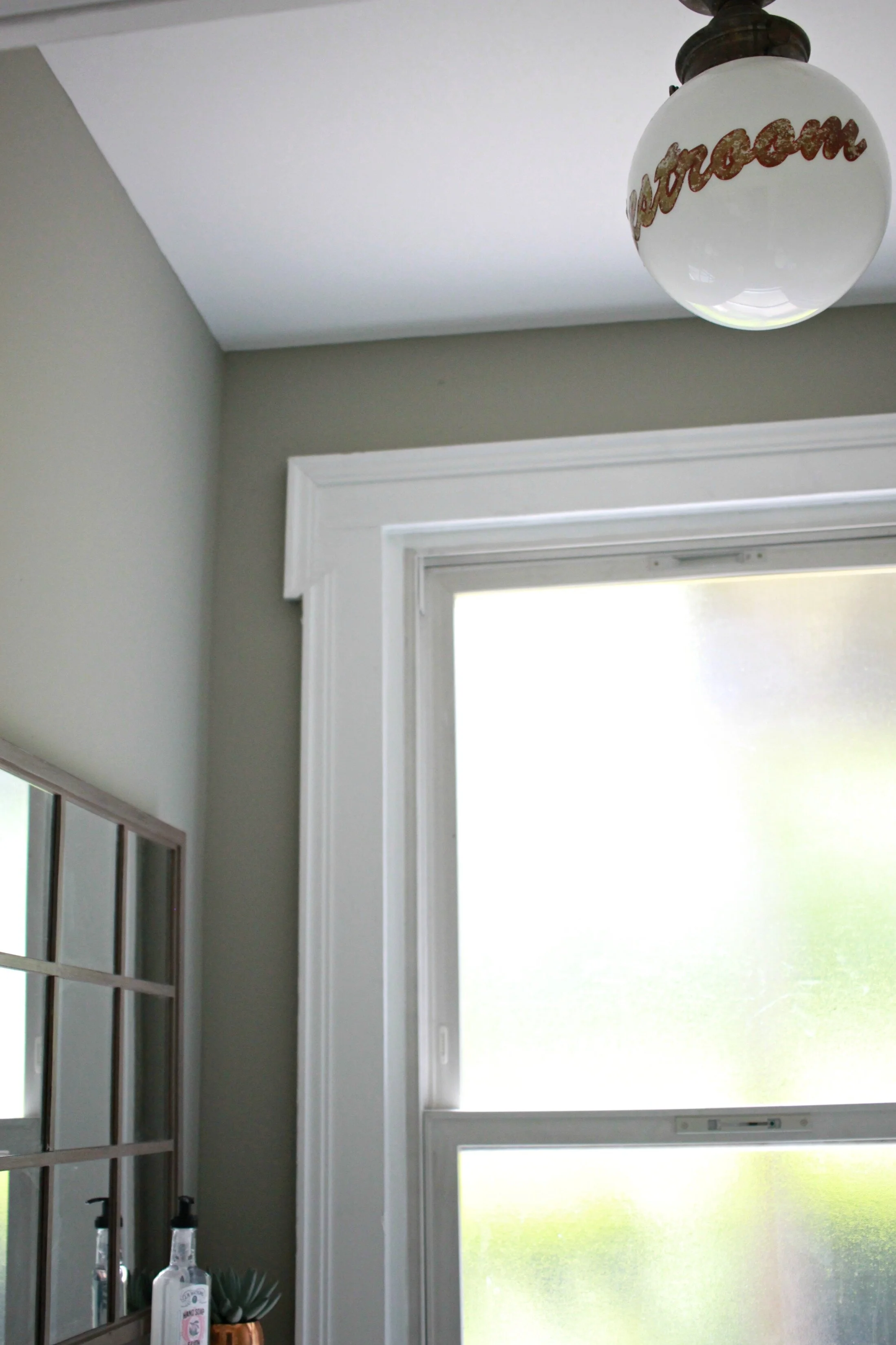
This light fixture is one of the first things I bought to inspire the overall style of this bathroom. We found this at Blue Ocean Traders in Louisville which is a wholesale furniture warehouse with amazing vintage and reproduction finds. This is a reproduction but everyone has thought that it was an original, old light! I love the quirky, unexpected touch it adds to this space.
I still have a little decorating and finishing touches to add. I'm not 100% sold on this mirror but I found it on super sale and it is the perfect size so it will do for now. I also want to get a new wastebasket and hang some more art/pictures on the walls. The windows are frosted glass so I don't necessarily need a shade or curtains but it might make the room look a little more complete- what do you think? I also like all the light that is coming in now with the window bare. Thank you for following along with our progress and stay tuned for more updates!
xoxo
Emily

